Let’s talk a little more about my wedgie and how I picked it. I know you love my opening lines. Just admit it.
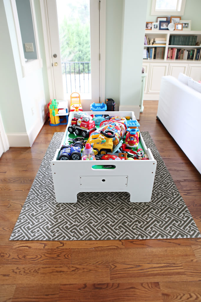
When I introduced the Great Switcheroo, I told yall that this area is the wedgie in my life. It is so annoying and just jammed packed with junk. It is technically part of the living room but we don’t see it if we are actually sitting in the living room. That doesn’t make sense but it’s true. You do see it when you enter the room though. It’s the first thing. It’s like in-your-face-kids-live-here-evidence.
Since my plan was to move all these toys (and many many MANY more into one area – my old office aka the future playroom) I decided that it was time to tackle this space and make it a little more functional. Enter mommy’s magic word – STORAGE.
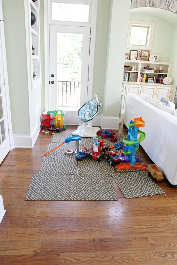
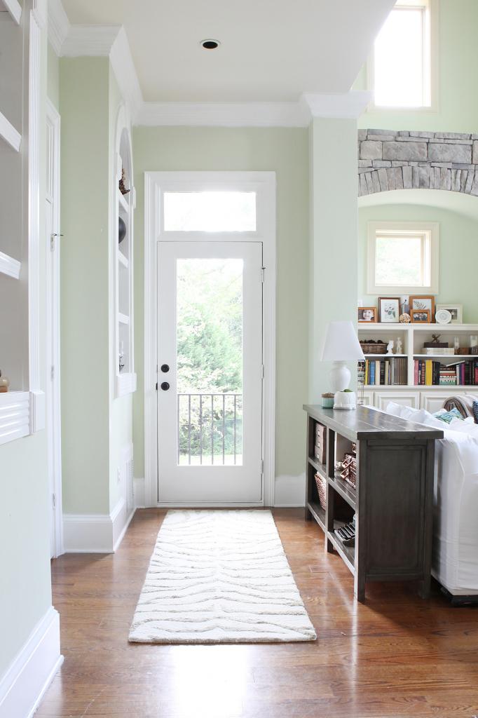
The plan was to build a storage console table. Something that would run almost the entire length of the back of the couch. Something grown up. Something not every color of the rainbow or sings the ABCs. And now we actually have just that.
The process was not hard. We hacked an Ana White plan. It was the Rustic X-console table and it is primarily made of 2×4’s and 2×2’s. We tweaked the cuts a little bit so that the table would be a smidge taller and be not quite as rustic.
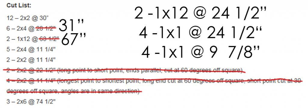
Rustic is really fun and kid friendly but in our house, we have to use it in smaller doses. I would rather have cleaner lines and a rustic finish because then the lines of the furniture goes with our moldings and the finish will be close to indestructible. So what we did was do our own cuts and then followed the construction instructions of Ana’s plan skipping the X’s on the ends (I think that was step 4?).
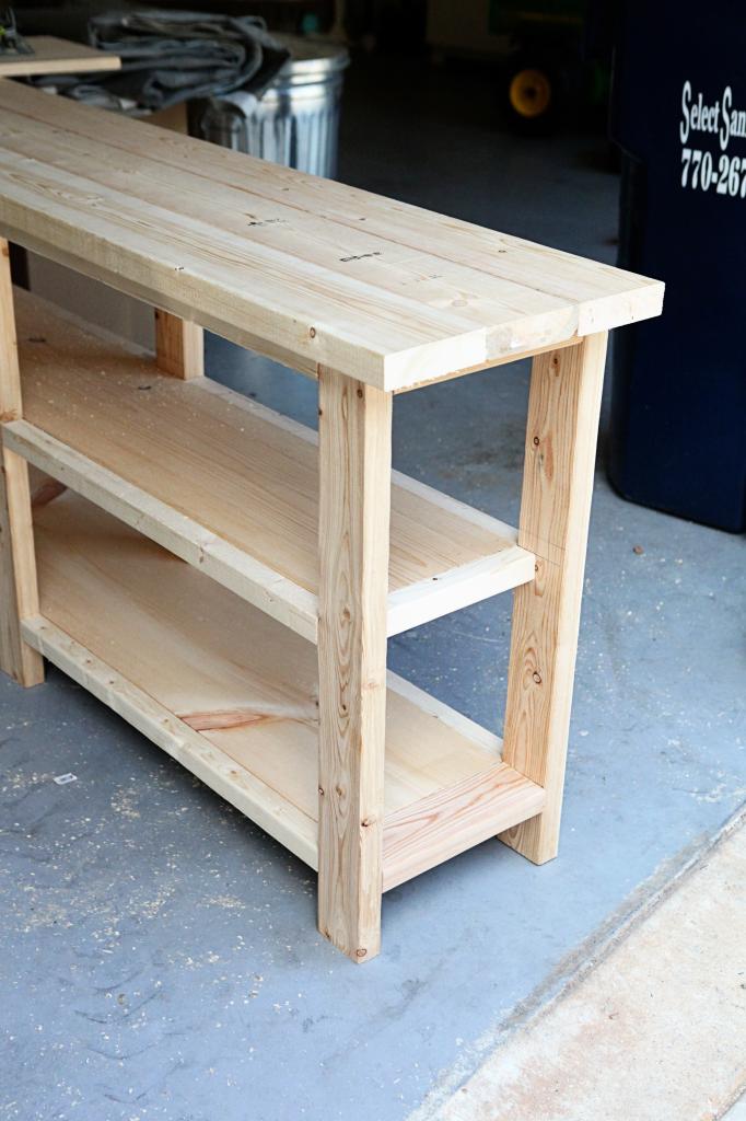
I told Jeremy that since this piece would be primarily viewed from the side that it would look really cluttered and busy if we left it open and plain…and then I batted my eyelashes while holding a plate of cookies and I asked if he could put solid end pieces in closing it all off.
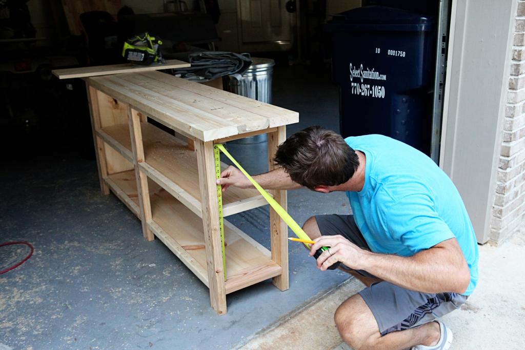
Of course, no man can resist that kind of sweetness, so he got to work. My hero 🙂 There was some leftover 1×12 from the shelving part of the table so the plan was to cut it to size and trim it out.
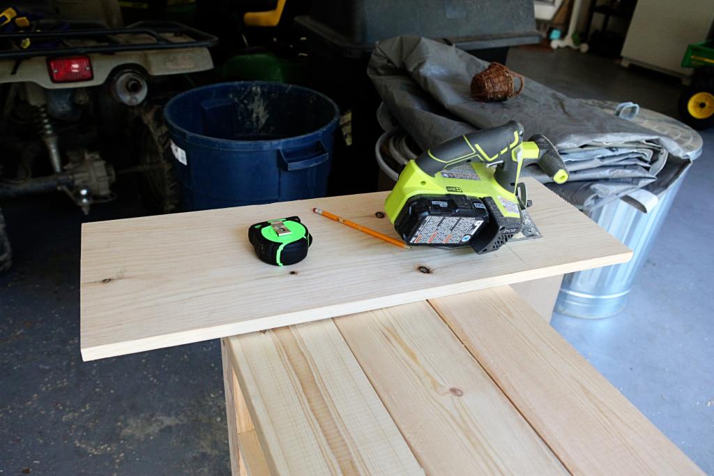
This would have been scrap wood anyway so it was great to use it!
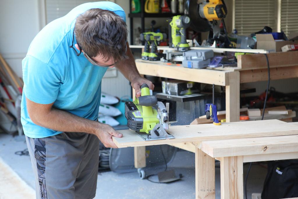
We used some 1×1’s to cut pieces to trim out the 1×12.
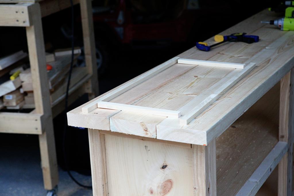
The 1×12 just got wedged in there. Jeremy used a rubber mallet to fit it in nice and tight. For the trim, it just took a little glue.
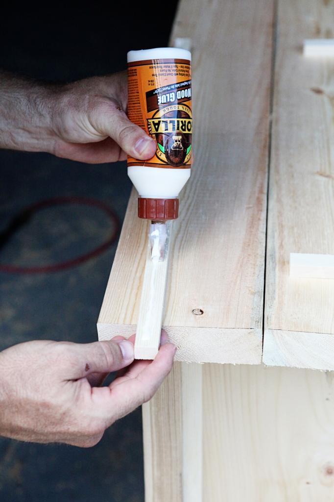
Those pieces were clamped onto it while it dried.
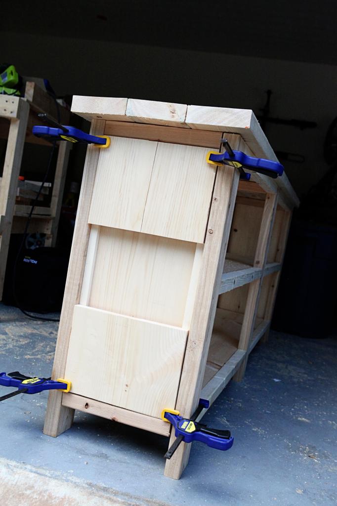
This is where it gets a little hairy. I thought that it would be nice to have two drawers in the top two sections of the console table. Closed storage. Spot for random living room stuff. Another place to hide candy.
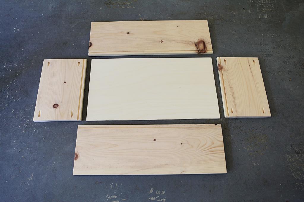
So I spent the better part of a weekend cutting and assembling them.
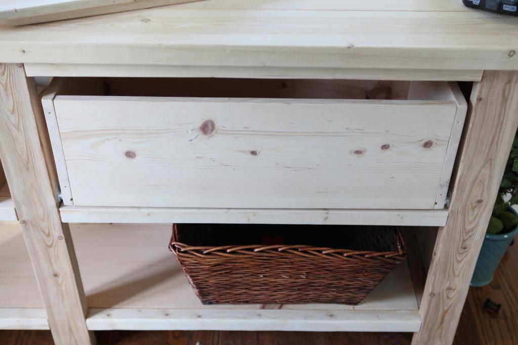
I trimmed it out and popped it in and literally I heard boos and hisses. I may have seen a random tomato being thrown. It just looked weird.
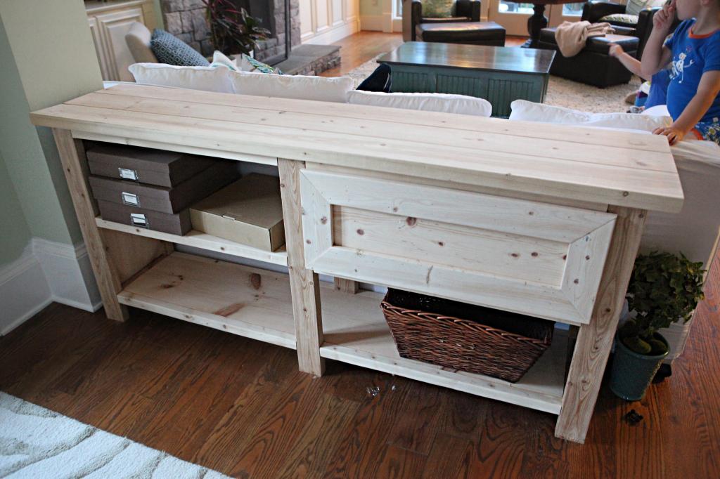
The drawer was way too bulky for the table…I blame the front 1×3’s. While the side looked finished and scale appropriate, the drawers looked like they belonged in a kid’s storage space. I quickly removed them…cursed the money I spent…and decided to just go with the original console.
Then came finishing time. The whole table got sanded a couple of times with 80, 120, and 200 grit. Then I used a can of old Alkyd paint to give it a nice warm gray color. This was Sherwin Williams Amherst Gray. I had gotten the paint originally to do my kitchen island and that was an epic fail on that finish. This however, was amazing. The raw wood sucked it up but after two coats, it looked amazing.
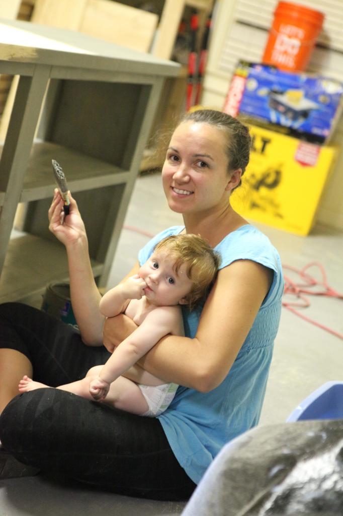
Side note…see what is in that kid’s mouth? It’s me…I’m totally wrapped around his fingers.
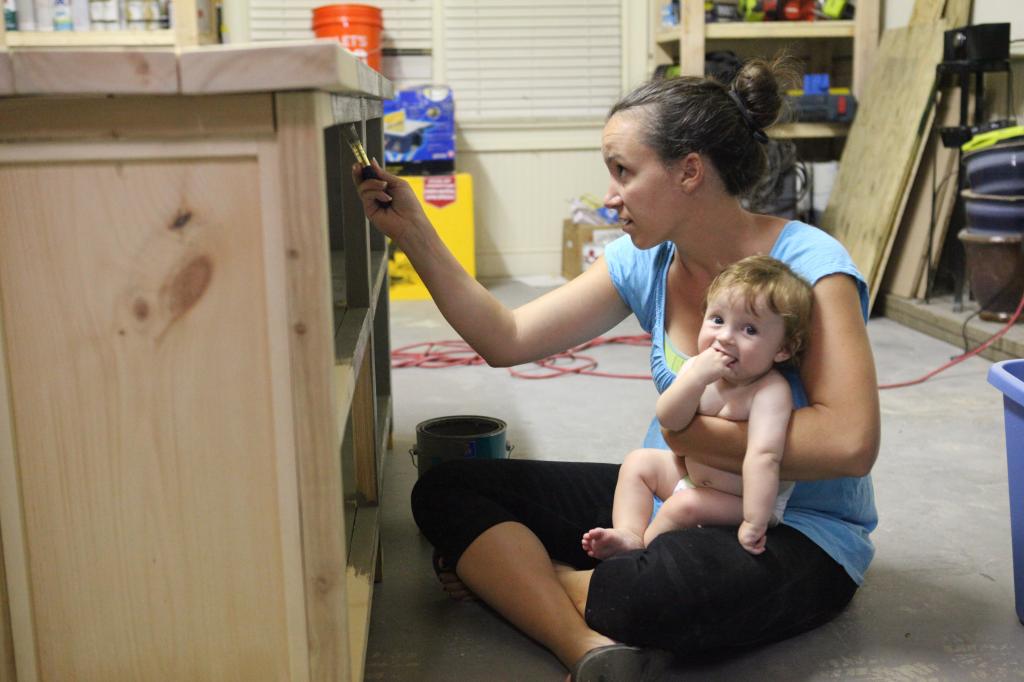
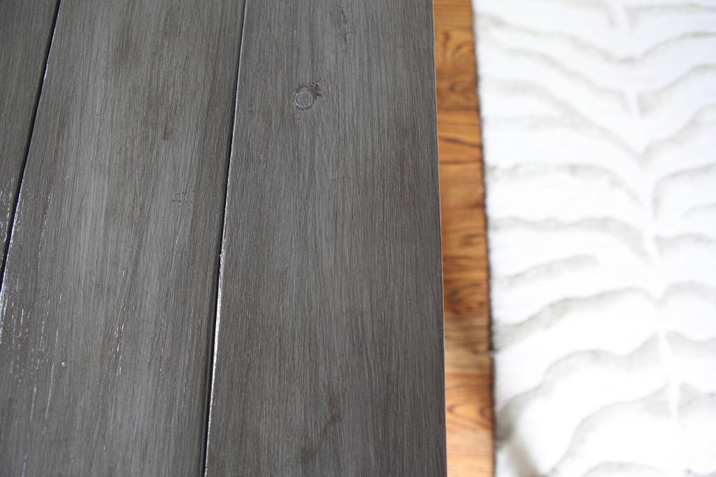
After the paint, I sanded the edges and corners with 80 grit and then used Rustoleum’s Kona stain to rub it all over. When you do this, it takes some serious elbow grease to get the excess off but I think the finish is worth it. Three coats of Polycrylic later, it is looking pretty fly for a gray guy.
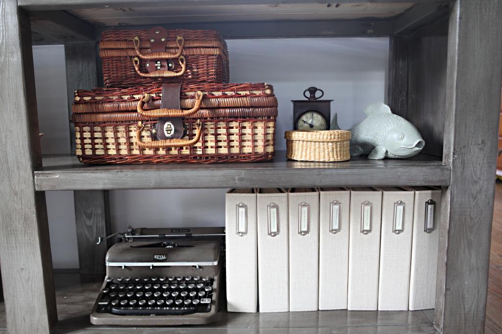
I put a bunch of my junk on it. I went with things that would take a little more time to destroy. Weston is up for that challenge but in general, these things are not as breakable.
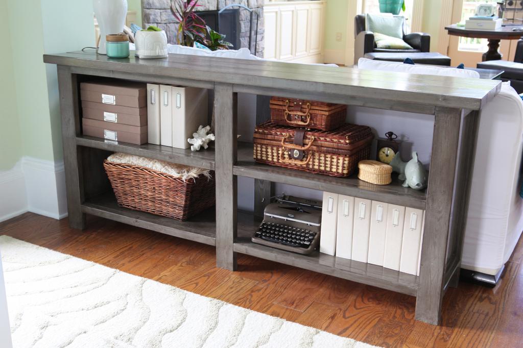
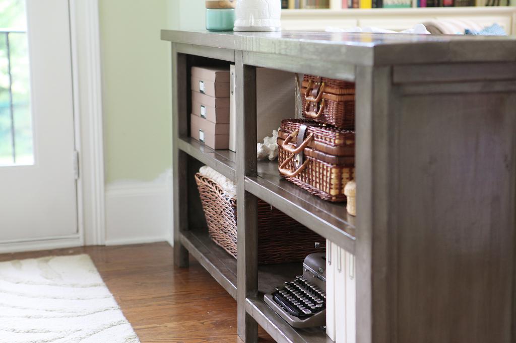
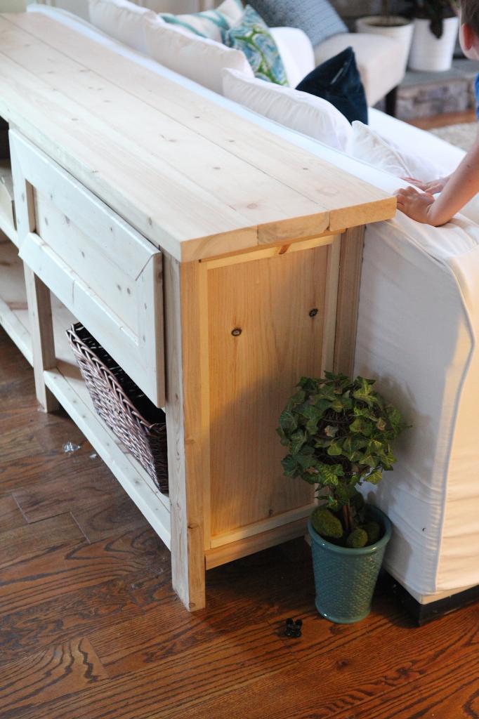
The ends were just perfect. I love the closed ends because they make it appear less cluttered.
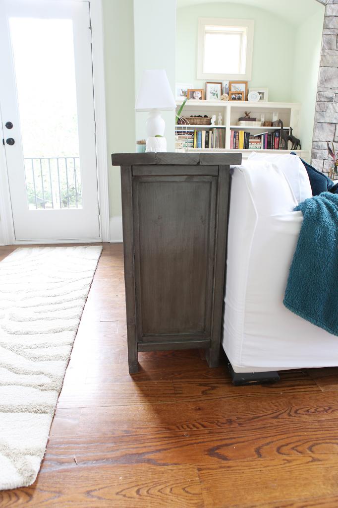
The other thing I love is the fact that now the sofa people have a place to put their drinks. Sofa people sounds funny. Like a bunch of people who live in sofa’s. Sofa hobbits.
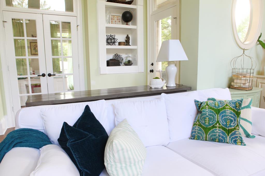
It doesn’t really obstruct the view to the nooks in the living room…but I imagine down the line when the boys get less rowdy (ya know, when they turn 30), I would love a couple of more-precious lamps on the top of the table. For now I just use my goodwill lamp. It adds a little balance at night because this side of the room doesn’t have any lamp-lighting.
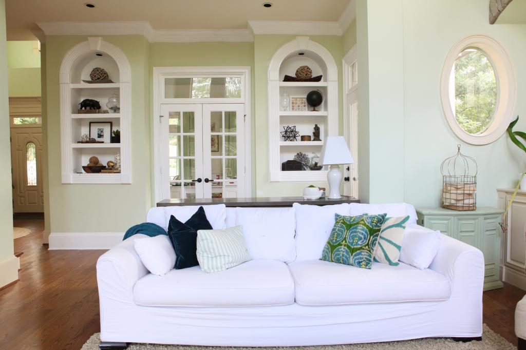
Although it would have been nice to have closed storage in this table, I honestly feel like it was the best decision to nix the drawers.
Besides…this just means that we can build something with closed storage on the wall with the big map. I’m thinking a huge unit that can hold ALL my random non-seasonal décor items. That would be an awesome thing to have. I think I would need a REALLY big plate of cookies to convince Jeremy of that one 🙂
Ok – so mark this little spot off the list. The toys are out, the grownups are in. Off to bake those cookies!
Update : Looking for more info on something you see in our house? We have a Shop the Bower House page with paint colors and links to accessories, furniture and decor!

Super cute! Quick question: where are the binders and boxes from?
I love how it turned out! I made a console table, but not as detailed as this. You guys are amazing. I just actually used the phrase “couch people” when explaining that very problem if not having a place for drinks when sitting. His solution was to not invite anyone over. Couch people problem fixed :/
I love this! The plan, the finish, and the styling. Beautiful work, and what a classy upgrade to the space.
Sofa Hobbits! I love it!
Wow – what a change! It looks fantastic.
Seriously AWESOME!
Katie – The table looks amazing! I love slightly hacking Ana’s stuff and totally agree with the need of less rainbow and ABC’s in the main living space. I might have to make a modified, modified version of this just because.
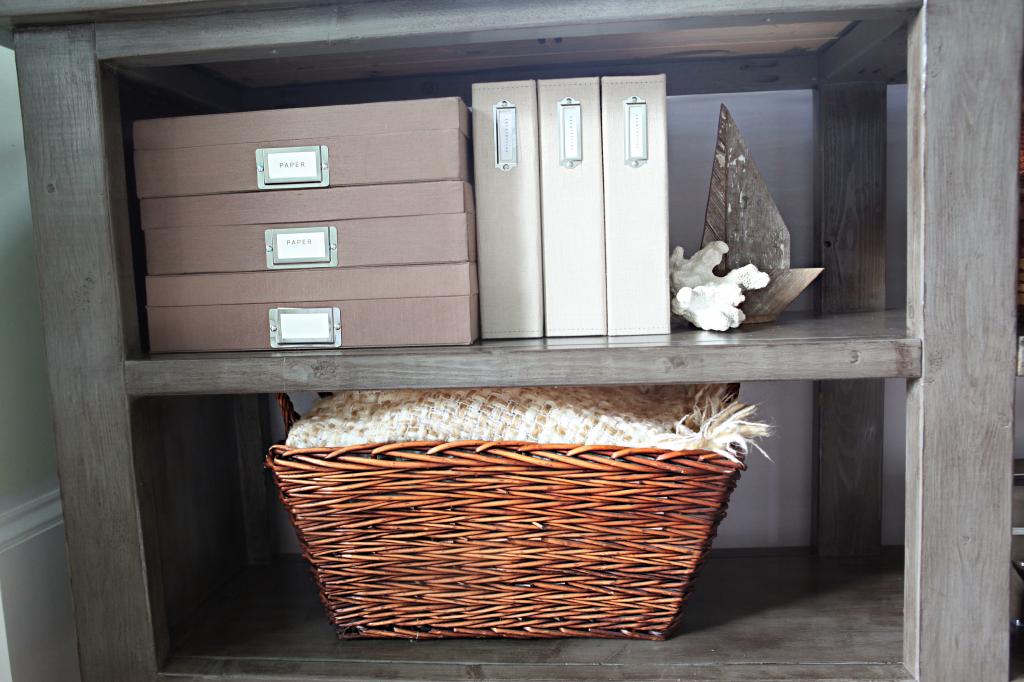
The beige photo albums are from Pottery Barn outlet. The brown boxes are from TJMaxx but they are Martha Stewart.
xo – kb
I really like it!! Just the right amount of rustic!
The grey paint color is gorgeous. And really really hard to find. It seems like every time I go shopping for a table or other wooden furniture item it’s always white or ‘Espresso’ color. I HATE Espresso colored things.
Maybe I should just learn how to make my own furniture like this… ideas brewing….
V
Life+1
I love it, especially the finish! I wonder, did you consider using the drawers you built on the bottom shelves, instead of the top? Maybe it would feel better balanced having them on the bottom. I also wonder if it would have worked better for you if the drawer front was flush with the frame, rather than sitting out in front. I love where it ended up, just can’t help thinking, because I know I would be sick over the wasted money/effort of building them, too!
Love. Just love.
What a sleek little table! At first I thought you were using an oil based paint and was mildly miffed that you had a BABY around it – but I see that you only put the clear poly on it. It looks fabulous!
Great wedgie pick 🙂
M
https://www.etsy.com/listing/204714171/upholstered-wingback-chair-grey-and
LOVE! I’m having trouble envisioning the wall with the big map…am I missing something?
Love it!
Looks wonderful! I’m in dire need of a console update as ours doesn’t have any storage and is currently housing about 8 bins of random boy toys (trains, planes and automobiles anyone?). Ana White’s website is amazing- I’ve used and hacked her plans to make custom storage in our bonus room, my entire sewing room and am currently working on a complete overhaul of my master closet…If you did decide to do drawers in the future, I’ve found that recessing them about 1/2 an inch and then adding trim with about a 1/8 of an inch gap around your drawer box seems to go better with her plans- don’t know why, but it just seems to work for how she builds…
Hi! That spot looks just perfect now!
Please tell me from where you got that lovely blue and green pillow on the couch?
Thanks!
LB
I love the finish on this! It’s gorgeous! I used Ana’s plans (slightly hacked as well) to build a bed for my guest room and love it. I’ve been wanting to update my front entry console table, too and this gives me some good ideas on how to improve it. The number one being sides!
Triple agree on the need for way less rainbow and ABC’s around the house!! 😉
Love it!!! The finish is awesome — adding the stain on top of the gray gave it a cool modern vibe (like the bleached-out gray stains we’ve been seeing on furniture in fancy schmancy stores), yet it seems totally timeless. 🙂 Great job, as usual!
This looks AMAZING! As if you bought it at the store. Send me one please!
What a great idea! I have been looking for blue velvet pillows for a week online! Where did you find yours? Hopefully it’s not from long ago or another dimension ’cause I can cannot find any anywhere. Thanks in advance!
Katie I have those same Pottery Barn outlet albums and love them! Did you get them recently? I got ours about 8 yrs ago and haven’t seen them since 🙁
It looks amazing! Great job Katie! Love the modifications you guys made and the stain is a great shade. I love your cute little helper too 🙂
Looks awesome! One of my favorite projects you’ve done! Love the rug, too. Perfect space!
While I absolutely love this console (build me one and ship it to Aus, pahlease?) I wonder how the couch (sofa) made it’s way back to this side of the room? I thought it would remain opposite the telly for prime TV viewing? 😉
Love the way your home is going….can I please suggest that these little nooks be added to your house tour page? Your tour is lovely, but I feel it misses a lot of little in-between spaces that you’ve worked so hard in 😉
OMG! I just spent allll day looking for a console table and came home empty handed!! This is the perfect solution to my dilemma! DIY my own.
Thanks so much for your perfect timed wedgie!
I love the color you chose., ti looks great. You have accessorized it perfectly, the old type writer is the cherry on top!
http://palsywalsyblog.blogspot.ca/
Your table looks awesome! I too like that there are closed ends but completely open in the front. Very nice! 🙂
Oooh! I love the new table! The gray paint / stain combo turned out absolutely lovely and I heart your solution for filling the space.
We keep moving the couch but if you follow along the blog and Instagram, you would definitely see the couch has been facing the large windows for a long time. It just flows better this way…but you are right…the house tour needs an update!
xo kb
Good advice!
xo kb
I made mine but check etsy…they have everything!
xo kb
Love the console. You guys did an a amazing job.
This post reminded of my kiddos fav book- well ok my fav book for my kiddos (b/c it’s short and cute) “He came with the couch.” It’s about a family that goes thrift shopping to find a new/used couch and when they find it an adorable creature comes with it:) Love your table. It looks fab!
Looks great! I also love how it is dual purpose – the sofa table aspect is clutch. Love the stain color as well. Wonderful job. 🙂
It looks fantastic! Love the mods and finish. This is the exact table I’ve been wanting to build for the back of our couch. The console table that sits behind it now is our first build From Ana’s site a few years back and it’s just too small. Love Ana’s site! Your boys are adorable!
I love it! I’m going to have to check out Ana’s website! Our next project is building some coat/bags/shoe storage. Maybe I’ll be able to find some plans I like on her site. So far, I haven’t seen anything on Pinterest that matches what I have pictured in my head.
Everyone KNOWS you hide your candy on a top shelf behind the oatmeal (or something else terribly healthy) away from the little people…. Love the sofa table. Love that you (Jeremy) built it. Anything I dream up, plan, shop for and set up, I consider I “built it” even if someone else did the actual sawing and hammering. Because it wouldn’t have happened without me.
You may have answered this question before, but I have to know how you maintain such a beautiful, pristine white couch with three kids. I only have one 8-month old who is still eating purees, and I have already ruled out anything white (furniture or otherwise) for the next 6 years at least!
This is a beautiful table!!!!
Can you just come to my house and style everything please? It looks so great in all of your photos.
Then I go home and try to do it, and it just looks like I’ve dumped junk all over everything. lol.
This is a great solution to my own “house wedgie”…. we have a larger than normal entry/wtf (I can only imagine the builders laughing right now….haha what are they going to put there!) area before our couches and I have been trying to find something that looks nice when people walk in, but also something that is not a tripping hazard!!! Awesome job!
I love it! It looks perfect there. Ironically I really could use a shelving unit like this behind our sofa in the basement for toy storage! 🙂
It’s beautiful! And it looks expensive – not that that’s necessarily what you were going for, but it does. Good job!
It looks amazing! You could use the drawer(s) for something like this instead: http://www.pinterest.com/pin/156077943309103282/
It looks great! I love the grey finish too. Will have to bookmark that for future woodworking plans.
Amazing! You are so talented! Thanks for sharing!
Annie
The Mama Gazette
ahh, I love it! Nice job!
Love the new console table! Thinking I also need to bake my man some cookies to get him to build this for me 😉
I feel like a bad fan…I check your blog every single day ( My hubby & I own a welding business and I do the books so I’m at the computer every weekday) and I’ve just noticed your couch was that way even in the ‘before’ pictures… I must have been oblivious in all your posts! haha
It is a washable (aka bleach able) slipcover! Best thing ever!
xo kb
It’s from Lola & Georgia 🙂
xo kb
I tried that but it was ugly that way too. I think it was the drawer front. Not cute with the rest.
xo kb
It’s to the left of the couch. It’s hard to envision I know!
xo kb
I got these about six years ago at the outlet and still love em!
xo kb
We love your build, simply beautiful and very grown up:)! It has been selected as “Brag Post of the Day” on our facebook page! Check it out here https://www.facebook.com/knockoffwood
It will post at 2:30 p.m.tomorrow AKST!
Thank! So honored!
xo kb
I forget how my own rooms are arranged – it’s normal !
xo kb
I love the console table, I’ve been thinking of building one myself. Can you tell me the name and brand of your wall color paint? It’s a really refreshing color.
It’s actually the color that was here when we moved in. Click on that widget in the side that Our Homes Paint Colors to see all of them.
xo – kb
AMAZING!! This looks professionally made. Thanks for sharing this diy.
Love this!! The stain you chose is just perfect. We just bought a new (haha “new”, it was built in 1959!) home and I need a coffee table for the Family Room. You have officially inspired me to build my own, so thanks! 🙂
That looks great! Amazing job! Now I need one and a place for one…
What a great modification to the X Console. I love it! I worked on the original plans with Ana and built the first X pieces (find the console here: http://www.friendly-home.net/2012/05/oxidized-x-console.html) and it has been delightful to see all of the modified versions popping up in people’s homes. Your console is such a great piece and your finish is absolutely perfect. Great work!
Hi Katie,
Love the console table, gorgeous! I am starting on my soon (thanks for sharing btw) and went in to the Sherwin Williams store and they have no Amherst Gray on file. Do you happen to have the paint #? They searched through their computer for the name and nothing….perhaps this is not an available colour in Canada. Thanks !
I’m sorry – that wasn’t right – it’s Benjamin Moore’s Amherst Gray colormatched to Sherwin Williams alkyd paint.
xo – kb
Awesome Thanks for the reply!
I love this… Forgive me for sharing my weird thought. Way down the line when you and Jeremy are gone, your grandchildren are going to love having this furniture that you two built. It may not seem very valuable right now since it’s “just something you made” but that sort of thing is going to be so special in the long run! My grandmother built things like coat racks and book cases and even though they are not “fine furniture” they are so special to me. What a great legacy you will leave!
That is so sweet to think about!
Thanks for the reminder 🙂
xo – kb
Did you do anything special to get the wood grain to show through? I love that look!
Nope!
xo kb
How could I make the depth smaller?
Where did you get your couch? It looks so comfy!!
Pottery Barn outlet!
xo – kb
Hi Katie!
Can you give me an estimate of how much this process cost you?
Thanks so much! 🙂
I wish I could…you might want to check out that link to Ana’s project and see how much that one cost and add like $20.
xo – kb
I love this! I found your plan online and started building it this weekend. One question, though: Could you please confirm the length of the 1×12 boards? From what I can tell, it looks like they should be 63 1/2″, but your plan lists them at 67.
Thanks so much!
Raj
Love this table! I have a question about the stain. Did you only stain the corners and edges that you sanded or did you put stain over the whole table? It looks like it has some brown tones over the whole table. Thanks!
Over the whole thing but you have to be QUICK. Rubbing it on and then rubbing the stain off is a very VERY quick process and requires a bunch of arm strength.
xo – kb
You mean the distance from front to back? You can rip the boards or buy ones that are smaller 🙂
xo – kb
The original plan calls for 63 1/2″, but we extended the length to meet the needs of our specific space. Hope this helps!
xo-kb
Did you use pocket holes for most of the joints, or just glue and clamps? I don’t see a lot of screw holes. Thx.
We followed the directions on Ana’s plan which calls for pocket holes. The rest is in the post 🙂
xo – kb
Love the modification you did to the sofa table. We are going to try to build one ourselves. I also love your decoration you did with the table. Where did you get your khaki covered albums/folders etc. with the label inserts? Sorry I know I am probably describing those wrong. Thanks so much.
They are from the Pottery Barn outlet 🙂
xo – kb
Do the plans above include the wood that was nixed for the drawers, or is the wood used for the drawers the red marked out items?
What finish did you use, semi gloss I’m guessing?
The wood for drawers is NOT included in the cut list. The red lined items were part of Ana’s original plans but we modified it and added the other pieces just for the table as it is seen.
xo – kb
Love this table! My wife wants to do the same color, but the Sherwin Williams website doesn’t list an “Amherst Gray”. Benjamin Moore has an Amherst Gray, do you think it could have been from there? Thanks so much!
I am a new DIYer, there are 3 different types of Alkyd paints at sherwin williams, which did you use?
ProClassic® Alkyd Interior Enamel
ProClassic® Interior Waterbased Acrylic-Alkyd Enamel
ColorAccents™ Interior Alkyd Paint
Thanks for sharing!!!
It’s the ProClassic Alkyd Interior Enamel 🙂
xo – kb
Hello, I love this table, esp the color you achieved with the paint/stain combination. Also, may I ask what is the paint color on your walls (the light green)?
all the paint colors are listed in the tab on the sidebar!
xo – kb