Are you ready for the before and after photos of the century?! I mean….this is up there with when Ashlee Simpson got her nose job and everyone lost their minds. Do you remember that? I even considered calling her plastic surgeon. kidding. sort of.
So ANYHOO…
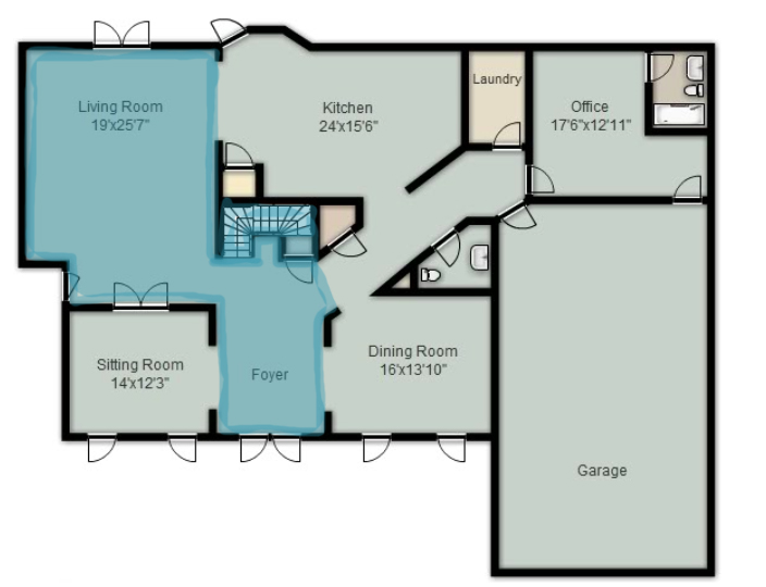
The best way to get an understanding of what needed painting was to see a floor plan….oh look, here’s one right here…
The living room and the foyer and the stairway all needed trim, walls, and ceiling done. The original color on the walls was closest to Valspar’s Cucumber Peel and the original trim color was close to True Value’s Irony.
The second floor also had some areas that needed painting….the stairway was completely finished but then the whole upstairs hall ceiling connects to the living room ceiling and so that needed completed as well.
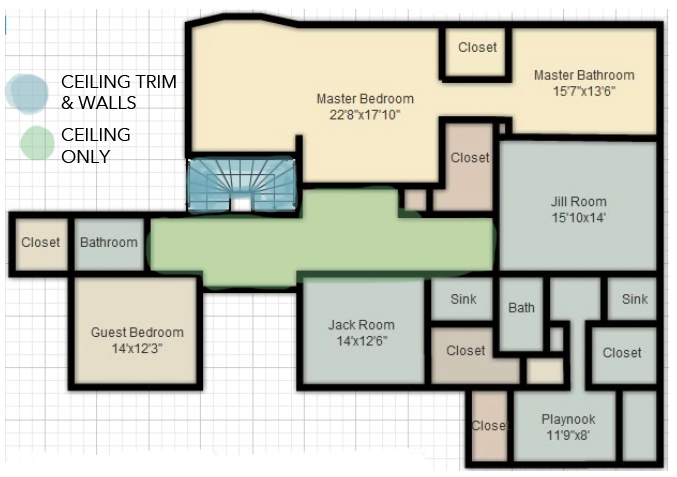
Like I have said before….Carlos and his wife get all the credit for this huge job and we HIGHLY recommend him as a contracted worker. If you are in Georgia, he does free quotes and is very reasonably priced.
Let’s get to those before and afters….
This is the upstairs hall…I call it the catwalk and before it was very blah….
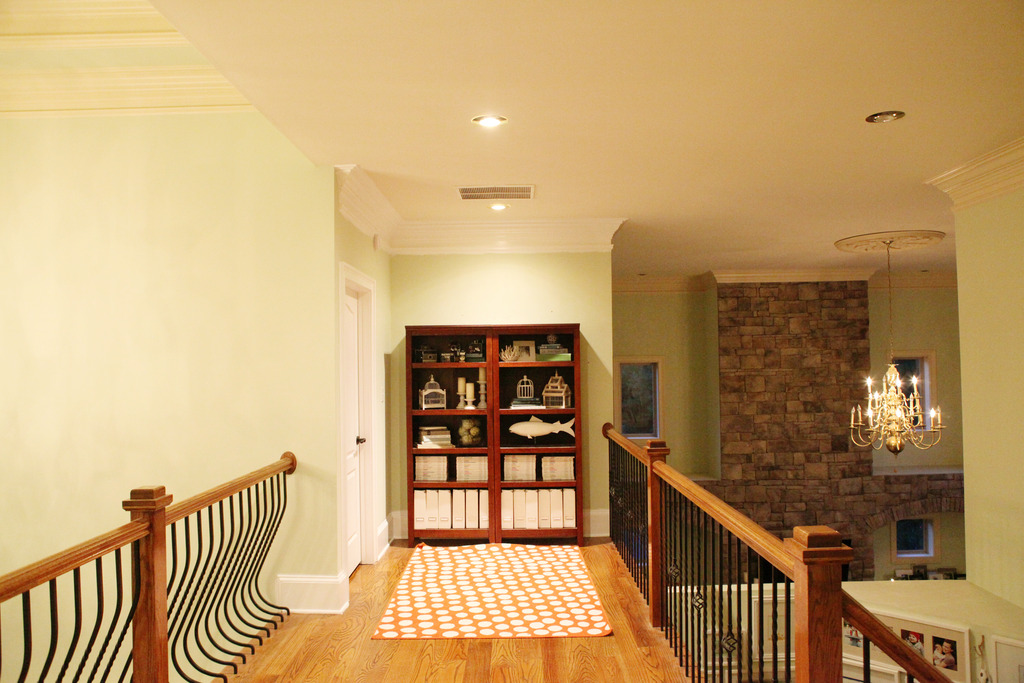
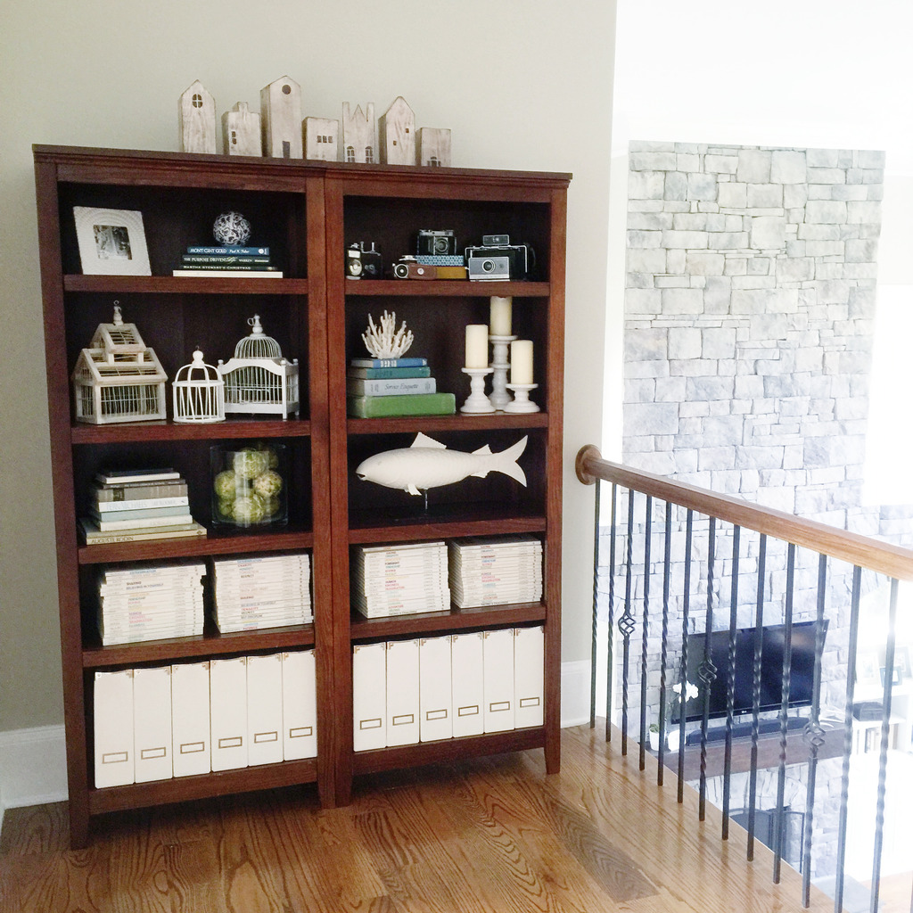
After the paint job, it looks SO MUCH CLEANER. We actually do have the bookcases back there now but I have a little art project planned for above the shelves so you will have to wait 🙂
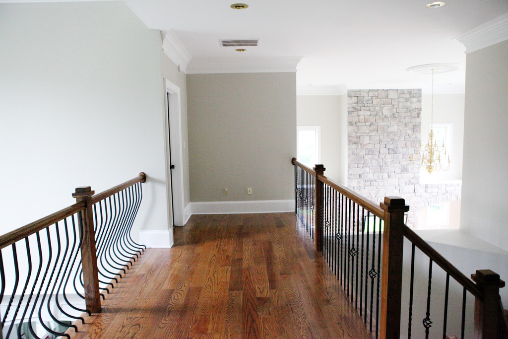
This is how it currently looks….
Our foyer is so big and honestly a complete waste of space. BUT before it would make me angry because it was also the first impression that someone would get of our home. I mean…ugly!
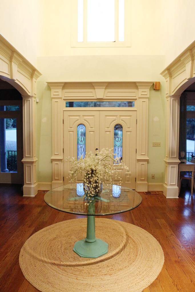
And now it is so much better….clean and happy. (do you see the frames from the stairway gallery wall in the dining room? I’m kinda digging the clean look. I am not sure though what I should do? Put it up or keep it down?)

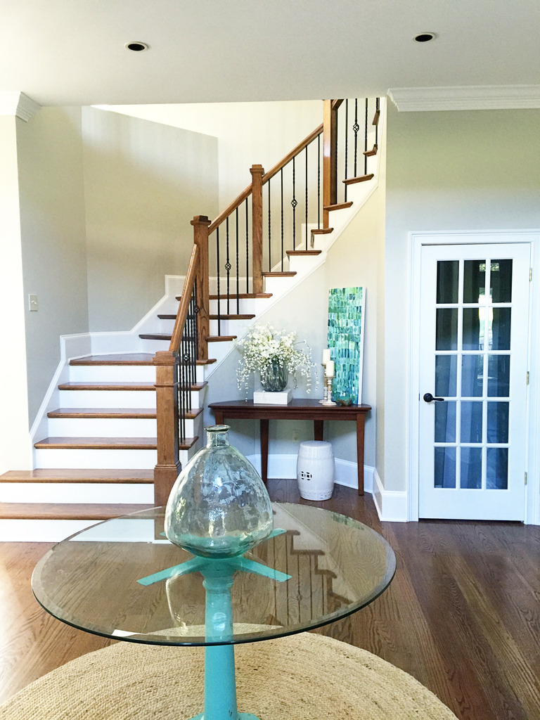
The foyer from the other side is so much better too. Before I was attempting to cover up some of that toothpaste colored walls with the art and I hated the tan stair risers.
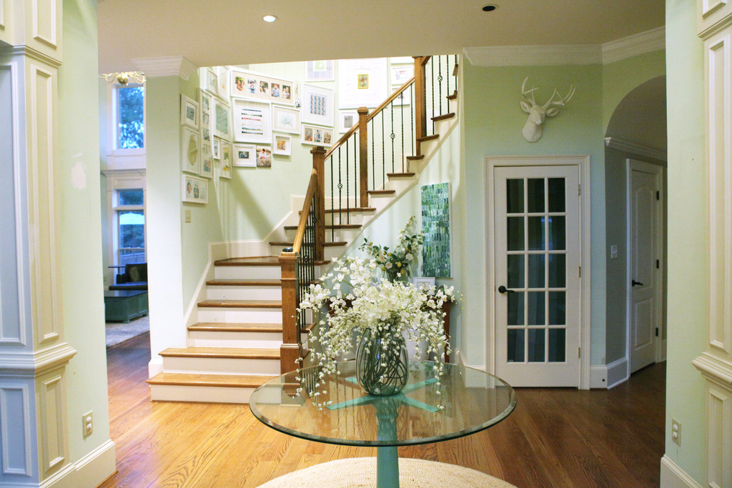
Now even the wood floors look better. I can’t wait to tackle this area!
The biggest difference was definitely the living room. Talk about the power of paint!
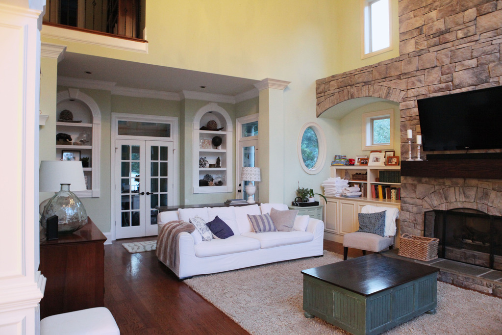
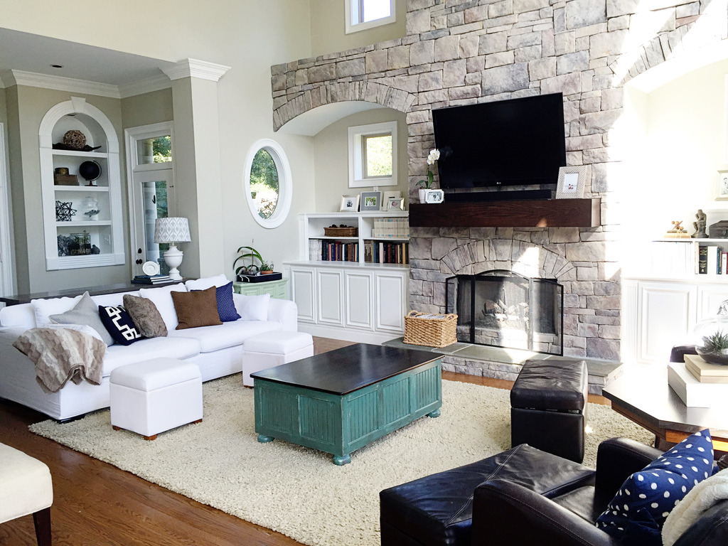
Here it is from the other side of the room….
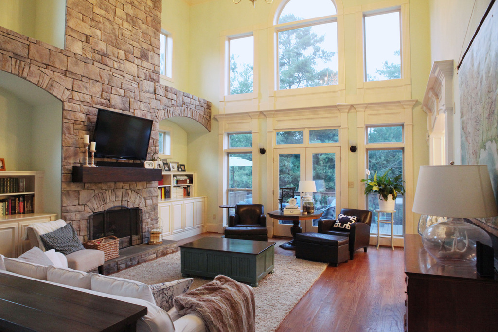
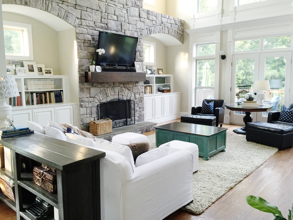
The big wall in the living room has tons of windows and do you see all that trim?
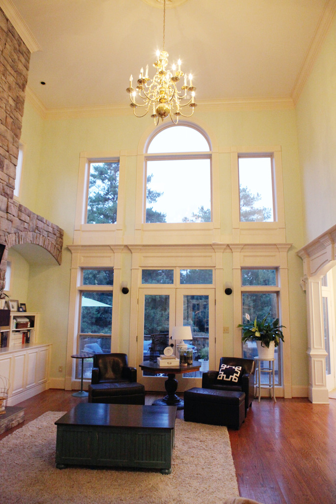
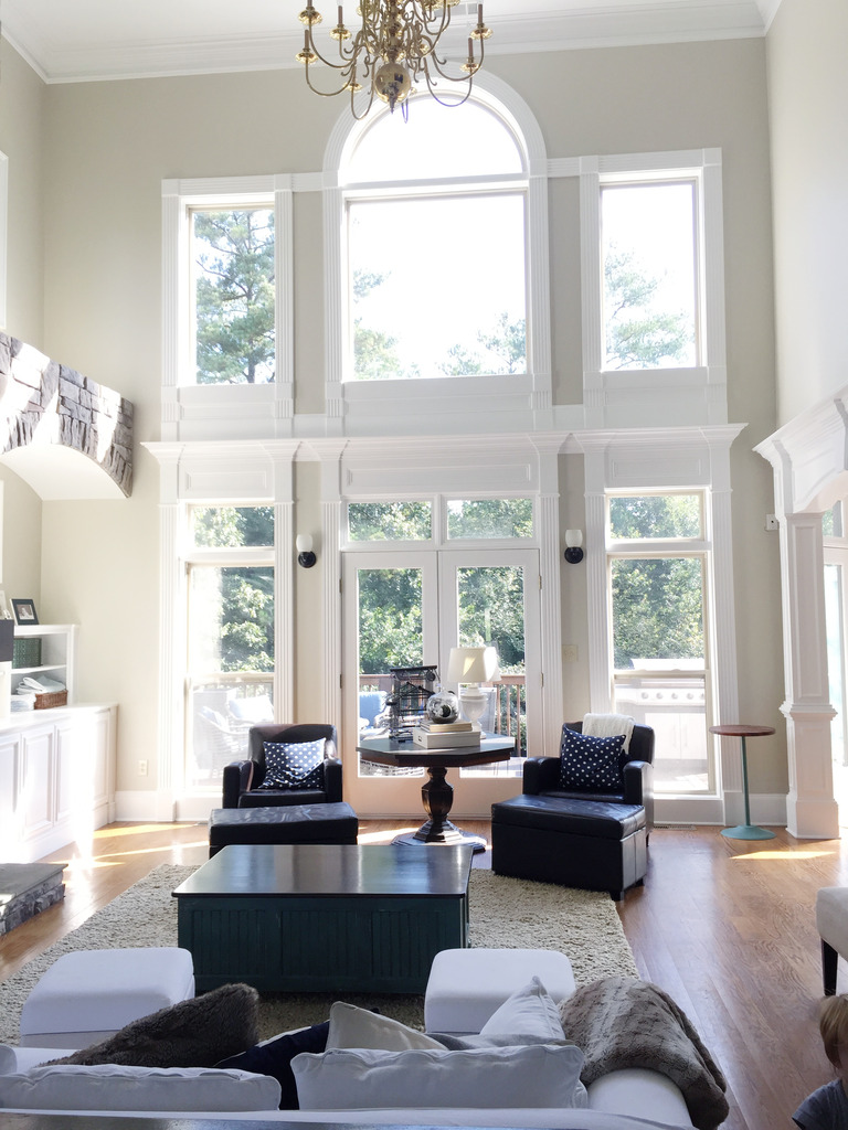
Now it is bright and light and clean and white! All that trim is not generally my style but I totally dig it more with the new paint color!
And this wall always stumped us before but now we are so inspired to add artwork and decor! Before it was just an old map….
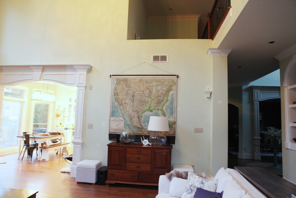
Now it is a clean slate for a gallery and new furniture (I CAN NOT WAIT TO BUILD THIS!)…

Here are some other shots of the room. As you can see, the paint color really does change with the light. Sometimes it is a muted latte color and then others it warms up for a creamy beige. The name of it is Stingray by Benjamin Moore and it definitely is grayish beige.
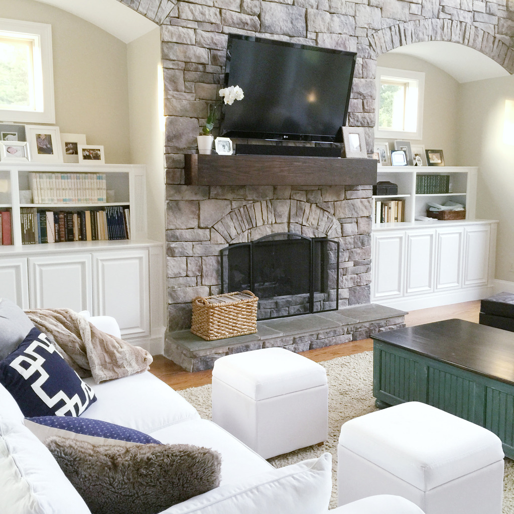
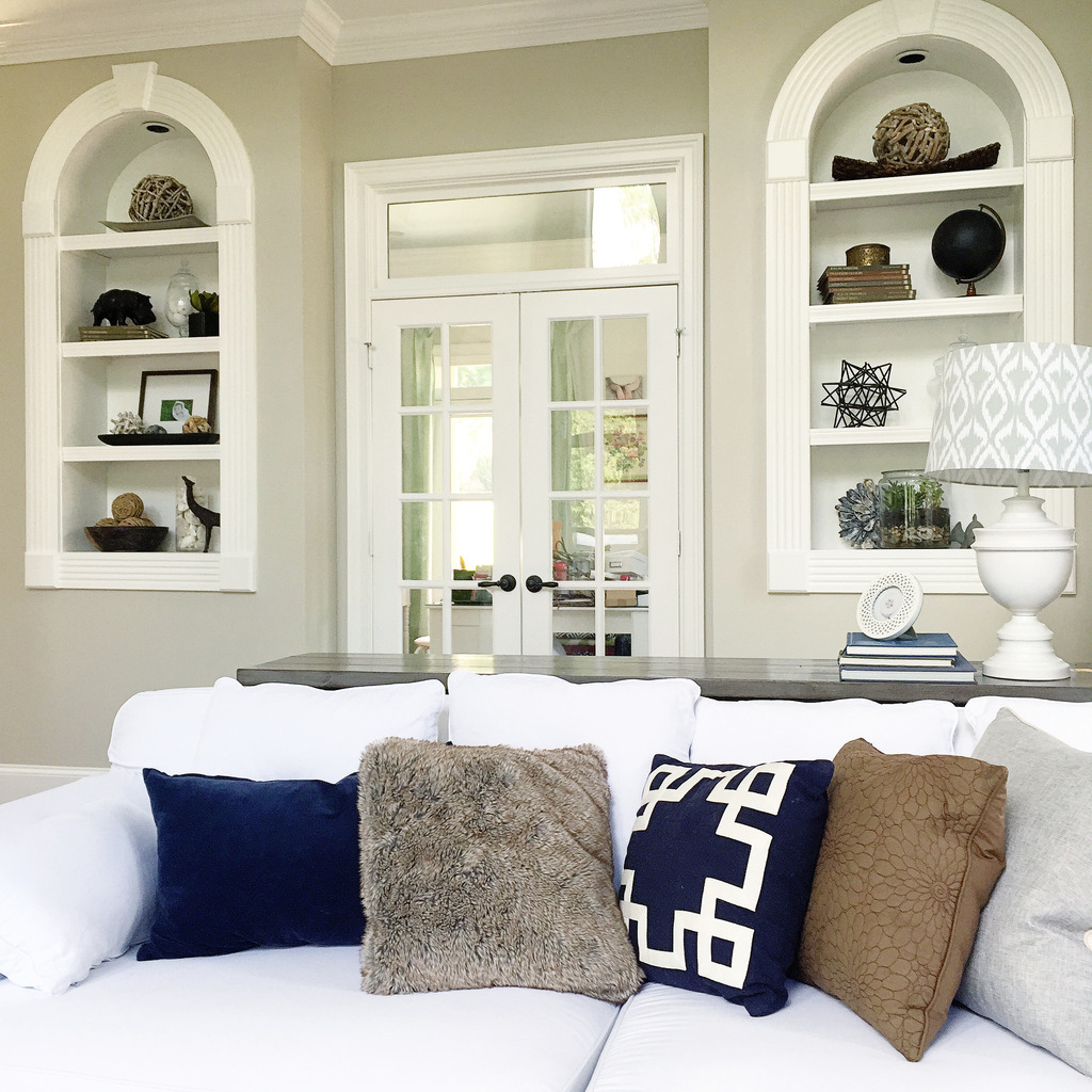
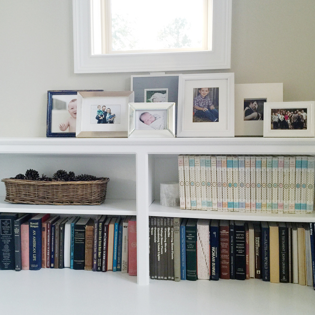
Oh and do you see that little bookshelf area in the picture below? That’s our diaper changing area. Yup. Keeping it real. We have three babies in diapers and so we take that blue mat and lay it down up there and then the kiddos get cleaned up. The little basket has our diapers and wipes and booty ointment and all that. I think I might just get a bigger basket because it would look better….right?
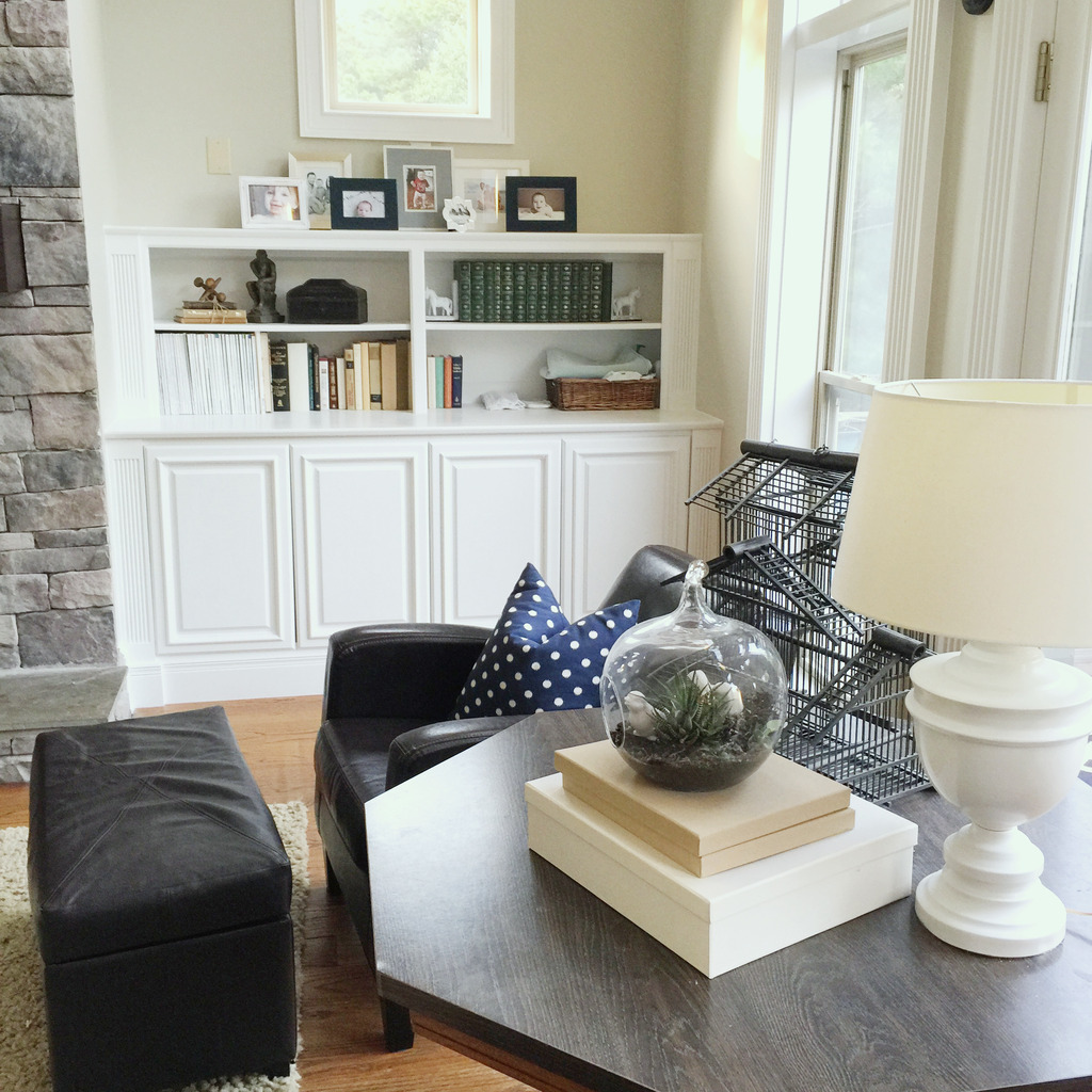
So that’s it! A wrapped up living room paint job. I can’t wait to finish up some of these rooms and get to final reveals! It’s amazing…the other day I told Jeremy that it feels SO good to have every room on the first floor painted. Isn’t that crazy? It took us over four years but we finally got each room with a coat of paint and now it comes down to decorating and finding the right furniture (picture me with my hands together while doing spirit fingers….that is my furniture pose….like crazy person eyes and a too-happy grin!).
Wow! Your house is gorgeous and the new paint really brings out all of the amazing trim and features! I love all the natural light that you have. Great choice on paint colors!
Don’t mind me, just drooling over all of your wood work! Gorgeous! I never noticed the color of your trim, it appeared white. But to see the comparison, it is crazy how much of a difference it made. I am envious of you for getting to have someone do the dirty work of painting it all. We sanded down and painted every corner of our trim ourselves. It was a looooong week for that one. I would do it again for sure for the results. I mean, not anytime soon, but you get the idea. I never knew your kids had a play nook type thing in their bedroom, how fun for them! My kids would love something like that, a secret room!
Looks awesome Katie! Talk to me about your pottery barn white ottomans….how have they held up with the boys? I am debating getting a similar one from PB but I have to convince the hubby that the white will hold up with with our little ones(2&3).
I would definitely leave the gallery off the staircase wall for a while and see how it feels. It looks so much cleaner and serene for a first view upon entering the house.
And yes…a bigger basket would look better for the changing area. The painting all looks great and you must be so happy…new paint is a total mood lifter…especially clean bright trim!
🙂
Love this! What is the after color called?
Also, that livingroom chandelier is screaming SPRAY PAINT PLEASE! 🙂
I can hear how happy you are, congrats. I would hate to heat that house. 🙁
The new paint color makes such a difference! It does make your house look so bright and airy and clean. On the bookshelf in the living room, you have a set of books on the top right shelf. What is that set, if you don’t mind me asking? It looks vintage. I love collections of books, so am just curious.
Katie – Just simply beautiful! What a blessing!
Awesome. So fresh. Love it. 🙂
It looks wonderful 🙂
Looks so refreshing, but SO much work – you got a hell of a deal!
I have a similar color cued up for our kitchen and family room. Just need to find the motivation.
This is such a vast improvement, I cannot tell you! You chose to make a huge investment in just the right thing – so many people would just live with that array of paint colors. It takes your house from suburban cookie cutter to “someone who knows what they are doing lives here.” The millwork is exemplary and now it’s a feature instead of an eyesore. Don’t you wish this would have been done from the start so you could have spent your money on other things? Ugh. The world, unfortunately, isn’t filled with people of taste. So much the better we have a handful of decent design blogs to show people the way. Might I make a few suggestions? Could you paint the air return on the (soon to be) gallery wall with the same color paint as the wall? We are all faced with such oddly placed returns and painting them can do so much to make them recede! Might you remove the small items that are on the TV area and replace them with a pair of (of course!) faux boxwood topiaries? They will add color, texture and height. Ballard Designs have wonderful ones. I might have the painter back and ask him to paint the wood newel posts in high gloss black. I think this would take things to the next level. On the two nooks on either side of the TV, might you place two large (again faux) ferns – really big ones in lovely baskets? The family photos are of course wonderful to have around, but they are so much nicer in groupings on tables rather than up high where they are lost. Also, in the right corner where a small circular table resides (between living room and your delightful kitchen/dining area) might you add a tall fig leaf plant? It would LOVE the light in there. Place it of course in a lovely large basket and put grey moss over the soil. I had one for years and years in my living/dining area and my little ones never disturbed it. You could add an uplight to the base as well. I’m a little confused as to why your furniture is so far apart. Would it work to place the rug in the opposite direction and put the white ottomans under sofa table (I can appreciate they hide toys, etc.)? In this way, you can push the couch and chairs closer together as I can imagine a person sitting in a chair might feel like one has to speak at volume to be heard by someone on the sofa. Now for the green coffee table. I’ll bet you think I’m going to tell you to lose it. Nope, but I’m going to ask you to add some elements that make this color fit in with the room. I’ve already done that by asking you to add other green elements that also add different textures and shapes. Now, I’ll ask you to replace the leather chairs with super comfy chairs in a cozy chenille with a textural pattern that has green and blue (dominant colors in your home) – but softer versions like the ones found in the map you had. Something like this: http://search.kravet.com/Kravet-Guaranteed-Chenille-Grey/31376.1611-400/CoverInformation.aspx. Last, this will mean recovering the pillows on your couch – do you see how softening the navies to other shades of blue and green might soften the contrast between the coffee table and the pillows? I’d love to hear your thoughts.
Oh wow, it looks AMAZING! You really have the most beautiful space :). And thanks for keeping it real about the changing station, haha.
Jess | fashionbycommittee.com
I only have 1 kid in diapers and his bedroom is on the mail floor only steps away from the living room and yet I keep a basket with diaper changing stuff on the bookshelf in the family room! Except i don’t even lay a mat down, which i have regretted from time to time when it was a messy change lol. Thanks for keeping it real!!!
Looks so wonderful!
Maybe put the gallery wall on the same spot as the map in the living room? What about the space directly above the map, off the catwalk? Is it a flat area? If so, green plants would look awesome!
I absolutely love your whole house and so envious of all that wonderful trim! Quick question, what is a ‘Jill Room’? I’ve never heard of that before, thanks!
Nevermind!! I figured it out and just saw the ‘Jack Room’. Silly me!
Love it!!! It looks so great. We finally got around to painting over the ugly flat brown paint in the main areas in our house a few months ago (after a few years of waiting). Sometimes I still just stare at the walls. 🙂
I vote photos going back up the stairs but in less of a gallery style. I’m a sucker for photos up the stairs. 🙂 We have ones of us as kiddos, high school graduation, and wedding photo going up the stairs at home.
LOVE IT!!!!!!!!
Just one question. Do you feel like you whole house being different shades of grayish is boring? I don’t think your house looks boring but when I think about using different shades of gray in 1/2 the rooms it just seems blah. Can you do a post on sight lines and how you see the different colors ‘working’ with each other. I love this Stingray color!
I love it! It looks so bright and airy now. I like the stair case empty with maybe one or two big frames/decorations
Where is the white living room couch and two little white ottomans from? And can you wash the couch covers? They don’t get filthy even with 4 little boys? I LOOOVE white couches and love the way yours looks!
Love the new paint job, what a difference it makes. You have so many light colored things in those rooms and the new paint really makes the spaces look clean and more open. I’m thinking of using this color in my baby’s room, his accents are navy, specifically 3 Windows with navy curtains. Do you think this color would work, and please be honest. Thanks.
The power of a paint job! Amazing what paint can do to transform a room, and your mood. Looks fantastic. I need to find a Carlos in the KC area.
Gallery walls, been there, done that. That’s my unsolicited 2 cents on the subject. I would enjoy the stairwell without all the clutter of a gallery wall. Take in the greige in all it’s glory!!
I love the lamp in your last picture. May I ask where it is from?
THIS. IS. GORGEOUS.
I love your new space!-Looks much more peaceful without the toothpaste on the walls, giving that odd glow.
I’ve been wanting to redo some of our home but was struggling with the wall color…I’m totally thinking Stingray now. I love it!
Enjoy your ‘new’ home and those cute kiddos! 🙂
Hi Katie,
It looks great! Can you please tell me the name of the trim color? I love it all. I could just move on in. 🙂
As I’ve followed your paint posts, I continue to be amazed at how perfectly your choice of color works with your fireplace stone. I love the look of your open, spacious staircase without the gallery collection. It lets the eyes focus on the railing and curve. All in all, what an improvement just a change of color can make. Beautiful home!
Where did you get the two leather chairs?
We have a diaper changing basket in our family room!! Right out in the open with cloth diapers and wipes. :). Love the the before and afters, amazing!!
Amazing! Absolutely in love!
What is that french door to the right of your stairs? I’ve never noticed that door before!
I’m sure it’s in your plan but do you plan on painting the interior side of your front doors a different color? I can’t decide if that will make all that molding stand out more or be a cool feature. Love the transformation though. I also love the color and now want to see what it would look like in our home.
That goes to the basement 🙂
xo – kb
Ikea 🙂
xo – kb
That was the one thing that I was most nervous about. I had picked the color for the halls up and down but didn’t think to do a swatch near the stone. Thank goodness it worked.
xo – kb
The couch and ottomans are from Pottery Barn outlet…and yes, they are washable. Here is the post about how we clean it 🙂
xo – kb
Yes it would look great with Navy…very nautical 🙂
I would recommend getting a swatch and sample and trying it in your space to get a look!
xo – kb
I got it at Goodwill…it was ugly brass and I spray painted it 🙂
xo – kb
It’s just the brightest white you can purchase in Semi-gloss. This was Sherwin Williams brand.
xo – kb
I thought about that but is that weird? I also thought about making the doors in the living room to the deck a nice glossy black 🙂
xo – kb
I definitely like neutrals…so that is why I liked this color…it’s more of a light greige which does play nicely with the gray kitchen. I would definitely love to do a post about color!
xo – kb
Like a Jack N Jill room?
xo – kb
Great suggestions! I definitely think I will paint the air return…I always forget about that sucker! I definitely haven’t attempted to decorate this space yet…so don’t judge all the stuff yet…it’s all just randoms. You are lucky with your little ones…mine LOVE to dig in pots, bury cars and pretend their tractors are farming 🙂 Like I said in the post…I definitely want BIG leather chairs to fill the space better and tweak other furniture items but all in due time! It will take a little time to save for that 🙂
xo – kb
It’s Stingray by Benjamin Moore 🙂
xo – kb
That chandelier is screaming – give me lightbulbs 🙂
xo – kb
The white has held up well but I would probably not recommend them for little ones because the tops do not hinge….they are really heavy and could squish little feet if they aren’t experienced with the lids 🙁
xo – kb
The dark green ones are The Program Classics (they are everything from children classics to Shakespeare) and the white ones with the pastel colors are The Book House for Children (all children books varying from nursery rhymes to fairy tales). I have found them all at Goodwill and collect them 🙂
xo – kb
I laughed when I saw the old color of your space, it is the exact color that is currently in our master bath (left from previous owners), and I am currently repainting it. Yours look great! Huge improvement. Totally worth the money you paid to not have to do that one yourselves! My only tiny criticism has nothing to do with the gorgeous paint job. It is the coffee table sitting in the middle of the room, it doesn’t make any sense to me. You have furniture on both sides of the room with ottomans, so the coffee table is not serving any purpose. I am wondering if there is something else that might work better there, or just remove it altogether? I hope that doesn’t hurt your feeling! It is not meant to be mean! I love your blog!
Love what you’ve done with just paint! As for the gallery wall, I think the stairwell is great real estate for artwork, whether it’s family photos or a painting. But what you have now is too busy and cluttered. Edit it down and choose a very structured, consistent arrangement for the photos that make the cut.
Hi. It looks beautiful. That odd wall where the map was would definitely be a challenge. My living room has two sets of double glass doors. The entertainment center is in between. Above the center was an air-intake that was off center and ugly. For 17 years it bugged me. I made a very pretty old-fashioned vent cover, painted a “fake” black hole to make the air-intake look centered and it looks soooo nice now. I wish I knew how to attach a picture because I saw that crazy vent on your wall too.
It looks awesome, so much nicer with your floors and stone fireplace. Huge improvement! (What were they thinking with the previous colors?) I suggest either editing down the gallery in the stairwell or moving it.
You must not have three tiny boys completely attached to cars, trucks and balls because that table is their version of heaven 🙂 seriously…it probably is the most used furniture item in the house.
xo – kb
that floor plan really helped me understand the flow of your house much better. I could stare at floor plans all day! Which of the rooms is the playroom?
Thanks, I think I will be trying it soon, and by soon, I mean hopefully within a year 🙂
What a difference! It just looks so fresh. I say don’t put the gallery back up– too busy. Maybe down the line add a few oversized ones? Also, the before pics seem so much more yellow (even the floors and stairs.) is it a white balance thing that you look the time to do in the after pics? Or a different camera?
Yes, black! I vote black!
I’m kind of surprised at a lot of the incredibly specific, semi-constructive criticism in these comments. Your paint job is a total game changer! It gives such fresh perspective for design and is (I can only imagine) a massive weight off your shoulders. That space is legitimately about the size of my entire house – and about five times as dangerous to complete. It looks beautiful and I hope it brings you more joy than you can convey.
Yes! This! I was also thinking you could repurpose some of the former stairway gallery photos to go where the map used to be. Or you could go emily henderson on it and do a picture ledge instead of a gallery wall!
And, I bet a single, large, abstract style canvas would look really good on that part of the stairwell wall. Perhaps a diy project with your mad art skills?
PS here is where Emily discusses the art shelves: http://stylebyemilyhenderson.com/blog/bold-styling-with-safe-neutrals-and-target
I love the constructive criticism and every one is presenting it in a way that it’s all just free discussion of good ideas! I love it! This takes me back to when I started blogging 🙂
xo – kb
The current playroom is the old office. I think I have it labeled “office” and should probably change that 🙂
xo – kb
The white balancing was SO tricky in these spaces because the walls really did bounce so much weird glow around…and they really did change the way the floors appeared. I think part of it was too that they were taken at different times of day…one was more in the late afternoon and the other was the early evening so about two hours difference made a change in lighting.
xo – kb
are you serious or is this a bad form of Punked from a few years ago? A few suggestions or pick it apart? They have 4 count that 4 under the age of 5 and you felt like it would be ok to post a few suggestions on what you are confused about? I realize this is a paid blog but Katie you were very diplomatic. it looks great and you all never fail to impress me with what you get done! Keep up the great work. Love your precious family! ………..sorry people sometimes just kill me, I will pray for that post person. Ugh
Jenn love you, you rock! I started thinking I was being a mother hen with her chick picked on?!!!! You put it much more tactfully than I did….IF my reply gets printed above.
These pictures are the proof what a fresh coat of paint can do to a room. Keep up the good work, it looks amazing!
Looks great. Don’t put the gallery wall back up on the stairs – it looks cluttered and makes the space feel way smaller. I also always paint the return grills in the walls to match the wall color so they blend and don’t stand out as that white thing in the middle of my wall. IMO. Keep up the great work.
Your foyer now reminds me of Tara from”Gone With the Wind!” So grand and beautiful. Coming from a girl whose life mission has been to unify the white trim paint in my own house, I clap and bow and squeal right along with you!! Stunning. Don’t you get a tremendous sense of calm when a long awaited project like this is over?
Love the new color. it looks fresh and clean and fun to decorate. You should definitely add some hardware to the cabinets in the living room at some point. Also on the wall where the map was in there just an open space above? Sometimes I wonder who designs these places and what they think people would put there. I always think of them as dust collection areas I can’t clean. But your house is beautiful.
I thought EXACTLY the same thing. All those beautiful white frames on the new color wall will look fabulous and the smiling faces of your family closer than up on the stairwell. All looks fabulous!!
That looks so great! You’re really inspiring me to finally hire painters for my own, too high to paint, rooms…
Total game changer. Looks fabulous. I think that wall where the map currently resides would be a great gallery wall. I do think the stairway looks really nice without so many pics. I know I would personally put something back up, but artwork used sparingly. You have a great eye and it will all come out beautiful.
BTW, I love all of that millwork and would love that type of detail in my house.
The before and after is just amazing. The green paint and tan trim hurt my eyes in the photo, it DID have a weird glow.
I’m ready to repaint my living room after 7 years of being in my house. I loved the color when I choose it (Twilight Gold by Behr) but now it’s looking dark and dreary. I want to paint the walls a rich cream color (my trim is bright white) but I haven’t found the perfect color yet. Every paint chip I’ve brought home looks too grey, yellow, or khaki once I bring it home. My floors are 60 year old oak with a warm orangish tone…any suggestions?
On the construction criticism….I wish I could put a pic of my living room up…lol. I’m totally stuck on what to do on my main wall. I’m thinking once I paint it will clear up my brain fog on ‘what to do’.
Yes, I vote for black too!!
I think it would work! I copied Katie from Little House of Four and did my 2 entryway doors in my foyer Iron Ore and not only does it look classy but hides toddler fingerprints and muddy paw prints.
First all of this is gorgeous. But my question is, HOW on earth do you have so much beautiful stuff within your boys reach? I have only one 2 year old boy and I feel like if it isn’t more than 4ft off the ground, its going to end up everywhere. Books on shelves? all over the floor in 5 min. Picture frames? everywhere. Glass lamps? broken. And he will use anything and everything to climb up onto it. I can just picture him taking an ottoman to get up on the glass table in your foyer and it all shattering. How do you do it???
Oh. Wow. I mean WOW!!! Katie, I knew it would look better (the trim bothered me more than the walls), but WOW. I CANNOT get over the amazing difference. I literally find myself sighing in relief. It looks sooo good! Take your time before putting too much on the walls and just thrill in the clean beauty of it all. And the stone looks phenomenal with that color. Kudos to Carlos and his wife for an impressive job. And thanks for keeping these things real time…sometimes I feel like I’m the only one who has to wait years to get all the doors and trim done 🙂
Well, the boys can’t get on the cabinets by themselves…they would have to push a chair over to do that…and those big chairs don’t slide 🙂 I have definitely had my share of broken things (lamp, chotchkes, etc). but usually it’s from a ball in the air 🙂
xo – kb
New paint looks amazing!!
I know that you made the little wood village houses on top of your bookshelf but I can’t seem
to find the link, I love them and am trying to figure out how you did the windows. Can you send me the link please? Thanks 🙂
weird question, but what are the books/magazine on the 2nd to bottom shelf on the bookshelves on your catwalk?
Jeremy’s parents gave him that series and then over the years I found a couple more sets of it at Goodwill. It’s called Value Tales 🙂
xo – kb
Here you go 🙂
xo – kb
Your room is lovely – what finish did you use for the paint? Sorry if I missed it…
It’s Eggshell 🙂
xo – kb
I LOVE the color! Question – did Carlos paint all of the switch plates/outlet covers?
No…all the switch plates are the previous color. Jeremy is going through the crazy task of switching them all to white.
xo – kb