Consider me a broken record because I’m heading back into our dining room to share some different thoughts….

First….I FOUND THE CURTAIN. It was basically a crazy man hunt for this one curtain panel. It forced me to clean out my linen closet (wasn’t there but I purged all the things) and then I went through all my fabric (also wasn’t there but now that is organized) and I even went through my closet thinking it might have somehow landed in there (still nada but my maternity clothing is now partially packed up and it gives me TONS of room so #perks). Low and behold, it was in the dirty laundry….wrapped up in a different blanket that we never use which is why I wasn’t about to spend time laundering it. So now it is cleaned and waiting to be hemmed.

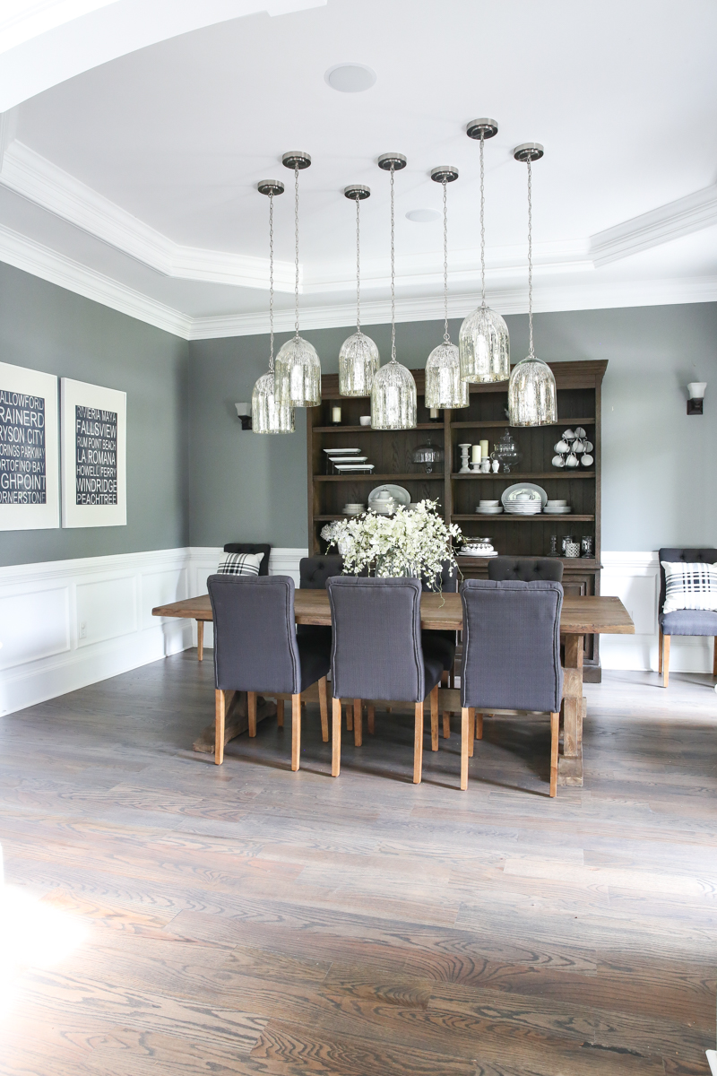
So right now the dining room is dark gray (it’s painted Benjamin Moore’s Secret) and I do love it but as I was going over the photos from the post earlier this week, I got to thinking….would it be fun to do shiplap in here? Maybe halfway up instead of the super traditional box molding? Or maybe all the way up but not in a farmhouse distressed style but super clean? I don’t know. I know I need a rug. And then I got to thinking…hey maybe I should just make a moodboard.
And then I did.
I made a couple.

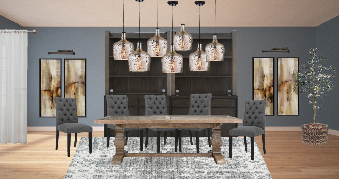
The first one is very close to what the room is currently – dark gray (although the moodboard maker on Wayfair is not easily changed for background colors. What they got is what they got.). I love that some comments suggested a picture light in the place of the sconces and I really AGGRESSIVELY love that idea. I popped some art under it just to see if flanking art would work. Also I love the idea of a more contemporary rug in the space since I have more traditional ones nearby.

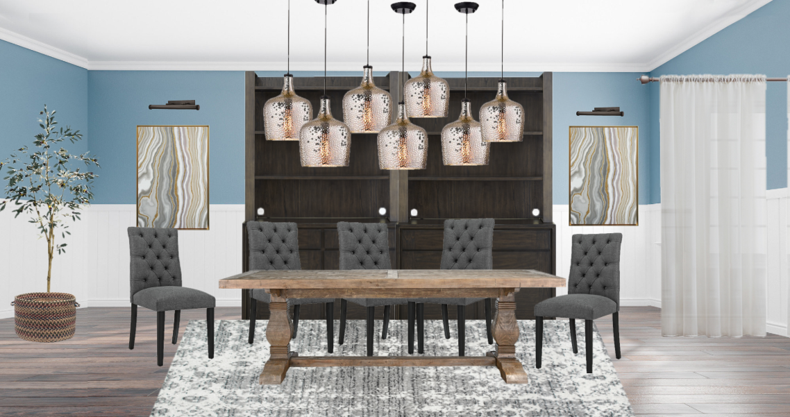
The second idea is with a little color on the walls. Like I said – this is what they had. And more of the contemporary rug situation but I am digging the lighter color with all that dark heavy wood. And also this is kinda what the chairs would look like with black legs. Whatcha think?! Also – I had to put a white curtain in there just to emphasis the fact that I found the dang panel. SO happy about that if you can’t tell.
Not that I would have hated ordering new curtains. There is nothing wrong with that idea 🙂
SO what do you guys think? I am just spitballing here with the ideas. Remember – no idea is a bad idea….unless it’s no curtain panels…then you are the master of terrible ideas 🙂
Ohhh, I love when you show us possible looks and ask us to chime in!! I love the picture light idea! Would you consider two different, more substantial chairs at the head and foot of the table? I think 8 “skinny” chairs seem to get swallowed in this large room with the large table and large hutch. 2 armchairs or something different would ground the room. Also, would you consider switching out that dresser and wine area? Though probably very functional, it seems to take away from the classiness you’ve got going with the table, hutch, gorgeous pendants, etc. If you had two larger chairs at the ends of the table, switch out the wine area to a mirror hanging here, and move the wine area to the furniture your teapots are in (or add to your hutch) and move your teapots into your hutch. Just some thoughts……Can’t wait to see what you do!
LOVE the picture lights! And I think shiplap halfway up would look amazing in place of the box molding that’s already there.
I have this rug! Based on the pics on Wayfair, I thought it would be a lot darker/more grey but it actually is quite a nice, neutral base. I currently have it in my dining area with a traditional table and it is a great mix! Go for it Katie!
loving the first mood board vibes!!! The art, picture light thingys…, and the color completely on the walls!! But you know… shiplap would also look fabulous, so… !! lol!!!
Love the idea of clean shiplap halfway up! But I think horizontal shiplap would look better (I feel the vertical paneling as shown in the second rendering almost dates the house and sets it back in an 80s vibe rather than brings it to date, if that makes sense?). Also, have you considered a faux brick wall with German schmear (not whitewashing) in there? Give it almost a French/Louisiana vibe?). It looks great! And I love the white curtain panels! I love the tufted chairs but I can’t figure out why, but they just don’t fit the way I wish they would. Maybe it’s because everything is so dark and heavy, a lighter wall color might help them to feel less heavy? Sorry, didn’t mean to sound critical of anything! It’s a STUNNING room, I just got the ideas flowing when you asked!
I think somecolir on the walls would be really nice. Great that you found that curtain panel! I am missing a couple of curtain panels at my house right now, but I am waiting the week until my kids start back at school before I even begin to look for them.
I like the lighter color with all of the dark wood. I also love the chair legs darker! The picture lights are a great idea.
Personally I would leave the wainscoting- it’s gorgeous and ties in well with the ceiling. I love the wall color, but maybe paint that if you’re looking for a change? And I love the idea of the lights over paintings/pictures! So good!
So I gotta be honest I’m not a huge fan of shiplap *for*this*room*. Your house definitely has more of a traditional vibe going on, so I say embrace it! What you *could* do is beef up the box moulding you have and make it go higher and cap it off with a picture rail. Then it would just be this huzzah of molding!!! Just my two cents. Love where you’re going!
I think your ceiling and your hanging lights are too traditional to go ship lap which is more casual. Different sconces or artwork lighting is a good idea.
I think I love the first one. Maybe a lighter gray? The room is gorgeous!
I like the more traditional panelling – it goes well with the rest of the houses architectural features but I get this is just personal taste. What about a plainer rug that has a lot of texture? Maybe sisal or similar? I think it would let the light fixture be the main player. Tbh I already really like this room as it is (chair legs aside haha).
I LOVE contrast so the thought of painting the room lighter with white paneling against the dark furniture is tempting to consider. But-when I look at the two boards- I cannot help but think the darker paint is dramatic, and combined with the paintings and picture lights, looks more luxurious and high-end. If you are going for more casual, then definitely, add the mill work. Love the rug in both room designs. 🙂
I love the way the room looks now and really think all you need to do is add a rug and paint the chair legs.
I love the gray and feel the chairs look more cohesive with it. I think all you need is a rug and call it a day. I don’t like the rendering without the wall trim. The box molding is traditional, but plays so well off the more contemporary lights and rustic wood pieces. I don’t like the chairs with black legs. They don’t bother me as is, but a darker wood tone would be very nice. I feel like you’re there, so let yourself be there. Whatever you decide will be beautiful, as always.
I would stick with the drama of the dark painted walls rather than do ship lap, which I think looks too “country-ish”.
I do love the art flanking the large wall unit! just my humble opinions!!
Can’t wait to see where you end up! Stay with the gray walls. It’s all working for the most part! LOVE the idea of adding the art and lights! I agree with others that the shiplap just wouldn’t feel right in this room with the ceiling moldings and more glamorous lighting you have. That said, I think you should totally do it somewhere else in the house!
A few other thoughts… I agree with a comment in the previous dining room post about removing the small cabinet your teapots are in and adding those to that gorgeous hutch. The small white cabinet just feels out of place.
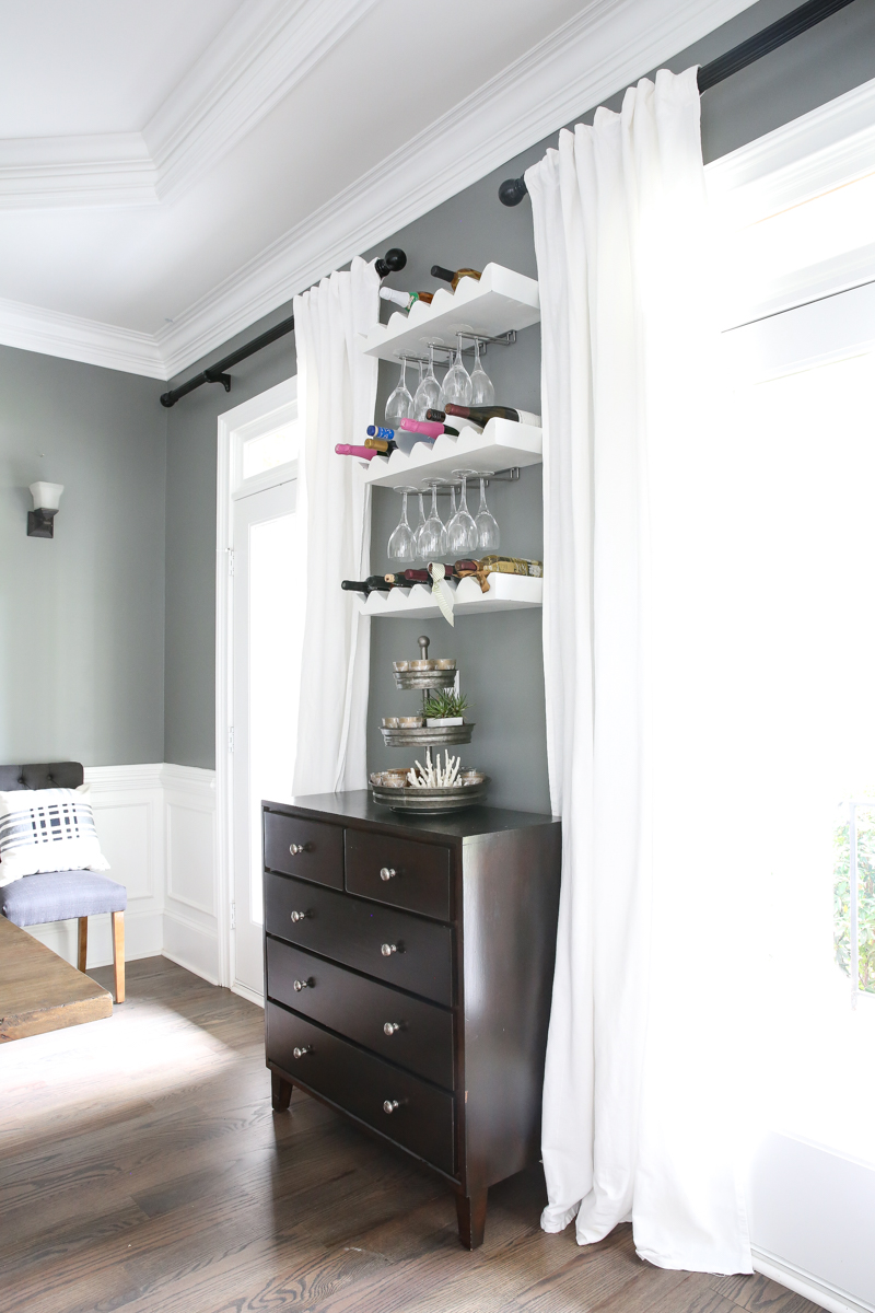
And please don’t hate me, but I would also consider removing the wine shelves and drawers. It feels too busy and not as sophisticated as the rest of what’s going on. I would probably just leave that bit of wall between the windows empty so the eye can rest on everything else. You probably have plenty of room to store the wine in the hutch.
I also agree with the comment above that two upholstered captain’s chairs at each end of your table would help give a little more weight to the table area and help balance to the size of the hutch. Your adorable pillows make me think a sophisticated buffalo check or stripe pattern could be awesome! Something like this: https://www.pier1.com/owen-black-%26-white-buffalo-check-dining-chair-with-black-wood/3615955.html?cgid=dining-chairs#nav=top&origin=gridswatch.
I love the white curtain panels but would love to see how they look flanking the outside of the windows.
I am not feelin’ the black chair legs either; I like them as is but could also see them in a stain closer to what the floors are.
Technically speaking they are doors and if I open them up wider, the doorknobs show 🙂
xo – kb
Congrats on finding the panel! I love the idea of picture lights as well.
We have shiplap in our dining room about 3/5 up the wall. We used MDF boards about 6 inches wide and used a tile spacer to give space as we hung them. I then used door casing pieced together (hard to explain) to be the molding at the top (transition to no ship-lap). It was a lot cheaper than real ship-lap.