Ever look at a perfectly good room and think….what this needs is a little bit of animal print.
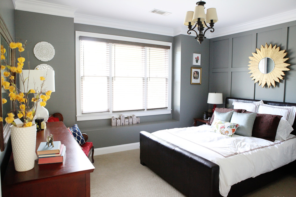
Been there, done that.
I seriously might be off my rocker but I wanted to take a walk on the wild side somewhere in the vicinity of my guest room. That sounds inadvertently dirty. And I kinda like it 🙂
Just kidding mom. I’m never dirty. Neither are you. Love you I’ll shut up now.
Okay. So back to the point. I wanted to add a little pattern and color to the room and the easiest way to do that is with fabric. You can choose whatever textile strikes your fancy and throw it in there via pillows or framed art or curtains. Since I already had the wall art done in here and I have some fabric already on the docket for new throw pillows, I decided that a window treatment would be just the ticket. The guest room window has this weird bump-out and long curtains would be more awkward than an exboyfriend name tattoo. Am I right Angelina or am I right?! That is how I landed on the idea of an upholstered cornice board.
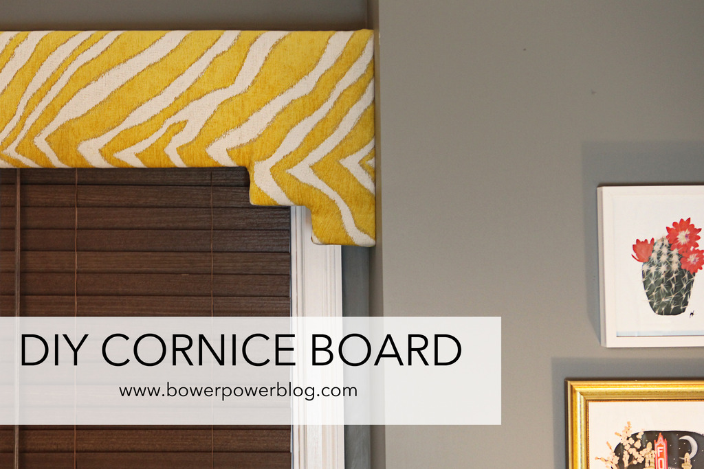
The entire thing was made out of scraps we had in our garage. Hooray hoarders!
The main piece was a 1×8 inch board cut to the length of the window opening. Then I had two pieces 1x6x12 and two L-shaped pieces that would add a little shapely interest.
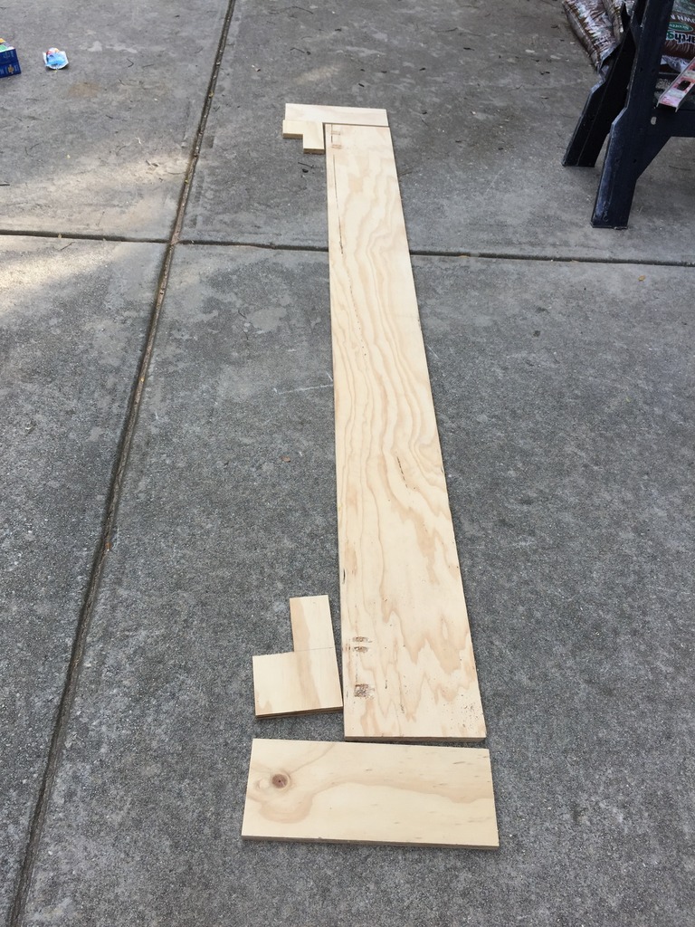
I used a R3 Kreg Jig to make a pocket holes to connect the L-shaped piece.
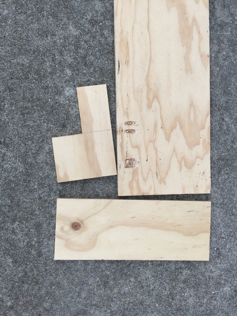
After I had the front the way I wanted it, Jeremy attached the side pieces with screws.
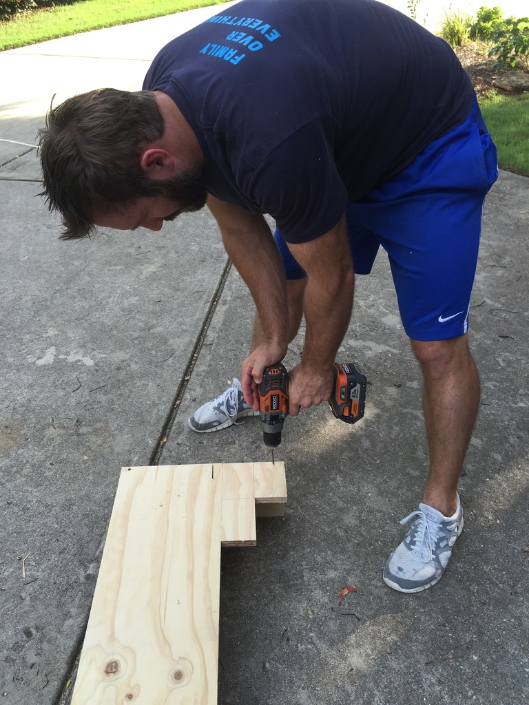
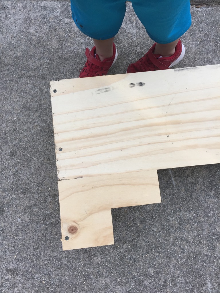
It doesn’t matter if the screw head shows…it will all get covered up.
I used the last of my upholstery batting….I guess I will have to buy some more for the next project. And I have been sitting on this yellow animal print upholstery fabric FOR-EVAH so it was great to be able to finally use it. I got it at the discount fabric store for $2 a yard (the store is in Stone Mountain on East Park Place for those wondering).
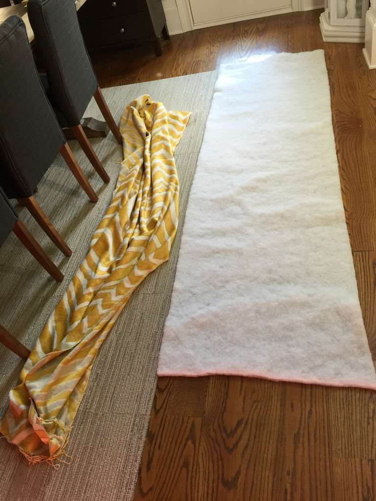
I simply laid the board directly on the batting and folded it over and stapled it in place.
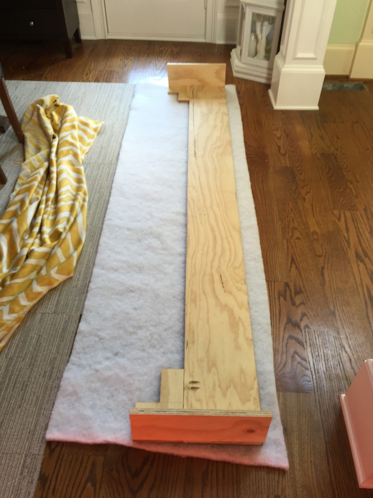
Doing around the little corner-y pieces was the hardest.
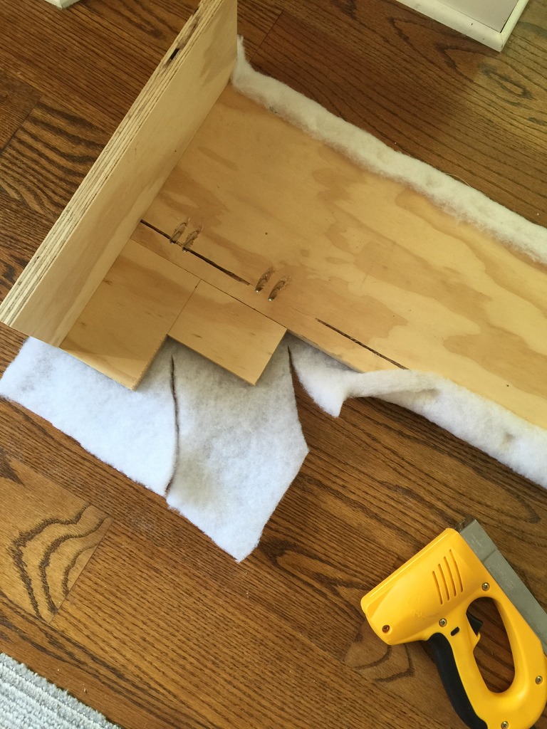
But soon enough I had the entire thing covered in batting and then I moved on to the fabric.
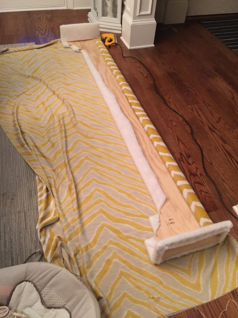
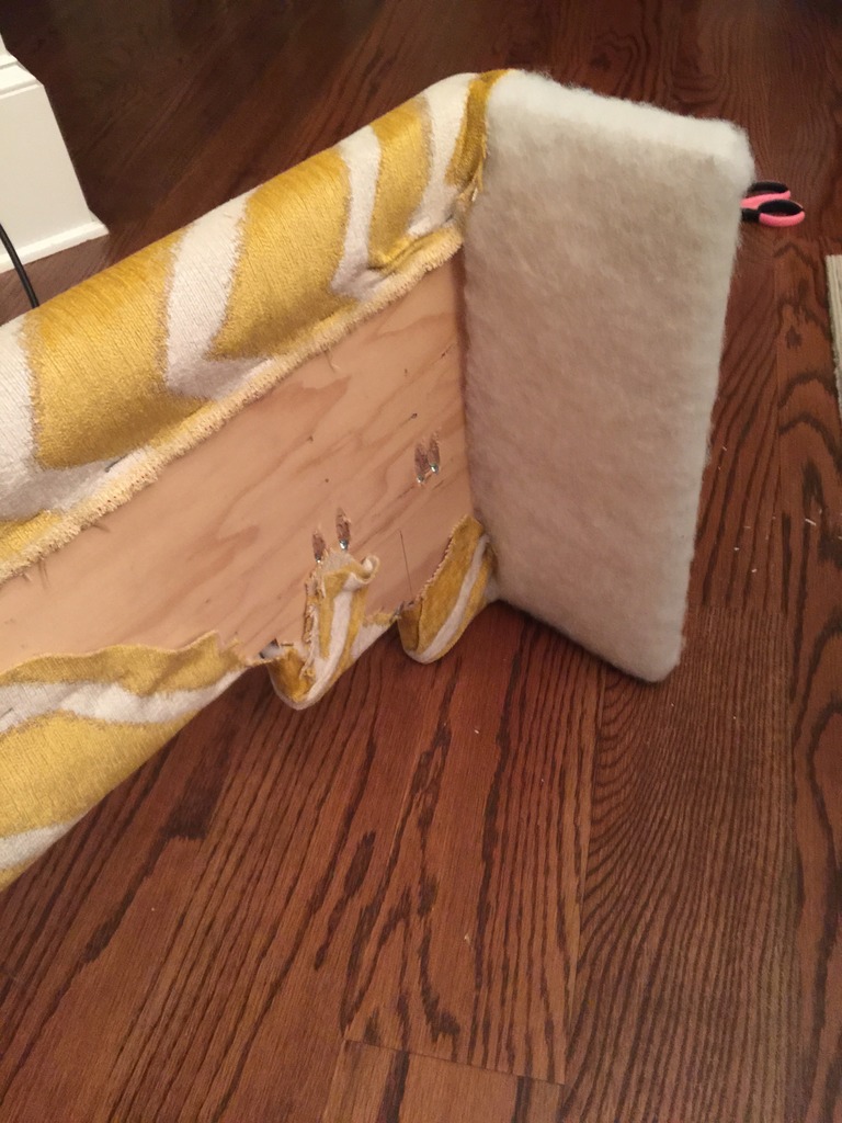
The front part got done first. I didn’t need to the outside part of the ends because that would be against the wall. I did need to do the INSIDE of the ends because that would be slightly visible.
Don’t ask me why I have upholstery cardboard strips. I have a whole ton of it. I guess I figured I would be REALLY into reupholstery one day.
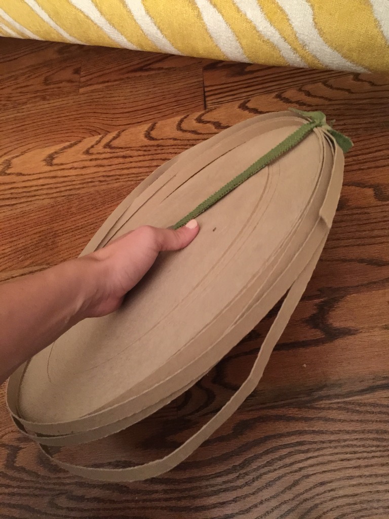
To get the cleanest possible inside fold, I stapled the fabric so that it was on the backside of the fabric to where I wanted the clean edge. Then you tuck a piece of the cardboard in and fold the RIGHT side over it so that you can see that straight upholstered corner.
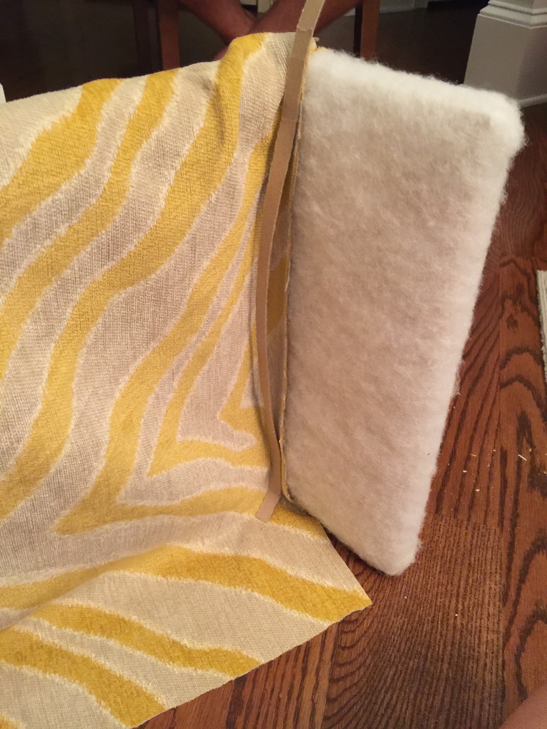
I know that is confusing.
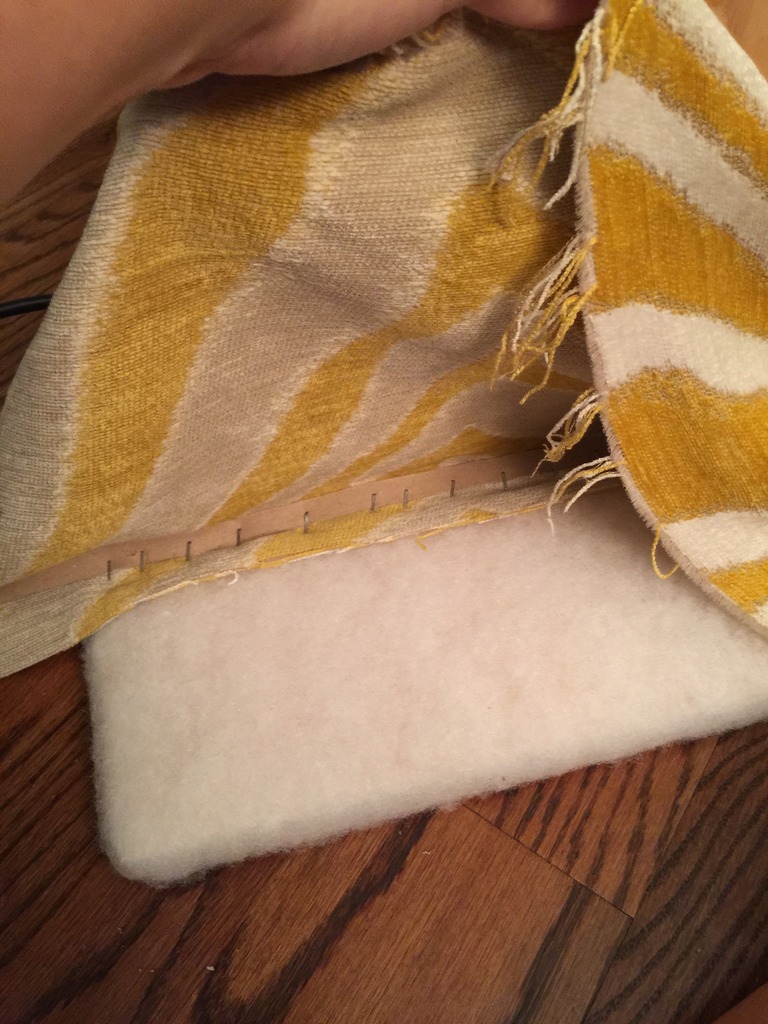
But once you fold your fabric back over so that the right side is showing, it looks like a clean edge.
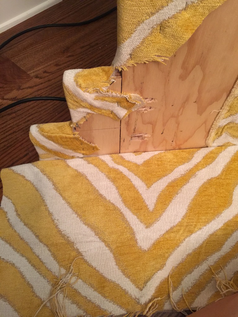
After everything was securely stapled and all the little frays were trimmed, Jeremy wedged it into the window nook. It took a few whacks with the mallet but finally we got it in there really tight and that sucker ain’t going nowhere. (double negative!)
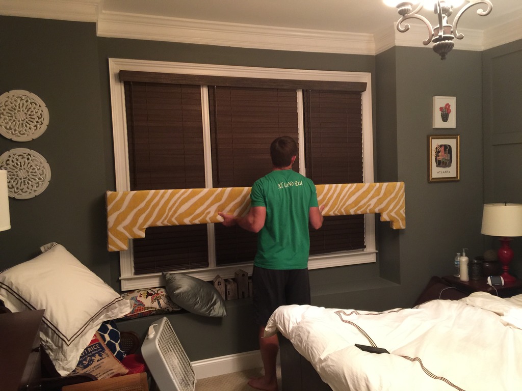
Now it adds some crazy pattern to the space.
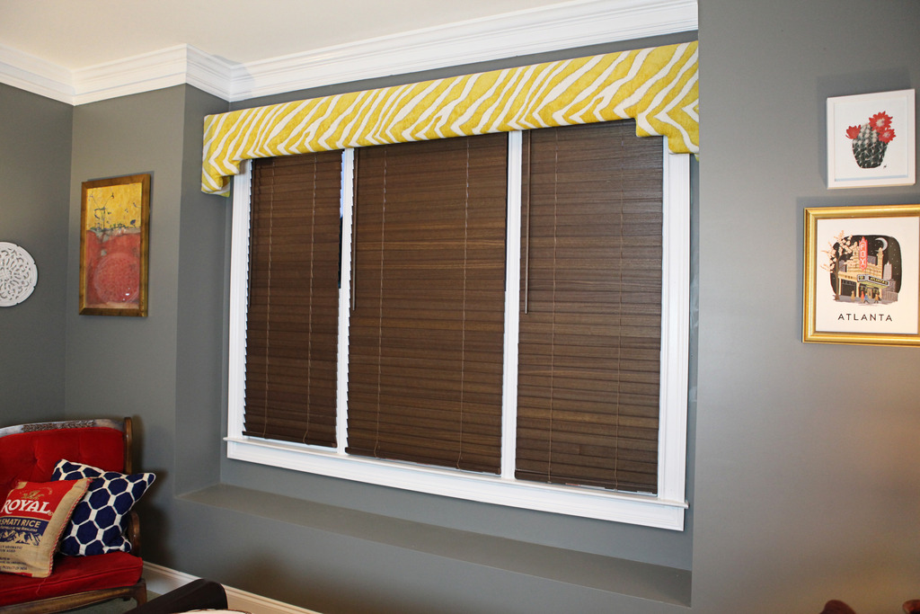
I know it isn’t for everyone but I like it. It adds just enough interest to spice things up. And I think it plays nicely with the gold starburst mirror.
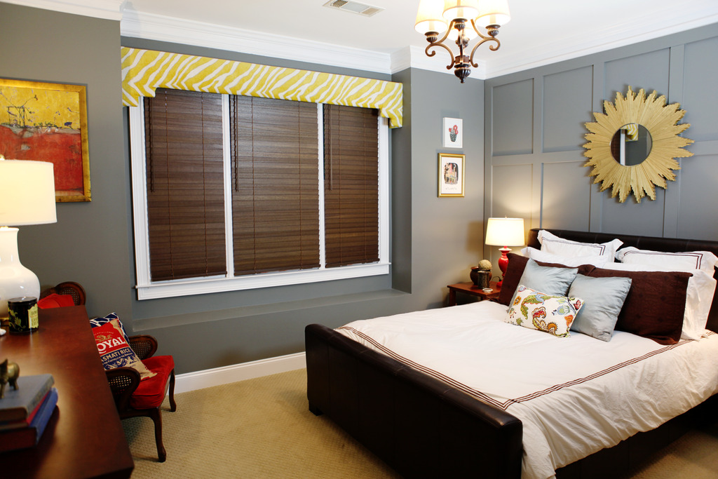
And the bits of yellow on the other side of the room too…
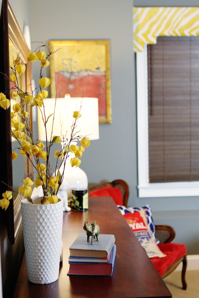
See where it nicked up the paint where we jammed it in there? It’s super tight. I gotta do touchups too I guess.
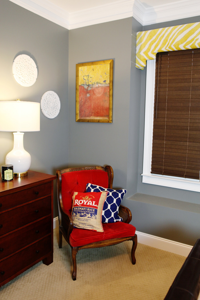
But it definitely was cheap (aka free because I already had everything for YEARS) and it is super fun to see a splash of interest.
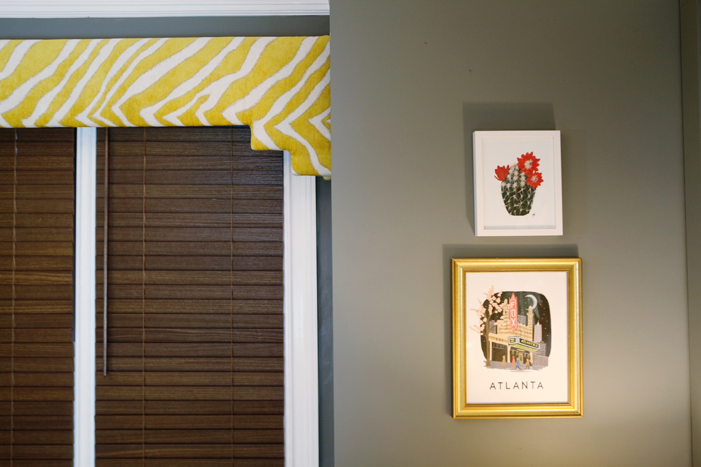
Now to change those bed pillows to something a little more spicy 🙂
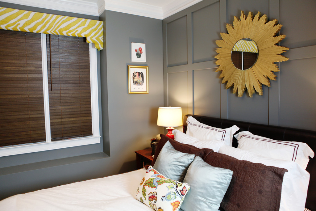
I feel like this room is really close to completion. I need to do those pillows and the little bench in here and then I can say finito. At least until yellow zebra becomes boring. Which is pretty much never. I mean…if there is a place to get all wild and crazy…it’s definitely in a room you never go in….just as long as my guests don’t get any ideas. Maybe there should be a note. Or a photo of us awkwardly staring at the bed. Nothing negates the lure of yellow zebra like an awkward family photo. Bet you didn’t expect to read that sentence this morning 🙂 You. are. welcome.
Girl, love the pop of color and really enjoyed your crazy sense of humor this morning! Thanks!
How does something become ‘free’ when you paid for it? Just because you’ve had it for years and not used it in a long time doesn’t make it free.
I love it! The yellow does play off nicely. Adds character to the room.
I like it! What I don’t like is the gray stripe at the top. The space between the cornice and the molding. I don’t know if a wider cornice would have looked good; but that gray space doesn’t please my eye. Just an opinion of course…..
Love the cornice, ADORE the painting on the left side of the window! Please don’t tell me you got it at Goodwill!!
LOVE! This is my favorite project you’ve done lately! You can never have too much animal print… roar! 😉
Gray and yellow are a classic combination. Did you secure it into the wall or is it just wedged in that nook? I guess that makes it easy to change out the fabric in the future if you wanted to.
I went to that fabric outlet in Stone Mountain after your post about the boys room curtains and it is AMAZING!!! I got 2 lengths of (matching) decor fabric each 4 yards long to make curtains for my family room for FOUR DOLLARS total ($2 per “remnant”). HOLY CRAP. FOUR DOLLARS for curtains!!!
ahhh! I love it!
This room is awesome. It has so many things in it I would never individually pick, but they work!
I also can’t look at it without remembering your diy competitions with Jeremy. Do you have another one planned? They are such a fun and awesome way to get stuff done!
I love the cornice board, and also this post made me snort coffee up my nose. Thanks for the laughs 🙂
The Fish Thrift store? 🙂
It was $16.00 though so more than I normally pay. It is originally zgallerie!
xo kb
Before you touch up the paint you could slide it up against the ceiling trim, because at the place it is now it makes the room look shorter. I have to say, even though yellow is one of my least favorite colors ever, the yellow/gold+grey+white combo in that room is looking classy and the animal print is a fun touch.
You just make me laugh, girl!
It really gives such a finished look to the window. Looks great!
Haha you made me laugh this morning. Have you seen those awkward family photo greeting cards at Target? They are awesome and your post made me think of them. Hilarious!
I love it. It looks like the print is subtle enough that it kind of blends in instead of screaming look at me! I am a sucker for animal prints though!
I love it! The color & pattern look great in that room with the dark wall color. Also, you are hilarious. Thanks for always being inappropriate, in the best way. 🙂
Nice DIY… it looks great. It goes really well with that gold frame and your sunburst mirror (love that mirror by the way)
Love it! What’s the name of the paint color here? Thanks!!
Looking at the “before,” it didn’t feel incomplete, but it looks so much more finished with the cornice. What a great finishing touch! Doesn’t it feel nice to be at the stage of a project where a room is totally functional and you get to focus on making it pretty?!
i thought just the same thing! Couldn’t you put it a little higher so you don’t see the gray anymore, katie?
I like the fabric and the pop of color, but I feel like the low placement of the cornice has made the room feel smaller – could you raise it to be flush with the crown mold? That strip of grey just looks weird. Just my $.02
I love it!! It looks great and really pulls out some of the yellow touches in the room. And to comment on what Marie H. said about ‘not liking the gray stripe at the top’ – totally disagree with her. Bringing the cornice board all the way to the top molding would look too traditional and your animal print is not that. Great choice leaving some of that nice wall color showing 🙂
Yeah…nope.
If you ever tire of it I’ll buy it in a heartbeat!
Denise
I LOOOOOOVE it! I think it totally finishes off the room!
I have been wanting to do the exact same thing in my bathroom window with a leftover cornice board from our old house. Only I want to use bird fabric instead of animal print 😉 Thanks for the push to get ‘er done!
It’s called Secret by Benjamin Moore 🙂
xo – kb
We need to have another one! I think it would be fun to do a Christmas Bower Build Off!
xo – kb
Just wedged it in there!
xo – kb
You have a point. I probably should clarify it…I didn’t have to pay any additional money to do this project. It did cost me scraps and $6 originally 🙂
xo – kb
The cornice looks good and gives the room a little sumthin, sumthin it didn’t even know was missing.
Where do you store all of the things that you keep for years, and how do you even remember that you have it?
I have a big chest of fabric upstairs and then I also fill my office drawers with it. I have a weakness for fabric hoarding 🙂
xo – kb