A while back, Laura contacted me to help her get some ideas for her kitchen makeover. Here’s what she wrote:
“Hi, Katie! I stumbled across your blog not long ago, thanks to Young House Love. I totally get a kick out of reading your entries! You always give me something to laugh about! Soooo, I thought I’d see if you would be interested in photoshopping my kitchen? We bought a great house back in October (after 13 military moves, we’re finally in our own house!), and have been working on updating things. Changes to the interior include ripping out the carpet throughout the downstairs, replacing with gorgeous dark hardwood floors (Brazilian Ipe), tiling the kitchen with 18″ travertine, painting the cabinets white, replacing the ugly rotted flesh color of countertops with a dark laminate, and knocking down the little “ledge” behind the sink, and installing new sink, faucet and cabinet hardware. We’re doing it all ourselves, all while trying to remain on a budget. Unfortunately, we’re completely out of ideas for the wall color, backsplash and lighting. Can you offer any thoughts? Thank you SOOOOOO much! Keep up the great job on the blog! -Laura”
And she included this photo:
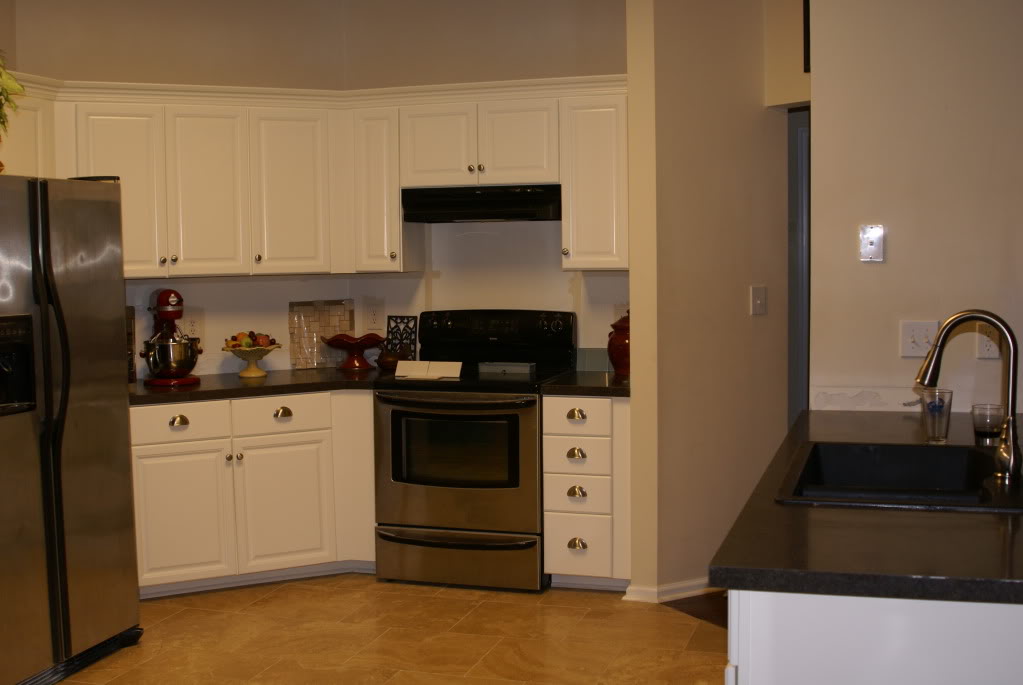
What a great jumping off point – right?!? I mean, I couldn’t have chosen a better one if I were skydiving. Which I don’t do. Because I like life.
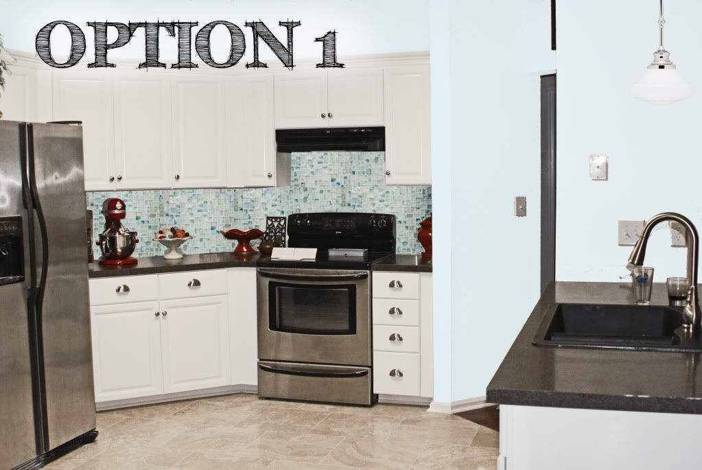
So like Paula Deen, I whipped her up some yummy things to munch on in the kitchen. And here is option 1:
Option 1 is the most artistic option in my opinion. It has the icy blue walls that play off the icy blue accents throughout her home. And since the kitchen is usually the hub of the home, this space really feels light and cheerful…just like any host wants their guests and family to feel when congregating in this area. The cheery feel continues with the glass mosaic backsplash that is a nice blend of blues, grays and a hint of warmth that calls on the floor’s name. We top off the first option with a vintage schoolhouse style pendant light over the ‘breakfast bar’ for a little warmth and additional lighting.
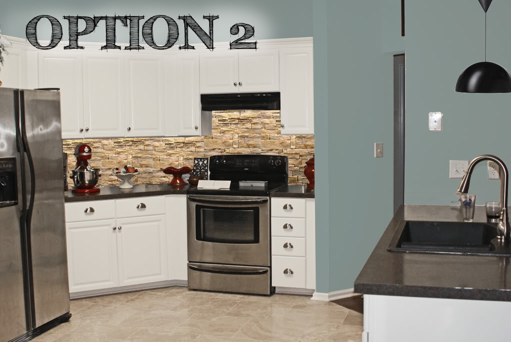
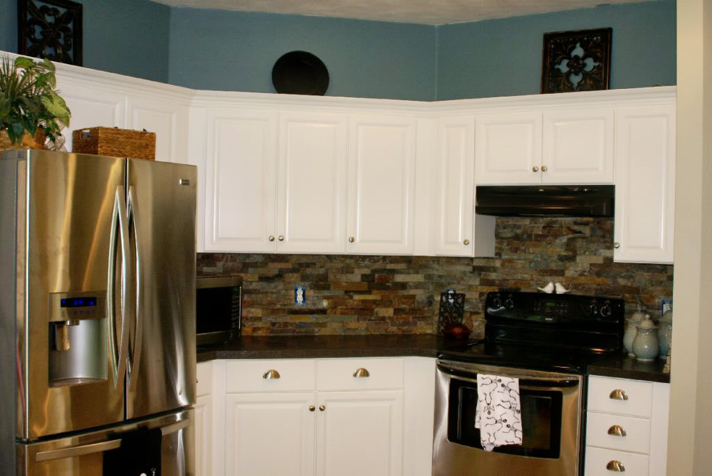
Option 2 is the Matthew McConaughey of kitchens: a little rugged, a little masculine, but overall pretty sweet to look at. The dark color on the walls really makes the cabinetry pop and appear uber crisp and clean. The backsplash is where the manliness comes into play with a stacked stone veneer tile that can be attached directly to the wall. This stone adds interest and texture into the space without overwhelming it. This is like sea meets sand…also known as Matty’s playground. And the dark lamp over the kitchen sink will ground out the space and allow the focus to be on the ripped up abs…err…backsplash. Yum.
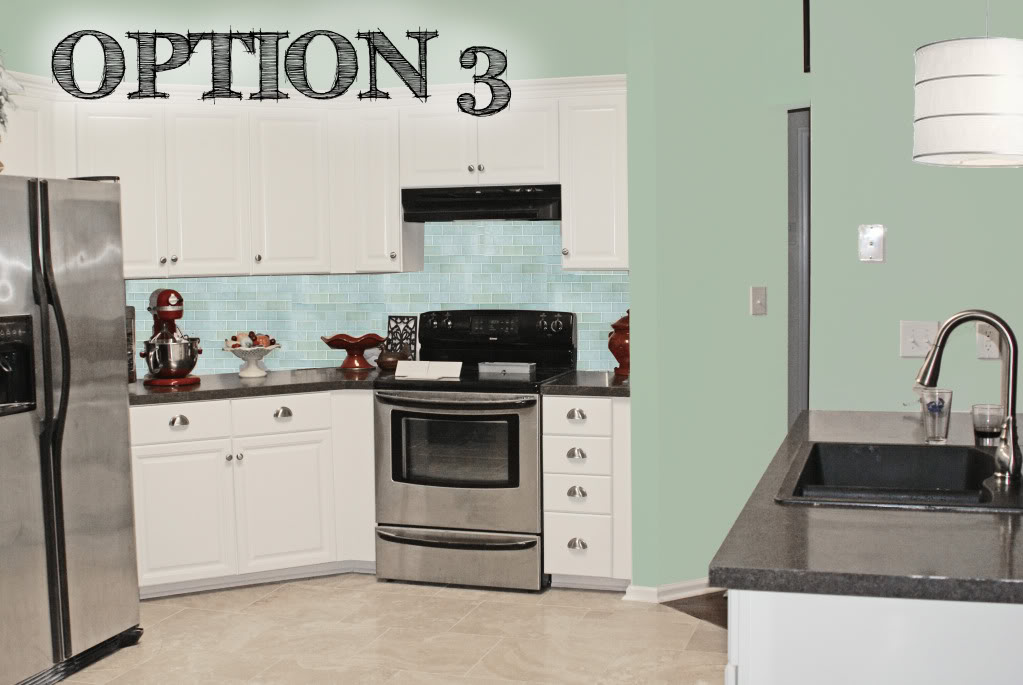
Option 3 screams casual. Although the color palette is ridiculously close to the first option, there are some notable differences that can change the entire look. The straight lines of the glass subway tile backsplash create a sense of structure and feel less busy than option 1…perfect if you are OCD about tiles. And the warm undertones to the wall color really can play off of any adjoining icy blue room…should the living room be already the blue hue. And the casual lighting pendant is made from paper and steel and also reflects straight lines (holla backsplash!). In my book, this scheme is similar to #1 but the feel is slightly more cottage and a little less artistic.
So off Laura went with her three options of ideas in tow.
I never posted this adorable Photoshop Fun because, well, life got in the way and then our basement flooded and well, the rest is history. But then October 13th came around and I got a very lovely email from Laura. and I was bamboozled. BAMBOOZLED! Do you even know what that means? It’s like when a magician smacks you in the face and makes a black eye appear…OUTTA NOWHERE! That’s what happened. Laura = magician. Me = stupid blogger with an eyepatch. Maybe you don’t understand.
It’s very simple. She took one of the ideas and ran with it. And even though I was begging for a magic trick to happen in this kitchen, I was full of doubt up until that moment when she sent me her after photo. Hence the eyepatch of shame. And right below that eyepatch is a huge toothy grin all because of this:
And now you are smiling too.
And so is Matthew McConaughey 🙂
Great Job Laura! Your kitchen makeover is drop-droppingly awesome 🙂
A big thank you to those of you who sent in their photoshop requests. Unfortunately, it takes me a little while to comprehensively compile options for people – and my time got SWALLOWED up with other bloggie goodness…so I am temporarily unable to take any additional requests. But no worries – I will make sure to announce in the little sidebar NEWS widget when I can take on your challenge! SMOOCHES! XO – Katie
Looks great! I like how the tile she chose seems to have some of that blue from the walls in it.
Oh I’m so glad she went with that one! That is totally what I would have picked too!
Oooo I was gonna say go with Matt. Loves the backsplash…and then she did it! And it’s gorgeous! And I’ve missed these!
Awesome! That’s the one I would’ve chosen too 🙂
Great choice by going with #2!
OMG! I was so surprised to see my kitchen on here! LOL Thanks Katie for everything!
We’re obviously still working on the kitchen – next up is painting the ceiling, adding some crown molding, stone outlet covers, and accessorizing!
Love @2 the best! Very warm and homey.
I love, love, love the back splash! I’ve been trying to think up something for mine & this hit’s the spot! Can you share your source info for the back splash stone veneer?
This option was my fave of the ones you posted and I love how Laura made it come to life. Kudos to the pair of you!
What paint color is the blue? I love it!
Love the backsplash – good suggestions KB!
Great makeover! Katie, it must have been so gratifying to see your ideas put into action. The kitchen has so much character now.
I was just going to say that I liked #2 the best… it turned out great!
PS I love the new fridge :).
Hey Katie! I love that backsplash! I wonder where Laura got the stacked stone veneer? Any ideas? Oh, and yes that kitchen did make me smile 🙂
Thanks so much for the positive comments! 🙂 The paint color is Sherwin Williams Moody Blue. It’s actually fairly bright in a well lit area, but the spot above the cabs has more indirect lighting, giving it that dusky look. The stone came from a local tile shop. Here is a link to the tile, though we bought ours from a local shop: http://www.msistone.com/products/..%5Cproducts%5CLandscapeItems.aspx?LSFamilyID=6 (My apologies to all for the disarray in the kitchen – we had just finished installing the last piece, and I whipped out the shot to send to my mom! I’d have at LEAST straightened the towels if I’d known it’d show up on here!) 😛
Oh – the color of the natural ledger stone panels is California Gold.