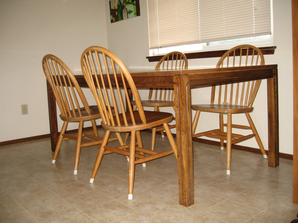
Natalie wrote me asking for a little table and chairs enhancement. Obviously I am an overachiever (my mother just died laughing at that one!) so I had to show how to incorporate color and pattern to really set off a furniture redo. But first her short and sweet email:
“Hi Katie! I love your blog and your awesome home decor ideas–especially your DIY artwork! I recently bought a mismatched table and chairs on craigslist and am looking to give them a fresh coat of paint. My husband is uber-traditional; I’m a little more adventurous. I really like an espresso color, but he thinks it looks too much like black. If you can help us find a happy medium, that would be awesome!
Thanks! – Natalie”
It sounds to me like Natalie and the hubs are like BAZILLIONS of couples out there that have differing taste in furniture. Throw me and the boyfriend in that bucket too girl! So what is a pair to do when they obviously have different tastes? Photoshop of course 🙂 It is really helpful to see how the room would look once most of the elements are completed. But first – take a peek at their great Craigslist finds:

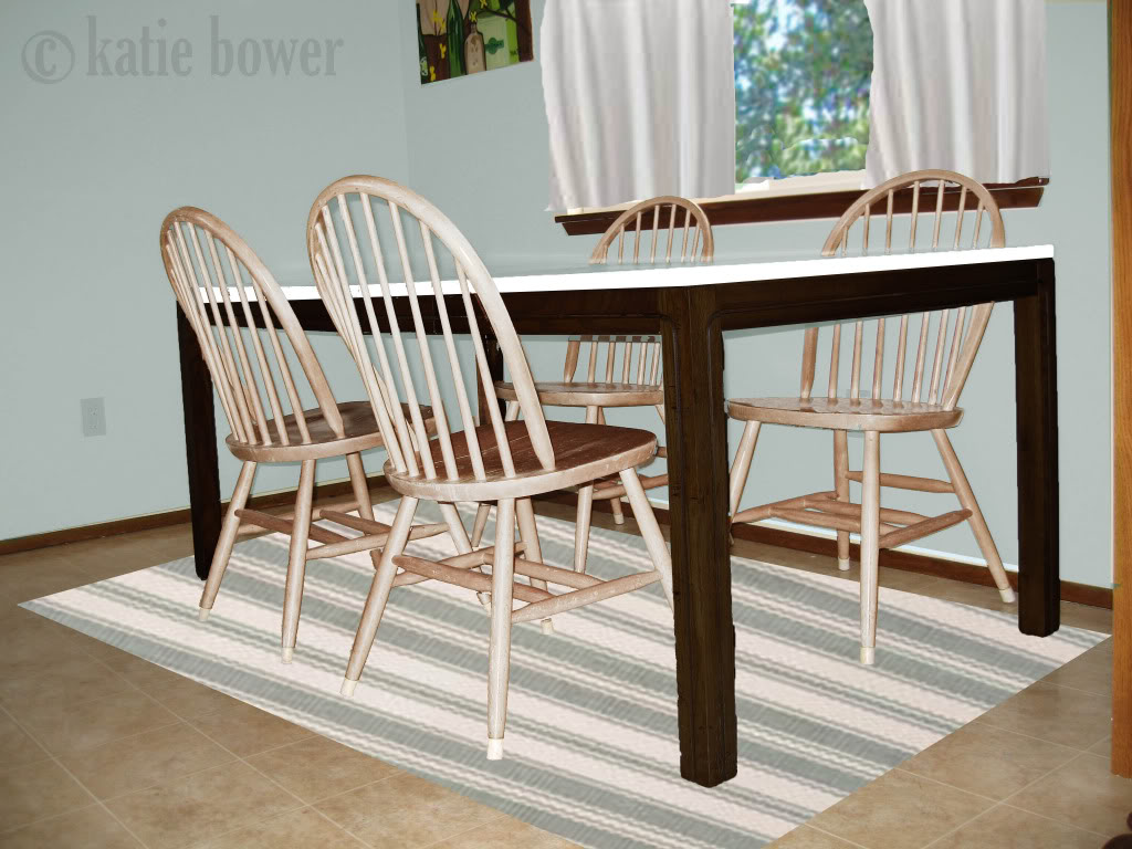
Option 1 is the coastal inspired option. It starts with a gray-blue backdrop on the walls with plain white cafe curtains. The striped rug is a great way to incorporate the seaside feel as well as give the space a little pattern. And the whitewashed finish to the chairs is a very coastal choice. The table is my favorite piece since it is two-toned. The finish could be white legs with a dark stained top or vice versa (like shown) for a more reflective surface.

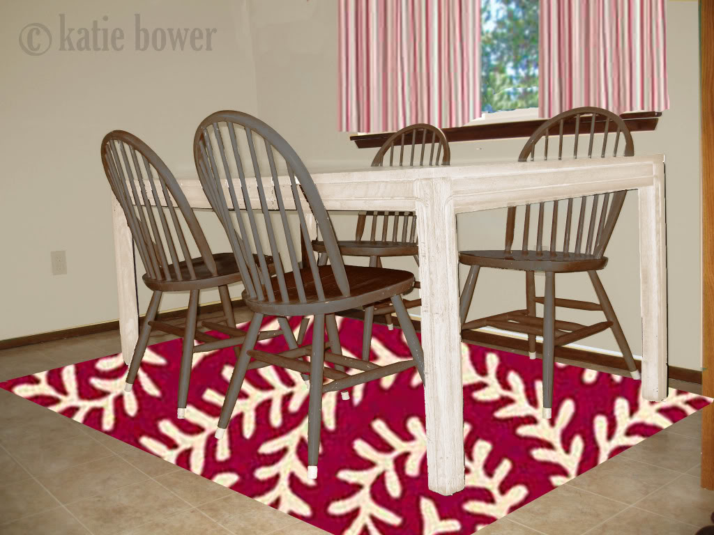
Option 2 has a more warm, contemporary feel. The red patterns in the rug and the curtains bring some pow to the big picture. The white painted table is a great contrast to the dark stained chairs (which will require a little elbow grease to complete) and in the end will appear very rich. I especially like this option because it has a great neutral background which will act as a great transition color between rooms.

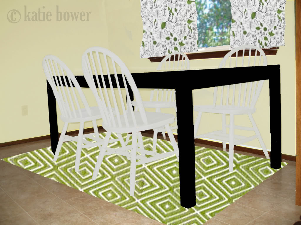
Option 3 is the funkiest of the options. The pale yellow walls will give the room a fresh feel and the white painted chairs really make it look so clean and crisp. The black painted (or espresso stained if Natalie & the hubs feel more comfy with that idea) will ground the room and make any white dinnerware look stunning! The green in the rug and curtains really complete the citrus inspired color palette while also introducing pattern and interest.

Oh – and for you people that like to know details – the rugs are all Dash & Albert designs and all the curtains are Ikea fabric or actual curtains.
So now that the alterations are completed, now I need your input – Which option would you choose? Anything you love?
And for those of you that are just dying to see something of your own fancified with photoshop and then hear some input from the hottest readers in the world – send me some of your hi-res photos to [email protected].
I love option 3…I have almost the same tables and chairs and was wondering what could be done with them.
Seperate question-if the dining room has carpet should a rug still be put down?
Oh- I pick the second option- mostly because of the distressed gray/green chairs. I love it!
Option 1 and Option 3 are my favorites. I love them both for different reasons. The calmness of Option 1 is really appealing but the rug in Option 3 makes my heart skip a beat! And perhaps I am drawn to it since green is my favorite color.
I love that last one, but my husband and I are both funky with our decor! For them, I like option 2 the best!
I was contemplating emailing you about how to handle a fiance with completely different tastes in furniture. It’s all about compromise.
I am completely drawn to option 3. I think it’s so fresh and full of pizazz. And green is a calming color, especially when it’s paired with white.
Love option 1.. that’s right up my alley!
I like option 1 myself. I think I’d do a different rug under the table, but I have a two toned table and love it. We did it with whiteboard paint for added fun
http://geekdetails.wordpress.com/2009/05/28/giant-whiteboard-table/
Option #1 is my favorite, but Option #2 is a close second. They are all really pretty. Can you photoshop my entire house?!?
Option #2!
OH – I want #3 for myself! I’m green obsessed though.
I like #3! I’m a sucker for that green color in the rug and like a bit-o-funky. How fun.
(I’m going to try this again, my posts never show up?)
Option #1 is my favorite. I love the beachy and vintage vibe. All great ideas.
I gotta go with # 3 but the I love all of the rugs.
signed,
hot reader # 212
Tough choice! I love both 1 and 2, but I vote for 2 because I like a cozier feeling kitchen.
These are great! You’re a pro Katie! My fav is #3.
No. 1!! Love the crisp coastal vibe.
I almost said No. 2 just so I could slip in some potty humor b/c I know how much you hate potty humor. =]
I like #3 the best. But maybe it’s because it would go with my new swag light fixture over our dining room table. It’s an apple green drum shade that’s square. The shape, that is. LOL Can a drum shade be square? Any waaaaays…I love it. It’s cool & different from anything I’ve ever seen.
Love the last one – I am a sucker for pretty shades of green!
#3 is my fave! love the black and white, and I just painted my entire kitchen pale green so I’m really loving the green accents!
I LOVE option 3 but with the existing floors I almost think option 1 looks best. I love your photoshopping, so fun!!
Love the serenity of Option #1, but the pops of green color in Option #3
I’d pick door #3
Great job Katie, are 3 are great options, but my personal favorite is #3.
oh its so hard to choose!! I really do like them all! but to me if the hubs likes traditional and she likes modern then # 2 may be a good compromise, but really. Katie you did awesome ’cause these all look great!!
I am loving those curtains in the 3rd option!
I love the first and second. I so need to send you a pic of our den so you can help me! I am trying to find accessories to decorate with, curtains and a rug and am not having much luck!
Option 2 – I love the pop of color the rug gives.
#1 is my fav… but I think I’d like the entire table stained. Good luck with this one, looks like everyone loves them all!
#1! #1! I love grey-blue . . . and the two-toned table.
Option 3 for sure!!
all three are great but my favorite is #3 love the contrast between the table and the chairs and i am in love with the curtain fabric
I think the rug, curtains, and wall color of #3 would look great with the table and chairs painted like #1
3 for sure!!!!
number 3!
i’m a coastal girl and love the seaside feel of #1 but i cant resist fun color and pattern so #3 rocks!
I like 1 and 3 the best, but would have to do rock/paper/scissors if I really had to pick…
I heart the first option – It would make the table look so pretty!
wow that is so cool! I had a kitchen table similar to the one above except it’s round, the chairs are the same. I’m showing these pictures to the hubs! you did an amazing job!