I got an email from a girl named Kelly Hughes. My maiden name was Hughes. Are you thinking what I am thinking? I thought so. Separated at birth. I knew it 🙂 Back to Kelly…she sent me a sweet email with a request to doctor up some options for her partially renovated kitchen. Read with me:
“Hey! I follow your blog on a daily (and yes, I look daily for new blogs!) basis! I love it! Get fabulous ideas all the time! Love your DIY & penny pincher attitude! When I saw you doing photoshopping fun….gave me an idea. I have an ongoing house remodel and I’m stuck and need your help! I can’t afford new cabinets at the moment with all the other projects – so…paint to my rescue! I want to paint my kitchen cabinets, but I can’t decide what color! My gut tells me a distressed black but then I get nervous and feel it may be too dark. It’s not a very large kitchen at all. And I recently installed dark mocha hardwood floors. (And I’m in the process of getting all stainless appliances) Please help!!! I would love to hear your opinions!!! Thank you!! – Kelly”
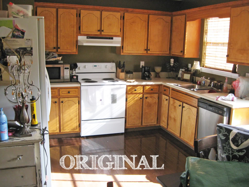
Her original photo needed a little help…which I gladly do for family 🙂 At first I could barely notice the new floors because my eye went directly to the chotchkies that were everywhere. So like a good sister, I decluttered and rebuilt a table for her. I have always been cleaning up wombs after this girl 🙂 Just kidding Kelly – you should see our house when we do projects…it’s like a tornado-hurricane-monsoon came through. Followed by a preschool.
Anyhoo -let’s see the original photo and the options:

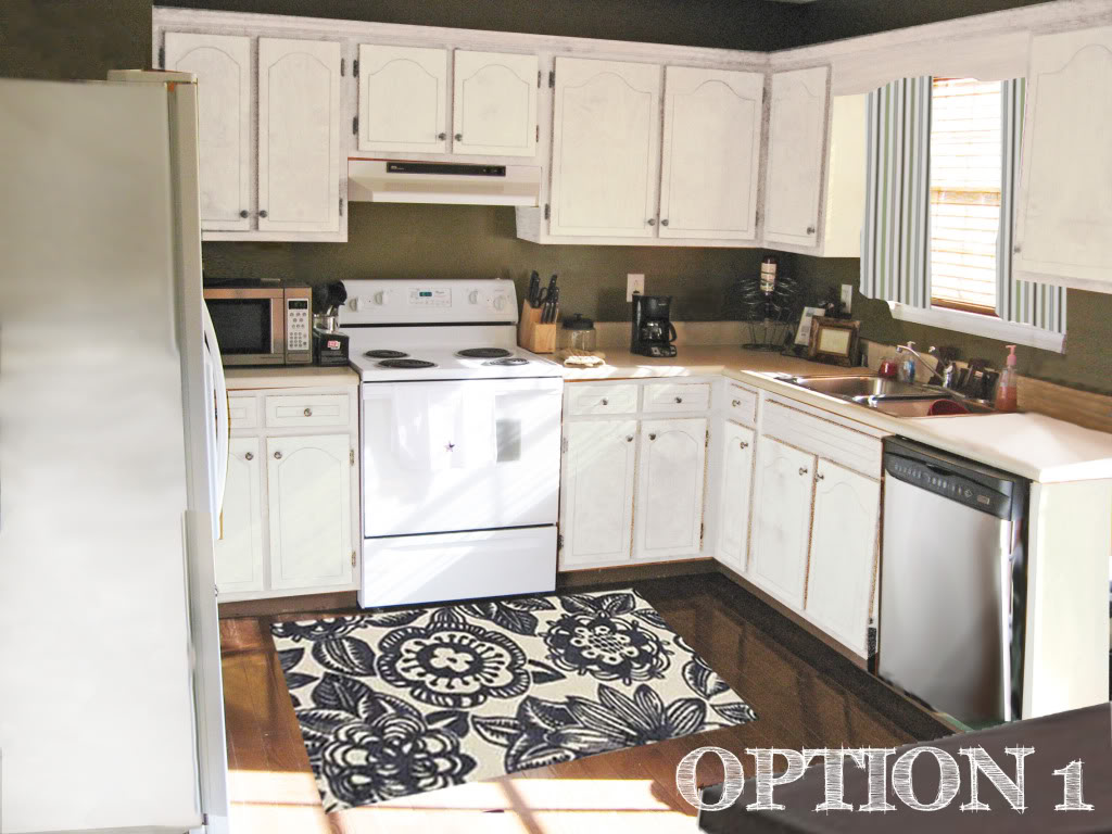
Option 1 is the crisp and easiest option. The existing wallcolor stays the same – and I do love the olive green 🙂 But since the walls are dark, I opted for a bright white cabinet that will really add some drama. Is it just me or does this look very Crate & Barrel? The navy graphic rug is from Anthropologie and even though it is not green – it has the same intensity as the olive so that it can balance out the whole room (while still adding a bit of cushion for when Kelly is cooking for future dinner parties). Note that the website says that the color is charcoal but it totally looks more navy to me (I guess you’ll only be able to tell in person!) I also like the fact that pattern can be introduced into the room with a rug that doesn’t feel too matchy matchy. The curtains are just a simple and cheap fabric from Ikea. Lastly, I changed the hardware to a nickel-finished version that will play off those soon-to-be stainless appliances.

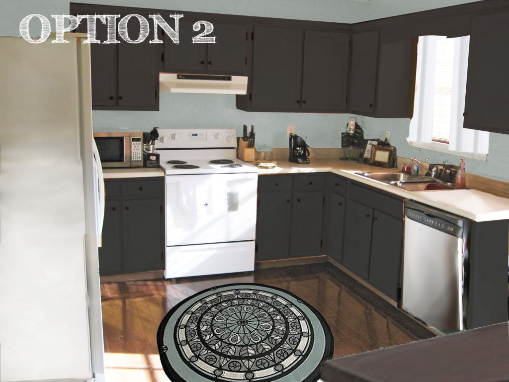
Option 2 has a more modern feel while not going too funkalicious. The black and steel colored patterns in the rug bring serious swagger and interest into the room (for only $30). Plus it will draw the eye down to that magnificent flooring that Kelly installed. The hue for the wall color is taken directly from the rug and makes the room feel really quite neutral with white or stainless appliances. And the room is gonna need that lighter gray blue colored wall when the dark black finish is added to the cabinetry. The hardware is also dark (either oil-rubbed bronze or even a black iron). And to ensure that the maximum amount of light is getting into the room filled with black cabinets, we have a sheer fabric that anyone can score at their local Walmart as curtains.

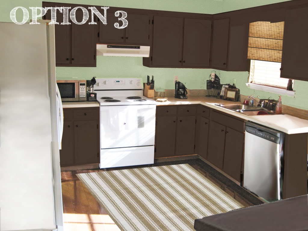
Option 3 is the cozy – “come home to mama” option. First we have the cabinetry that is stained (or painted) to a nice dark espresso brown color. Since that is our dark hue, we bring balance by introducing a pale green to the walls which will offset the dark cabinetry while adding a crispness to all that warm coziness. The rug is from Dash & Albert (and is one of my favs btw!) and can add more interest into the room while playing off the color of the current countertops. Finally we have the bamboo roman shades that will bring some texture into the room while still allowing light to filter in.

So there it is – three options available for my kin and for your viewing pleasure. Now for your vote:
Which one would you choose? Which would you prefer to live in?
A big thanks to everyone who sent me their photoshop requests. Even if I have not responded yet, I am working hard to prepare three options for you! Unfortunately, I am SWAMPED with people asking for a little photoshop magic of their own…so I am temporarily unable to take any additional requests. But no worries – I will make sure to announce in the little sidebar NEWS widget when I can take on your challenge! THANKS A BAZILLION! XO – Katie
Oooh, option 1 all the way but I must admit I am a huge sucker for white kitchen cabinets….love it! : )
Love the sophistocation and elegance of Option 2. Option 1 is nice, but looks a little generic. Not a big fan of the brown in Option 3 – kind of reminds me of number 2, if you know what I mean…. 🙂
Oh, and Katie – I’ve posted more critters on my blog today – thought you might like to take a look!
One!!
I love the look of option #1, but I’m dealing with some white cabinet issues of my own at the moment so for practicality purposes, I’d have to lean toward #2 — both equally lovely!
I’m loveing #3 – it feels so warm & welcoming!
Then, #2 is my next choice, crisp & clean is always nice for a kitchen : – )
I love option 2! White cabinets are nice(I have them in my kitchen), but seems too easy. I really like the rug in option 2.
Wow – you really outdid yourself with those photoshop skills on this one! I can’t believe how well you got “rid” of her stuff! Not in love with 3, but like both 1 and 2. Guess it depends on what look she’s going for.
They are all fabulous, but I love Option 1! 2 would be by second choice, love that rug!
You are doing a great job with your photoshopped fun and mood boards… pretty soon you could have a business like TYH!
Definitely option one, but with the bamboo roman shade from option 3 instead of the IKEA fabric. 🙂
I love all of them and FANTASTIC photoshop job!
I vote option 3! I love white cabinets but love #3 for some reason 🙂
I like the first one- but I think I just long the rug . . .
we just painted ours white so I’m partial!
I think to keep things light and bright with the dark floors, Option Numero Uno is the best!
OR – what about still keeping it on the lighter side, but mixing it up by having a darker color on the bottom cabinets and lighter on top like everyone’s favorite Cottage Living kitchen?! I think that would look just smashing. 🙂 Here’s a link with all the details on colors and whatnot (on Urban Grace Interiors).
I like #2. The charcoal & blue are chic.
Hi Katie! Love your blog. I also stalk daily for new posts! 🙂 Love this photoshoppin’ thing you’ve got goin’ on too! My favorite is the 3rd option, very warm and comfy looking!
Keep ’em coming! 🙂
I’m liking Option 1 the bestest (but I like the rug from Option 2 with it)
I would definitely choose the white!
Option 1!!
I’m torn between 1 and 2 just because of the gorgeous rugs in both. So if it were me and because I despise painting, I would choose option 1 so you don’t have to paint!
#2 all the way 🙂
Option ONE is exactly what my husband and I want to do! I say GO FOR IT!
When I saw #1, I thought, “That’s it!” I love white kitchens and thought it would balance out the dark floor. But then I scrolled down to #2, and lost it! FABULOUSA!!! The black/brown cabinets look too awesome with the blue, and actually highlight the floor even better. And the rug . . . oh that rug . . . So, #2 just ROCKS!!!!!
I love option 2!! But they are all great! What font are you using to write “option 1/2/3”? I’m a typeface nut… can’t get enough of them!! 🙂
#1! #1! Great photoshop and design!
1 is definitely my pick! 🙂
Option 1 – for sure!
What about 2 different colors – one for top and one for bottom? Have you seen the renovated kitchen on Lifeingrace? http://lifeongrace.blogspot.com/2009/06/blog-business-and-please-dont-rate-my.html
White on top/blue on bottom. It’s really neat. Probably not great for resale, but at least it’s not the same boring all white or all black kitchen. Just a thought.