A true life dollhouse was sitting in my inbox waiting to be transformed. Did I hesitate? The correct answer is no. I did not. Here is what Kelly (the owner of this amazing Victorian-ish home) wrote:
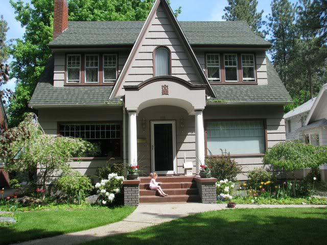
“Hi guys! Love the blog!! Obviously we need help. We’ve been here a year and have done lots of fun stuff inside. We’re looking at getting the exterior painted soon (love gray w/ white trim..or anything BUT the red and weird color our house is now!!!). Landscaping – want to take attention away from the huge windows!!! The red porch has to go to! Help! :0) – Kelly”
Well, you can bet your bottom dollar that I was pumped to get a chance to modify this cute home’s exterior into something that is worthy of the newly-renovated inside. So here is the dollhouse currently:

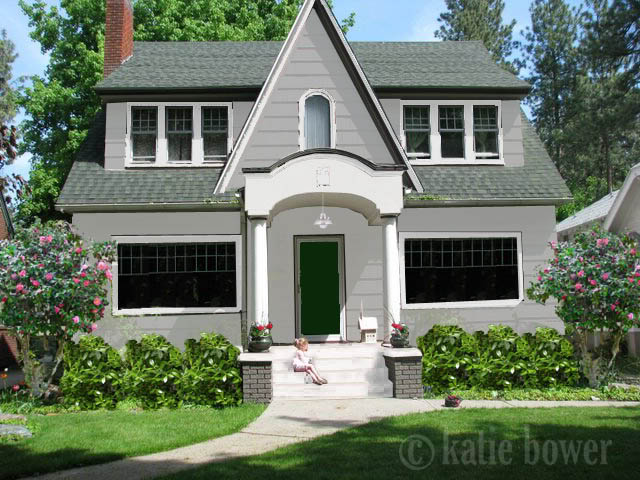
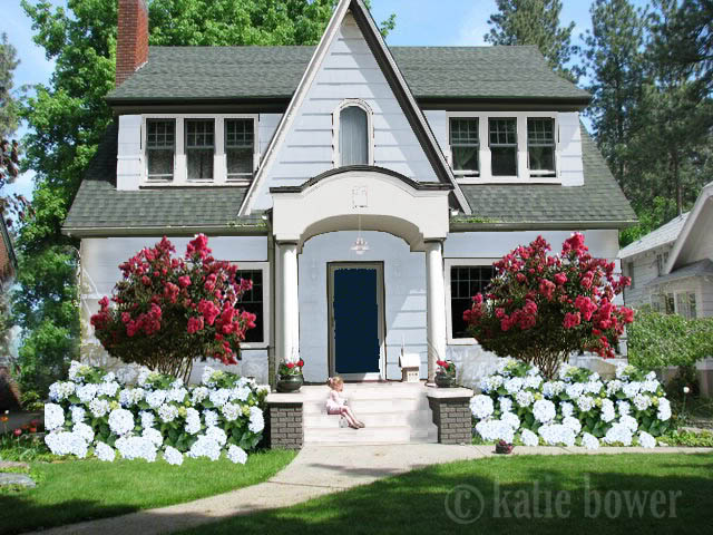
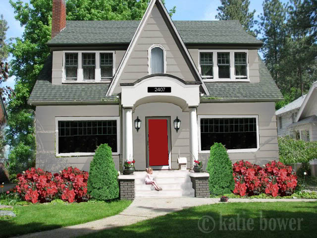
Let’s just clarify a few bulletpoints – I changed the porch to white in all three options. I tried black but then the thought of scorched little tutsies made me cringe…plus white will be really easy to clean if Kelly painted the stoop with multiple thin layers and add a little mild detergent to her pressure washer for a quick hose off. Secondly, I changed the trim to white for the entire house…including the front of the portico. This was a specific request and I aim to please. Thirdly – Kelly may want to cover up those glorious big windows…but me, well, if you got it, flaunt it 🙂 Let’s just say that I am jealous with a capital J. Now folks, here are the options:
Option 1 – I went with the gray for the siding that Kelly suggested and then to spruce up the landscaping I removed the hydrangea plant and added inkberry holly shrubs on either side of the porch. Flanking the corners of the house are camelia bushes that can be pruned to look like trees. This is going to be the option that covers those amazing windows the least. Also, I added a pendant light and finished off the look with a subdued dark green front door.

Option 2 – This is the cottage by the sea option. I changed the color of the siding to a light blue and added an inky navy colored door to give the house depth. Also, the pendant is the same and blends really well with this beachy theme. The hydrangeas on either side of the porch actually wrap around the crepe myrtle (which will help block those windows and provide the needed shade for the hydrangea to prosper).

Option 3 – This option is the most traditional and most all American. Holla George Washington! On the siding we have a greige color – and you can see that it has more brown in the color than option 1. The front door is a 1-2 punch with a nice ruby that plays off the understated color of the house. On the front porch we also have black fixtures that allow a nice light for guests. Flanking the porch are dwarf alberta spruces and a line-up of red azaleas. The crowning glory is the number plate that adorns the portico.

So whattya say folks? Any option bubbling your bathwater? Is option #2 your favorite? Or how bout numero tres? Do you love the windows just as much as me? I’d love your innie-put 🙂
And for those of you that are wanting some input & virtual transformations of your own – you can email me some of your hi-resolution photos to [email protected]. Kisses…
I love everything about 2, except that the trees block the windows. I agree with you that those windows are awesome!
What a bee-yoo-tiful house!!! So pretty. I’m crazy jealous, I have to say. *Sigh*
In terms of the Photochopping magic, I think I like Option 2 the best, light and fresh and seaside-ish without being too beachy… I really like the pendant light and the white trim which makes such a huge difference.
Option 1 is my next favourite, although I’m not crazy about the dark green door, it’s elegant but I think it’s a bit sombre or something..?
I really, really love 1 and 2- I can’t pick!! And those windows are beautiful! Great job again Katie!!
I like 1 and 3…but I can’t decide which I like MORE! Alright, if I HAD to choose right this very second, I’d go with…THREE! I just love a red door.
okay first, i just wanna throw out there that i am madly in love with this house. even as-is it is breath-takingly amazing. but i am very much in love with option 1 as well. i love the colors and the way it really does make those windows pop!
I like #3. The black fixtures flanking the door provide a nice contrast from the white trim. I can see her point about the windows, though. Depending on what time of day the sun hits that side of the house, it might be really nice to have some shade trees there and the crepe myrtle in #2 look great.
Love Lurve LOVE #2! The light blue siding coupled with the pop of pink is heavenly. And if the homeowner decides not to cover those lovely windows, the flower bushes can be kept trimmed down. Nice work, Katie!
Definitely, without a doubt, #3 totally steals my heart!!! LOVE this house!
I can’t decide between #2 and #3. There is NO WAY I would EVER cover those windows! People kill for windows like those!
oh by the way Katie did you see Jon and Kate last night? Jon was taking down trees and totally excited about it!! It reminded me of your post yesterday 🙂
I like #1 but with a blue door..not crazy about the super symmetrical foundation planting..the house is already symmetrical, I would let the planting be a bit more fluid. It would be a shame to ditch the dwarf weeping cherries. Just need to build up with more substantial perennials infront of the windows…
I like the greige color of # 3 the best, but with the landscape of #1 or #2! Great job!
Love # 3!
i’m loveing number 2!!!!!!
#3 is my favorite! Too much overwhelming landscaping in #2, just in my opinion. And too much gray in #1.
Well I really like #2 or #3 I LOVe the traditional look of #3 but the the beachy look of 2 is so serene and peaceful looking! I think putting a flowering tree in front of the window is a great alternative to showing off those amazing windows!
Great job as always!
Wow that’s tough. I’d say #2.
I like #2, but I would move the bushes so they’re not blocking the windows! Love the colors though!
#3…Love the punch of color with the red door and the house number!
LOVE number 3!! Love the contrast of the black light fixtures & number plaque. You’re right, the number plaque really is a gem. Who doesn’t love a red door?!! 🙂 good job.
This is an adorable house. I say #1 for the paint colors. But I think it would be cute painted a olivey green/gray and dark eggplant/tobacco colored window seals & sashes with white trim. Don’t know the names of those colors so that is how I would describe them. Also I don’t think I would put shrubs in as the main plants that aren’t evergreens. The hydrangeas will be beautiful, but in the winter they will have to be chopped down. Same with the crepe myrtle and I think you would eventually have to cut the back of the tree off to keep it from hitting the window. Ok hope you don’t think that was mean, just my opinion.
imo, the little girl matches house #3 more.
Thanks for the comments! I am totally torn. This pic was taken right when we moved in, so we have since replaced all of the windows and taken the lattice junk off the big windows. The fixtures, mailbox and numbers are black. I wish I could change the greenish roof (who does that??) but it’s relatively new. I feel like #3 looks a lot like what we have already (minus the trim). I am in love with a house in the neighborhood that’s gray with a hint of green in there and white trim with chocolate accents. Deeper gray than in #1. Like I said – TORN!!!
Oh and the windows let in great light…but show the world our house inside!
I’m loving the color combo of option #3. I’d probably plant the dwarf spruces on the outsides and shift the azaleas in since I love the windows too. I might even add a matching potted set of spruces next to the front door too.
Will I be strung up if I say I love it as-is? It’s adorable!
But if I have to, I choose # 3, I’m a sucker for a red door…
Lovin’ #2. Great work Katie!
I like option #2 but with the house numbers in #3 added
#2! It’s my dream!
Love 2 & 3! I think I would choose 3 because it doesn’t block the windows. Question though……what about when the azaleas are not blooming?
Oh, I love #3 the best. I actually love the current color if they’d update the landscaping, and I’d like the first option but with the navy door (love navy and grey/silver together!). But #3 is my overall favorite.. especially with the new house number above the porch!
That house is so adorable!!! I suck at decisions, I like them all. Can’t go wrong. But I do have a question…how do you know so much about landscaping? I’m terrible outside. Did you always have a green thumb or this a recent hobby? Any tips for someone who wants to learn more about trees, flowers and plants? Thanks as always, you rock!
I can’t believe someone wants to block those lovely windows! I could only imagine having those two windows, OPEN to see from the street. I love that, when I drive by a house at night, and you see a lamp on showing the color of the walls and decor. (I know I sound like a stalker!) 🙂 I just love it. I definitely would choose #3. I LOVE LOVE LOVE red, and especially if you can paint your door red and have flowers to match, WHY WOULDN’T YA! Great combos on all three though!
Option 2! I might need your help 🙂 Great job Katie!
i love the red door, and the white flowers in the front, though not the trees which block those gorgeous windows.
ps. like some of the changes to your blog, but not the change that means that I can’t scroll through the posts since I last visited, now I have to click into each old post – kinda annoying (hope you’re not offended! it just now takes too long to look through the posts!)
so neat–I didn’t know anyone else did this. I personally know how much time it can take–and you do a fantastic job :D. Love the site. I’m gonna stay awhile–maybe even start following 😀
Lol!