D’Rae was eager to get down to bidness in terms of photoshopping options for her living room. And she didn’t waste anytime getting right to the point. Here is what she wrote:
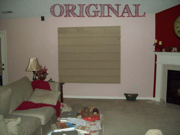
“This is the current look of our living room. Well the wall that the window is situated on anyway! (Please overlook the coffee table/ottoman. We were working on homework and I didn’t have time to clean up before taking a photo.) Anyway, I LOVE the blinds we have, but I am thinking that the room just needs a bit more. I am thinking curtains, but have no clue what to get. The wall colors are Abalone Shell (that pinky tan color) and Fireweed (the brick red color) both from Sherwin Williams. Accent colors in the room are Khaki, Red, and light Olive Green. I have talked to my hubby about it, and he doesn’t think we need curtains as well as the blinds. -D’Rae”

I know that D’Rae’s hubby was not keen on the curtains+shades combo…but I like it just fine. What I really wanna talk about is undertones. Sometimes – specific colors like olive and abalone shell can look fab in the store or by themselves but their undertones can clash so it is always good to remember that fabrics should be picked first and paint color picked afterwards. Combinations of different undertones can be a real designer danger zone. Changing the wallcolor or neutralizing the pink/green/yellow undertones by adding a white curtain to break up the combo can be just the thing to take this room into the land of Hue-tasticness.
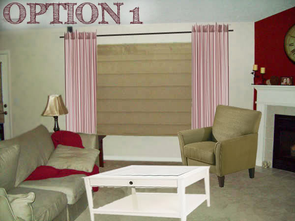
Option 1 is the choice that would require the least amount of purchases to complete. The existing wallcolor gets a redo with a nice creamy white. The white will eliminate the pink undertones from the room and allow the curtains to take centerstage. And speaking of curtains…I brought in the Ikea white & red striped curtains to add balance to the rest of the room. The red in the fabric really makes the red blanket and the red accent wall pop but doesn’t steal the thunder by being too bold. The neutral colored armchair will create a conversation area in this room and provides additional seating. Lastly, I brought in a white coffee table to bring some light into the space. Mismatching sidetables to the coffee table can be very appealing because it gives the sense of ‘collected furniture over time’ instead of ‘I went to Rooms to Go and bought this whole room’ feel. Designery devinery.

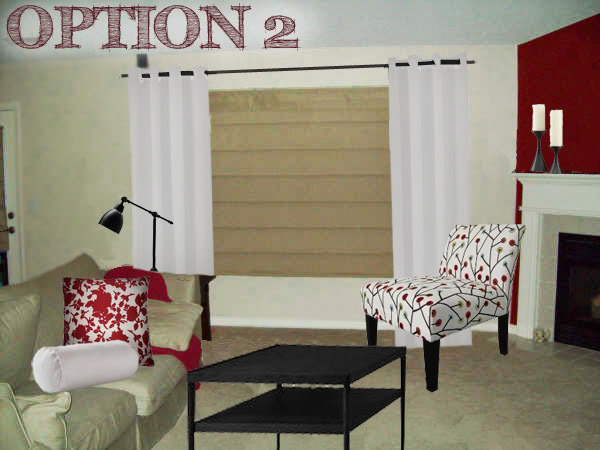
Option 2 is more young and contemporary. The black coffee table really stands out…and D’Rae could always stain her existing one darker or paint it to add depth. The Target chair and red pillow really add alot of pattern into the space…which is great because she didn’t have any interest before. The chair didn’t look right with the salmon-y walls so again, I changed them up to a creamy white. The white curtains are grommet style and I love the way they accentuate the horizontal lines of those blinds you love. And that black curtain rod really plays off the new lamp nicely. Lastly I added a few accessories to the mantel and a neck roll pillow that is great for the Sunday afternoon naps 🙂

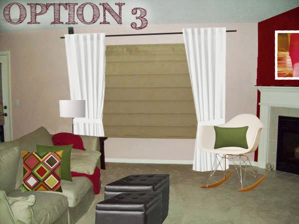
Option 3 is the modern, ‘who’s your daddy’ kinda room. The walls can stay the same…yay! And I brought in some modern art from Ikea that luckily incorporates all the current colors. The fun chair is a Eames designer knockoff but looks quite cozy in the corner. The metal lamp plays off the legs of the rocker but still allows a ton of light in with the drum shade (which I explained in one previous post how drum shades are GREAT for letting the light go round!). And speaking of light – the white curtains help neutralize the pink by giving the eye a resting place. The pillows add a little more piz-wow and are quite comfy looking at the same time. Lastly I switched out the coffee table for a couple dark hued Target ottomans. These are great for storage and will come in handy if D’Rae needs more seating.

So there you have it…three options for Miss D’Rae. Now comes your input. And this is my favorite part because you guys now have the power to persuade each other. By voting for an option, or making a constructive suggestion, or commanding that my advice be ignored immediately, YOU are influencing positive changes in someone else’s space. And D’Rae…you need to be under the influence pronto 🙂
Tell me…Which option would you not vote off the island?
A big thanks to everyone who sent me their photoshop requests. Even if I have not responded yet, I am working hard to prepare three options for you! Unfortunately, I am STILL SWAMPED with people who asked for a little photoshop magic of their own…so I am temporarily unable to take any additional requests. But no worries – I will make sure to announce in the little sidebar NEWS widget when I can take on your challenge! THANKS A BAZILLION! XO – Katie
Love love love option 2!!!!!!!!!
I like all three in that they speak to different design styles. It all depends on Miss D’Rae’s personal preference, but if it were me I’d go w/#2.
I thought I’d be voting for #1 for sure until I saw #2. LOVE IT! Pick #2, pick #2!
I vote for option 2, I really like the slipper chair and the pillows you picked out.
TWO is my fav!!! good luck keeping that chair clean what whatever monsters were doing their homework, though! Maybe room 2 with the chair from 1 for moms sake. Horray for photoshopping fun, Katie!
Option 2
When did Target get such great furniture? I’m dying for the chair from #2!!! Anyway… I like #2 with the lamp and ottomans from #3.
I love 2!
I’m lovin’ option two!
I’m a fan of option 1 – mostly because of the accent chair. But Option 2 is my 2nd choice – love the black coffee table and patterned slipper chair.
I really like option 3. Love the colors!
oh yea definitely option 2!! way cute!!
Love #2!!! BTW, I am blogging again!!! I missed it too much.
Option 2 is by faaaar my favorito!
I am also for option two! But it might just be because I am in love with those target slipper chairs (seriously, I can’t buy one because I change my mind about what pattern I like base on a hour by hour basis)!
Option 2!!
Yeah I gotta go with # 2 as well and it has NOTHING to do with the fact that my family room is red and tan. It’s the chair-pillow-table combo, it’s a winner.
Option #2! Maybe with a green pillow thrown in from #3 (could be a bad idea I just LUV green 🙂
I vote for number 3 because it doesn’t require repainting. I like the existing colors. White walls are blah.
I like option TWO! So fun!
Love the modern flair of option #2, although I would replace the desk lamp with the lamp in option 3#. Love that target chair!!!
Definitely option 2!
I love the second room. I think it looks great. I love the chair and the pillows. However, I am not crazy about the new lamp. I think the lamp appears to office-like.
option 2.
#2 is best no doubt. That chair is too cute!
I think I like option 2 the best because it looks so crisp and clean.
I love option 2! That chair is awesome. I like the lamp as well because it adds a masculine edge to keep things from getting too girly.
I’m liking option 2. The fabric patterns add just the right punch to the room. Great designs!
#1 is my fav – with a couple additions/changes:
L.O.V.E. the curtains in #1 – they make a great statement and go really well with the bamboo shades. Take the pillows from #2 and the lamp from #3 and you have a winner!!!
Thank you so much for doing this for me! I really like the look of 1st one, it is more our style. Now I just have to get hubby on board! Thanks again!
I really like option 2 but whatever you choose, please paint that pink wall!!
I love love love them all. This is some serious good photoshopping! 🙂
I think I like 2 and 3 the best, although i do love the table in 1! Hard choice!
i like #2 with the lamp from #3 and a maybe a mirror above the fireplace. super cute love your photoshop skills
I’ll take door number one, please! Since this doubles as a homework zone, the big coffee table will give them plenty of room to spread out and the drawer will hide supplies like pencils and paper.
Numero dos (2). Love the use of pattern, black, and the plain white curtains with the existing shade.
#2 is my fav! Love that adorable chair!!!
Option 2–followed by option 3. Great job Katie!
Darn but I love the curtains in Option 1! But overall I love Option 2 (me too with that cute chair!)… with an added wall art to the left of the windows that brings a touch of red to the wall.
I think I would like to keep #2 on the island!