When Crystal contacted me to spruce up her little brick ranch, I was bubbling over with excitement. Literally. I bubbled. Here’s her email:
“Katie, First of all, I enjoy reading your blog often, so keep them coming! Secondly, my husband and I bought a major fixer upper when we got married. The only thing I have never liked about our cute little house is the outside and curb appeal. Our inside is almost finished, but we’ve barely started on the outside. I have a few ideas (one included painting the brick which my husband vetoed quickly). As you can tell, a room was previously added on to our little home, and I completely despise the cedar….I’m always open for new (cost friendly) ideas! We have considered moving, but I’ve moved my entire life (being a PK) and I would like to stay put for several more years. Help us make our home more…..”homey”! 🙂 Thanks Katie! ~Crystal”
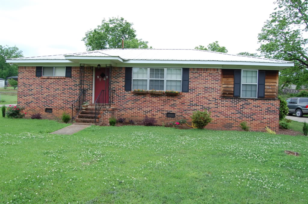
Well, Crystal, this homey has gotcha back 🙂 This fight is on. Girl, hold my earrings, I am knock this one out…cause I float like a butterfly, sting like a bee (actually not but nobody wants to hear that I float like a rock and sting like a slug…anyhoo). Here is the PK’s current abode…

Potential city, right?! This little brick rancher has potential spouting out of each grout line. But here are some of the things holding it back…
1. THREE WINDOWS VARIOUS SIZES
2. LACK OF LANDSCAPING and HARDSCAPING
3. CEDAR ADDITION THAT DRAWS THE EYE
So my goal is to address all three of these items in order to give Crystal an idea of how fabulous her home could be with a few minor tweeks.
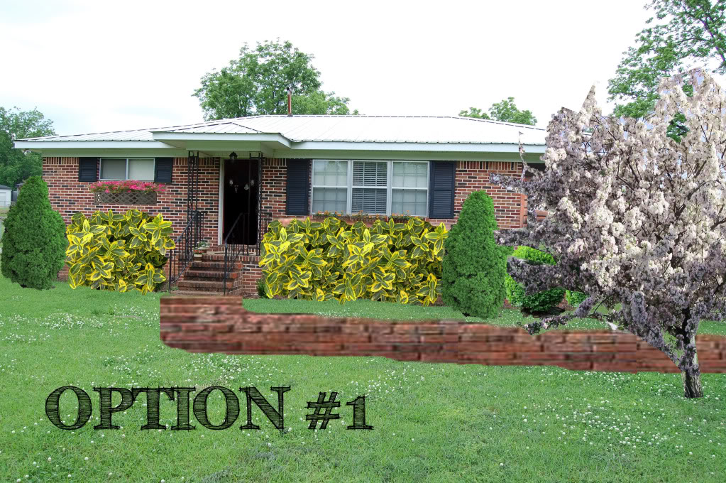
I decided that with all three options that Crystal needed bigger shutters and a new front walk. A walk made of cobblestone or brick or even poured cement would allow guests to have a clear path to the entrance. My photoshopped version is kinda janky but the idea is there nonetheless. I also included some colorful landscaping so that the front of the house could appear soft and welcoming. A windowbox on the far left window helps bulk up the size so that it balances out the large center windows. Note that you can’t even see the new addition because of that beautiful crabapple tree…if you can’t flaunt it, hide it, right??! Behind those blooms, the cedar gets a stain that is close in hue to the surrounding brick. Making the cedar the same color allows your eye to wander right past the differing surface and continue till it focuses on that newly painted front door. The color of the door could stay as-is but black would be the #1 option in my book because of the depth that it gives the facade of the house.

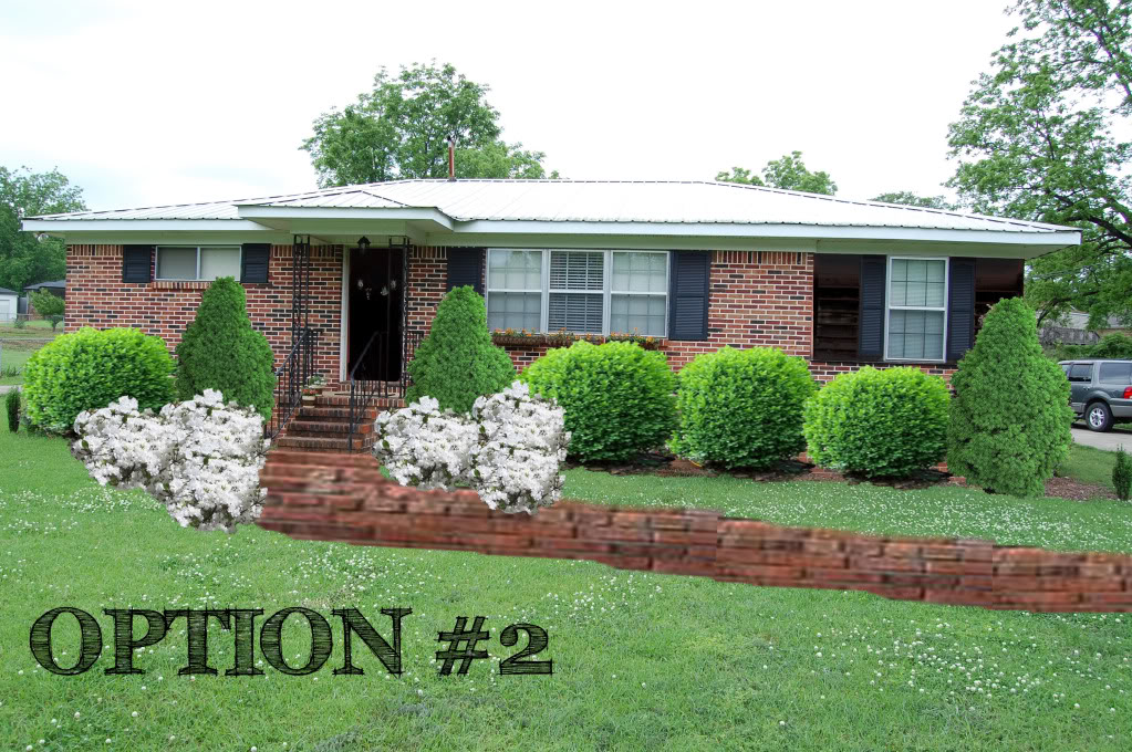
Option #2 is the most formal of the options. Staining or painting the cedar the same accent color as the rest of the house makes the cedar look like just part of a bigger shutter. And to balance out the darkness on the right side, we should really have a black door. The real difference in option 2 is the landscaping layout. The two dwarf alberta spruces on either side of the porch give the entryway more substance and combining the boxwoods with azaleas makes for a stately front walk.

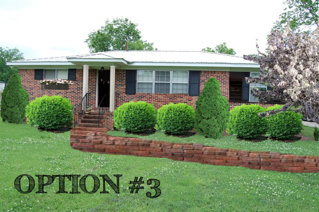
Option #3 is a combination of the two above. I added some porch columns that exude a colonial feel without the pricetag of a whole new porch. Traditional plantings combined with a quaint windowbox and a soft tree makes this one my favorite.

Now that the photoshopping fun is done, now comes your part – Which one would you choose?
Oh and if you want to see your own yard/room/house/boyfriend photoshopped with a few Bower Power enhancements – email me some pics at [email protected]
And I promise I won’t pull a Tyson and bite anyone’s ear off 🙂
#3, #3, #3!!!
Three, three, three!!!! I LOVE it! The dark stain on the cedar is genius, and the covered porch is one from my dreams. Plus, its functional as well as pretty!
I’m going with #2. The roundy bushes and the white things (this is all technical talk) go well together. Although I like the purty tree from # 3 as well. Combine em!
I would say, option 3 is definitly my favorite!
I think the columns really draw your eye to the
front door and not the cedar surround (yuck!).
#3! I love photoshop!!
I like #3 as well. The columns are SO cute! It absolutly draws the eye AWAY from the addition. I was thinking also there is the option of a trellis or two with a grwoing vine of some sort to cover the cedar part. That might cover it fster than the sweet little crabapple tree they will plant and wait patiently for! Great ideas as always!
As a side note- we have brown paint swatches on the floor and 3 paint colors inluding your sugestion on the wall to see which we like best! We are making progress!!
Three but with the pretty yellow and green bushes from number 1 instead of the boxwoods…
i really like the columns in number 3 and the bushes you added for number 2 – what huge improvements~ 🙂
Im torn between 2 and 3! They are both great!
Your reader totally has to show her hubby the painted brick at Chatting at the Sky. She painted her exterior brick and it is STUNNING!!!
http://www.chattingatthesky.com/2009/06/01/before-and-after-2/
Two is my fav!
#2 I love the white bushes at the curve of the walk and I like the right side of the house (as you face it) open and not obstructed by the tree. However… I think that the white columns would be perfect with #2!
I like #2, but I’d still put the crabapple tree in front.
Two Dos Deux – I like #2 🙂
Love option 3! The columns really make the porch stand out!
Katie, I totally recommend photoshopping the house painted white and letting the hubby see it… and trust me, painting a house isn’t that hard – I’ve been a part of painting the exterior of a house and while it’s not the most fun in the world it can make a HUGE difference! Just rent ya a spray painter and have at it 🙂
Otherwise, #3 is my favorite!
I would go with #2. Your eye seems to be more drawn to the middle of the house and the front door. And the bushes in the front just seem to pop.
I really like 3! Love the bushes but can she still have the adorable flower box???
Option #3 – love the columns and the tree!
I like option nr. 2 the most! It looks clean and homey! Kudos for the photoshoping Katie!!
Crystal stated she was a PK. Can someone please explain what that is?
Hey Mary – I could be wrong (like a 99% chance I am incorrect) but I think that PK means pastor’s kid. Or it could mean psychokenetic….or prekindergarden….I guess Crystal will have to clarify it for us 🙂
XO – Katie
Yep, I’m a preacher’s kid! I’m glad to be in one place for now! Thanks so much for your hard work! I will definitely have to send you some after pics when it’s all completed. When you emailed me back about the back yard, you never mentioned what color the garage should be. Should I paint it white again? Thank you, thank you, thank you!
P.S. I’m tempted to send you pictures of every room in my house! You’re pretty good at this! 🙂
#3 all the way. Could she replace the iron railings with white wood to match the columns? Or just paint them white? Seems like the more attention you draw to the front door the better. Katie, you did a great job on this. So are you running a consulting business now like TYH and The Lettered Cottage? If you aren’t, you should!!!
Torey you made me all blushy. You sweet thing you. But to answer your question – nope…no consulting business…just a nerd that has too much fun with photoshop and home decor. However…if you wanna send me money, I won’t chuck it out the window or anything. I really enjoy seeing befores and afters and this way, you readers can get in on the action too! Fun for everyone, right?!
XO – Katie
I love option #2~And I feel her pain on needing landscaping 🙂 I’m still waiting on you to come south about an hour Katie to help me 🙂
I love option number two!
so… where do we send the e-mails of ugly house exteriors? We’ve been kicking a on the inside of our ’55 ranch, but the exterior looks like the founders of a geriatric sailing club painted it! I’d love to get some feedback about it. I have an idea but no photoshop skills to try to make a mock-up.
Hi! Are you still willing to accept pictures and photoshop them? We have a brick ranch as well and I am stuck. I know I want something new and reasonably priced on the front. Just not sure if that will just be adding hand rails or if we should add a larger wooden porch. I stumbled across your page was curious! Thanks!
I don’t. Sorry! My friend Chelsea did it for a while…you can email me for more details.
xo – kb