Photoshopping is absolutely a blast when the smallest changes can perk up a room or an exterior. So I can say without a doubt that this was one of the easiest photoshopping experiences because all that Cassie requested was a little hue info. Here’s her note:
“Hi Katie! I absolutely love your style and sense of humor and am so gald to have found your blog. After reading your blog entry about painting your house and helping Crystal with her curb appeal, I thought you might be able to help a girl out. My husband and I just bought a new house that is painted in less than ideal colors. We don’t really want to paint the whole house yet (we’re going to add on a porch at some point and will repaint the house then), but thought you might help give us some ideas for the doors/windows/shutters that might make our yellow-y house a bit more tolerable, perhaps even stylish. The house is currently a yellowish tan color – applesauce, maybe? – with a hunter green front door and garage doors (on the back side) and brown (yes, brown) shutters and creamy window sashings. I would love it if you could help us infuse a little Bower-style into our new place. Thanks! -Cassie”
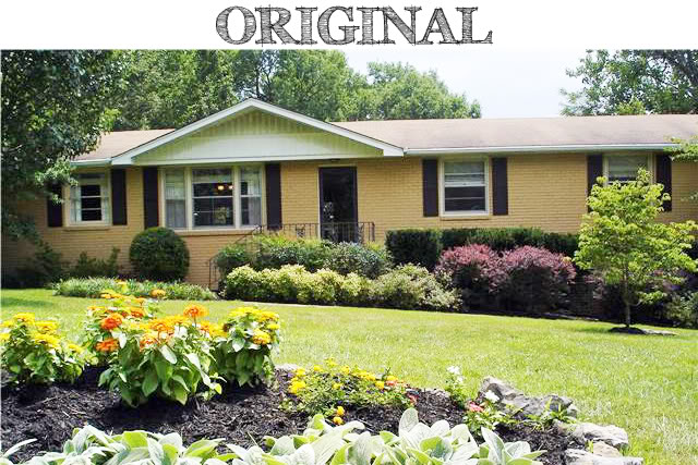
So let us take a peek at the current paint situation:

When I started this wee project, I changed the shutters and the door color but I also spruced up the trim and added an exterior accent item. Let’s call this house Britney…the accent item is Brit’s dad. The addition of the accent piece would allow the house to have a little more balance. At least on the exterior. So basically the balance will allow the front door to be the final resting place for the eye…although I must admit, I wouldn’t mind looking at that yard all day. Cassie’s landscaping is better looking than Ms. Spears’….not that I ever looked 🙂
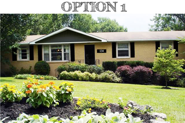
Moving on. Option 1 is the most masculine option. It starts with changing the green door and brown shutters for a black finish. Also, to make the black really pop and make that applesauce color look more crisp, I added paint to the exterior trim with a bright white. The interior alcove of the porch overhang is filled in with a dark gray. And to balance out the dark ‘triangle’ I added a number plate with white digits so that the friends and family coming to visit Cassie’s new home will absolutely know without a doubt which house is hers.

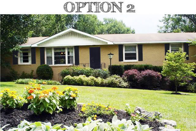
Option 2 is what I call sea-side funky. Again I painted the exterior trim a bright white and played up the white since I brought in a dark navy for the shutters and door. The blue is a cool based hue whereas the yellow has warm undertones so the pairing should give an overall neautral look. The accent piece is a solar-powered lantern that can be moved later when the porch gets the re-do. And Cassie’s guests with poor night vision will thank her when they need to navigate the entryway.

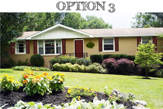
Option 3 is the boldest of the ideas. The two-toned brick red shutters & door really add interest to the facade of the house. And the bright white trim goes one step farther with a new front door encasement that will make that red pop. Doesn’t the applesauce color almost seem like a neutral here – almost tan? Ok – and here is one last idea that might toot Cassie’s horn – painting stripes on the inside of that overhanging will give the home some height (and isn’t that on every ranchs wishlist?!). Throw an accent fern on the right hand side of the door and have a very warm and inviting exterior for cheap.

There it is. One rancher with a little hue redo. So now it is up to you beautiful readers for your input. Do any of the options appeal to you? Which one and why?
And for your own photoshopped options, email me some hi-res photos at [email protected]. Oh and just as a little heads-up, there is a wait time of ten days right now for your results. So if you emailed me ten days ago…thank you so much for your patience…I am working hard on making your photos look freakin awesome and will talk to you soon 🙂
I’m loving 3, with the black detailing on 1 bringing it in a close 2nd. Good work, Katie!
i like #1 – great idea painting the top peak
I like 1. I think the black modernizes it.
Thank you so much, Katie! I am thrilled with the options you have given us. The hubs and I are duking it out over option 1 and 2, but every time I look at number 3, it grows on me. I’m interested to see what others think.
Oh wow… this one’s a toughie. All three of them have their redeeming qualities but I think that I’d like the fun that #3 brings. And yes, the applesauce does become a neutral. I likey.
Cassie – I am so glad that you are happy with the options. I think it is absolutely wonderful that you guys are planning on touching up the colors of the house even though you have a huge facade makeover in the plans. Most times people leave it alone and four years later, the neighbors are still looking at the same exterior. You deserve a pat on the back for taking action even though bigger and better is in the future 🙂 Can’t wait to see whatever you choose!
XO – Katie
I vote for # 1, I think the gray alcove makes a big wonderful difference…
#1 is my fav – a perfect balance opf colors! Just lovely : – )
I love photoshop fun!
Love option #1…the gray looks sophisticated with the brick.
Totally digging #1 – the black upper triangle really makes the difference for me. Love it!
I love the black!! You are a SUPER photoshopper Katie 🙂
I looooove #3. Great job!!
Add the great lantern to #1 and it’s perfect. Love what the black + gray does to the house. And I love the accent house numbers – helps balance and focus on the door!
I really really like #3. So bold and cute and different.
But #1 is super classy!
Tough choice…
#1 ROCKS MY SOCKS!
And if she didn’t want the number plate, I think the hanging fern would be an amazing alternative.
Number 1 all the way! Love how the gray alcove makes the rest of the exterior pop!
I love #3… the red gives it an unexpected punch of color. Good job Katie! and I am envious of that awesome landscaping!
#1 ROCKS MY SOCKS!!
And if she doesn’t wanna use a number plate, the hanging fern would be an amazing alternative.
Option#2 but add the fern – love my ferns!!
OPTION 3 minus the stripes. It looks so cozy.
#3 all the way.
I think there are too many shutters. I would leave the picture window without shutters, or go to like a canopy there. Also, make the door a different color than the shutters.