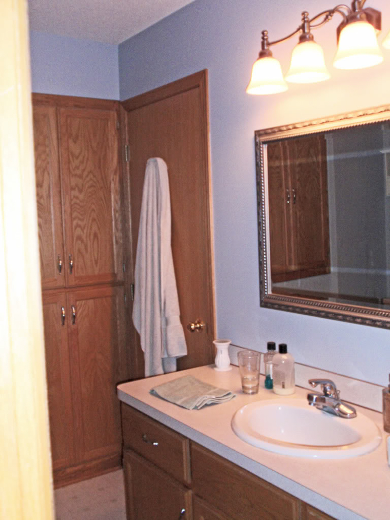
Anne was uber-enthusiastic about getting her bathroom photoshopped into three different scenarios. Here’s her note:
“Do me, Do me, Do me! I love your new photoshop posts. Such a great idea! Our bathroom has been a struggle for me since we bought our house 5 years ago. The mirror & light fixture are new, so I would prefer that those stay. I would be willing to paint the room, paint the cabinets, and/or replace the vanity. Plus, replacing the shower curtain is a must! Please help with suggestions. Thanks, Anne”
Well Anne, struggle no more. I am here to help with three options that incorporate that mirror and light fixture while adding a little pizzaz to your formally builder’s basic bathroom space.
Since you can’t see the shower curtain in the original photo, I took the liberty of just adding a bit of it along the left hand side so that she can see all in one picture how the options would incorporate the new purchase (that Anne called ‘a must!’).
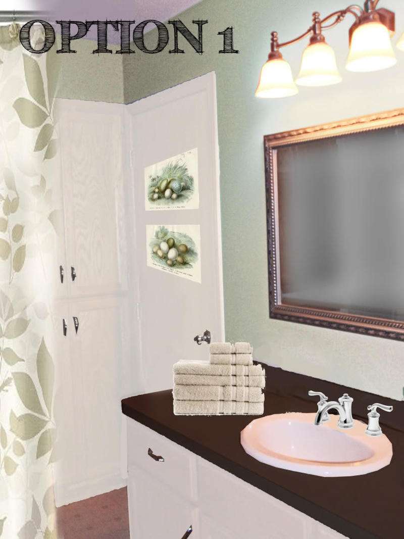
Option 1 is the Covergirl option…you know, easy and breezy 🙂 The cabinets and the trim and the storage doors all got covered with white paint…I didn’t see any windows in her bathroom and I want to ensure that this space feels clean and bright even without natural light. The white is really nice with the any of the options, so I would recommend that Anne go for it first thing. The shower curtain is a subtle and beautiful way to bring in pattern. I love the leaves. Love. And since the shower curtain is so beautiful, the other colors for the room are sprung (spring? sprang? sprat?) from there. Taking the light green and applying it to the walls will really play off of the new countertop…which is a rich chocolate brown. Light stone colored towels hide any residue from those late night face-washes. The uber-cheap art on the door can be framed and hang on her door or even on the wall on the right side of the mirror. Lastly, Anne’s faucet gets a nice upgrade to a finish that will match her existing mirror and light fixture. Nikki Taylor, watch out.
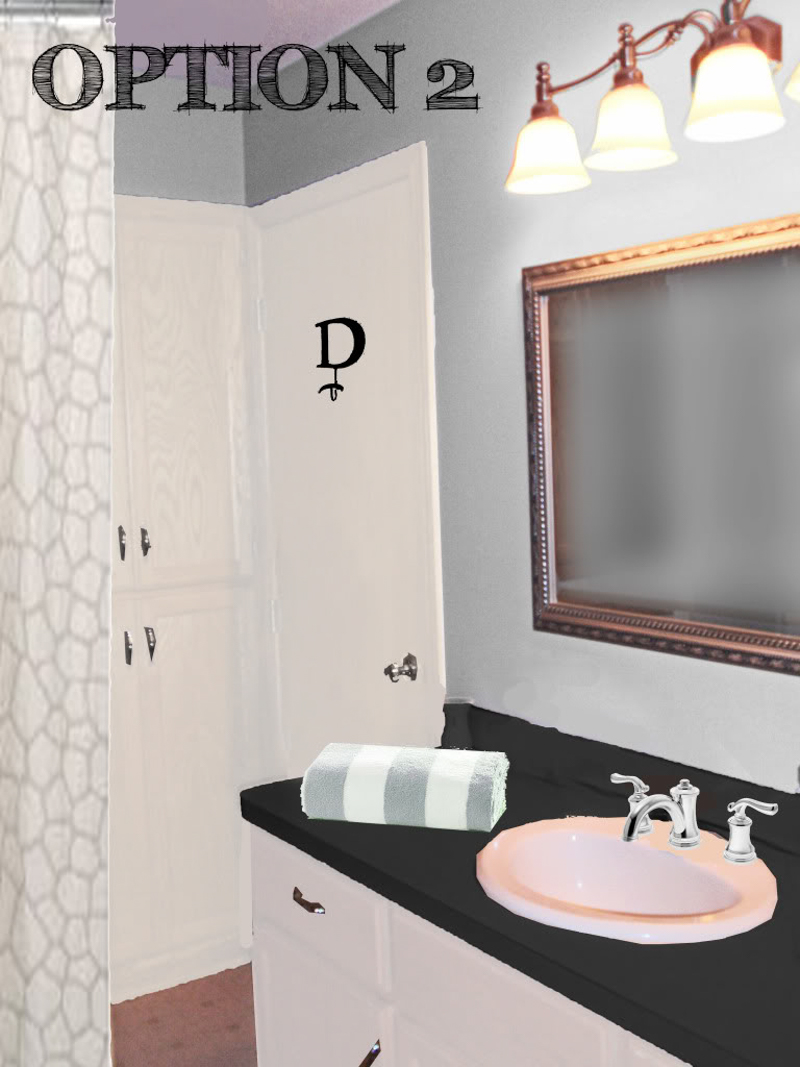
Option 2 is my favorite…mostly because I adore blue bathrooms more than Michele Obama likes JCrew. The pale blue walls are set off by the dark slatey gray of the laminate countertop…which is also reflected in the dark color of the monogram hook that will hang on the white door. Even though the hook will need a coat of spray paint – in the end the simple letter will personalize the space without getting too personal. Afterall, nobody wants to be sitting on the pot and see a photo of Anne staring back at them. It can hold things up, if you know what I mean. The striped towels which can be mixed and matched with plain blue or plain white will be a nod to the nautical side of things. And just for additional pattern, I chose a fun and subtle giraffe patterned shower curtain (now available only in beige) to spice things up a bit.
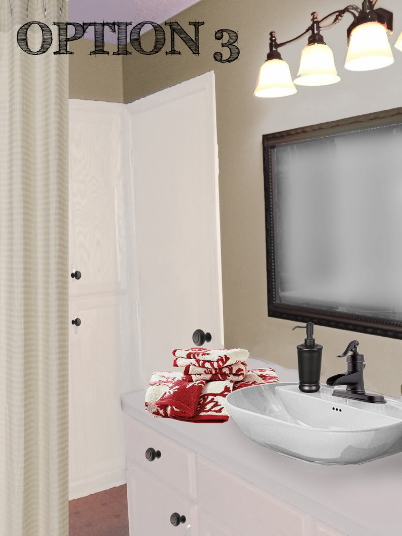
Option 3 shall be called ‘wombly warm’. And it is, no? The simple change of the walls to a warm neutral color will help make this room feel updated and take the chill off. The new laminate countertop will be host to a raised bowl sink that has oil-rubbed-bronze accents. Since the dark faucet looks best with the tan walls, I changed out the knobs, the mirror and the light fixture as well to reflect our new palatte. A few simple coats of spraypaint can take her nickel finish to a rich bronze in a matter of minutes. And the neutral hues continue with our simple waffle shower curtain in khaki. Lastly we pop some color in there with the coral inspired red and white towels…which are SUPER because if Anne does wanna trade red for orange or blue, it will be as easy as switching her towels.
So there it is – a simple makeover that requires a few purchases and a couple buckets of paint. Isn’t it amazing what a coat or two of paint does for those cabinets?! Holy-add-value-to-my-house-batman!
Now it’s time for your vote – which option would you choose? Does #1 make you feel easy and breezy? Or maybe it is #2 that really takes you out to sea…surely #3 doesn’t leave you stopped up (heehee!). So squeeze out a comment letting us know what style is really your floater…your boat floater that is 🙂
A big thank you to those of you who sent in their photoshop requests. I am working hard to prepare three options for you! Unfortunately, it takes me a little while to comprehensively compile options for people – and I am STILL SWAMPED with people who asked for a little photoshop magic of their own…so I am temporarily unable to take any additional requests. But no worries – I will make sure to announce in the little sidebar NEWS widget when I can take on your challenge! Right now I estimate that I need one to two more weeks until I can take more requests. SMOOCHES! XO – Katie


OOhh I like all the options but I love #1!! I love the fresh green and brown countertops! Very easy breezy!
Also did you know rustoleum has countertop paint!!? I mean not for the permanent fix but for the ‘tide you over till I can fix it’ fix I think it’s a great solution! Just thought I’d share!
http://www.rustoleum.com/CBGProduct.asp?pid=208
Great looks as always!!
Can’t wait to see what she picks! And what about afters?!! Have we seen any afters from your photoshopped fun?!!
Come one people! Share your afters!!
That is a tough one. They are all great. But I think I agree about the blue and #2. I would have to pick that one.
I’m loving option #3. Classic and cozy. Those towels are awesome, but if they go out of style it will be so easy to change the towels to something new.
Me? I’m going with # 3. I heart waffle shower curtains and the option to change out the towels for another look. Plus, have I mentioned that I love red and tan together? Mac and cheese, bacon and eggs and red and tan…and really, who doesn’t want to do their business in a womb?
#2 is beautiful!
Gah! We can only pick one? I love all three choices! #1 feels the most spa-like, which is what I look for in a bathroom so I suppose that’s my vote. Good luck to Anne!
I like elements of all three. I love the color scheme od option #2 – who doesn’t love blue in the bathroom. I think option #2 should be combined with the raised bowl sink in option #3 and some bold graphic artwork placed in the same location in as option #1. Great work, Katie.
you should really start charging for this
I like them all a lot, but I’m drawn to #2. Great job, Photoshop wizard.
i love the option #1, but I also love the brown and red on option 3, i would personally choose 3! I love natural colors 🙂
love them all but my favorite is #1. Maybe it’s because I have that shower curtain in my hall bath and it is BEAUTIFUL!! Love the egg prints, too.
I really do like all of them this time, but I’d go with #1.
I’m extremely in love with option 3 – it’s like you read my Master Bathroom mind. Outta curiousity – is the color you used on the walls based on an actual paint swatch? Because I LOVE it!
I think I like option 1. It’s my fave, and seems to be the easiest transition with the biggest change. LOVE it!
Definitely Easy Breezy–so serene!
#3!! I like them all, but No. 3 is definitely my favorite. Love the warm neutral walls and shower curtain. Very timeless color palette. And the modern sink is a nice touch.
I really like option 3 the best!
Option #3 is wonderful. Also wanted to mention that I love the monogram hook. I bought almost the exact one (actually several of them)on sale at Hobby Lobby this week for $4. Cheap and cute!
I like #1. That shower curtain is too cute!
A mizture of 2 and 3. I would keep the sink hardware in #3 but change the walls to #2’s blue.
#1 for me because I am IN LOVE with that shower curtain!
#1 (but with that awesome sink from #3)!
i like 3#!!
Option 3 for me! Love the punch of red.
My vote is for 3.
#3 is my favorite. It is right up my alley with the oil rubbed bronze and neutral colors.
I love version #3. All are great choices though!
http://www.thesouthernnest.blogspot.com
For the first time ever I cannot even tell you which is my favorite! I literally LOVE them all! Which one did Anne choose?
Love #2 but with the lights, mirror and sink in #3 – love the darker colors of these with those gorgeous blue walls!
I think green walls are the way to go with the new mirror and light fixture that are staying. So option #1 or #3 in my humble opinion. 🙂
I’m feeling #1 – I also really like the shower curtain and love the art on the door. It looks like a very relaxing bathroom! And painting the cabinets white is a must.
Tough call, but I like #1 the best.
I love #3!!!