Photoshopping is a great way to see what a piece would look like if you changed the color or hardware, added decals and adornments or even just added fabric or accessories. So naturally I was pumped to take a break from exterior photoshopping and come inside for a bit of furniture fun. Here’s Amy’s note –
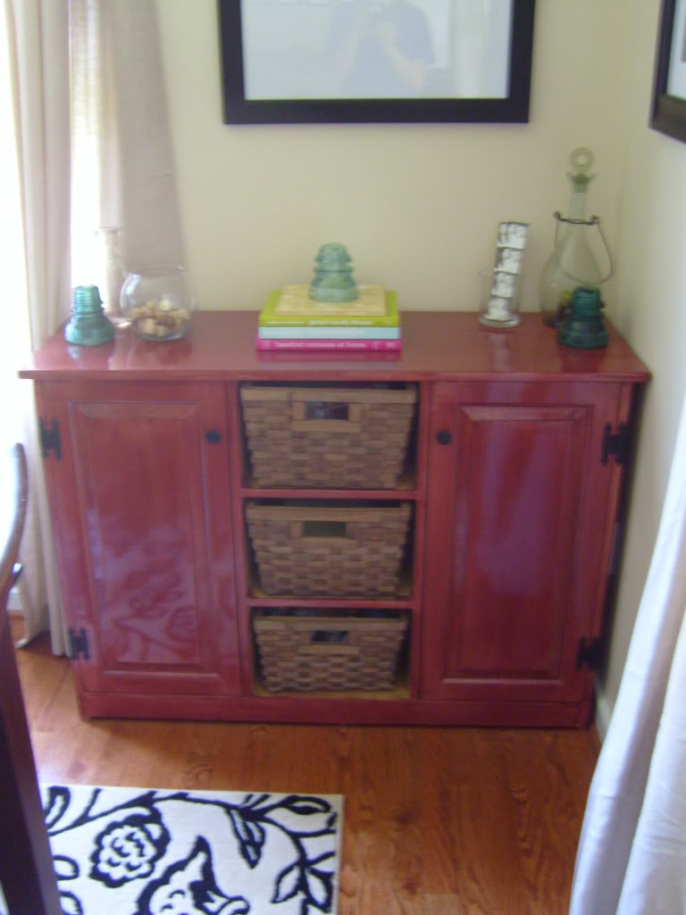
“Hi Katie, Love your blog, you crack me up! I figured I would see if you could help me out with this buffet I’ve had for quite some time. It started out white, but with that worn, unfinished look… a little too country for my taste. So, I stained it a dark cherry color about a year ago. Now, I know I want to do something else, but not sure what. I was thinking of painting it an off-white creamy color and then painting the inside of the shelves (where the baskets are) a bright color (maybe green? or turqoisey-blue?). I’ve also thought about painting it all black. The baskets could be spray painted as well, just not sure what color. I have attached a picture (sorry for the blurriness).Thanks for any suggestions you can give me!! Peace and bacon grease! 🙂 – Amy”

Well, Amy totally had me at bacon grease…so I knew that I would need to provide some ideas for a cabby-redo. Let’s get to it.
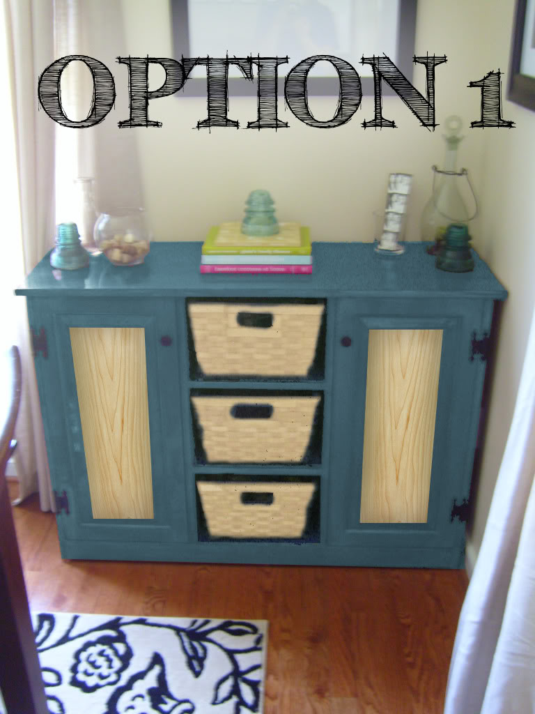
Option 1 is the loud funky cool option. The color of the cabinet has been changed to a fun blue that plays off the glassware that Amy has displayed on top. The baskets are a birch color (or they could be spray painted until reaching the desired hue). The funky flava flav is the wood veneer that I attached to the front of the doors. This is a spin on the idea of adding a fabric or paper accent to the door fronts. Very artsy and modern, no?

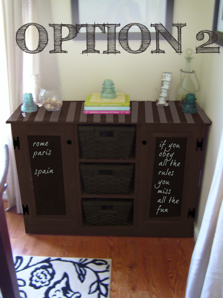
Option 2 is what I like to call subtle funk. The monochromatic color palatte will really work for Amy if she plans on doing a subtle design to add interest. I would recommend that Amy chooses one or the other flavorishous ideas shown here – either the chalkboard doorfronts or the pattern painting on the top. Stripes either fatty or pinstripy, or even this chevron pattern would look awesome (I want to do the chevron pattern REALLY bad…I love it that much). Either way, the baskets practically disappear when you change the color to all a nice dark chocolate brown…and that corner of the room will look very grounded.

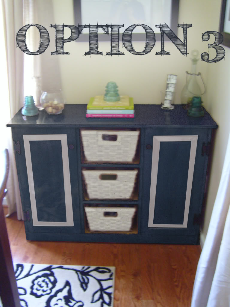
Option 3 has a very nautical feel. The not-quite-navy-not-quite-royal blue is really nice next to the rug and plays up the bright accessories without an ounce of dowdiness. The white baskets and trim detail really pop with their new lightened color. The best part about this option is that Amy can change the inside of those cubbies to an accent color if she wanted to add a little more of a funkeriffic seaside feel.

Well, there it is folks. Some fun and funky ideas for a fabulous cabinet makeover.
What option would you prefer? And tell me…have you used chalkboard paint or painted a pattern like my beloved chevron or even applied wood veneer on a piece? Please share all the details – and provide any links if you got them!
A big thanks to everyone who sent me their photoshop requests. Even if I have not responded yet, I am working hard to prepare three options for you! Unfortunately, it takes me a little while to comprehensively compile options for people – and I am STILL SWAMPED with people who asked for a little photoshop magic of their own…so I am temporarily unable to take any additional requests. But no worries – I will make sure to announce in the little sidebar NEWS widget when I can take on your challenge! Right now I estimate that I need two more weeks until I can take more requests. THANKS A BAZILLION! XO – Katie
Love option two with the chevron print!
oh i really love option 1! way cute!
I would do option #1 but with the chalkboard fronts of option #2. I would also paint the baskets a nice dark brown. Or you could just leave the cabinet fronts painted in that blue color and paint the baskets brown. That would also look good. Good job Katie!
I think #1 …. to me, it really brings out
the rug – I actually had to scroll back up to
make sure you didn’t photoshop it in!! I’m just
unsure about the wood veneer, I’ve never seen it
done before and wondor if it’ll look just as fab
painted a creamy distressed white where the veneer is??
Either way, love all the different designs, can’t
wait to see what mine looks like 🙂
Option 2 – love it!
Option 2! Love the chevron pattern!
I think I like #2 the best.
To date, I have not applied veneer, chalkboard paint, or a pattern to furniture.I tend to change my mind a lot, so I try to keep pieces that take a lot of work simple.
This was a close one for me. I’m very torn between #1 and #2 but I think #1 takes the win. I just love the pop of color and the brightness it brings to the corner.
I do love the chocolate brown, though, with the chalkboard paint. That’s always a fun accent. I painted the inside doors of my bar cabinet with chalkboard paint and just love it. Here’s the link:
http://loveleehomemaker.blogspot.com/2009/05/welcome-to-my-home.html
Fantastic options! Do they ever tell you which one they choose??
I actually just painted the chevron pattern on a tray! LOVEE it! You can see it here:
http://cprojectpretty.blogspot.com/2009/07/diy-chevron-tray.html
Oh my, I love all 3 options. Im really loving the brightness of the first one, the chalkboard paint of the second option, and color of the third option.
Such a hard decision! This is going to require some discussion with the husband! I will be sure to send you “after” pictures when its done!
Thanks so much for your hard work Katie!
I’m not loving #2 (sorry peeps). #1 stands out for me – love that turquoise blue color.
I’m going with Option 3. The color is SO rich, I just love it.
Option 2! Absolutely beautiful. Good job Katie! (My second favorite is option 3)
My house came with a door chalk board painted and it works great. Though I do hear it takes a good amount of coats but on something so small that shouldn’t be a problem.
Love all three options but hope she goes with something like the first. Quickest of questions – what is the font you have used on the photos?