Let’s face it, our husbands/boyfriends/roommates can’t always climb into our head to see our vision for a completed room. Don’t blame yourself. You are perfectly communicating. No one would ever question your integrity. You are gorgeous and lovely. You are smarter than the average bear. People are very attracted to you. Both inside and out. (This pep talk was brought to you by Mariah’s personal assistant…how else could Mimi think a micro-mini is appropriate in public after the age of…well, birth? WAIT – is that what ‘Always Be My Baby’ is about? Interesting. P.S. Mariah – I love you my sweet butterfly!)
ANYHOO…
Dreamlovers need a little push in the right direction sometimes – they need to SEE the results with their own peepers. That is why I do Photoshop Fun – a little virtual visualization for your room….or Aimee’s. Here’s her sweet note:
“Hi Katie! My name is Aimee and I am from Ohio. I have been reading your blog since my maternity leave in November. I love all of your posts, especially your recent photoshop fun! I was wondering if you would be available to help me. My husband and I recently redid our TINY bedroom. I attached a BEFORE photo and an AFTER. We have no decorating sense, but we do know that we want our bedroom to be simple and “clean”. Enter BOWER POWER. Could those powers help photoshop possibly throw in pillows and/or wall decor? As you can see, we need some help and some inspiration! Thanks, Katie! Keep the great posts coming… 🙂 -Aimee”
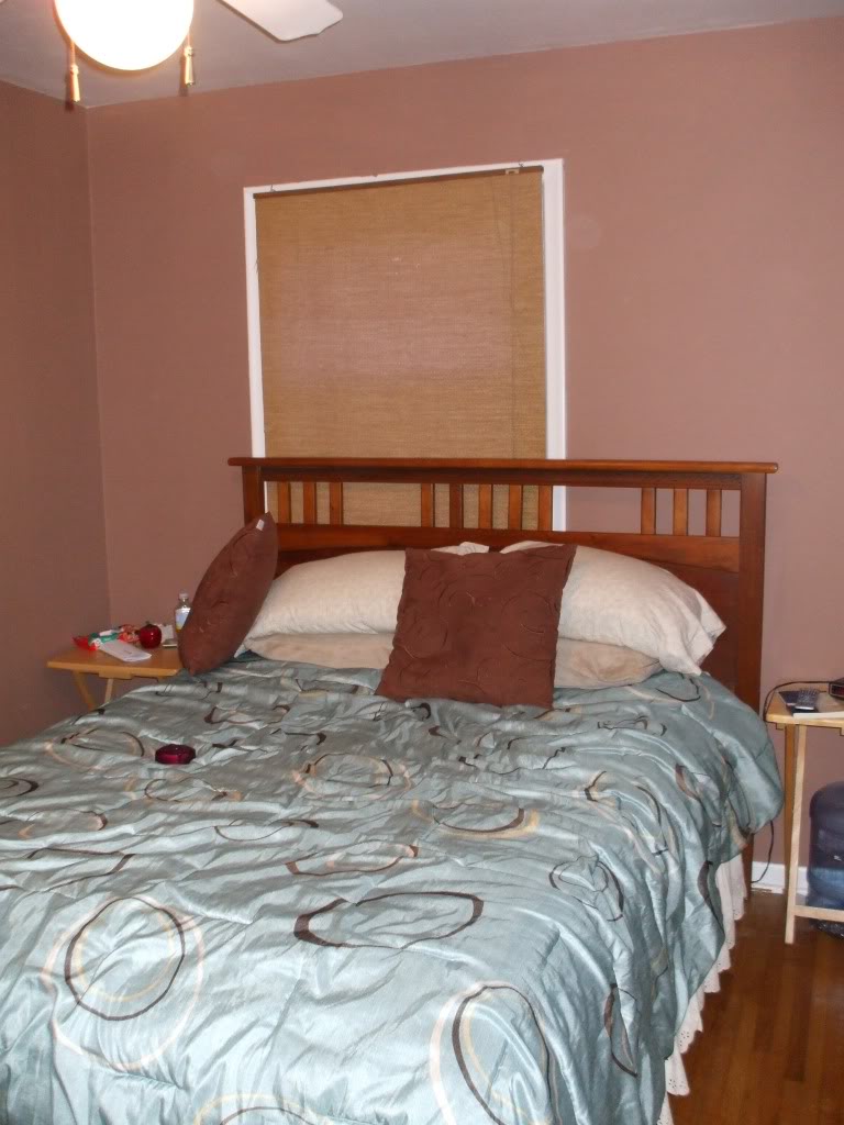
When Aimee wrote that they had already started their bedroom makeover, my heart glittered with joy. Just check out the before:
and the after:
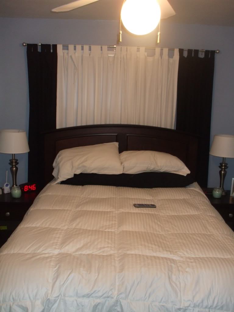
Pretty outstanding right? She upgraded to a new bed, got some neutral linens, included matching side table lamps, and was even able to use curtains to hide a wayward window. So now Aimee wanted to finish off the room to create a cozy abode to snuggle that new baby in…so I doctored up some options. These three versions are chock-full of IDEAS for a bedroom with an off-center window, different styles, and different emotions. So buckle your seat belt, here we go.
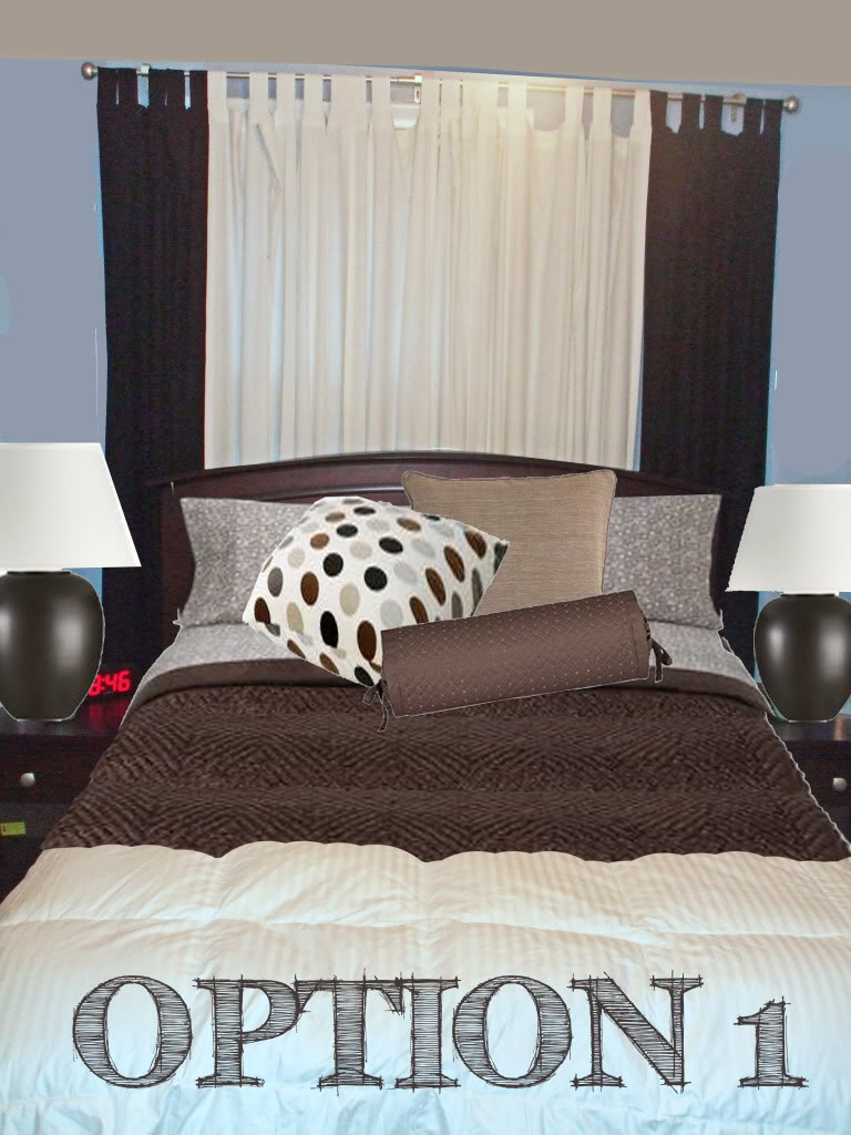
Option 1 is the easiest option. Basically I added brown to ground the blue walls. The curtains are playing a vital role by covering up a offcenter window (similar to what we did in our master bedroom) and faking out the eye. I would recommend that Aimee take her curtains and raise the bar up REALLY high next to the ceiling so that she doesn’t cut the room in half…but instead create the illusion of a huge headboard. The brown bedding will help break up the lots of white that is going on with the bed linens…and will perfectly accent the brown lamps (which happen to be on sale right now). Our inspiration piece is the pillow which has the slatey gray, brown, white, and black…combining our color scheme into one singular item…and playing up the cozy factor with the other light brown and bolster pillows.
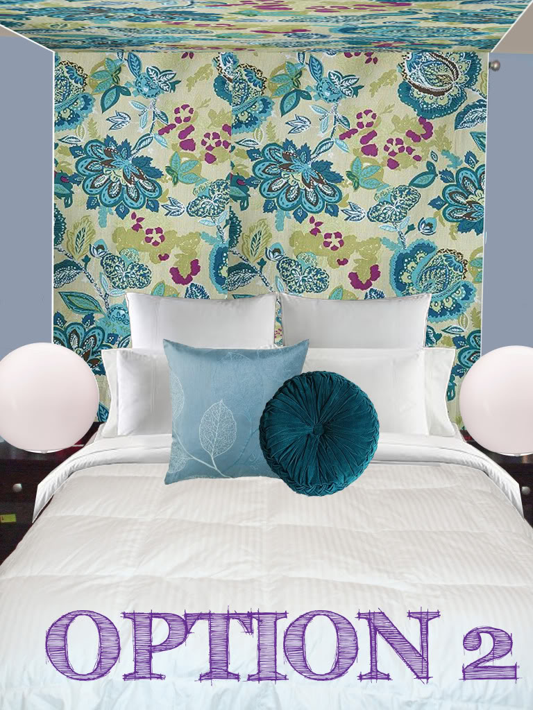
Option 2 is loud girly fun…while still keeping the clean part (maybe I fudged on the simple!). The existing bedding stayed the same…just with a rolled down comforter and a couple euro pillows and a couple standard pillows in matching white linens. Isn’t it amazing what a difference a little turn-back makes?!?! The crowning glory is a faux canopy. Kinda like this but with funner fabric 🙂 And speaking of fabric – the beautiful girly drapes contain our color palette for the rest of the room. The blue pillows play off the hues and add texture. And the round pillow is a mimic of the round modern lamps and the curves that are in our flowered fabric. Funner than Nick Cannon, right!?!
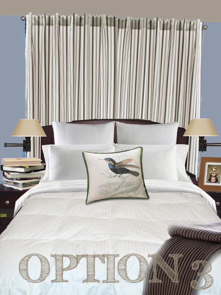
Option 3 is the most masculine…with a very Pottery Barn esque feel. The white bedding stays the same as the fem fatal option2 except now the room is gorgeous for both the male and female that sleep here. The back linens help elongate the room and really play off the color of the walls while not taking over. And the drapes will hide the base of the swing arm lamps that I photoshopped in. Since this is a narrow room, nightstand space is precious real estate…so free some up with wall mounted lighting. The pillow and the throw bring a little rustic feel in but really the room is primed for any combination should Aimee prefer a pillow she spots in the future 🙂
There she blows. Or doesn’t blow. You decide.
What option would you prefer?
A big thanks to everyone who sent me their photoshop requests. Even if I have not responded yet, I am working hard to prepare three options for you! Unfortunately, it takes me a little while to comprehensively compile options for people – and I am STILL SWAMPED with people who asked for a little photoshop magic of their own…so I am temporarily unable to take any additional requests. But no worries – I will make sure to announce in the little sidebar NEWS widget when I can take on your challenge! THANKS A BAZILLION! XO – Katie
Definitely number 3. It’s crisp and clean, slightly unique, and not too girly for the man. 🙂
I love the canopy idea in option #2, although pesonally I am not sure I could live with that fabric (love it for a pillow or something small, but not for something sooooo big). Option #1 seems the most ‘homey’ and ‘live-able in’ to me. Not too keen on the lack of color in Option #3. Great work, Katie!
This is an easy one for me – #1!!!! Calm, cool, and cozy!
I vote for # 2. That fabric is awesome; I love the blues & greens with the existing white comforter. And a faux canopy will totally impress people…do it!
Katie, when your time allows… I have been thinking about going brunette and I am a bit timid about losing my golden locks. Can you Photoshop me brunette to see if I’d be as smokin’ hot as you before I make my appt?
Just a thought! Thanks, Chelsea
By the way I prefer option #2 since nothing is sweeter is than a cool blue!
Option 2. But maybe it is too girly for my husband.
Sure Domesticatedbliss…send me a high res photo and I will see what I can do!
XO – Katie
3 fo’ sho’!!
Option 2 Is my favorite 🙂 (Minus the circular modern laps)
After that I would say option 3. But I so love option 2..so love it…
Definitely #3. Great job, Katie!
two is most definitely my fav! but i think three may be most practical.
Pre-married days I would have stolen option 2 for my own girly boudoir…but that would be waaaay too feminine for my hubs now. I love option 1 except the lamps are a little heavy for me, also love option 3 (especially the lamps) except maybe some different pillows for a little more pop as another reader mentioned…GREAT JOB!!! So basically I love all 3 on this one and am no help….can’t wait to see what you pick Aimee!!
Option 3 is my fav. It looks so clean and neat!
i LOVE the curtain behind the bed!! we dont have an odd window behind our bed, but our bedroom (rented house) is paneled, i DETEST it, but we are not allowed to paint it. something like that would really help to bring some light into the darkness and break up the god awful faux wood crap. i also love the canopy idea, but wouldnt work for me as we have a ceiling fan right above the bed.
OMG – I think #2 solves a problem in my guest room! That would be the problem of the small room with dark chocolate paint that my husband insistend on. In fact, the green version of those curtains would be perfection. Woo-hoo!
# 3 I just may steal this for own room!
i love them all!! FABULOUS! but i think i like #1 best! i love the clean lines and look!
I like it when it’s easy. Option 3!!!! I want a bird pillow like that so much, even though I don’t know where I’d put it!
Number 3 is the one I would go with. Very chic.
Number 2 is my favorite but 3 would suit the husband better. Love your blog!!
Carole
I’m thinking #3 is the best. Although I love the idea of #2, I too am the notsoproud owner of a tiny bedroom and I think the faux canopy thing might actually make the room look smaller. So I say stick with #3 (love those smaller swing arm lamps).
Wow ya’ll…this looks like it will be a close one! Love your input…and I am sure Aimee does too! Keep it coming and let’s see which option wins out!
XO – Katie
#3 without a doubt! Love it 🙂
I really like the classic pottery barn look of option 3. Cant wait for you to be able to take on more photoshopping fun. Have a great day!
So cool! Im thoroughly impressed with your photoshop skills. I really like #2 with #3’s lamps.
where is the brown tweedy throw on option #1. i didn’t see it listed, but i LOVE it, katie! don’t you just love perusing your favorite sites for things you missed? such a fabulous blog, you have here, my dear
Hi Jenn – I believe that the blanket was a Crate & Barrel find – however, I don’t seem to be able to find it now that I am looking. They do have a nice alpaca throw that would work just fine for a twin bed and has the same texture (although smaller in scale):
http://www.crateandbarrel.com/family.aspx?c=1465&f=24376
Hope this helps – and have fun blanket hunting 🙂
XO – Katie