The day is here! We are revealing the Pedraza’s laundry room and I am super excited about how it turned out. I know. I say that about just about everything so just imagine me NOT exaggerating this time and being REALLY excited. Like dancing. And yes, I look slightly like a penguin mixed with a jazzerciser when dancing. Just thought I would clarify that so you got the big picture 🙂
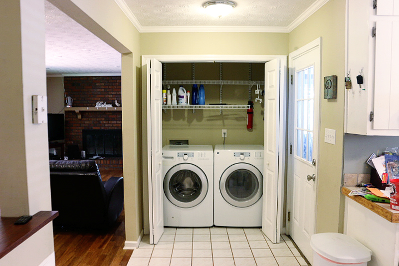
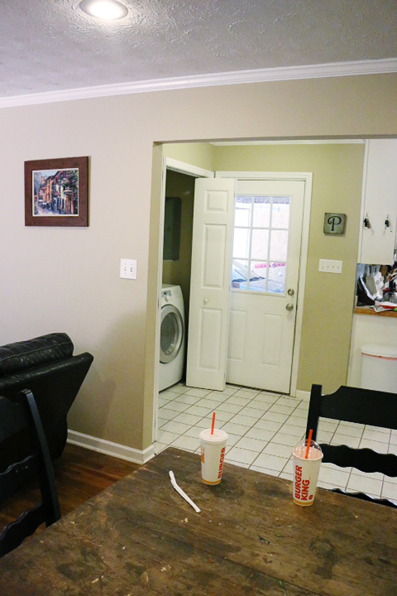
The space before was dark and dreary and open to the kitchen and the dining area and the well….whole house.
We wanted to take this space and make it a dedicated room….both to provide additional wall space to the neighboring kitchen….and also to create a dedicated zone for the laundry and to make a mudroom of sorts. The kids in this family needed a spot to hang backpacks and the mom needed an area that she could comfortably fold clothes without them falling into the black hole (you know the one…the space around a washer and dryer that eats socks!)
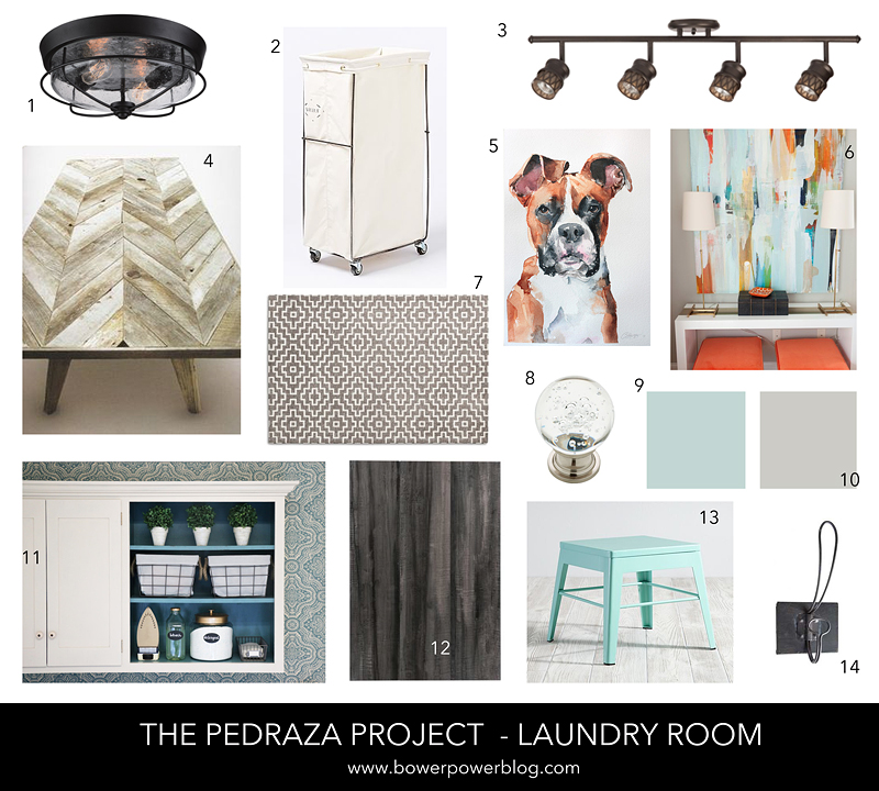
We came up with a plan that mixed woods and metals and a light and bright and clean feeling.
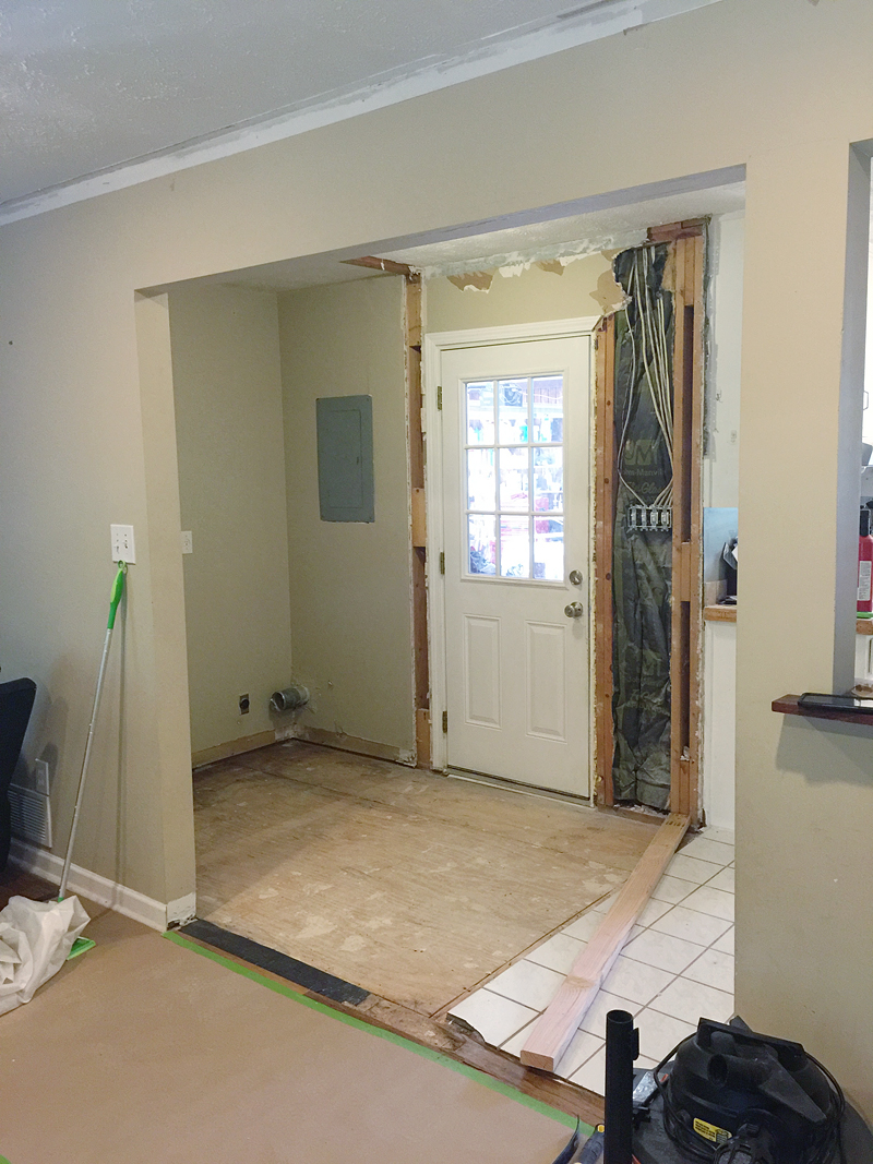
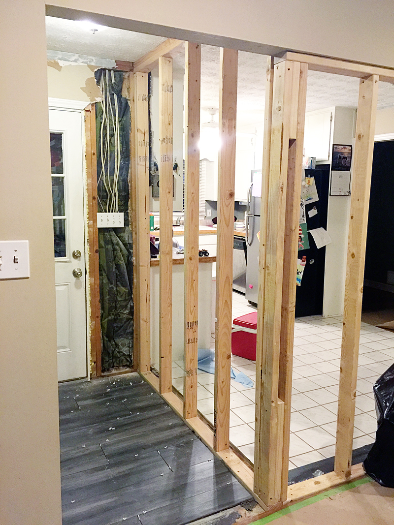
And then construction began. We had to remove a doorway opening and then construct a wall.
The flooring had to go and then a new beautiful tile flooring went in.
We did several DIY projects in this small space….building a hook wall, DIYing a countertop, creating storage and simple solutions for the families needs….
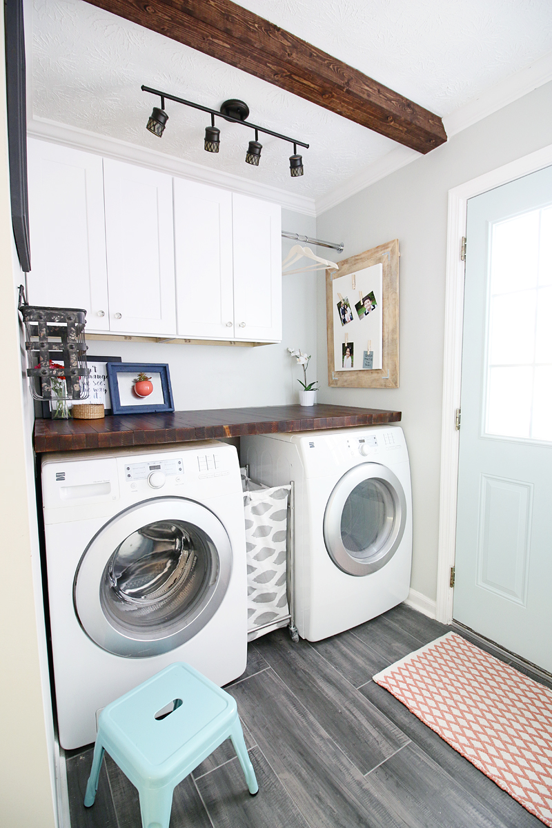
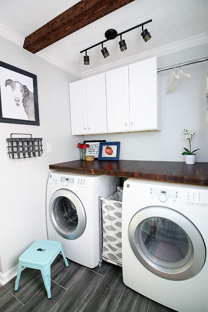
And this is what she looks like today….welcome to the Pedraza’s new laundry/mudroom!
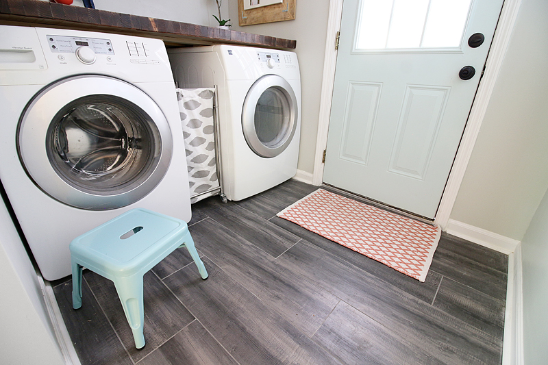
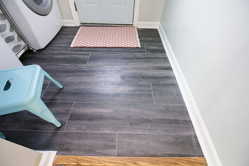
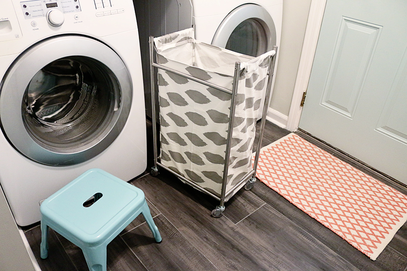
It honestly all began with this floor. They absolutely needed a laundry room floor that wasn’t WHITE. They have two kids, adopting a third and have a cat and a great dane named Bella. This floor needed to be dark and durable. We got this beautiful textured plank style tile at Floor & Decor and I think it deserves all the heart eyes.
The color variation hides dirt REALLY well and it plays nicely with the colors we wanted in the room.
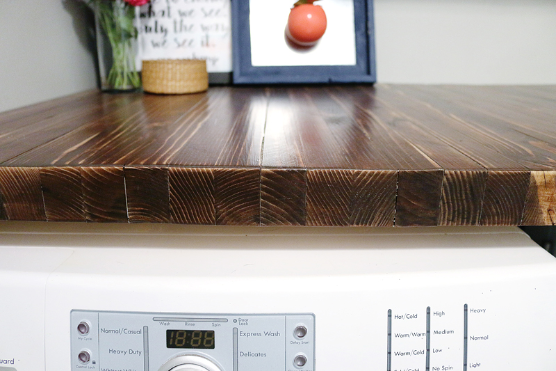
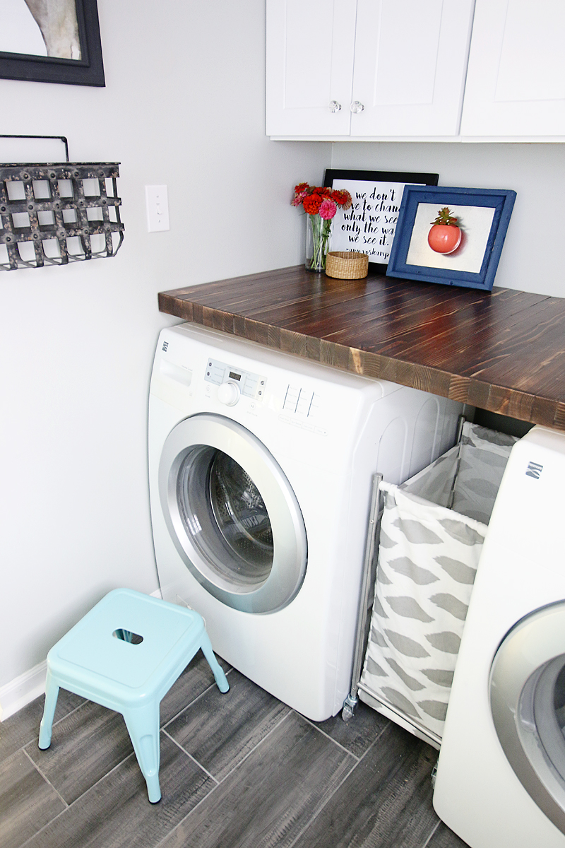
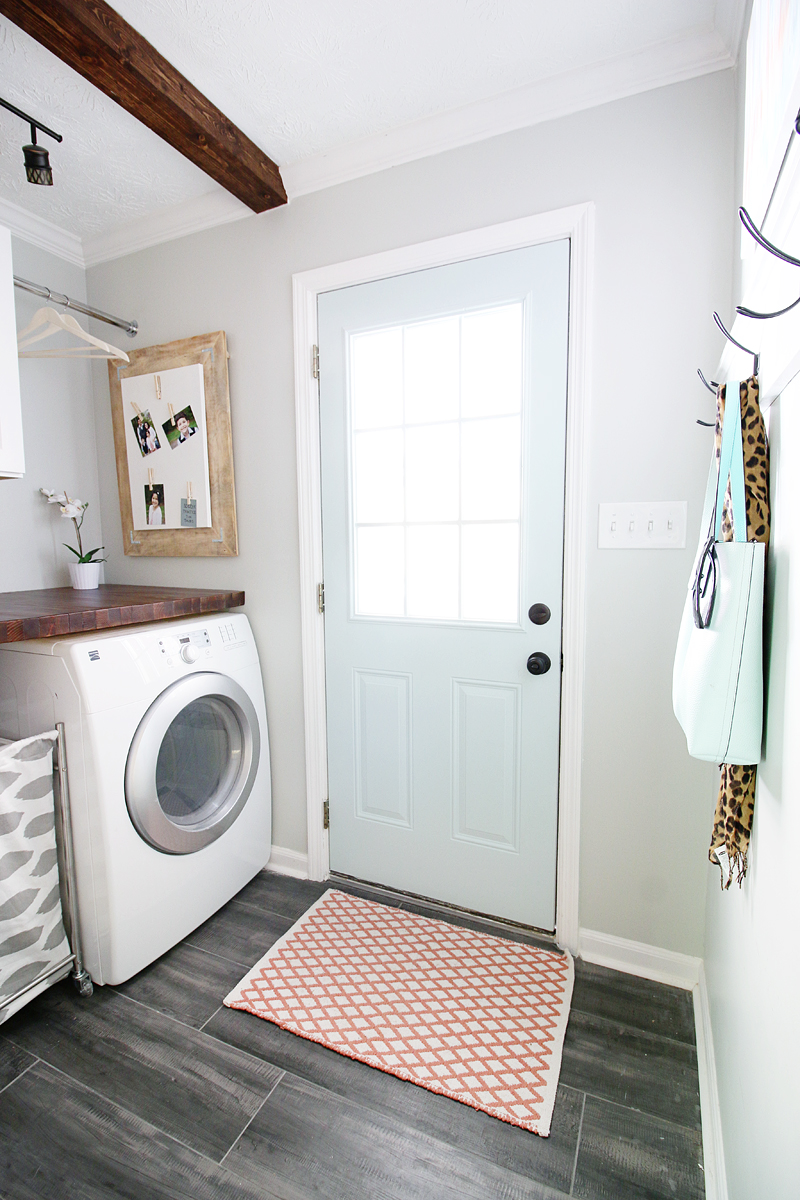
The next biggest thing was a countertop. For this space to function well, Charity needed a countertop that she could fold, stack and place things without worry.
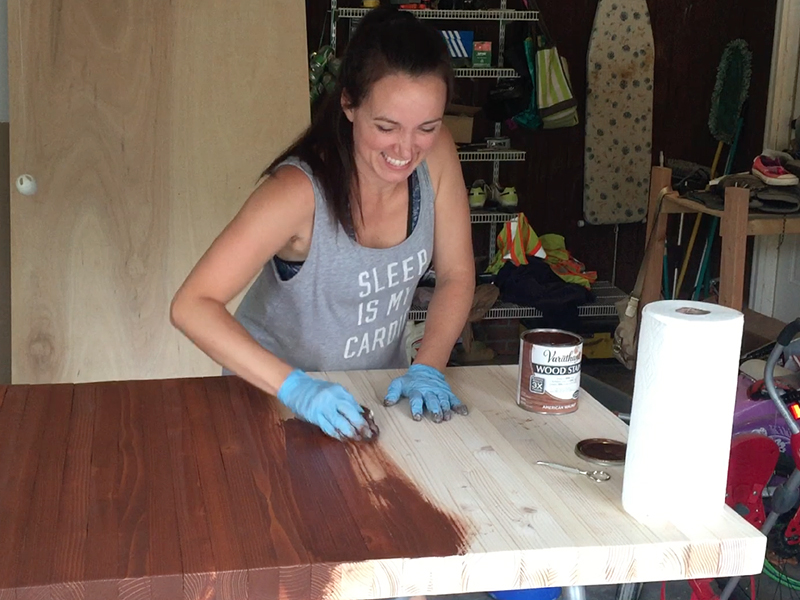
This DIY countertop is made from simple 2×4’s and it is BEAUTIFUL and full of texture and warmth.
The next biggest need was creating drop zones. Every family needs drop zones….a place to put your stuff when you walk in the door. We came up with the idea of a mail drop, a bag drop and a key drop. That is what this family needed and we think it all worked.
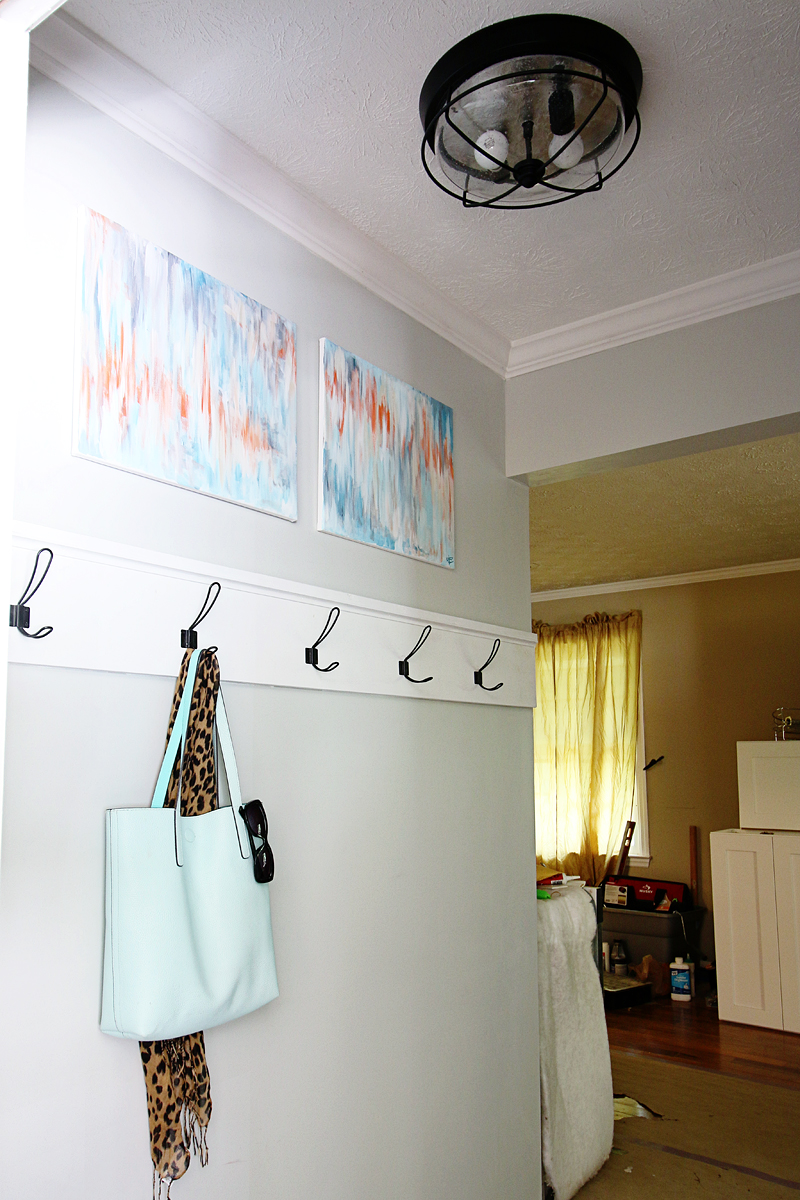
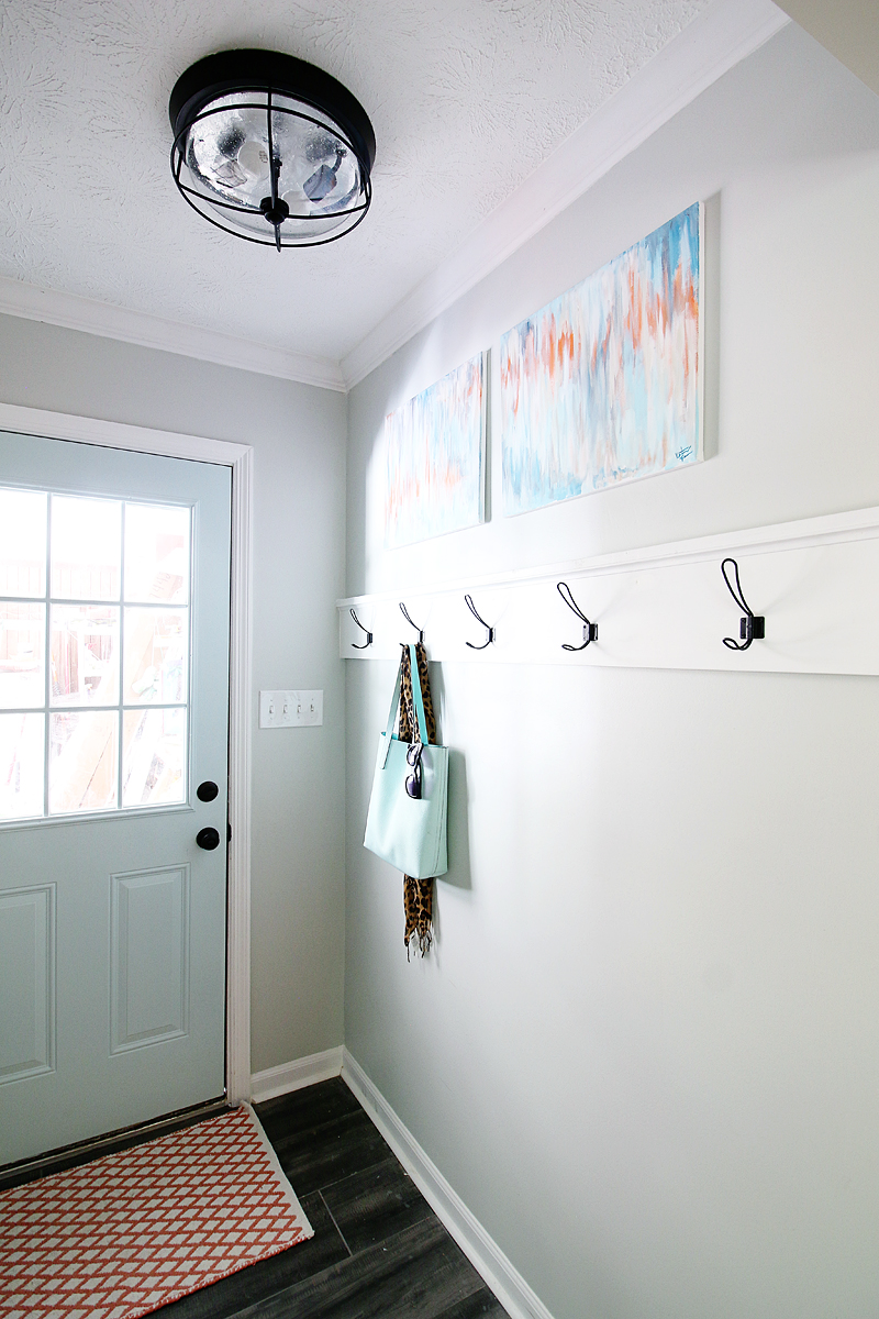
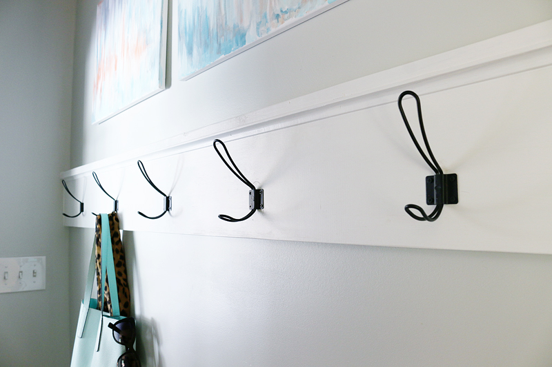
On the new wall that we built from the ground up, it was vital that it has a function. We needed it to be our wall of hooks….for the kids backpacks and purses and coats and all that. But we also needed it to be super narrow so that nobody would hook their face. We DIYed a simple wood base that the hooks attach to and so far, it has been a Godsend. The hooks are perfect for this growing family.
The hooks that are doubles are the biggest bang for the buck….it’s like a double whammy!
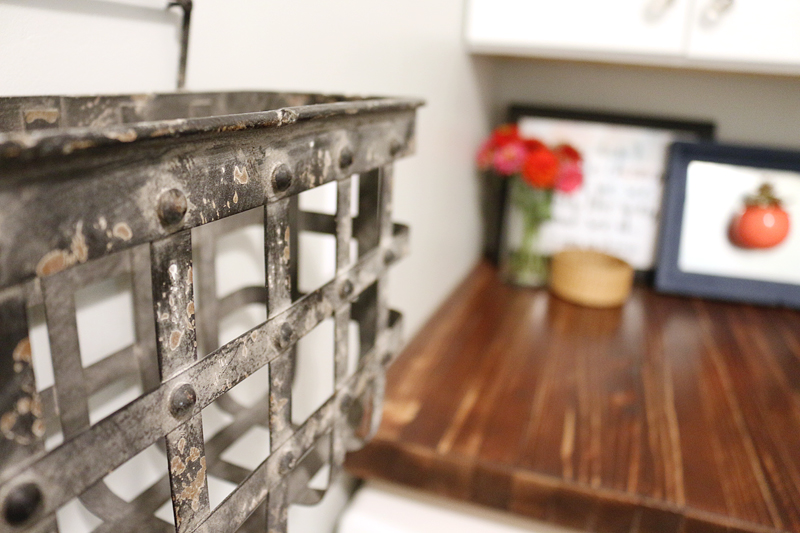
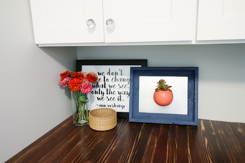
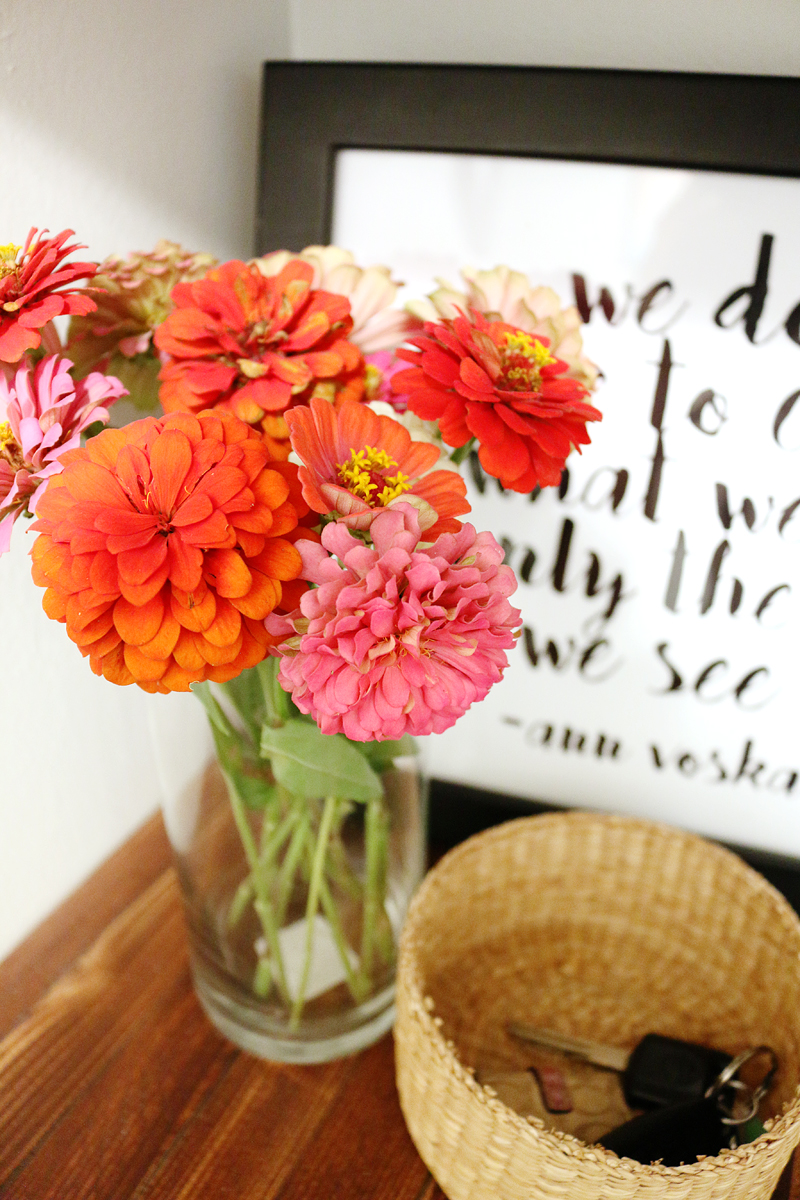
The other drop zones are this cool textural basket for the wall (hello mail!) and then a little basket on the countertop. The basket can hold keys or even little items Charity finds in pant pockets. It’s not too big (begging to be filled with clutter) but just big enough to hold the items deemed important.
This basket is great because of the size – it works for magazines and mail but the holes won’t let it become a crumb catcher.
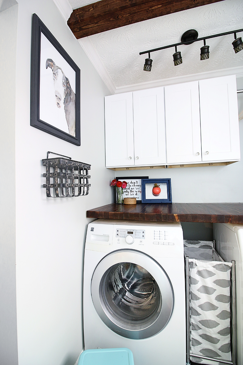
The other storage solution in here is the wheeled laundry caddy. We got the metal frame at Ikea and I sewed a custom fabric liner to jazz it up a bit. Having a fun fabric in here is so important since there are limited textiles in the design. We also added a little stool….both for the kids to sit on if they were hanging out with mom and for Charity to use to access the upper cabinets #shortgirlproblems
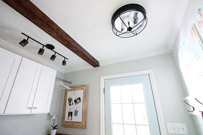
One of my absolute favorite things about the space is the blue door. It’s happy! It’s fun! It feels fresh and clean! It’s all the things that young families need to feel when they come home and go out. I love love love this color.
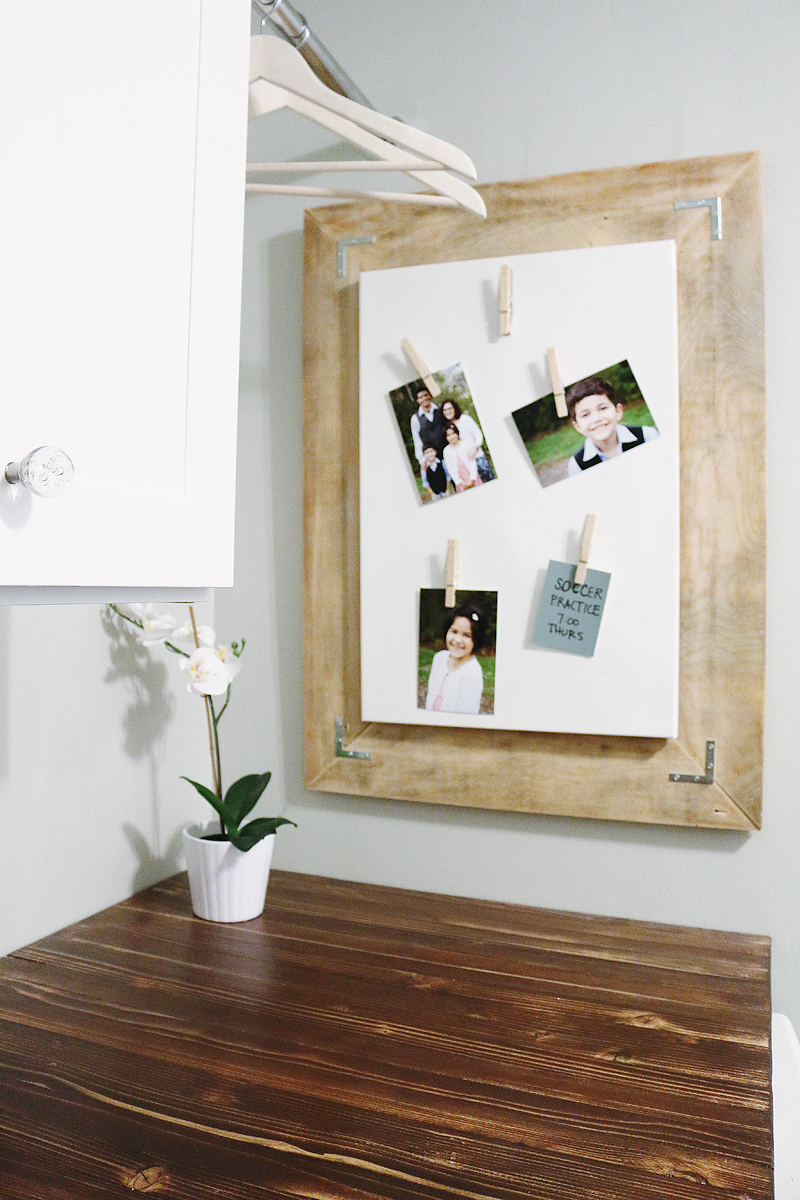
Spaces always have little brain teasers. Some people might call them problem areas….but really, they are only a problem because you haven’t found the solution. The little areas that need help challenge you to put on your thinking cap and figure out a way to make the space work. We had an electrical panel on this wall….it could have been an issue but we decided that it would create the perfect statement area.
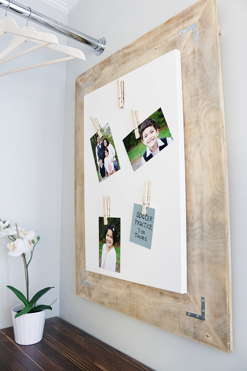
I created a cleat to go over the whole thing and the magnet board with frame can remove so you still have access to the electrical panel but it is a beautiful solution. Now Charity can write notes with a dry erase marker, hang photos (aren’t those magnet clothespins adorable!?) and even put up her kids magnets from school and events. We connected the wall to the cabinets by putting in a hanging rod and now it feels cohesive and thoughtful while still functioning.
We also had a little area where the water access box was slightly above the countertop. We solved this problem by hiding it behind some cute decor. Isn’t that quote by Ann Voskamp so true? We don’t have to change what we see….only the way we see it. That author is Charity’s favorite and I wanted to make sure I worked it into the room….and doesn’t it apply so well to laundry!? Like we don’t need to complain about the dirty clothes….we just need to appreciate the fact that we have clothes to wear, a washing machine to make cleaning easy and kids that are having an awesome day getting them dirty again!
And a big ole shoutout to Charity’s neighbor who grew these flowers 🙂
Seriously – her neighbor’s yard is straight out of Better Homes and Gardens and these beauties are the perfect touch in this space.
One of the other challenges was dealing with the ceiling that had a gap in the drywall. We DIYed a faux beam and now it looks so polished and complete!
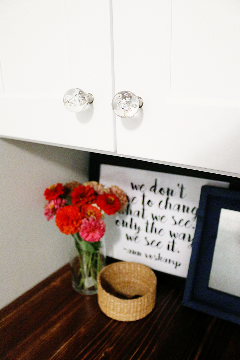
A lot of the finishing touches (like these knobs) were inexpensive finds and they make the whole room tie together in a fun way. I love the fact that we worked in two different wood colors and two different metal finishes – it makes the room feel very organic and collected over time.
And of course, the biggest way we made the whole space feel clean and bright was with two big double door cabinets that hide everything! Cabinets are by far the best way to make a space feel clean. You just put everything inside and boom! it’s clean! Ha!
Overall, we are super excited that this family got to have receive a wonderful space but honestly, they worked hard too…so it was definitely a group effort from all of us and we are super grateful to the brands that provided products in this space. I mean…I love supporting companies that have a heart – especially toward children – and both Floor & Decor and RTAStore both provided items to make this makeover possible. You can read about the backstory to this worthy project in this past post.
and one that will continue because now we are doing their kitchen! Yup – the other side of the hook wall has already begun and I can’t wait to share the plans with you. Stay tuned for that. And if you want to follow the progress along on Instagram, I give lots of sneak peeks of what we are up to. I’m @bowerpowerblog and make sure you search the hashtag #thepedrazaproject
Past posts about this project –
- Pedraza Laundry Room Plans
- DIY countertops
- DIY wall hook
- Demo & Tiling
- DIY faux beams
- Watercolor Pet Portraits
Sources for this project –
- tile – Floor & Decor Riverwood Charcoal Wood Plank Porcelain
- cabinets – RTA Store Aspen White Shaker Style
- door color – Sherwin Williams Tidewater
- wall color – Sherwin Williams Front Porch
- stool – HomeGoods (alternate stool)
- rug – HomeGoods (alternate rug)
- laundry hamper – Ikea Grundtal with custom fabric liner
- Countertop color – Rust-Oleum American Walnut with Dark Walnut
- Beam color – Rust-Oleum American Walnut with Dark Walnut
- faux orchid & pot – Ikea FEJKA
- metal basket – Hobby Lobby
- dog watercolor – custom
- hanging rod – Modifi Closet Rod
- magnet board – Ikea (alternate board)
- door hardware – Kwikset Juno
- hooks – Hobby Lobby (alternate hook)
- blue bag – George Reagan Reversible Tote
- leopard scarf – Old Navy (alternate scarf)
- track lighting – Allen + Roth Eva
- ceiling mount light – Portfolio Valdera
- hangers – Mainstays Natural Unfinished
- mini basket – Goodwill
- cabinet knobs – Threshold bubble knobs
- art over hooks – custom
I’d love a post on the magnet board over the fuse box!
I think the laundry room looks great! I was curious though, what made you decide to have the laundry room open into the living/family room area versus open into the kitchen?
This turned out amazing!! I love everything, but especially the wood top over the washer and dryer. Great work you guys!!
-Shonee
http://www.hawthorneandmain.com
I loved this series! It’s pretty amazing that it’s not too difficult to build a new wall if needed. So I especially liked that aspect. It’s a great space and so functional. Best of luck to them with the adoption.
Wow! Great Job! I love that you are leveraging your partnerships and talents to help others – that is just as beautiful as the after photos. I would love to see an after shot of the view from the family room and how narrowing the opening transformed that space into a cozier place for the family to come together at the end of the day.
We really needed that wall space in the kitchen. We couldn’t get the flow right in the kitchen so we absolutely needed one large wall and it wasn’t available without closing off the laundry room access.
xo – kb
Aww thank you Shonee! You are so sweet 🙂
xo – kb
Once that room is repainted, we will definitely share the view from the living room 🙂
xo – kb
Love it. Almost as much as I did my own laundry room project a few years ago (I was practically dragging in people off the street to see it).
Great job. Looking forward to the next part of the project. And someday, your closet project….
Looks great, I am considering this arrangement as well. What did you do with the other utility room items, brooms, mops, vacuum, etc?
They keep all of those in their garage. The vacuum they keep in their hall closet.
xo – kb
Heart eyes for sure!. I’m wondering how to pronounce Pedraza? Is it Pe-dra’-za? (No need to reply right away, I know you’re busy, and I’m just curious.)
Yes it’s FABULOUS! We are slowly toying with the idea of a kitchen/laundry re-do and this was fun to read. I actually went home over lunch so I could read it with a sandwich and ooh and ahh out loud. My washer is in my kitchen and my dryer is in my utility closet (which you get to by going outside to the carport. First world problems but still – blergh.
So I go back and forth with what to do. This was such an elegant redo I hope to take some inspiration! I love the simple art. I think it’s time for my puppies to be photoshop watercolored as well!
Oh WOW!! Great job Bowers. Love it ~ love the color of the door.
Beautiful project. Loved the paint colors and that counter is amazing!!!
Looks great!!! Some white floater frames for canvas from a art supply (like Dick Blick) would totally finish off your DIY art perfectly!
Me too!!
I would be worried about the bulletin board thing and if they want to hang wet clothes next to it
It’s metal so it’s not like wet clothing could ruin it. In fact, it is probably better for wet clothing to be next to that vs. the cabinet or drywall which is not meant to be smack dab against moisture.
xo – kb
I never even thought about that! I bet that would look good!
xo – kb
kinda like Ped-drawz-uh 🙂
xo – kb
haha! That’s what I do too…save the best blog reads for when I have time to really enjoy it with a snack 🙂
xo – kb
Beautiful!
I am sure even the biggest critic (their little girl) is in love with it! Can’t wait to see what you do with the kitchen…
Thanks for sharing!
Agree!! We have this same layout and this is the best option for covering the panel we’ve seen!!
Very nice job, big improvement, I’m sure they are thrilled with the new space!
It’s pretty amazing, Love to see the way of design the wall.