Disclaimer – This is a sponsored post brought to you by Modsy. All opinions are 100% my own.
Our living room is the hardest space in my house for me to visualize. It is literally like a brainteaser when it comes to space and furniture and colors and sizes. Anyone else feel that way about a space in their home? Like it was made for someone else with other things and definitely not YOU and YOUR THINGS? It is so frustrating!
In the last seven years we have tried every configuration that we could think of. We tried floating things off the walls, different size rugs, so many different chairs and different orientations. When it came down to it, it was just beyond my abilities. I am no designer and as a mom of five – I have my own set of needs when it comes to the living room….
- it needs to be child friendly but not become a playroom
- it is the only spot we have a tv for the kids to watch so it has to seat all of us
- it is our main entertaining area so it has to be adult friendly
- it has to be able to be cleaned easily and resist ALL the candy and spills and dirty little toddler fingers
- and it has to be affordable
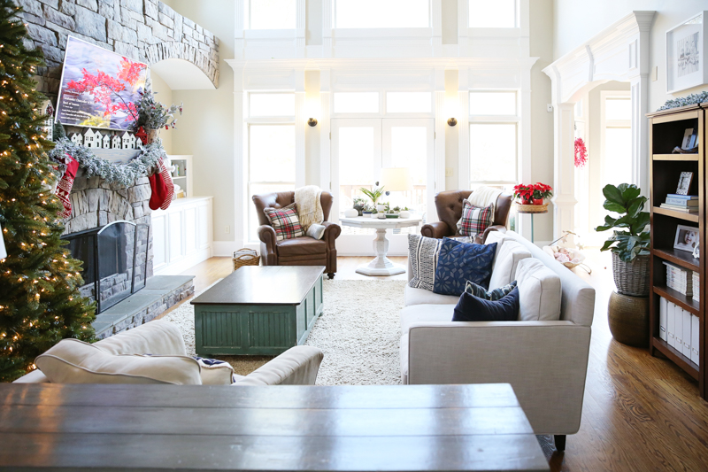
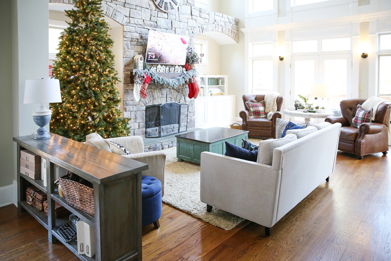
So what was the issue? Well, first it is the space itself. It is a long and narrow room with one wall that has the fireplace (focal point) and built-ins, one wall completely of doors and windows (nowhere to put furniture), one wall with a giant opening to our kitchen and one with a different ceiling height that has doors and walkways. It means that we have to float furniture….the biggest challenge in my mind.
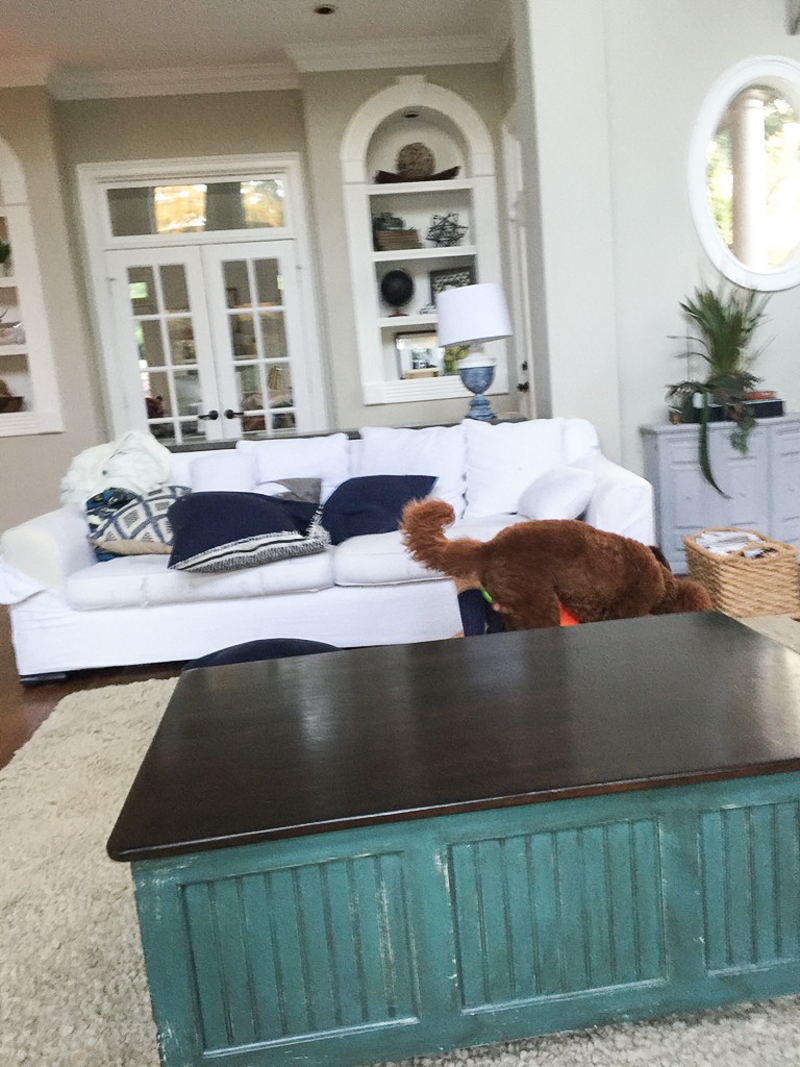
In the space before, we brought in our white slipcovered couch from our old house. We all loved that couch. It was basically indestructible and so comfortable and cleaned up like a dream. (here is the post about how we cleaned our slipcover!) But then it started to show wear. After nine years a couch will do that. The slipcover had been washed so many times and stood up to the test and the construction was great….there weren’t any rips at seams. The problem was that the areas that we rubbed it the most (especially at the front of the cushions) were thinning and eventually they were more destroyed than jeans on a teen.
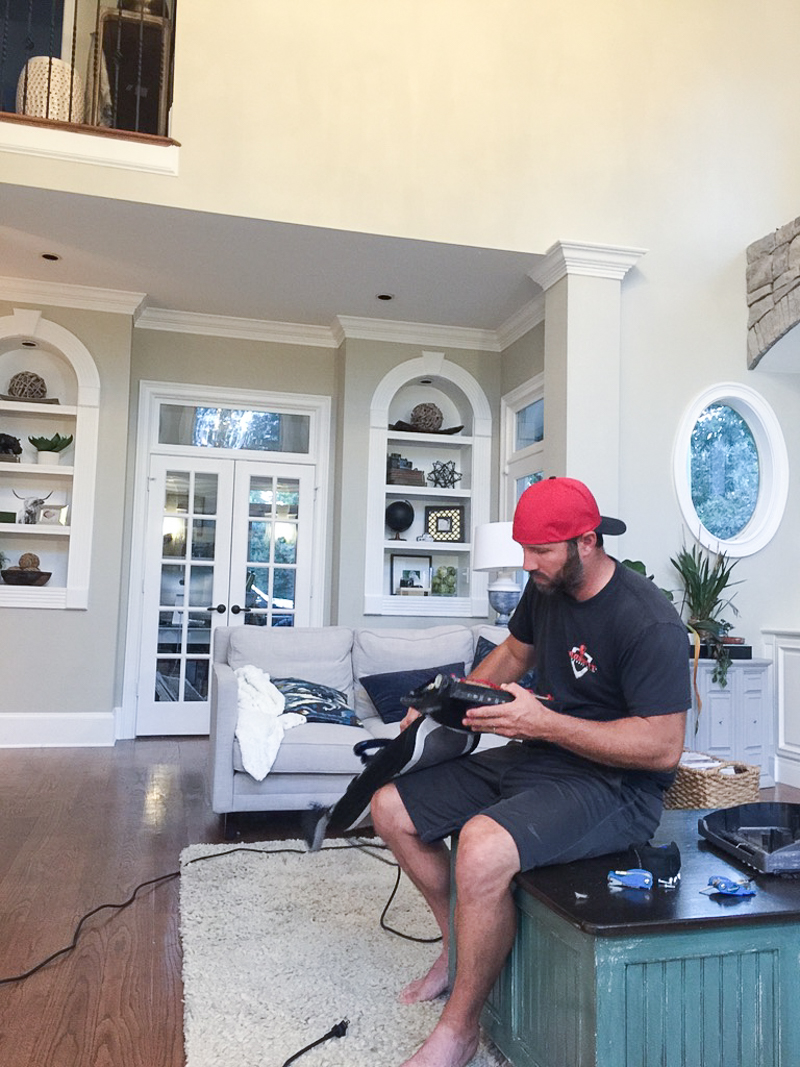
A tiny little hole on the arm got caught on the wheels of a monster truck and it tore down like a flap. It was a sad day. (this was the only picture I could find of it….I have no idea what is going on here.)
Shortly after Ella’s birth, we decided to give the couch away (it went to a friend who retrofitted a dark brown slipcover on it and she loves it) and we brought in our other couch from storage (we have been saving it for the Monroe house). You can see it was quite a bit shorter and less deep than the white one.
Rather quickly we learned that the kids needed a spot to watch tv and the new petite size didn’t really allow for them to pop a squat and still see the screen….so we rotated it and pulled in a chair also from our old house.
That is when we started realizing that the boys LOVED the new couch arrangement. In the past, they would lay on the coffee table to watch Paw Patrol and I imagine that it was less than cozy.
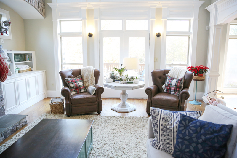
The other side of the room is the one with the big windows and set of doors. It is also where we have the recliners that are in real life HUGE but in here they look tiny.
Do you see what I mean about this room being a conundrum to work with? It’s so hard.
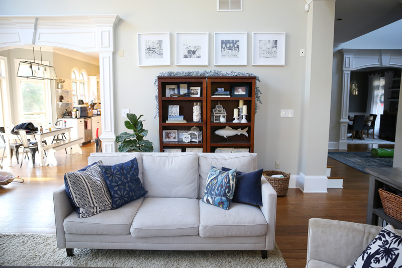
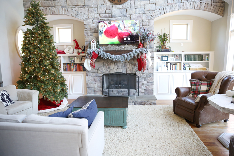
And here is the view of the back wall. We can’t put the couch back there (although the distance would be fine for tv watching) because it is off center and we need that walkway behind the couch to go from the kitchen to the front door.
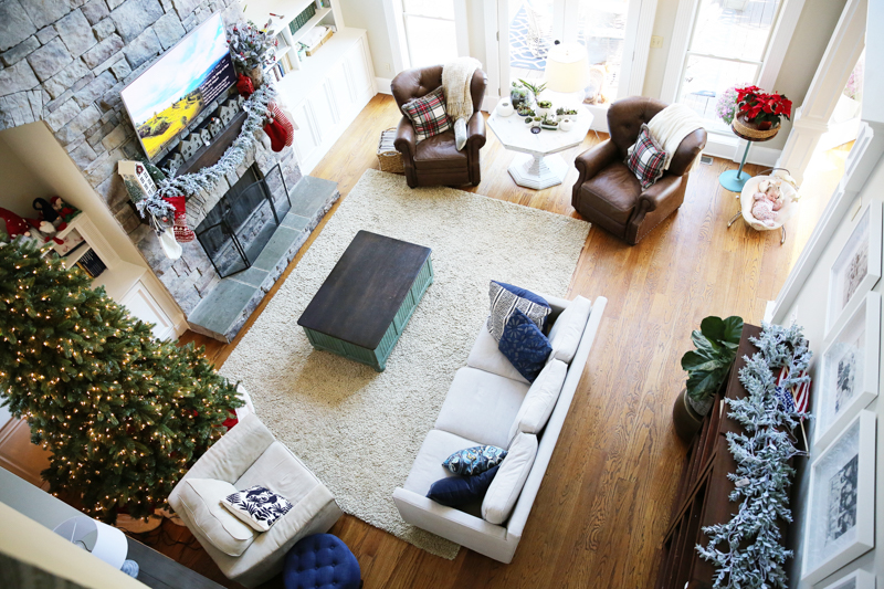
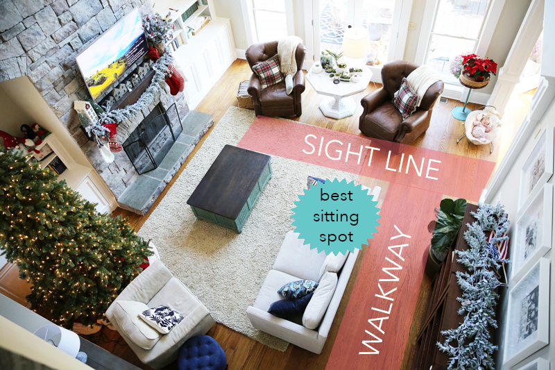
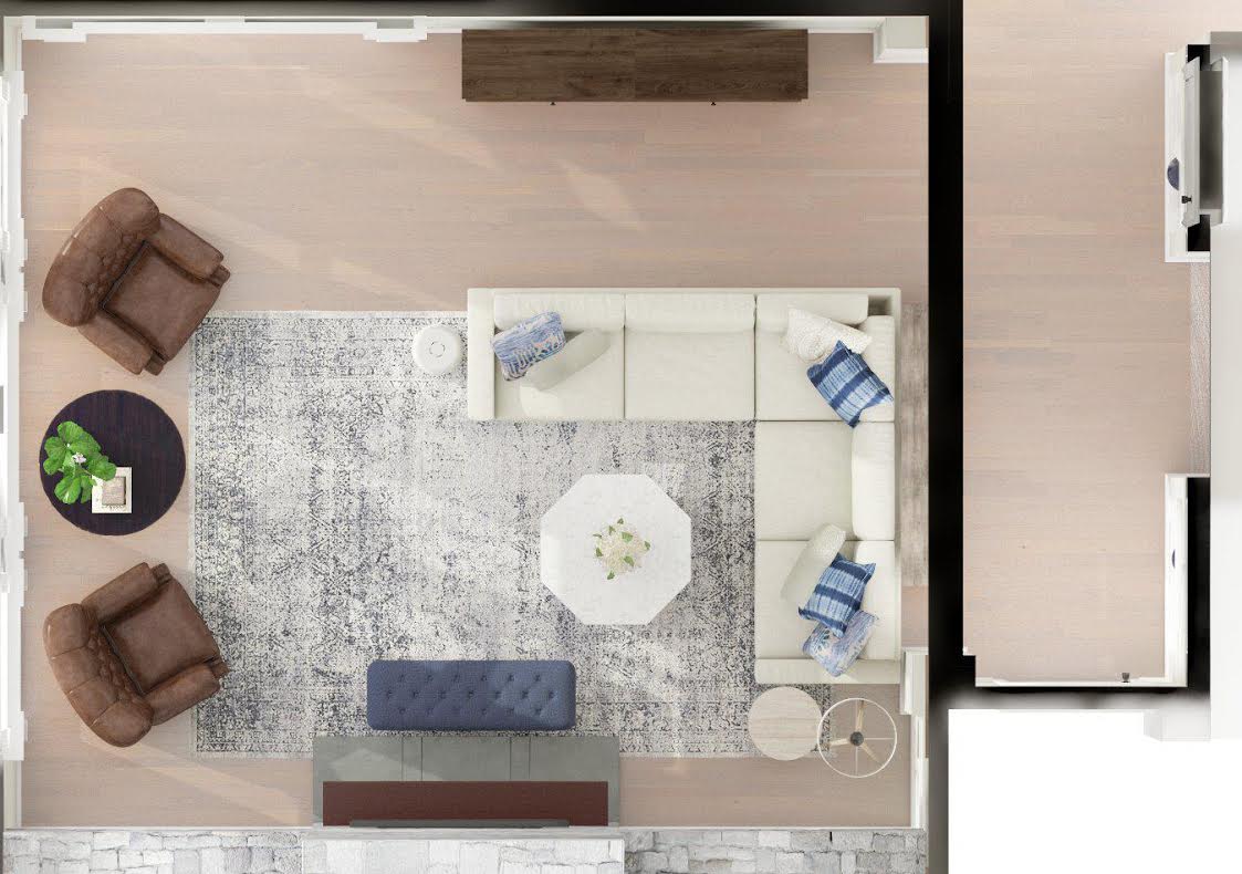
Here is an overhead shot to show better how the room is laid out.
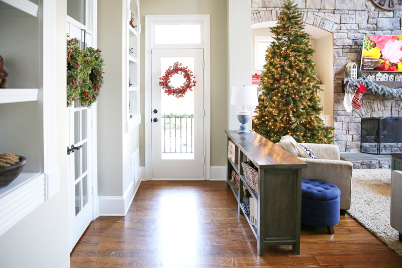
We need to maintain the sightline from the kitchen to the living room….otherwise it feels way too closed off. The walkway behind the couch is important to keep because we travel from the kitchen to the front door/stairway about a million times a day. Behind the beige chair in this photo is the console table we built….this gives us a clear line, a delineation between the living room and the little hall to the side door, so that is something we also need to keep. And the best sitting spot in the house for movie night is smack dab in the middle. So all of these were the parameters.
If you can’t tell it is a brainteaser, it really REALLY is. I am sure that there are other rooms out there that are worse than mine. I just know that this room – with it’s 20+ foot ceilings and weird footprint – it swallows furniture whole and so I would put a piece in here thinking it would work and realize that it is too small or just not work.
That being said – I knew I wanted to keep a few things….like these leather chairs and possibly that table in between them.
I also wanted to make the built ins feel cozier in the long run….maybe by cleaning them up – minimizing the stuff we have on there.
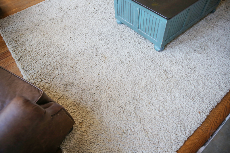
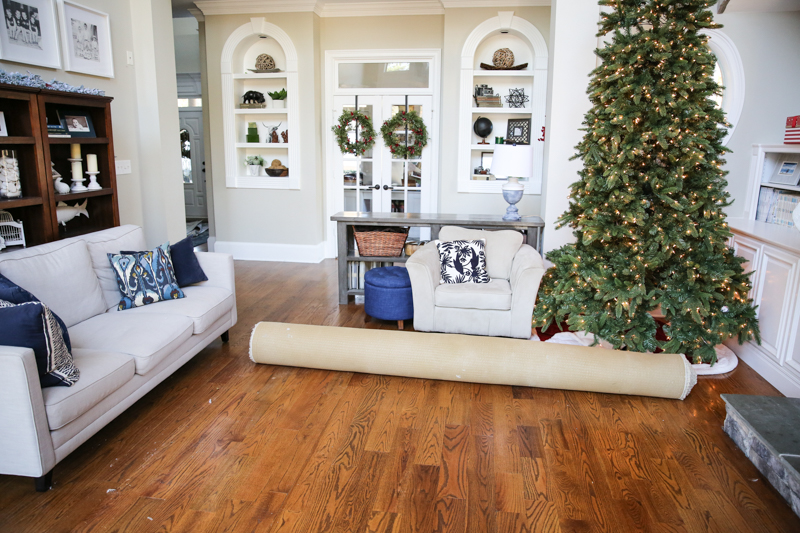
And I desperately wanted to get rid of this rug. It was our victim when it come to getting Bear housebroken. This was his favorite accident spot.
I also wanted to try to keep this console that made the little hall to the side door possible. It was the thing that made this room a more normal shape.
That is when I realized this was beyond my skill set. I couldn’t be moving furniture all day. I definitely couldn’t be buying all these couches and tables just to SEE if it might fit. And I had a clear deadline – I wanted a spot to sit by Christmas. Family was gonna be joining us and I needed seating! So that is when I called in the pros over at Modsy.
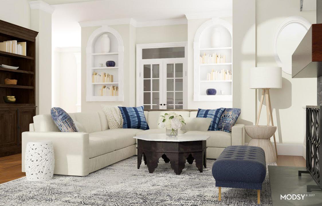
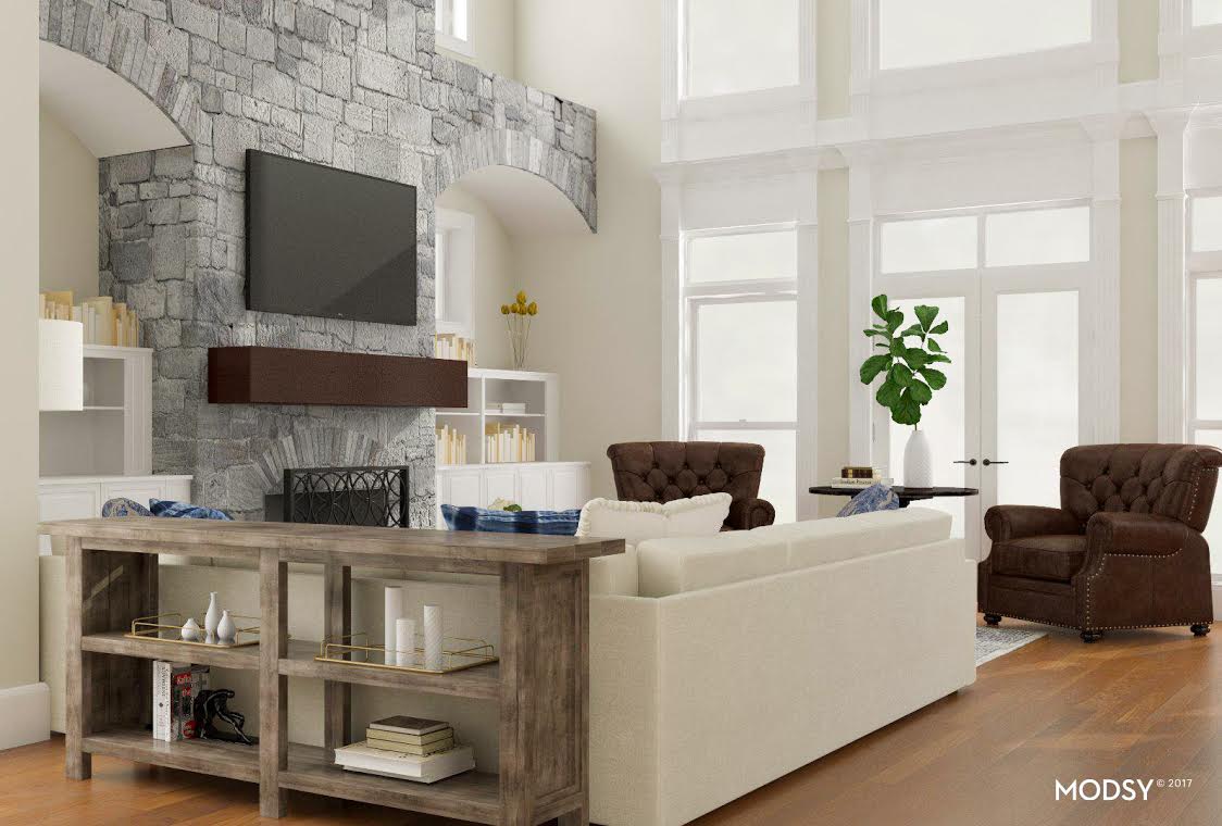
If you don’t know what Modsy is – it’s my secret weapon when it comes to design. I’m not a designer. I didn’t go to school for it. I don’t do it for other people. I am just a mom with an idea of what I need to make my life better. Modsy is PERFECT for people who want to ‘see’ what works….the exact sizes, the exact pieces, the colors and the layout in your space. Modsy is like hiring an interior designer and them putting together a 3D rendering of your space and you getting to decide what you love before purchasing. I’ll give you a bit more info later – but here is what we came up with….
I thought a sectional might be the perfect way to add additional seating and make it wrap around the room so that we can really getting the best seat in the house for movies. The sectional would also allow us to keep that console table and maintain that walkway.
Of course, this was the first round of tweaks with the Modsy program but so far, the visual renderings sold me on a couple plans….
- A bigger rug. I needed something that would be much bigger than the previous 9×12. That was so helpful because I probably would have kept buying the same size and kept on being frustrated with it.
- A sectional that I could have extend to a certain point. If I had not visually seen a sectional in here, I might have never thought it could work. I am SO glad I did and figure out that it couldn’t be longer than a certain length to fit our space correctly.
- A round coffee table. A round coffee table would be easier to move around (no sharp corners hitting kids!) and also be similar to the table between the flanking chairs.
- A floor lamp next to the sectional.
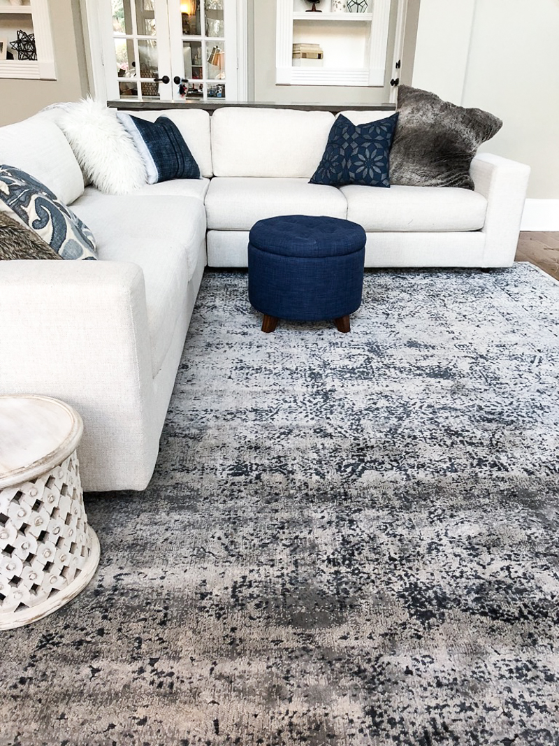
That week was Black Friday and I found an AMAZING rug. It was the best feeling….knowing that what I was ordering was going to actually fit in the room and look amazing. I could not get that pee-pee rug out of my house fast enough!
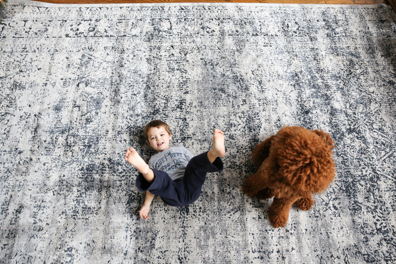
Maxi Knight was the first one to roll around on the knew one and it was the perfect fit for our family. Now that we have lived with it for a few months (and experienced testing with toddlers, pets and spill-prone adults) I can tell you that I LOVE it.
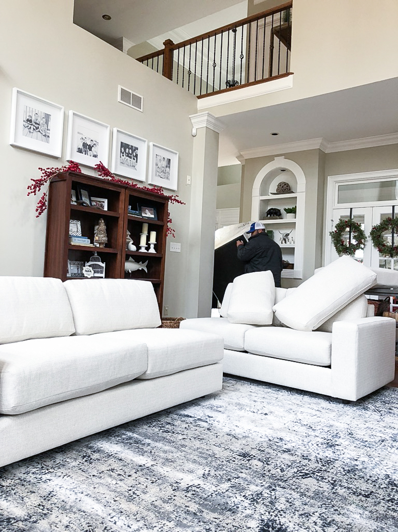
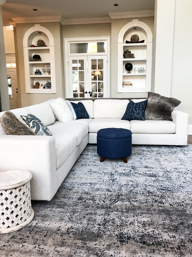
Second came the sectional. We got an amazing Black Friday deal and I was holding my breath. Even though I was 99% confident that it would look great, that self-doubt always creeps in.
As the delivery guys were setting it up, I was going over everything in my brain…..does it look good with the wall color? does it look good with the rug? can I see dust bunnies if they were growing under there? can it hide the toys that will surely roll under the couch? will the fabric hold up to my little ones?
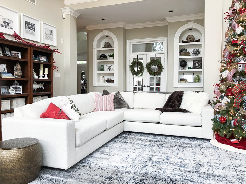
In the end, we decided that yes….it’s amazing and a perfect fit for our family. We love having the ability to all cuddle up on it for movies and the boys have been trying really hard to learn that we don’t jump over the back of it 🙂
And as for the space – it was the perfect size. That was the one thing I felt pretty confident about because I had used Modsy. It allowed for plenty of walking room in that sight line from the kitchen to the living room.
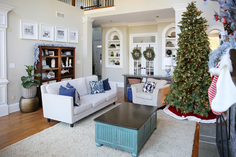
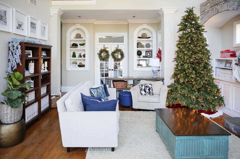
And now that we have the tree out, we are loving how clean it feels with just one big piece of furniture. Next we need a little side table on the right and to order a floor lamp!
So yeah…that is my story about using 3D visual aids to pick furniture. It’s a crazy world we live in! I totally feel like Joanna Gaines when I get to see the final renderings…and then overwhelming relief when things fit and look good in real life! I could not have pulled this off in here without Modsy.
We had used Modsy before to figure out our bedroom….you can check that out here. And guys…if you were thinking about this before….or if you are totally new to the concept….the best part is the price. It’s only $69. Yes….you read that correctly. I would have saved that in shipping one terrible purchase back. Nowhere else have I found a designer to raise their eyes for that price. And I couldn’t find a person to make renderings for that much. It is an amazing price!!!
AND!!!!
Yes, there is an AND!
It gets better than that because right now Modsy is giving my readers a very special discount – 20% off! That means for about the price of a steak dinner and a cocktail with tip, you can do one of your rooms! holy biz. HERE IS THE CODE —- BOWERPOWER20 – Just go check out what they can do for you! Here is the link.
Happy rendering yall!
SOURCES




Beautiful work! But… The ottoman is too small. Maybe a pale wooden one with fabric on top?
You can’t put a couch on that wall because it’s off center, yet the sectional you add is off center the same way, but just removed from the wall…. so does that seem less off center? If you want a path from kitchen to front door, why put such a big piece (referring to your insta stories sneak peek of a large appears to be book shelf) there to jut out into that “hall” space? Without that you’d have space to move the couch back some so the room is less skinny and still have room. Just a suggestion.
Oh yes, it is not staying…
xo – kb
Well I should have clarified…it is off centered but it also removes our walkway making us walk around the whole room. It just doesn’t work with a sectional and if we put in a couch, it eliminates seating space. The sneak peek shows the bookcase – and it does jut out but as long as it is no deeper than 18″ (worked that out on Modsy) it fits between the molding. The room has a lot of molding. It will be clearer in the post about the bookcase 🙂
xo – kb
I LOVE sectionals. They’re such a functional way to add seating, and they fill up a big room like this so nicely. I’m kind of obsessed with Modsy and how true-to-life their renditions are. Such a genius service for making these weird little dilemmas a little easier!!
I love the changes you have made!!
The carved white stool.. will it be used as a side table or extra seating? I love the style of it!
When you use modsy how good do your pictures need to be? Do you input your measurments too? Do they do outdoor spaces?
I love that sectional!!! We are looking to to purchase a new one here in the near future. I am a little hesitant about purchasing it online without actually being able to try it out. How comfortable is the sectional? We use the sofa a lot so it not only needs to be comfortable, it also needs to be durable and easy to clean – I am a boy mom – you understand!
Looks good! Can’t wait to see it evolve. Love the idea of a big round coffee table without any corners! Quick question: have you considering moving the large bookcases behind the sectional to a different room? By nixing them you’d be able to push the sectional closer to the back wall providing more sightlines to the TV. It would also create more space to have your big armchairs in the same seating arrangement as they look a little isolated right now. It might make sense to put a smaller table between the armchairs so that they’re more in line with open part of the sectional rather than facing into the side. I know it’s still in progress so I’m looking forward to seeing where you end up. Just a few thoughts in the meantime!
Omg I am in love with that rug and sectional!! Looks great in the room!
Does this rug have any beige/creamy white in it? It’s been on my idea board with wayfair for awhile but I have a big oatmeal colored tufted ottoman (accents in the room are navy, white, and oatmeal).
Hi!
I think your living room looks fantastic. Floating furniture is definitely difficult, and the architectural details of the room, while lovely, certainly make functional design a challenge. If I were you, one thing I may consider would be getting rid of the entire fireplace/ stone work, and replacing it with perhaps a long and low built-in console with shelving or even just blank space for artwork. That way you wouldn’t be wedded to having your TV in one single place. You could shift it over to the left and have it more integrated into your living room and also maximize the prime viewing spots. Admittedly, I’m biased against above fireplace TVs– they hurt my neck! In any case, great work designing a difficult spot. I really love the new sectional!
I am glad I saw this post. Our living room is a weird layout and there was no way we could have our sectional directly in front of our media center so its a little off center. But now that I see yours, I see that a rug could totally pull it all together.. Looks great, your home is so beautiful!
I absolutely love it! I adore your couch. I would love to have a white couch myself, but the thought strikes panic in me with a young child, a pet, and myself being rather spill prone… How do you keep it so clean looking? Do the covers come off for washing??
We have chosen to go the leather route due to ease of cleaning…
Looks great! Curious how you will keep that sectional clean? Did you consider leather at all?
We did consider it but we knew that this wouldn’t be a long term couch for us. We wanted to do a five-year-fix so we went with a performance fabric instead of leather because we felt like we could clean the cushion covers in the wash and the rest we would do our best to spot clean. So far so good!
xo – kb
The covers do zip off the cushions but the arms and back do not. We have spot cleaned chocolate and other stuff off it already though!
xo – kb
It is definitely a nice player with oatmeal color (that is close to our wall color)….so that might help.
xo – kb
You do the pictures – a phone would even work! And you do measure the space to put it in. I have no idea if they do outdoor stuff – it might be worth asking!
xo – kb
I think in the long run I might use it as a plant stand – but the boys use it as a stool 🙂
xo – kb
It’s very comfortable – you can usually test them out (or something similar) at West Elm stores. I also can tell ya that West Elm is owned by William Sonoma and they also do Pottery Barn – so most of them have similar types of comfort 🙂 Hope this helps!
xo – kb
It doesn’t give me that much extra space if I push that back because the columns and moldings stick out a solid ten inches. That is one of the big reasons we have that in place. And yes – I agree with you completely about the smaller table….but the hardest part is sourcing it. We haven’t been able to find one that isn’t visually swallowed by the chairs. Pray for my sanity!!!
xo – kb