Disclaimer – This is a sponsored post brought to you by James Hardie®. All opinions are 100% my own.
I have such a juicy post for you today! This is one that I’ve been super excited to share with you for a long time and progress has finally warranted an update. A very long time ago, we purchased a very old historic house in a nearby town of Monroe. At the time, we didn’t really know why we wanted it or what exactly we were gonna use it for….but it found a place in our hearts and we were excited to make big changes to it. The entire thing needs a massive amount of work. And it has been a big test of our patience.
Okay – so if you are wondering about this house, first you need to read this old post where we introduced it and gave some info about it’s past life (or lives…it’s had a few! ha!). Well, the plan was to renovate it back to a single family home and it has given us some major challenges. For one, we wanted to pay for the entire thing including all renovations with cash. Since our money tree is a slow-growing variety, we would set aside a certain amount for each year and then when we got to the bottom of the barrel, the work stopped. This was frustrating at times – like when we learned that a new roof would cost a years worth of renovations. But it also forced us to be patient and figure out EXACTLY what we wanted. It’s amazing how time can help in that respect.
So fast forward to now and we are finally able to start sharing some big things! WAHOO! We wanted to share the renovations in a progression that made sense and in my mind, the first step is the planning phase and the exterior. I will be sharing individual details of each step as we go along but this post is about products that we nailed down and also the plan of attack for the outside of this hundred year old beauty.
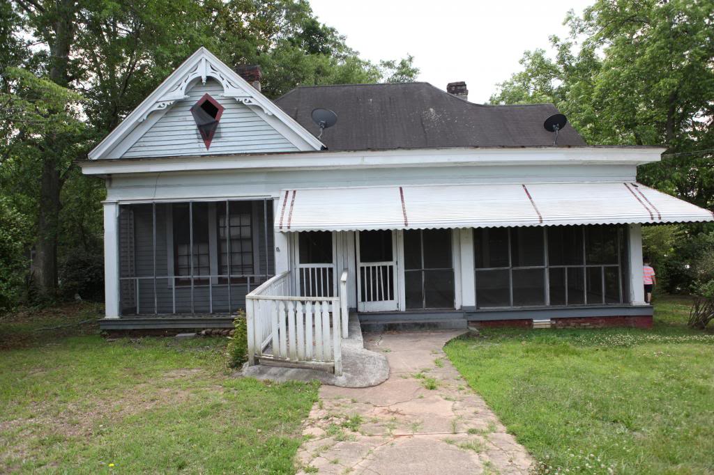
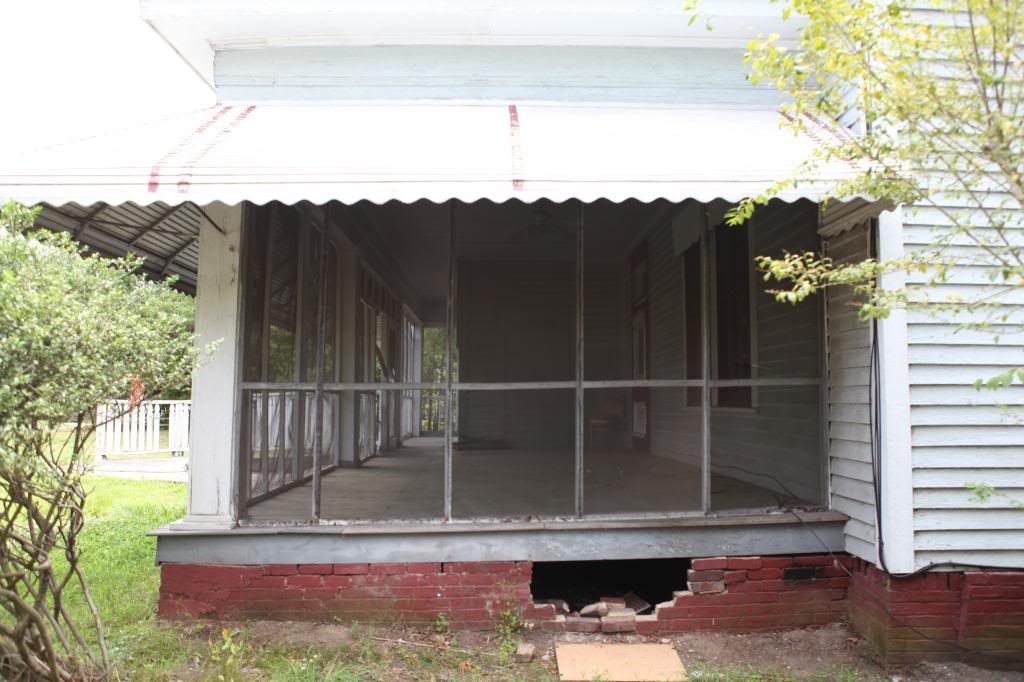
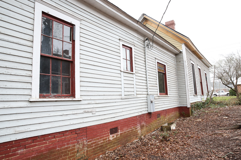
The exterior of the house is not much to look at right now. Since it is part of a historic area of town, we have to get approval for anything that is not a replacement. Basically anything new or removed must be approved by the Historic Preservation Society. Basically, if we are just taking something down that is broken or in poor condition (like the roof) and replacing it with the same thing (black shingle roof replaced by black shingle roof), then it is fine to do without city approval. But all other changes (even removing the awning) must be approved by the city. That being said, we have done all the things so far that we can do and now we pitch the city for all the other changes.
So what are the changes? Well, I’m glad you asked. We have a long list of exterior changes that we want to tackle. Here is our starting list….
- Replace roof
- Rebrick chimney
- Rebrick foundation
- Remove awning and screened porch
- Remove ramp and concrete path
- Replace siding
- Add privacy fence
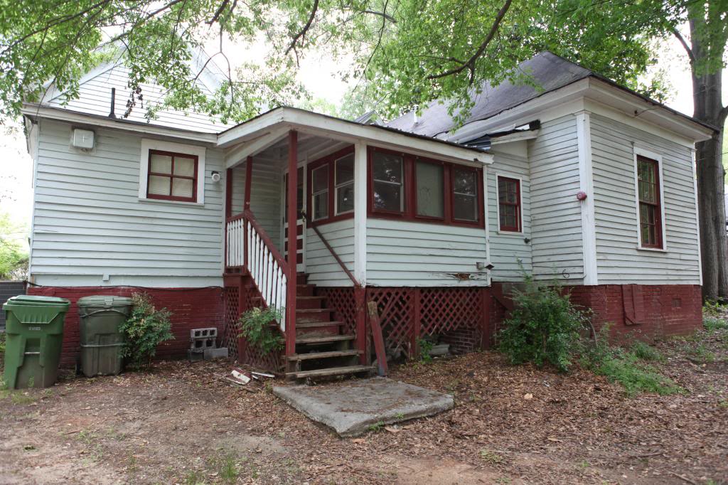
- Remove back laundry room & utilities room
- Replace all windows and doors
- Refinish porch floor and ceiling
- Paint all fascia, columns, trim
- Add landscaping
- Build back deck
- Pave side driveway
- Add paver walkway
So currently we have tackled a few big jobs with a few big speedbumps (more on that soon) and we are hoping that in the next big push, we can update the exterior to a point of decency. I dream that one day we can make it look more like a cottage style home and have less victorian style details. One of the BIGGEST transformations is going to be the siding. Right now I am trying to decide the color and I hope you will help me pick!
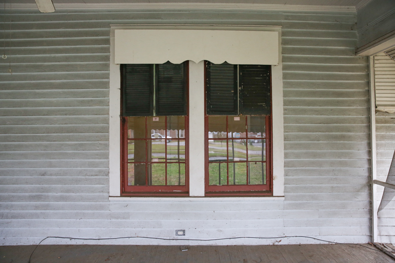
Okay – a little back info…first of all – all of our windows glazing has asbestos. So that means we have to have an abatement company come remove them or we have to seal it or we have to replace them and then dispose of the glazing appropriately. Enough of the windows need to be moved or replaced to justify buying new windows completely so that means we will have big holes that need patched in the original siding.
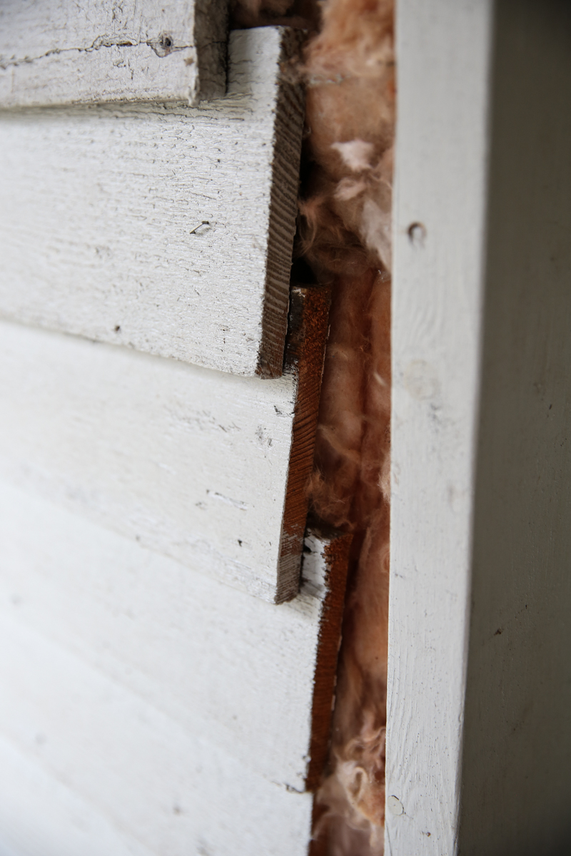
Also, the original siding is not sealed or insulated. Yeah. That’s like an invitation to bugs. Plus, it’s not in great condition. So that means replacing all the siding. We did find one patch of insulation – where a part of the trim work fell off the house and the previous owners just jammed some insulation into the thing. If that gives you an indication of the ‘fixes’ around here, you will understand how daunting this project is…
I know that sounds like a bummer….having to replace the siding….but in actuality, I am super pumped about it. This means that we can make the house more energy efficient (the summers here are brutal and insulation is a must) plus, the idea of getting a house that doesn’t need repainting is AMAZING. Yes, you heard that right. I did a whole lot of research and we landed on James Hardie® siding which has this thing called ColorPlus® Technology – it basically has the multiple coats of color BAKED on. So the color is rich, thick and consistent….unlike paint which would need to be redone and maintained. Plus, I won’t need to worry about the edges or the features being uneven because they have this cool technology that coats those surfaces and spots uniformly. Everyone says that it resists chipping and peeling and cracking and fading. I mean YES! Heck to the yes to the amen!
That chipping and cracking is something really common especially with the hot weather and the traditional way paint on is put on wood or other types of siding. You can see that is what happened with this house….
But since this James Hardie® siding is different – it’s made to have that color not be applied like a mask over the siding. Think of it this way – a plate can be food safe if the paint is applied and fired and during that process it becomes part of the plate. But you wouldn’t ever eat on a plate with just dried paint on it. The paint would dry and flake and make you sick if ingested. The same with this siding….this siding has the color as PART OF IT versus just a layer on top that could peel off. And peeling paint means scraping, sanding and repainting which costs a lot of money.
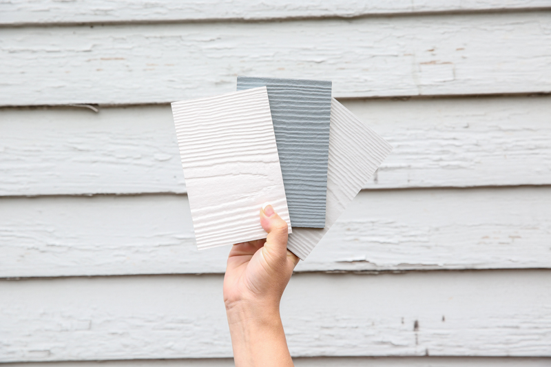
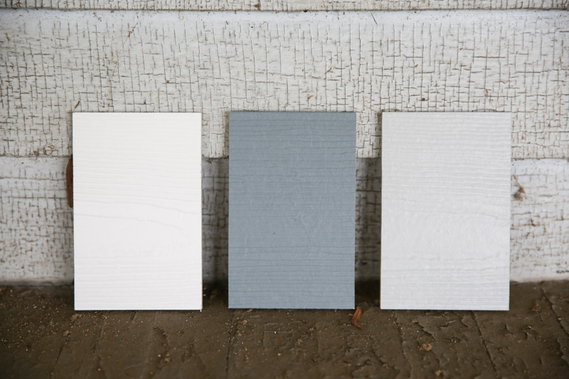
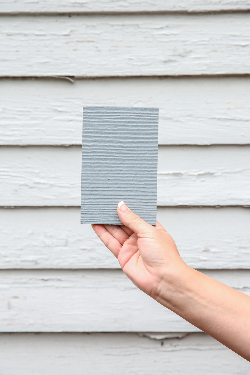
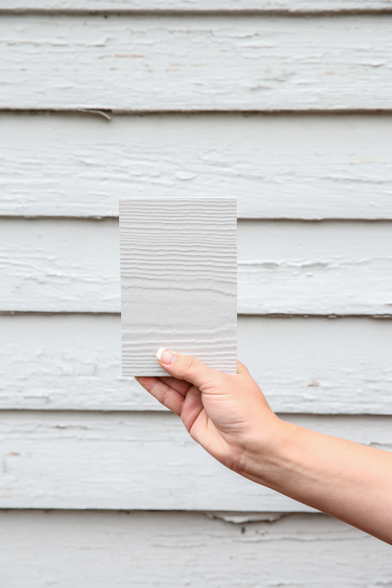
I was sold on the way the siding was made but I wanted to be sure that they had some great colors too. And they do. I picked three samples for the Monroe House and here is what I am trying to decide…
Look at that chippy wood y’all!! This house is gonna look ridiculous good when it has new siding.
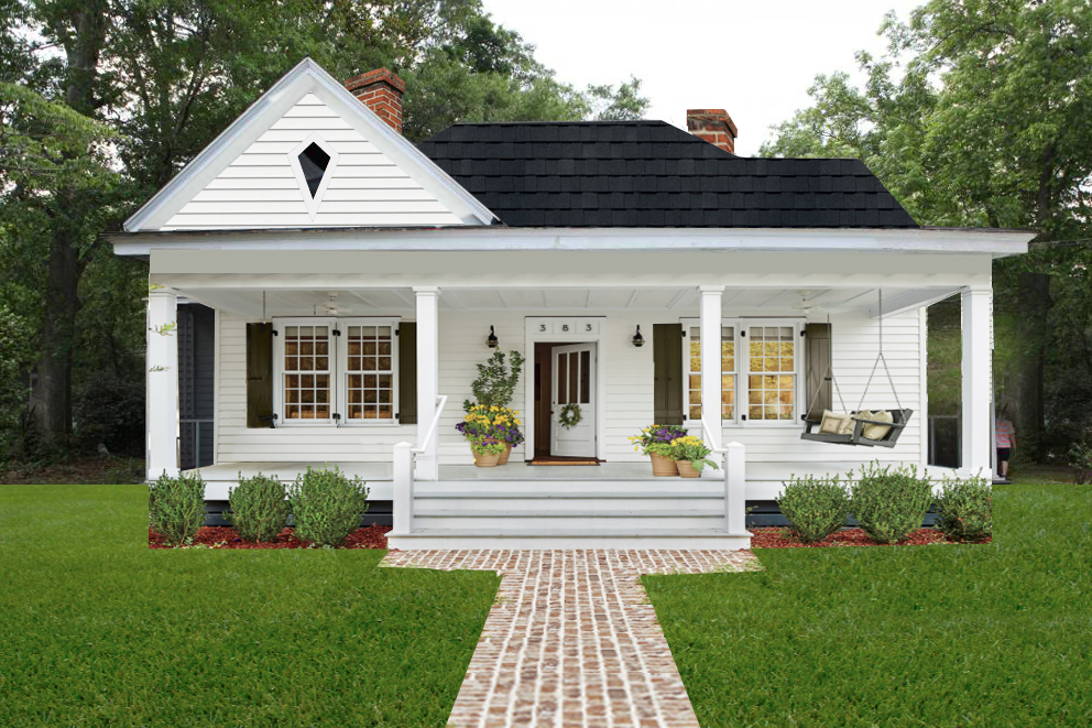
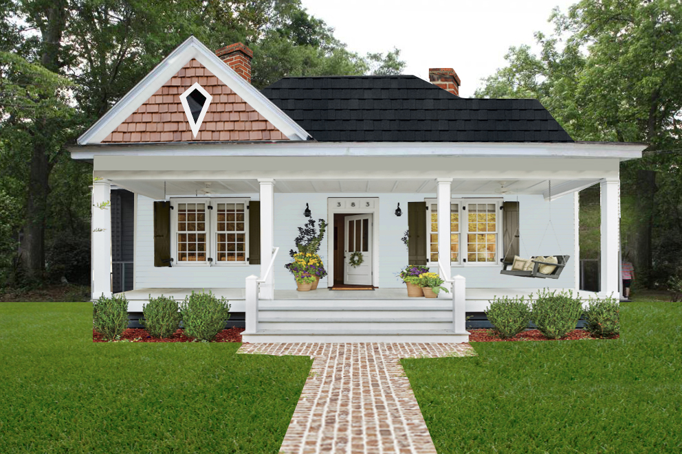
ANYHOO….The siding colors are Arctic White, Boothbay Blue, and Light Mist. I love the crisp look for this house – especially since it will have white columns and crisp details (like the diamond shape in the front gable). The very first color we considered is Arctic White. I love me a good white cottage with dark shutters and a pretty front door.
Prepare yourself to see this….I photoshopped the before into an after for you to tell me your thoughts and the virtual transformation is insane. Here is the before…
And after the new crisp white siding…..
WHA?! I mean INCREDIBLE, right?! I mean…I love the white columns with white siding and how it feels so CLEAN. White also feels like a classic choice. You would expect this home to be cozy and inviting yet a really timeless beauty inside. I think that is kinda what I am going for in general…like an amazing home with low-maintenance living.
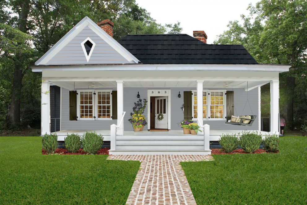
Moving along to option #2 – the Boothbay Blue…
And here is the rendering. This color is really very refined. It looks crisp and clean and it gives a definite masculine vibe. I love the way it makes the white trim pop.
Last is the Light Mist. It’s a very similar color to what is existing on the house and it is a lighter gray with blue undertones.
I photoshopped this with a wood element in the gable and it feels a little more quaint and full of personality (the wood look is not a James Hardie® product, in case you were wondering). I think this color is the one I like the least because it is most similar to the existing color. But it does have a cottage feel and gives off mad home-vibes.
Besides the color, there is also the choice of profile. James Hardie® also has a variety in choices there. There are three options – textured, smooth and beaded. Personally I like the textured (that is what is pictured above)….but I would consider a shingle on the gable. They have a HardieShingle® siding that is pretty gorgeous too! You have to check out their website to see it because literally – words do not do it justice.
So what do you think? What are your thoughts on the color options? I am leaning toward the white and do either the HardiePlank® lap siding (I mean….it’s North America’s #1 brand of siding for a reason!) in textured or do HardieShingle® in maybe a straight edge design in Arctic White. Either way, I will rest easy once this job is done and the exterior will look RIDICULOUSLY GOOD.
And if you are thinking of updating your home’s exterior now or in the future, or would just like to know more about James Hardie® siding, you can get your own free samples HERE and check out the inspiration guide HERE.
p.s. At the risk of sounding like a complete siding nerd, here are the bullet points on James Hardie® fiber cement…
-
- Stands up to storms and harsh weather
- Water resistant to protect against swelling, warping and cracking; also resists damage from mold
- Won’t be eaten by animals or insects
- More fire resistant than wood or vinyl siding
- ColorPlus® Technology finishes can add years of unrivaled color performance
- Helps reduce time and money spent on maintenance as compared to wood or wood-based siding
- James Hardie® siding and trim are uniquely engineered to perform beautifully, despite what nature brings. So, even after years of wet or freezing conditions or blistering sun and hot, humid conditions, your exterior will continue to impress with its warm, inviting look
- A home is only as strong as its weakest point. HardieSoffit® panels reinforce your James Hardie® siding by protecting the vulnerable gap between eaves and exterior walls
- Warranty:
- James Hardie® does not prorate their siding coverage. They stand behind their siding 100% for 30 years and behind their trim 100% for 15 years
- ColorPlus® Technology has a 15-year limited finish warranty


I was leaning toward boothbay blue until I saw the rendering. It didn’t have enough contrast to me, and I really liked the rendering in white. The light gray was my least favorite all along. I vote Arctic White!
BTW: I’m very excited to see stuff happening with Monroe House!
I love that you are fixing this house up – it is certainly been through a lot! I must say, though, I am a member of my local Historic Architectural Review Board, and a licensed architect and it is a *huge* loss to replace the original windows and doors (as leaky as they may be, and as much paint as they may need) and also a big injustice to the house to remove the Victorian detailing. There are enough cookie-cutter capes being built out of Hardiboard these days – the wavy window glass and the delicate Victorian details are what make your Monroe house special!
Katie, all three look amazing,but my favorite is the white. I am so excited to see the transformation of the Monroe house.
oooh, I’m loving all the colors you chose. That last one with the shingles is so cute! I can’t wait to see what you pick.
The ‘fixes’ the previous owner did makes me laugh… and then cry cause it kind of reminds me of my own home. Our previous owners must have been reading the same janky DIY instruction manuals 🙂
White!!! Love the classic look!
I like the white. I was wondering what you were doing with the Monroe house, thanks for the update.
I love the look of Arctic White! ‘Tis beautiful.
Arctic white all the way- classic and gorgeous!
Love love love the Boothbay Blue color! I think that would be dreamy! I agree with you, Light Mist is my least favorite of the three. Happy renovating!
Ooo! This is perfect timing- We’re about to start building our house and my husband was just talking about this siding yesterday lol We’re going for the classic white siding with charcoal/black roof and shutters look, so I’m definitely partial to that choice 😉 Oh, and I need that brick you used for the walkway renderings lol
#1 Boothbay blue #2 White
I think the mist color is out!
We have the white and I love it!! Go with the white!
At first with just the swatches I thought I liked the blue. After the photoshops, I like the white best. The blue is pretty, but isn’t as striking as the white. I’m not a fan of the light grey, like you I think it’s too similar to the current color. It’s going to be so pretty!
Boothbay Blue!!
All the way!!!
Will look fabulous!!!
How big is house?
Square footage?
Bedrooms?
Bathrooms?
KATIE,
I had a White House with black shutters for 15 years and NEVER AGAIN!! The heat and horrible humidity made it get mold and mildew and green whatever on it! It was always dirty!!! You have heat! You have humidity!!! Don’t do the white as you will regret it!
I vote a color like the blue.
This is so exciting! They’re all beautiful and I can’t wait to see what you pick! I like the last one the best, fo sho. And the swing?!?! #allthehearteyesemojis
My choice would be the white, but I also like the Booth Bay Blue.
I thought the white was going to be my least favourite until I saw your renderings and that is the one I really love! It looks so amazing. We had hardie plank on our house in TX and it held up wonderfully to the brutal summers and crazy storms etc. I would definitely use it again.
Your instinct for white is spot on, I think! I really thought I’d like the dark grey but once I saw the white I realized it suits the house much better! Any would work, but I think the white is definitely the best!
I thought I was going for the blue until I saw the renderings, and oh the white completely stole my heart. It’s just so classy with the dark roof and shutters. It will be such a beauty when you guys finish.
White, White, White
I thought I would like the blue, but after seeing it on the house white it is.
I thought I would love the deep blue, but in the rendering it did not pop like I thought it might. The white however looks just gorgeous!
WHITE!!
I didn’t think I would like white the best- by arctic white is my pick. Have you already talked with the preservation review board about removing the windows and doors? As a preservationist it breaks my heart to remove original (they look like they could be original, but apologies if I’m wrong) windows, and they also might have issues with that plan!
Apparently I’m in the minority, but I love the darker one! I love the way the columns pop so much more against it!
Arctic White with the black shutters and roof. Beautiful!!! Looking forward to seeing all the changes.
I vote white!
Honestly, the whole post I thought the blue would be my choice until I saw the photoshopped images. I love the white! Arctic White for the win!
I am loving the blue! It’ll be different from most houses while still being a classic. So crisp and lovely!
Can’t wait to see what you picked!
Please reconsider the removal of the Victorian detailing. It is charming and, moreover, original to the home, which is very important to keep in mind when your house is in a historic district. I think it would still work with the cozy aesthetic you are going for.
Arctic White!
I think they are all gorgeous, but I LOVE, LOVE, LOVE the arctic white. I already want to move in.
I had the same reaction as someone else. Looking at the samples blue but after your renderings white. It’s classic, clean and full of southern charm. Love it
The original plan was to keep them but the frames are in poor condition, the glazing has asbestos and majority of panes are already broken. If we can, we want to salvage any that we can but we would have to have the glass reframed and it would be very cost prohibitive. We will let you guys know what they say.
xo – kb
I like the Boothbay Blue! The gray is a wash-out and the white feels toocountry/farmhouse. For the cottage vibe, I think the blue is the best choice. No matter what, I’m excited to watch the progress!
I will definitely think about it. If I can work it in, I definitely want to keep original if I can!
xo – kb
It’s almost 2000 ft2 and we are taking it back to three bedrooms and two and a half bathrooms. It is a great size for a small family!
xo – kb
I love, love, love the white!
I love the crisp white SO much! Do that one!
I love the white!
Artic white is my fav!
The blue is lovely might stand up to dirt better since this is a home you don’t live in (longer periods between maintenance)..
We have Light Mist on our house but I considered Boothbay Blue too! In the end, I thought Boothbay Blue might look dated in a few years and Light Mist was a more classic choice. Our trim is Arctic White.
They’re all gorgeous but the white is definitely my fave!!
So before I saw the photoshop (ummmm amazing) I thought “White will be so plain” but hands down that’s my fav. Either way, it’s going to look fabulous. B x
I like the all white!!
Yay! I’ve been wondering the latest on this house. I just know you guys will turn it into an adorable place!
I’m loving the Arctic White…but maybe with the wood shingles, too? (I loved it without, too; just a thought for some contrast.)
White white white white white!
The white is my favorite!
I like the last one.
White all day long!
Blue!
James Hardie is a great product. I like your idea of using two types – clapboard and shingle. However, I’m not a fan of the textured look for any product – siding, doors, etc. To me, the “wood” texture immediately says “not wood.” When you install real wood siding, it is smooth as are wood doors, etc. They’re sanded smooth. When I helped my dad build their cottage south of Savannah two years ago, we went with Hardie siding in the smooth finish and it looks really great. In our case, we paired the Hardie clapboard with some board and batten. Whatever you pick, I’m sure it will turn out fabulous!
Oh the issue isn’t just the paint. That would be a simple fix that I would love to get behind. I can get into it more later but in general, they are needing rebuilt and the glaze has asbestos, the glass on most are cracked and there aren’t any original doors that can be salvaged…even the front door was quoted by a local to be completely rebuilt. I will say that I am on the fence with the details…there aren’t many but I would like to keep them if I can somewhere on the house.
xo – kb
As much as I love the blue the white just screams classic, southern charm! So I’m gonna have to say white.
My absolute favorite is the white. Classic with black roof and black shutters. Second is the light mist. Can’t wait to see what you chose and I will definitely be following along.
So excited to see this awesome update! We have Hardie planking on our lake house and LOVE it. The crisp white is perfect for your future adorable cottage! Can’t wait to see what the Lord has planned for this venture!!
Definitely the Arctic White!
I love the white!
I love the white. I have one question though…
Is the gingerbread trim above that window original? I ask because my husband and I lived in a historic district for years and here you could not remove original features or change those features to something different. If that is the case I wonder of you’d be able to remove that trim as shown in your mock pictures or if even you’d be able to add those cedar shingles.
The guy who owned our house before us did things that were not historically appropriate and we inherited those violations when we bought the house. We were okay changing them back to how they should have been because that’s what living in a a historic district is all about.
Just curious.
Wow what a difference. It looks so fresh and clean now
I like option #2 – boothbay blue.
White. No shingles—it looks too busy. The front of the house is not large so keep it all white. A crisp color for the front door and accessories.
I love the white. Clean, classic , very stunning.
Arctic white!
White!
Yay!!!
Definitely the white! Super classy and timeless!
Hi Katie,
Great work on the renderings. I want to echo the others who implore you to embrace the “Folk Victorian” style of the house. I know the white/black combo with simple exterior details is very trendy and “Fixer Upper” right now, but it may look dated in a few years when the modern farmhouse thing goes out of style. The cool thing about folk victorians is that you can have more fun with color! It’s part of the style! Check out this home that is similar to your gray scheme, with painted shingles in the gables and a bright red door:
https://i.pinimg.com/originals/70/6f/ad/706fad90eb6e91bf5ca772cfb208c20e.jpg
I think your house would look fabulous with a color scheme like that. And you could even consider adding some additional victorian details in the porch and in the window molding.
Love your blog!
Wow, what a different with the changes you plan to make! I have to say the white siding really looks amazing on this house. So bright and happy!
White siding! So classic and beautiful. I would pass the house by in the other two colors but really be interested in the home with the siding white.
I am in the same group with many before – I thought Blue but after your rendering I like the Arctic White.
Arctic white. It is so classic. I am hope you will keep the Victorian detail on the gable. It belongs with the house.
I vote for the white. Stunning! I have Hardieplank on my house and snd its soo worth it.
Arctic White for sure!! I love that blue color BUT when I saw it photoshopped onto the house I liked it less. So excited to see the progress on this house!
It’s just so classy with the dark roof and shutters.It looks great, and more ideas can be used
https://banehmarket.com
thanks alot
Came here looking for this comment about the Victorian detailing. I would like to see this Reno do it’s utmost to work with the original features of the house. Would be interesting to see a post considering how to work with them instead of ripping them out.
The white siding definitely!!!
White
I vote Artic White! It is just so classic and timeless.
All three options are great; I think you can’t go wrong, and you have a tough choice ahead! As stunning as the white rendering is, I wonder about it showing dirt (rain splattering dirt near the ground etc) and pollen/mildew. We have white gutters, and they show gray streaks from the roof which isn’t the pristine image I had in mind when deciding on white.
I definitely want a front door that shows more personality. It is far down the road but I’m not really going with farmhouse as much as cottage (it originally was very small) and honestly I don’t know exactly what is original and what isn’t because it has had so many different lives.
xo – kb
We honestly don’t know what is original and what isn’t. We are allowed to remove stuff but it will have to be approved. I know that right now – even that old awning is considered ‘original’ but it definitely was part of the phase the house lived through at one point.
xo – kb
Arctic White!!!! The gray was my least favorite and actually I’d pull it out of the running altogether.
Everything in the Arctic white picture I love…the wide stairs, the brick walkway, the white siding…just everything looks so wonderful. Would love to see the house since I live in Commerce, GA
I live in a historic district and own a home from 1850 and am fixing a little back structure with James Harde siding as well! My brother in laws are contractors and use it all the time because it’s a great product. We’ve got a red brick, so I’m going with a dark blue/gray, but I love the white on yours! I also echo all the comments above – see what you can keep of the victorian detail (even if its in the house somehow? ex – if you take that gingerbread off, use it for shelving or something inside the house?) Excited to see where you go from here!
Love the first rendering and how awesome is that hardie plank!!
GORGEOUS! So exciting to see a post about Monroe House! It’s going to be a labor of love but OMG those renderings!!!! WHITE, my vote. But anything is going to be beautiful!
In agreement about the Victorian details. When you renovate a historic house, you’re agreeing to preserve it’s features – you’re preserving history, you’re preserving the time period in which that house was built. Hopefully you meant cottage touches in the decorative sense! 🙂
You will love the Hardiest Siding have used it in a former home and it is definitely the way to go! Also used the textured and loved it! The color is such a personal choice after seeing the renderings the white pops where the blue is to pale to place with the white accents! Personally I prefer their medium colors with the white but you cannot go wrong with the product!
I vote Arctic White! Your Photoshop rendering is dreamy
Boothbay Blue is my vote. I love it with the white trim and it really brings your eye up to the diamond window. To me the little window gets lost with the other two paint colors.
I like the white the best. I was surprised. I thought that would be boring, but in the rendering it’s beautiful! Please please keep the Victorian details if you can. Those are the kind of details you don’t see in new builds and it makes your house unique. 🙂 but of course this is your house and renovate it the way YOU like 😉
We will be residing our house in the near future and I was on the Hardie Board website this morning! Ha!
I vote for Arctic White, but I’d do the cedar-look shinges in the gable, and a stained wood front door.
I love the white! Cant wait to see the progress. Also Im with you on the victorian thing! Hopefully you can find a good balance of keeping original details and still making it look fresh!! 😉
The first photoshopped image is perfection, so my vote is for the white. But whatever you choose, I know it will be stunning when you get finished. I think I’ll have to polish up my patience too, waiting to see the finished product! Thanks for taking us along on the transformative journey.
I agree with Betsy!! Call me a Nicole Curtis type, but PLEASE don’t do like most people do and take an old beautiful home and gut it and make it look brand new inside. Victorian details and ORIGINAL details are what make a home so amazing. Preservation, not renovation. haha
My vote is white! But they all look nice.
Also, since you are replacing the windows have you considered black casing on the windows and then still farming them out in white?
I also conquer with a previous poster about the Victorian detail – it is probably original to the home.
I wish my money tree grew quicker as well, I have big dreams of bringing an old home back to life someday, but like you don’t want to finance it.
I was thinking for sure the blue before I saw the photoshopped versions, but I’m definitely team white! It looks so classy and timeless. What a cute cottage!
Me too! I was definitely thinking the blue/gray until I saw the rendering. Definitely white!
I was loving the blue, until I saw your rendering in white! Clean, classic and just right 🙂 And…………..what a difference taking that awning and porch off. Yes!
I really thought the white at first because it’s so classic and you’d have more options with trim, door and shutter colors down the road. Thinking more though about the age of the home, it would be more likely that it had more color to it than just white. You may have better luck with the preservation board in your arguments to try to keep those detailings by arguing that those are more likely to be original than the obviously newer awnings and also keeping a more Victorian color scheme to balence the loss of the original windows. I’d do some research to see what original glazing/mullion options there would have been to see what new windows you can get to mimick that historic look. I’ve always loved historic buildings and ended up with an emphasis in historic preservation (didn’t know that “emphasis” was a thing lol, just liked the classes but didn’t want to minor in it) with my architecture degree. I’ve always wondered though if it was my house, how I would balance those decisions between historic preservation and creating a home that works today with resale value in the decision mix. Can’t wait to watch your journey continue with this home and it’s new life. ❤️
I love the second option… in my opinion , it makes the trim stand out, and it makes the whole exterior seem so interesting! You can’t go wrong, but I feel the blue is perfect! (Which is interesting, because I anticipated liking the white, until I saw the renderings. I LOVE classic white… but I think the smaller facade on this house benefits from the color… as opposed to a large farmhouse two story, that I always prefer in white. If that makes sense?)
White White white white white white white!!! ❤️
I liked the white the best! It’s so classic and clean. Your Photoshop skillzzz are amazing!
I agree. Depending on what the town of Monroe has in its archives, you can probably find at least exterior photos to give you hints on original door, trim details, possibly even paint colors. I understand that asbestos abatement and broken glass is a pain, but preservation or at least recreation of original details is the honor and responsibility of anyone who purchases an historical home! You can find salvaged trim and glass. You can commission some trim pieces or re-create them yourself. Please please cherish and respect these details. There is so little architectural history in the suburban/rural south, especially the areas surrounding Atlanta. You have a great opportunity here!
White! The blue is pretty too & would be my second choice!
Artic white!!!
I vote for white!!!!!!
I wholeheartedly agree!
Katie,
Other than that one peak on the front left, what original “Victorian detailing” does the house have? Just kind of glacing through, that appeared to be about it. Just curious if there is more original detailing elsewhere covered by awnings and screening, or if that is it.
wow! The white one is in a category by itself. Go with the white one!
Artic white
When I originally saw the swatches, I was all Boothbay Blue, but after the photoshop renderings, white all the way! So classic and clean!
I also vote white…it is looking like an all around fav!
Definitely Arctic White. I also agree with Betsy about not removing the Victorian details!
I thought for sure the blue…but dang. That white is amazing in the rendering. It looks like the kind of home you would see in a southern home magazine…perfect for sitting on the porch and sipping lemonade in the summer.
Holy smokes Katie!!! They all look darn gorgeous!!! U couldn’t go wrong with any. I’m a sucker for number one… classic white with dark shutters.
Its funny I was leaning towards the middle one until I saw your photoshopped pictures and now I definitely would pick the artic white!
I vote for white with cedar shake! Then, obviously, a red front door and dark shutters.
OMG! That Arctic White without the screen porch and awnings is AMAZING!
The same detailing is on one other peak on the right side of the house. But that is it. We have other peaks but none of the rest have the details 🙁
xo – kb
Yes – we are definitely going to go with the same profiles and going to be able to salvage one of the original stained glass windows.
xo – kb
I wish that I could do that with black casing but it would be a far cry from the original look of the house and we want to honor that.
xo – kb
Yes – it was a cottage to begin with (at least in the sense that it was a small single family home in a farming town) and we will try our best to preserve as much as we can!
xo – kb
Yes – it’s a hard thing. I definitely want anything new to be as similar as possible to the original!
xo – kb
Definitely white! So crisp and clean. Beautiful! I thought for sure the blue would be a better choice, but I didn’t like it at all in the mock-up. I like the cedar shakes in the last one, though!
I thought the same exact thing! Arctic White for the win!!
Are they providing you with free siding for this?
I like the darker blue. But I’d keep the gingerbread trim. It doesn’t look like a historical preservation if you remove it. Any way you choose the house is going to be charming.
white al the way.
I wish.
xo – kb
Definitely white! Please strip the paint off the transom or replace the glass in it. Typically, a house of this age would have had a glass transom above the front door for light and possibly air circulation if it was hinged. If you replace the windows instead of stripping and re-glazing them, I hope you putt back windows the same size as the existing ones. Pre-HVAC these old houses were designed for cross breezes to cool the house essential in the South. That’s why we tended to have larger windows and deep porches.
Keep all your salvage wood. Offer it for sale and it could pay for your exterior renovations. Central Texas folks would drive to LA to pick up that wonderful chippy wood!
As far as a color, Artic WHITE is my vote.
I was wondering what program you used to do the Photoshop mock ups and the render? Looks amazing!
The white scheme is SO classic. But I love the shaker detail of the cedar gable!
Same here. Looking at the samples, i
I was leaning towards the blue one. But in the rendering is a total nah. The white rendering is perfect, so I would say go for it!
Yes – we are hoping to use all the same size of the originals (at least on the front where we can tell what they were!).
xo – kb
White seems to be popular, and it is nice, but Boothbay Blue is the way to go…for my two cents. :^)
I totally agree with Maura!
White!