There is no connection between the post title and the post content by the way.
This post is actually about Will’s accent wall. You know…the one I covered in burlap.
The last you heard, we repainted the entire room a pretty standard tan color and then I staple gunned a roll of burlap to the wall with the crib (as a shrine to his old nursery’s accent wall)…and with all that texturey awesomeness, I decided that it would be the prime backdrop for some artwork.
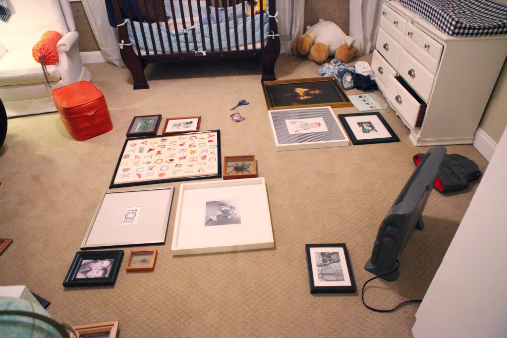
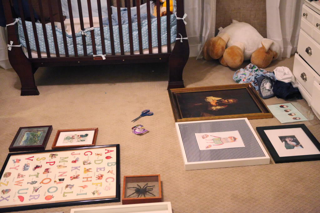
Okay – sooo…let me just put this out there…imagine me saying this with Nene attitude…I am not buying any more frames. I had to work with what I had…not spending money on stuff…so if you have a suggestion that involves the words “you could buy…” or “you need to get….” – well, it stinks to be me…cause I ain’t got no money for new stuff. I know. I’m such a tart. One big house-poor tart 🙂 Would Nene use the word tart? I think not.
And yes, that is my son falling off the ottoman…
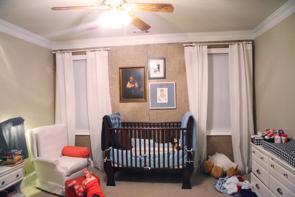
Do you see all that chaos? The dirty laundry, the blue bumper that is pushed by unnamed toddler down past the mattress, the blankets draped everywhere like it’s a dorm room…chaos.
After a little decluttering, the new three grouping looked like this…
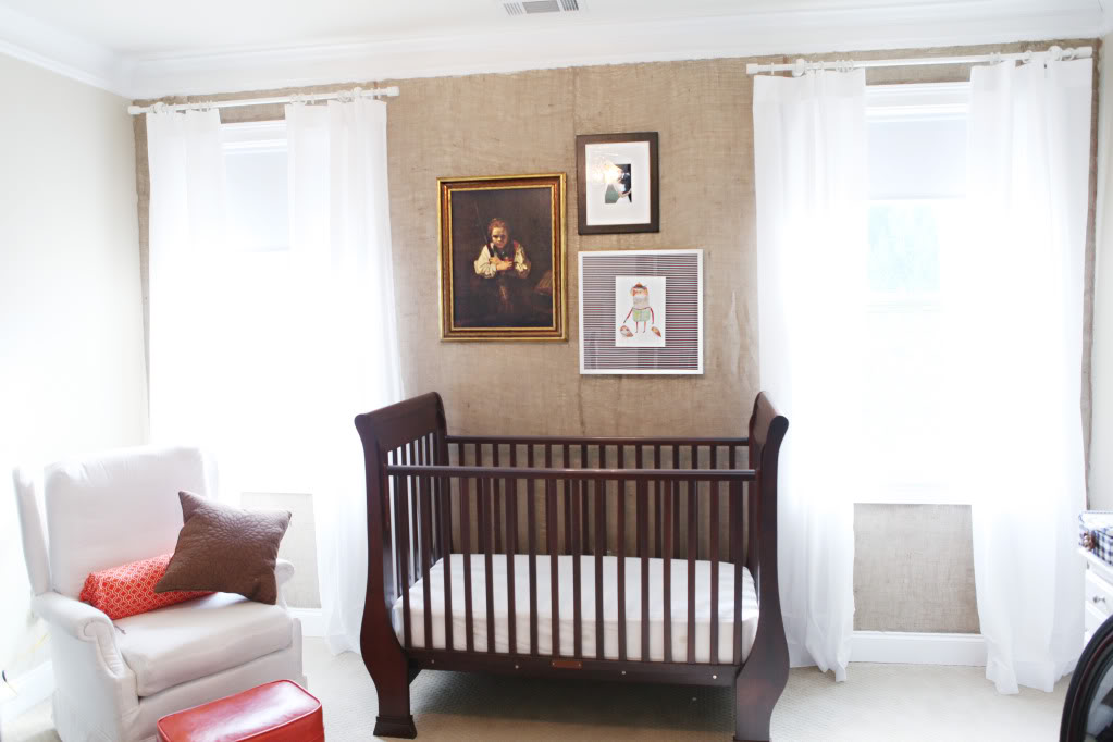
I wanted to see how just a few looked up on the wall – mix n match style with the three different frames. And I also put up some fabric that I had in storage to see how a homemade bumper and homemade crib skirt would look.
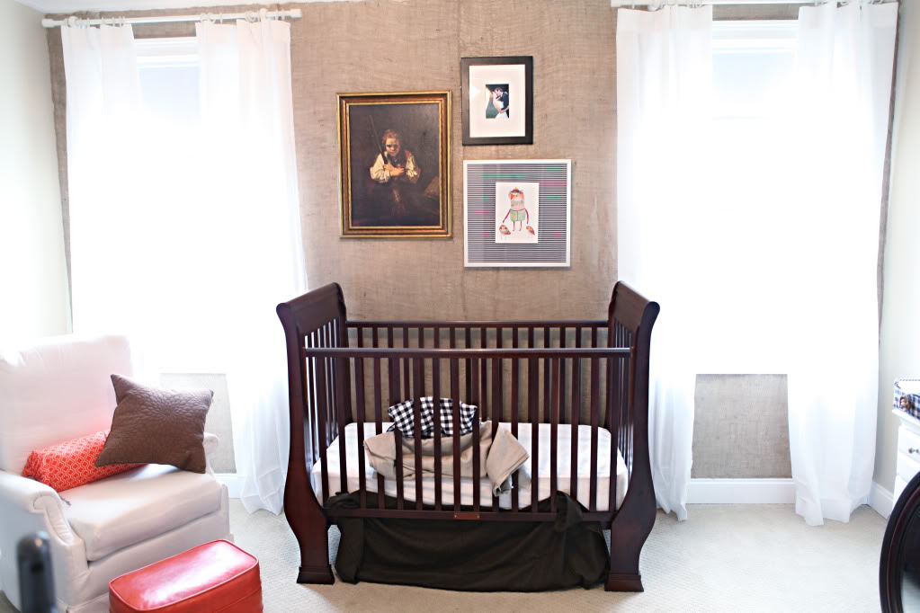
The rest of the room still looked crazier than a handlebar mustache on a newborn.
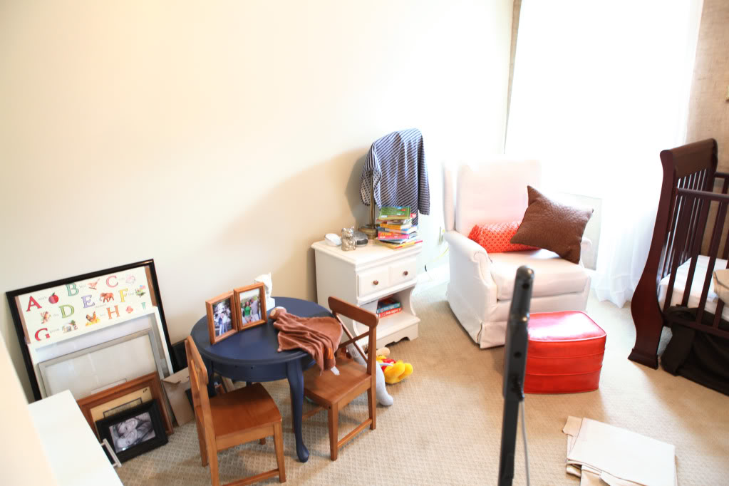
And the right side of the room wasn’t working well either. (obviously this photo was taken before we hung the mirror!)
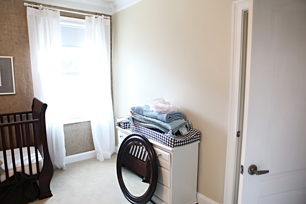
So I decided that the entire room needed switching…the left needed to go right, the right needed to go left, the nightstand wasn’t big enough for books at bedtime…so the $6 nightstand I had in storage (and desperately needs a makeover) came in and the little white one went out…
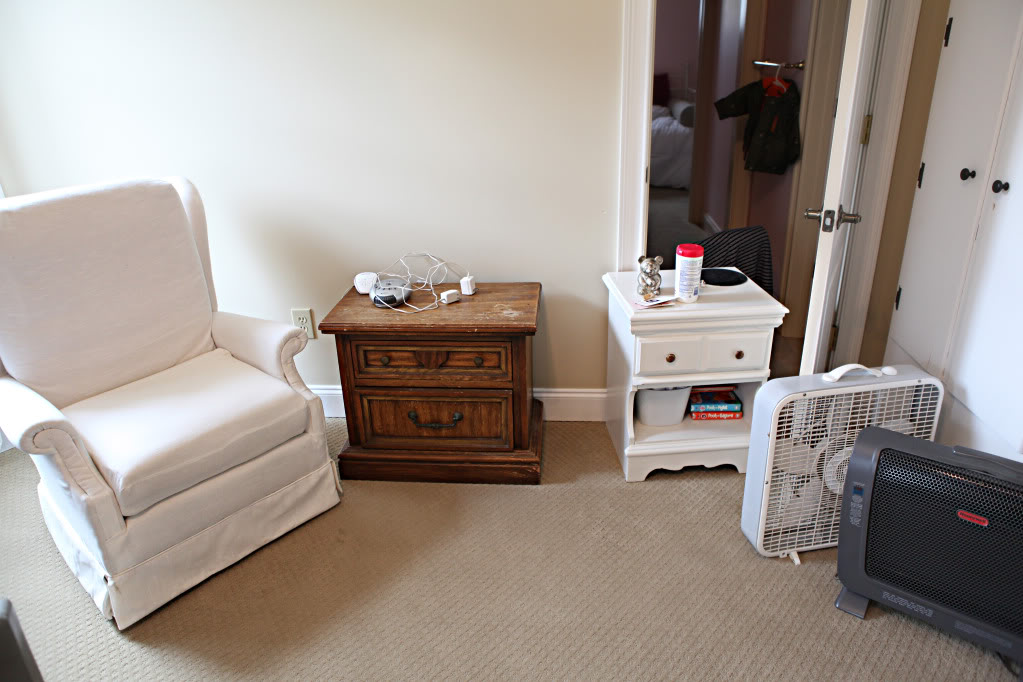
The mirror went up…
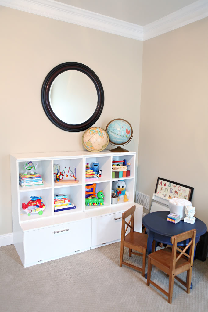
I brought in a new light…the brass version I had also in storage…it looks more masculine for some reason and also I liked how it tied in the artwork frame…ignore the fact that it’s so tall…these photos were rushed 🙂
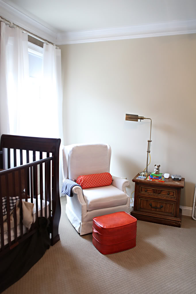
Oh and did anyone notice that I extended the curtains? Yup…just let the hem out 🙂
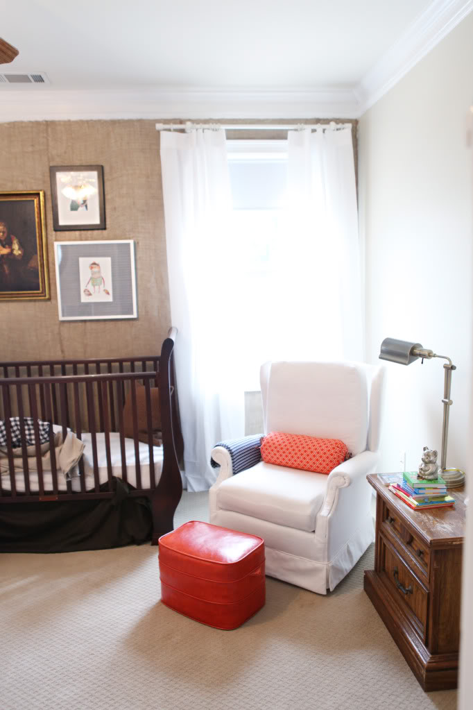
And the dresser/changing table got moved to the other side…
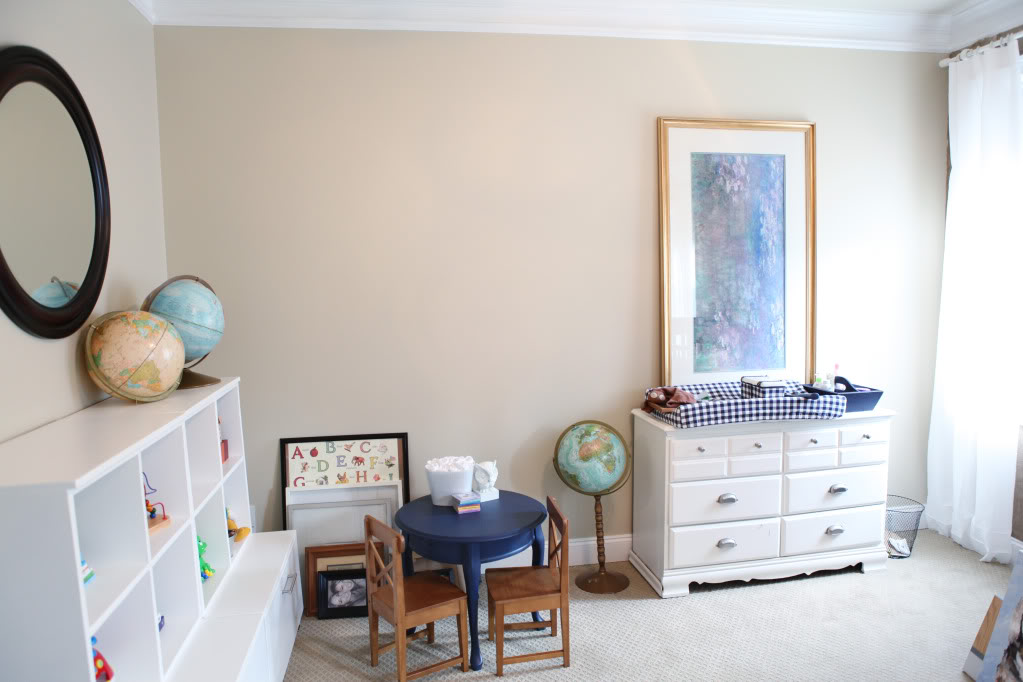
And we slept on it…
Sometimes sleeping on it helps give me a little clarity on if I really like something…and my clarity told me that the gallery frames just weren’t enough…I wanted more….I really wanted to fill up that space above the crib…
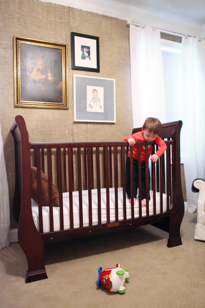
So I switched some stuff up and moved in more frames…
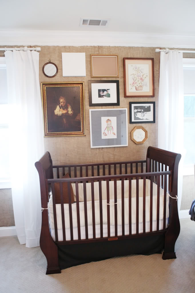
Ignore the fact that the artwork is incomplete…
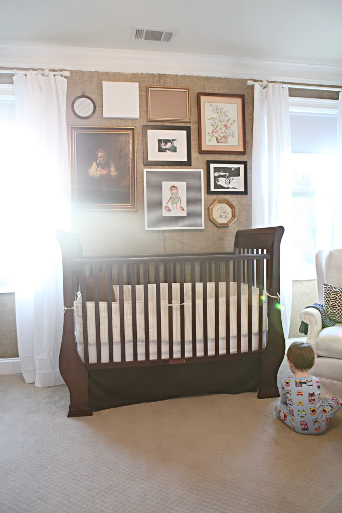
Oh and I stitched up the new crib skirt (more on that later) and used the backup bumper I had ($3 from Goodwill BRAND NEW) which is really sooo much better than the blue one that never matched.
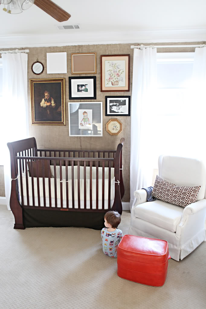
I know this look probably doesn’t strike a chord with everyone out there…you know, all the different frames…but it works for me. it works for my eye. it works for my grand vision in the end. it may not work right now…but it’s not finished…it’s evolving.
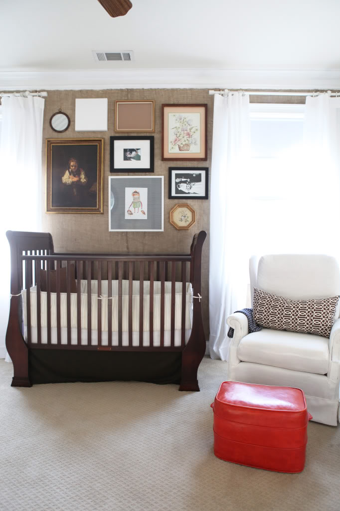
And did you notice the seam where the burlap meets? Yeah…it seems to disappear a little more with all those frames up there.

You can still see it but it doesn’t pull out your weave, if you know what I mean.
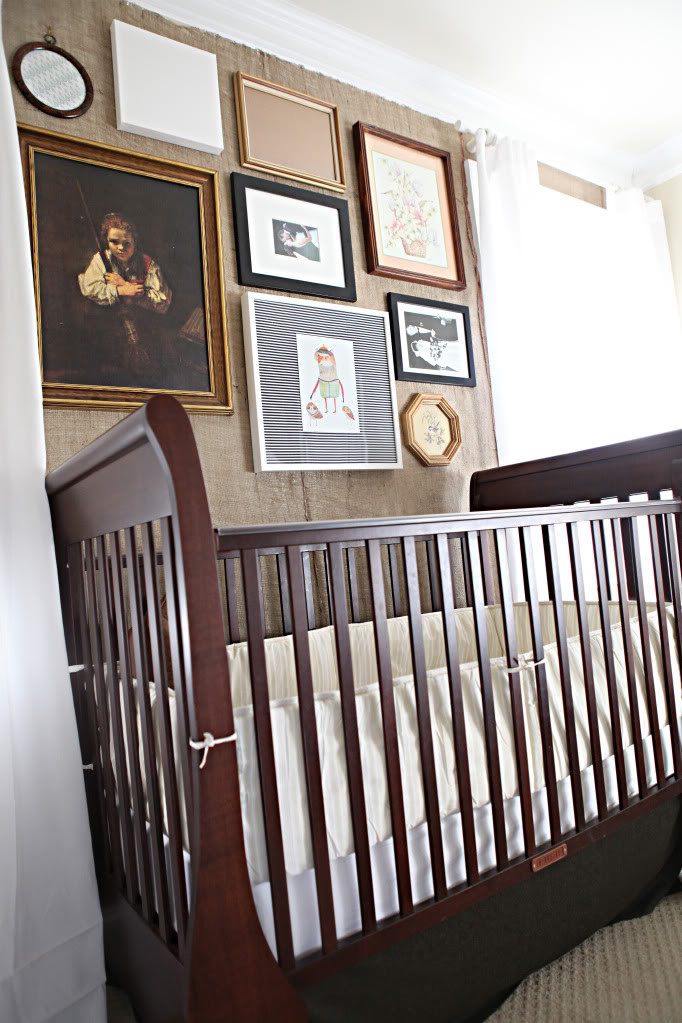
And no – I didn’t iron the curtains, thanks for asking 🙂
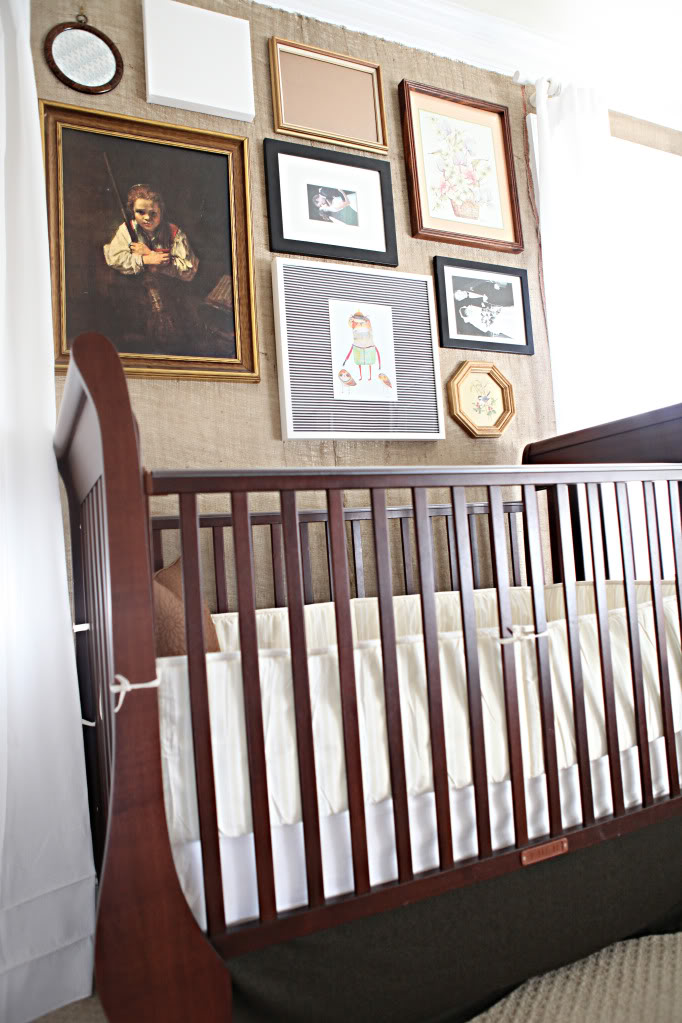
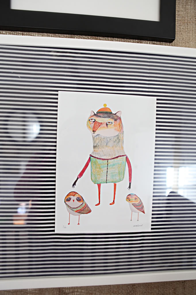
Now onto artwork brainstorming. There are only two things staying as is – the girl with the broom painting (or as Jer calls it – boy with a gun)…and the wolf and his two owls with the striped background.
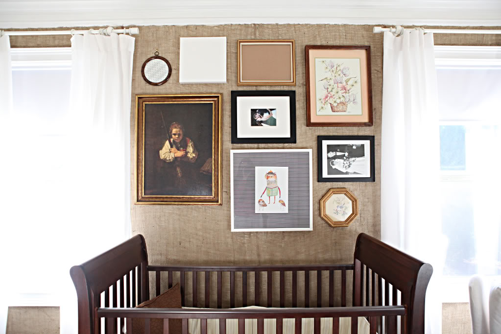
This print is from Ashley – who check this out…is so talented that her fun whimsical tshirt designs are available this month at Urban Outfitters (yup totally tooting Ashley’s horn)…and she sent me two prints that are ADORABLE. She picked this one out for Will…and it’s perfect…especially since I call him my little Werewolf sometimes 🙂
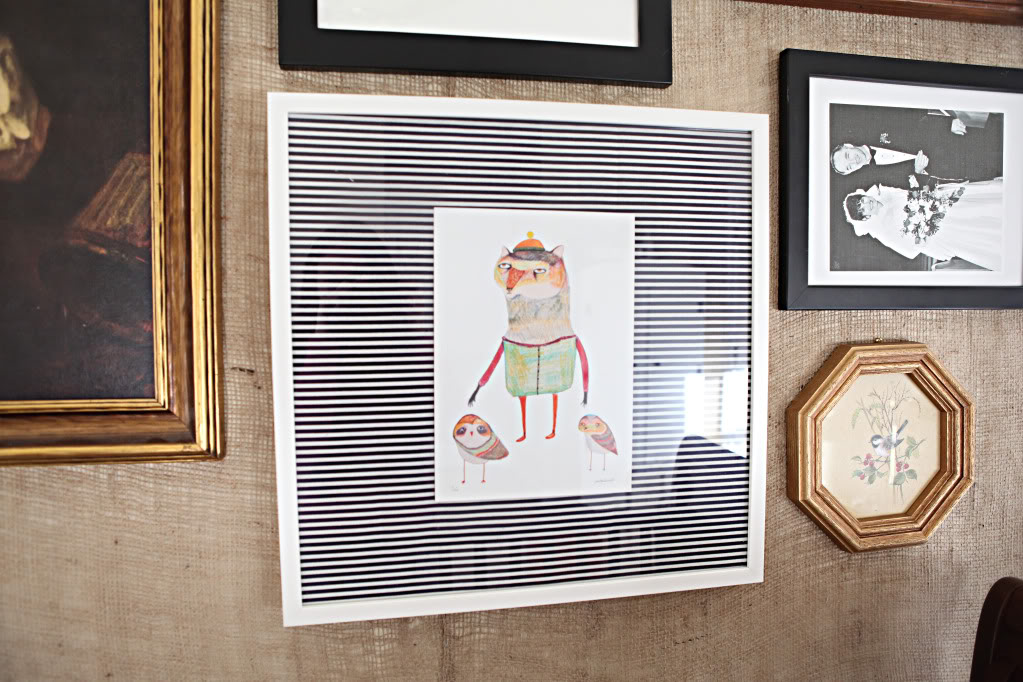
I guess the two little owls are Jer & I 🙂 Plus, the color is great for what I’m looking to do in this space…
So that’s our update so far on this room…You guys making any progress lately on rooms? Or are you as obsessed with gallery walls as much as I am? I am pinning them like every waking minute. Or perhaps you just want to say how the new bumper really REALLY helps 🙂
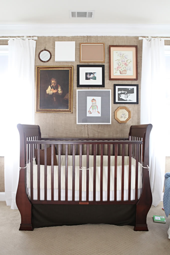
The difference between the initial pic (with the hilarious ottoman action) and the final pic is AHmazing!!!! The gallery wall looks so good!
I really love the collection of frames and prints (so far). It reminds me of an old timey library. And that picture of Will falling off the ottoman… is it okay to say I thought it was funny? Since it’s your kid… falling…?
Also, does Ashley have an Etsy store? That print is so funky!
Do you worry about will grabbing them or one falling and hitting him?
I love, love, love the gallery wall. The mix-matched frames make it interesting. Gotta say, though…Not digging the boy with the gun/girl with a broom print. It’s creepy. But to each her own. 🙂
Love the new arrangement of the furniture and the new skirt and bumper, too. Will’s room is coming along nicely.
Also? I haven’t ironed a single curtain my house and I’ve lived there almost three years. 😀
I like the gallery wall. I wouldn’t be brave enough to use all those different colored frames but I like it in the room since there are so many neutrals already. I think it might be fun to have Will paint some art for the frames, you could hang his masterpieces in his room. And, it’d be free!
I don’t have a big gallery in our house but I’ve been trying to figure out where I could put one.
I really like the mismatched frame wall. I’d love to do it in my own home, but I’m nervous it won’t “work”…guess I should just try it and see if it comes out as lovely as yours.
Also…2 thoughts. It looks like the upper leftmost frame might be a canvas? One thought is you could transfer a picture of Will onto it since you take such amazing photos. I’ve seen a bunch of tutorials on pinterest recently. The other would be to let Will make his own artwork for his room. My mom framed a picture I made in second grade and put it above my bed. I always loved that I got to create something awesome that hung in my room.
It’s fun to see the room coming together. This is already a VAST improvement over the old room with the sushi colored walls (still makes me cringe thinking about it). One question… what keeps Will from grabbing or pulling at the artwork on the walls… especially with his great passion for throwing things?
Here’s a great piece of art Will could make for his own room!
http://pinterest.com/pin/57209857735934196/
I am obsessed with how the room is evolving!!!! KatieB, you’ll be back on NateB’s show in no time!! I am totally on board with the “workin with what you got” train too!! It’s more fun that way, no?!?! High Five girl!! xo Jo
LOVING the updates!! Will’s bedroom is coming along nicely! I really enjoy all the changes and the wall looks good to me too..you’re not alone on that one…it’ looks GREAT!
PS. And as per usual…your posts have me cracking up, at my desk at work. (I’m working really hard lol…not)…brain break!
I’m a huge fan of using what you have to create something totally original. Check out my picture wall for my girl.
http://btweenblueandyellow.blogspot.com/2011/06/room-reveal.html
And by the way, your not alone in being house poor 😉
The different frames work for me. I’ve been dying to do a frame wall like you have on your stairway. Years back, I got rid of all the little table frames I had, which effectively got rid of every family photo in my home, and I love those people, so I need to bring them back. You have such a neat way of incorporating sentimental “stuff” into your frames, too; I can see you doing that in here, too.
Your monthly “Safety Lori” comment: crib pulled out from wall? Or some kind of secure hanging hardware? Gotta keep that ottoman stuntman safe!
I think it looks great! I actually like the mismatched frames. It kind of gives it that collected feel and adds extra dimension. Yay for using what you’ve got! Sometimes you have to be more creative when you can’t just go out and buy something!
Frame galleries are like my go-to decorating style. I think I have one in every room! I love that wolf and owl print, I’ll be watching for the t-shirt at UO fo sho!
You’re so awesome. I’m loving seeing this room come together. And I adore gallery walls, although my kids are hell-bent on demo-ing the one in my staircase. Post forthcoming.
In other news, I’ve been walking around lately saying, “Put a Snuggie on it!” Worse, I often sing it to the tune of “Put a Ring on It.” GET OUT OF MY HEAD, KATIE BOWER! Except not really. You can stay.
Thanks for the update! And yes, working on updating my little boy’s room as well! AND planning on doing a gallery wall in it! I’ve done two posts about it – one ‘vision’ and one progress one – if you’d like to take a peek 🙂
http://visualmeringue.blogspot.com/2012/01/big-boy-room-for-my-little-guy.html
http://visualmeringue.blogspot.com/2012/01/what-is-blue-white-grey-and-striped.html
“Social notworking!” I’m sure everyone just thinks you REALLY like your job. 🙂
I literally laughed out loud when you pointed will falling off the ottoman, oh to be a decorating mama! I think it looks great so far. Love the curtains being the right height, love the room switched left to right, love the new bumper, it really looks fresh and pops off the brown. And I really love the different frame styles, its not for everyone but I’m way into that eclectic mix. And I know you are going to be super cheap and creative and come up with great art. And the only thing that bothered me about the burlap wall was the seam, and the pictures really do cover it up better. Great job! I dont know how you have time to do so much!
I think the gallery wall looks great and I like the mismatched frames. I too am OB-sessed with gallery walls (in fact, I have a whole pinboard devoted to them) and recently put one up in my own house. We’ve lived there for over a year and it didn’t really feel like home (much like you) but the addition of art has gone a long way.
Oh, and speaking of Pinterest – you MUST try this recipe. I made it as a gift for all of my family members this Christmas and it was a big hit. Are you ready for it? Bacon. Jam. Divine! So good on a cracker with some sharp cheddar. http://pinterest.com/pin/276267758360998474/
I love gallery walls. I’m too chicken to hang pictures over my daughter’s bed though. I have some stupid paranoia that she’ll pull them down or one will fall off the wall while she’s sleeping (I apparently hang pictures horribly or have ghosts in my house). I never would have thought of burlap either, but it works! Can’t wait to see how it all turns out.
That bumper makes a serious difference. And my favorite part of the entire post (no offense) is Will diving off the ottoman. Kind of like he’s moved from throwing things to throwing himself…
I soert of like the frames, the girl with broom is freaky!
And O-m-g you did not put a photo that had a stonking big mofo of a spider in did yoooooou?!!!
I sqealed and had to slowly scroll incase you had a close up… Ughhhh shudder..
Still squirming..lol
I have to tell you that I looooove mixed frames! I’m always drawn to gold ones for some reason. AND, holy crap! I have that same bird and berries print in the gold octagonal frame that I bought from goodwill like a year ago! P.S. It’s so inspiring to see what you’re doing on a budget of $0. Keep up the great work as always!
katie — i found your blog through YHL and have been following all your house updates for awhile. Your photography is amazing. You really have talent.
I just wonder, why the bumper at all, given all the various warnings against using them?
The crib looks a lot better with the white. 🙂
The room looks so sophisticated now.
Well the first night he touched but we found that with him if you address it right away (like we did with our stairway gallery) that he doesn’t mess with it. Of course leaves the safety issue of them falling off by themselves…so all the frames are hung with wires which are much harder to get off the wall..and I pulled the crib about six inches from the wall. It’s probably not the worlds safest room but he’s fairly responsible as almost two year olds can be and he’s learned that frames in general are pretty boring 🙂
xo kb
Katie, I love how real you are. I’m still laughing at the picture of Will sliding off the ottoman. Love the new bumper, love love love (listen to us.. a bunch of Real Houswives sound-a-likes) the burlap wall, and REALLY LOVE all the art. The more space it takes up, the better. I can’t wait to see what y’all do with the huge piece that’s leaning against the wall.
And I’m pretty sure I’ve left a link to our nursery before but my pregnant brain isn’t fully functional, so I can’t be sure… Here it is, ready for the little man inside of me who is officially 4 dang days late:
http://bontempsbeignet.blogspot.com/2012/01/nursery-reveal.html
Nope. He’s gotten bored with frames…I credit the stairway gallery wall as his training for not touching. They are all secure so unless a natural disaster happens then they will stay up…and if a natural disaster happens I think I’ll be more worried about a wall hitting 🙂
xo kb
I love it! I am really into kid’s rooms not being super baby-ish! He could grow up in this room and you’d hardly have to change a thing. I’m sure he doesn’t care anyways! 🙂 And it has enough fun kid elements to keep him feeling cozy and at home.
I love how your design style is out of the box-ish – but also has a classic bend.
Well I spoke with my pediatrician and she said that most times the bumper issue affects the babies who can’t roll over…since Will is almost two it’s more so that he doesn’t push his feet through the crib slats. We definitely did without it for the first ten months…so I encourage everyone to talk to their doctor!
xo kb
I am SO glad the baby blue bumper is gone! Looks much better and I can’t wait to see the evolution. It’s amazing tome what you do on a budget, so inspiring.
I.LOVE.THIS!!!
Adorable! And I’m LOVING the different frames – I’m really loving the not-so-matchy-matchy look right now, and this wall is PERFECT!
I love seeing you evolve your new house into your home…it’s fun to see your style coming out in all of the rooms, and I love that you do it on such a budget – we are pinching pennies right now (feels like we always are…) so it’s fun to see you take things you already have and make them all work together to look fabulous! Gets my wheels turnin’ 😉
I love it! It looks so grown up and masculine. It’s really great.
Hi Katie,
I am liking the mix of frames so much more than all IKEA frames for gallery walls.
The contrast is really nice.
I can’t wait to see more of the room as it comes together.
– Kathy
Hi Katie,
I really like the mixed frames. I also agree what someone above… I love kid rooms that don’t look like kid rooms. And it will be so easy to change and adapt the room as he grows or as your tastes change. Can’t wait to see it all pulled together.
Hi Katie –
First time poster – but full time stalker 🙂 Love your ideas/homes/decorations, etc.
Quick question. Are you nailing into the wall to hang all of the pictures? I’m always so hesitant to change things up becuase I’m so nervous about the nail holes and fixing them once I change something up. I have a wall with grass cloth wallpaper I can never hang anything because I”m wondering what will happen if I move the furntiure under it, etc.
Obviously you do it all the time. What do you do with the nail holes if you want to change it up down the road?
I LOVE the frames! I wish I had gone mis matched frames…. but I worked with what I had and maybe one day a good can of spray paint (or two) might come into play. I like that you treat this room as any other room you would and yet still add the fun kid touches. <3
Looks beautiful Katie!
I love it!! The new crib skirt and bumper look great!! I am concerned about the safety factor…but as I’ve seen in your previous comments, you seem to have them secured pretty good. Just yesterday we had a frame in our daughter’s nursery fall and break and I couldn’t have lived with myself if it had been over her crib, especially since it fell in the middle of the night when she was sleeping.
As always though, thanks for a great post! And thanks for keeping it real! Glad to see my house isn’t the only one with stuff thrown everywhere! 🙂
This is the first time I’ve commented on one of your posts (been following your blog for awhile now), and I have to say that I LOVE what you’re doing in Will’s room. I’m putting up a gallery wall in my hallway and I just added a bookcase to our living room. I’m not on your level decor-wise, so I love getting inspiration from you!
I’m in love with gallery walls too! Just finished 2, and have a 3rd in the “huge-pile-on-the-floor” stage. Wish me luck on ever getting it finished 🙂 Yours looks super!
I too am obsessed with gallery walls. We have 4 right now in my house and I have to resist the urge to make more! My favorite is the one that cost no money because I just used a bunch of stuff we had lying around with no wall home. Here’s the link if you want to check it out. http://www.houseography.net/2011/09/hallway-gallery.html I love the mixed up frames and sizes even though it’s not everyone’s cup of tea.
Forgot to add that Will’s looks great! Can’t wait to see what other fun art you come up with!!
the gallery arrangement looks awesome. can’t wait to see what you fill the frames with. also Will might have the same lovie as my little. i noticed the little brown monkey/blankie in the chaos picture. my babe lovingly calls his monk a monk.
i love the gallery! my husband and i are in the process of buying our 1st home and your site has been a huge inspiration for when we go to decorate and actually move in! 😉
I am loving the way it’s coming together. I think-gentlemen’s club (not a nudey bar..the other kind with books and cigars) meets modern NY with the white. What color are you going to do the end table? Maybe a deep Navy Blue??
Funny! I too just did a gallery wall for our nursery! My first one. Now that it’s done, I really love it. I did find it a bit tedious to get under way and measure and all that stuff!
Hope you like it!
http://www.refreshandrepurpose.blogspot.com/2012/01/nursery-sneak-peakgallery-wall.html
House poor is the name of the game baby! Living the american dream?! LOL!
Loving it KB! My daughter is the same age and I’m itching to update her room too…even though I never really finished it in the first place. Burlap, check! Gallery wall, check! Globes, check! Loving the little man cave!
I think it’s great! It’s really coming along. I wasn’t sure what direction you were going in but now I love it! And I love you! HAHA not in a crazy way. But you’re funny and I love reading your posts.
maxwellhouseinteriors.blogspot.com
It’s a far cry from the yucky pink walls 🙂 and looking better every day! As I was reading the post, I kept scrolling back to the “finished” picture of the room and it just seemed like something was off though. It’s just my 2 cents of course, but I think that the gallery wall-with the mismatched frames look like they’re competing with the burlap background. I think it may look more balanced if you take the burlap down and make curtains out of it instead. I think the gallery wall could use a big “W” too. 🙂
Did you get that vintage ABC poster in Richmond? I bought the same exact one for my niece at Mongrel in Carytown!
Actually, i DID want to tell you how great the new crib bumper is! I love your gallery wall & new crib skirt too. They go together so well and, somehow, they even complement the burlap wall. All the pieces you’re assembling make so much sense when you see them together! You have such great vision. I’m definitely looking forward to seeing the final product. 🙂 Bravo!
– Lauren
I love it. I’ve got to tell you the seam in the burlap wall (amaaazing idea by the way – totally original) was reaaaally bothering me. But the gallery frame wall takes your eyes off it…it does disappear, like you said. And I love the little circle frames – they really balance it all. Kudos!
I really love it Katie!! I love all the frames above his crib and I think it looks great with the different finishes. Makes it more eclectic. I’m really enjoying seeing this room come together! (and the white bumper made a huge difference) 🙂
Thumbs up! I am loving the wall. The more frames the better I say, as I’m gallery wall obsessed as well. And the burlap looks amazballs! Almost like grasscloth…but tons cheaper. You’ve got my head spinning.
YUP! When we went to visit Miss Clara (and Sher & Johnny Boy)…we picked it up…I’ve been dying to put it up!
xo – kb
ooo- we did this! Only ours says “If it’s not MESSY, It’s not FUN!” 🙂
I hear ya…and I can totally see what you mean but in real life it reads a little different than the photos. In real life, the burlap doesn’t stand out at all…and the curtains and windows aren’t blown out….it actually reads as more subdued (which I hope to change once art goes in)…hopefully it will turn out looking not off 🙂
xo – kb
“The rest of the room still looked crazier than a handlebar mustache on a newborn.” SOOOOO funny!!
Ok, also, I LOVE the gallery wall with the mis-matched frames. However, I’m not really a fan of the girl with the gun/broom. Do her eyes follow you when you move around the room? Has Will been sleeping better since it’s been up because he’s too afraid to cry? hehehe… just kidding, maybe it looks less creepy in person?
I have no idea! I might go with a fun pattern in grown up colors…or I might go with a fun color…or I might just refinish. Like I said – no idea 🙂
xo – kb
Yup, Katie is right.. Just like the books say! Bupers or anything in the crib is not recommended for infants, but for older babies/toddlers its great so they dont try to stick body parts like feet or worse-a hand – and get them caught or tangled!!!
Love your blog so much.
Only one I read! (I dont even read YHL!)
I love how unpredicatable it is!! Its fun not knowing what kind of post will be up each day… or how many posts go up in a day! 🙂
Heehee…ours is an owl 🙂 But maybe they are the same brand 🙂
xo – kb
Totally dig where this is going. The black and white on the crib looks great and the balance of the gallery wall is spot on. Excited to see more 🙂
I love all the rich colors, it reminds me of a little man cave! I’ve seen you pinning gallery walls like crazy, Pinterest always gives me the kick in the tail or that last piece of inspiration I need.
I’m loving seeing it come together. It looks so great! The burlap looks great! Love all the texture in this room…..the softness of the curtains against the burlap against the frames. Brill. Who the heck cares if this doesn’t strike a chord with everyone? Own it girl! It looks like a page from pottery barn. Love mismatched frames. Nicely played.
I recently did a gallery wall with mismatched frames…. http://www.itsgoodtobequeen.net/2011/11/gallery-wall.html
Keep up the good work KB!
I’m loving the mismatched frames, the burlap, and the neutral colors! It look great! My only question is if you’ve thought about the toddler bed transition at all? Would that change much about your design and layout of the room or would a bed just go in place of the crib? PS- Totally jealous that Will is still happy in his crib! My (now 2 year old) son had to be switched at 18 months and sometimes when he wanders in my bedroom at 11pm or 5am I REALLY miss the confinement of the crib!!
1. Love the frame wall, I’m actually working on one this week so this came at the perfect time. I got a bunch from goodwill and ones I had for a while, spray painted them all white and have them laying on the floor ready to hang. 2. I do like that you mixed so many different frames, but maybe what’s in them should coordinate so they don’t compete too much? 3. Honest opinion, girl with broom or boy with gun…either way…SPOOKY!! 😉 4. Why not refinish the new nigh stand to match the dark crib? I know you are into mix and match but I would think any other color/pattern would be too busy in there with all the other stuff going on. Then again you never cease to amaze me when thinking outside of the box!! Either way I’m excited to see what else you have going on. Keep up the great work Katie, enjoy reading your blog each day!
“a handlebar mustache on a newborn”
i just peed my pants! for real- you kill me!
haha…actually I don’t find it creepy at all. It’s actually a reproduction of a Rembrandt…and it was Jeremy’s grandparents and he inherited it after Papa B passed. What makes it even more special? Jer’s grandfather passed away and he got the painting the same day he met me. Yeah. Super sentimental. I like to think that the child is Papa B looking down on our little one 🙂 I’m sure that without all that history it probably wouldn’t seem the same to me though…
xo – kb
And they even have “breathable” bumpers which are made of a mesh like material, even safe for littler ones:)
Well then~ I’d keep it too!! I’m super sentimental!
haha…yes, Will’s bed converts into a toddler bed…and we are thisclose to it. Actually Will had figured out how to climb out of the crib – it was quite impressive because he did it really smooth and well…but then his dear cousin Cole hurt his foot during a wrestling match – aka Will throwing himself on Cole (we did the whole x-ray doctor visit bit and it turns out he may or may not have had a fracture) but either way, it stopped the climbing…so now he doesn’t do it. Instead he screams. Yay 🙁
But eventually he’ll outgrow the toddler bed and then I get to redo the entire room 🙂
xo – kb
Love it, Katie! Just looks adorable! I really love the how “big boy” it’s becoming! So very handsome and I can’t wait to see the finished artwork and nightstand! Again..I can’t write a comment on this page with out a million !!!! so, I’m sorry!
Wow, great job, this room is looking so much better! I love it, except the girl-broom painting. Reminds me of a painting my parents found sentimental & kept in my room when I was younger… creeped me out & I could never look anywhere near that wall… finally I told them how much it scared me & they moved it! 🙂
“Social not working”…. that’s Awesome Colleen lol 🙂 I’ll have to remember to use that. 🙂
Same here… that spider in the frame was freaking me out. Lol
Katie! I love the gallery wall with the different frames, I think it makes it look so much more masculine that way instead of with matchy matchy frames. And it does a great job of hiding the burlap line. Nice work!
I love his room! It really has come a LONG way from those ridiculous pink sushi walls. The burlap definitely makes it more masculine lookin’. It looks awesome!
Is the girl-Ashley at the end of the post, where you said the prints are at Urban Outfitters, the same Ashley-The-Guy mentioned earlier??
BTW I have assumed 2 straight dudes were a couple before too… you are not alone! 😀
I am really liking how this room is coming together.
The new theme/color scheme is great! I’m crazy about it.
I have to say A to the Men! for posting a mismatched frame collage. So many people are using fully matching gallery walls (which is great if you have them) but I have so many mismatched frames and I want to work with what I got. So I started this photo gallery going up my staircase and I love that it doesn’t match.
http://wanderdownpennylane.blogspot.com/2011/09/arranging-photos-in-home.html
Yup…they are one in the same…
xo kb
It’s transforming!! And I love it so far. Unexpected choice of frames for a toddlers room and it makes me happy!
-Diana
Love the frames! I also love all the backsides of Will staring around and him falling off the ottoman! Too stinkin cute!
Will’s gallery wall looks fantastic! I actually like the mix of frames and I’m sure it will look even better when you’ve got all the art in place. Great work, Katie!
I think almost everyone is in love with gallery walls lately. I know I am! I’ve got three in my house already: http://ourhumbleabowed.wordpress.com/2011/10/11/sentimental-gallery-wall/
Um, boy with gun would give me nightmares if he was hanging over my bed.
Love the Ashley print so much!
Love love love it! We have a miss-matched gallery wall in our nursery, too. Yours is looking sophisticated and eclectic!
http://domesticate.blogspot.com/2012/01/our-house-elsies-nursery.html
What a great story! I love the personal history behind everyday objects!
LOVE the way this room is coming along. It looks so Old World meets Modern. The gallery wall looks incredible on the burlap and the mismatched frames work perfectly in this setting.
Also, the bumber and crib skirt make a world of difference! It is amazing what you can find shopping in your own home!
I LOVE it! And the fact that you just whipped this up with the stuff you already had. Sigh, I have a ton of frames and stuff too but I lack your eye for what works! Thanks for inspiration though
I must me different than most everyone here when i say i loooooove Rembrandt and that painting. I love the gallery wall too, but the rembrandt just makes it so much better 🙂
Love the new wall – the burlap and mixed frames have a great look together. And what a great example of using what you already have. Katie, you have a really good eye. Maybe that’s why you take such great pictures too.
I love how it’s coming together! I currently have a very frame-clashed gallery wall that I’m “building up” in my living room, so it makes me feel good to see yours au naturel. 🙂 I especially lurve the fact that you’re mixing some modern and vintage elements – especially with the wall texture and Rembrandt picture. Makes me want to throw some similar elements into my nursery-in-process.
I love the burlap walls and the frame gallery! And it is your childs room. So why the heck is someone even telling you (or making suggestions) what to do with your room!
I think it would be adorable if you to let Will go to town with watercolors or paints on some heavy white paper, and then add that to the gallery wall. It would give you more color and it would be F.R.E.E.
everything looks awesome! I wish I could just throw stuff together and make it look as awesome as you do. P.S. Could Jeremy come build my son a toy box/bookcase/storage thing? Please!! My son is almost 2 (February 17th) and you guys can just come to Oklahoma (boring, I know) and bunk with us! LOL!
Can I tell you that I weirdly love the sideways wedding picture on the right side? before I realized it wasn’t supposed to be like that I thought it was an awesome idea…but now I really wish you’d leave it!
I think this looks AMAZING and also very unique and original. I am so impressed I had to comment – my first!
Love it. Good work- especially making use of what you have already. So good!
I love that story about the painting. My godmother had the same reproduction in her living room when I was growing up. I always thought it was a boy with gun. …until today. Thanks for the art history lesson. 😉
I LOVE the mismatched look, and I the gallery wall fills the space above his crib so nicely! I looooove how this turned out!
Welcome! I love me some first timers…just make sure it’s not your last Peggy dearest 🙂
xo – kb
haha…yeah, funny.
xo – kb
oooh…I will keep that in mind if we ever need a vacation to Oklahoma (just rent Jer out for a couple days!)
xo – kb
Yeah – my thoughts exactly 🙂
xo – kb
Great vision Katie, as always! And I love the girl with the broom painting. It adds such a mature depth to the room, which you’ve balanced well with Ashley’s whimsical art. Can’t wait to see more.
The gallery wall looks great! I love the mismatched frames.
I love the eclectic frames! I have a similar grouping in my living room and have never regretted it. I’m so proud of you, Katie, for finally embracing this house and putting your own stamp on it. Things are coming along swimmingly!
Looks great! Love the mix-n-match frame colors.
May I ask where you got those white cubbies? I’m in the market for some and these would be PERFECT for our new playroom. Thanks in advance! 🙂
Hi Robin! We actually built them…here’s the post all about it 🙂
xo – kb
I l-o-v-e the frames. I’ve seen it done before, but never over a crib – genius! I’m enjoying watching your new house come together. I appreciate that you’re doing things in real time. It makes us regular peeps feel more normal 🙂 Keep up the great work!
I have that girl with a broom/boy with a gun photo in the background of one of my wedding photos. Lol I was sorting through them just now and I noticed it. Crazy. (P.S. I’m on team “boy with a gun”)
haha…your p.s. will please Jer 🙂
xo – kb
Burlap on the wall? Hmmm…does it stink? As far as the frames go, my wife and I like this look. We actually did this type of thing in our daughter’s room back in october! We love that it’s not the typical look for a babies room.
http://justinandkatie.wordpress.com/2011/10/18/some-changes-to-carlys-room/
Nope – no smell. Well, unless you count the odor from the diapers 🙂 Seriously though – the burlap has no smell…maybe because it was all natural and never was outside or got wet?
xo – kb
Interesting! I recently got a roll of burlap from Joann’s to cover up plants (one of the silly things Floridians do when the temperature drops), and it was stinky! Not like really bad, but it definitely had an odor to it.
PS – it looks great on the wall!
hmm…that is interesting! I got mine in the garden section at Lowe’s – it’s a looser weave than the stuff I see at fabric stores so maybe that allows the stink to leave 🙂
xo – kb
I LOVE the new collage! You’ve inspired me… I’ve come to a dead stop over in our guest room (with chocolate brown walls) and your vintage-esq photo collage is just what I need to inspire me to get back on track. I have 5 or 6 frames hung but there’s just something about them that is not right… http://www.pepperdesignblog.com/2011/12/19/office-makeover-new-diy-spoonflower-curtains/
Hey Katie! I have a quick question – where did you get Will’s little table and chairs for his room? I want to get Cohen something like that for his room, now that I’m slowly starting to bring in more “big boy” elements and would love to get him one. Sorry if you’ve said this somewhere else…couldn’t find it! EEK!
Thanks!
Madison
The chairs are from Ikea…and the table is actually an old side table that I got at Goodwill 🙂
xo – kb
Lookin, over the family photos – can-t believe that’s my GA branch.