One of the best parts of blogging is the conversation. You didn’t realize that we were having a conversation? Well….you are talking to the homeschool kid and it’s not gonna kill ya rep. And no, you won’t be better at spelling bees. Or be required to wear culottes.
For the most part I talk and you listen….err read….surprise surprise that’s how blogs work. But there is the long-forgotten comment section….and you guys maybe don’t realize that I have read EVERY.SINGLE.COMMENT ever. Including all the ones you left about the foyer conundrum.
I had asked you guys your opinion….which yes, I REALLY want. They are each completely valid, worthy and express a different way to look at things. But it is also kinda like opening a can of worms. It’s kinda like opening a whole bunch of cans….maybe even like opening a worm canning factory. Its tricky because you don’t know what will look good in a particular space ONLINE because it’s not real life….and it still has to translate for our family and for our reality. On the flip side, our real life involves taking pictures of beautiful spaces and sometimes a finished space photo can be like a calling card….or get us more opportunities. It’s a weird awesome life.
So thank you for responding. I really do want you to know that if I didn’t take your suggestion….it’s not because I didn’t see your point….it’s just that I’m going with my gut on this thing. What stuck with me the most is that someone said – wow I didn’t know your foyer was so big. And for whatever reason….I realized that pictures just don’t do something justice. And also I suck at giving house tours….so y’all don’t see this space all the time.
The other thing I came to realize is that just because something looks good in real life at a certain elevation….it can hide something else that looks good behind it at the same elevation. So the table in the middle of the foyer doesn’t block the table in the back in real life….but it does in photos. And since this space is rarely used, why not make it pretty for pictures even if in real life, it feels a little empty?!
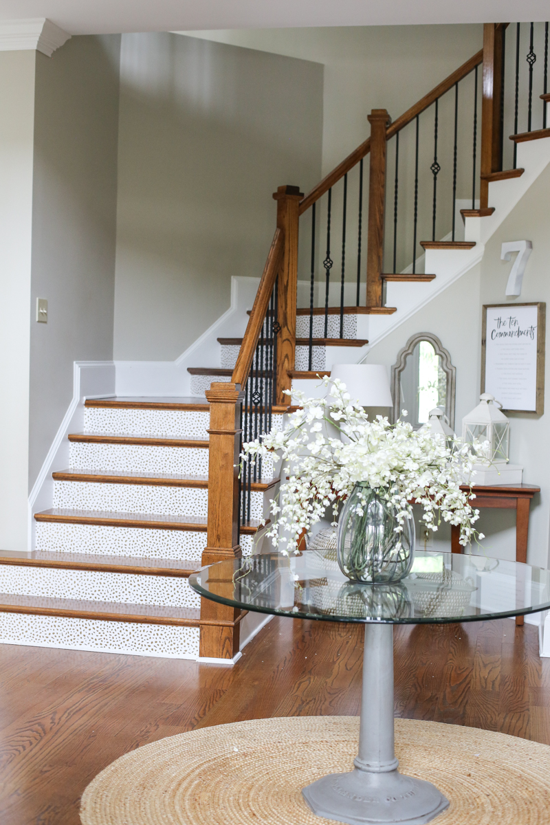
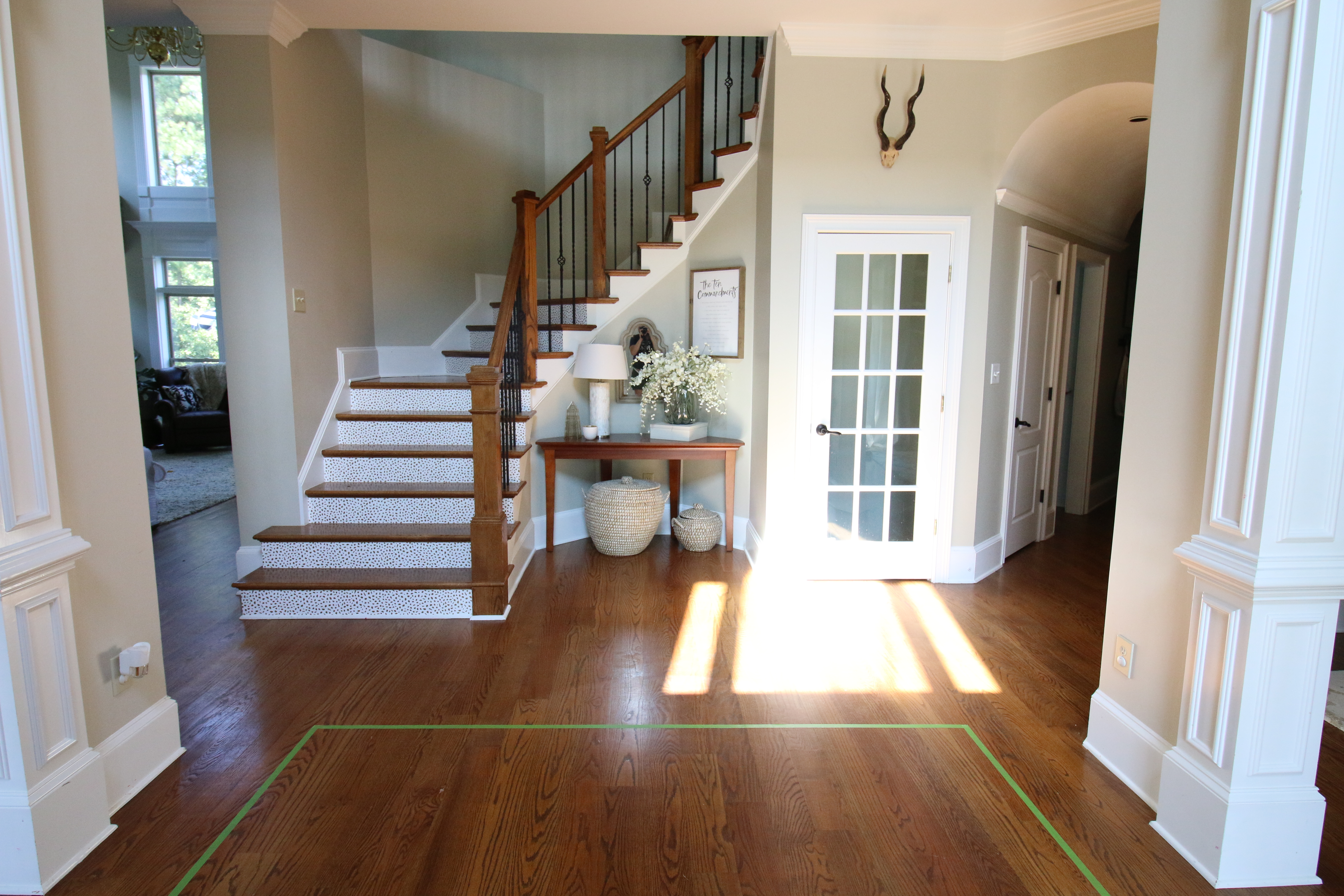
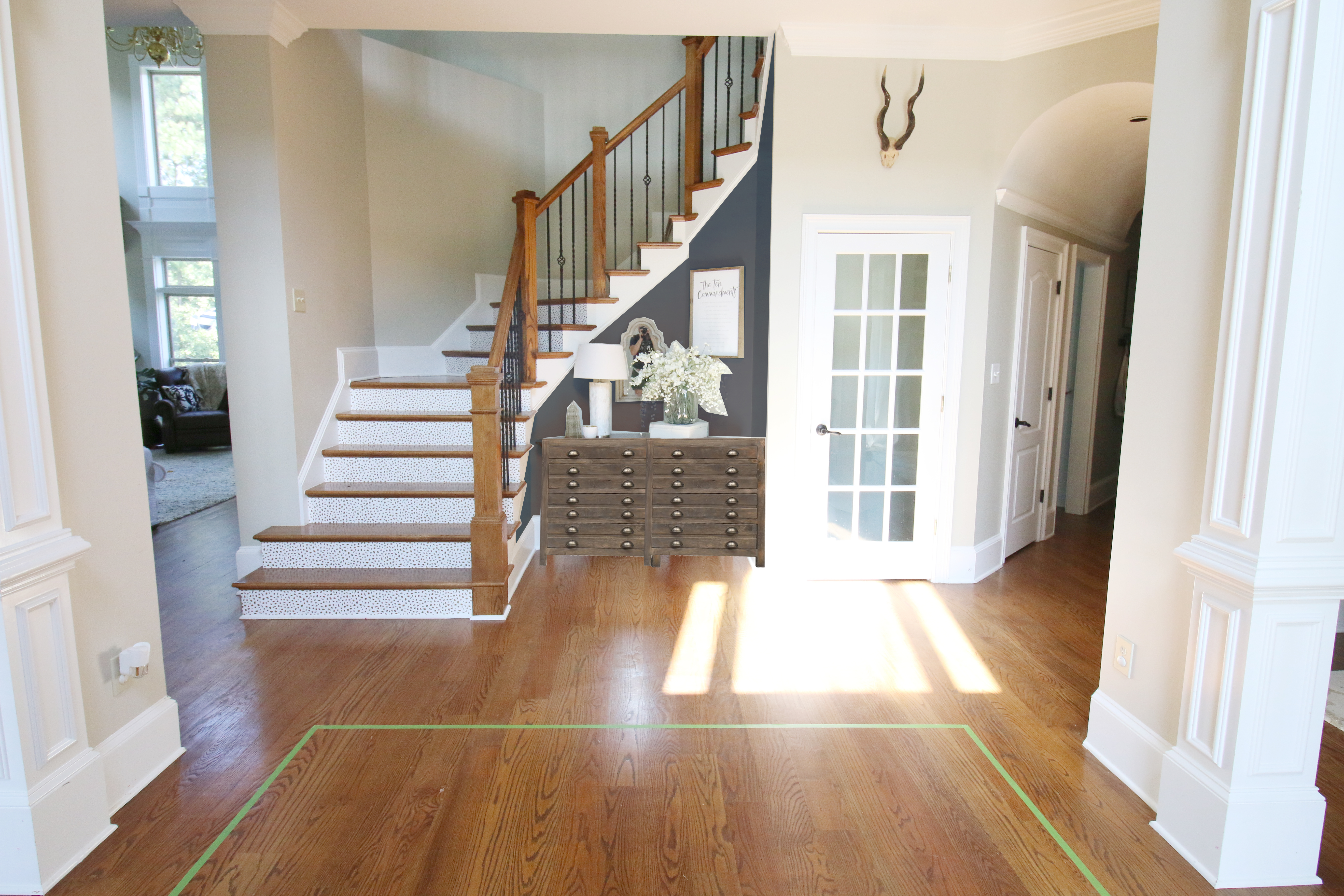
That means I would need to continue with part of the plan….sprucing up that weird alcove nook next to the stairs and getting a new rug but it would mean that my beautiful round table would be nixed. So Jeremy moved it out and I was left with this….
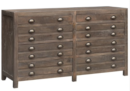
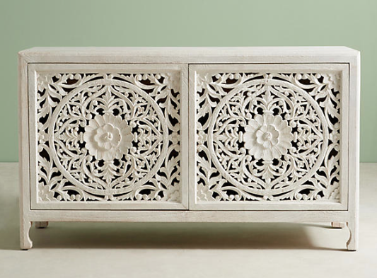
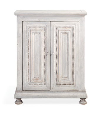
Still hate the leggy table in the alcove and decided that if that would be the center of the attention, then a custom hand-built piece by me would be necessary….after this baby is born 🙂 The inspiration for the piece was one of these three….
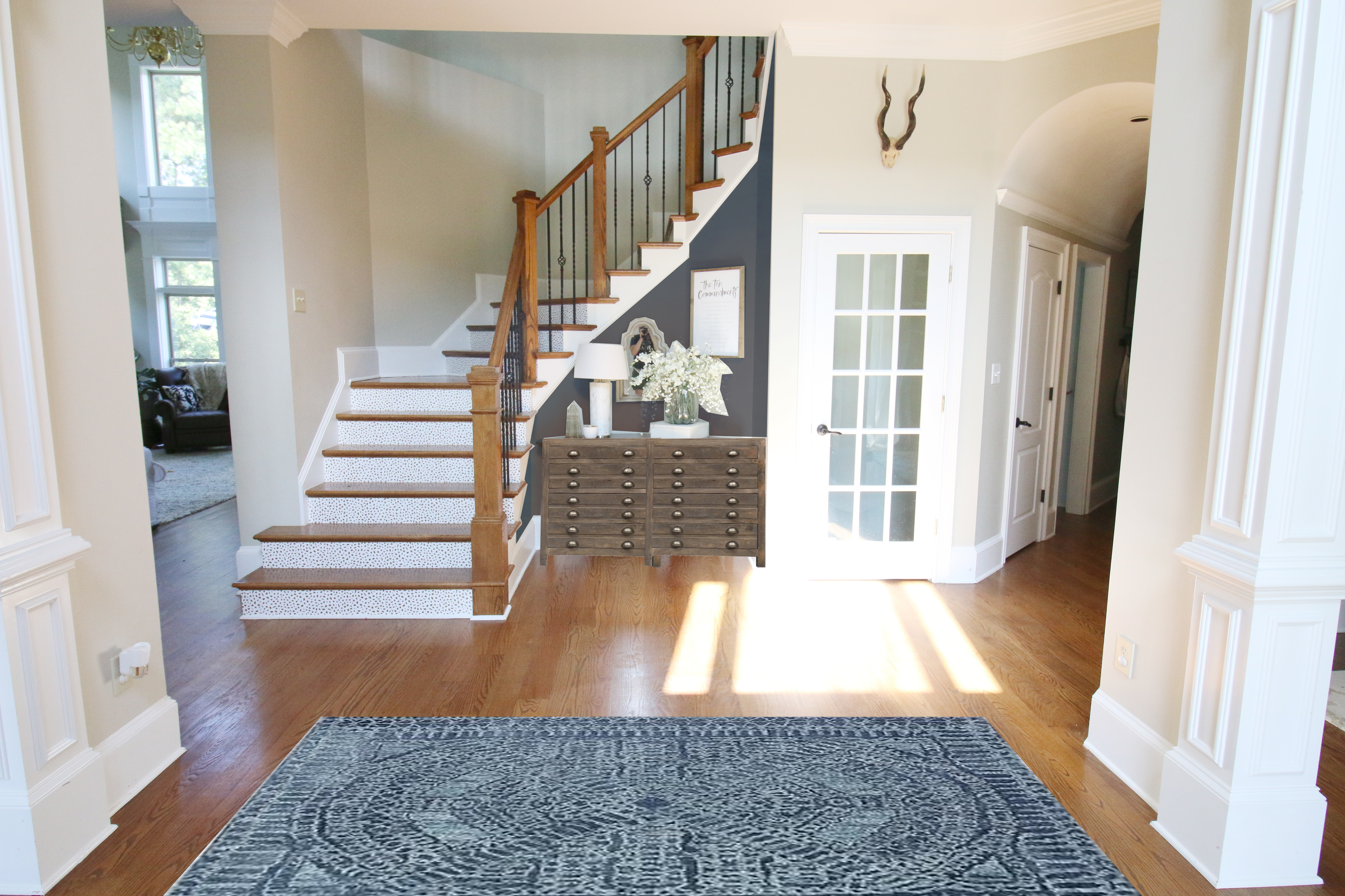
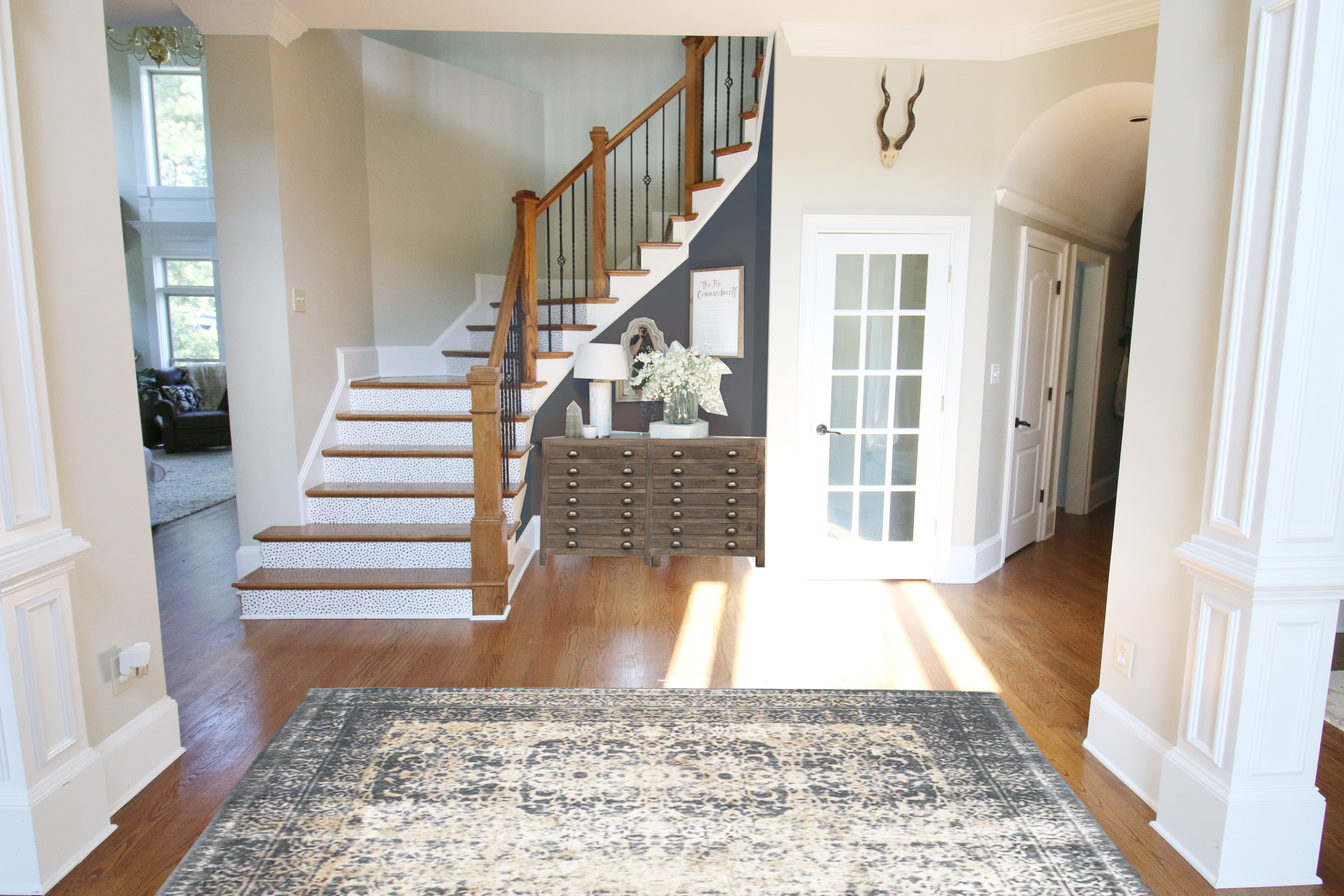
The one I liked best photoshopped in the space was this one….(and you can see I tried out a new color in that little alcove to see if it would punch us all in the face a little….in a good way.)
And then came the big decision….what rug?!
I had already mapped out what size I would need – 8×10 for the foyer – and I decided that I needed certain things out of this rug for it to work long term….
- it had to hide dirt (so it needed to be on the darker side or have some brown tones)
- it had to be wool (Jeremy will not tolerate anything that moves or doesn’t lay flat. Once I bought a flat weave. It’s amazing I’m still alive.)
- it couldn’t be plain because the space needed more pattern and interest
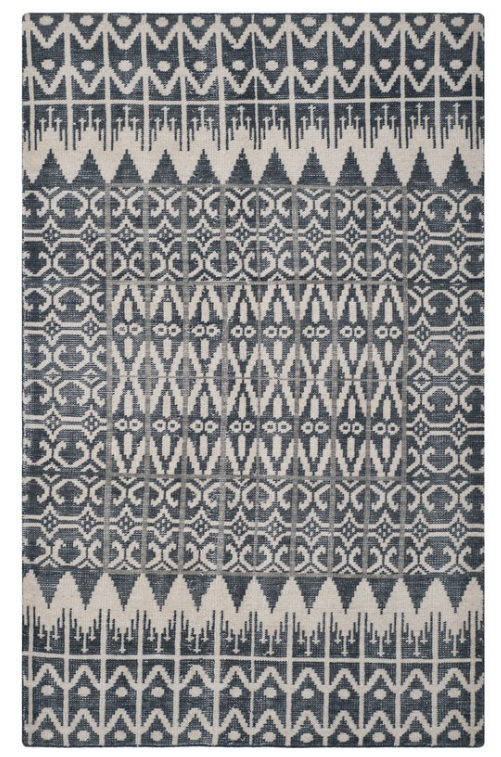
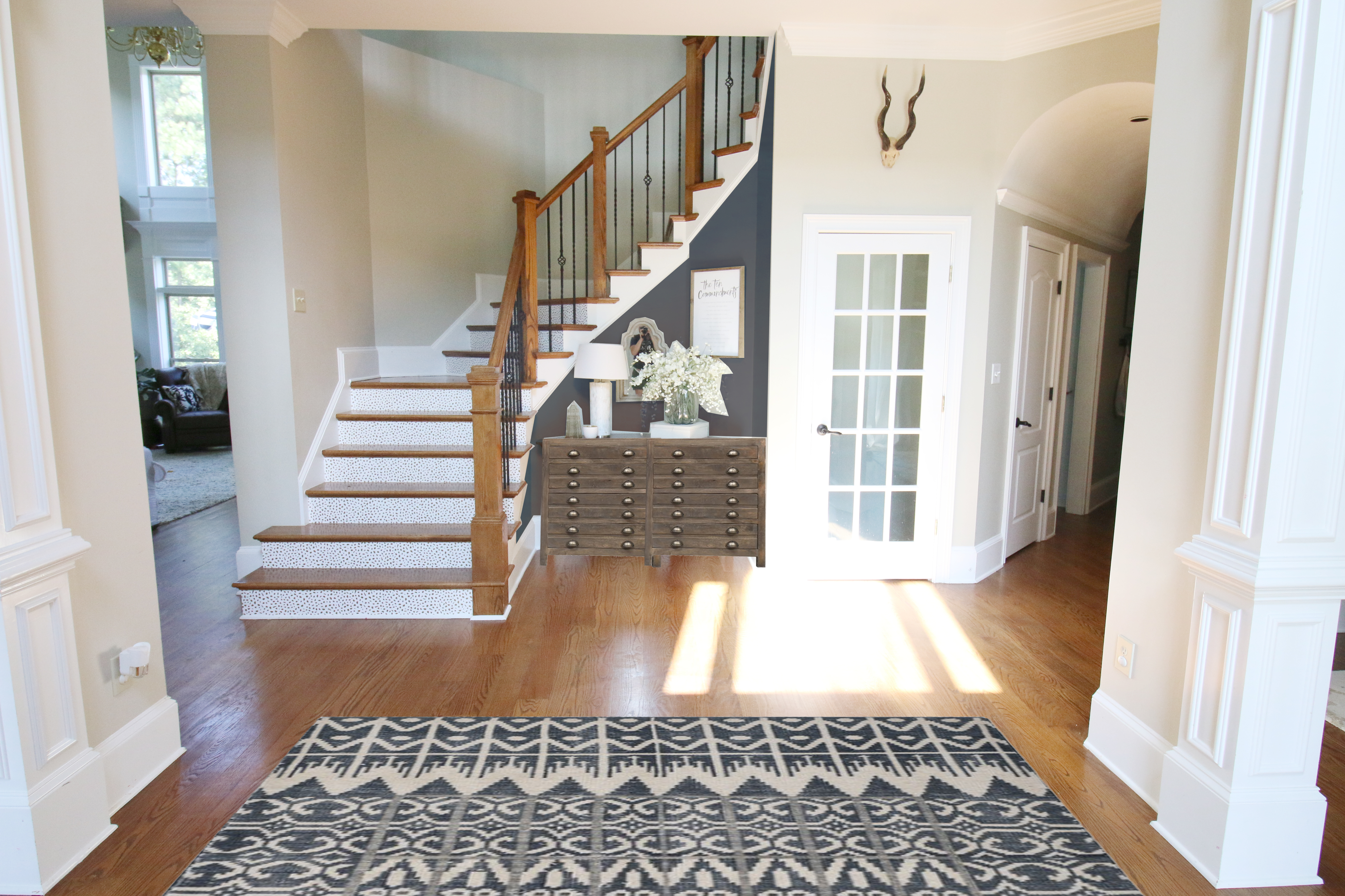
The first one I found I was immediately in love. Here is the link. The navy with the gray undertones and the lots of interest. BUT it was $800 for the 8×10 (I figure I could find a coupon for 20% making it $640) but honestly I think I might like this one better for my living room. Plus…it wasn’t as warm as I preferred…meaning that any dirt tracked in from the front door would be really evident.
The second option is very Joanna Gaines in my mind. Here is the link. A little southwestern with lots of bold pattern and a basic color scheme. The price hovers right around $550 for a 8×10 but I don’t know that it’s my style exactly. I like it….but worry that I would feel like it’s too trendy for my house.
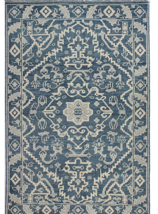
Option three is a more traditional style and I love how knotted wool rugs always clean up well. Here is the link. This was definitely closer to what I wanted in this space. It’s still traditional to go with our woodwork and warmer undertones to hide dirt. I liked that it had a little updated feel in the pattern (it’s categorized as an oriental rug but I see a little southwestern flare to it). The only reservation is that I thought it was more royal blue than navy and I really needed it to be on the navy/charcoal side.
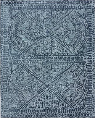
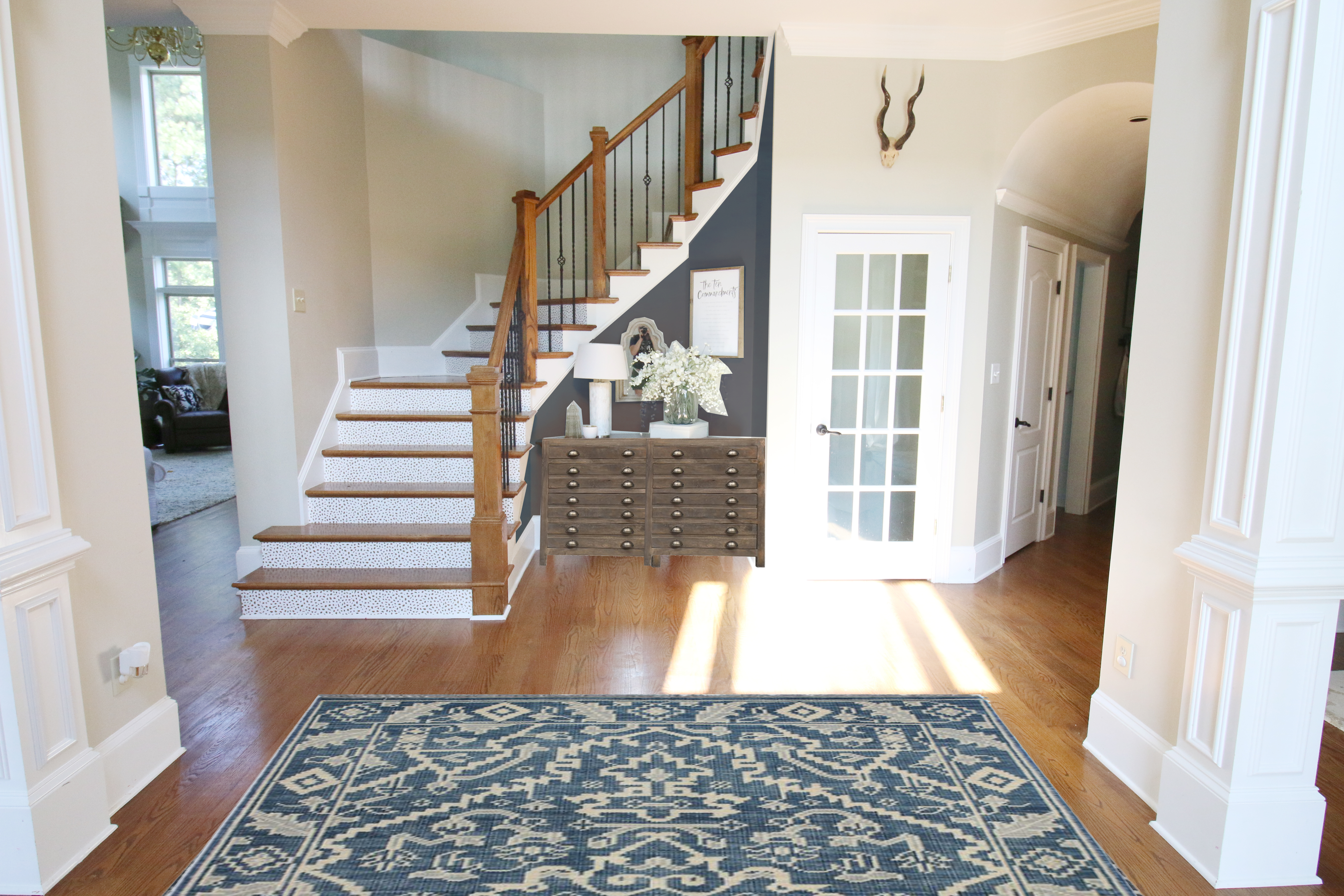
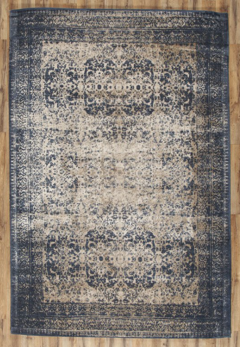
Last but not least is my favorite. I found a vintage inspired rug that is only $417 for a 8×10….and it fit the bill! I hope it just turns out in real life the way it looks online and in the reviews! Here is the link. It has the navy blue and the warmer brown tones….which will hopefully hide the dirt. It has the traditional look that works well with my house…and because it comes with the ‘worn’ look, it won’t wear unevenly if my kids do their best. I’ll keep you guys up to date on how it looks in the space!
And so now I gotta plan out how to build a console for that alcove so that it has an angled back. Should be a little tricky at first but once I have the frame down, it will be easy. I say that. But watch it take me like 4 months to actually do it 🙂
For the console – could you just make the whole cabinet square, and simply cut the top to the profile you need to fit the alcove? Then, when it’s in place, it would fit nicely against the wall and have a full top, but in reality, the top would simply be hiding the void between the square cabinet and the odd-shaped void behind it. Seems like a win/win.
Good luck on baby girl Bower’s impending delivery! Can’t wait virtually meet her!
I love this space (especially since you added the removable wallpaper to the stair fronts). Just a thought on simplifying your console conundrum… Could you build the piece wide enough to touch the walls on either side, and then just cut the top to fit the weird angles on the back?
Those all seem like good choices! I love the color you added to the nook space…. and I’m wondering… what would it look like if you painted the walls on the left side of the stairs that color, too??? Love your rug selections.
Totally option 2. It’s clean-lined, classic, and compliments your current decor (doesn’t compete with it). The others are beautiful, but they’re busier or look worn, which I think detracts from your other decor. Option 2 is great (which is crazy for me to say because I’m normally a Southwest decor person — but I love the rug!)
I’ve always thought that round table looked a little out of place. I like that you’re opening the space up! One suggestion on the custom-built piece. You could just angle the top instead of the entire frame. I hope that makes sense. We did that with a dresser that we put in the corner. The actual dresser was rectangular, but the top was more triangular.
Your glass round top table, would that work in your master bedroom sitting room in-between your armchairs?
I vote for #4 🙂
Love it!
Ooh ooh I think I said that about the table hiding the stuff in the alcove! 🙂 I’m sure I’m not the only one who said that, but I have to say that I’m immensely happy that you took the advice! It’s going to look great!
I love the items you chose, and I think they’ll look just right in the space. I especially love the “nook” wall painted blue!
Have you considered adding sconces, or even matching built-in demilune tables on the slim walls that adjoin the columns where the rug is going? I think a sconce on either side with a piece of colorful artwork would really make that space pop.
Why does the console need an angled back? The top and sides just need to be flush. The fact that the oddly shaped shell is on top of a generic console could be your dirty littl secret!
I love the rug. I have a similiar rug in my bedroom and smile every time I walk into my room.
P.S. can’t wait to meet baby girl Bower!
Looks great! Couldn’t you just take the existing table as a frame and build the new console around it? Just an idea that came to my mind 🙂
I LOVE the idea of painting the niche another color. Love it.
I love everything about this post–not that you need to explain anything to your readers but I do appreciate learning the rationale behind why/how a blogger makes design choices. The rug and the accent wall color look fabulous and that table is giving me the feels!! I think your kids will figure out a way to use that open space right up and you’ll never even miss that round table. Finally, how are you still blogging on your due date? At 40 weeks, I was busy stuffing my face with ice cream and googling “methods to induce naturally.” (None worked btw!) Best wishes!
You nailed it! I was in the minority but I didn’t like the round glass table there at all. Round and glass to me is for small spaces so it doesn’t look bulky, but this space can tolerate bulky.
LOVE the rug, LOVE the piece, LOVE the wall color. Amazing! Also I am a huge fan of curved stairs, your bolsters and the wood floors!
Love the rugs! One question though, are you really set on a cabinet in that little alcove? With the bigger view of the space, seems like you could totally put a round table there and free up the wall for art. Chair, baskets, table? I don’t know seems like you have a lot of real estate you can use.
I love that alcove wall painted that blue!! It’s gonna look so good!
Love it!!!! I think the last rug is the best!! In building the console, have you thought about building it like a regular dresser with a removable top and have just the top angled? And that way if you decide to use it in another room you can add a rectangular top?! Hope that makes sense… so it looks like the whole piece is angled, but it’s really just the top that is custom to the alcove! Can’t wait to see!!!
Love the rug, but almost $300 for shipping?!?
That makes it much pricier to me.
I’m sure there would have been shipping costs on the other rugs too, but that figure surprised me.
Hope you all weathered the storm okay. We only got rain where we are in Birmingham.
Glad Baby Bower waited so you didn’t have to rush to the hospital and feel compelled to name her Stormy!
Your gut was spot on. 🙂
You collected everyone’s opinions so well! Seriously love whoever suggested painting the alcove, and the rug is amazing. I think it will definitely hide the dirt and love that it won’t feel damaged when the traffic does wear it down–it’ll just look intentional!
I have a large space in my kitchen. Normally a little breakfast table would go there, but it is literally right next to the dining room. We have a small house, and there was no need for two dining tables so close together. So I took out the pendant light, we put in a pantry on the large wall, but it left us with a weirdly large open space between the dining room, the pantry, the back sliding door, and the kitchen. So I filled it with a rug for a long time. It definitely helped ground the space and “fill it up” even though the footprint hadn’t changed. Now that we’ve changed flooring I don’t mind the open space, so the rug has been moved to the dining room.
Definitely think this will help ground the space, and while empty I think it’ll still feel filled. 🙂
I missed it at the time but gotta comment on your previous post’s comment re Big Bro: it’s even worse now and the bullying is totally unnecessary and not even good game play! Kevin for AFP (dream on Alex.)
Love your choice on the rug.
I did but decided that I would probably like the additional storage and since I don’t really have a spot for it otherwise, why not make it bigger? It’s weird but honestly I don’t have that much built in closed storage considering the size of this house.
xo – kb
Umm….free shipping over $49….it says across the top of the website. Is your area different?
xo – kb
We tried the round table there and it blocks the area that is ‘walkway’. I would prefer to keep that clear since the boys like to run the circle with their cars 🙂
xo – kb
Yes I probably could but I figure that I would still need it to be a new top to make it deeper and new legs so I will use it as a general template and probably just sell the one that is there.
xo – kb
That’s true but then I miss out on a little extra storage space which I need and want.
xo – kb
Oh I didn’t think of that. I don’t think it will because it is about five feet across and that space really needs something smaller.
xo – kb
I love the alcove wall painted, I love the round table being gone, and I love the choice of console table. My first preference would have been the first rug, but for 1/2 the price I probably would have went with the rug you ended up choosing, too. It’s a great 2nd choice. My eyes keep getting drawn to the antlers above the door. They really don’t really seem to fit with the décor of the room, but I think they would look awesome in either one of the boys’ rooms.
I like this plan! You should check out And White- she’s got a tall corner cabinet plan that I used as a jumping off point for an angled-back piece. It helped a lot for me to see that and understand the geometry. Angles can be such a brain-bender!
That space is maybe 12-18″ across so we probably can’t fit a table (the doorway to dining room and office are right there)….and we didn’t think about sconces – probably because we hardly spend any time in there 🙂
xo – kb
Is it possible to use the leggy table as your starting frame and you build it out to have the drawers that you have your eye on? It seems like it fits in the space pretty well, but doesn’t meet your needs functionally and visually. (I don’t know if that’s a bigger hassle or not!)
What about using this idea to do peel & stick flooring for the cabinet fronts?
http://thepaintedhive.net/2017/03/easy-diy-faux-multi-drawer-cabinet-hack-using-peel-and-stick-flooring/
IT’S PERFECT! Every single time, Katie… how do you do it?!?!
I guess I figure if I’m gonna build the cabinet anyway….why purchase a $63 product just for the drawer fronts? It’s a good idea if you aren’t handy…but seems like a lot of money if I have to custom build this piece.
xo – kb
I love your rug choice! It has a modern/traditional vibe, should hide footsteps and dirt very well, and the colors are spot on for the space.
I do, however, want to comment on the wood piece you chose for the nook under the stairs. I feel it looks too heavy and large for the space. Crowds the small space. I personally would like the second piece you posted. It is a little smaller and has more personality/visual appeal. The larger piece looks like it would be more at home in an office, den, etc. where storage is needed. Perhaps you could built something like the middle piece and paint or stain it dark?
You read every comment ever? I don’t know if I could handle the criticism of reading comments if I had a blog. Anyway, I feel like we’re having a conversation, too, even though we’ve never met! Can’t wait to see how the foyer turns out.
I obviously don’t know about in person but in pictures it looks great! I also like the idea of sconces, wall vases with greenery, or art on the two narrow walls if that would help make the space feel a little less open.
Blessings to you for a good labor and happy healthy daughter.
Your blog is a daily addiction. Love your style, home and adorable family! Where could I purchase the 14 drawer cabinet. The one that you choose … I love it in your entry.
Every comment ever. Yes there are lots of hard ones but there are far more friendly and encouraging ones and honestly…I wouldn’t have it any other way!
xo – kb
They are a gift that must stay….they mean too much to me 🙂
xo – kb
Hey, Great ideas to decorate home Simple and cost-effective things to try out. Recently I’ve shifted to my new house. I’m very much confused about my living room rug. The walls are decorated with a pop of bright colors and the white colored couch is placed at the one corner of my room. Please suggest me the best rug which can go with my living room. I’ve been choosing the rugs from https://therugmall.com/octagon-area-rugs-best-rugs-to-buy-in-usa/ they are having the greatest collection of rugs.
Nice blog, I really appreciate it. It is nice to decor the living area with hand knotted rugs. A traditional hand knotted rugs can make your house perfect and decorative.
Really great post! – this one has a role model dimension. The work done is extremely amazing. I am also choosing rugs from https://therugmall.com/product/nourison-traditional-nourison-2000-2101-area-rug-collection/ , they have a nice collection you must check it out.