I literally have not been this excited since N’Sync came out with their Christmas album. And we all know that was worth every bit of the boy band hype. Even my mom was on board that faux snowy holiday train. So you can imagine how thrilled I am to share with you this very long overdue post. It’s all gonna be worth it….I promise on JT’s 1998 over processed ramen noodle hair.
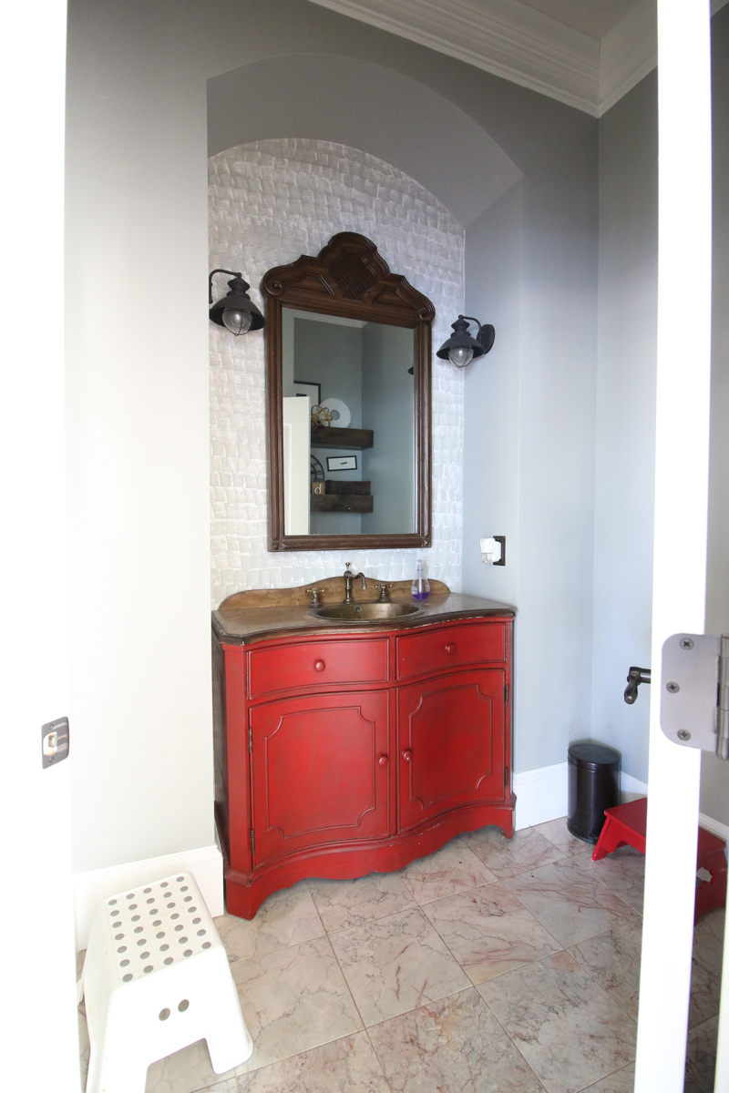
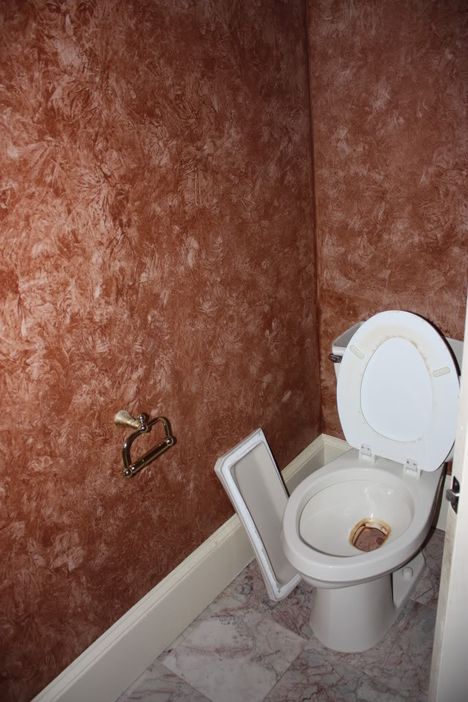
So this time last year, our bathroom looked like this….
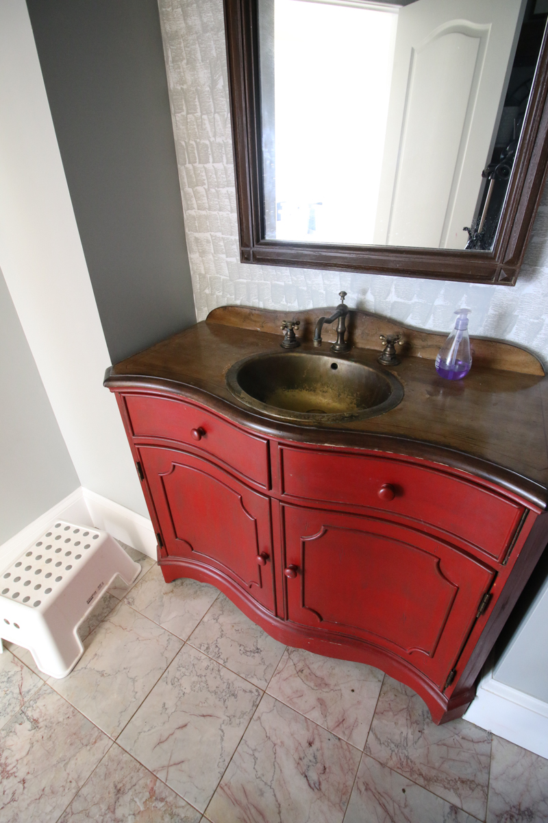
We had a red vanity and gray walls and a goodwill mirror with outdoor sconces. Believe it or not, this was actually a huge improvement over the original photos of this space. The originals were straight horrifying (don’t worry. You will get to see that poo show later.) But we did minor improvements because we were in this awkward stage of saving money and figuring out a plan. It’s hard to know what to save for when you don’t even know what you are doing!
The vanity I painted a red color and I had done an interesting wall paint job….I say interesting because it was not good…but I totally could have done better.
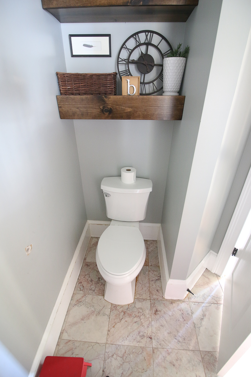
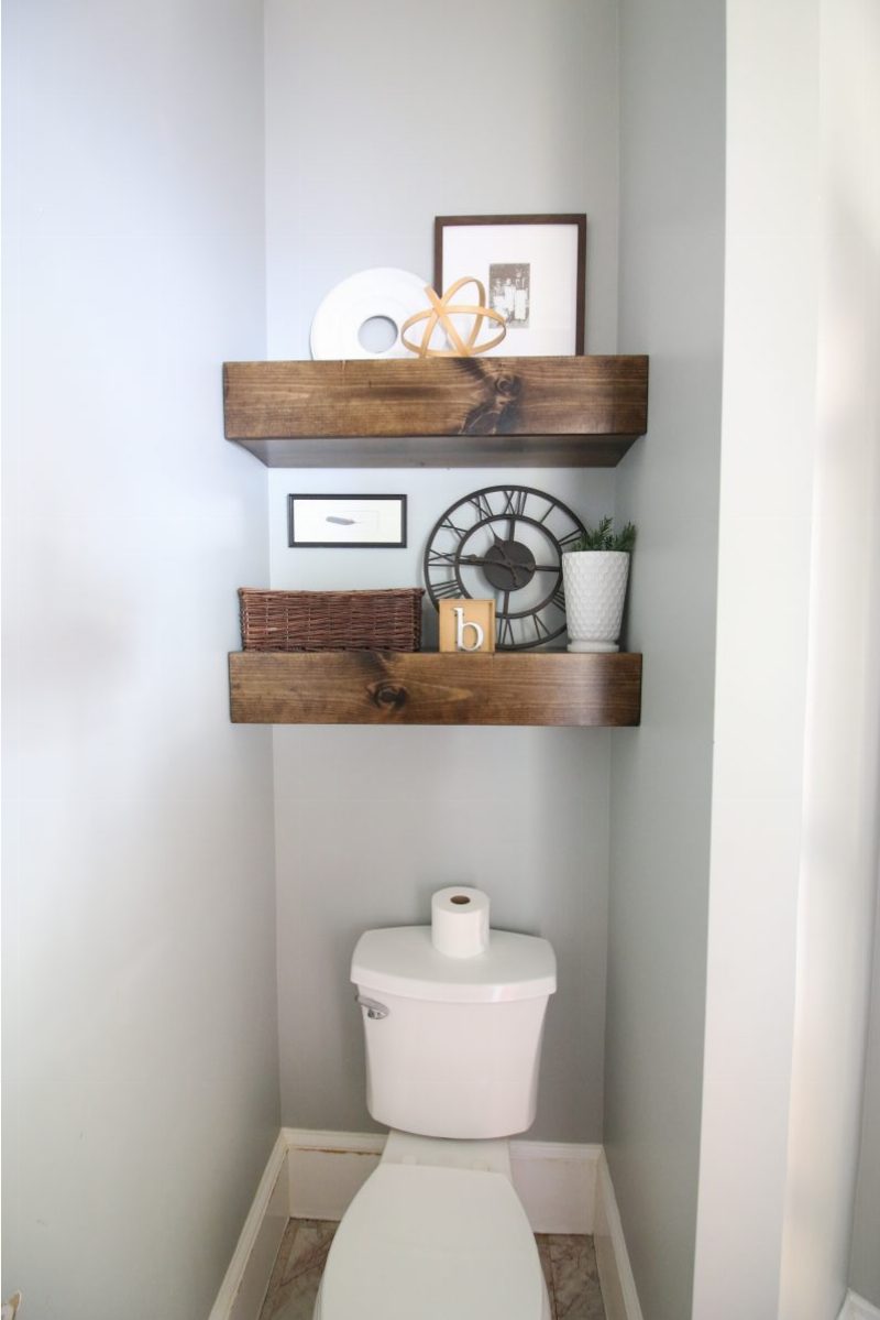
On the opposite wall, we had built some very nice rustic chunky shelves and they did help the space feel more finished. We replaced the toilet but it always had issues because the flange was cracked. Periodically we would have someone sit on the toilet and we could tell it broke the seal and we would have to replace the wax ring and start over. It was annnooooying!
The trim around the toilet had experienced a flood at some point before we moved in so it was warped and swollen and definitely needed replaced.
Okay….so are you ready to see the AFTERS?
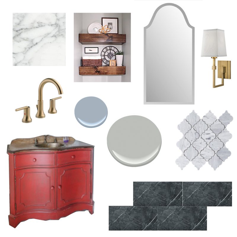
Say BYE BYE BYE (N’Sync pun!) to the befores because this is gonna be gooooood! As you may recall, we outlined the plan in one of the posts and how we were gonna do some touches of marble and gold and blue in the space. You can read that post here.
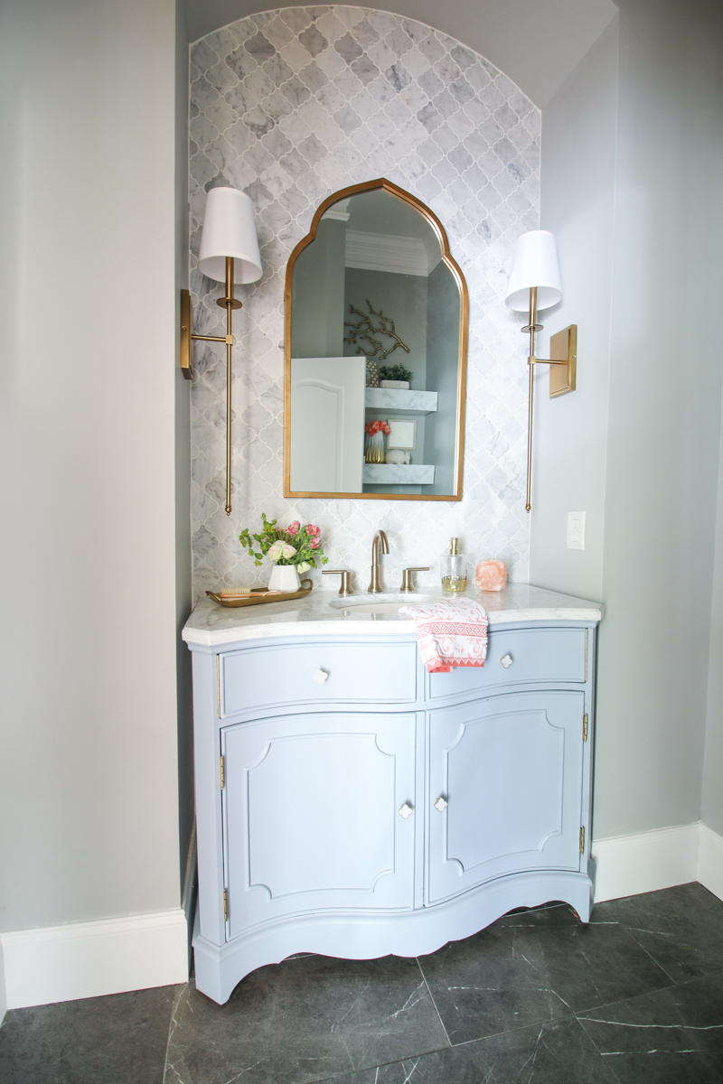
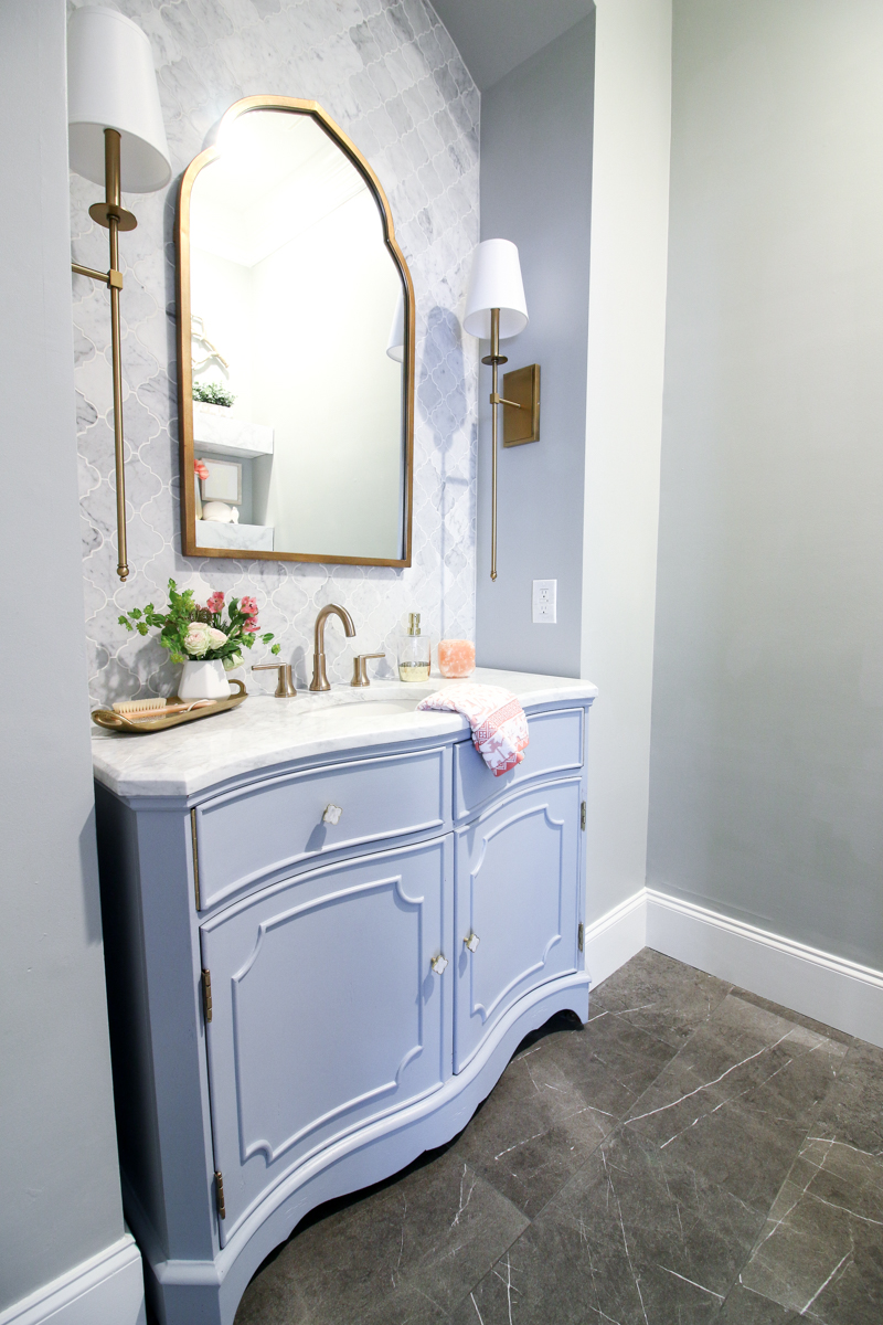
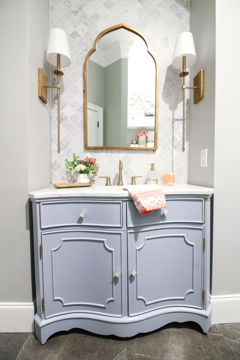
And here she is today in her full makeover glory…
I say ‘FULL’ but in reality, we are still missing two little things….a marble plate for the light switches (it had a long delivery time! ugh!) and a marble trash can (ordered two so far and returned them….can’t find the perfect one). But other than that, we are good to go!
I figured I couldn’t wait forever to share this room so I thought it would be better to keep it real and let it all hang out.
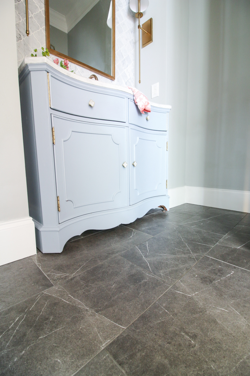
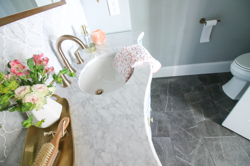
So obviously the biggest transformation is the tile. I think that everything else before was workable….but I really hated that tile. Now the floor is dark and marblesque with a veiny porcelain tile that should hold up even to my four little demolition derbies.
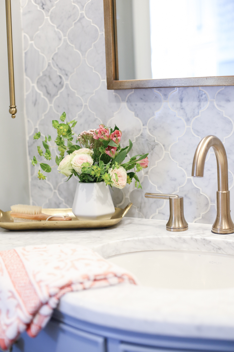
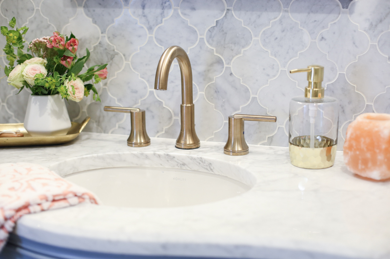
The tile backsplash is another big addition….completely stealing the show and looks ridiculously amazing paired with the new vanity top and bathroom faucet.
All three play very well together and I am so glad I went with my gut on this one because several times I wondered if I was making a poor choice on that floor. I am very happy with the end result though because I know the kids will abuse the floor (I mean potty training is inevitably messy and this can withstand lots of traffic). I love how the marble ties in with the kitchen that is right across the hall and it looks so high end (even though the vanity top was a steal because it was a remnant!).
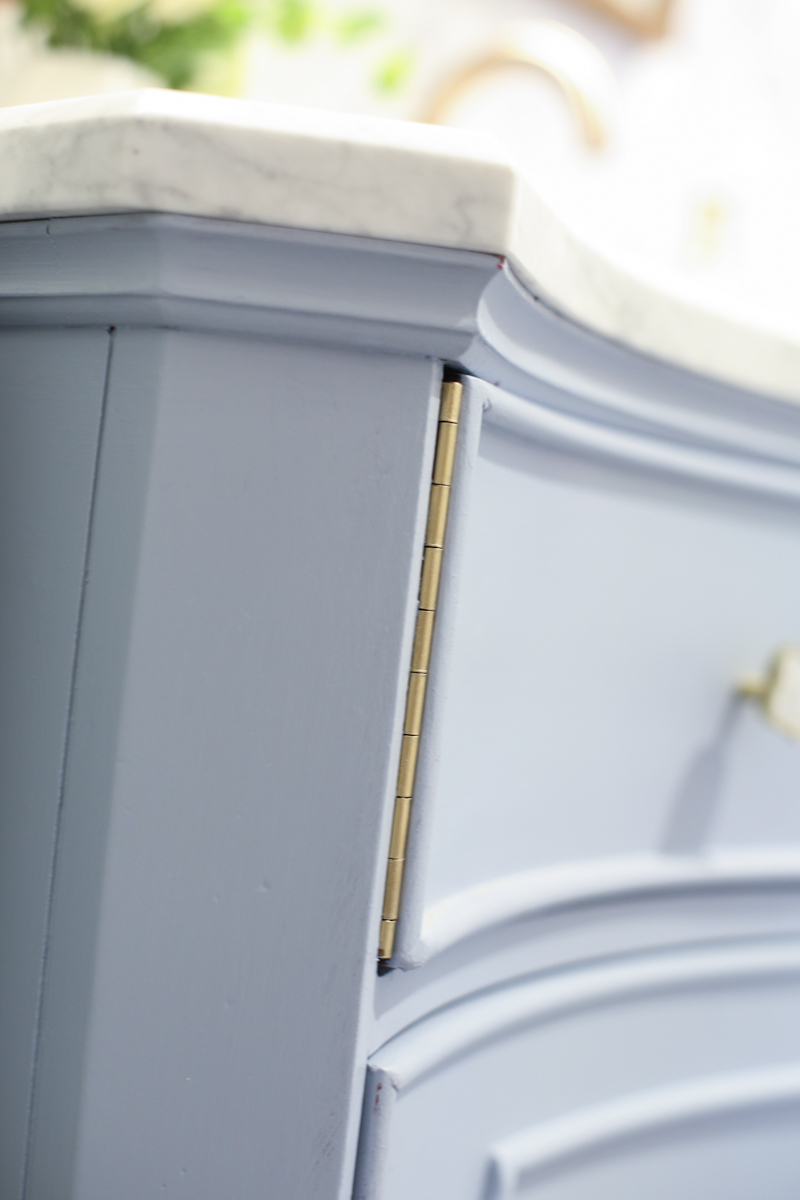
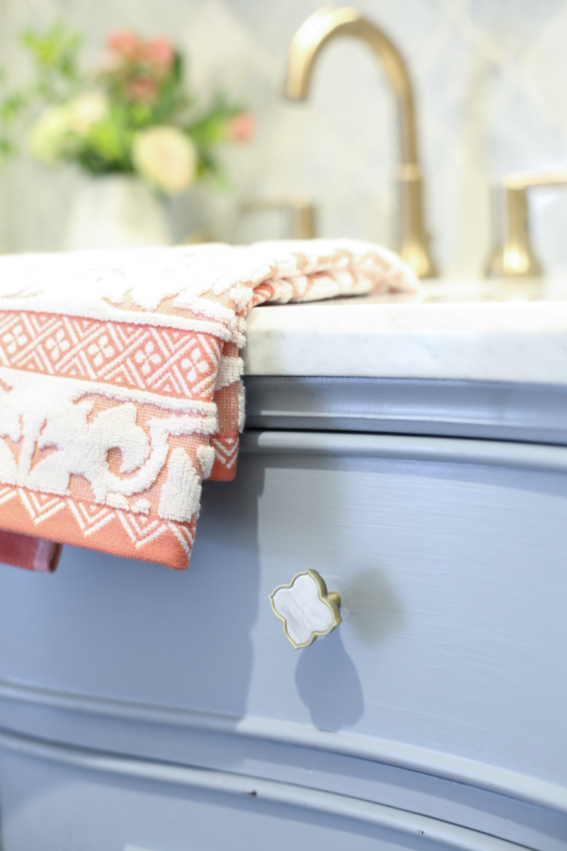
The vanity itself got two coats in Ovation by Behr and I am obsessed with the blue color. I love it mostly because it pairs so well with the gold of the hinges and the new handles. Yup. I took the time to sand and spray paint the hinges and it was well worth the extra time!
Speaking of knobs, these are so good, right?! I mean….I think I might buy some extras just to have them. They are the perfect match for this space.
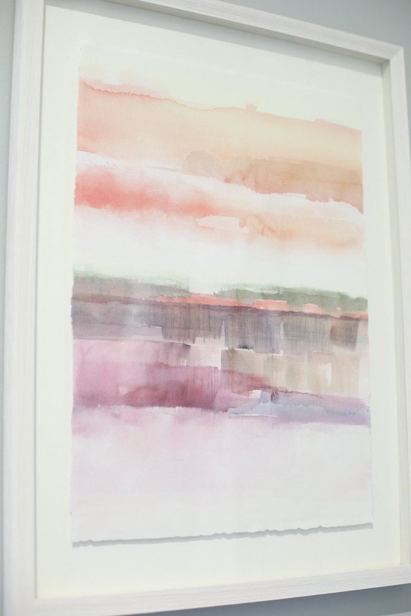
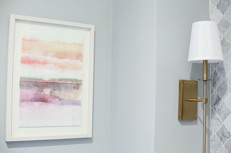
As for the color inspiration, I found this art work at Target and instantly knew that it would be the perfect print for the bathroom. Don’t you love these colors? I figure that when it comes to holiday decorating, I can always just swap this out for something more festive and add a couple other holiday related decor items…maybe including a certain boy band in ski goggles and turtlenecks.
I translated that watercolor goodness into all the accessories. It’s amazing how accessories in a bathroom are like a pushup bra….they make everything else look so good.
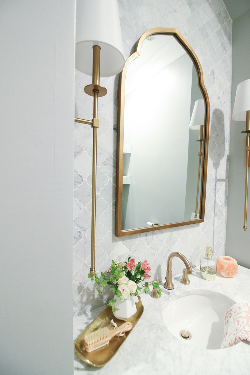
Speaking of accessories….that mirror. Amiright?! I feel like it was obviously designed by someone awesome just for my space. They literally envisioned a bathroom exactly like mine and said I have a great idea for the perfect mirror and BOOM.
And the drama of the mirror is balanced so nicely by it’s BFF’s – the sconce twins that live next door. One is named Elizabeth and the other Jessica….because OBVIOUSLY SVH forever!
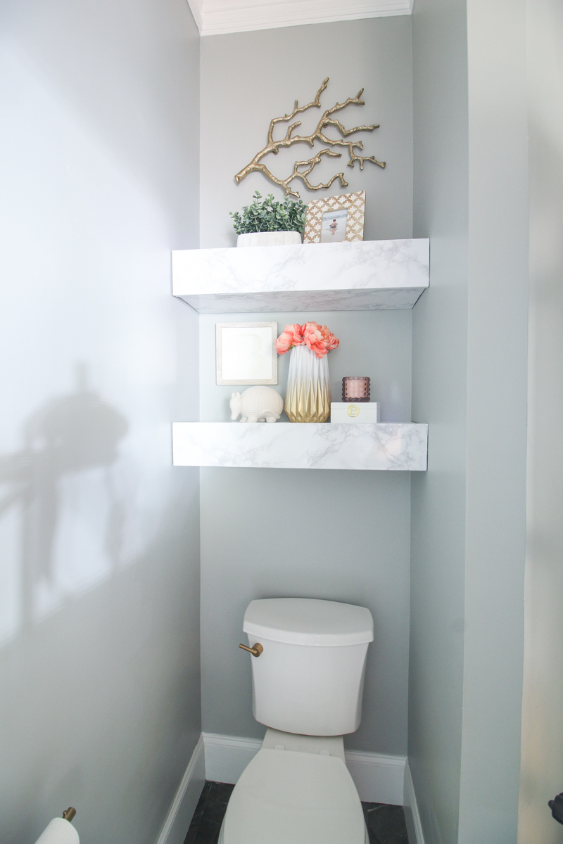
On the opposite side of the room, we kept our floating chunky shelves and I gave them a face lift to match the rest of the room.
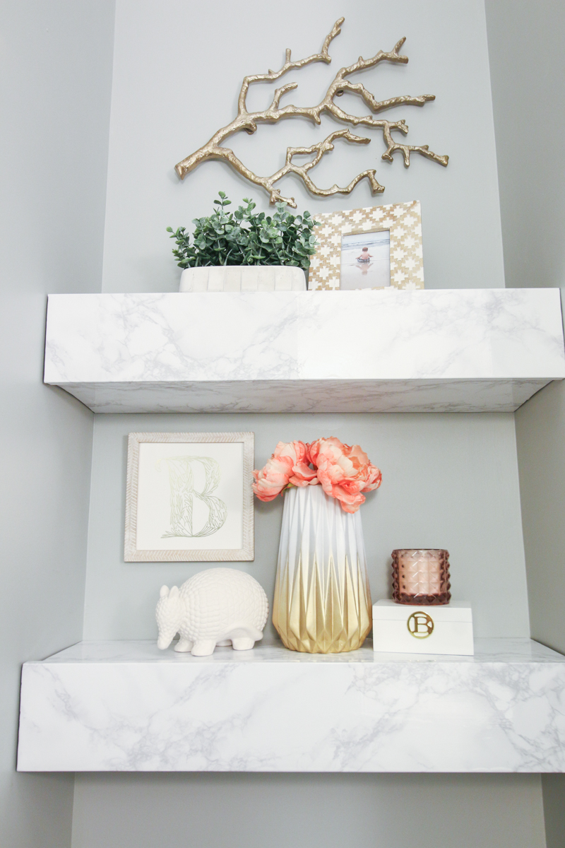
As much as I loved the wood versions, they just seemed way too rustic for the rest of the bathroom and so I decided that I would go with a non-permanent solution….non-residue contact paper! I simply wrapped the shelves and trimmed it down to size. I really love the end result!
The gold branch thing is from Target and the frame and faux plant is from Home Goods.
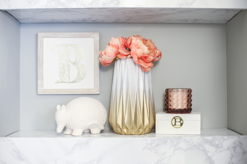
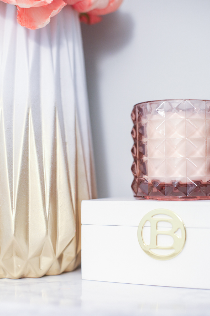
Both shelves were accessory spots because I gotta. I found the armadillo at Home Goods, the candle at Target, the B box at Michaels and the vase is from Hobby Lobby but it got a gold makeover. The initial artwork is actually gold foiled and it’s SO pretty in real life…it’s from Minted.
In order to do the vase, turn it upside down and shoot down at it with Rust-Oleum’s gold metallic spray paint…it’s the best gold there is.
The best part about this space is the gold and brass mixing it up. I love the brass of the sconces….
and that is a really good match to the mirror. And all that brass is nice compliment with the champagne gold of the faucet. It’s like they are cousins.
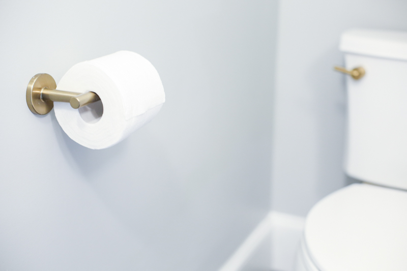
And we ordered the matching toilet paper holder and toilet knob. It’s such a sweet detail!
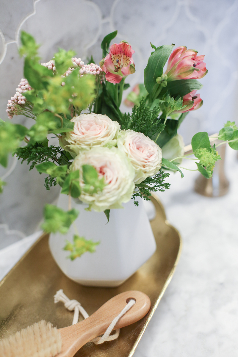
And then it all goes with this gold tray (also from Target)….it’s amazing how well they mixed together (I had my doubts!).
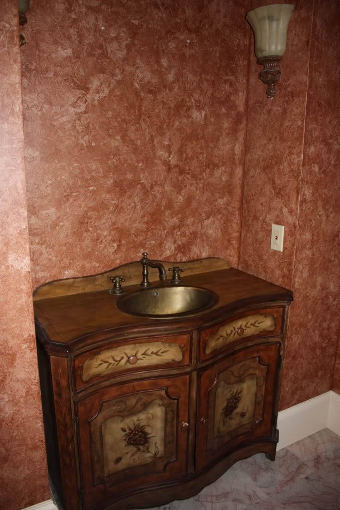
And there you have it folks….our first floor bathroom reveal! And for the really breathtaking before and after, check out these side by side. The before photo was taken when we first bought the house.
Amazing right?! I can’t even with that sponge painting. And it’s hard to believe that it’s the exact same vanity. Oh the power of paint!
For anyone wondering about details – here is all the INFO….
- Wall paint is Metropolitan by Benjamin Moore
- Vanity paint is Ovation by Behr
- Floor tile is Sensi Pietra Gray Porcelain Tile from Floor & Decor
- Wall tile is Bianco Carrara Arabesque Marble Mosaic from Floor & Decor
- Vanity top was a carrara marble remnant cut at A Polished Finish
- Electrician who we used – American Electric & Garage Door
And here are the links to the products featured in this space (click on the photo for more details!)…


Wow! Wow! Wow! Great work!!!! It looks beautiful!
Technical question. How do you hang a mirror over tile without cracking the tile?
PS-Looks amazing! (I guessed the contact paper!)
A. It looks amazing. I especially love the sconces and I am swooning over that faucet!!
B. The fact that you worked in a Sweet Valley High reference makes me love you even more (in a non-creepy, internet stranger way).
C. I think you should caulk around the edges of your shelves so that they don’t show a seam where they meet the walls.
Love it!!!
I have the same watercolor print in my (only) bathroom.
What a wonderful design job, Katie! It feels so clean… which is what you want in a small bathroom 😉 It seems bloggers usually don’t put humans in their styled pictures, but would you mind so that we can see the scale?
Absolutely gorgeous! Now I want a champagne-coloured faucet!!!
Of course I want to know abput the one thing you didn’t link to! Where is that nail brush from that’s on the tray?
So beautiful! I am so glad you went with your gut on so much of this, because your gut obviously knows what is amazing. Love this! I am waiting to do the floors in our house and I am now considering that awesome tile somewhere. So lovely!
Love it all, but especially those knobs and backsplash! Also laughing at the SVH reference. I was delighted to hear of my daughter’s new friends in middle school (twins) who are named Jessica and Elizabeth.
Amazing job. The mirror, drawer pulls, tile, tray, the towel, even the detail on the cabinet all evoke a Moroccan spa feel. And the sconces. Wow! But now I cannot erase from my brain that truly horrible before bathroom :). I mean, the walls? What were they thinking? You’ve made it a serene, yet durable, space.
Beautifully done!
The fact that you referenced *Nsync makes me love you even more! I honestly didn’t continue reading until I commented! Now back reading…
World Market! I tried to find a link but couldn’t. It is soooo needed with boys!
xo – kb
And it looks amazing!
We drilled anchors into the tile and then also used command velcro strips. It’s the only way we can ensure that the boys don’t move things!
xo – kb
That is exactly what Jeremy said! He was like use caulk and I was on the fence. Maybe I will try it on the top so I can see how it will turn out 🙂
xo – kb
Sure! I’ll probably try that later maybe for an instagram photo 🙂
xo – kb
Beautiful job! So much better than the before. Just a couple of practicality questions: 1) Why no towel bar or ring? Is it like my house where the kids never hang up towels anyway so you just gave up? 2) I think the toilet paper holder is backwards – wouldn’t you need the open end facing away from the toilet so the roll doesn’t slide off every time you pull it towards you?
We actually never had a towel ring in here so I never really thought about it. But you are right…my kids would literally NEVER hang it up if we had one. And the paper holder has a little thing on the other side too that keeps it from sliding off. I didn’t even think about it being the right or wrong way….maybe I will have to ask Jeremy if it makes sense to switch it.
xo – kb
Every time I think Napolean’s taste can’t get any worse…lol…I thought the tile was bad, but the whole before pic!!! Ack!!!
It looks great!
I love it!!! That blue is absolutely my favourite colour and it works so amazingly well with the gold and the wall and floor tile! Every detail is just perfect! The transformation from the ‘before, before!’ is incredible! Xx
I installed our tp holder ‘backwards’ too, even though it has a lip to keep the roll on. With 5 kids ranging in ages from 3-16, I don’t trust that lip!! I’m pretty sure it wasn’t kid-tested!
Now all the kids can easily refill the tp, and the roll never bounces off!
Love it – what a beautiful transformation Katie ❤. Especially from the original photos – wow!!!!
in my humble opinion the blue of the vanity doesn’t work well with the wall color. they are both too much alike. i would definitely go for something darker… even a stain maybe. everything else is really lovely though. xoxo
This bathroom makes my heart sing!! Is that weird? I want to move in!!! Plus references to *NSYNC aaaand Sweet Valley? I love you Katie Bower!!!
Your updated bathroom looks great! You guys did a wonderful job. I remember the original bathroom from when you first moved in…yikes! 🙂
Sweet Valley High for the win!
So beautiful
WOW!! What a difference ~ beautiful.
Katie this bathroom is absolutely gorgeous! You left out no details and I love what you did with the shelves over the toilet, great idea!
How do you shop for accessories in a makeover like this? Do you shop with specific things in mind or specific colors/finishes?
Oh you’ll get plenty of use out of it with your girl too! Trust me, my 1.5 year old girl constantly has dirty fingernails!
Looks great! Could I ask you to please link to the post where you tiled the backsplash? Thanks so much! 🙂
Love it!!! I am really hoping you will keep us updated on the marble top – as a kitchen/bath designer, we’ve always stayed away from real marble with how soft it is & that it will patina over time. It’s all beautiful!
I did kinda both…specific shopping and non specific shopping. I feel like this is an entire post! Maybe I will write one!
xo – kb
Oh I bet….I blame it on the boys but to be perfectly honest…I’ll probably end up using it more 🙂
xo – kb
That’s a great idea.
xo – kb
You’re super-sweet! Thanks!
Beautiful job. Love how everything ties in together. Suggestion: Since you’re having trouble finding a trash can you like, why not wrap a trash can with the same contact paper you used on your shelf?
I probably don’t have enough contact paper left over…so I guess I’d rather spend the $20 on a new one that is already done…ya know?
xo – kb
I found trash cans at bed bath beyond that the liner pops out. I love it. I can take it outside to clean easily!
The bathroom looks great! Hard to believe the same vanity! I love, love that wall tile behind. Just beautiful!
Bowers did it again!
PS. LJ and his big boy haircut! He is so cute! I can’t wait for this little girl, to see what comes out! You all make beautiful babies!!!
I love, love, love this bathroom, and your bedroom!
I’m using Metropolitan in my kitchen/dining room/ entryway with Hale Navy on our island with carrera marble backsplash to the ceiling. I like the clean look of a brighter whites trim’s contrast with midrange color, but I do not want too go stark or Icy. I’m still picking ceiling (open to a vary light gray ceiling) and trim color. Would you mind sharing what white(s) have you used with Metropolitan?
The cabinets are Simply White by BM and the trim is just plain untinted brilliant white paint from the home improvement store.
xo – kb