I’ve come back to this post about a million times. This is not a reveal. If you are here for one of those, you are gonna be more disappointed than Kylie on National No Lipstick Day. (or should I say National No Lipkit Day?! What is the jargon these days kids?!)
Anyhoo….It’s hard for me to share this space because it’s nowhere NEAR complete….I think that fact is obvious….but I want to share more imperfect moments. Ones zoomed back so you can see the space. We all love those finished grand reveals….but the moments before that perfection are important too. We all have rooms with missing curtains and no rug and little details that bother us and need ‘fixing’, right?! Right?! Please say “find that missing curtain” if you agree 🙂
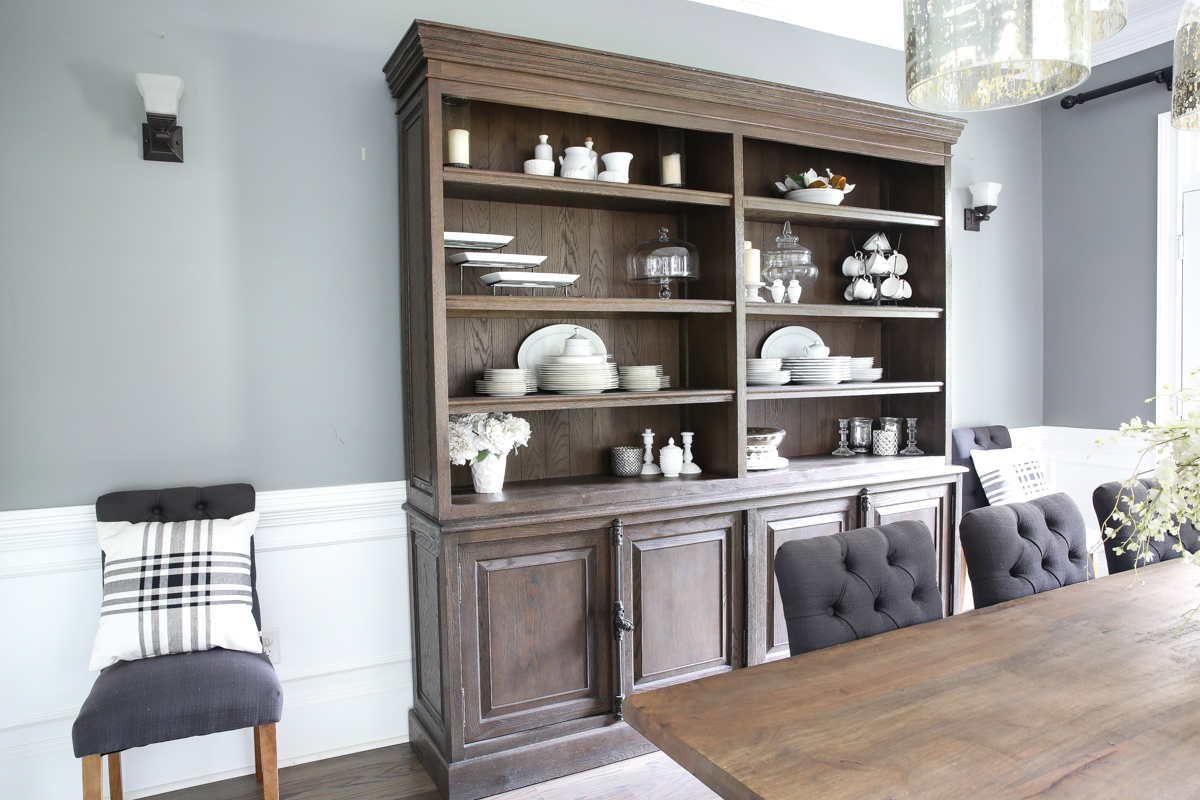
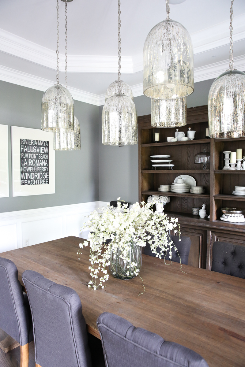
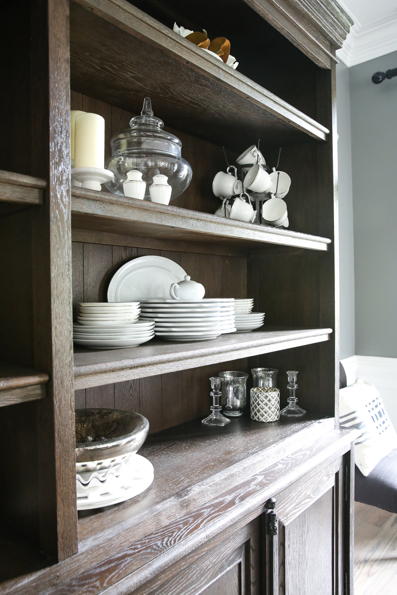
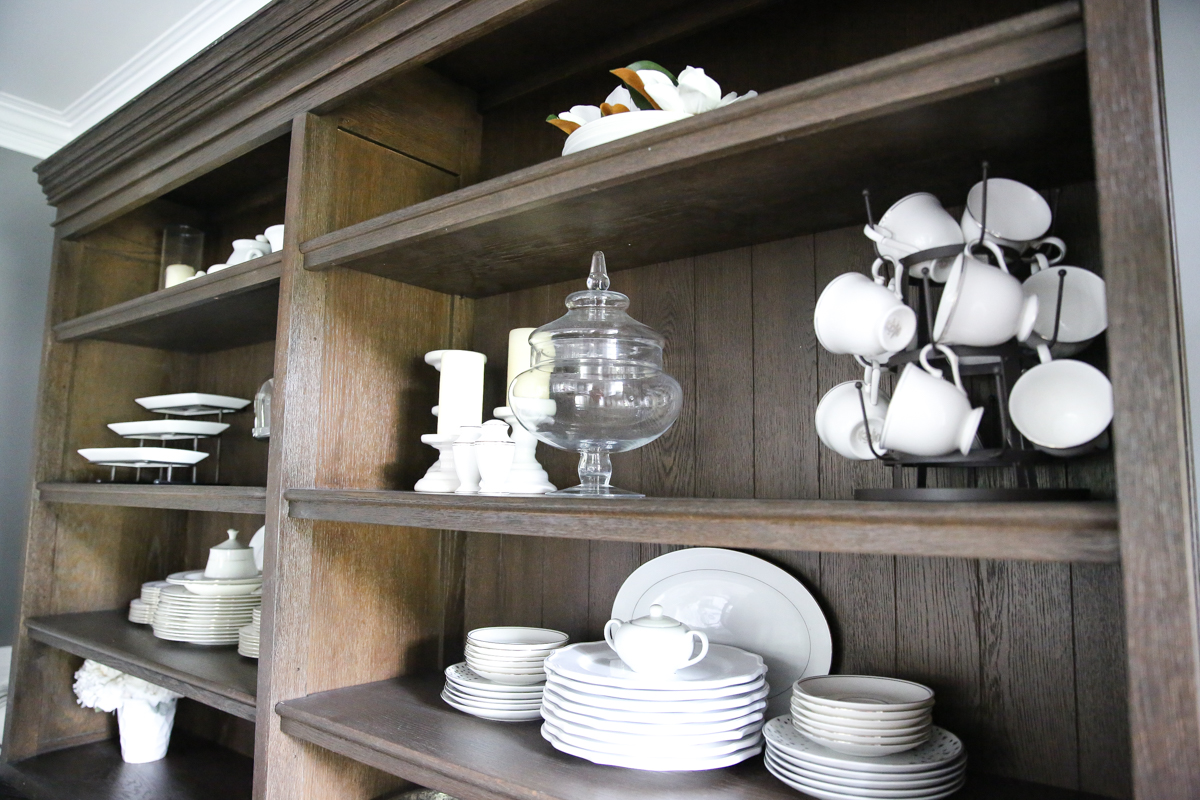
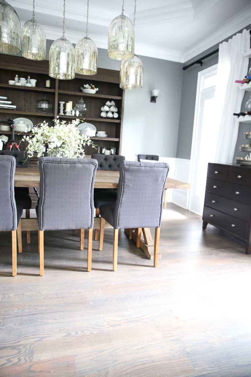
SO this is my space. The one that is still in the middle of it’s journey. It got a brand new hutch (relocated from the living room) and I wanted to share how great it looks in here.
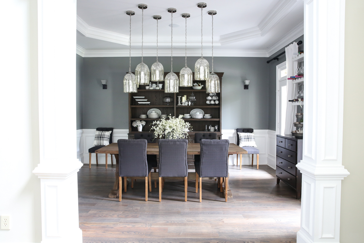
The hutch is definitely big enough to hold it’s own in the space. It’s like the room is wearing the hutch and doing a really beautiful job of it.
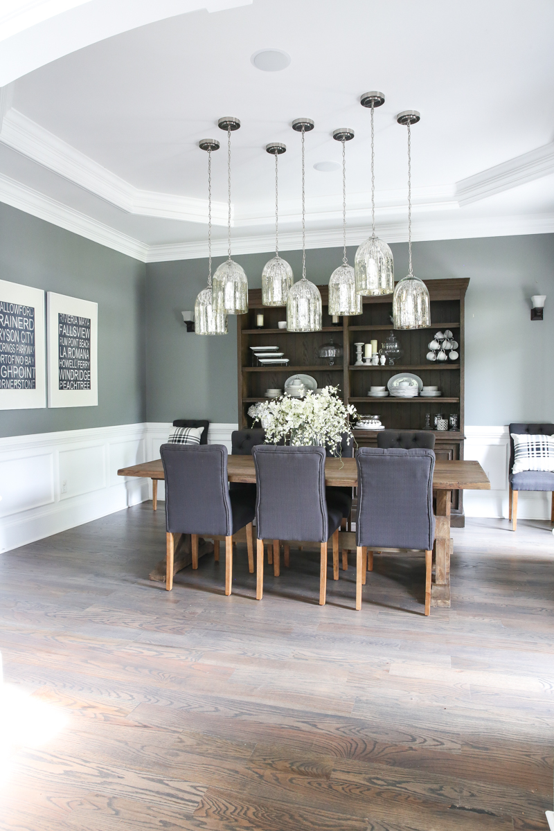
The rug we had in here had to go. It was a victim of the Bear housebreaking era and very happily I threw that sucker away. I can’t wait to find the next rug that will go in here. I’m looking for something polypropylene and a bit lighter with a lot of pattern. It has to play nice with our foyer rug too….because they are in the same lines of sight.
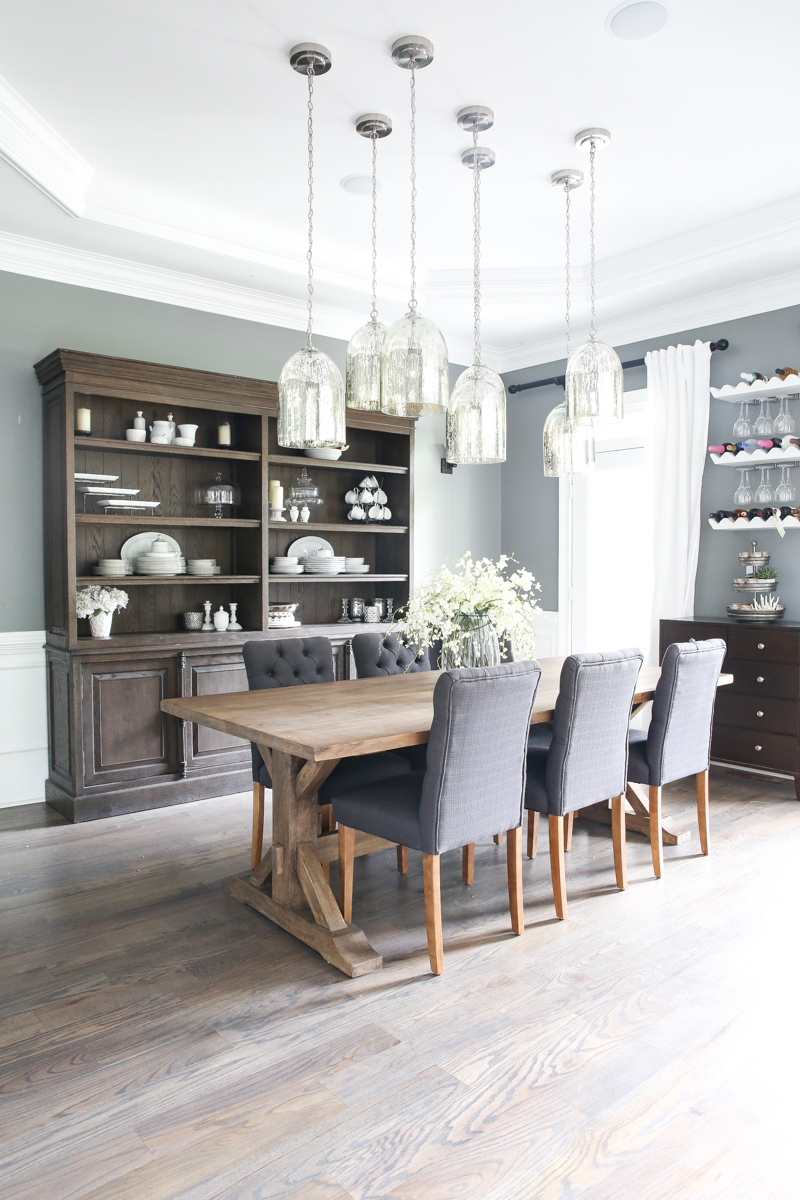
And seriously guys…how did I lose ONE curtain panel!?! What is my life and where did I put my brain?!
Don’t answer that.
I put the hutch in here and seriously it is just my favorite thing ever in this space. It is such a deceivingly large room that it swallowed the other pieces in here. This one is gigantic and just looks normal size now.
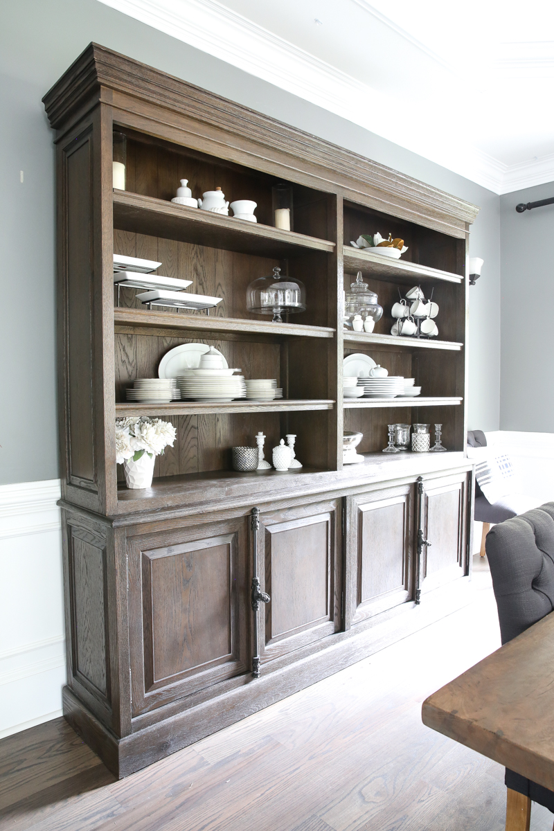
Another thing I want to change are those sconces. I want something with more personality.
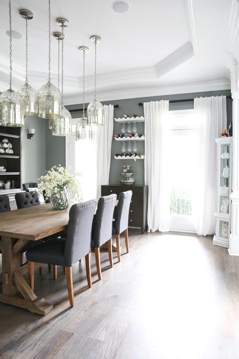
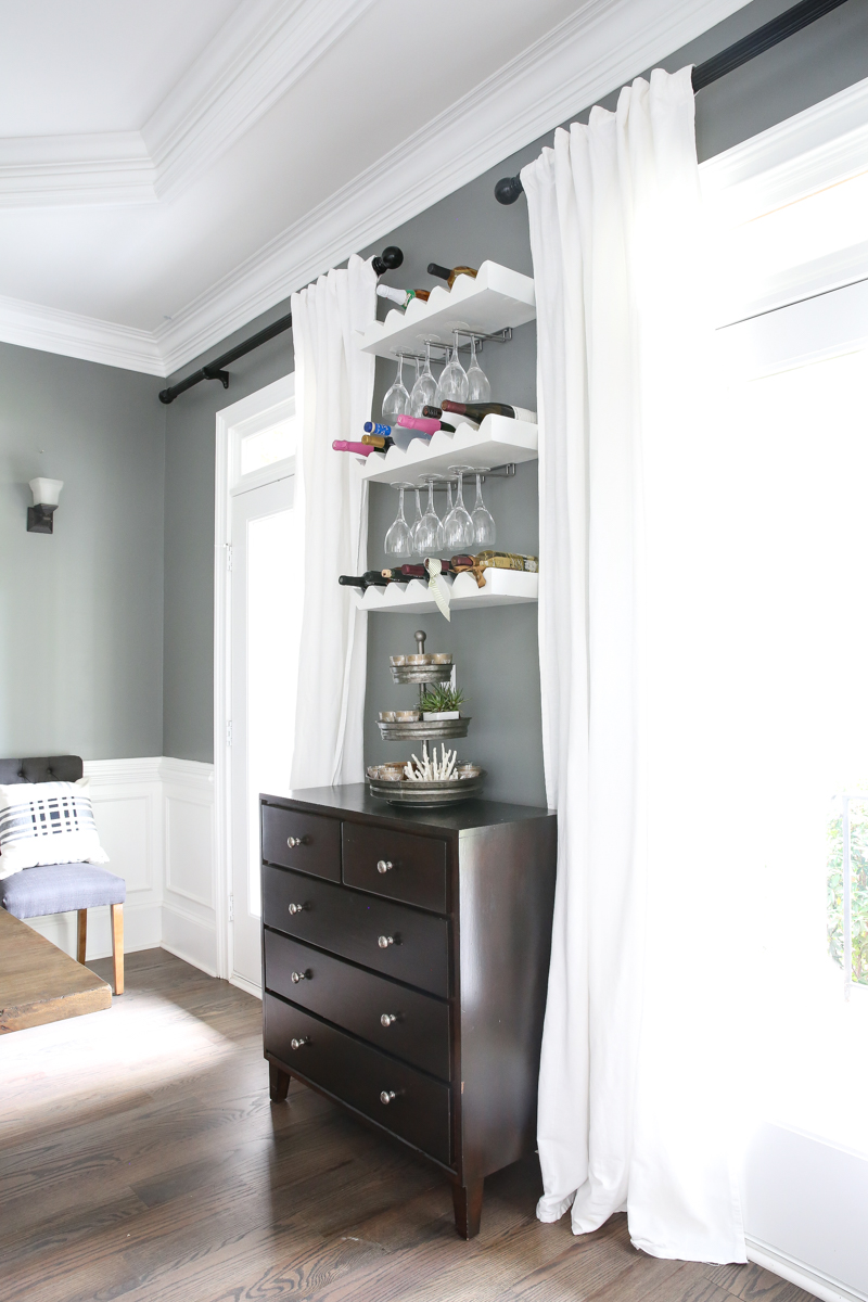
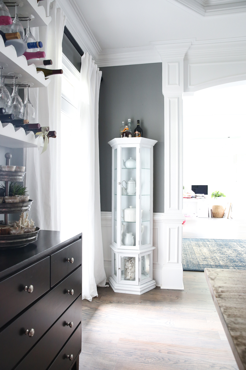
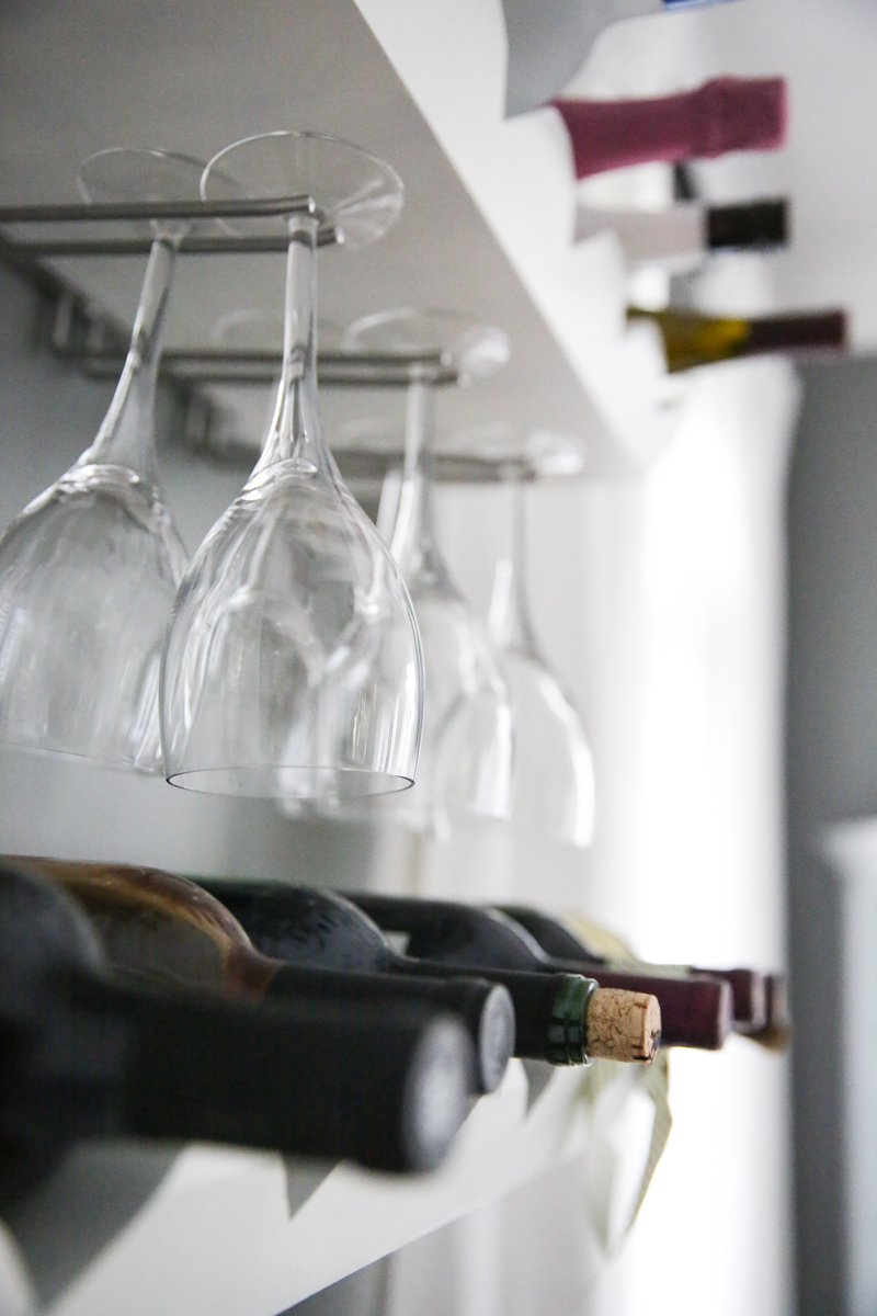
Between the doors is this dresser and my ‘wine’ area. I know I’ll get asked – the wine bottle holders are from Pottery Barn outlet and then we added the little glass holder things on the bottom. Those are from ikea 🙂
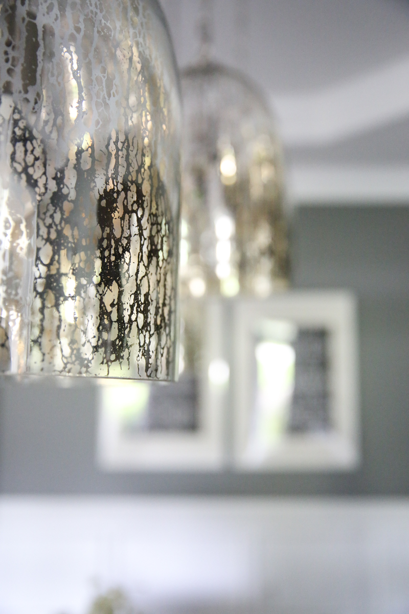
And the pendants are old from Target. We hung all seven of them because there is only one thing better than one pendant…it’s two. And there is only one thing better than two pendants….it’s three. And….you get the point.
Also – please note the color of the legs of the chairs. I desperately want to change the color. I’m thinking sand them down, restain and go 🙂
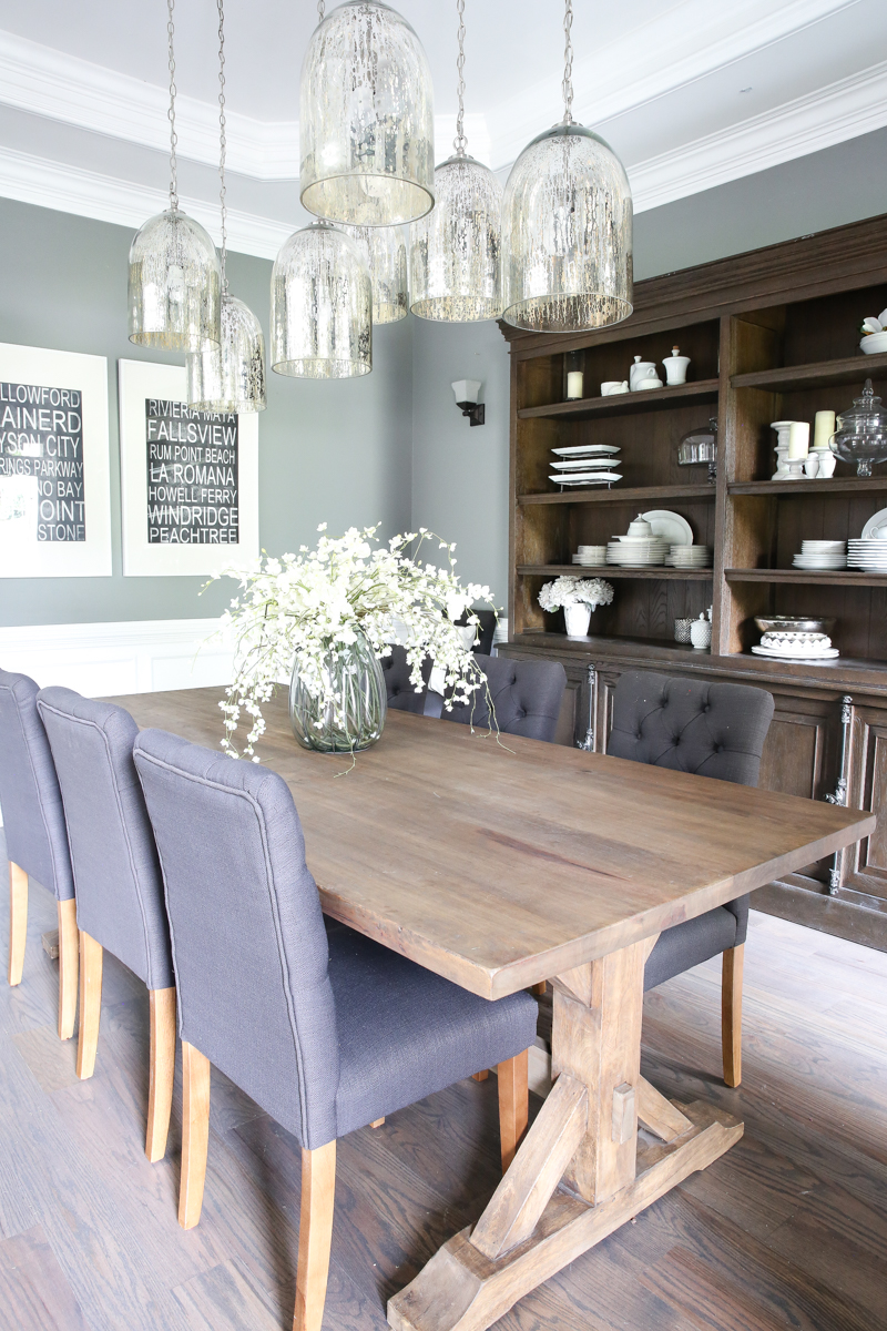
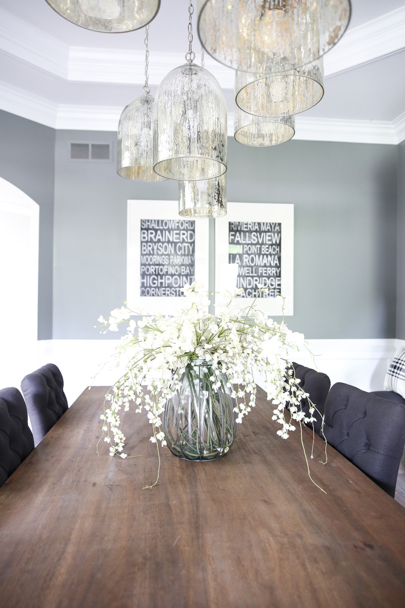
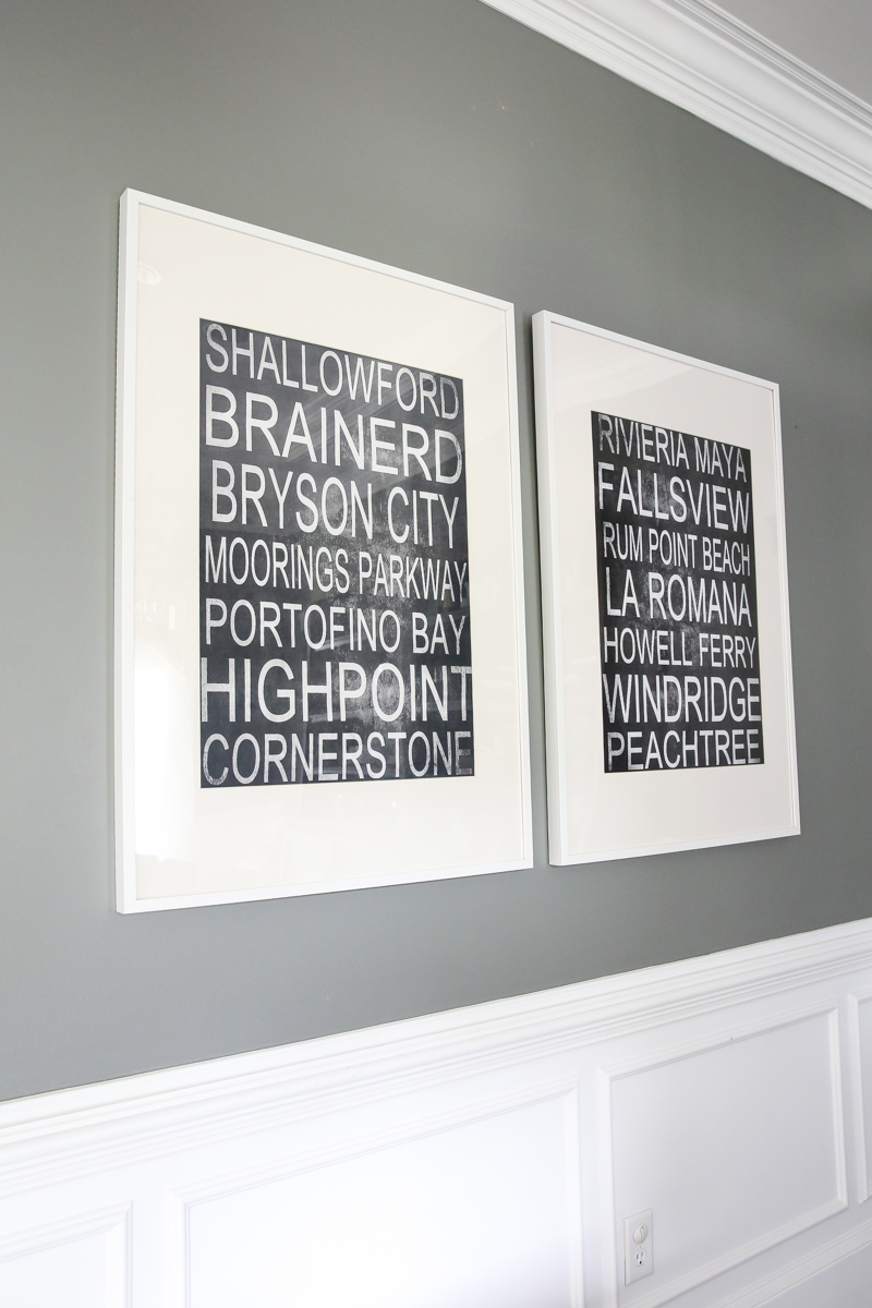
At the end of the room is our word art. I made it years ago of all the major places in our relationship. I’ll walk ya through it….
Shallowford is where we met. Brainerd is where we first danced. Bryson City is our first official date. Moorings is where I became his girlfriend. Portofino Bay Hotel is where he proposed. Highpoint is our first house. Cornerstone is where we got married. Riviera Maya (yes I misspelled it on the artwork) is our honeymoon. Fallsview is our first anniversary. Rum Point Beach is when we decided to start a family. La Romana was our baby moon. Howell Ferry is where Will was born. Windridge is our current neighborhood. And Peachtree is where all our other babies were born. It’s like a story of our lives together 🙂
The only other piece of furniture in here is a very old small hutch that I gave a makeover to years ago. Now it holds all my tea pots. Oh and some rum.
I think the next steps in here are to get a rug and maybe try to find that window panel. For the life of me I can not remember where I put it. I forget my own kids names though….
What was I saying?
Oh right. Forgetfulness. Well…here are the rest of the pretty pictures. I love this room….truly I do. It’s something about the light in here. It’s always just right.
All that to say….let’s make a list of the things to do. I like lists.
- Order rug
- Find and hang curtain
- change color of legs on chairs
- maybe repaint the walls (it’s really gray) or do all shiplap look on the walls
- host more dinners here
And that’s about it. Those are my goals. And also share more imperfect spaces. I know I like seeing half done rooms so why the heck not, right?! It’s gonna be the new thing. Let’s make it the new thing together. I know we can. What was the new thing again? Seriously….can not remember a single….what was I saying?! 🙂
The hutch looks so good in there. I was worried it would take over the room, but it seems like you still have plenty of space for sitting at the table. That room must be really big! I don’t think the chair legs look awful, but I can see how you might like them better if they were a little darker.
I am in love with the seven pendants, what an original idea that turned out so gorgeous!
I agree that hutch looks AMAZING, but in the vein of not asked for opinions, I think you have WAY too many wood finishes in there. They are all competing with each other and none of them are standing out. Maybe just keep the hutch and table which complement each other and paint the rest? The chart legs might look mighty nice in a super dark brown almost black finish.
What a beautiful room! I love the massive hutch. And the art is so charming. I like this post because it makes me feel better about all the unfinished rooms in my own house!
One small thing I might change is to take out the tiny white hutch and put the teapots in the big new hutch. The little bitty hutch seems too small with the scale of the furniture in the rest of the room.
That’s my two cents. Thanks for sharing!
Those pendants are AMAZING!! I can’t believe they are from Target!
First of all, beautiful room! Seriously, I love it!! Maybe some bigger sconces would look more balanced though… Just thinking out loud.
Just a suggestion until you find your missing panel – why don’t you move the panel to the left side on the left window, and just have one on the right side of the right window (taking off the other one), and it will look like you meant to do that. I know it sounds weird, but it works – at least it did in my friend’s house. She had a valance though.
Just take one of the other panels off and keep the set of curtains on the outside of the window – it will look intentional!
Love. all. of. it.
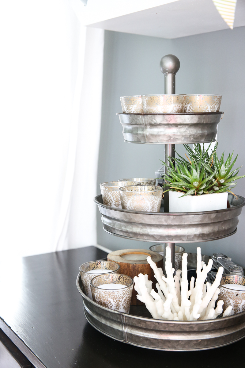
Where did you find the galvanized tiered stand? I’ve been looking everywhere for one just like that!
I loveee that wall art you made! What an awesome idea!! Can you fill us on on how you made that? Or is it already on the blog??
The room looks great! Don’t forget that most of us a schlepping through life with very unfinished and never-will-be spaces, so to the average Joe, the room looks amazing. What incredible pieces of furniture you have and how beautiful are all of the finishes and colours. I love the paint colour and the hutch in there is perfect.
((When a room is 95% finished, talking about the 5% of imperfect things can smack a bit — tone is everything))
Your dining room is beautiful, and perfectly polished reveals are overrated!fl Thank you for sharing the in-between stages. That’s more real to the rest of us. Keep it up!
I love the big hutch! Could you possibly post a tutorial about the art? (If you already did, could you send a link?) I would love to try it. Different sconces will make a big difference. Thanks for sharing an unfinished room!
Can I ask where that hutch is from?
What about picture lights instead of the sconces and some small art on either side of the hutch?
I also agree about just moving the panel over so it looks intentional. I think the sconces should just be removed as the hutch is so big……or maybe you could find something a bit larger that would compliment your awesome pendants! A rug would be nice but not necessary to have before you entertain. What a great dining room!
I had the exact same thought- floors, table, table legs plus 3 different pieces of wood furniture in all different colours!
Thank you for these in-between photos and descriptions! I’ll walk into a room and feel it’s not complete, but have no clue what is missing. You wrote out a nifty little list that I will definitely refer to as I work through my house to make it feel like home. Thanks for showing the progress and the details!
Aww, that “meaningful places to us” artwork is cute! I like that idea.
Aw asking you where you got those wine racks was my very first blog comment ever (ala 2012 maybe?) Looks great now, and it will be even better when you round out those final pieces!
Hobby Lobby! They also have one at Pottery Barn that is a dead ringer 🙂
xo – kb
Have you considered slip covering the chairs? I have the white skirted slip covers from Ikea. They are affordable, hide the legs, and can get thrown in the wash. And I think they’d look great in your room.
Still a beautiful space, even in “transition”! 🙂
Two questions:
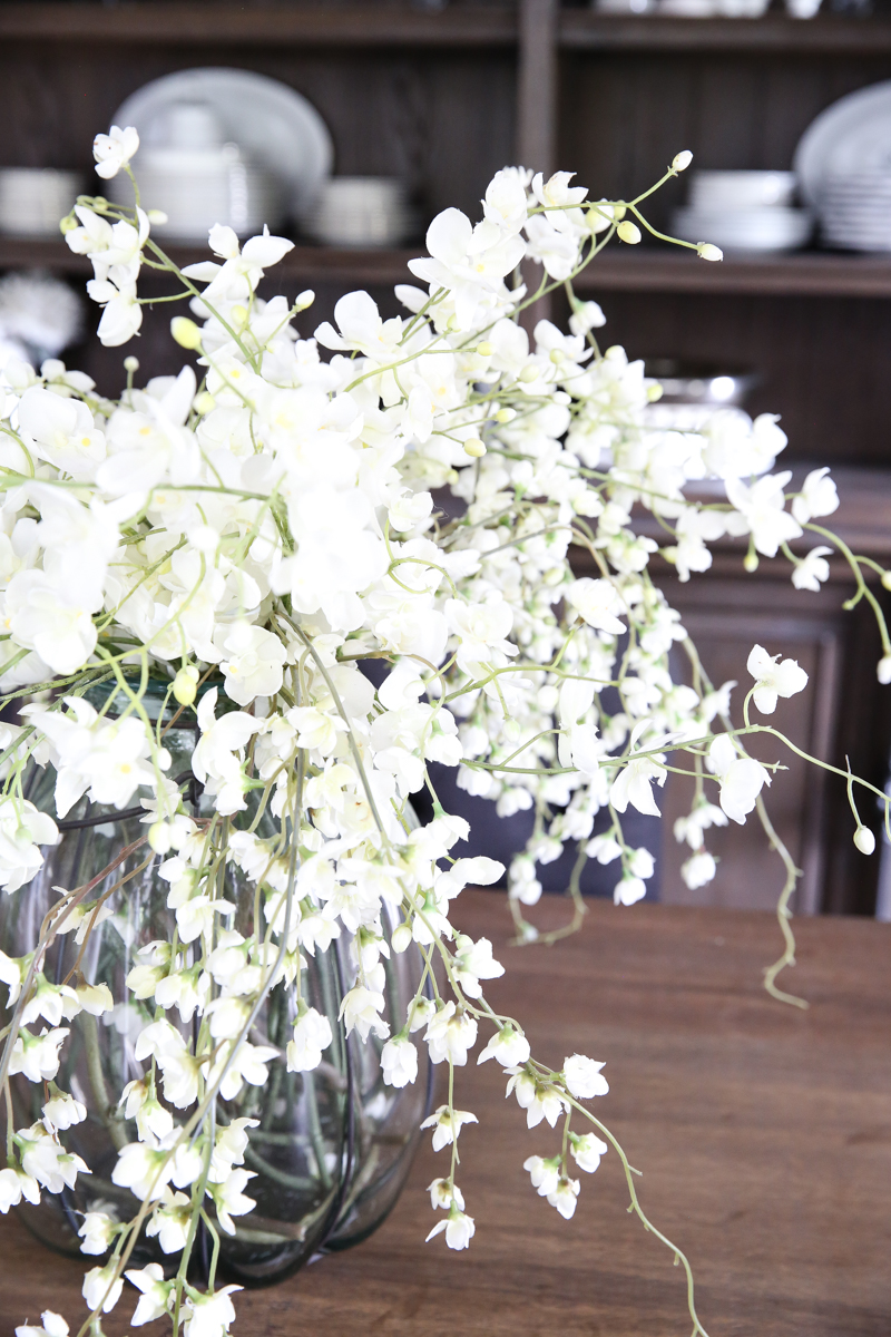
1. I’ve been wanting to have something that lives on my table for a centerpiece that’s simple and elegant. Where did you find the vase and flowers for your table centerpiece?
2. LOVE the word art! Do you have a template or a different post that explains how you did it? Definitely thinking of creating one for us. Great idea!
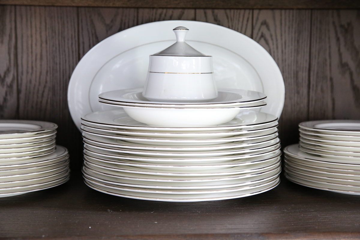
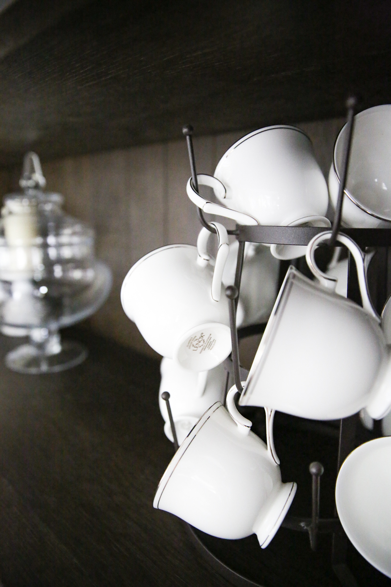
Is your china Hannah Platinum by Lenox? It was hard to read on my phone. It looks JUST like my china, which I love so much! Everything in you’re dining room and home is so lovely! You have beautiful taste!
Ha! I actually love all the wood!! The white on the walls helps balance it out.
Where’s the table from? Not sure you said that one.
It’s the Federal Platinum by Lennox but sooo close! And thank you….the Hannah is gorgeous 🙂
xo – kb
We got it at Southeastern Salvage but I found a similar one on Wayfair!
xo – kb
Yes – I did post about it but no template…so sorry! Here is the post where I describe it. The vase and flowers are from Pier1.
xo – kb
I haven’t really considered that. I bought them dark gray because I figured it would show less 🙂 But I will have to see them with painted legs. If I hate it, then I might have to make an Ikea run 🙂
xo – kb
Sure! The hutch is from Restoration Hardware 🙂
xo – kb
The art is an old post. Here is the link!
xo – kb
It is on the blog! I made them ages ago! Here is the link.
xo – kb
Thank you! The rooms in this house are deceivingly large. They make other furniture seem tiny which is hard at time 🙂
xo – kb