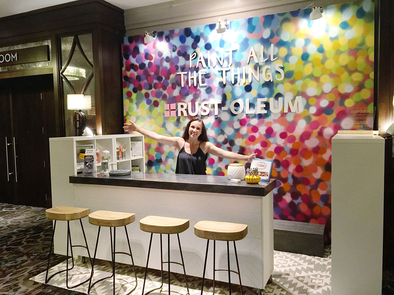
Happy Labor Day y’all! I hope it’s filled with food and fun and a little relaxation! Normally I don’t post on holidays but I really wanted to get this post to you. It’s that important. Also because my posting schedule is going to be craaaaa-zaaaay in the coming weeks to I didn’t know when else I could show you this fun DIY. Today we are gonna talk about how to make that colorful explosion that is behind my outstretched arms….because really that is what color does….it gives you a hug filled with love. Bring er in there friend 🙂
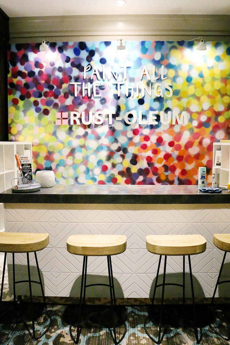
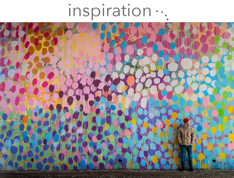
We made this backdrop wall as the focal point for the Rust-Oleum booth at the blogger conference called Haven. We were asked to concept this space and I had seen and LOVED a mural done by HENSE – a well known Atlanta street artist turned contemporary artist that is famous for his love of color.
Here is his work in Atlanta…..amazing right? Well, I wanted to create something with loads of color because let’s face it – we all know Rust-Oleum for two main things – spray paint and stains. Granted they do have about ten million other products (that actually might be an understatement) but that is what they are best known for and I wanted to showcase AS MANY COLORS AS POSSIBLE.
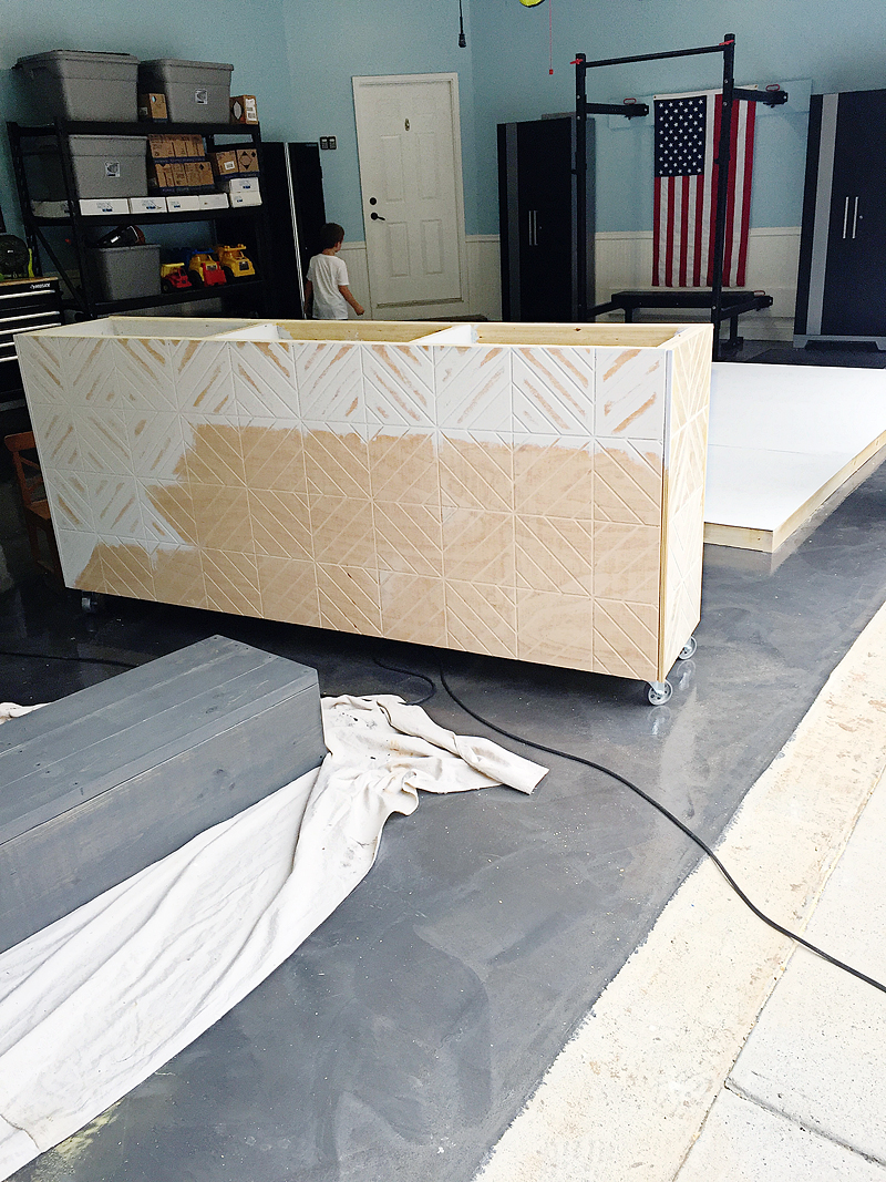
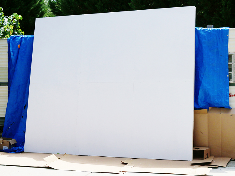
We built the backdrop with 2×4’s and used thin plywood as the tops. There were three panels each one was 4 feet by 10 feet and we could bolt them together to create the monster 12’x10′ backdrop we needed. I don’t really have any pictures of that except the bit in the back of this one….
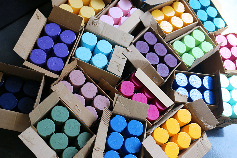
Since Rust-Oleum was using this booth, they wanted to make sure we didn’t run out of paint….
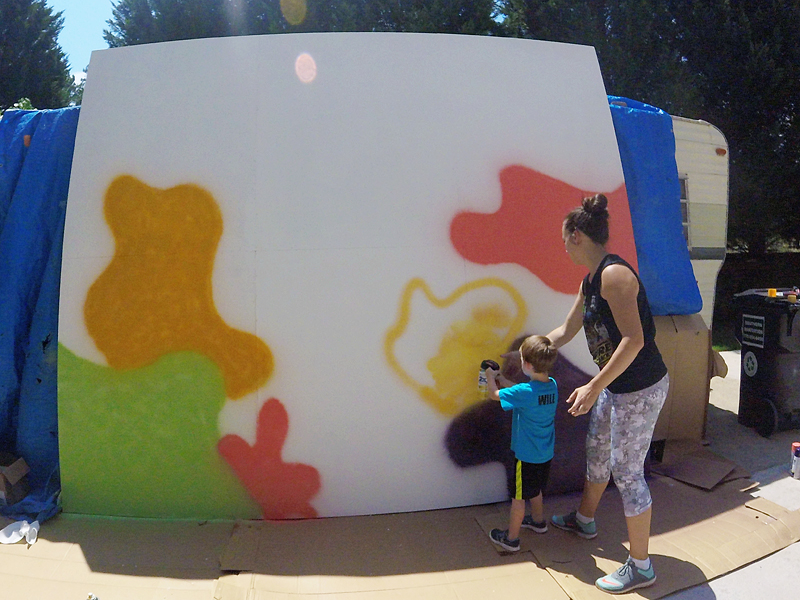
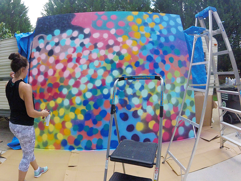
I only used about 12 bottles….each with a different color. The backdrop was primed with flat white paint to begin with and that was completely dry before I started. We set it up in our driveway and we were really careful to protect the edges from overspray….
If you plan on doing this indoors, make sure you protect your floor and ceiling from overspray. You will want adequate ventilation because duh – spraypaint.
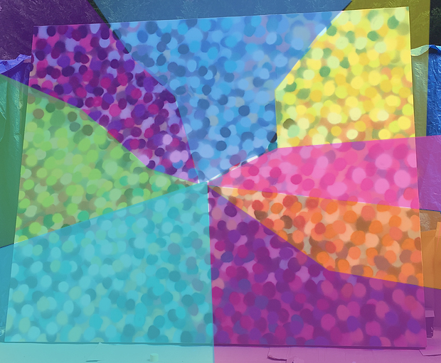
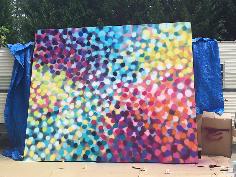
Then I set up our GoPro and just went for it. My plan was to create a ‘merging of colors’. I just used my head to map out which colors went where but for example, you could make something that looks like this….
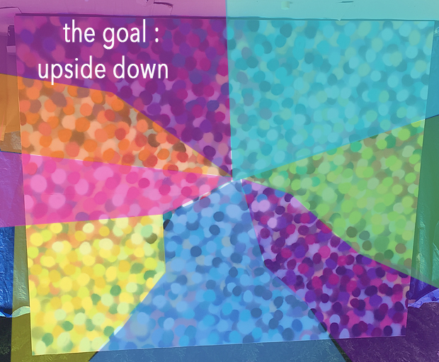
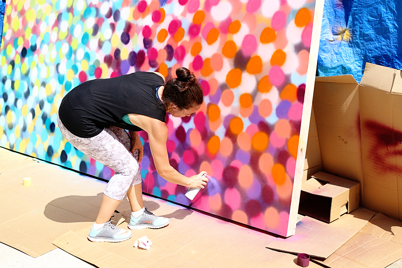
Since I couldn’t paint the full length of the panels at once (ladder issues!), I decided to paint the base color on everything and then just focus on the bottom half and then flip everything over. That meant that this video shows me working on the lower half of this….
Okay – so here is the very spirited video….
TIME OUT!
Okay – so we switched some things on YouTube to be consistent….and if you previously were subscribed, we accidentally lost you! We want you all to go click subscribe and click the thumbs up if you liked it. This way we know WHAT YOU LIKE! It helps us provide good content! And thank you. Thanks bunches for helping us out that way 🙂 I know it’s annoying…but we appreciate it.
If the captions in the video don’t make much sense, I am sorry…sometimes ‘art’ (even just blotches on plywood) is hard to explain…especially in a time lapse.
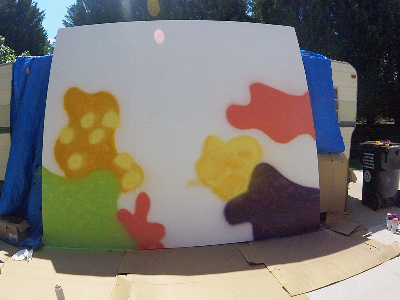
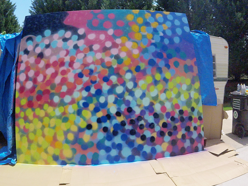
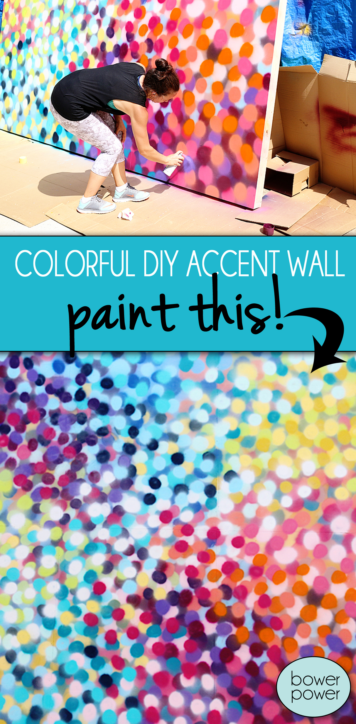
If you want to make this yourself – like for an accent wall, I would highly recommend it! It’s not hard! First just fill in some organic shapes on the background in colors that would go with your zones. The ‘zones’ is the color map that I showed you above.
Try to make sure those shapes are filled in completely and you can start adding smatterings of those colors in other areas (like I did below with the yellow). Those yellow dots on the orange background are smatterings.
The colors will start overlapping some – especially with the smatterings – and that is okay! Just keep going. I like this base layer to be GENERALLY the same as the zone goal (base layer GREEN for a zone of GREEN) but IN BETWEEN the zones, I liked the look of adding a complimentary color….so next to green is pink. Google the complementary color wheel to understand that concept.
After the base layer is in, you want to fill in the spaces with blotches of MID TONE COLORS.
That means if the base is light green, you will want to get a darker green (not the darkest) to add dots to that zone. Remember that you get to color outside the lines here. Sometimes it helps to step back and squint your eyes and focus on JUST that one color….see if you need to add more or less dots.
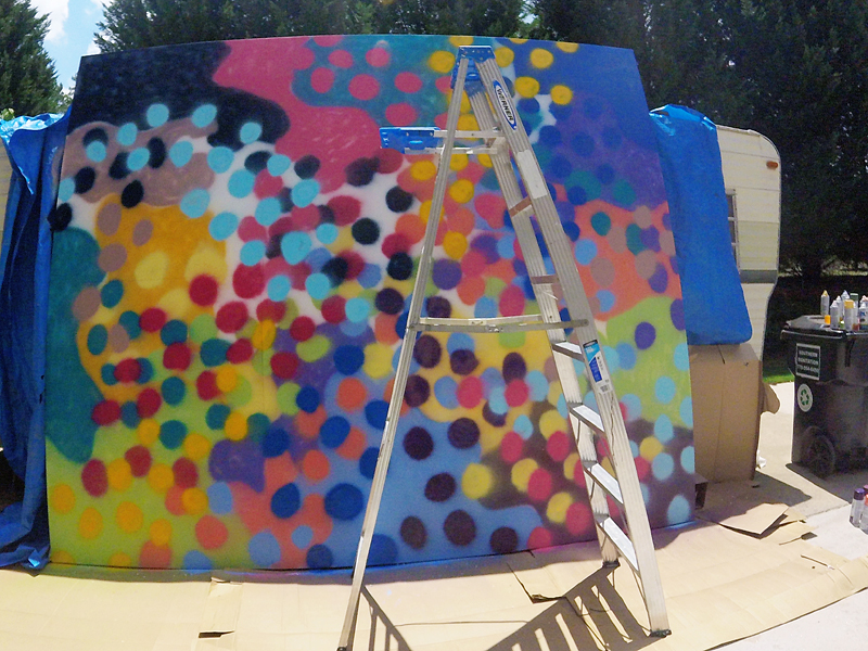
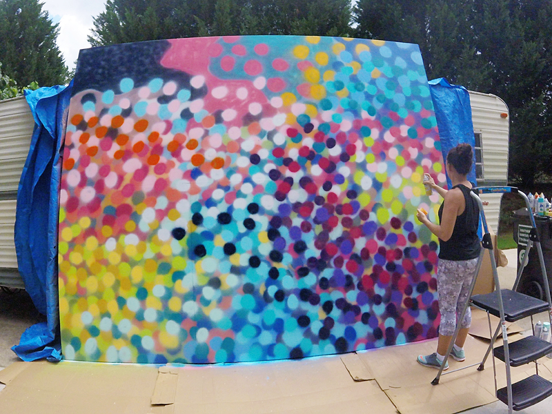
After your mid tones are filled in, it’s time for highlights. This is where it starts making sense. You will take your LIGHTEST colors and add those to the areas that need defining. See the pink? That is going to be a pink zone. Underneath it is coral, deep pink, muted purple color and yellow and orange and even blue.
Once your first layer of highlights is in, it’s time to add depth with your low lights. The contrasting darks are gonna come in and make you feel like you made a huge mistake. Don’t freak out. It’s part of the process.
Once you have some of your darker colors in there, it’s time to add mid tones again….don’t cover over all your highlights or lowlights….just a couple of them so that the mid tones feel like they are on the top layer and bottom layer.
I got to this point with the painting before Jeremy and I flipped the boards….
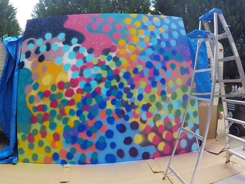
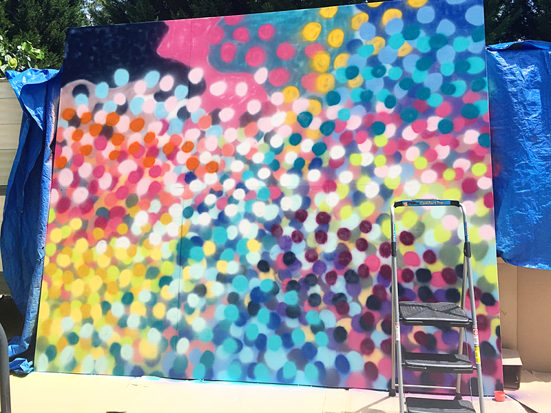
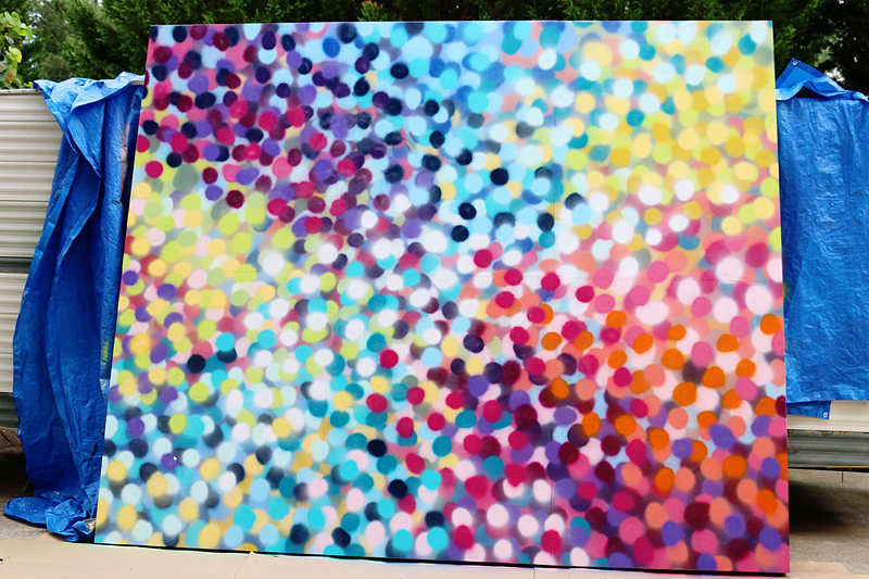
And then I finished the lower half.
The key here is to just spray enough darks to make it feel balanced, enough lights to make it feel alive and enough mid tones to define the color zones.
And it’s an amazing workout. My arms really felt the burn 🙂
So that is how I made this super colorful backdrop….wouldn’t it be amazing for a wedding or a birthday? Maybe I will whip it out for Jeremy’s 40th birthday….because THAT is what he really wants….a colorful backdrop….not that Jeep Wrangler with the 33’s and the lift 🙂
Happy painting y’all!

I love this!
Did y’all get an RV?
I am so impressed with your masterpiece! I just love it!! You have to use it somewhere in your home. It’s too cool not to!! It looked like it was windy that day, but did you get any overspray on the driveway or the motor home? And I know you were outside, but please wear a mask when you spray paint girl. Just looking out for ya!!
Love it! You’re so talented! But I think I’m most impressed with those arms. You look buff!
This is incredible! I love all of the colors and want a giant wall to put this in my home!
It looks amazing and I have no idea how you know how to execute projects like this without messing it up! And also…. Please add a blog post into your craaaaazy schedule about what you’re doing to have such gorgeous toned arms! K thanks.
I loved this beauty at Haven! Great job. And totally agree that a colorful backdrop and Jeep Wrangler are pretty much interchangeable for a b-day pres!
I was thinking the same thing!! But I do totally love the background art!
I had to lie down and take a nap after that video! Whoa! Pretty fabulous. I can see it as the wall in a future play room…
Or Jeremy’s birthday party, that’s cool too.
Or a really chic coffee house…
I LOVED this backdrop at Haven and it was so fun to see how you did this. I might have to try this on a small scale for some fun DIY artwork.
Haha! I wish I had a secret….but I don’t. I haven’t worked out in so long it’s embarrassing. I think I have the muscles just from lifting kids 🙂
xo – kb
I came here to say the same thing! Love the accent wall…but please tell me more about this camper! 🙂
This is SO GREAT! I’m thinking of re-creating it for a party photo backdrop. Any idea how long the actual spraypainting took you?
Love it!
What’s up with the trailer?? :0)
Yes – it took me three hours with breaks.
xo – kb
very nice!!! love it too!
This may be one of the coolest DIYs you’ve shown!! Thank you for the awesome inspiration.