You guys were so sweet about all the changes that we made in the kitchen. Thank you so much for supporting our crazy ideas – like putting two regular fridges side-by-side. The overall functionality is SO improved and now I thought it was about time to take on the next phase of updating the space. Namely the things I want to do to tweak the kitchen island now that it has bar stools and a new quartz countertop.
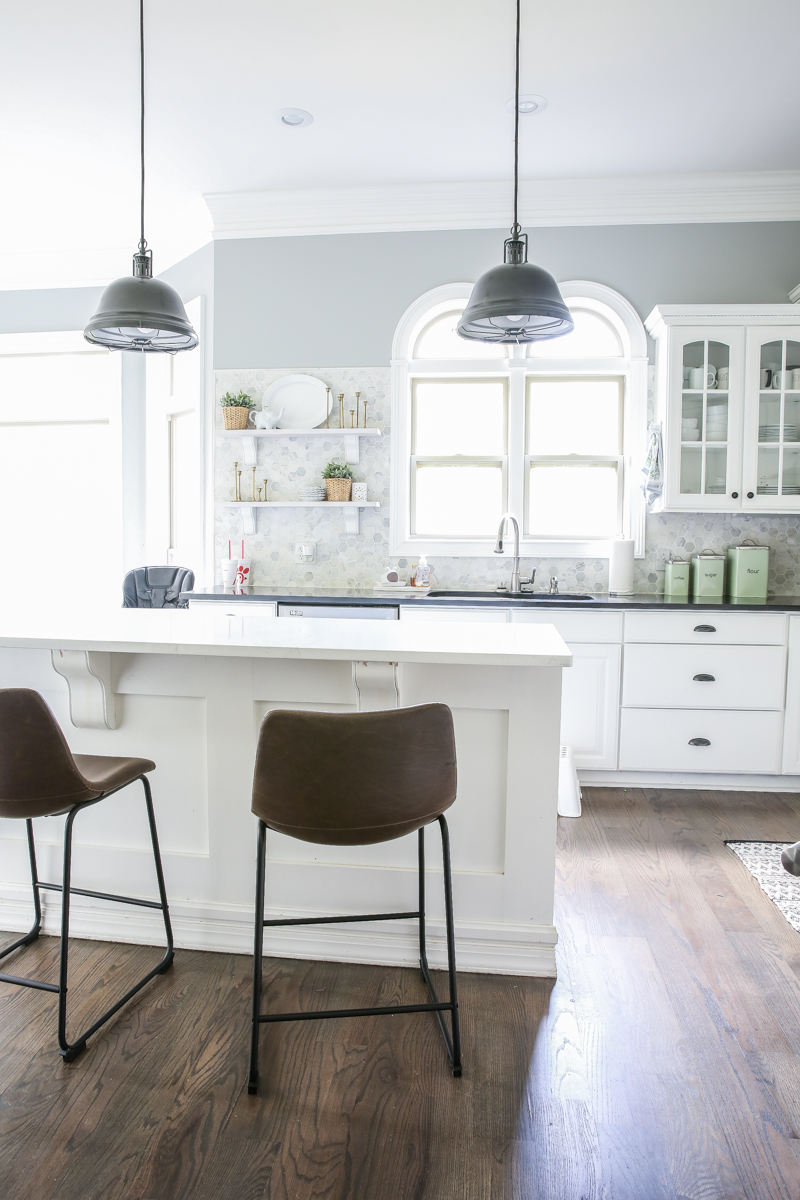
Our kitchen island right now is white on white with the counter having some very subtle veining. The lights were outlet finds and are intended to be a children’s space (which I would love to reuse these in a homework area!). And the other thing that bothers me is the windows in here. I’m honestly not a huge fan of the rounded tops (I say they look like a bum, Jeremy said boobs….either way, they are pretty much not our style)….I don’t know if they are gonna be something that bothers us enough to change but I did a little photoshop action to see what y’all think.
Okay the first question is…..What do you think of these three changes?
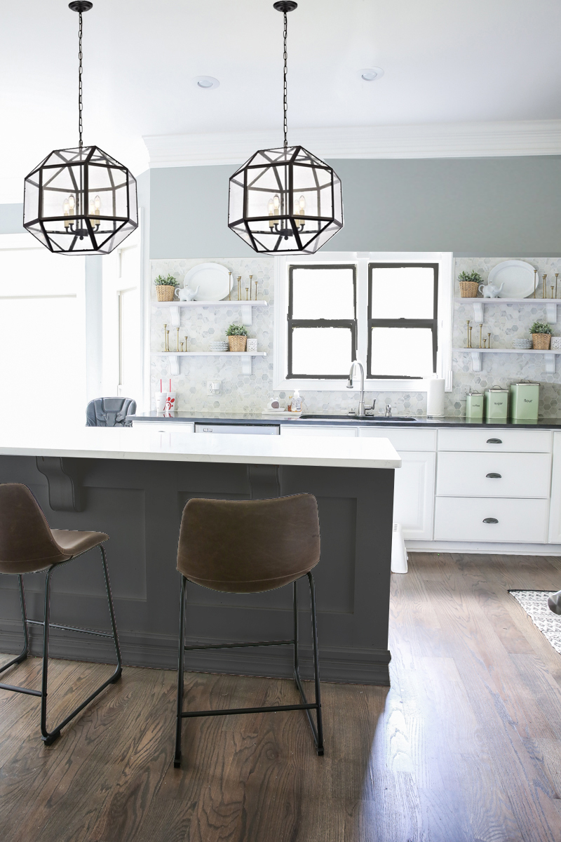
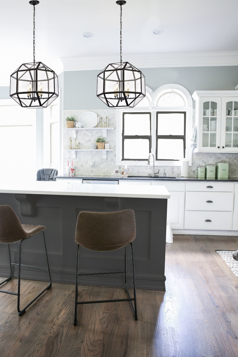
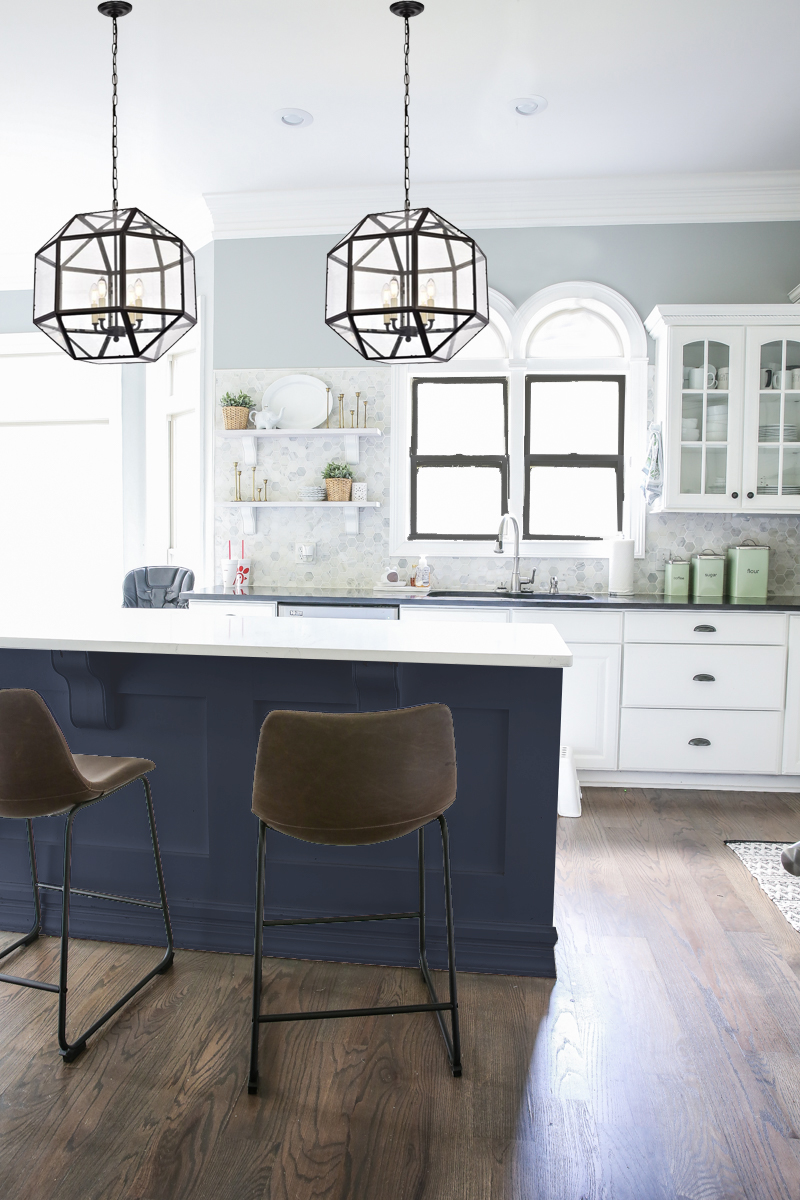
First, I switched out the lights. I want something a little bigger (these are roughly six inches wider than the existing) and still go with the black of the fixture over our table. The previous lights were also not hung in a place that it makes sense so that location would need be tweaked (hello more drywall work). And then these are also more light bulbs so I hope it will brighten things up.
Secondly, I virtually painted the windows black. I don’t know if I can paint my windows but the tan color looks dirty all the time and I would prefer to have black or white. What do you all think? I would paint the bottom parts black and then the rounded parts white to blend in with the trim a little more.
Lastly, I am deciding if I need to keep the bright white island for unity sake or take a plunge with a different color. My options would be a dark warm gray. I actually have tried this concept in the past (remember this old post?) but this time we have different floors and lighter quartz countertops so the actual contrast might work now.
The other option for the island is dark navy blue. This rendering is a little too saturated for my taste but you get the point. But then comes the debate….black with white and blue and brown and gray? That’s a lot going on.
And then again – we can just leave it white. I am not opposed to that idea either.
Okay and just for kicks and giggles, here is the rendering with the bum/boobs no longer on the window….aka rounded transom gone. Also I did open shelving on both sides because balance makes me happy. What do you think? I know it’s easy to say “oh yeah definitely looks better.” and then spend someone else virtual money….but REALLY worth it? That’s what I want to know. It would mean drywall work, new siding and even tiling and new shelves. It would be pretty pricey for what it is. Thoughts?