I am so excited to share with you a new regular feature here on Bower Power. I’m calling it a Before & After Showcase…and that is exactly what it is…a time to share, put on display, and applaud a fellow blogger who has taken something hum-drum and made it something worthy of the fist bump, a pat on the back and a piece of bacon. I hope you all will visit the featured site and tell these DIYers what an amazing job they did, share your favorite bit of their transformation and in general spread the love.

Ashley & Greg Brown are the bloggers behind the blog, 7th House on the Left. They have been tackling their 1970’s home…and their kitchen transformation is so amazing that it literally makes me drool. Let’s get right to it…the before was a lacking layout with little storage space…
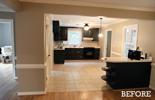
and the after is a bright and white scene with a new layout and a gorgeous wall of tile…
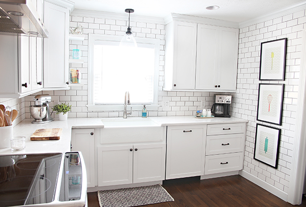
They reworked the dishwasher, fridge and range location and I think it makes a world of difference.
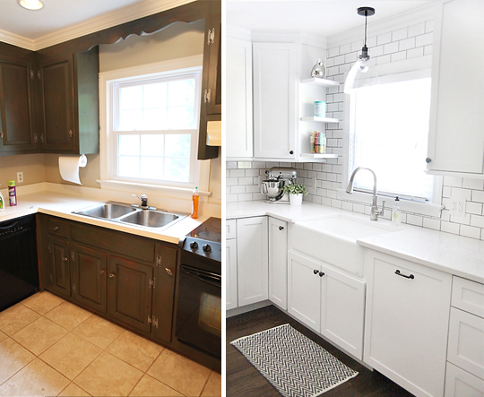
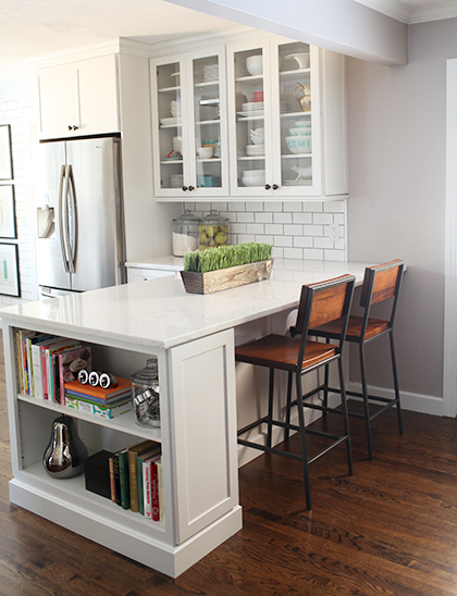
They also create lots more storage space by taking out a window and putting in some beautiful glass front cabinets and expanded the peninsula to have shelves on the end. Love that. Oh and check out those yummy floors.
My favorite bit is their faux-zinc letters that Ashley created for her range backsplash. Don’t they look like real metal?
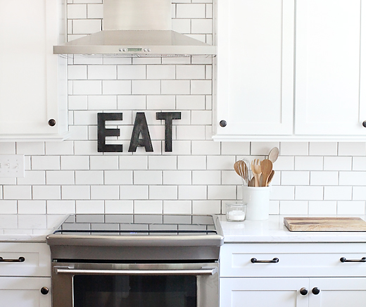
Overall – it’s a beautiful space that could short-circuit my computer (still drooling)….
What’s your favorite part? The tile? The hardware? The Eat signage? That amazing farmhouse sink?
Wow! I love it all, but I think the eat letters are my fave. And what are you doing up at this hour? Middle of the night feeding and you though you would share some gorgeous kitchen inspiration with the blogosphere? Haha.
Holy crap! That is beyond amazing and beautiful! I waaaant their kitchen!
Such a gorgeous kitchen! Nothing quite like a nice bright white kitchen! I’m already a big fan of 7th house on the left. 🙂
I love how light and bright this kitchen feels. One of my favorite touches is actually the warm wood of the stools contrasting with the crisp white of the peninsula.
I was just checking out their blog the other day. What a great re-use of space. They should be very proud indeed. Fresh and clean make for glorious kitchens!
That wall must have been fun to tile. Everything is too white, imo. Not enough contrast.
Absolutely gorgeous. They did a great job.
I’m a bit confused. This “new” feature on the blog is the exact same concept as the reader redesign feature on YHL. Not interesting to me.
Ohhhhh so excited to see Ashley and Greg featured today! Those two have done a wonderful job on all of their renovations….but that kitchen really takes the cake 🙂
Well done, Ashley and Greg.
The bookshelf at the end of the peninsula is a wow for me with its beautiful simplicity and practicality. I also love the glass cabinets in the same area.
… Great new regular feature, Katie!
Oh my, that is gorgeous! I think my favorite part is the stools! And that cookbook storage at the end of the peninsula.
OMG Katie… Are you sure you didn’t find this in a shelter mag?! Absolutely gorgeous. Great job Ashley and Greg!
Love this reno! We are in the process of something similar and it’s making me really dig the grey grout!
Gorgeous!!! My favorite part? that’s hard because I love it all!
It is funny that this concept is very similar to YHL “reader redesign” and the 7th House blog is literally a CARBON COPY of YHL. I know there aren’t that many “new” ideas in the blogosphere, but it is pretty ironic that you chose 7th House as the first one in the series, because their blog is the exact same as YHL.
I love the shelves on the end of the peninsula! Cute and functional 🙂
I love seeing all of the kitchen renos, because I’m planning to replace cabinets and freshen up our kitchen as well. I love the clean organized counters… but where is the microwave? I’d love to hide mine, but don’t know what to do with it. Do you think it’s in a cabinet?
I love love those counter chairs. Any idea where they are from?
Natalie
Ooohhh!! Aaahhh!! This is so pretty and refreshing. I think my favorite part is a tie between that beautiful sink and the spacious peninsula. I wish I had a peninsula like that in my kitchen for additional seating and space to layout food when haing guests over.
Love this! Thanks!
Love the idea of the before and after showcase. One question, in the future could you link to the specific post on the blogger’s site (rather than their home page) so we can easily find the project that was showcased? Thanks!
CORRECTION! They are West Elm!
I believe they are Crate and Barrel…so pretty!
xo kb
Great idea! I’ll do that next time.
xo – kb
I believe it’s in a cabinet in the peninsula.
xo – kb
haha…actually I invented the concept of before & afters 🙂 Seriously though…I love Sher’s Reader Redesigns and I love when Design Sponge, magazines and tv shows show before and afters – and I really wanted to introduce my readers to other blogs and just show off some of their great transformations. It’s definitely not a new concept…just a new feature here. And it’s funny that you think that about 7th House because I don’t…to each his own!
xo – kb
Feel free to skip it! I will always use the title Before & After Showcase – so when you see that, you’ll know it’s time to move on to another blog!
xo – kb
Interesting to see this “new” feature on your blog. What bothers me about it is that it is the same concept as the reader redesign posts on YHL. You seem to do this with other things as well such as your monthly updates. I don’t intend to sound negative, but it would be more interesting to read new concepts and ideas on your blog rather than recycled concepts from other blogs.
Also, sorry that there are now two comments on the blog from the same person. No need to approve my last comment, I just thought my comment from earlier this morning had not published because the server crashed on me. 🙂
Well…hmm…ok Jackie…do you really want to talk about this? I mean really talk? Because I’m up for it. And I don’t want this to come across snarky…just as a discussion…so feel free to comment back and we can really dive into this topic. mmkay? Let’s do it. Reader redesign is basically showing before & afters of anything…a dresser, a room, a craft…right? And shelter mags have been doing that for years before blogging ever gained steam. This is not a new concept. And it’s not intellectual or creative property as far as I know. Where the stuff comes from is pretty negligible…whether folks send it in or you find it online…it’s basically Before & Afters. That was an old concept before ANY blog did it. There are some of my readers that don’t read YHL and even if I showcased the same project as Sher, it would be a nice way to spread the love, right? Do you think it’s ok for two magazines to feature the same project? And since I do realize that we do have some readership overlap, I hope our features aren’t the same because yeah – that would be boring. BUT I want to share the love…and applaud other bloggers who have done a spectacular job. Honestly it’s not about me…it’s about patting other bloggers on the back. I have a pretty large audience and I don’t want to be selfish…I want to share my readers with other blogs that work hard and have done amazing work. Okay…and monthly updates were actually something that Sher and I talked about on the phone over a year ago – I got the idea from Thrifty Decor Chick…another amazing blog…and Sher put on her superlatives spin and I added it to my sponsor shoutouts so I would remember to actually thank my sponsors on a monthly basis. It wasn’t a new idea or YHL’s…but you are right…most concepts in general are recycled. Do you have any new concepts or ideas that you would like to see on a blog? I’d love to hear them!
xo – kb
I love seeing the beofre and after photos. I also love finding new blogs. Thanks for adding this to your lineup, Katie.
I love seeing the before and after photos. I also love finding new blogs. Thanks for adding this to your lineup, Katie.
I’m normally just a creepy lurker on your site, but today I felt compelled to comment. Katie, please do not feel bad about all these negative comments of you copying YHL. I love Reader Redesigns, so I’m super excited that you decided to add this ‘new’ feature to your site, too! If people don’t like, they can skip that day! Jeez.
I always love a good before and after! I’ve loved 7th House on the Left for some time now and was really happy for you to feature them. My favorite part is the entire kitchen in white, while it may not be everyone’s style, (and I’m probably not brave enough to pull it off either), I really appreciate the effect. I look forward to more Before & After Showcases in the future!!
I love this idea everywhere I see it – on your blog, on YHL, in magazines, etc. Forget about dem haters, Katie! If I could take every room of my house and make it an “after” worth sharing, I’d want it displayed everywhere!
You should do a before and after of the Petersiks’ playroom/big girl room when it’s all finished! That’ll give the naysayers something to talk about!
Spreading the love and sharing ideas is what blogging is all about. If more than one blog you follow have similar posts, it’s likely the information they are sharing is new and different!
I love this idea of before and afters! … I found Bower Power through YHL and love and follow both! I have spent that last few hours at work … shhhh don’t tell my boss :S I’m attempting to look very busy and important! … scrolling through other ideas on 7Th House on the left. Thanks for the intro!
Man, blog-readers are a rough crowd! I fully appreciate seeing (and being reminded of) beautiful spaces from around the internet. I’ve seen 7th House’s gorgeous kitchen before, but it’s well worth seeing again. To the feature haters out there, if you don’t like the feature, don’t read it! No one forced you to. Wow! Katie does an amazing job on her blog and projects (Hello 9 months pregnant kitchen reno!), but let the girl do what she needs to right now which is to enjoy every sweet moment with her precious babies!
I love that you’re doing this. I’ve been reading for a long time…not sure I’ve ever commented, but I just had to pipe in here!!
1) I enjoy these type of comparison posts…no matter where I’m reading them. They serve as great sources of inspiration and are a nice pat on the back to the home owner.
2) Who cares if another blogger posts something similar?! As KB eluded to in another comment, if you don’t like it…don’t read it! I hate how the internet enables people to be bullies. If you don’t have something nice to say, keep it to yourself!!
I’ll read whatever you post, KB. I’m just happy to see new posts, regardless of the content.
Thanks for sharing with us!!!
XO (probably just O, because I don’t kiss strangers)
kate
Katie,
I’m so sorry that you have had to deal with such negativity when you are putting so much of yourself out there in the blog-world! If readers don’t like a segment they can feel free to skip it (like you mentioned). All blogs, art, literature, music etc are bound to have some overlap and derivative content. Keep up the good work 🙂
Kirsten
Crap…which one is the hug — X or O?! Lol.
Love the glass front cabinets! I would probably have some in my own house, but I doubt sippy cups would show off well! Ha! I love how you are doing something new and paying respect to other bloggers! So sweet of you!
Also, I love the way you handle yourself in regards to the people who don’t always have something nice to say! You are such a genuine and warm hearted person! :))
Love the new feature! There’s nothing like a good before and after, and it’s fun to find new blogs to follow. I’m drooling over the tile in this kitchen! Also, any chance that you know the type of hardwood they used? I am looking into reflooring our house, and that is the perfect shade!
I love an all white kitchen and this one is supreme. My husband and I have been visiting showhomes lately and there is still a trend towards dark wood in kitchens…which we do not like at all. We’ve asked about a white cabinet option and the builders around us just don’t seem to have it available. Sigh, guess we won’t be buying new anytime soon.
I love before and afters! So much inspiration! Keep them coming. I’ve got a few blogs bookmarked where that’s all they do!
I love seeing how neatly a job can be done.
Hey Katie! Thanks for sharing the ‘before and afters.’ I love the idea of seeing what all the different clever people out there can do.
I also read YHL and followed a reader re-design link (a while ago I think?) and started regularly visiting your blog. That’s why I love the idea – there is so much great stuff out there! Thanks for sharing and showing me more. I’m looking forward to the next before and after,
Rachel
Good points, Katie! Before & Afters are really the only time I read People magazine when real people lose weight the real way. I love any type of Before & Afters, especially the kind where people change. And let’s face it, blogs are a way to record that change for all to see. Whether it is a change in the way we think, live, dress, decorate, eat, etc., watching each other change is a gift. Thanks for giving us more opportunities to watch *the* change happen.
Like the new feature! Personally not a fan of 7HL kitchen because it is so cold and white. Also, I don’t understand why they run a diy/design blog but everything for the kitchen was hired out. I was totally bummed as I followed along on their blog and they never get in the action. Every post they are planning something or they bought something, but not much DOING. I hope some Before and Afters are more warm areas.. I know most people are into the super white kitchens now but not all of us 🙂 I hope we get a mix
Great -newtoyou- feature! I totally agree that it’s a great way to explore new blogs and and share the love. I’ve been following 7th House for awhile and think their style and writing is great, but I always enjoy seeing the same project from a different perspective when it gets covered by another blogger. Each person describes and shows pictures differently.
My favorite is the tile choice, and how each element looks timeless and modern at the same time!
I love that kitchen!!! I love how they changed the floor plan to be more balanced and functional, it makes a huge difference.
Btw – no complaints here of more “before and afters”, they are so much fun to check out I never get tired of them!
Sorry some people are being a little cranky 🙂
That is a gorgeous kitchen, but I would pretty much never remove a window! I think that was a mistake! They could have made it just as gorgeous without removing that window I would think.
You go girl! Nice reply. Why bother to comment if only to tear someone down. If you don’t like the blog, don’t follow it! I love your blog and I love that you and Sherri are buds! Love you both, read both blogs, and don’t get tired of either or. And you are right, I see the same concepts and ideas on many blogs, but don’t like any of them any less. I am inspired by them!
I actually LOVE this type of feature. I have found awesome new blogs this way (never seen this featured blog before, so hopping over to follow right after this) and I love seeing the huge change a room can take by just seeing the before and afters sometimes. I think the concept is great.
I love love love white kitchen cabinets! That subway tile is pretty fantastic too.
Hey Katie!
Ohhhh man, do I LOVE a good make-over show. Whether that’s on a talk show, The Biggest Loser, a mag, or blog, I’m a sucker for a good before and after. Seriously, even plastic surgery ads. :-p Haha, ok, maybe that’s going a little far . . . point is, I think before and afters have an audience and I love being introduced to new blogs and virtual friends.
Honestly, I’m just selfishly glad you are still blogging! Even with your life full with your brand new baby, little boy, and boyfriend. 🙂
P.S. Did you know Sherry got bangs? She’s totally copying you. You had them first.
P.P.S. I’m just kidding. Obviously you knew Sherry got bangs.
I think they used Lumber Liquidators and got red oak stained with dark walnut. I could be wrong though.
xo – kb
The kitchen is beautiful. Seems like everyone is jumping on the white kitchen trend. I personally like a bit more of a balance betweeen light & dark. All the “after” kitchens I’ve seen on blogs & magazines have been white & though beautiful they are all starting to blend. Looking forward to the new feature.
I’m so surprised at the negative comments. Personally, I think you’re one of the most honest and true-to-yourself bloggers out there. There’s no one out there that can project their personality quite like you can. I love your bacon jokes, your honesty about about some of the up’s and down’s of life and so much more. I think that 7HL has a GORGEOUS house and that Ashley has great taste, but on a relate-ability stand point I will always stop by at Bower Power first because it truly is like catching up with a friend. And besides, how can you really have too many before and afters?!
I found 7HOTL (think they’ll adapt that new acronym?) a few months ago and spent hours drooling their projects.
Also, love the new feature. My husband and I thinking of buying an older home (that’s all that the neighborhood we like has to offer) and these b&a are pretty inspiring when we encounter yet another god-awful 70’s kitchen.
Katie, the classiest of replies. I’m not sure many others could show the same respect and coolness as you did 🙂
Jackie, and anyone else who laments this common and crowd-pleasing type of blog feature: get a grip. It’s a blog. You read it for free.
Love this blog and that kitchen! It’s a total change! Love it!
Just wanted to pop out of lurking mode to say I’m so excited about this new feature! I love a good before and after, and I’ve been a casual reader of 7th House on the Left since their kitchen was still a work in progress. That gleaming white beauty in the after photos is definitely worth all the work they put into it!
Also, it’s kinda cute how a few sheltered people here apparently think YHL was the first / only place in the history of the universe to feature before and after pictures, LOL. I hope you keep it up, and I’m already looking forward to the next installment! 🙂
WOW… someone so concerned with getting her negative opinion across that she had to post three times? You aren’t that important, Jackie.
Count me in as another person that loves seeing Before and Afters. And I love seeing other people’s opinions of Before and Afters because people seem to pick up on something different that I might not have noticed the first time around. I don’t care that more than one blog does Before and Afters… heck, give me 50 blogs that do them and I’d be sitting at my computer staring at them all. And chances are likely that because I like to read these types of blogs, I also might see the original post on the original blog, and then see it once or twice on someone else’s blog. Doesn’t kill me to move along if I don’t care to see it again. But it’s more likely that I do appreciate seeing it again… again, because people bring a new perspective.
That being said…. I love the reno and I think it’s so beautifully done to maximize the space. I’m not a huge fan of dark grout with white tile… nor white on white, but that’s just MY taste. I think the room’s gorgeous and bright. Love the dark floors, and I love love LOVE the light above the sink. I WANT the light above the sink! And I love the cabinet hardware.
Everything’s just so pulled together. Ashley and Greg did a fabulous job!
While I do appreciate the Before and After, I think that feedback from your readership is never a bad thing, especially when it is meant in a constructive air.
I also feel a strong YHL reflection in this post and the monthly summary. Especially in the “What is your favorite part?” at the end which is practically copied and pasted from YHL. Now, as you are friends and have common taste/themes, some over lap is inevitable. However, I don’t think that it is wrong to expect the Katie Bower spin on things and when it doesn’t come through, to be slightly disappointed in that.
Like the feature, love the after shots of that kitchen, and thanks for the breastfeeding update.
I think people that don’t like what they see on the blog should really ask for their money back!
Go Katie!!! Love the new feature, because I get to take a peek at other blogs and get hooked like I did with yours and YHL.
I want this kitchen. I am obsessed with white cabinets and making over my kitchen ASAP. It’ll have to wait (as many large things do) but now I really want to add in some of her details… the book case at the end of the cabinets?! Yes, please! I have the perfect spot for that… now to just demo, rebuild, and add those small but important details!
I love the white tile wall! I’m pinning this for the bookshelf at the end of the breakfast bar. Definitely want one of those in our kitchen reno…if we ever do a kitchen reno.
You took the words right out of my mouth. Its not that no one else can do a Before & After post, its just that Katie’s blog is starting to feel like YHL’s little knock off. What everyone likes about Katie’s blog, are the posts that makes her unique. Stick with being the best You, not the second best of someone else.
I’ve been reading Seventh House on the Left ever since YHL did a feature on it. I love when one blogs does an occasional spotlight on another blog… it usually leads me to one I haven’t discovered on my own.
If we’re going to start complaining about one blog doing something another blog is doing, we need to start a list. Gray walls, white cabinets, marble countertops, white slipcovers, ceramic animals, faux taxidermy, coffee filter wreaths, chevron, sisal rugs, open shelving, pallet furniture, industrial lighting,etc, etc, etc. Need I go on?
If you stop reading every blog that does something similar to another you ain’t gonna have much left to read. Personally, I like see the different spins put on similar ideas.
Looking forward to the next Before and After, Katie. 🙂
WOW – what a difference, this kitchen looks amazing! great job.
also, katie, what a fun idea. can’t wait to read more!
That kitchen actually inspired my own granite choice in my kitchen reno, last year.
Where can I get those barstools!?
They are from West Elm. Beautiful, huh!?
xo – kb
Geee whiz Katie! I’m sorry you have to put up with negative comments from time to time. I just don’t understand that! Growing up, my daddy always used to tell us, ” If you can’t say anything “nice”, don’t say anything at all”. Frankly…I ENJOY everything you take the time to share with us. As far as I’m concerned you are one of those individuals that God uses as an ENCOURAGER …your posts never fail to put a smile on my face and a lightness in my heart! THANK YOU!
Katie, I love this idea for your site!
The little bookcase “end cap” they put on their peninsula is genius! Right now I have a trash can in that exact location, but that bookcase totally inspired me to put the trash can under the kitchen table or something. Pretty is as pretty does.
this is jaw-droppingly awesome! wow wow and more wow.
sorry if someone has already asked this and you answered, but will you take submissions for your new before and after feature? just curious.
thanks, katie!
Sure – you can nominate a blogged transformation to [email protected]
xo – kb
Thanks, everyone, for the comments! This renovation process was a lot of fun and we’re looking forward to getting started on other room makeovers in our house in the near future.
Katie! Thank you for featuring our kitchen! You are always so sweet and supportive 🙂
I absolutely ADORE your kitchen renovation! Wonderful taste & love the clean feel!! Did you use your existing cabinet & buy new doors or did you buy completely new cabinets? We’re getting ready to tackle our 1995 oak cabinet-kitchen & i’m having a hard time deciding if I should replace door or buy all new!
thanks for your help!
It was paint! We used our existing and saved the money! Here’s the post about it.
xo – kb
do you know the wall paint color?I love the pale gray !
You can get a ton more details on her blog!
xo – kb
Hi Katie,
Love your kitchen! We’re doing a kitchen remodel and I love your counter stools. Where did you get them?
My favorite part is the peninsula with the glass cabinets great look