If you have been around for a hot minute, you will know that the room I struggle with THE MOST is the living room. It’s just this very complicated relationship. Me and it. It and me. The length. The lack of width. The flow. If you are confused what I am talking about…its how to decorate a room. It’s a very intimate relationship I have here.
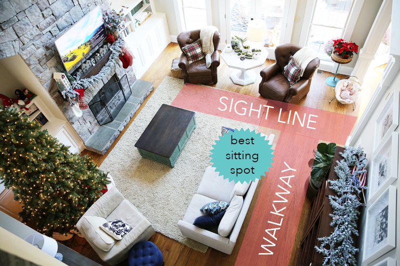
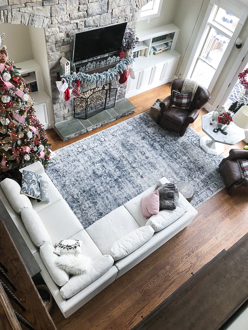
The last time you saw the room, it looked like this with the layout…
I had tried to explain how it works. The room is extra long but not very deep so the couch has limited areas it can go. That doesn’t even begin to explain the issues though.
Wall #1 has double doors to the deck and a giant focal wall of windows. It can’t really have much in front of it to make sense.
Wall #2 has a giant two story fireplace and built ins that my kids LOVE to ransack and make a huge mess with.
Wall #3 isn’t really a wall…it’s an opening with two nooks in it and a door out onto the side porch and french doors to the office.
Wall #4 has a big opening to the kitchen. The other half is literally the only wall space and it isn’t centered on the room.
The couch can’t be on wall #4 so it has to float in the room. We also want the couch to be centered in the room to create balance but the couch has to be very deep and low backed so that you can rest your head for good tv watching.
We felt like when we bought our sectional that it made sense. It created another wall for us and gave us the desperately needed seating.
But like you can see below the chairs were still in front of the doors. I liked having the right flow but then the shelving unit that we put behind the couch felt too deep and it was adding shelves when the room already had two “walls” with shelving. It felt redundant.
So I did what any warm-blooded home blogger would do….I made my boyfriend move the furniture about thirty times till I decided I was okay with the arrangement 🙂
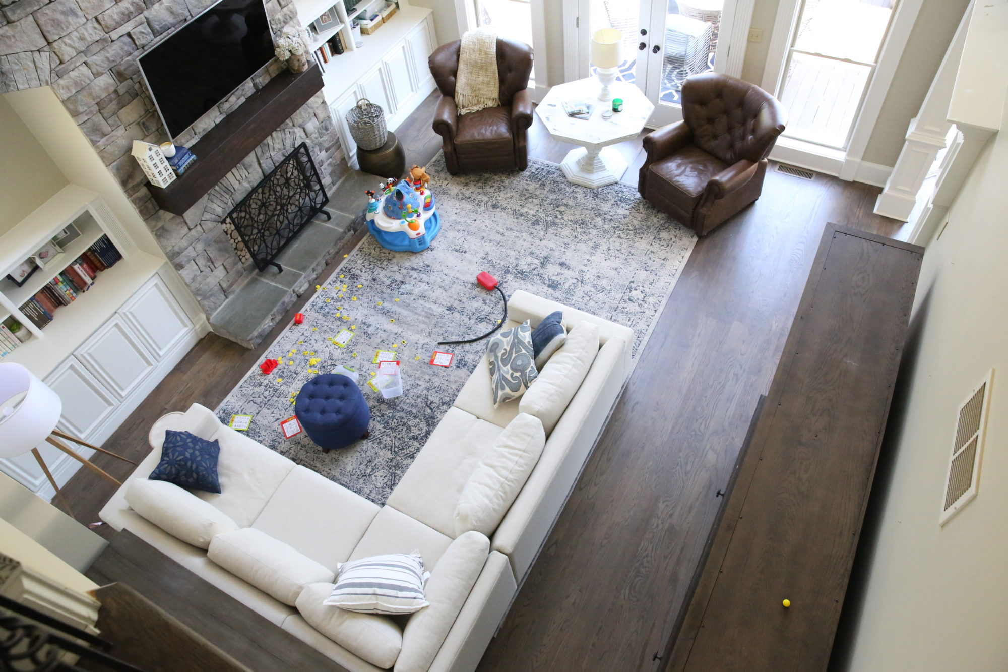
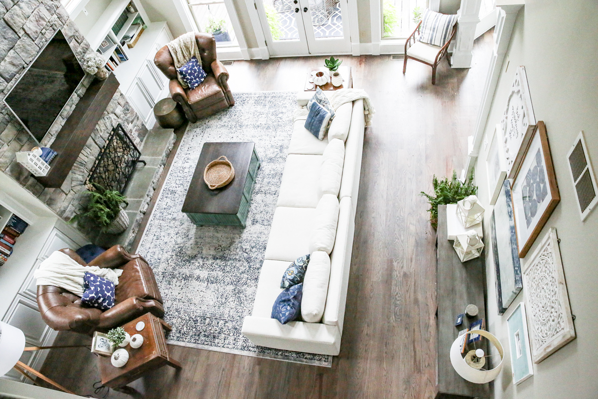
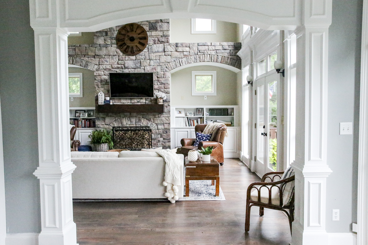
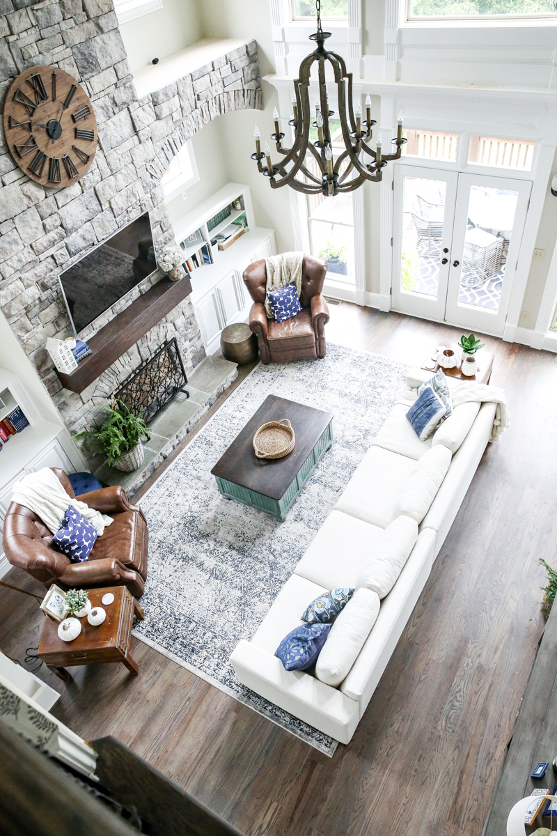
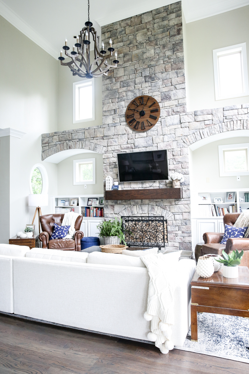
This is our current flow and it makes sooo much more sense….
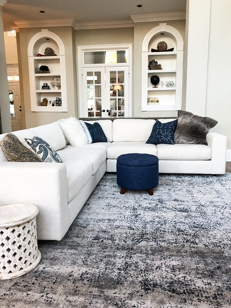
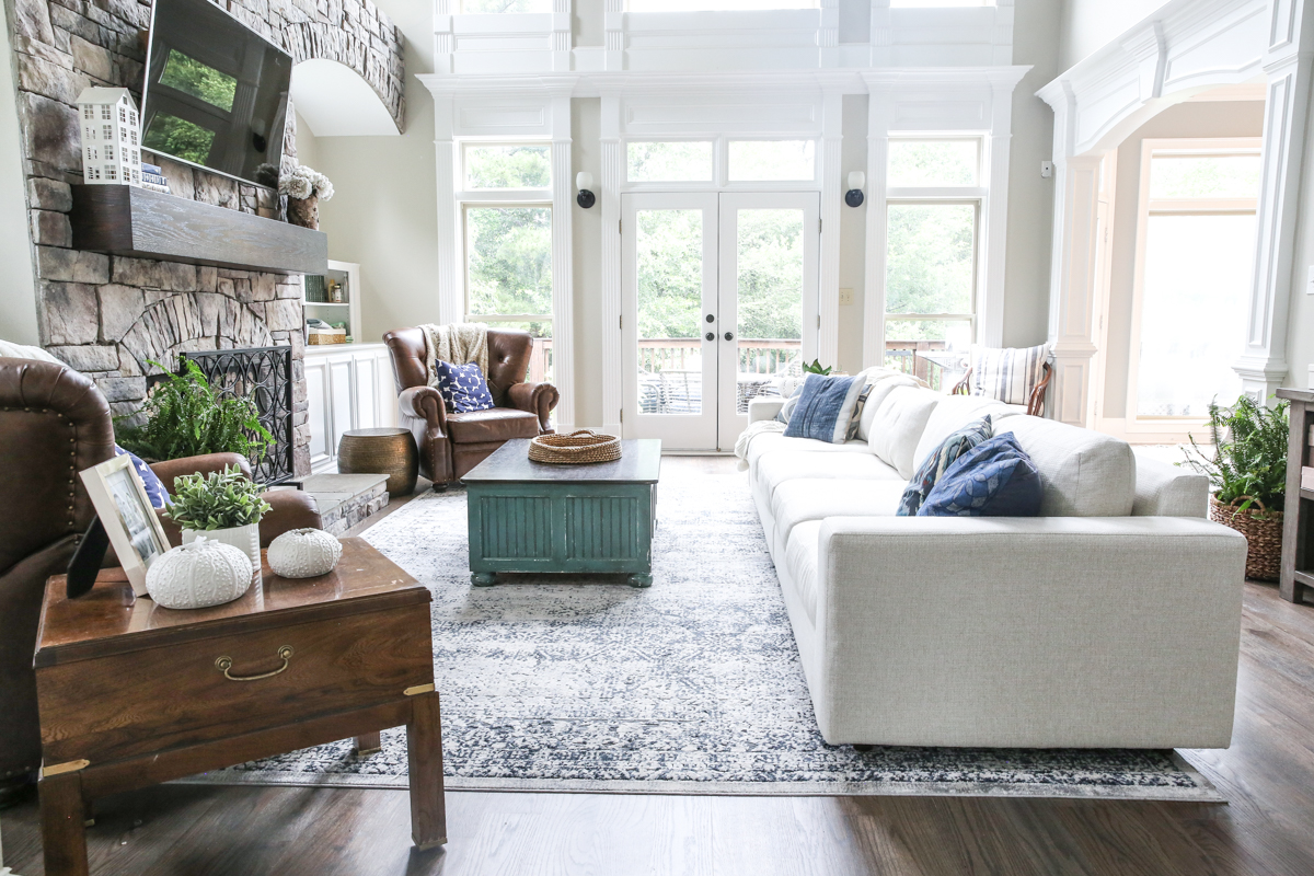
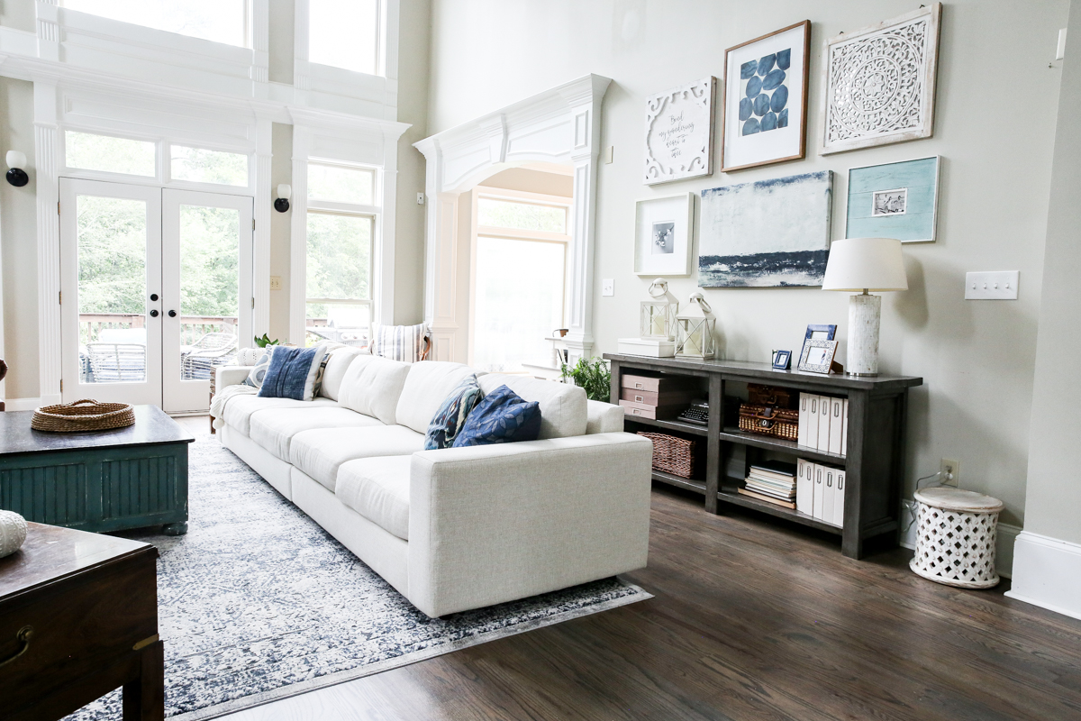
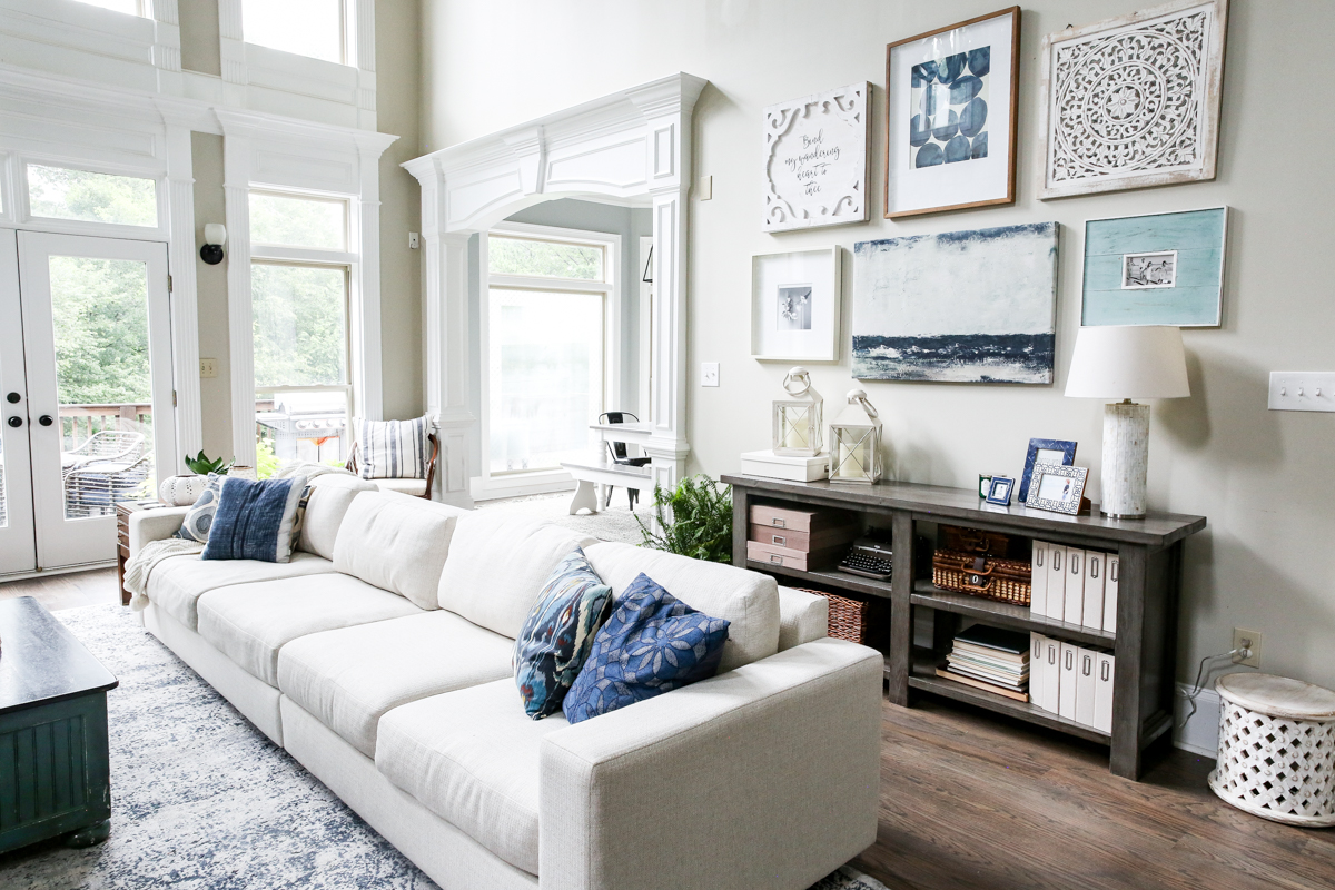
So the biggest thing is obviously the biggest thing. We took out the corner section of our sectional and put both ends together to make one giant SUPER SOFA. It’s so freaking long and I love it. (Please forgive me as I stifle my laughter.)
The issue before was that we couldn’t find a sofa long enough or deep enough for all of us Bowers to snuggle and dive into a good episode of Paw Patrol. Now Jeremy and I and all five kids fit!
That of course means that we have an extra corner section that is sitting in the basement storage but HEY THAT’S OK. Sometimes you buy things and don’t need them! #thosegoldtemporaryfeathertattoos
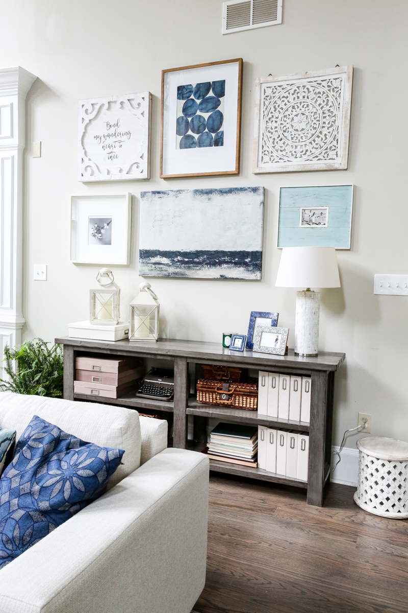
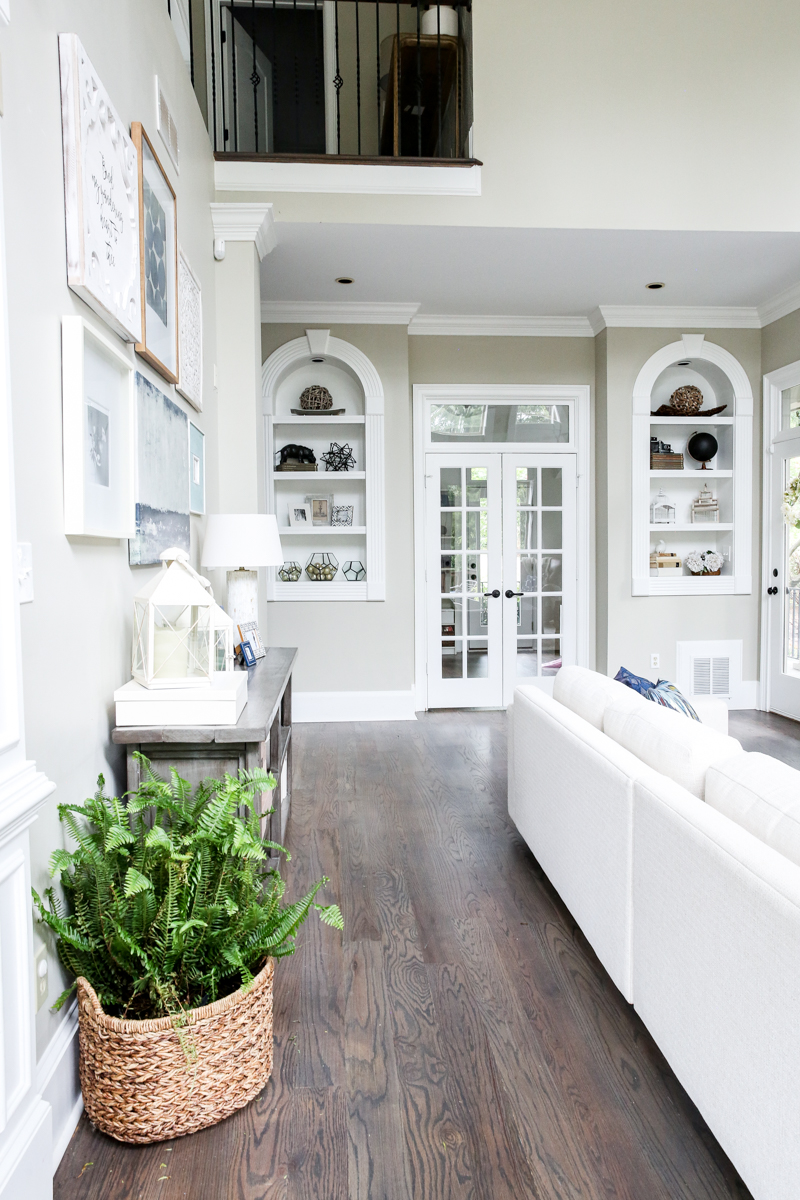
Once the sofa was in place, it felt like the domino effect. Immediately we needed a little extra room behind the sofa so our big shelving unit was moved into the dining room and we rotated our diy-ed console table to that wall.
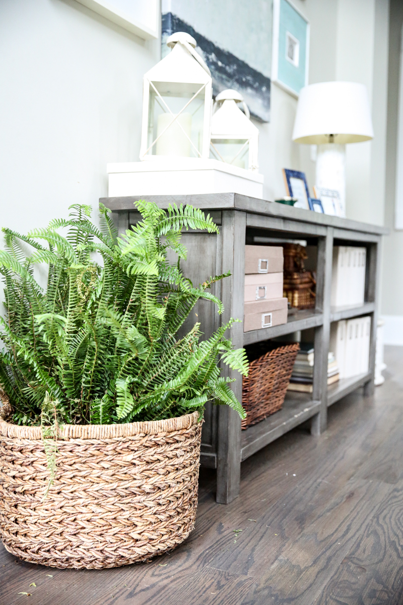
The console table was a little less deep so it gave us some much needed inches behind the couch while still preserving room for a walkway.
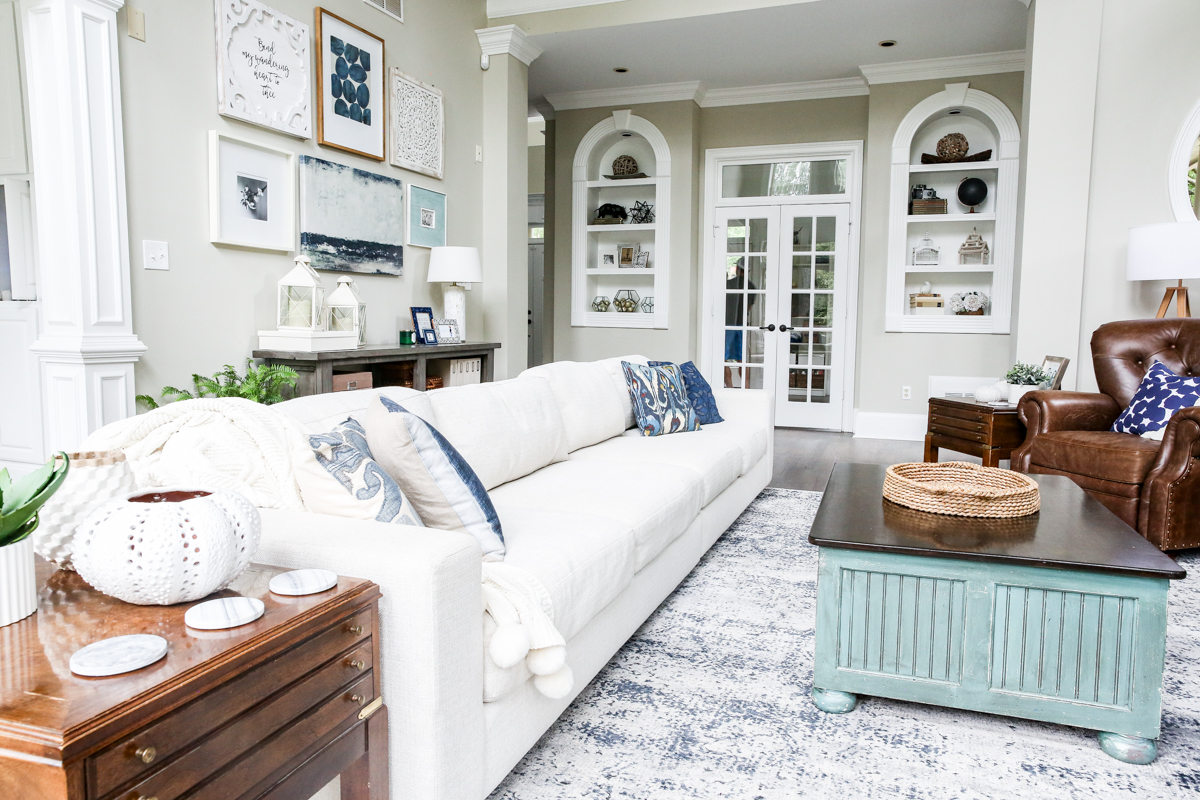
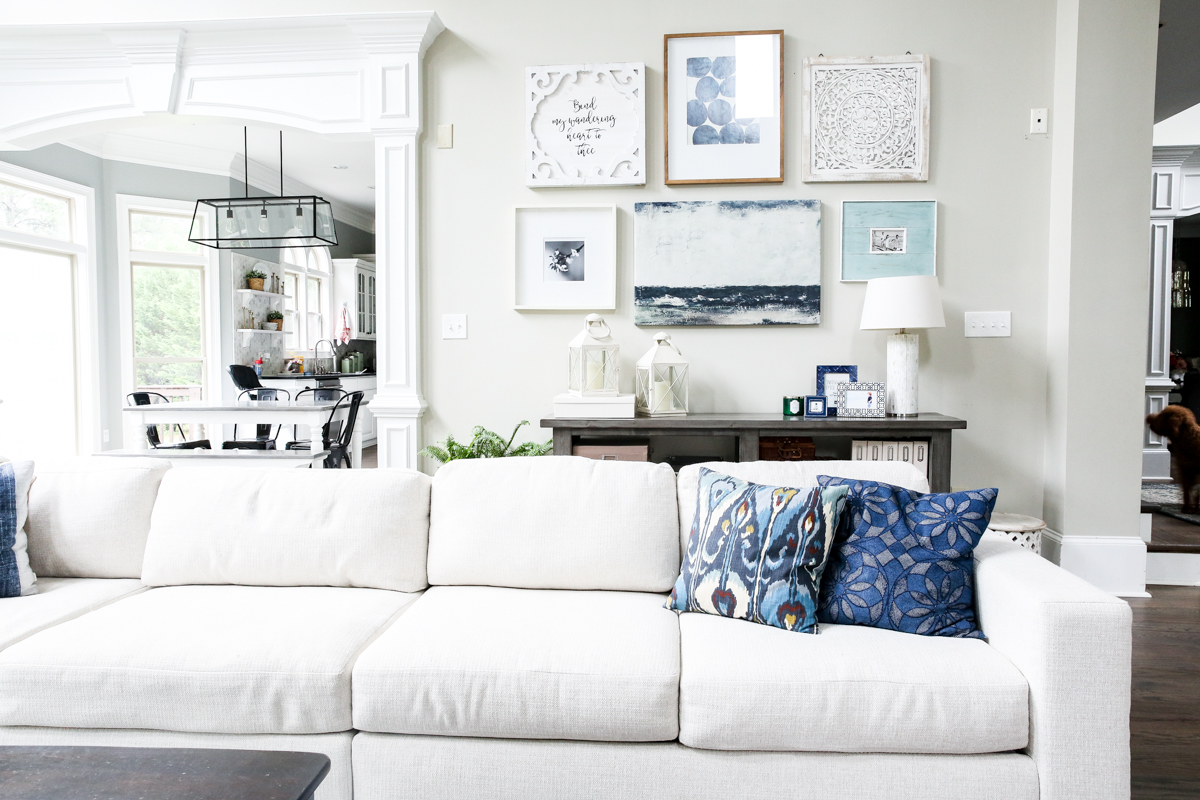
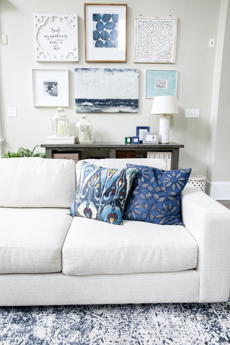
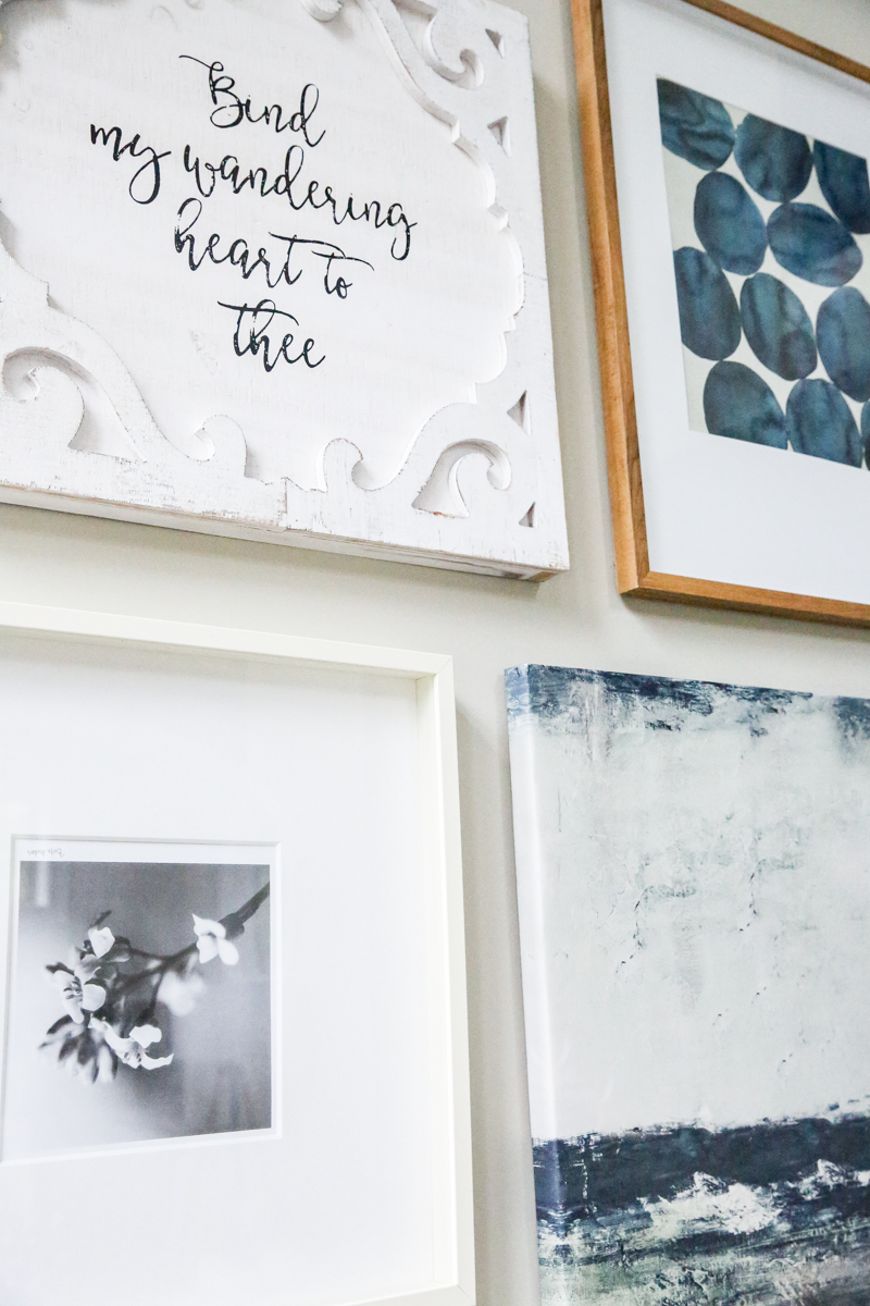
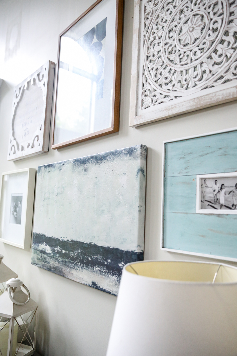
The console table screams “I NEED A GALLERY WALL!” so that happened next. And yes, I can hear console tables scream. It’s like hearing dead people but a lot less creepy.
The gallery wall was stuff I already had in storage but I’ll list all the sources at the end of this post.
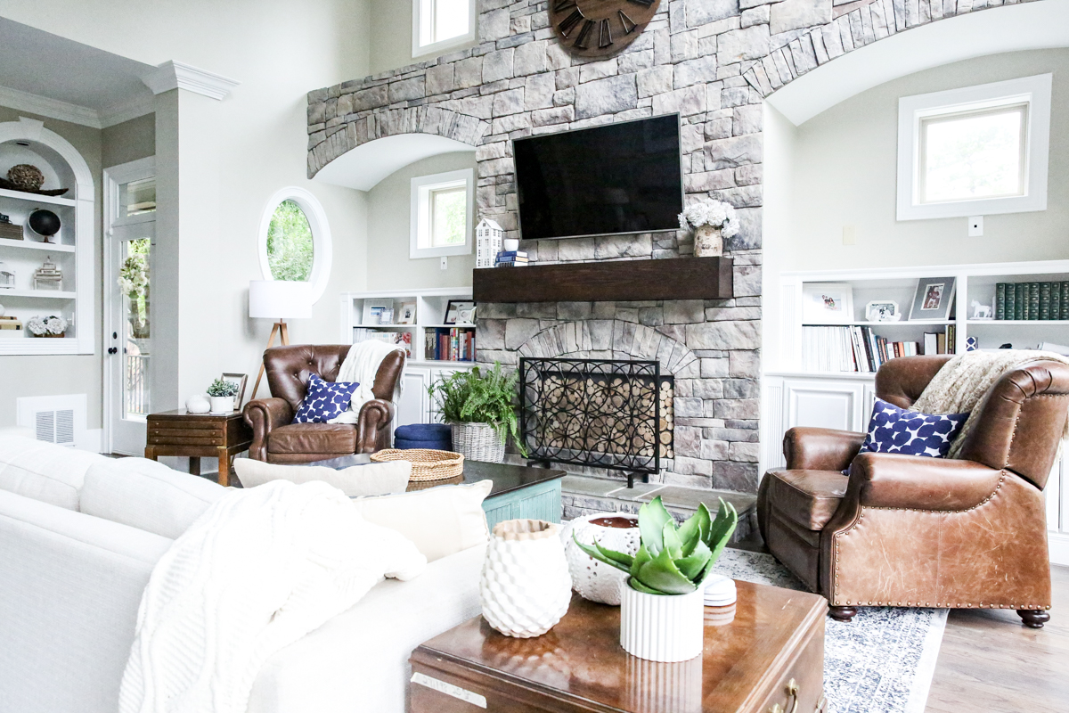
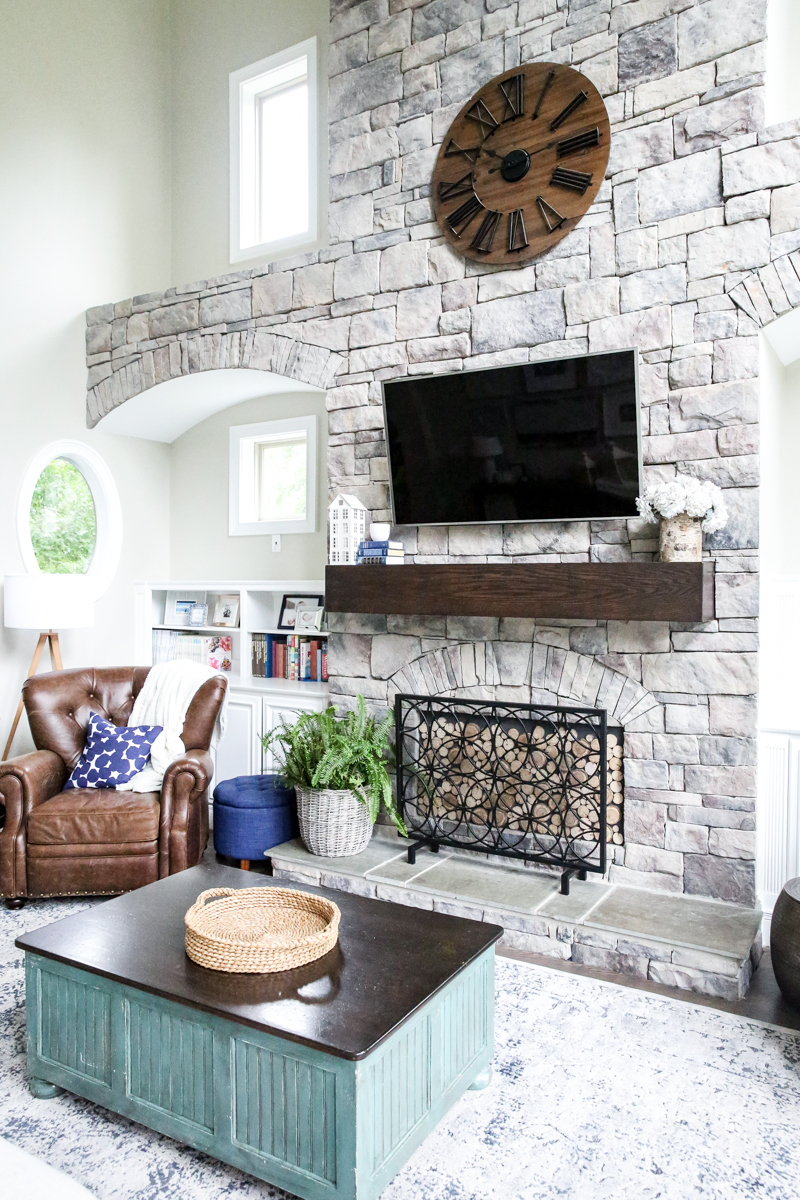
With the couch clearly centered on the fireplace, we were able to put both recliners on either side of the fireplace.
The recliners were angled in toward the couch to allow for room for the actual reclining motion. And the fact that we put them there helped limit the boys accessibility to the cabinets (in which they were very interested in DESTROYING).
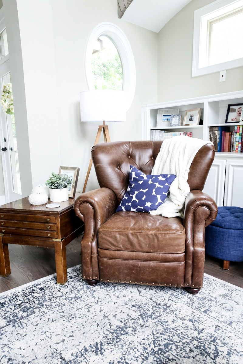
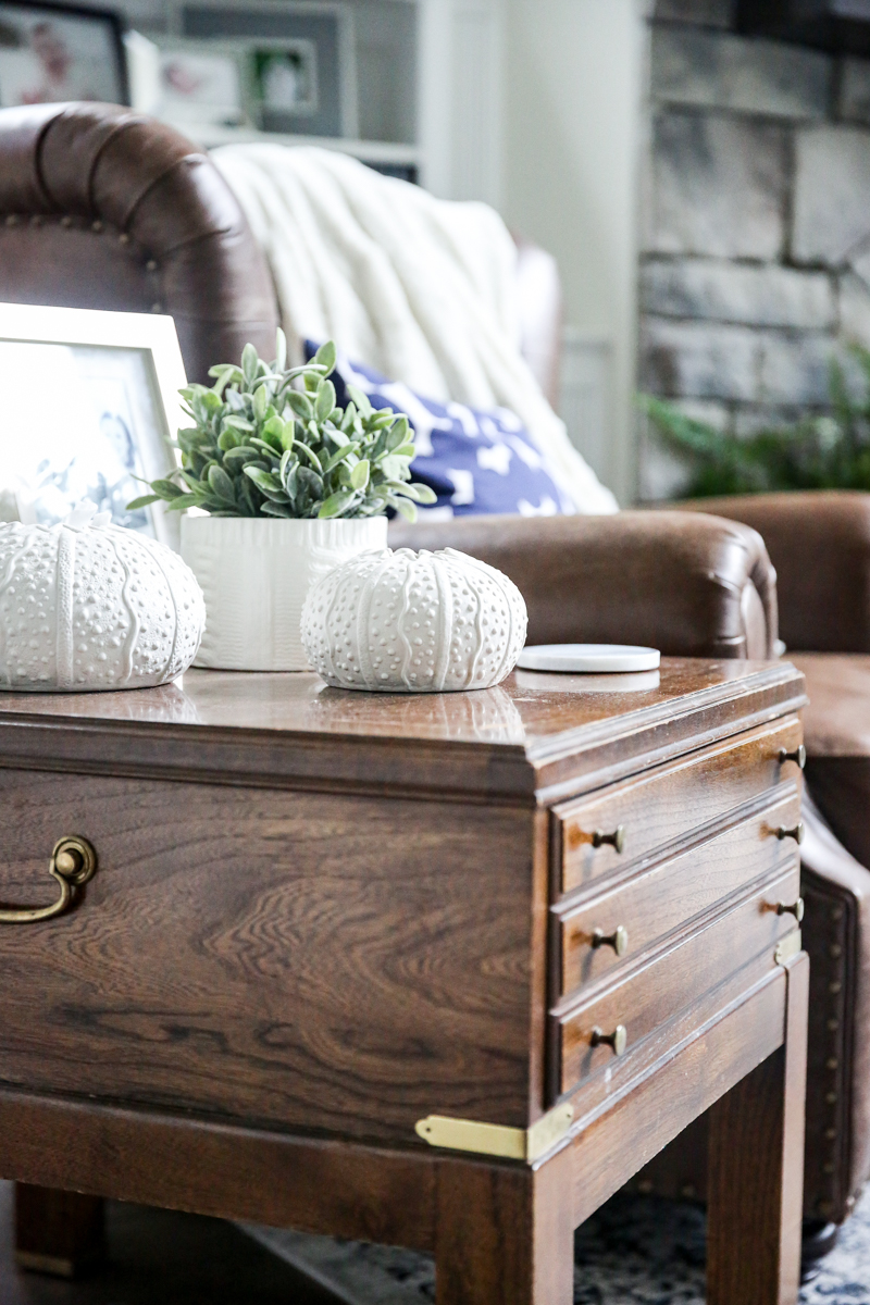
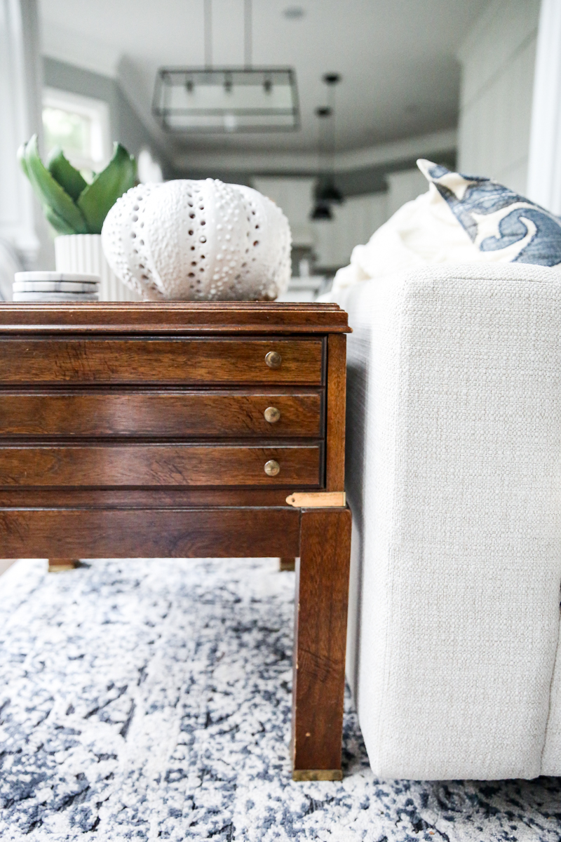
That’s when I remembered some super nice campaign style side tables I found and had in my hoard. They seemed like the perfect fit because they added a spot for drinks and made the room a smidge wider.
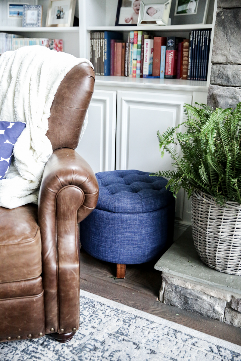
On the other side of the chair we put two round options – an ottoman and a little side table thing. They were perfect as a blockade to the cabinets (I don’t feel like fighting that battle everyday to keep the kids out) and honestly they are great for putting down your magazine or extra storage!
And yes, I have two plants in here that are real and they help keep this room feeling so fresh.
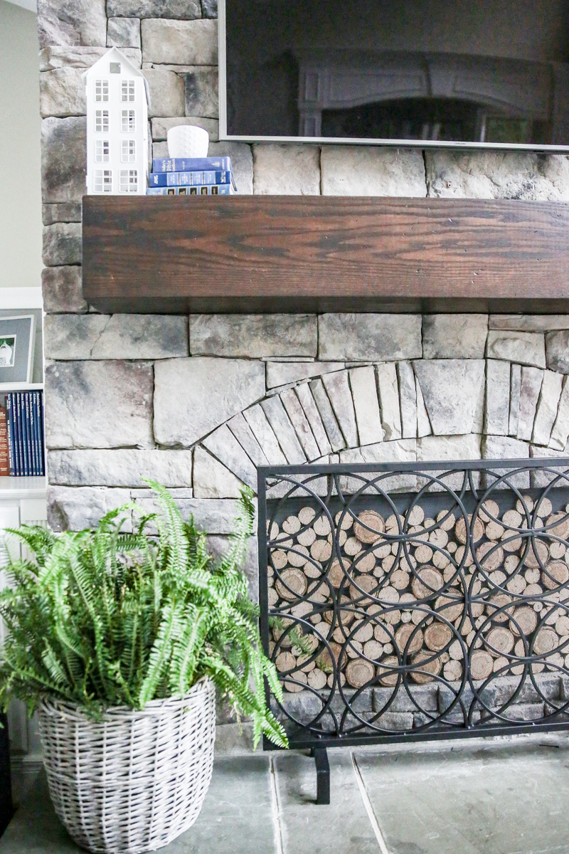
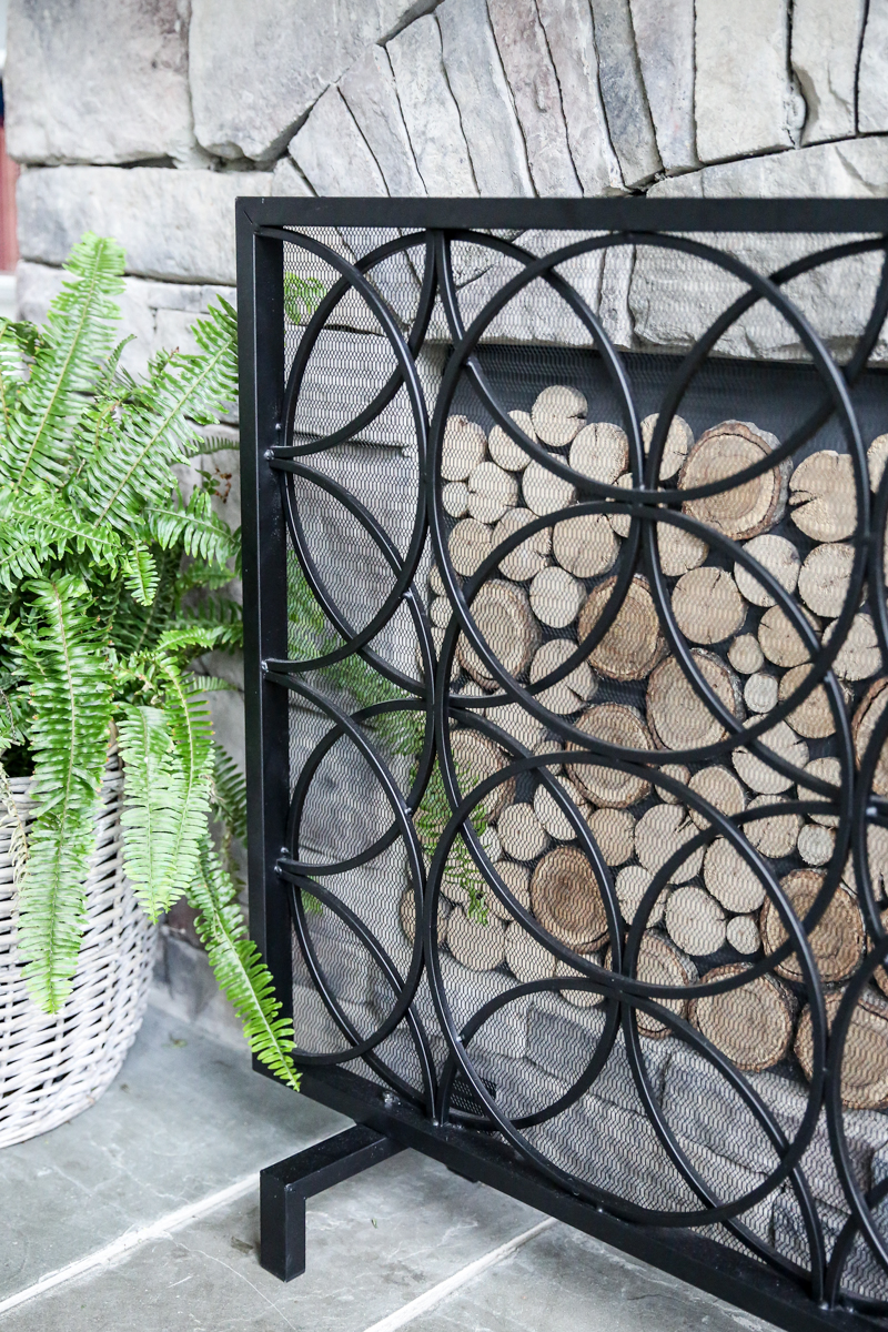
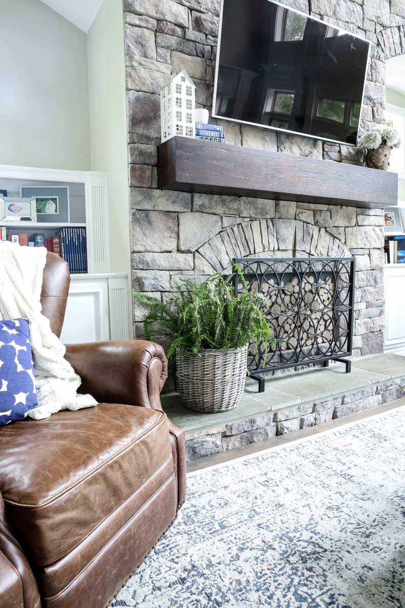
We still love our fireplace screen (the one that I waited MONTHS for it to come back in stock!) and our DIY stacked log fireplace cover.
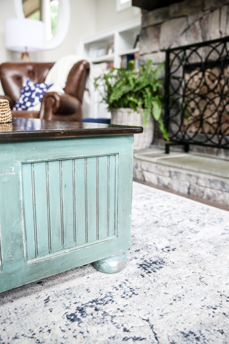
Jeremy said that he wanted to build me a big ole fat coffee table…I’m gonna bet that I will beat him to the punch 🙂 For now, our old coffee table is working just fine!
I am thinking that I will refinish the side tables to be a little less orange (they are toned down in these pics!).
Overall they are in decent shape but I need suggestions on colors 🙂
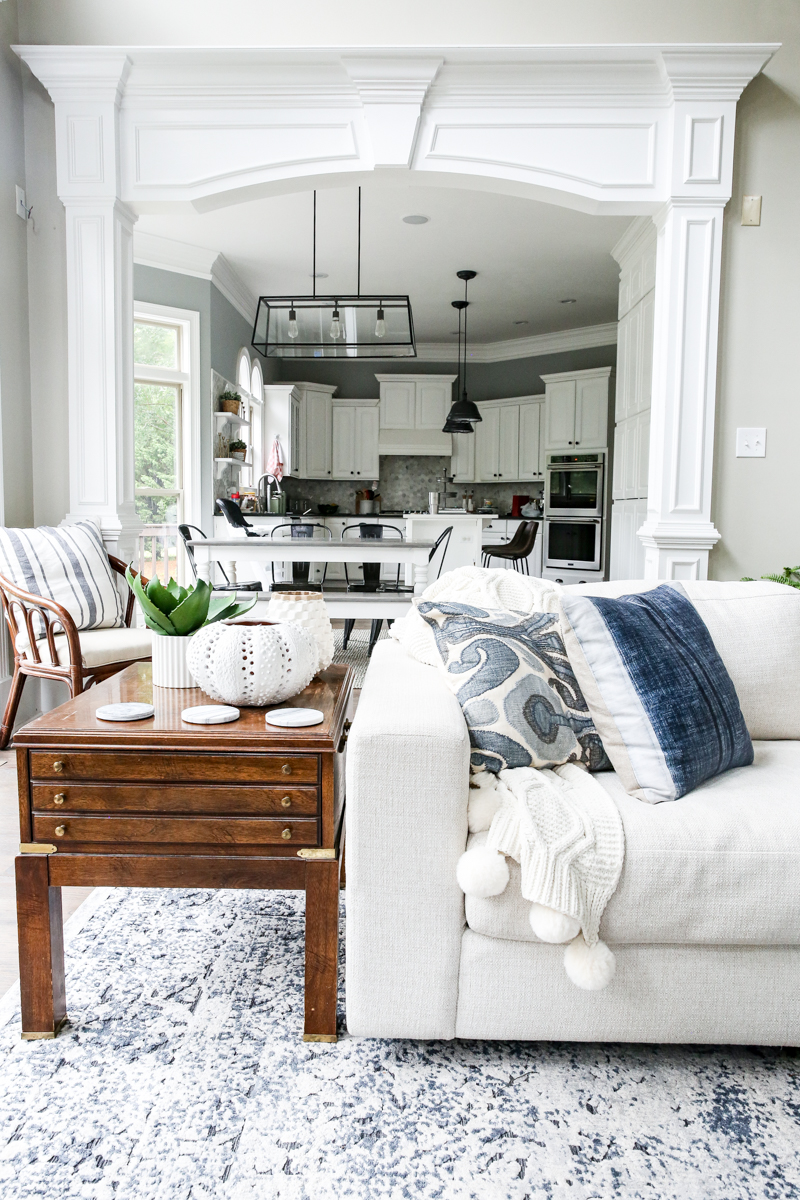
So the overall flow is about the same – the kitchen flow changed when we turned the table the other direction so seeing the back of the sofa feels like we are mimicking that table. The great part is that those double doors are no longer blocked and make way more sense now.
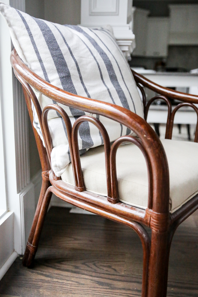
Also you will notice that we popped a chair in the corner. I use it as my coffee drinking chair. It is very old and I redid it AGES ago. I still dig the bentwood frame (even if the staples are pulling out a bit and it obviously needs a bit of dusting!).
Overall though it feels like it makes so much more sense.
There are definitely some minor tweaks I want to make. Like I need to paint that vent (and get a ten foot ladder out to clean it!) and paint the little plastic covers for some old surround system wiring. Jeremy wants to build a bigger console but that isn’t a desperate situation.
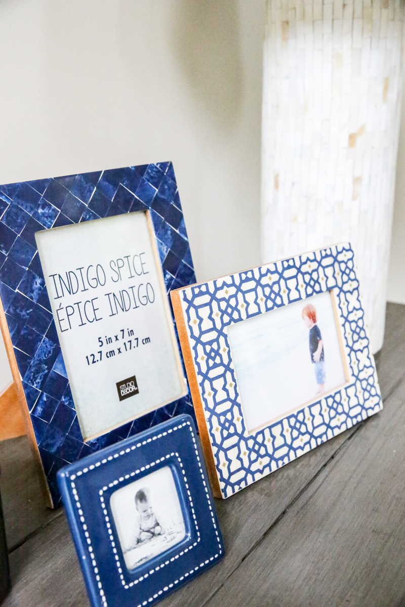
I also need to print out some photos. This is my disease….not putting photos in frames. Does anyone know a cure!?
Look another fern! The floors constantly have these little fern leaves on it because Ella’s favorite thing is to pull off the leaves and throw them like confetti. I hope this means that she will like parties 🙂
Also I want to change the mantel a bit. I like the chunkiness of it but I was thinking of adding some distressing or some details to it somehow. The color is kinda the odd man out so I might change that slightly.
And obviously I need to change the pictures in some frames…
Fake families are in half my frames y’all. Don’t judge.
Oh and see the way the walkway is still preserved?! I read that you need at least 28″-32″ as a minimum for a walkway….so this fits the bill.
And here is the view back into the kitchen. Still makes sense.
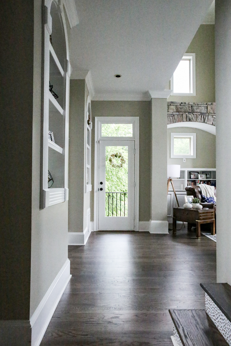
The one area that feels different is this view….from the foyer into the living room. It feels SUPER open. I don’t mind it because it gives the kids room for board games and all that. But one day I am sure they won’t play on the floor as much so who knows.
Now I wanted to share with you some of the things that I bought recently for this space that I am just LOVING.
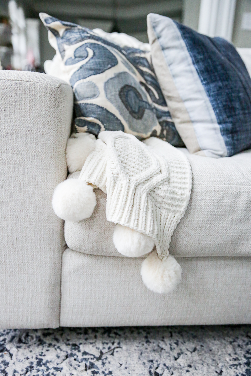
First – this blanket. There are a ton of pom-pom blankets out there but this one is just super soft and so much better than I had hoped. It also is half price of the one at Pottery Barn!
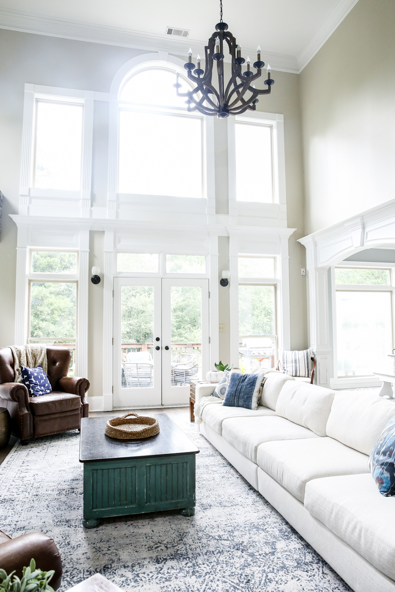
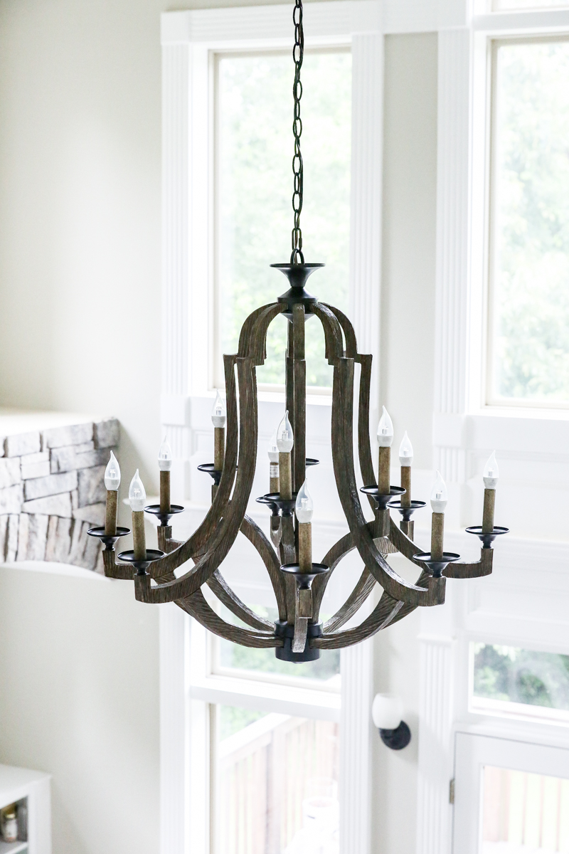
Secondly this light fixture. I have to share all the details on how we got it up there and how we decided the height and all that….but for now – just know that I am obsessed. My mom and sister were like WHOA we didn’t even realize it because it looks like it always should have been here!
Basically it looks good from every angle.
And even though we have LESS bulbs than the previous chandelier, we actually have more light. SO I will be sure to share all those details soon!
And lastly – the fireplace screen is such a steal that if you don’t have one yet, you should definitely consider this option. It also comes in gold and is such a classic design that it will look great forever.
If you are looking for ANYTHING else I hope that I have it listed here…..
- Rug
- Sectional (ours is performance basketweave in Natural)
- Leather recliners
- “Bind my wandering heart to thee” piece
- blue stones art in a frame
- carved wood art
- fireplace screen
- side tables – thrifted
- coffee table – thrifted
- pompom blanket
- chandelier
- tripod lamp
- clock
- corner chair – thrifted
- navy & white dotted pillows
- ikat pillow
- white wood drum stool
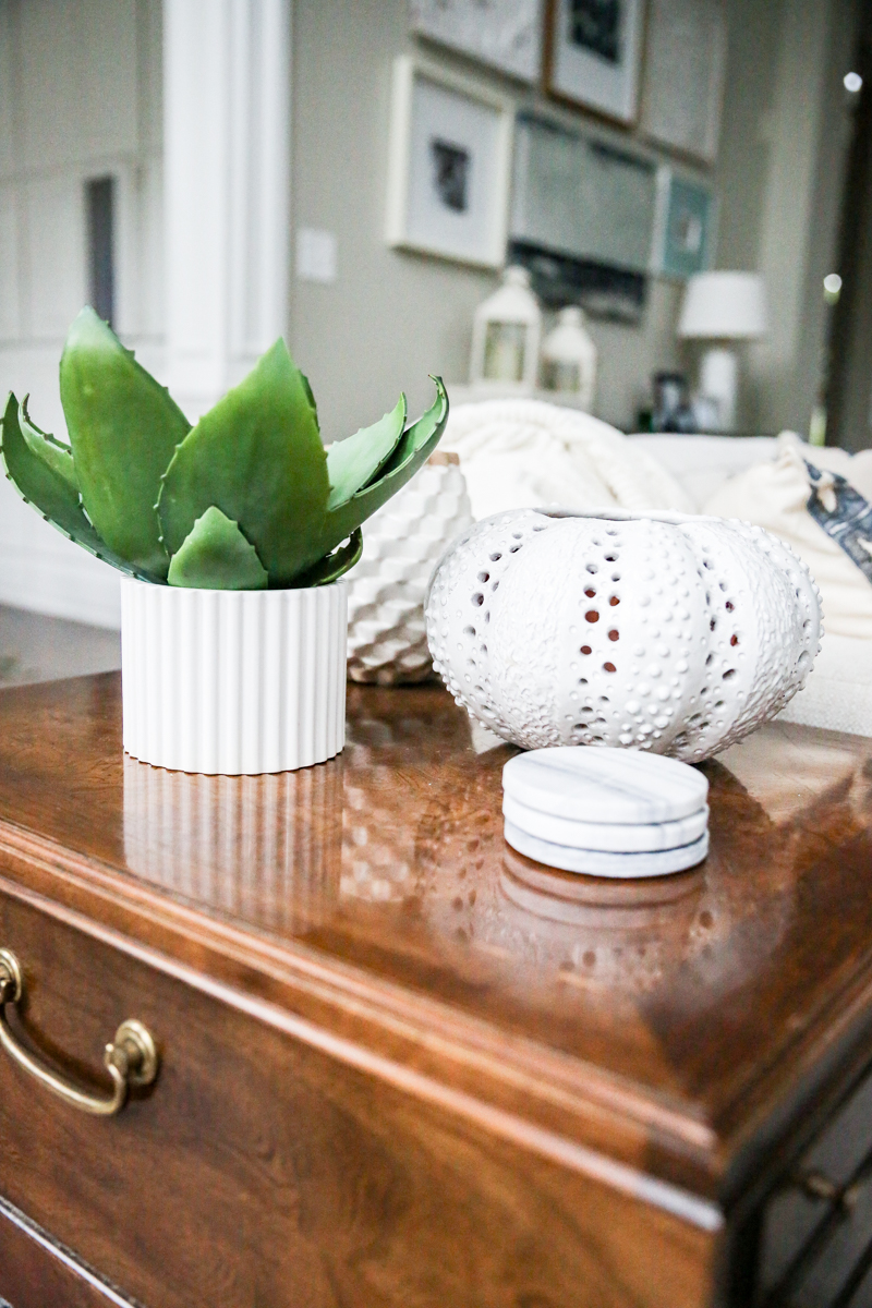
- white textured vase
- brass drum stool
wallcolor – Benjamin Moore Stingray in eggshell
And I’d love to hear what you think of the living room! Is this better?! Are you dying to see the big shelving piece in the dining room!? Are you weirded out by the extra long sofa?! Or is it totally your jam!? It’s mine 🙂 And also what room are you struggling with? Have you rearranged furniture a million times?! I’d love to hear your rearrangement stories. My mom used to do it all the time and it drove me nuts but now I realize why!
You have TOTALLY nailed it! What a GREAT space for your whole family to gather. The sofa configuration is perfect, with views from every angle that look great. The flow is clean, and the space from the foyer gives it all a bit of room to breathe. GREAT JOB! So happy you have found a solution to a challenging space indeed!
At first I was like “it looks great, why would you change it?” But the after is fantastic, it really does make way more sense.
This makes so much more sense and it looks a lot more cohesive!! Good job for not giving up!! Lol
Looks. So. Much. Better!!!
I love the extra long sofa! We’re about to do something similar because it just makes the most sense in our space. You guys did a great job! It looks really lovely and open, easy to live in.
Have you thought about “filling in” those shelf niches on either side of the French door? I’d have them removed, dry-walled over and put pretty sconces there! Just an idea!
OMG I love it. The room flows and feels so big. Love all the pieces and colors on the galley wall too.
Have you tried moving the blue stool beside the console table where that other white stool is? Just an idea, but I love what you have done
Yes!!!! I love how you stuck with this room and kept trying – and showing us the process – because it makes the struggle we all have with that one place in our homes that just won’t come together seem so normal! You did a beautiful job! As a mama of 5 kiddos I LOVE what you did with the sofa!!! Yes!!!
This looks SO good! Much much better. The super long sofa is perfect for a big family. Love it. And have Jeramy build you a cushy long ottoman instead of a coffee table. Less sharp corners for kids to bash their heads on! (We just swapped out our coffee table for a ottoman after a kid almost lost their front tooth!).
It looks great!! The new arrangement totally changes the shape of the room and it looks more cozy with out being cluttered.
We need the blue stool there because it is padded and the kids can’t bang up the cabinets with it. We also like the stool there because it works as a time out spot 🙂
xo – kb
Yes we have thought of all different ideas! I talked about all the options in stories on Insta recently!
xo – kb
I am loving everything about this room! Also, dying to see the big shelving piece in the dining room!
This is so good. Love that couch. The chairs are great in their new spot. The new gallery wall is light and bright and fun. You have so many beautiful photos it’s hilarious you have fake families in the frames (too many to choose from?). As for the corner seat… when winter rolls around you could temporarily “L-shape” the couch and reposition the chairs to close off the doors (like you used to have it) and make way for the Christmas tree. And yes, I can’t wait to see the shelves loaded up in the dining room.
Yes! Best of gas ever looked! Great job, Katie!
L.O.V.E. the long sofa. I adored the sectional, but the long sofa is even better. Everything looks great, and yes I want to see that giant cabinet in the dining room. I’m having a hard time imagining how it will work in there.
Also, I think the kitchen table looks so much better turned the new direction, at least from the living room. I don’t know that I cared one way or the other from the kitchen viewpoint, but from the living room I like the current configuration.
It is PERFECT!!! Love love love it!
We did the same thing with our couch- two end pieces of a sectional without the corner piece. We also suffer from the long but not deep living room (although considerably smaller altogether!) It looks great! Also, I think those side tables would look great with a nice cool gray stain- maybe like a driftwood color. They would be a nice balance to the fireplace!
I. am. ridiculously. HAPPY you got rid of the shelving unit!!!!! It looks SO much better! Layout is fab. Virtual high 5. 🙂
YYAASSS! I LOVE what you’ve done! The extra long sofa, WOW! I really appreciate that you have shown us your process and progression in this difficult room. The struggle is real! I totally dig that you have also found an easy and non-permanent solution to the daily struggle of small children and their love for unloading/dumping/undoing ALL the things! This phase in life passes… but sanity during is SO important! Now about those side tables and a change in color…first, they are very neat! I really like them but understand the ‘orange’ thing all too well. I think color change would depend on your future plans with the coffee table?
Our living room is very similar to yours and we have been struggling with the layout too! Love how you have it set up now.
Love the new space, and to echo PP love that you show us the struggles of just how to make a room attractive and function for your family.
Also, you asked for suggestions for the “new” campaign tables and I suggest navy or a deep blue to complement the rest of the room.
I seriously never comment but I had to open up the page from my feed reader to tell you how fantastic this is. Such good decisions all around. Consider your choices validated by a stranger on the internet lol — come do my house now?
I love to see how you are slowly tweaking the room and adapting it to the changing needs of your family and your taste as it evolves. Thank you also for showing the fern leaves on the floor and dust on the chair. What a lovely way to remind people that everybody has that stuff and it is totally normal.
I’m a long time reader and hardly ever comment, but just had to tell you that I absolutely love it!! Totally nailed it with all the challenges in this room. We have a 9 foot leather couch and I couldn’t be happier with it =)
Hi!
I LOVE how welcoming your house feels, so cozy.
We have a similar issue in our house, without the large space you have. We had to put our TV on a long rotating arm so it can be pulled out and you can watch easy from anywhere.
We are in the midst of a remodel and it’s so fun(well, mostly).
Lovely home you both have created
love It!!! The flow and everything looks so good!!! This layout was my first thought when you were looking for suggestions!
Katie this looks awesome! I never rearrange my living room because there’s literally only one way we can set it up. (My grandma had the house before me, she tried and couldn’t find anything either. And neither could my mom, whose house is the same layout due to being from the same company.) So we’re stuck with what we’ve got. This visually looks so much nicer and so much more functional. We’ve got no coffee table at the moment because our little loves to play on the living room floor (not much other floor space in our house). I laughed when I read that the chair in the corner is your coffee time chair because my first thought was “time-out chair.” hahahaha!
Hello Katie! LOVE your new arrangement!
Because it caught my eye and I cannot figure it out….what is that small black object sitting on top of your built in next to the fireplace? It’s probably not visible at eye level, but is obvious from the vantage point looking down into the living room. I’m so curious.
It’s AMAZING!!! Soooooo much better. It just makes sense now. (And there is no better feeling than FINALLY nailing the layout of the room!!)
I LOVE LOVE LOVE the super long sofa! And the new arrangement. It feels very fresh and open now. Like the room can finally breathe easy. The only thing that bugs me a bit (since you asked LOL) is the one end table by the chair. It feels a little clunky. Like maybe it should be round? Love it’s twin sister by the sofa, but here it feels like an odd man out. Just a thought. Love the new look. 🙂
Katie, I LOVE this room! Great job! I learn so much from you and your blog. I will be helping my son & his new wife-to-be remodel and decorate their new home and I know I will be using so many of your ideas. Thanks for your inspiration!
I think it looks so much better now!! It makes more sense and everything fits the space well (I think the couch works great), and how nice will it be to be able to use the french doors! Looks great!
Great job! This blows me away! It looked good before but now it looks perfectly suited and makes so much sense, solving all your issues. It just all makes sense now. And to be able to use your new sectional is fantastic. I’ve always thought a sectional is too limiting in its configuration but you made lemonade out a lemon. I would like to know if you have a source for the geometric flower blue and gray pillow? P.S. I adore your whole family. A few more pictures of Ella would be nice. They grow up and change so fast.
It looks great and now I can’t wait to see the dining room! I’m still obsessed with the light fixtures that you hung in there so will be anxious to see what it looks like now.
Love this new layout! It’s so refreshing when you find that perfect fit for a room, right? Also, I have the generic frame pictures in SO MANY of my frames. So glad to know I’m not the only one!!!
I love it! I love the description of the domino effect in that room. I’m also eager to see the Dining Room!
Yes, so much better Katie! Love it!
Katie, your living room is SO beautiful!! Just love the new attangement. All the textures you have included in the room. are so nice. You have done a wonderful job. Don’t move anything around now. It is perfect!!
Love it! Great arrangement now. I never let you know how much I love the rug. It pulls everything together so well. The room would not be as beautiful without that great rug. Great choice, Katie!
I think the new layout ist waaaay netter. I Just think there ist a mittlerweile too much going on. I would reduce the amount of Stufe (throws, pillows,… especially on the recliners) and nix those new sidetables altogether (I don’t think they go with anything else in there really). Also, is there another door the office? If so I would probably t take out the shelving and the french doors altogether and make just one simple straight wall. I think it would make the room so much calmer. Oh and I would probably change or remove the sconces on the large window wall… But otherwise I think you’ve come such a long was and the room looks great!
But what about the Modsy rendering you had sponsored in January? Would you no longer suggest that as a service? Because this set-up is completely different.
You solved many of the issues of this room – well done!
Yes! Great job! It looks fantastic, it’s more functional and it has better flow from so many paths. Yay!
omg! I just hung that exact chandelier in my rotunda-ish foyer! I bought it when I moved in almost 2 years ago but there were challenges in hanging it because of how the house was constructed (i.e., there was a structural beam running across where the mounting thingie is supposed to go up). And it is VERY heavy as you know. But my dad re-engineered it and my aunt and uncle were visiting with their friends last week and pitched in to hang it – it took 6 people! LOL. But it’s gorgeous! You have good taste! 🙂
I love the new arrangement but have a couple of ideas. I like the soft ottoman idea above. Also, I think those big brown chairs are just wrong for the room. I think it needs something more sleek and less heavy and a brighter color. I also would consider (don’t hate me) removing all that ornate wood around the doorways and pass throughs in favor of simple moulding. Much sleeker and less ‘fussy’. And perhaps a lighter mantle since you are rethinking it. Both in color and weight. Just a couple thoughts.
You’ve done well though.
I second the idea of an ottoman, perhaps with storage as well for quick tidy ups. The thing that does not seem to me to be quite suiting the space is the clock. Perhaps it’s a bit too rustic for the formal details in all that fancy trim?
Hi Katie, I have a hard time with my living room too! It’s taken many years and several tweaks to get it right. I really like the new layout. You’ve done a great job. I’d personally tweak a few things. The side table feels disproportionately large beside the recliner. Maybe eventually get a reound table so that it won’t be square object(chair) beside square object (table). Also, the couch feels like it’s pushed too far in on the rug. Ideally just the front two legs would be a foot or so on the rug. Might want to consider forgoing the console table and pushing the couch back some. Of course this is just my opinion (only because you asked), so take it with a grain of salt! Altogether, great job!
I think the new layout ist waaaay better. I just think there ist a little too much going on. I would reduce the amount of stuff (throws, pillows,… especially on the recliners) and nix those new sidetables altogether (I don’t think they go with anything else in there really). Also, is there another door to the office? If so I would probably take out the shelving and the french doors altogether and make just one simple straight wall. I think it would make the room so much calmer. Oh and I would probably change or remove the sconces on the large window wall… But otherwise I think you’ve come such a long way and the room looks great!
Question about your recliners – would you say they are holding up well? I’m looking at another recliner from PB but am unsure on the quality etc. Thanks 🙂
Great improvements to a challenging space! The more you share about this room the more I understand what you mean by the challenges. Just a thought, could the leather recliners work on either side of the long sofa, facing towards the tv but angled in? This would add more tv seating. Would you consider moving the console to the back of the sofa? or building a big one for the back? I could see the white getting dirty and this would protect it/break up the white? Then, on that huge wall, maybe print oversized engineer prints of each of your kids. Since there are little decorative things on the built in niches and fireplace built ins, oversized on this wall would change the scale and be easy on the eye. Just some thoughts….
Yes,I am excited to see the shelving unit in the dining room. Your long sofa is perfect for your long room. The coffee table looks good and I personally wouldn’t replace it with another table. Like the open space looking from the foyer.
This looks so complete. Love the long couch.
I’ve enjoyed the living room journey and its one of the reason why I enjoy your blog so much. It’s so relateable, because very few of us get it right the first time. Thanks for showing the ups and downs of it all.
Regarding previous comment/question about the source for the ottoman: Nevermind. I think I found it at Target and the beautiful bright blue is no longer available. Such a pretty color!!! Maybe I’ll try the heather blue.
https://www.target.com/p/tufted-round-storage-ottoman-threshold-153/-/A-15222988?preselect=15092286
love it Katie… it really is perfect just the way it is… a cushiony coffee table would be awesome as someone else said.. love the console wall and gallery photos – so happy that you got it right.. now you can get some rest at night 🙂 Great job!!
Looks great! Is there a post somewhere about the diy fireplace cover?
Absolutely love the new lay out great job! I agree with the comment about drywalling the niches they just look so busy to me and take away from the beautiful furniture that you have in the room.that couch!!
Symmetry for the win! We have a long, narrow space with essentially one loooong wall. (Two walls are walkways, and the third is our fireplace and back door.) We’ve been here for 8 years, and the space felt off until we flanked the fireplace with two chairs recently.
Can’t wait to see the dining room! I bet that shelving unit is the perfect scale in there.
I thought it looked great before but I LOVE the after. I love to rearrange furniture – my kids think I’m crazy too but it is the only time I do clean things like the AC vents!!
It looks sofa king amazing! (Sorry had to do it) . Love the new arrangement!
Looks amazing! I have the same chandelier in my dining room and I LOVE it!
Love the new layout!! Sometimes you have to just move the furniture around a million times till you find the right spot (as I always tell my husband) I know the last thing you need is another suggestion but have you tried not putting anything behind the sofa. So removing the console table and just doing a gallery wall or picture ledges.
Love it and yes now I want to see the DR.
I know you already have lots of blue in there but I’d love to see those side tables a shade of dark blue! I remember in your old house having the pops of green – I still love that concept 🙂 I painted our tiny half bath sink cabinets a navy blue and I’m in lurve still 🙂 Living room looks great! Our living room is oddly shaped and we work with limited wall space as well, super bummer!
Hi Katie! If you haven’t come across it already, you should checkout kelleynan.com _ looks like she has the same living room so you can see how someone else has styled the same space x. Yours is looking good though.
It looks amazing! This made such a different feeling to the whole room! I feels so put togetherI and the flow i great. I love it! ^^
I think you’ve done a great job with every iteration of this room but this one… WOW! You’ve nailed the balance and proportions of that room (not an easy job, obviously!) It looks awesome! Great Job!
I love it! It works for your family NOW & that’s what matters. It will be tweaked over the years as things change. When we moved into our new home about a year & a half ago, i was feeling stressed about decorating with 2 small kids (we have 3 now ) & all the things I wanted to do…My new neighbor laughed & told me that you’re never really done decorating because taste & need always change so just enjoy each stage. Best Advice EVER. I needed that perspectiveadjustment.
I like the color of the campaign tables. It gives a little dimension to the room that could seem washed out otherwise. Grays are hard like that. It ties in with the recliners so they don’t seem like an accident. Perhaps it t needs darkening but I would keep them brown
It’s awesome! Makes so much sense now 🙂 I know you think you need to do something with your mantel, but I think it’s fine. You might consider instead doing something different with the coffee table…………….different color, or different table all together! Totally love what you’ve done!
Where is the console table from?
This new arrangement looks SO good!! I liked the old one, but this is just perfection.
Have you considered a different vent grate for that one way up there? Something like this so you can customize the design and make it look like part of your pretty wall. https://www.pinterest.com/pin/323344448232949095/
I love all of your updates! I have a long, narrow living room with french doors too and it really is a challenge to arrange properly. It’s neat that you’ve played with it till you found a functional and beautiful option for your family. Thanks for the great ideas!
Love all the blue! I say just place a fern basket to hide cords and put round thingie on other side of console.
The room looks amazing! And oh so cozy. Great job!
My dining room needs help. I need decor help in the bedroom and living room. Come see me in Richmond, Va 🙂 Love the new layout. I love your wonderful giant house!!!!!!
We built it. Here is the post.
xo – kb
Yes – I love Kelley! Her space is eerily similar!
xo – kb
Yes! Here is the link!
xo – kb
I personally don’t love the giant engineer prints of the kids in such a formal space…it would feel overpowering to have FIVE life sized prints. And we have considered the recliners in but the room doesn’t flow then. We don’t have enough space for anything behind the sofa and thankfully the sofa is a performance type fabric so it definitely holds up!
xo – kb
I definitely would still use Modsy. In fact, I was the one that pushed for the sectional and chairs near the deck doors. It still saved me because of knowing what size rug to get and seeing the fireplace screen and knowing that I need something tall behind the sofa. It was a learning lesson to be sure because I realized that if I had been more flexible with the layout, maybe I could have come to this conclusion earlier.
xo – kb
It is old – from Crate & Barrel 🙂
xo – kb
It’s a sock. My kids constantly throw things on top of the ledges :/
xo – kb
These are holding up but I would say that this finish does show scratches much easier than the burnished walnut. We have the burnished ones upstairs in our sitting room and they show very very very little wear and if the ‘broken in’ look bothers you, then I would definitely recommend that.
xo – kb
hahaha! Thank you!
xo – kb
I love it! Looks so good!
I think my biggest problem isn’t so much arranging the furniture but the art more so. I love that gallery wall.
Wow!! What a huge difference!! Love the new layout! It looks so much bigger and not so long and narrow! I love reading your blog!! Keep up the good work.
I just read someone’s comments about filling in the niches on either side of your french doors and I just thought of a new option! (I did watch your stories about those, so I know you’ve pretty much considered it all!) You could remove all of the shelving in them so it’s just an open cubby and put a plant in there that fills the space! Amazon has a Fiddle Leaf for $30 that’s just about that size in their new online plant shop. My mom has a plant in a niche like that and it makes such good use of the space and adds such a lovely splash of organic color.
Love the updates!! So inspiring to never give up!
This was so interesting! I’ve remembered reading past challenges of the space so this seems like such a great use of it! It is also a good reminder for us all- I have a much smaller space so it is easy for me to think of a large room automatically working and having options, but that’s not always the case!
Katie, I love the changes! The room feels so much better! Even though it’s such a big space, removing stuff rather than adding more was absolutely the way to go. The super large sofa is fantastic, makes sense both for your lovely family and scale of the room.
Since you asked, I would suggest simplifying and streamlining the overall aesthetic even more. It seems to me from the pictures (and it might feel very differently in person) that every wall of the room wants to be the focal point right now, and with clashing design elements – like those large windows without mullions (fairly modern), that super fancy trim (hardcore traditional) and the stone wall (rustic), while your style is more farm house/ industrial/coastal. Classic, yes, but not stuffy traditional. Somebody else has already suggested replacing the trim with something simpler, and I agree, especially around the opening to the kitchen, it’s just so.much.trim.
The niches around the door to your office are also quite busy. I think I remember you added the shelves. Maybe remove them and fill the opening with one big (faux) topiary/olive tree/bonsai. I like your idea (from IG)of making them square on top to match the height of the door in the middle, or even removing them altogether.
My eyes are a little confused why your French doors have mullions, but the transom window above them doesn’t. None of your exterior windows and glass doors have them, either, so (again just a suggestion) removing the mullions and having one simple glass pane in each door would be both less busy and more cohesive with the other doors.
The built-ins flanking the fireplace would look much better imho if they were going up all the way to the stone arch, either around the little square windows, or even over them (as in, hiding them). The room certainly wouldn’t be dark without those squares and they just don’t make much sense to me. I don’t know about sight lines though. Like do you actually look out of those windows to see the side of your property?
The wood chandelier is amazing! I feel like the clock is trying to steal its thunder a little though.
Painting the scones on the wall of windows white would help them blend into the wall and let the windows be the star.
Even without any of my suggestions the living room has come a loooong way from orange floors, toothpaste walls and dirty looking trim, and, again, your new furniture arrangement is awesome!
xx