I was thrilled to receive a sweet little note from Lyndsey. You might know her…she has a blog called All Things Fluffy, Fashionable & Famous. Yeah. She rocks. She is also rocking a new house. And a baby belly. I am pretty sure she had to turn down being the surrogate for Sarah Jessica Parker. She’s that fab. I mean, SJP is pretty picky about her shoes. You can imagine that she ain’t puttin her eggs in the wrong basket.
Anyhoo, here is Lyndsey’s letter:
“Katie – Hey girl. I have to say I am quite the admirer of your blog (and your twin Sherry) and a fellow Georgian 🙂 I love both of your styles and I just bought a house so I have lots of things to do and I am impatient and want them done NOW NOW NOW 🙂 I have a couple of questions for you about several things and I was wondering if you would be willing to lend your advice. I don’t really need a mood board, just several questions about what color to paint a room and my house desperately needs a new color (it’s mostly brick but has some wood on it-it’s old built in the 60s).
So basically I am inquiring about your interior design expertise 🙂 and I love DIY! :)…
Let me know what we can work out girl. I am desperate for some advice 🙂 Thanks – Lyndsey”
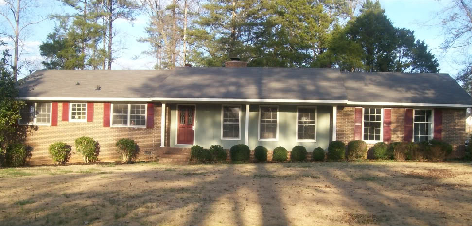
Lyndsey already painted her shutters a nice black and was hung up on the color of the door and the spa green colored siding. I guess the combo of a deep red door, a gray roof, red bricks, black shutters, and green siding had her brain spinning on the color wheel. Here is the photo before she tackled the shutter reno:

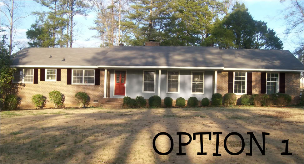
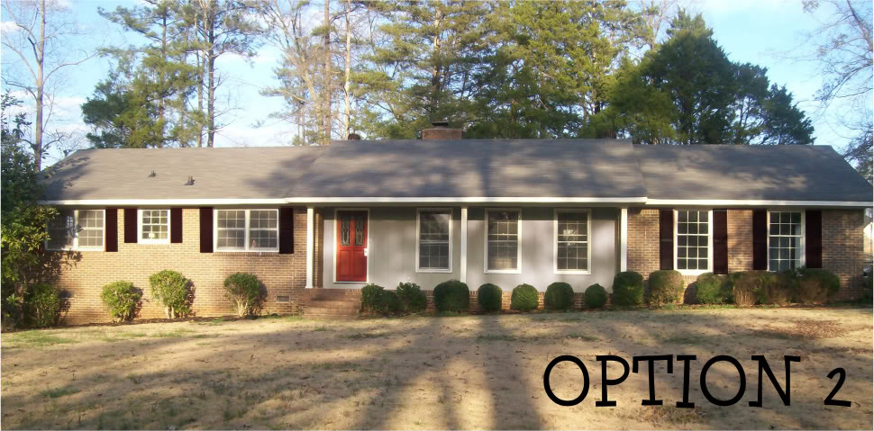
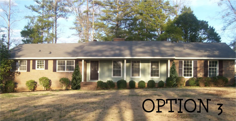
She really liked the idear of a red front door so I tried to come up with a couple options that incorporated a red door…but my favorite was the last one (no red paint on the door – ikes!).


I recommended that she go ahead and paint the door since she was up to her elbows in black paint anyway. I love how the door in black really gives the facade of the house some depth. And the green siding actually becomes more of a relaxing oasis for your eyes. Plus I told her that maybe she could plant a couple trees on either side of the porch to allow your eye relief from going back and forth, back and forth, back and forth with the line of the smaller bushes. Note my photoshop skills with droppin in a couple trees…one bazillion points me.
And although option 1, a blue/red combo with an all-american feel and option 2, greige with an emphasis on gray…are sporting that red front door, they would require more work and I for one vote that pregnant people only sit and focus on growing that human.
So now comes your part – tell Lyndsey which one is your favorite. Voting is fun and burns calories. Sortof like growing someone else’s baby…but less stretch marks 🙂
Sorry but I have to vote for #2 (ewww, how about option B?)
I think the green paint/black door washes the house out. I am a big fan of red doors and it looks perky on her house. Nuf' said. Let's some comments going here, people!
Im also a fan of option 2. I like 3 too though. Either would be a good choice. 🙂
#3
I like #3. I think it's more cohesive and I'm not sure I love the red door with the brick color…
Option 3 – easy on the eyes and makes me feel relaxed 🙂 Looks classy.
Love #3.
Don't apologize Slip4! I think it is really important that everyone feel free to voice their votes! And I am sure that Lyndsey loves hearing the pros and cons to each option! Afterall, different folks, different paint strokes, right?!
XO – Katie
I like #2!
Is painting the whole house an option? I was just thinking that it would look cool to have the whole house a color instead of being so broken up. I feel like my eyes don't see the whole house . . . I see a brick house that's been cut down the middle and had a mini house set in . . . is that weird or what??
I do vote for Option #2 color-wise
Option #4… Paint the whole house. 🙂 Trust me, I know that's super pricey… so that would be if money grew on trees. If I had to chose 1, 2, or 3… I'd pick 3. But Katie, can you show us one with the whole house painted the same color {maybe an oyster shell grey/khaki} with the door and shutter all the same color {maybe a chocolate brown with a hint of olive}? Am I asking too much?!
I like #3 the best but I also agree with lisabrandow. Having the house all one color might bring it all together and allow just the door and shutters to stand out.
Option two makes my heart go pitter-patter! The gray is super soothing, but the red door gives the house some pizazz! I do agree that the trees make the front easier on the eyes.
I like the third option, but I feel like that's a more common color scheme. The gray and red gives the house more personality, I think. Of course, my door is boring white, so I can't really talk. :o)
I like #3…sorry Lyndsey.
I like #3, too.
#3 all the way – is it stalker-ish when you see the photos and know whose blog it's from?! Love both your blogs.
#3 gets my vote.
I actually really love option #2, especially if you use your mad photo shop skills to drop in a couple of those trees!
I love #2 and #3 both, which essentially means I am no help.
Love your tree drop, Katie. You are so right, she needed some height difference in her greenery to make it more interesting.
Can you, in all of your photoshopping genius, also maybe throw in something to the right of the front door? I can't quite tell, but is the porch light there? Maybe a larger porch light would provide some more interest. And some pretty hanging basket with trailing red flowers?
Option 3!
I wanted to say #2 just because red doors are awesome but #3 is pretty sweet so I'm voting 3.
how's that for a concrete reason?
#3! I'm a fan of a red door (I just painted mine red afterall!) but with the color of her bricks I'm not sure the red door makes sense. A black door would look great on her house (I thought about black for mine but with the black foundation and black shutters on a small house black just wasn't an option for me).
I really like option 2. I love the red door.
def #3! very cohesive and established.
I like #3 too. I think the all black look makes it feel even more cohesive, and makes it easier to bring in the color of the wood without much work.
I really like option #3.
Numero dos, por favor.
#2! LOVE the read door
Let me first say you are HYSTERICAL!! I needed to read this funny post today. Can I borrow some of your wit 🙂 hehe!
Also, I will go ahead and announce 🙂 I chose #3! It's done. And I will email you an updated picture Monday! The only thing we have left to do is landscape the bushes, etc. We will be tearing some up and planting some different things. To balance the house and make it look less LONG 🙂
Ps-you are da bomb 🙂
I am with you on option 3… balances out all of the brick with the black door. And def add some height to the bushes with those trees!