Gia of A Life in Progress emailed me telling me about her bathroom with the golden tile…here’s her sweet little note:
“I have recently stumbled across your blog and must say that I absolutely love it and all of your decorating advice. I do not have the bargain-hunting knack, but I am getting there. Not sure how you handle giving out decorating advice, but I figured I would pose this question to you anyways, and maybe you could get back to me.
We recently bought our first house and have done LOTS of cosmetic work. We do not have the money to do a major bathroom overhaul, and I have two choices: I can either work with the yellow tile and brown cabinet and counter OR I can ignore it.
I want to lighten it up and would be willing to paint the cabinets (as they are the same ones in our kitchen that we painted) and walls again. I feel like it is too dark. The yellow tile is throughout the shower and on the floor.
What advice do you have to offer? Thanks! -Gia “
Gia already tackled this bathroom once and made some great improvements. Let’s just say before it was like Anna Nicole minus the Trimspa…
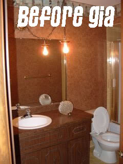
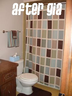
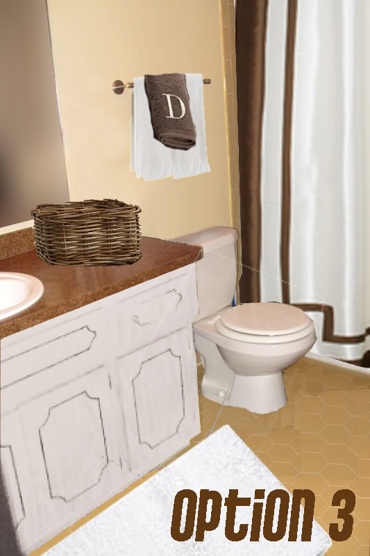
Moving in the right direction, right?! Well, I downloaded her photos into photoshop and played. Here is what I came up with:
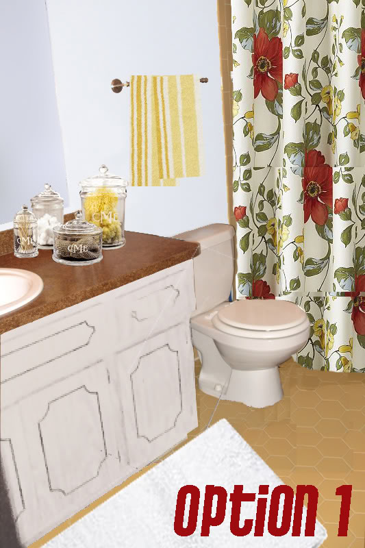
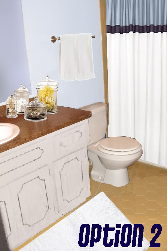
My favorite is Option 1 because of the beautiful Pottery Barn shower curtain which picks up the yellow of the vintage tile while still making the room look fresh and clean. And a couple coats of blue on the walls allows the yellow to become more of a neutral colors rather than an uber-dominating hue.
I also recommended that she switch out her brown floor rug for one in pearly white. That and remove the toilet rug…can you say drippage? yummy. And while she is incorporating white – a couple layers of white paint on that vanity will really allow the bathroom to appear lighter and brighter. Dontcha think?!
So which one is your favorite? Vote for one and tell us why you like that option best for Gia’s golden child. I’m off. Suddenly I feel like eating a bowl of Honeycombs cereal….interesting 🙂
I vote for option one. It really ties in the floor nicely and I adore that shower curtain. Definitely paint the cabinet – the brown just dates it.
I vote for option one. It really ties in the floor nicely and I adore that shower curtain. Definitely paint the cabinet – the brown just dates it.
Option #1 – love the shower curtain and how it goes nicely with the flooring.
Option #1 – love the shower curtain and how it goes nicely with the flooring.
#1 – absolutely! And paint the cabinets white. Great job!
#1 – absolutely! And paint the cabinets white. Great job!
I agree. Number 1 for sure!
I agree. Number 1 for sure!
I really like #3.
I really like #3.
I like option 2!! It looks very beachy.
I like option 2!! It looks very beachy.
What fun!! I feel her pain because I inherited a pink and gray bathroom when we bought our house, yes gray bathtub and even the toliet. And the floor and wall and shower tiles were all pepto pink. It is hard to work a dated color! But you came up with such cute ideas!! I like #1 and #3. They have 2 different feels, but both are adorable! Love your photoshop makeovers!!!
What fun!! I feel her pain because I inherited a pink and gray bathroom when we bought our house, yes gray bathtub and even the toliet. And the floor and wall and shower tiles were all pepto pink. It is hard to work a dated color! But you came up with such cute ideas!! I like #1 and #3. They have 2 different feels, but both are adorable! Love your photoshop makeovers!!!
#3! Absolutely! It goes from drab to classy instantly!
#3! Absolutely! It goes from drab to classy instantly!
Nice photoshop mockups, girl! I vote #1 too. love that its light and bright and airy. Great job making that space feel like its from this century:)
Ps. You crack me up!!!
Nice photoshop mockups, girl! I vote #1 too. love that its light and bright and airy. Great job making that space feel like its from this century:)
Ps. You crack me up!!!
I like option #1 or #3, but that shower curtain in the first one is just so pretty.
I like option #1 or #3, but that shower curtain in the first one is just so pretty.
they all look great, but i kinda like #3. are the monogrammed jars real or of katie’s imagination? they are really cute 🙂
they all look great, but i kinda like #3. are the monogrammed jars real or of katie’s imagination? they are really cute 🙂
#1 or #3…I love the shower curtain and colors in the first option, but then I love the “hotel” look in the 3rd option…
#1 or #3…I love the shower curtain and colors in the first option, but then I love the “hotel” look in the 3rd option…
Completely depending on her style, #1 is more traditional and #3 is more contemporary. I lean towards 3 in my own style, but I do love option 1 if she likes the more traditional style! Great job!
Completely depending on her style, #1 is more traditional and #3 is more contemporary. I lean towards 3 in my own style, but I do love option 1 if she likes the more traditional style! Great job!
#1 and #3 are my favorites! I love how sleek and modern #3 looks. And love the shower curtain of #1.
#1 and #3 are my favorites! I love how sleek and modern #3 looks. And love the shower curtain of #1.
Hi Claire –
I only wish I was that imaginiative…err..imaginatory…err…imaginationery. Whatev 🙂 The monogrammed jars are from Pottery Barn…
XO – Katie
Hi Claire –
I only wish I was that imaginiative…err..imaginatory…err…imaginationery. Whatev 🙂 The monogrammed jars are from Pottery Barn…
XO – Katie
I love #1! That curtain is great!!
I love #1! That curtain is great!!
I’m torn – I love #3 (such a brown) fan, btu I think #2 might make more sense… Hum – either way it’s due for an improvement : – )
Good luck Gia!
p.s. Seriously, I was JUST looking at those fabulous monogramed jars at Pottery Barn, woah!
I’m torn – I love #3 (such a brown) fan, btu I think #2 might make more sense… Hum – either way it’s due for an improvement : – )
Good luck Gia!
p.s. Seriously, I was JUST looking at those fabulous monogramed jars at Pottery Barn, woah!
Katie, you are the best!! Thanks for giving me some options!
Katie, you are the best!! Thanks for giving me some options!
I like option 2. Reminds me of a beach house bathroom.
I like option 2. Reminds me of a beach house bathroom.
Love option 1!
Love option 1!
I’m loving option one. It makes the shower curtain the focal point, and the rest of the room just complements, instead of competing. Nice job!
I’m loving option one. It makes the shower curtain the focal point, and the rest of the room just complements, instead of competing. Nice job!
I love the big floral shower curtain!
I love the big floral shower curtain!
#1 for sure. No doubt.
You do good work, girl.
#1 for sure. No doubt.
You do good work, girl.
What?? No toilet rug? Am I the only one who likes softness under my feet when I read?
What?? No toilet rug? Am I the only one who likes softness under my feet when I read?
I vote for #1 as well. The shower curtain is so bright and will add so much color to the dark room. I love the idea of painting the cabinets. Such an easy fix.
Oh and by the way Katie, how embarassing that my mom made you look at my blog. Sorry! She’s way into this stuff!
I vote for #1 as well. The shower curtain is so bright and will add so much color to the dark room. I love the idea of painting the cabinets. Such an easy fix.
Oh and by the way Katie, how embarassing that my mom made you look at my blog. Sorry! She’s way into this stuff!
Though the other two are nice I would defiantly say option 1! 🙂
Though the other two are nice I would defiantly say option 1! 🙂
#1! Great job Katie!
#1! Great job Katie!
I love all the options but I agree, option 1 looks fabu. 🙂 Love your blog…I just found it a couple of weeks ago. You crack me up!
I love all the options but I agree, option 1 looks fabu. 🙂 Love your blog…I just found it a couple of weeks ago. You crack me up!
Love #1-great curtain! 🙂
Love #1-great curtain! 🙂
I love Option 3 best (or even Gia's current curtain.)
The only thing… instead of painting the cabinet white (my fave, too!), I'd pick an off-white, bone, or pale tan color to better pull together the color of the commode, tiles, and curtain. Meh… I could go either way. Heh.
I love Option 3 best (or even Gia's current curtain.)
The only thing… instead of painting the cabinet white (my fave, too!), I'd pick an off-white, bone, or pale tan color to better pull together the color of the commode, tiles, and curtain. Meh… I could go either way. Heh.
Agreed- #1 to pick-up that yellow floor tile that I actually love, it is very pretty in the photos!
Agreed- #1 to pick-up that yellow floor tile that I actually love, it is very pretty in the photos!
Agreed- #1 to pick-up that yellow floor tile that I actually love, it is very pretty in the photos!
Agreed- #1 to pick-up that yellow floor tile that I actually love, it is very pretty in the photos!
Option #1 all the way!
Option #1 all the way!
I really love how option one pulls in the yellow tile and makes part of the look instead of something your trying to ignore.
I really love how option one pulls in the yellow tile and makes part of the look instead of something your trying to ignore.
I love option one and option three. I love how the colors work well together with the option one shower curtain. However, option three is more my style. I love the subtle amount of brown.
I love option one and option three. I love how the colors work well together with the option one shower curtain. However, option three is more my style. I love the subtle amount of brown.
#3 is classic and feels serene. #1 feels busy and my eye is drawn immediately to the big flowers. #2 is ok too but #3 is still my vote! Good-Luck!
#3 is classic and feels serene. #1 feels busy and my eye is drawn immediately to the big flowers. #2 is ok too but #3 is still my vote! Good-Luck!
Option #1 for SURE!!! I LOVE it so much!
EMBRACE your vintage tile, I say. I had black and white tile and a black toilet and an awful orange oak vanity, but no money to change much. So I embraced what I had, and am so pleased with the results! I refinished the vanity to glossy brown/black and the bathroom looks great (and um, is NEARLY finished). Check it out at http://www.TamaraAndTim.blogspot.com
I can't wait to see what you do with it! Definitely paint that vanity and get some new drawer pulls. The difference will be stunning! And cheap!! 🙂
What kind of software you use to come up with all these design options?. It looks very cool
What kind of software you use to come up with all these design options?. It looks very cool
I like option 1, but prefer the paint color in option 3 since it blends better with the tiles. I also came upon this project on Lowe's if Gia would like to try it out. The old cabinets look just like hers. The project looks easy enough and budget friendly too!
http://images.google.com/imgres?imgurl=http://www.lowescreativeideas.com/Libraries/0309%2520-%2520project%2520images/0309_bicksler_hero.sflb&imgrefurl=http://www.lowescreativeideas.com/idea-library/projects/Bicksler_Helping_Hands_0309.aspx&usg=__nTuVPDb5jyVRdNnBV9inK5bFGj0=&h=292&w=635&sz=67&hl=en&start=10&um=1&tbnid=bsY0F5lYfTy_tM:&tbnh=63&tbnw=137&prev=/images%3Fq%3Dadd%2Bplywood%2Bto%2Bcabinet%2Bdoors%26hl%3Den%26um%3D1
and oh, i would add a frame around her mirror as you had done in your bathroom. that would be a great touch in my opinion…
and oh, i would add a frame around her mirror as you had done in your bathroom. that would be a great touch in my opinion…
I like Option #3 – seems more put together. How about painting the yellow tile? There are many how-to's online about painting ceramic tile. It would give the bathroom look a major overhaul…
I like Option #3 – seems more put together. How about painting the yellow tile? There are many how-to's online about painting ceramic tile. It would give the bathroom look a major overhaul…
Hi Tamara – isn't it great the difference a coat of paint can make?! And funny thing is – Gia already changed out her hardware but you can't tell because the dark cabinet is swallowing up her nickel finish!
Hey there Sara – I used photoshop…hence the post title…but I have done this kinda thing in Paint too…so every computer can be used as your tool for instant room makeovers!
Priscilla – thanks for sharing that link! I am sure that someone will be dying to know the how-to! And funny thing is – I told her the same thing about the mirror…definitely add a little sumpin sumpin, right?
Hey Amy – I don't really know much about reglazing tile…but it is definitely worth the research!
I am sure Gia loves all the suggestions and input so THANK YOU!
XO – Katie
Here's some more inspiration for Gia. These people managed to make a bathroom with orange countertops look cool.
http://flythroughmywindow.blogspot.com/2009/04/orange-you-glad.html
Here's some more inspiration for Gia. These people managed to make a bathroom with orange countertops look cool.
http://flythroughmywindow.blogspot.com/2009/04/orange-you-glad.html
Gia definitely LOVES all the advice and suggestions. Husbo HATES the curtain from PB (and I think he is a NUT) so I am not so sure what I am going to do. School is out in a few days, so I will keep you all posted when I take the time to get it done!
Gia definitely LOVES all the advice and suggestions. Husbo HATES the curtain from PB (and I think he is a NUT) so I am not so sure what I am going to do. School is out in a few days, so I will keep you all posted when I take the time to get it done!
I say 2 or 3
I say 2 or 3
I like the first one too. Well done Katie!
I like the first one too. Well done Katie!
I love the yellow tiles on the floor. Using a patterned shower curtain and towels is the way to tie them into the new scheme for sure. I would not paint contrasting trim on the cabinets, but I'd like them painted white with some glass knobs.
I love the yellow tiles on the floor. Using a patterned shower curtain and towels is the way to tie them into the new scheme for sure. I would not paint contrasting trim on the cabinets, but I'd like them painted white with some glass knobs.