Wanna see something freaky? It’s friday after all…
So special thanks to Catherine (who I took photos for WAY back in the day) for sending me this link. She found my house twin for sale on Zillow as she was house hunting and sent me the link and WHOA. Mind blown. I squealed and laughed and loved exploring the house-that-looks-like-ours-but-also-doesn’t.
I always knew that our dream house was built by the previous owner – a man who was named Napolean and who happened to be building some really fancy shmancy houses in the north parts of Atlanta….but I guess it never dawned on me that there were other houses with the same floor plan out there! I have no idea if he was the builder of our house twin but boy am I interested! I thought it would be fun to go through the rooms in a compare and contrast type manner. There are still some rooms I don’t understand (frankly I don’t really understand our own house layout so it’s hard for me to see how it translated to another house!) but for the most part…it’s very easy for us to see which are which!
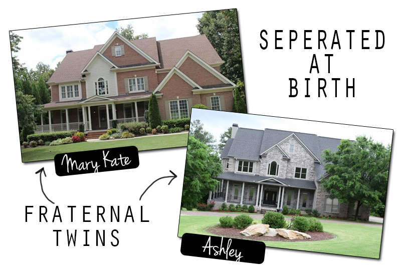
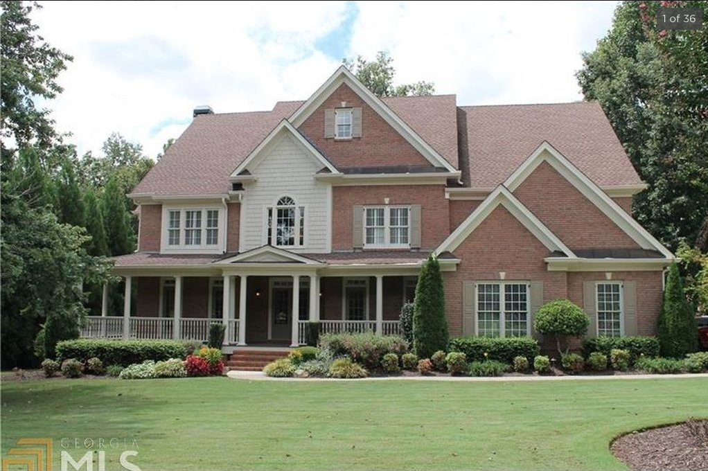
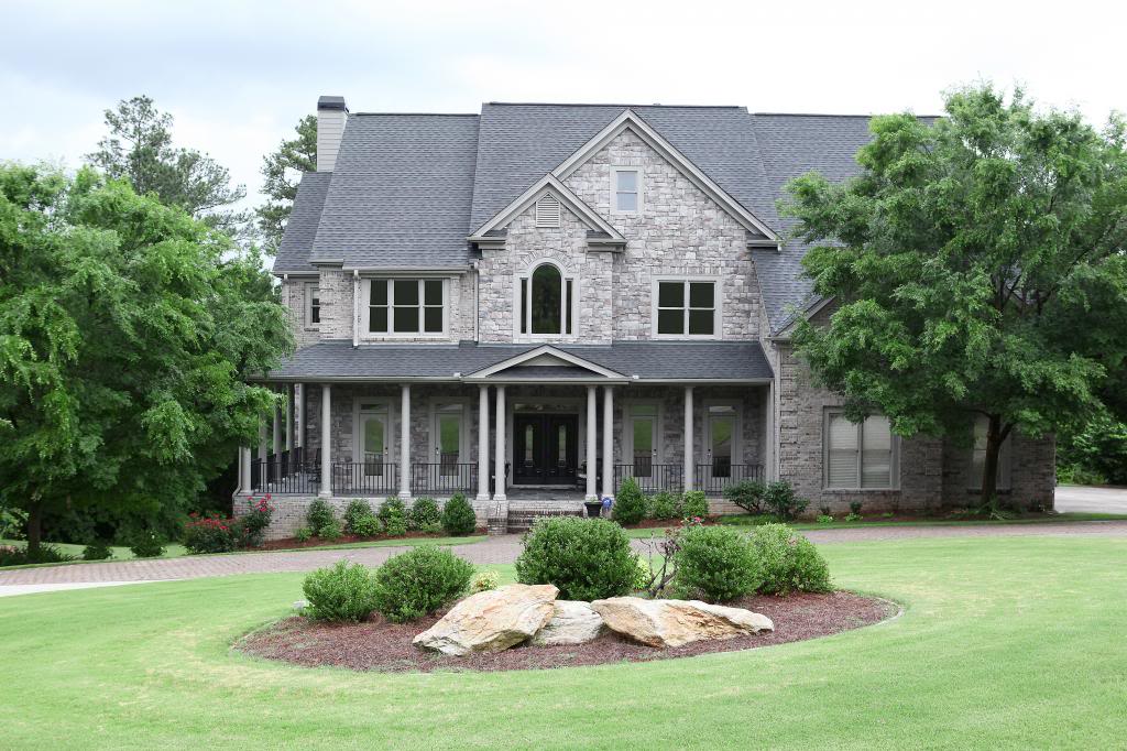
For the exterior, I LOVE seeing the front part of the house that is blocked on ours with the tree. I never thought I would but I’d definitely taking tips on landscaping from the Twin House. Also – the color scheme and other details (window pane dividers, shutters, different railing) all make the Twin House seem so much more cottage style and I totally dig it!
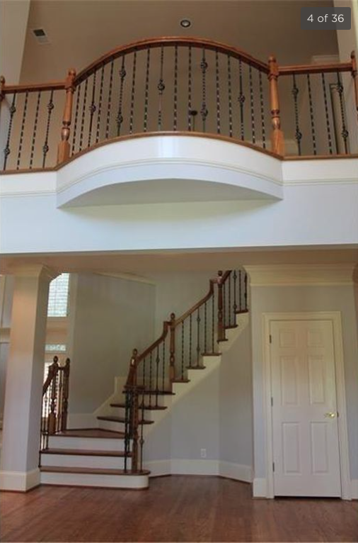
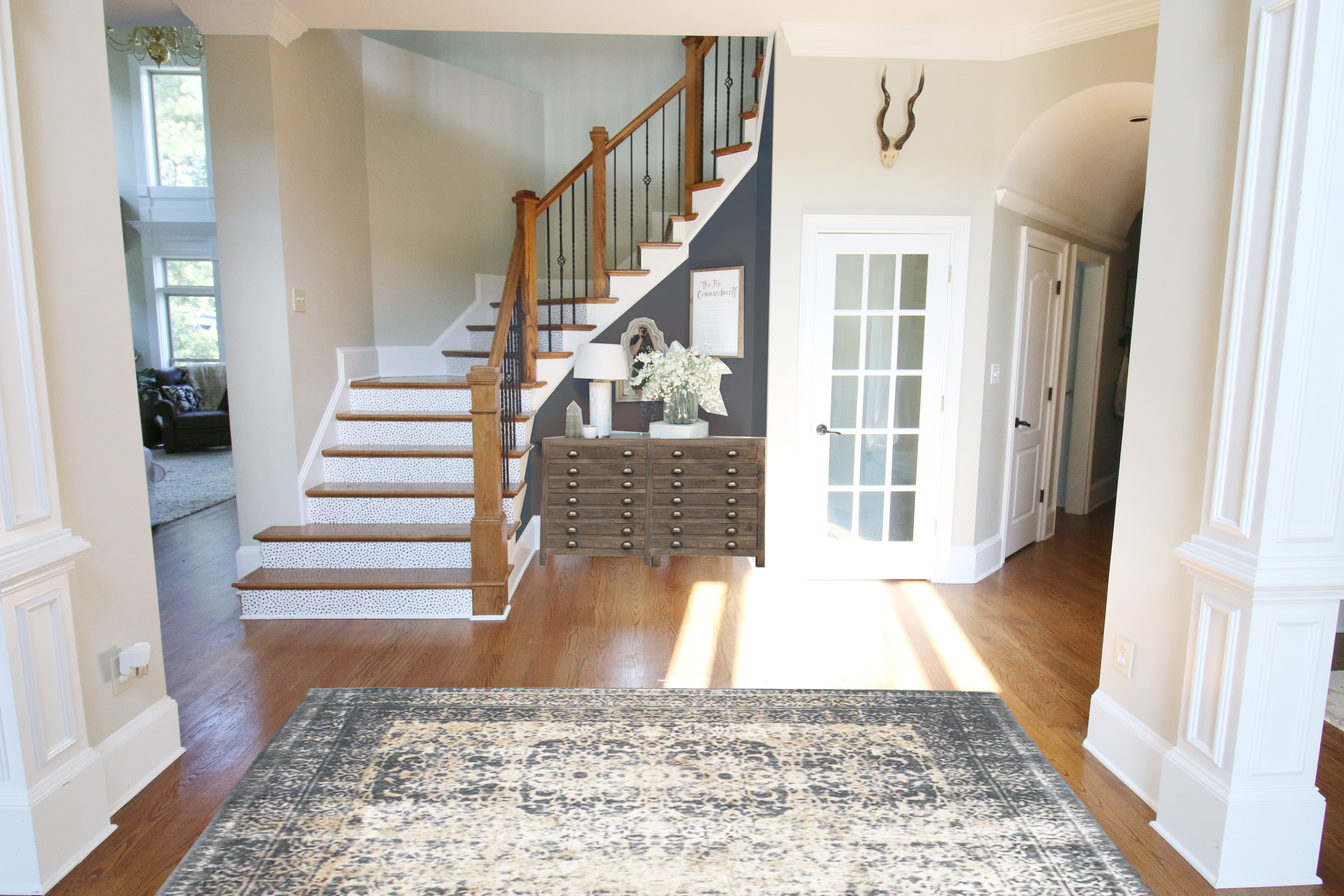
The foyer in the twin house is different too! We both have a two story foyer with a curved stair case but it seems like our ceilings are much higher….which would be why our house exterior seems less spread out in the photos. The taller ceiling allows for more stairs and I’m so glad that I have the boxier hand rail on the stairs as well as the paned glass door to the basement.
Our foyer is also a little more closed off to the living room….so glad about that because there is very little wall-space in the living room and if it were open there, I would lose valuable picture hanging real estate.
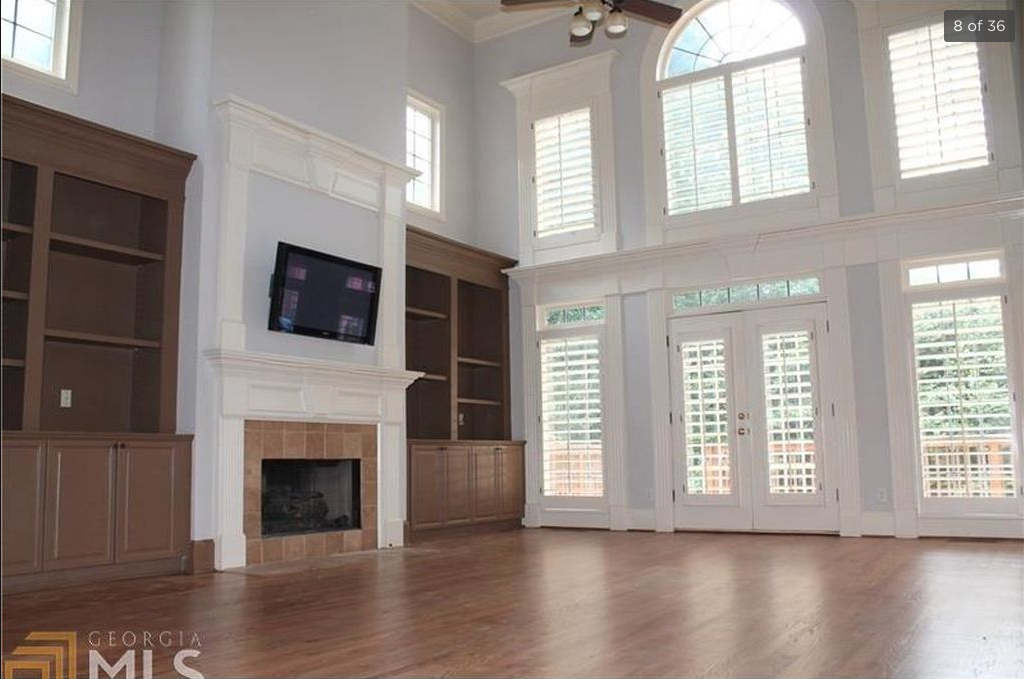
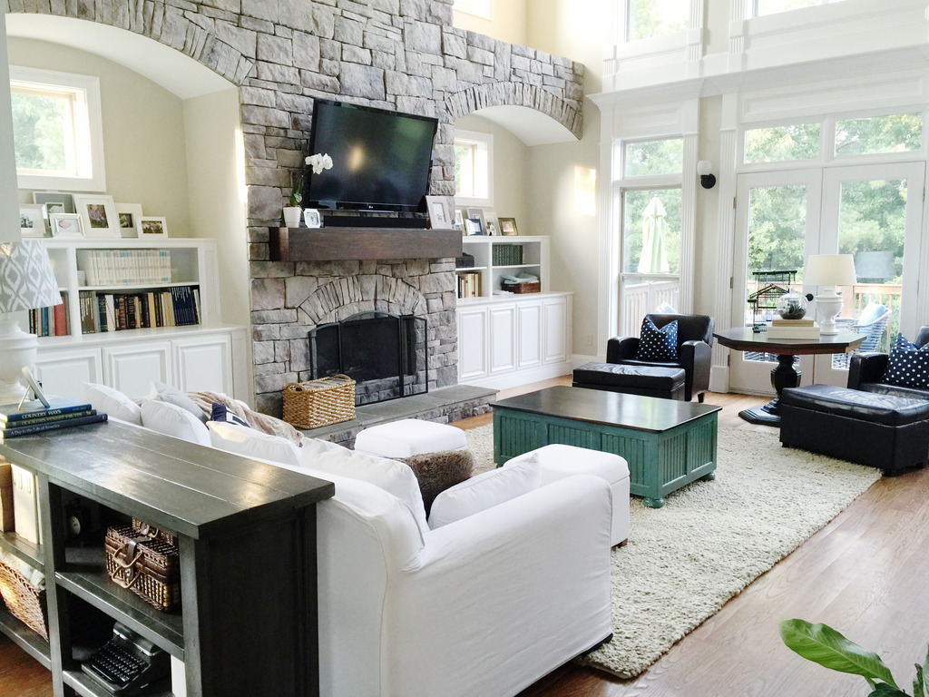
The living room really showed some differences – the Twin House has a two story room with a center fireplace flanked by builtins. The wall of windows is relatively the same – apart from the shutters. Jeremy said that he prefers our stonework and I would love to see the stone with larger builtins.
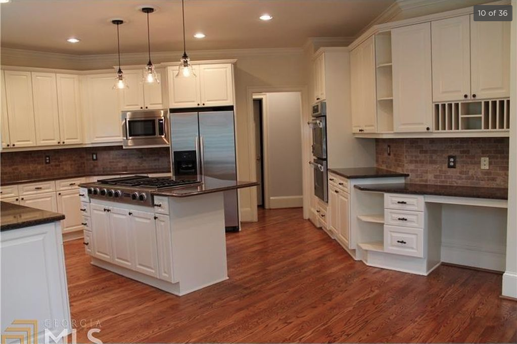
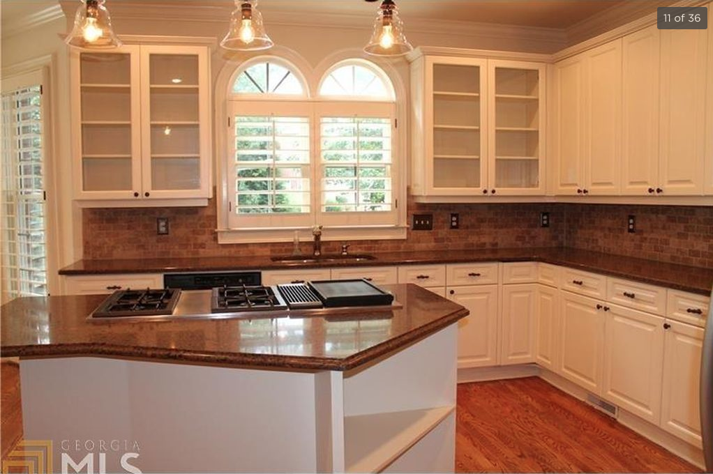
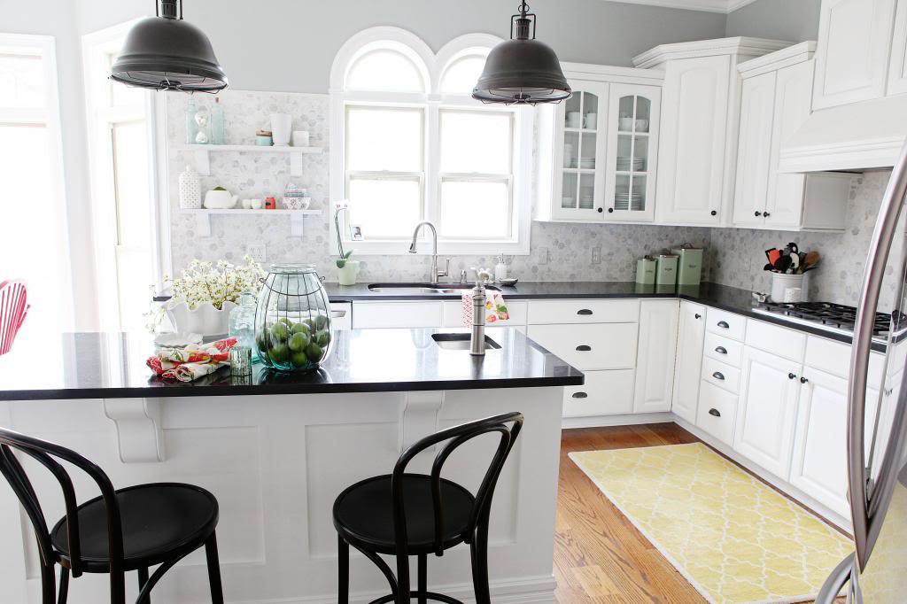
One of the biggest areas that I like better in our house is the kitchen. Even though they both have white cabinets and the same layout, the Twin House has their stove top in the island and built in microwave and double ovens. SWOON!
The other difference is an additional cabinet flanking the window. Ours never had that and our island is definitely more simple.
Our kitchen underwent a big makeover four years ago and I’m so glad that we did tackle that…but I can definitely see the advantage to having more storage (our desk doesn’t have all that upper cabinetry) and double ovens. Hopefully soon we can do some changes in this space to make it a bit more big-family-friendly.
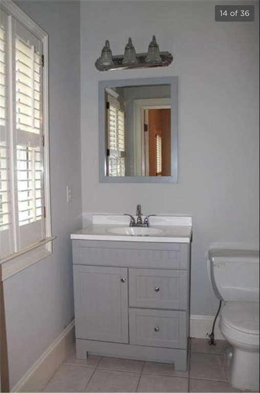
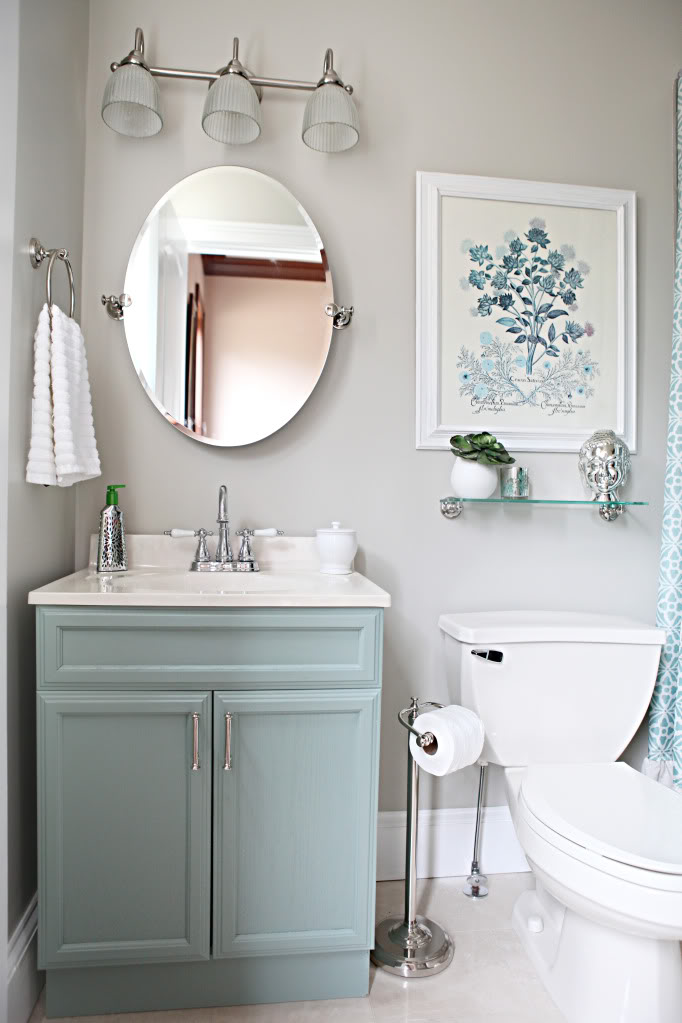
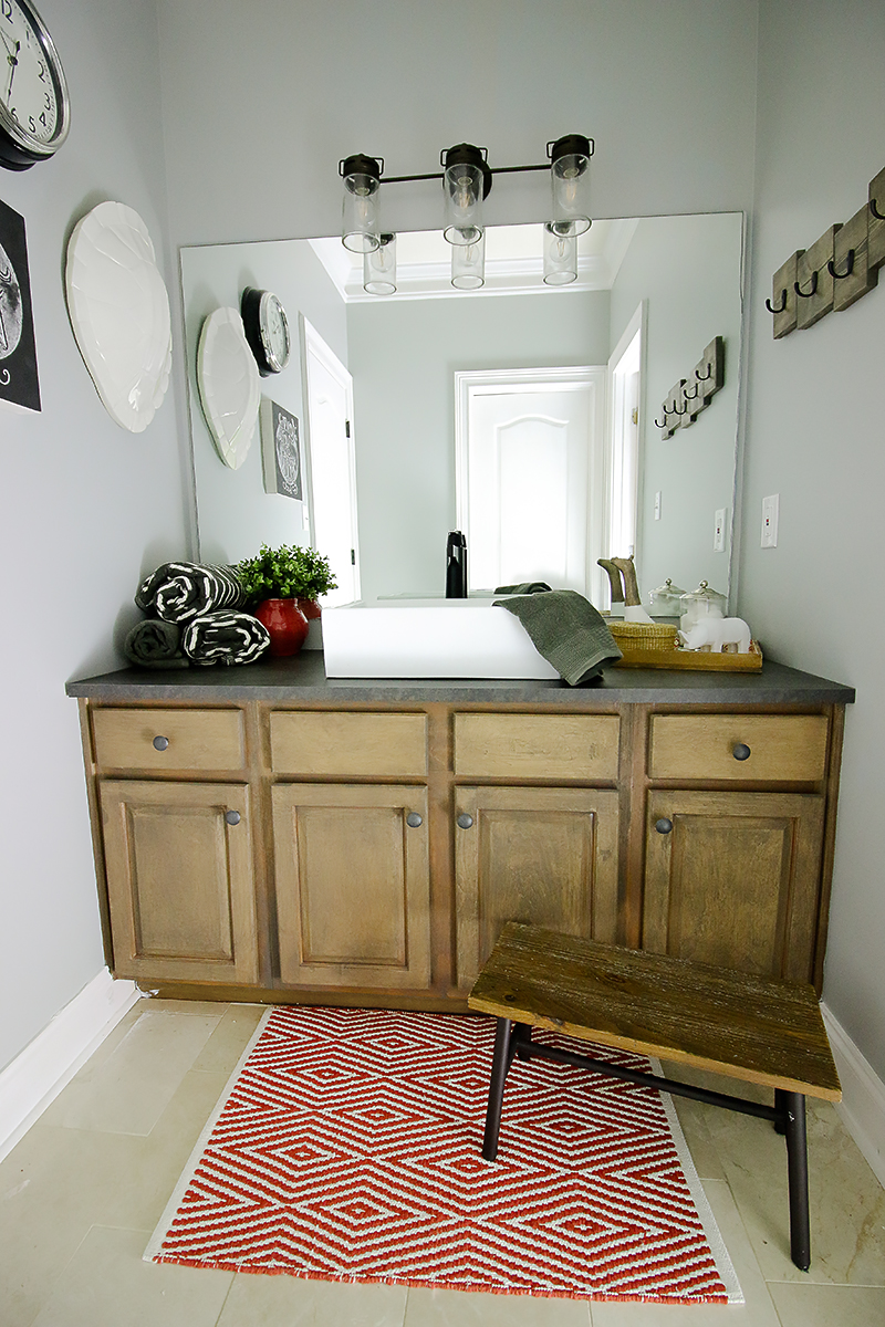
One area that I could tell a big difference in was the playroom bathroom. The Twin House has a much bigger window and came with a better vanity than our builder version. Thankfully we had tweaked this space and gave it a makeover years ago and I personally feel so much pride with this space because it was so budget friendly!
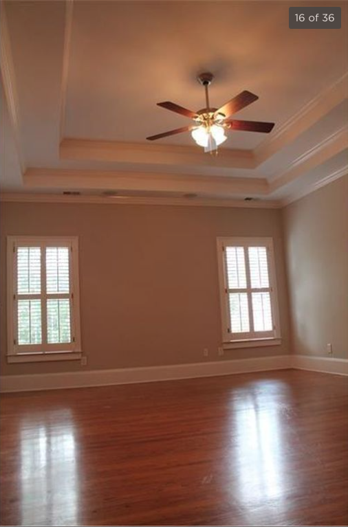
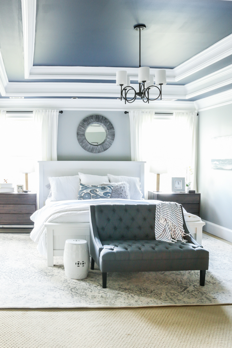
Upstairs there are quite a few differences….one of the biggest things that turns me green with jealousy is the hardwoods throughout! WOW! I totally wish we had that! Of course, that doesn’t make our master a ugly stepsister…our master bedroom recently was revealed and I am still obsessed with it.
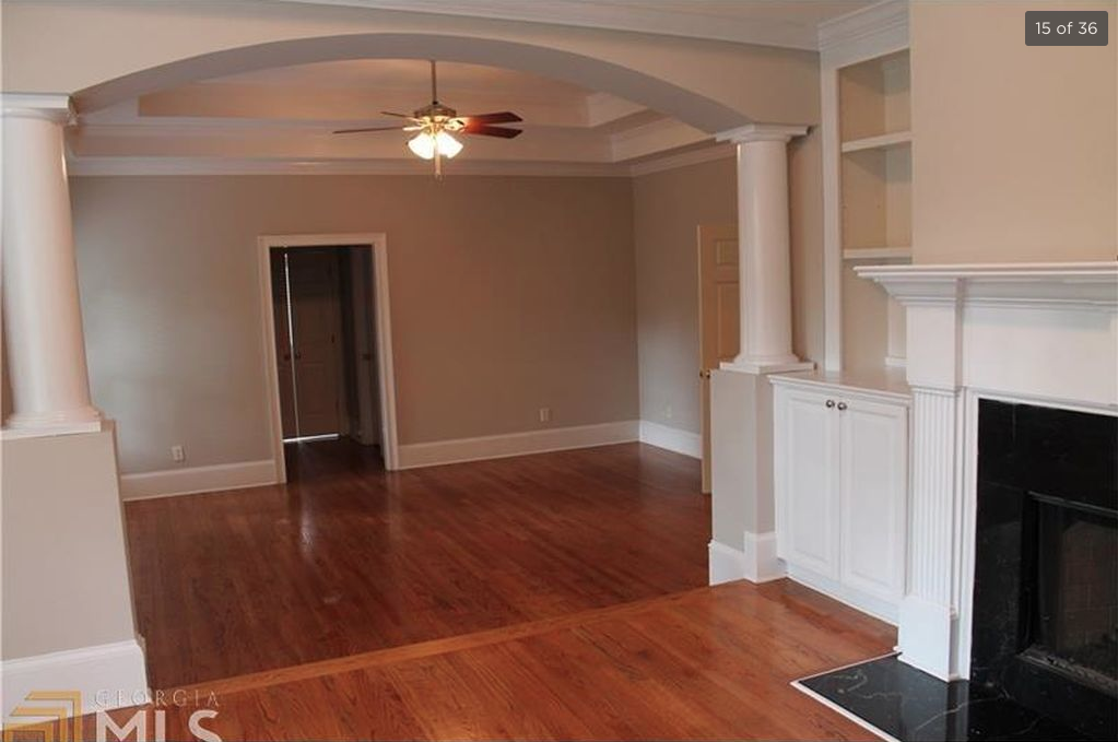
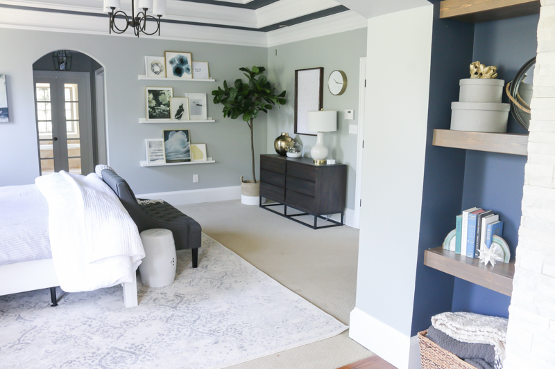
It was definitely interesting to see some of the more structural elements in the Twin House….like the fact that they had built ins, columns and a legit fireplace up stairs in their sitting room. It also appears that there is a step UP to this area….where ours is all flat.
As beautiful as those details are….I’m glad we have the architecture that we do have. I LOVE our stacked stone fireplace that we DIYed and as much as I would like the extra storage in the sitting room…our shelves make me happy!
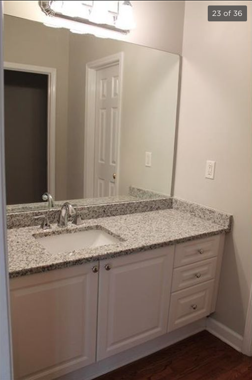
In the kid’s bathroom, the builder basic mirror is about the only similar thing. The doors in the reflection are even spaced differently so it makes me think this part of the layout changes slightly….going into the toilet room and then the closet. I would love to get a tour of the Twin House….you know just to see how things worked out with some tweaks.
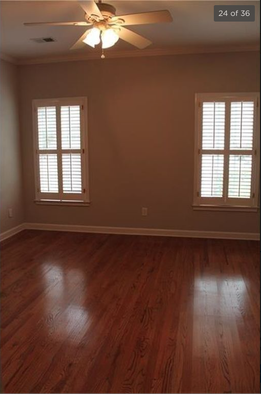
Speaking of the kids, the Twin House has the same kid room layout with the two windows and again…those hardwoods! Swoon!
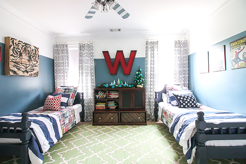
Our boys room looks a little different. Even the air vent is in a different spot….
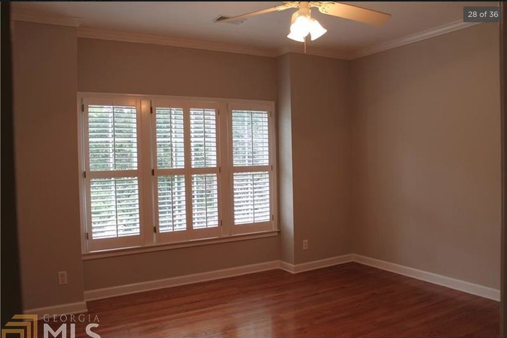
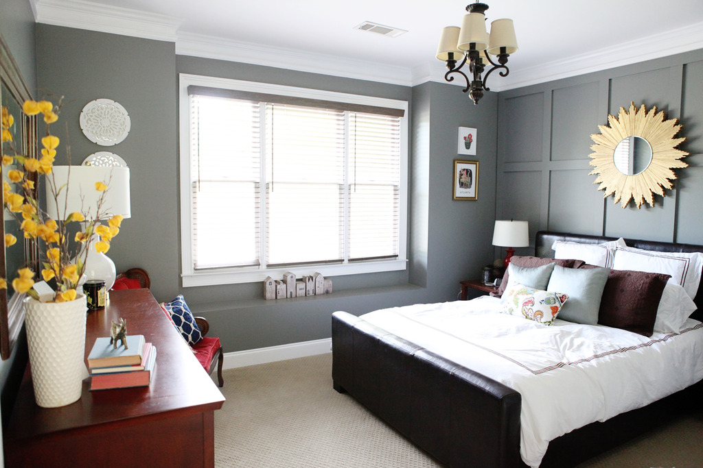
The guest room is an easily recognizable spot. The windows appear slightly bigger in the twin but they aren’t…they are just located lower…and obviously there is no built out bench thing in the room.
I need to do more updated photos…but this shows the same space….
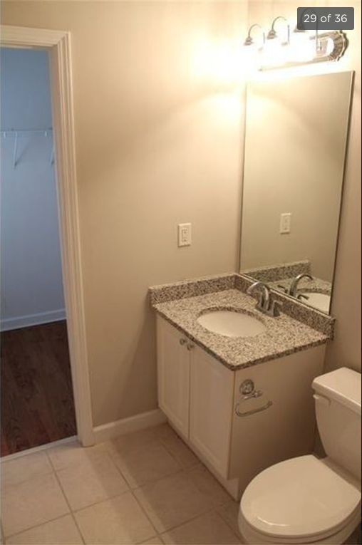
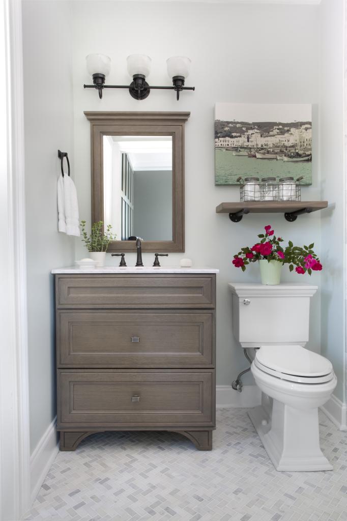
And this is the attached bathroom. We obviously updated the guest room bathroom and I am so glad that we did – this will be our little girl’s bathroom one day! I think it will be really such a special treat to have her own space and honestly as someone who shared a bathroom with two brothers…she will appreciate it one day….hopefully.
I wish I had more photos that I could compare….but some of them were completely unrecognizable angles….that is why I would love a tour. I even looked on Zillow in the same neighborhood to see if there were any other houses with a similar build (I’m a house stalker whatcanisay?!) and there were two more with similar rooflines but they had never had listings online with a real estate agent so I’m stuck just to look at these pics and hoping I can figure it all out! Maybe one of these days I’ll discover another listing that has the same floor plan and I can see the rooms! TRIPLETS! #allaboutthebabies
Not because I read your blog, but I do love what you have done with your house so much better. The stone fireplace in your house…yummy…just my style. You guys did good.
I know you’ve been busy birthing a new baby and all (congrats, BTW!), so I’m sure this won’t be a priority for you anytime soon. But it’ll bother me until you have a new post up, so I’m just gonna say it. It’s “sepArated.” Love your blog, love reading about your kids, love everything about it. I’m just a spelling nerd with a touch of OCD thrown in, and that spelling error makes me a little twitchy. Enjoy that sweet new baby!
We have (had .. since sold) a house twin too! Someone dropped off photos of our house twin on our front porch. Both houses were built in 1929 -30 in the tudor style. The floor plan seems to be identical with different finish choices. Fun to see how they handled remodeling the kitchen.
So cool! However, I definitely prefer yours!! Their kitchen is probably the only advantage, however I still prefer your simple island. Your stacked stone makes me sooo incredibly jealous!
I don’t think the step up to the sitting room adds any benefit- I wonder if that was because of some other design choice? All in all, I definitely prefer yours, but it would be really interesting to see a proper tour!
Now, pics of sweet baby Ella please! <3
In our area there are quite a few houses with an identical (or mirror image) floor plan as ours. Whenever i see one up for sale, I search for the listing and save the pictures. I have a whole pinterest board full similar and identical houses. We even went to one of the open homes! Wait…. that sounds totally creepy! Im not a (complete) weirdo! We are about to start a major renovation, so it helps to see what our house could look like (and what we dont want to do).
Katie I love your home so much better. I realize the twin house isn’t styled but it looks so dark and uninviting. You and Jeremy have really made a HUGE difference in your forever home. Well done!!
mw
Katie, I love the inside of your house so much better!! I much prefer your kitchen island. I never cared for stovetops and large sinks in the island because it can be used in a lot more ways. Also, I’m not a fan of the step up in the bedroom in the twin house, because that can cause someone to trip. Your stonewall fireplace is soooo much better than theirs! I do love hardwood floors, and so regret not putting them in our living room. We’re on our 3rd carpet in there. Just hate to go through what it would take to put them in now. Y’all did a great job! I do agree with on their exterior. I would probably cut down that tree that is blocking that side of your house. I never would have thought that until now. I need to rethink my landscaping now. But, who cares, in the grand scheme of things you have four handsome little guys and now a Baby GIRL!!! You are the winner!!! SO HAPPY for you!!!!
You’ve put so much work into making your home yours! I’m most curious about that random room that is behind/between the boys’ rooms. And lucky Ella–she’ll get her own bathroom while all 4 of her brothers have to share!
It’s just a random room…it’s too small to be a bedroom and so we think of it like a little bonus space for storage right now. And yes – she is lucky but also it might be a little unlucky…the boys love sharing.
xo – kb