I might be feeling overly dramatic today. Just wanted to warn you. I blame Big Brother and the fact that people LITERALLY THINK IT IS OK TO BULLY. If there is something you should know about me, it is that I have a very fond affection for mercury glass, I get weirdly excited when people are pregnant and I will ALWAYS be that girl that steps into the circle to defend someone else…even if they deserve a verbal beat down…which we all do at some point. I don’t like gangs of people bullying. And I can have a very smart mouth. Just ask my mother.
I fully believe that if you are mean on tv (even if it’s a game show) that you are mean in real life. Same goes for the internet. Same on the baseball field. And at school and at work and at home. It’s not complicated.
ANYHOO.
I’m in the final countdown of this pregnancy….three more weeks till DD. And the most popular question is – will we do a nursery before the baby girl arrives? No. Nope. Not even a little. Generally speaking, we keep the baby close during those first months. With all our boys we have kept the pack n play and the swing in our room and we co-sleep until they are about 6-8 months old. So that means 2018 will be the year of the nursery.
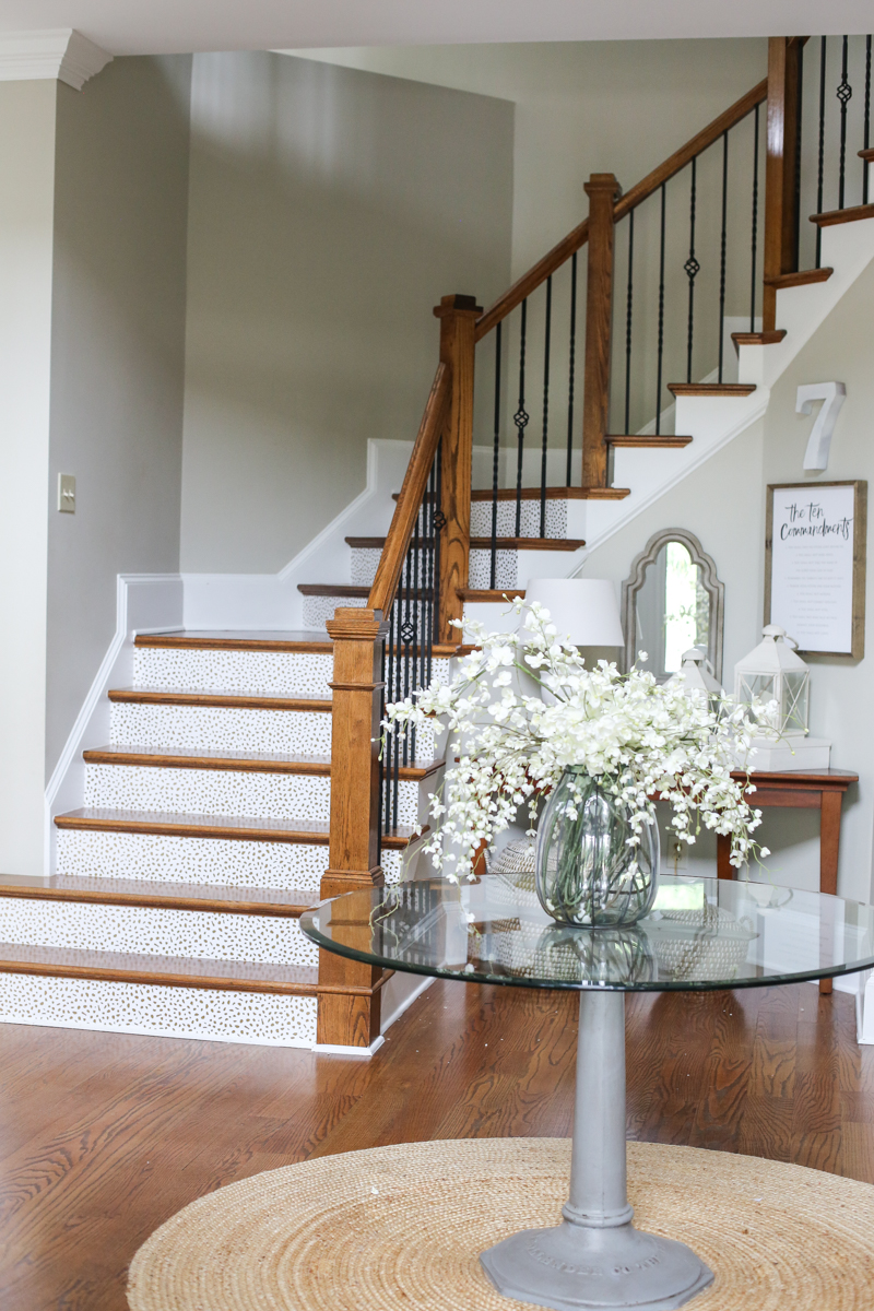
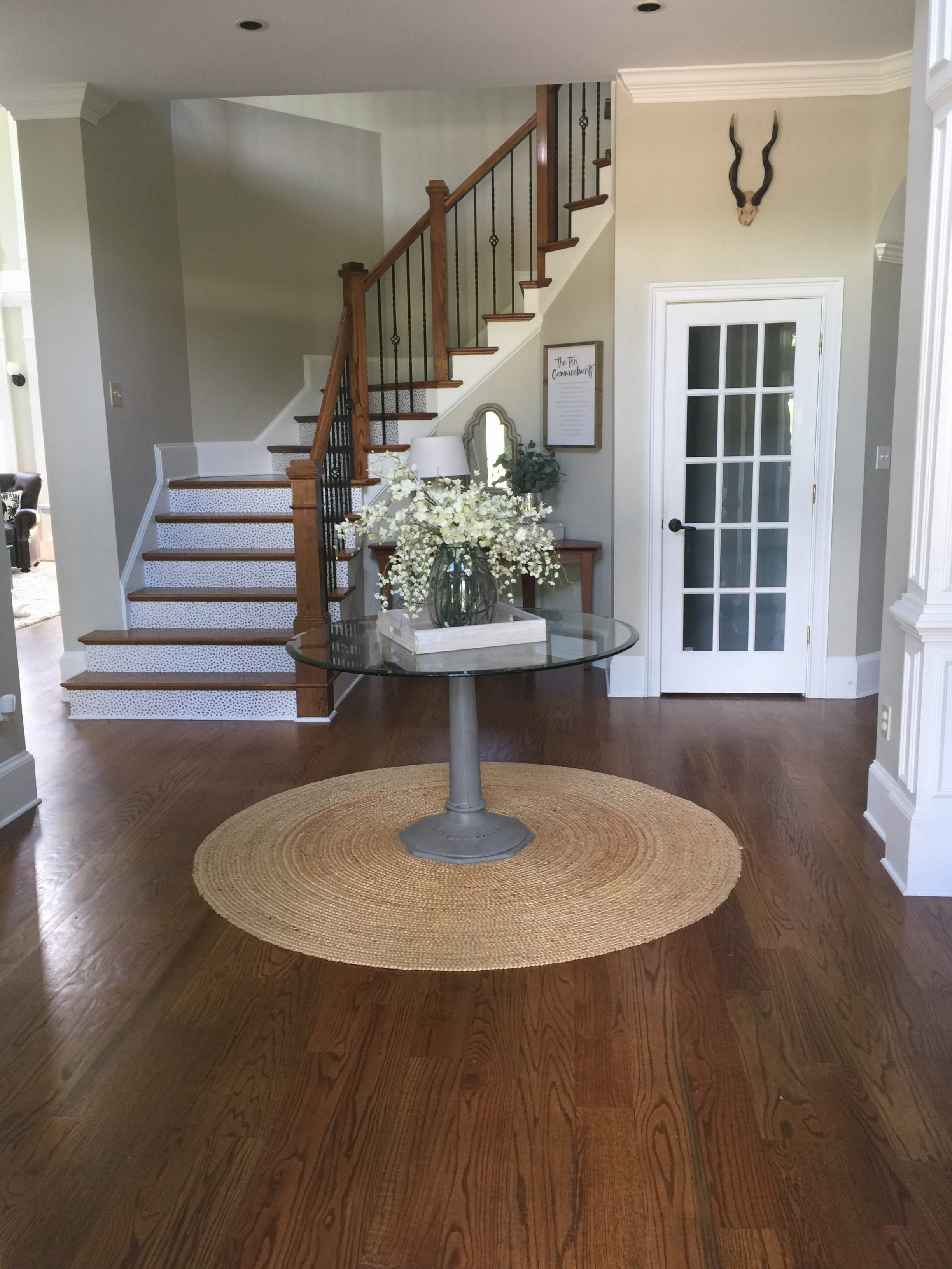
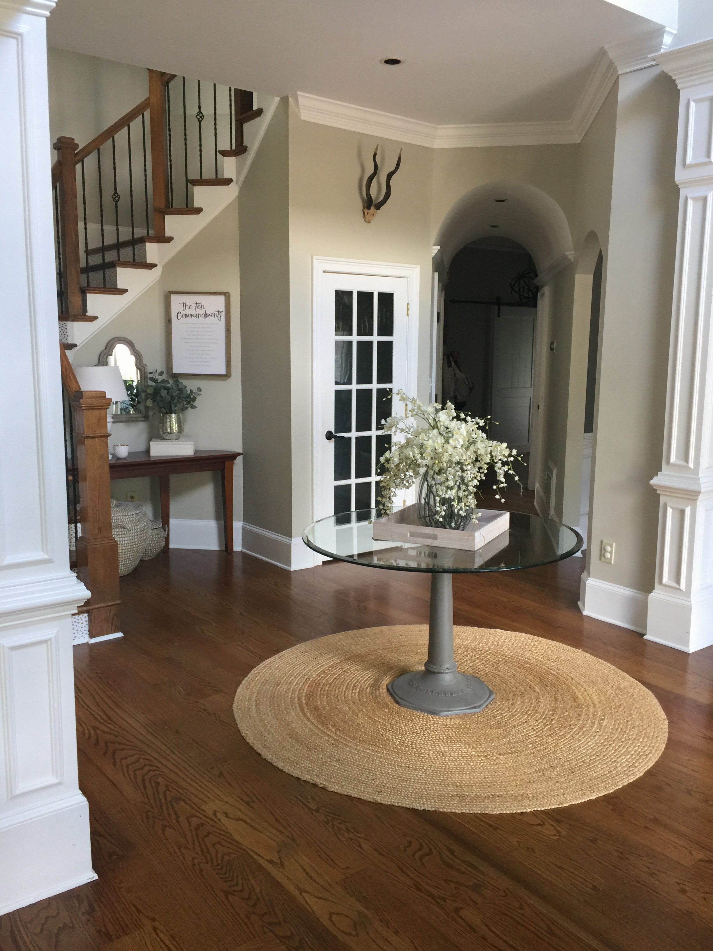
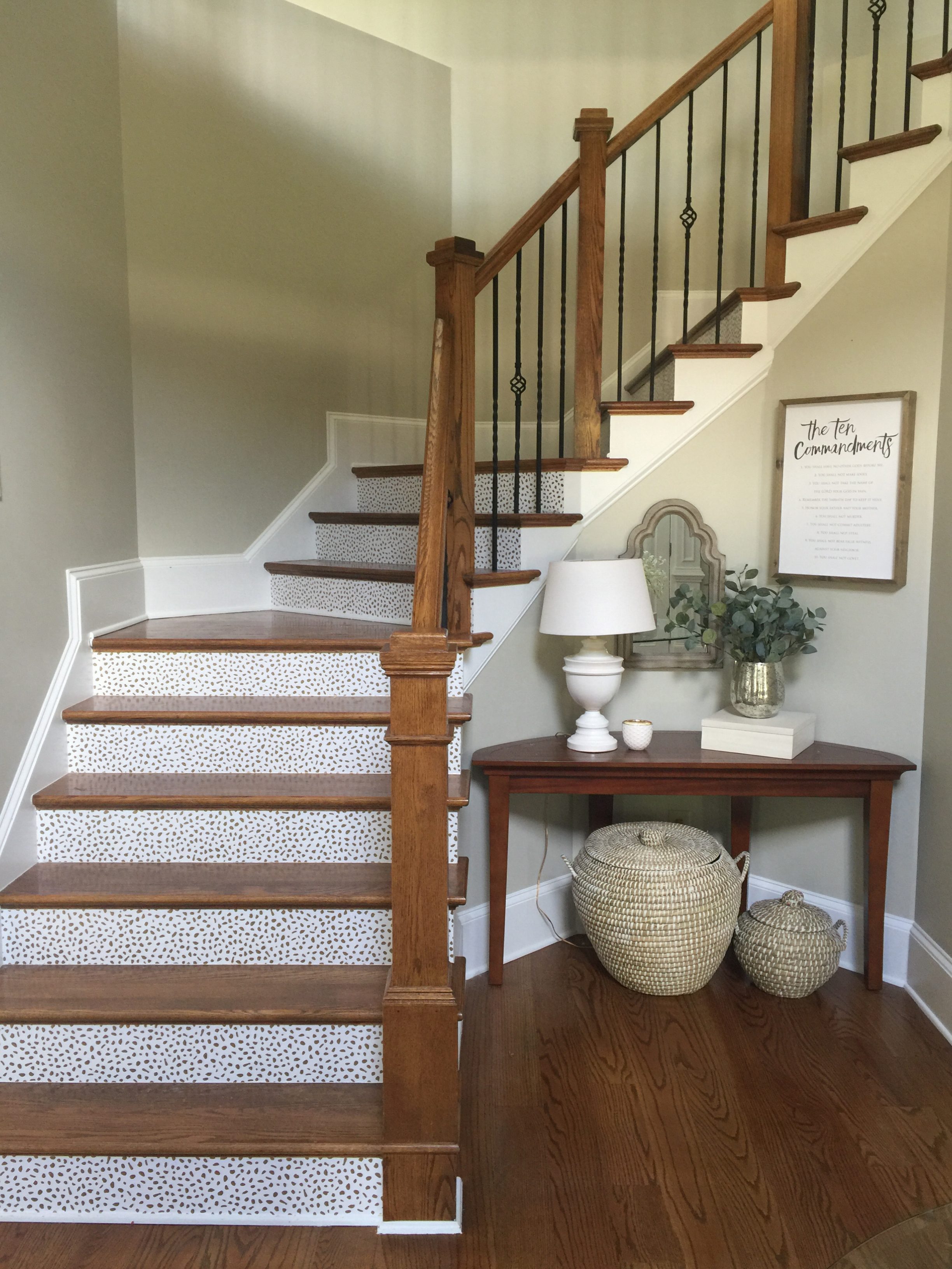
For now, we want to tackle the easiest spaces to finish up….the foyer, the living room and the little boy’s room. So what is gonna be first? What is the weirdest space in our house? Well….the foyer is up there. Currently it looks like this….
The curved stair case isn’t really my style….I would prefer much less traditional balusters and I do not like the color of our hardwoods. BUT I’m rolling with it….because I priced out new balusters ($2k-$4k installed ahem) and the floors and stairs would be a cool $5k. choke. gag. ugh.
So for now….little things are gonna tweak the space until I win the lottery. Which will happen because it’s on my dream board and Oprah said I will become what I believe….and dang if I don’t believe that I am meant to be Cindy Crawford with a Bill Gates bank account. Or until I follow my parents instruction and save all my pennies and get them done in 2020 after we get a pool. Reality check. If only I could cash that in for actual money 🙂
ANYHOO. (told you I was feeling dramatic today!)
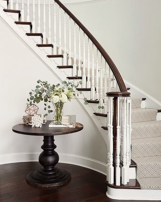
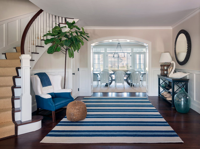
Here are some really pretty curved staircases that are inspiring me for our mini foyer makeover. Love the runner on this one…..swoon!
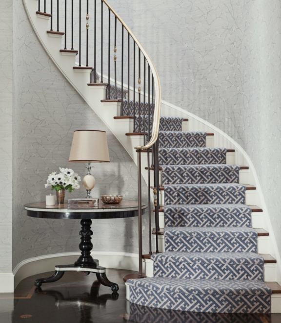
And this one has a nice pattern on the walls with pattern on the steps which makes me wonder if I should incorporate a little pattern on ours….
Nelson Hancock photograph – design Markham Roberts – via This is Glamorous
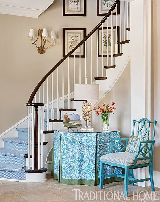
This one shows the round table with a skirt….which makes me think I definitely want something that is not leggy in my curved area. It would just make more sense since I already have a pedestal table in the middle of the foyer.
And this one shows a big comfy chair and a tall tree….which definitely looks good but in real life for our space would look a little jungle-y….
These are my thoughts….my foyer is really big. Like WAY too much square footage is wasted here. If only I could transfer it into the laundry room. But I can’t transfer the fat from my thighs to my cheekbones either.
SOooo….in real life it feels right to have this floating table and rug in the middle of the foyer. Maybe I’m all wrong though. Maybe we need to eliminate it….but then it feels empty. It would be an emptry. Get it? empty and entry? good one katie.
If I keep the center table, I need to do something different. My idea is to keep the glass round table and then choose a different round rug and build something else for the staircase alcove area. This is an iPhone photo taken about thirty seconds ago…
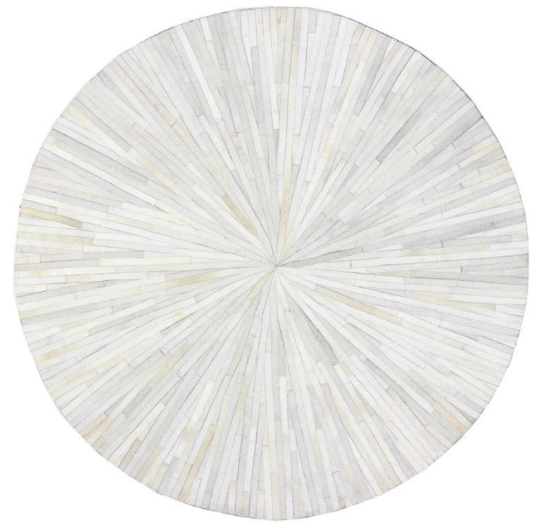
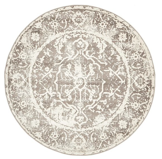
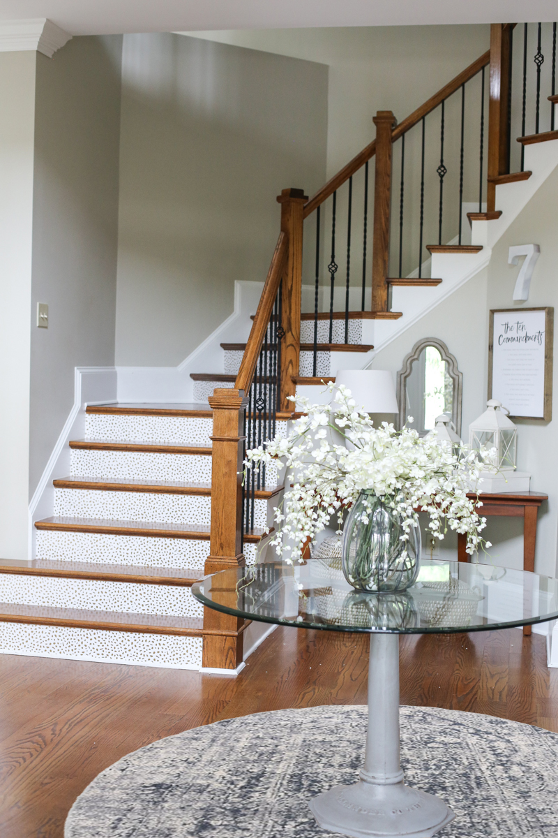
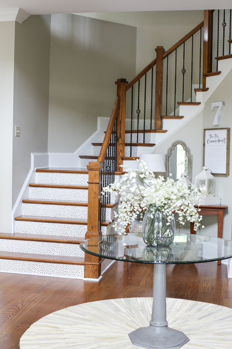
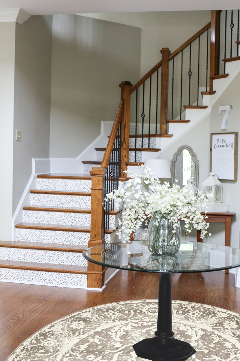
If I keep the center table, I think the easiest way to make things look more cohesive is to buy a rug because the jute one is just not working. I picked out three different options.
The first rug is more blue/gray and it kinda ties in the table. It’s a really really great price so that makes me like it more. (LINK HERE)
The second is actually cowhide and I LOVE it. But it’s also the priciest option. And there is always a fear of spending money on stuff my kids could destroy in seconds. (LINK HERE)
The third is warmer and looks like it was supposed to be a round option. It is a decent price but looks terrible with the gray pedestal. So I would have to modify that. (LINK HERE)
So here are the three options photoshopped into the room….
I know you have an opinion and I would love to hear it in the comments.
As for the table in the back, I think that the leggy demi-lune table is just not working with the pedestal table. It’s like being at a Victoria’s Secret fashion show….allllll the legs.
But this area could benefit from closed storage unit built to fit. It would cover up the cords and still be a spot for a lamp….which we absolutely need because at night we keep it on. Again with the iPhone photo….
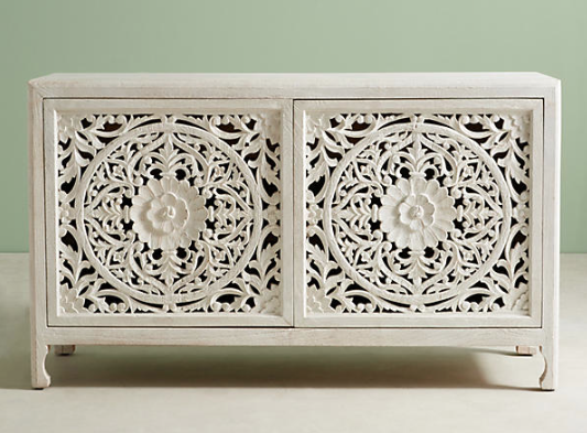
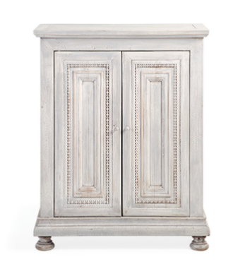
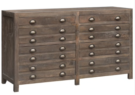
I’m thinking I could make a piece that has some doors or drawers with detailing….here are three pieces that I think are gorgeous….
OR a completely different option would be to eliminate the round table completely and put a rug in that spot that is square….
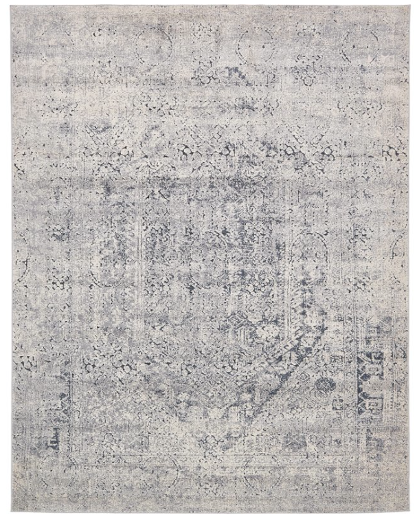
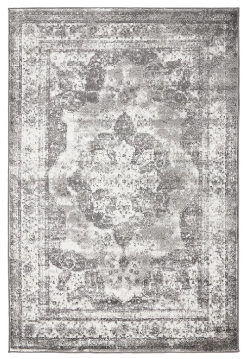
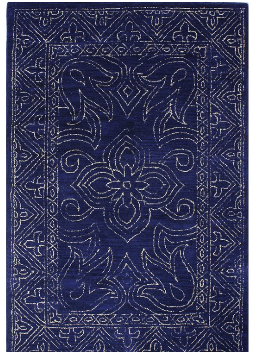
the blue one from above comes in a square….it’s a good price and (LINK HERE)
the middle one is less blue…more gray….and it is a superb price….under $200 for a 9×12? RIDICULOUS. (LINK HERE)
the third would be a big splash of navy. It is the darkest and the most kid friendly….I mean….I don’t put it past them to try…but still. (LINK HERE)
So what do y’all think? eliminate or keep the table? Then which rug? And then which inspiration do you love for the storage piece? I’d love to have lots of eyeballs on this one so that I can really get this done in a hurry! Also keep in mind, this is the foyer….where Bear goes in and out multiple times a day to the yard and does his business….there is always a little dirt and kids are gonna try their darndest to destroy it. So yeah…#realitycheck.

Something else that might help the space is getting a big light fixture for over the table to maybe help anchor it. The table does feel kind of weird floating in the space that having a light fixture above might make it make more sense.
This post cracks me up. You’re very good at putting your personality into your writing! 🙂
I vote for getting rid of the round table and doing the blue/gray rectangular rug. We have a round table in the entry of our office area at work and it drives me nuts. I constantly walk into it! Ha! It literally has gold lion feet on it. I’m not kidding. When was that a style?
Anyways, I think removing the table seems more kid friendly and I’d add the closed storage. I personally love the printers console table.
Can’t wait to see pix of baby Bower! Sending you cool vibes in this southern heat!
First round rug, or rectangle if you can get away with it, with a black pedestal base. I feel like the pedestal table needs to be black to tie into the stairs a bit more. Also, what about making a cover for the table in the alcove? Similar to the one in your inspiration pic with the cover.
Love the rug/table combo ideas you have, but… I gotta say, I think my top vote is to get rid of the table altogether and go for a gorgeous rectangle rug! The grey or navy would be a real stunner in that space. Plus it’s one less piece of furniture to dust or for kids to run into! Always a win! 🙂 Have you thought about removing the table and rug and having an “empty entry” for a few weeks? You might be surprised at how quickly you get used to the openness! But again, you always have the best eye for your own space. Whatever you pick will look great! Your master bedroom is a perfect example of your talent… just amazing! 🙂
Am I first to comment? Crazy. Long time reader but rarely comment.
I like the round table but think you need one with more gravitas… more visual weight. A wood table – the glass top doesn’t seem to fit.
Definitely do a square/rectangle rug. If you love the muted gray or blue, either would work. But I was told the best way to hide dirt is to choose a rug that has the same color as a background as your dirt. As I am a fellow Walton Countian, I can tell you that is Georgia Red Clay… so an orange or red rug (preferably vintage or vintage style) with a patten would help with the tracking. I have had good luck with rugs off eBay and Etsy but you probably are more aware of great sources than I.
Another suggestion would be to look for a rug at Sander’s Consign & Design in downtown Monroe – amazing selection and great quality.
I think the custom cabinet for that nook would work best.
Just suggestions and I love what you’ve done in your house so far so you’re good at making it work with your needs and style.
Excited for your little girl! Love reading about your boys and watching your family grow!
Here is a really cool option for a different table base. I love it with the ringed rug. https://www.pinterest.com/pin/97601516899860093/
Have you considered a more organic shaped rug? What about like a cow hide either with or without the table?
And here is a picture with a little dresser tucked into the curved staircase.
Eliminate the table and go with the dark blue rug. We have lots of space in our foyer as well but I like it uncluttered. I like the narrower white cabinet. I think the wood one would clash too much with the floors/stairs.
Love your entry, so much potential!
I would definitely go with a rectangular rug to fill up the space. Even if it’s otherwise “empty” it won’t feel empty with a nicely patterned rug. I wouldn’t use the circular table you have now at all with a rectangular rug, or you could get another circular table with more of a presence (larger, stronger color, no glass top). Personally, I’d prefer a Persian rug in reds or pinks in this space but since you don’t seem to be into that the one listed in this post might be an option as well http://littlegreennotebook.com/2017/08/rug.html/
And any of the pieces you listed for the alcove would work since you need something with more of a presence than what you have there currently. The darker one would make for a more dynamic space with more contrast.
It’s hard to get a true feel for your space with just pictures to refer to but there might be a space in the entry where you could fit a chair or a small bench to up the usefulness factor.
Just my two cents I’m sure whatever you pick will look great!
I thought about the big rectangular rug option before you even mentioned it. How about a big long rug that covers the whole space in front of that table as well. Also, I am not a fan of the idea of a table in the middle of an entry, but you see the space in real life, I only in photographs, right 😉
Something cowhide-shaped could work as well. Hm. And I love the idea of an armchair somewhere in a foyer, or maybe a bench?
Ok, way too many ideas for your home, you will make it look even more amazing anyway!
I love the table with the intricate doors! So cool! And I’d vote to get rid of the round table, since it kind of blocks what’s behind it..and if you did that intricate table you would not want that hidden away! And do the blue rug to help with dirt and just be a cool bold color!
My grandma has a glass table like that for the dining table, which when all the extended family (30+people) is there she’s always paranoid about people bumping into it or flipping it on ourselves! And if she were that worried about it she could just get rid of it All the cousins call it the table of death. My sister wasn’t able to come one year up to Cape Cod where we all go every summer, so we put her “face on a stick” and took pics of her all over the place. And we tucked her under a blanket and laid it under the glass table like she was sleeping there and all got a large charge out of it So save yourself from the death table!
I actually think the foyer is nice the way it is, but I understand your thought process. One thing to think about: we have a navy rug in the living room with dogs. It’s not the worst because of an intricate pattern, but it does show hair & grass (esp. dormant Bermuda). I think the one you linked might be hard to keep clean if there isn’t a table on it to divert traffic.
Anyway, looking forward to seeing which direction you take it!
I LOVE the center table, and if I remember correctly, isn’t it an heirloom? If you remove it, the foyer will definitely feel empty.
I personally like the demi-lune table in the back. It’s like it was made for that space. However I can understand wanting/needing something more closed. If you build something I’d go for first option. The third seems to “shop” to work in a “grand” foyer.
I think updating the rug will help tremendously!! I wish you could find a round navy rug!! Maybe like this:
https://www.overstock.com/13311189/product.html
I’ve heard cowhide is actually fair kid friendly, but I still don’t think I’d do it! LOL
I honestly think the foyer is pretty good as is!! The angle of photos make the table stylings compete, but I doubt that is the case IRL.
Dark Navy Blue Rug ( hides the dirt!)
Second cabinet ( tall looks better against the squatty/horizontal area the demi-lune is on now)
NO round/middle table ( open space is restful)
Round rug and round table are too twinsy in the space 🙂
Eliminate the round table and put down the blue rectangular rug. Make a “slipcover” for the table in the back by the stairs. Check out Crazy Wonderful’s blog for her skirted slipcover on the buffet/table in her dining room. I believe she even made it out of a drop cloth!
AhaHAAAA, I LOVE being asked for my opinion! For me, I would just put a huge plant where the demi-lune table is, slap a massive round wooden table in the centre and call it a day! But I really love your idea with the closed storage, and I think it would work great for you. (And also I really want to see how you build it, I get pretty much all my DIYing thrills from your blog.)
And yes, I’d get rid of the big table and put a huge rug there – I think the dark blue one would look amazing! 😀
I am always a fan of open space. We host a lot of church events at our house so a big entry is the bomb. I would get rid of the table in a heartbeat. Do the rectangle light blue rug and build a custom cabinet similar to the third option (the dark brown wood one with lots of drawers). If you didn’t have to have storage by the stairs I would absolutely put and arm chair and a tiny end table with a lamp. It just seems like the perfect spot!
My vote: keep the table, replace the jute rug with the cowhide rug, and find some pretty fabric to drape over the existing table to soften the space and hide the legs. I think any of the built in options are too bulky and square there. Just my opinion.
I vote to keep the table, it grounds the space. Rug #3, looks good, scale and pattern. Have you consifered skirting the demilune table. Adding the fabric texture will bring something else into the spacecas well as hide bits and bobs underneath.
I think a rectangular rug sans table would be the best option. As far as the alcove, you could use the round table with a skirt (maybe tuck some bins under for storage) or go with closed storage. If I were to choose from the options you’ve presented, I like the first storage option and the navy rug the best, although I don’t think they would look great together since they’re both quite busy in pattern. For some reason, I’m really drawn to the navy rug, but I think the contrast with the wood floor might make the floor stand out more and you mentioned that you’re already not a big fan of the floor color. Just a thought…really not trying to make this more complicated 🙂
Omg that navy rug It so stands out to me! I don’t have great ideas but am gonna throw things out there anyways. Wonder if you could (or would even want to) paint the wooden parts of the handrails on the staircase? Maybe paint those white so it breaks up some of the wood and then leave the black iron pieces alone? I loooove your stair faces with the wallpaper! Such a perfect start there! I wonder about doing one of the more boxy furniture pieces with the rectangular rug, I think it would look so pretty! Or a cheaper option could be to paint the existing leggy piece back there (less wood tones) and then add a fabric “skirt” with velcro or something, to hide the legs? Definitely not the greatest for storage underneath the skirt though. I just can’t get past that 1st white furniture piece and navy rug All the heart eyes!
I would skirt the round table.
Okay. Here’s my thoughts. I think I’d paint the base of the metal pedestal black (I love how it compliments the banisters), but move it back where the wood table is and get rid of the wood table. Then you can do a rectangle rug where the table is. I like the gray one that is most similar to the round one with dark pedestal. I think having two tables in there makes them fight for attention with each other and with your stairs. It will feel empty in comparison to what it does now, but only until you get used to it.
I love the round rug with the blues in it and keep the glass table. And, I agree, something for storage along the back wall.
I love the first option for the round rug, second option for the storage unit and first or second options for the square rugs. Good luck!!!
Wishing you a very smooth DD! Looking forward to baby bower girl photos! As for the entry! I love big open spaces! So, I would remove the round rug and the circle table. I like coming in and seeing wide open space and I don’t like my path in blocked … I like to feel like I can come in and breathe. And, my troop would totally run around and bash their brains out on the round table glass. 😉 I think I would look for an awesome rectangular rug that says “come in” and leads to the consul table, where we could place keys, phones, etc. and always have a gorgeous seasonal arrangement (I am a fresh flower only kind of girl—comes from my Grandma who taught symposiums on arranging all over the US and was a master gardener. But, I will admit, faux flowers have come a long way….). Maybe a patterned wallpaper POP right behind that little nook where the consul table sits? And I like your ideas for closed consul table for hidden storage and cord camouflage. XO
oops here is that second link
https://www.pinterest.com/pin/394135404880397085/
Yes I tried it 🙁 I did a photoshopped version of both a dark brown cowhide and a lighter and they looked a little crazy with the animal print on the stairs. It read like a little zoo-topia! ha!
xo – kb
So this is a two story foyer…so yeah…not happening.
xo – kb
It’s the table…it’s still just not deep enough…I have draped it in the past and it’s just not enough.
xo – kb
We have done that…but like I said…it feels empty which is why we choose for a round table. BUT I’m not ever closed to ideas which is why I put it out there.
xo – kb
We have tried a wooden one…it’s in real life super bulky feeling in that space…and I can’t do the red vintage…just not my style. I know its popular right now….but I just can’t seem to make myself love it. Isn’t that sad?!
xo – kb
I have draped it in the past but I should have mentioned that its not very deep (probably because it is not intended for this) and so I would prefer something deeper so that a lamp or items put on top actually aren’t too competing for space.
xo – kb
I was thinking the same about that floor color and the navy. You took the words out of my mouth 🙂
xo – kb
Look at your inspiration pictures. They look cute with little round tables and nothing on the wall behind them.
I like the round pedestal table, but am wondering if an oddly shaped rug would add more interest. Like that cow-hide rug YHL has in their office. Then I’m definitely with you on swapping out the small leggy table for something with storage.
I know everyone is here for the rug comments, but I just gotta say – I completely agree with your comments on Big Brother. I normally love watching the drama unfold, but lately it has gotten way meaner and just makes me sad. Why can’t everyone just be like Kevin and get along with everyone?
I’ve started actually watching the Canadian BB version (yes, I’m a dork) and I actually prefer that to the US version right now. There is still drama and strategy, but everyone still gets along and they don’t tell people not to talk to so-and-so.
That round cowhide rug is amazing! I didn’t look at the price, but that’s my choice. If we’re playing a game where I get to make design choices in someone else’s house with no budget, that’s the rug I choose.
I think you need an insanely large rug that stretches from the front door to the stairs. I think the issue with the round table/rug is that it’s kind of like a little island floating in a big sea of wood floors. Instead of drawing you from the front door into the heart of your home, it’s cutting off the flow, you know?
every single one of this person’s suggestions is what I was thinking. i’m not a designer at all–just a fan–but I feel like this is spot-on advice. and if you think wood tones are too heavy in the space, maybe a wood table painted in a light color (like white or taupe)?
Love the first closed storage option. I think the contrast will actually be great especially with that navy rug. I think removing the round table is a good idea. Just one more thing to clean right ; ) Good luck, I’m sure you’ll find what works best for you while you wait to win the lottery and make the changes you really love!
Have you tried just putting the round table in the awkward corner? You could get a tailored cover for a sleek look and hide baskets underneath for storage. You could try a smaller top for it to make it fit and feel balanced? I ‘m incredibly opposed to non-functional furniture, so that table would be a huge source of stress for me. We’re all weird in our own ways.
I was going to suggest going a different direction and doing a big square rug before I got to the emd of the post! I think having two tables is too many so if you keep the round table maybe do a chair and lamp in the alcove or do closed functional storage in the alcove and a big rug in the foyer!
I would say either eliminate the round table all together and do square rug 1 and build option 1 for the built in storage OR keep the table and go with round rug 1 and then storage piece number 2!
Also, I really like the first rug because it picks up on the dotted wallpaper on the stairs.
LOVE the round rug and the table in that space. And, I love the least practical/white rug of those 3 🙂
I agree with you. Big open space with rug. Great place for dog/kids to run and play. New unit by the steps with storage and lamp. Go vertical with it. Jealous of all the space!!
The first round blue gray rug. A built half circle closed storage in the curved area. Also in a question you didn’t ask I think you need a runner on the stairs or maybe repair the risers – the freckles look cute close up but sort of like dirt in the photos.
Get rid of the round foyer table. Too many tables too close to one another. This coming from someone who happens to have a table obsession! Ha! Ha! Think along the lines of less is more. Less really is more once you live it! Good luck!
Maybe putting a large square or rectangle rug there would feel spacious and luxurious, and having a large pendant light hanging down would help to fill some of the space visually. And I think a cabinet piece of furniture by the stairs would be lovely with some greenery. Whatever you do will look great! Your home always looks so inviting.
I vote to get rid of the table. With openings and door all around, I guess you just have to embrace the wide oped space!
I would remove the round table, it seems visually busy, but that may be just in pictures? I would use the navy rectangle rug and something along the lines of the intricately carved first piece with a statement type table lamp. I am sure whatever you choose it will be awesome!
Oh oh me me! This is fun. My completely unprofessional opinion is: the round rug looks too small and makes the wasted space more noticeable. I feel like the glass top on the table does that too maybe. So get a big rectangular rug for the open space, put a skirt on the round table and add some books and cool natural elements together, and then your legs legs legs problem is solved, and you can always change out the demi lune for something else later. It will make it seem cozier, but not smaller because it’s such a big space. I know it will look awesome no matter what.
My very first thought before you mentioned possibly getting rid of the round rug was to get a larger square/rectangle rug for the space. As a designer, this is what I would do. Something that will tie into your dining room and work well with that rug since they will be next to each other. Here is a few that might work:
https://www.rugsusa.com/rugsusa/rugs/rugs-usa-bd30-honeycomb-labyrinth/Grey/200RZBD30A-2808.html
https://www.rugsusa.com/rugsusa/rugs/rugs-usa-am02-medallion/Grey/200HJAM02A-508.html
https://www.rugsusa.com/rugsusa/rugs/rugs-usa-faintly-florid-tribal/Grey/200RZBD75A-2808.html
https://www.rugsusa.com/rugsusa/rugs/rugs-usa-vn04-raised-floral-medallion/Blue/200HJVN04A-508.html
As far as the table is concerned, this is really what your preference is. Maybe you could place some sort of tall plant on it to add height to it like this…
https://www.decorpad.com/photo.htm?photoId=518
Somehow nailing that baby down though. Or you could remove the round table entirely and put a small table, chair and plant in the little corner.
I also have a two story entry and while beautiful, they are a beast to decorate. I don’t know what the budget is for the entry but this is a chandelier that is substantial and looks nice for not a lot of $$$.
https://www.jossandmain.com/Melinda-8-Light-Chandelier-THRE8353.html
Whatever you guys decide, I’m sure it will look great.
If you asked me (and you did…yay) I would get rid of the round table. I actually really like the table, but I find open space more relaxing, and it seems to somewhat block the walking paths from the photos. I’d go for the navy rug and the 2nd or 3rd table…
Would the round glass table fit/work next to the steps? It’d be fun to see a picture of your foyer from the steps so we can see the space and height more 🙂
Ooh – I love an opinion request! I always have so many. 🙂 I think the room needs something more than a rug in the middle. I vote for keeping the table, and buying the first rug. It’s hands down my favorite in the rendering. I agree you need something more solid in the stair nook. I’m drawn to the textured doors, but you have a pretty strong design pattern on the risers. I’m not sure how nicely they’d play together. But, honestly, that may just be because the pattern on the riser isn’t my taste. I may have trouble envisioning anything under it.
I didn’t read all comments, so I apologize if I’m repeating suggestions. Personally, I would get rid of both tables, and put down another rug. I like round rugs, but I like the navy color. Have you considered a rug that makes a statement? Perhaps one with more detailing and different colors. It would be the focal point and the busy-ness hides dirt. Then get/build a piece of furniture for the corner that has many purposes ( lighting, storage, etc.) with a design you love. Perhaps something taller? I found a French lingerie armoire on Craigslist that stands about 4′. Open the doors and there’s many shallow drawers for, well, lingerie….or board games and dog leashes in our case 🙂
Eliminate the table and go with the middle rectangular rug. Open and airy can be relaxing and lovely!
I’m writing my own thoughts first, and then go back and read the comments from others. So apologies in advance if this is a lot of repeat. I vote to get rid of the table in the middle, but if you keep it I would go with rug 2. It looks the least traditional, and I love a hide rug… they are indestructible! Love them! I like the idea of a cabinet by the stairs. I like that it would hide your cords (although that isn’t critical) and I like that it would anchor that corner a bit.
My vote is to ditch the round table and add closed storage in the back. Right now, both tables and their décor visually competes with one another and that would drive me batty! Lay down a gorgeous rug and your boys will have even more room to wrestle 😉
I am a little too excited to find out what you do end up doing with the space. So many options!!! I vote to remove the table, go with a larger rug and a new table for near the stair case. Something more intricate (like your first option) will draw the eye to the pretty detail instead of it stopping in the middle of the foyer. I would live with it for a little while and then decide if you want to add the table (or a different table back in). See how your family uses the space when there isn’t a table there for a few months. Maybe the boys will request a camp out in the foyer, put on shows on the rug while family watches perched on the stairs. Who knows! But it might be fun to see what they do with the space, given the time and it may reveal something completely different you can do with the space that will work for your family.
Katie,
I love your inspiration! I’m a designer and had a similar foyer just the other day!
I’d definitely nix the round rug and get something big and rectangular to fill the room (would totally work whether you keep or switch out your glass table!). You might also consider a nicer indoor/outdoor rug that could be cleaned when Bears paws are muddy!
Then once that’s decided I’d go with a 36″ or 42″ round table with a pretty table cloth in the curve of the stairs like in that one Inspiration image. That could hold all your lamp and all that other junk that ends up in an entry! You could do some storage beneath the table cloth too!
Then in the center- do you have room for a couple of arm chairs with a little table between? Could be a great spot to put on some shoes before heading outside! If there’s not enough space- maybe bring the table cloth table to the center like you have now and tuck an armchair with a side table and floor lamp in the curve of th stairs!
Round rug, option 1.
Inspiration table pic option 1 (love that detail)!
My thoughts are that you may need to break up all the round edges. I like the idea of a rectangle rug with a more pronounced/larger wooden table (no glass). I would leave the half round table in the nook since it fits so well but would have a custom table skirt/cloth made for it. Also, use a taller flower arrangement on your round center table. You’ve got the ceiling height so use it girl friend. Have you considered painting the wooden stair balusters? Love your blog. Whatever you do always looks great. Best
I think the glass table is kind of the challenge to this space. Visually your eye moves threw it and the base is not substantial enough. I know it is a sentimental piece for you, could you use it in the family room? I think a wood round table in that space would add more heft. In an ideal world you could accessorize the heck out of both tables but if you kids are like mine they would be constantly pulling it all down or balls would go flying through that room.
I think you should keep the round table because it’s a family heirloom, add a round rug (option #1 is my favorite) and MODIFY the existing table in the alcove by adding doors and a base to the existing legs.
I would swap out the glass top table. I agree with another commenter that it’s not enough visual weight in the space. And I’d personally go with a rectangular rug instead of circular. I’m always curious what is behind the glass door? It feels like a solid door would actually work better here unless that’s a room that functions better with glass for practical purposes. Just a suggestion! Looking forward to seeing what you come up with!
I like the first round rug. Have you ever considered putting a large ottoman where the pedestal table is and then you could put whatever you want in the alcove without the two pieces fighting.
This is my take exactly, and this look seems most similar to the inspiration pictures you posted! Good luck I can’t wait to see what you do!
I can definitely see how the space would feel empty without the table so I vote to keep it and change out the rug but I feel like the problem is the look of the table. I would go with something that had more substantial and richer texture. A pedestal is great but I would try to find something in a wood that contrasts with your floors or even a black. I feel like the grey and glass make it look inconspicuous, which could sound like a good thing, but I feel like they look they are just interrupting the space with out providing anything of their own. Does that make any sense?
I think the table needs to go, not sure if it would fit but could that go where the leggy table currently is? That would more closely imitate your inspirational pics. I think the table is too big for the middle. I think open and empty is ok 🙂 maybe just a nice big rug to break it up? Good luck!! House is gorgeous!
It’s the table that’s not working in my opinion kiddo 🙂 I would hunt around for a lovely round antique piece………… with a new rug it would all come together!
My 2 cents….. I’d like a chunkier table like the dark brown one in the first picture. This table is super cool but a little lost in the space. And a round rug but bolder colors. more statement, hide dirt and dog tracks. (we have a lot of dogs((9)) and I find bolder busier rugs are much friendlier for pups and kids). What about a built-in bench seat? I like the design of the first one… lift top for quick junk stashing, cushy top and maybe some pillows, great drop spot to put on shoes, button up jackets or even drop coats when guests come over. And I like the idea of doing something on the steps. Runner to match round rug? Or what about a tone on tone detail painted onto the riser – a little drama but nothing too crazy or $$$. Love the grand staircase – speaks to the drama queen in me I guess! Good luck, have fun
https://www.pinterest.com/pin/258745941074213871/ I love this one 🙂
Im sure the space looks different in person than the photos, and not sure what the other angle (looking towards the door) is like, but I’d consider removing the round table and rug, so there is one focal point (or at least one less) and put one large entry rug. I think there is some great inspiration here for textures mixes: Birch Grove / Martha O’Hara Interiors http://houzz.com/s/m=7/u=L3Bob3Rvcy8xNzMzNDMxNS9CaXJjaC1Hcm92ZS10cmFkaXRpb25hbC1lbnRyeS1taW5uZWFwb2xpcw==
Whatever you decide will be awesome! (It’s already pretty darn good!) Happy nesting!
I didn’t read all the comments but most are saying get rid of the table, but, I feel the table is fine. I think the rug needs to be the color of the second one but not the cowhide. The color looks really nice. Also, the rug maybe should be a little bit bigger than the one you have. As far as the space behind the center table, I would try to build something with the same shape but with closed storage. I love the way you stylized the top. I know you will come up with something, you’re good Just keep trying things until you hit on what’s right for you. Thanks for reading. Love your blog and congratulations.
While each of the elements is lovely in itself (I especially love the cellar bottle exploding with white flowers) this view of your foyer always causes me visual frustration. My eye sees a destination on the back wall but is distracted by the flowers in front of it. Thus, neither of the elements gets its due. I think I would enjoy an unobstructed view of something like the white cabinet on the wall under the stairway. With maybe the exuberant jar of white flowers on top! Perhaps something bulkier on the back wall, even extending into the room a bit more, would take up more visual space and make the foyer feel less empty.
I think a round table looks a bit strange with a round rug. I vote making a pleated table skirt for the pedastal table and place it in the middle of the entry on a square rug. Then I would see how the demuline table looks with that, but probably would like a small chest best.
I like the foyer as is but always love the idea of moving things around 🙂
Maybe part of the problem is that the staircase isn’t actually curvy like the inspiration pics? It’s actually a series of straight lines and angles. I think this makes it a little visually busier and hard to play well with others. Maybe you can find some inspiration pics like that?
I hate to say it but I don’t like the round rug/table. Yes, the rug is too small, but there is nothing curved in that space. It is all straight lines and angles. I’d do a big rectangular rug for sure. As for table, it’s hard to see from the pics if you really need the center table…I personally might try without it and then see, you could always look for a square/rectangle table later.
I say fill that space up with the biggest rug you can fit. I really like the navy! Any chance it would work to have some sort of a large rectangular bench/ottoman that ran down the middle of the rug to break up the space a bit (like the table tries to do) and provide a spot to put on or remove shoes (you could sit on either side)? It would have to be pretty big but potentially easy to DIY. I see it in long living room/dining room/kitchens that are really big and there needs to be a divider but they don’t want something that is visually tall breaking up the space. It could be completely weird and not work at all but maybe worth a try?
Something like this
http://www.roseandgrey.co.uk velvet-buttoned-ottoman-available-in-4-colours?nosto=nosto-page-product2
Or search on Pinterest “rose and grey velvet ottoman” it’s a pic of a grey tufted ottoman on a navy rug
First time giving my two cents (like ever) so here goes. Without knowing ur style (first time on the blog) , it seems like a fairly traditional space with a hint towards rustic (antlers, wood newels) Why not play up both and add some whimsy…
Round table: keep shape but maybe a mirrored top with traditional millwork thick frame in white to mimic your molding. Then , wait for it….. Suspend the table with either iron colored cables of thick rope and merchandise it. The rug becomes less important but mite be interesting with chevron or ikat pattern (did I spell that right?)
Little table in background: make more of a nook. Cut the legs off that bad boy and turn into bench. Pillows and a shelf above , big soft west elm style baskets underneath..
So there it is my opinion…..n you know what they say about those………
Love the Navy rug. One thing I noticed in all the inspiration photos you posted is that the molding on the stairs was a level height versus the way yours stair-steps up. Best wishes for meeting your baby girl!
Hi- Happy Baby!!
i think a floor lamp where the small table is, with baskets at the base if you need a little storage. then, a nice rectangle rug, in a color that you won’t worry about the kids (& dog?) messing the rug up every time they touch the rug. i can picture you setting up seasonal decorations there, like a Christmas tree in front of the lamp, etc. it will be one less stressor that would be endless- now is the time for the basics to help hide the dirt, so you can spend more time enjoying your family. they’re little such a short time, & what do you want the kids memories to be- “mom was so busy worrying about the stuff in the, that’s all we heard” or ” mom let us be kids when we were little, & cared more for us than her stuff”.
again-Happy Baby & God Bless you -Gini
So darn pretty! I love your traditional wide plank wood floors, swoon! I would probably remove the table, but that is just me. I have been reading too many minimalist books lately, lol. And i have two little kids so I’ve been keeping my furnishings pretty minimal. Whatever you decide, will be beautiful. Agreed Agreed Agreed not he bullying. Its so sad. Best to you on the rest of your pregnancy, you look great!
btw, i like the little white cabinet w/ the cut-outs- it’s so pretty! it should be easy to dust- open the doors, then use a blow-dryer to blow the dust out.
I think a good use of space would be to remove the Demi-lune table and build on bookcases in there. Ones that start small at the lowest part and wrap around. Then put a big but beautiful chair in front. That foyer would go from unused to library or quiet reading spot.
Honestly visually I don’t link that the two tables are behind each other, you can’t see both by themselves until you walk around. What I would do to make this space more useful and visually more appealing from the front door is to have a little built in desk unit in the alcove, and then put an oversized chunky coffee table and rug in the middle, the boys could play on it and it wouldn’t be in the way of the alcove view, which is really the star.
My two cents Keep the foyer table, add a nice stool slightly to the side/under it so you can use the table when you need to, use a square rug that fills the entire entry to make it cohesive with your nook instead of Sep spaces. Aaaannnnnd put a comfy chair with small side table in the nook area for lamp, keys, waiting, etc. So that way if you ever want to switch it up without table it’ll still flow.mLove your paint scheme and updating the banisters to white or darker wood would be dreamy. You got this regardless of feedback :0
I’d go with a small chest and an arm chair in place of the small table. The chest would hold a lamp and hide the cords and the chair would offer a seat to adjust shoes or just a place to wait for everyone to be ready. I love your round table but not in the foyer. I think you’re on the right track with the navy rug but I’d go big and round and a little more “whitewashed” (I don’t know the actual term that they use for this look!!!), by not having too dark a rug it will hide all that Bermuda grass and dirt that gets tracked in!
Keep the round table and buy a new round rug, definitely not a rectangular one. I didn’t like the black photoshopped version of your table- too much contrast. The first and third rug options were better because pattern is needed in that space. The cowhide is too plain. I like the demilune table, it works well with your stairs, but a closed storage option would be nice too.
Have you ever had the thought that 4 boys and a soon to be toddler and a glass top table might not be a good idea?
There is a lot of visual weight at the stair end of the foyer. I think the key is to balance that weight in the center of the foyer. You could do that by adding a large rectangular rug, though it might still feel “bare.” Additional weight could be added by keeping the round table and skirting it. I think those two additions, large rug and skirted table would visually balance the space. (I would keep the “demi luna” table and add an upholstered chair. Make it into a writing nook.)
Hi. My two cents: I love the glass topped table. I think the big problem is the current rug is too big and too light. Try the blue sale rug for sure. I think you could paint out the table base in a dark blue. I like the half-round table but I think you have too many things in the vignette. I would remove the mirror, use a taller not white lamp placed toward the right hand side where there is tall visual space, maybe put the 10 commandments where the mirror is now, and maybe put the box and plant on the left. That would be SO much easier than starting to build and finish a new piece. I just love the branches in the vase. This is your foyer. Find storage elsewhere and give yourself a break.
I like the big rug with the chair off to the side. Definitely blue. Add some colour and hide stains easier.
I vote to get take away the pedestal table and add one of those gorgeous square rugs!
At first I was thinking keep the pedestal table, because I know its a family piece and you didnt express any issues with walking around it, dusting it, or the boys running into it. After reading comments and browsing through some foyer photos with curved stairs, I think the pedestal table becomes more of a filler piece than a needed piece, and depending on what type of cabinet you put in the curve, it’ll be hiding what could be a pretty focal point.
So I say remove the table, put in a rectangular rug, and add the new cabinet. I prefer the first or second rug, only because it was mentioned the navy would bring out the more orange tones in the flooring. I love the first cabinet with the intricate doors, but the second one (taller and more narrow) would leave space for a potted plant on the floor or basket for some added interest in height.
I know it’ll be beautiful whatever you choose!
My first thought is skirt the round table and put it in the stair alcove (like one of your inspiration photos). My biggest “problem” is the double-table look, so if you kept the center round table, trade out the other table for a chair/plant/etc. while I do like the airiness of the round table (so it doesn’t weigh the whole space down), maybe a bigger/more substantial rug will anchor it better? The photoshopped rugs already look improved by giving the center weight without adding bulk.
I’m not sure if there’s walls next to the entry, but adding some kind of buffet or cabinet piece there might add some bulk to the space without needing the table in the middle.
I’d love to see the newel posts painted white and the hand rails in high gloss black. I would put the round table in the nook (with the base repainted dark) and use your existing baskets below. I’d go for the large rectangular rug, but in the same color-way as round rug #3 to relate better to your stair risers and minimize the contrast to the floor color.
Lose the round table and rug. Put in your square/rectangle rug. I’m assuming this is the main entry, so let the rug fulfill its destiny and get trashed. I actually like the leggy table in the nook. The cord can be better hidden with a velcro tie/elastic, and maybe another larger basket. I get that its a snake-charmer basket set, but the tiny one gets lost and isn’t filling the void.
Two cents, fin.
😉
I think you should paint the demilune table and the round base both black to tie into your metal railings. Then go with either the 1st round rug-I don’t think you should get rid of round table but base needs to be black. Or a new round wood black table and paint the demilune black.
I like the idea of taking away the round table and putting in the blue rug. Not sure it even needs the closed storage cabinet in the back.
My gut feeling for that spot says that alcove at the staircase would be perfect for a built in seat. As for the lighting maybe a sconce light? Then leave out the table for a bit.
Hi Katie,
I will say it again…I LOVE Bower Power and you! About the foyer, conundrum feels like an understatement. As I read through the piece and then the comments… I can tell its frustrating you. I will offer my opinion, BUT I can’t stand in the space and truly feel its emptiness… So, take it for what its worth, not much. I kinda lean toward move the pedestal table and do the big rectangle rug. Pick the one you like most then, scotchguard the heck out of it, ha ha! I’m curious, though, what is the left wall (as you are facing the stairs)…any room for narrow table, art, storage rack?
Large square rug- the bold blue would be cool. Either a big comfy chair – maybe a cool leather wingback- with a pouf or a throw a floor length table cloth on the round table For the nook. The chair would be a great place to add some fun seasonal pillows. And you could always do a solid side table or something with it too.
Put me own for team get rid of round table and insert rug!
You have a beautiful entry way so there really is no bad option. I know you mentioned it would look empty without the table there, but I don’t see it that way. Just preference I suppose, but I prefer a more open look. After a week or so you would get used to there being nothing there and maybe even like it? I’m a bit of a minimalist though so take that for what it’s worth 🙂
grr, *down
How about a squashy wingback chair and small side table on a round rug? Something that says, “I open my mail here,” or “Please wait as I see if the lady is at home.” It seems welcoming but is an actual extra perch in your home.
The round table is hard to see in the photos so I wonder if a full length cover would help make it pop more. Maybe material with a bold print in the blue family?? Then on top of a large rectangle rug, placed so that it is like a “run way” into your beautiful and welcoming home. 🙂
I love how large your foyer is!!’ I’m sure whatever you come up with will look awesome!!
Completely random … would you consider writing a post about how you get new babies on a schedule or how you get them to sleep through the night? My little girl was born 6 weeks ago and I’m trying to figure it all out but a momma of 4 is a pro! ☺️
I like the option of getting rid of the round table all together and adding the dark blue rectangle rug. The sight line looks crazy crowded going through the table to the back storage cabinet and lamp. As for the the back table I would choose something not like #3, all those drawers look like too much next to all the stairs. far too much of the same shape going on there.
I’m pretty sure a round, floor to ceiling aquarium would fit that space by the stairs: http://www.atonimpulse.com/a/2017/08/headboards-for-queen-size-bed-aquarium-headboard-headboards-queen-bed-studded-headboards-cute-headboards-stores-that-sell-headboards-bullnose-fish-tank-acrylic-aquariums-for-sale-online-whe.jpg
😀
It is hard to know how it feels in the space, but in the pictures the entry looks cluttered and crowded with the pedestal table there. Almost as if it is blocking entry…only in a psychological way. haha. Does that make sense? Like a pretty round barricade. If you keep it, it does look prettiest with a black base. Less visual noise.
I would get rid of the round table and switch to a square/rectangular rug. The table totally blocks the view of everything in the alcove from the front entrance. I know that’s not the only angle you view it from, but it is the money shot when you walk through the front door. I’d replace what’s in the alcove with a round table like the ones in your inspiration photos. That skirted hexagon table is gorgeous too, but I think the dark wood pedestal table or the black with the wood top would look amazing. I hear what you’re saying about storage, but it’s a big house with lots of other places for storage. The front entrance is for making a statement, and it’s not the entrance where you need storage for kid gear, shoes, etc. so I would make choices purely for their visual appeal in here!
Forgot to add that I would totally paint the newel posts and handrail black and either leave the balusters black to match or paint them white or gold for contrast. That would modernize them without having to replace them.
To me the table feels weird. I love the first built in and the navy rectangular rug.
I like the #3 storage solution. I like the colors in the #3 rug better…but with a square or rectangle shape. I think it would draw the eye away from the duplicate shapes and take up more of that entry space. I’d really like that table to be one with a wood finish or just putting a table cloth on the glass one. BUT, I also think you should test out the entry with no table and see how you like it first. As you can see from the comments, there is no “one” consensus. It’s your home…trust your already great instincts!
So I’d get rid of the round rug and table and put a big rectangular rug with a pretty pattern. Then a big chunky chest in the alcove. Keep it simple and spacious with big pieces and a few accents on the chest. For now I thin that would take care of your cravings for something different. And make it appear less fussy and more of a “passing through” space.
I personally would remove the table from the middle and just go with a rug. (I love the blue rectangular one.) I know you said it felt empty when you removed the table, but I like the idea of open space. You actually live there, though, so maybe it feels different in person. Does the round table fit in the nook? Maybe that’s an option? I like cabinet #2. I feel the one with the multi-drawer look competes with the stairs… that seems like a lot of rectangles. I think someone else commented about the hand rail being painted a different color. Maybe you could try photo shopping that, too, just for fun. Your inspiration pics listed above seem to have contrasting hand rails. I’m sure whatever you do will be great. I LOVE what you did with the master bedroom and sitting room.
Agree. I know someone with a similar problem and a large rectangular or square rug with a bold pattern does a lot to fill up the space. I think it would balance out if you worked some non-leggy storage in the area where the demi-lune is. If you end up keeping the table, I’d avoid a round rug, opting for a square. Something about that round table top on a round base on a round rug just seems not quite right.
Here is my two cents – I prefer your third choice of a rug because I feel rugs need a border or they look like a remnant of carpet. The glass table works, and I know it’s sentimental, but the black leg seems a little harsh in my opinion so maybe you could tone it down a little. The alcove seems like a good spot to place a chair with a small chest/table to hold your lamp. It’s nice to have a spot to sit down to take off shoes. I have seen a bench with one side curved that could fit but it would not accommodate storage.
Do away with the round table and I like the second rectangle rug, or maybe one that’s even more geometric? Or a bold stripe? I can’t see all the walls, so maybe this won’t work, but what about a nice armchair or a bench that could help fill the space?
What about doing a built in bench in that alcove? You could do wall lamps or sconces for the light in the evenings.
Did I miss the post when your stair risers grew gold polkadots? Can we talk about that?
What about a large ottoman/big round seat thing? Just throwing it out there 🙂
I would like you to photoshop the navy rug with the round table in the niche.-both covered table and uncovered. What does that look like?
I think you should definitely remove the round glass table (it is fighting the other things in the space) and get a beautiful rectangular rug, but maybe one that is less overall navy, to hide the dirt, etc.! And then, if it would function well with your kids, maybe get a large round ottoman for the center, one that people could sit on (while waiting or changing shoes?) but that would also be made of a durable fabric AND be gorgeous as a focal point.
I’d go with the first round rug–the one with muted blues and gray. Even though it ties in well with the existing table base…perhaps it’s too well cuz I feel like the gray base kinda disappears with that rug cropped in. With that, I’d go with a darker base, probably black, so it pops and ties in with stairs. Then for the alcove, I’d shoot to find a console table or closed storage piece that I could refinish in blue—something that ties to the blues in the rug. If a blue piece isn’t possible, I’d go for an clean looking industrial style console table. To me, it would tie into nicely with the existing table base. Then I think adding some greenery is good. Alos, perhaps there is an opportunity to update the lampshade to an accent color and same for the lanterns….maybe they are accented as well–blue, gray, or some cool metallic finish to make them glisten. Good luck!
I vote to remove the round table and rug and go with the Navy rectangle rug. The glass table just seems in the way and too fancy for its own good 😉 I like open spaces though. You are going to have five kids! You need open spaces! 😉 Whatever you do it will be great though.
First of all, so much bullying on Big Brother this season! I feel like it is worse this year than in the past.
If you are going to keep the table, I like it with the cowhide rug. But my vote is to get rid of the table. The room seems pretty open with good light, so I would go for the navy rug and the first storage option. I like the lightness with the navy and love the details on the doors!
I actually think your foyer is very pretty. I love the first photo with the wood pedestal table and the patterned runner. I think your current rug in the foyer is fine and I absolutely love that wood table that you already have so I wouldn’t change that; I think that whole area looks perfect. If you just added the runner and went with a wood table (like the one in the first photo) instead of your current glass table I think that would be great. In the future, I’d probably darken the floors and keep the wood pedestal table the same as the floors like it is in the first picture.
First of all I have to say that I think you’re doing a lovely job with your home. So many beautiful touches! My preference in a home is for open space so if it was my foyer I would want to move out the round table and put something both visually weightier and more simple against the stairs. I’d probably choose a heavy piece of furniture, maybe even a large trunk, place a taller plant in there and a large mirror. I’d also go for a rectangle rug for a feeling of movement through the space rather than round for stopping there. It’s all about preference though. Your home is beautiful so you need to just trust your instincts. Best of luck!
Yes, on the navy rectangle rug – in the nook a chair and small side table with a lamp would give it a warm welcoming feel.
First time commenting on your blog so obviously I feel strongly about this XP (Just keeping up with the drama of the post!) 🙂 I’d go with a rectangular rug and a round table – I think the reason the foyer doesn’t look right is because you are over-emphasising the curved stair with a round rug. A storage cabinet built for the space would also not draw attention to the awkwardness of the space but enhance the curved stair. I haven’t read the other comments above but I’m interested to see which direction you take. Good luck!
Yes , yes get rid of the round table and round mat as it’s blocking the pretty table and accessories behind.
I’m finally getting caught up on my blogs and saw your issue.
The round glass top table has to go! I see what you were trying to achieve but it just isn’t working. Time for a drastic change.
Also although I love that table and vignette in the back directly under he stairs, it seems like way to crammed in there. Time to open that space up.
I think you need to put a nice comfy chair and small side table in the nook directly under the stairs. It’s a great place for people to sit and put on shoes or put friends coats on when they come to visit. Maybe put an umbrella bucket or stand nearby too. More transitional stuff. You know, from outdoor to indoor. Think about what guests and visitors need when they walk in. Maybe a mirror nearby to check and fix your hair. A small table for keys or bags.
Can’t wait to see what you com up with.
I vote for getting rid of the round table and adding a big square rug…I like either your second or third option for the square rugs, so there’s a bit of a design on it. I think the round table is pretty, but, at least in the picture, it makes it cluttered (even though there’s so much space). Since it’s your first view in the house, you don’t know where to look – the center table, the stairs, the alcove area? Moving the table would, I think, open it up and draw you in. However, it’s definitely something you’d need to test out and see how you like it.
I like option two…but I’d try it out first with a rectangular rug you have as a space holder before you buy. I see how the space feels really empty, but the table seems to interfere in walking paths.
(I do love that round cowhide tho…baby girl
Nursery?)
You have so many classy architectural elements in this room but the speckled steps and jute rug really ruin that image. All of the elements you have shown would improve the look and be so functional. The patterned stair runners are beautiful and would really change the look of the stairs if that’s what you want. Keep the table, I love the far right rug shown with it or the dark navy. I’m old enough to beg of you to avoid the wallpaper fad. No matter how often they say it is removable – it is never easy, ruins the drywall and is sooo trendy!
I think if you replace with demi-lune table with something more substantial like a bookcase it will help fill that space better and therefore you could get rid of the pedestal in the middle of the room. I bigger rug ( I like that 3rd round option or the 2nd rectangle option) would also help fill up the space. Have you thought about painting some of those smaller walls a darker color- help draw things in a bit so it’s not so open feeling?
I think the wood table you have now is nice in the alcove space, but I would just place some fresh flowers on it – nothing else on it nor the surrounding walls (The Ten Commandments print and the horns above the door are distracting & I’d probably do away with those as well.) I would also not place a round there at all. A pretty entry rug and a nice stair runner that blends with the rug. But I’m also turning into more of a minimalist, so there’s that . . . .
I would remove the round table for a few days and see how you feel about the space. I think the alcove calls for a chest with drawers for storage you can also put the lamp you need in this space and a place for re-charging etc. I would see what a colourful rectangular rug looked like & live with it for awhile. I think you are pretty amazing you manage to keep your home welcoming and find the perfect mix between making it a happy place for your adorable boys and a place you can entertain grown up family and friends.
I was actually thinking a square or rectangular rug (not sure which would best fit the space), but keep the round table in center. I would do some kind of skirted console in the nook. I think part of the problem with this room, to me, is that there isn’t enough soft texture…you need some fabric, Katie! All the wood and metal and jute…not enough softness to balance.
3rd round rug and 1st and 2nd rectangle rugs are my faves. Maybe if you did do a skirted console, could get some fun pattern and or color going?
I know you express that you are not a designer and are not always comfortable with your choices, but I think you do a great job, and it will look awesome no matter what you decide :~)
i’d keep the round table in the middle of the foyer, whether it’s the one you have or a heftier wooden one as others have suggested above. nothing prettier than a table with flowers when you walk into a house.
as for the area by the stairs, have you thought about building a custom bench (with storage) and fun cushions? it could turn a strange space into a functional one for all the kiddos to sit and put on shoes, etc. plus it would be fun to watch you and your boyfriend plan it out and build it. just a thought!!
ps: can’t wait to see you with a little girl. she is going to be the most loved baby with all those big brothers!!!
Just a thought on the cowhide rug options – if it is real cowhide then they are actually VERY easy to take care of. They don’t stain and liquid just bubbles up on top and doesn’t soak in. I have 2 in my house (how I know liquid bubbles and doesn’t soak in, lol) and my MIL has one in her living room – where 4 littles and 2 schnauzers are in and out all the time and it still looks new. As far as dirt, you’re supposed to be able to just wipe it off – maybe using a little bit of dish soap if necessary. Some have even said you can hose them off, although I’ve never tried that myself. 😉
Whatever you decide, I know it will be beautiful! So excited for baby girl to arrive!!
I agree with painting the table base black. It does appear to tie into the stairs better. I personally like a table to drop things on when I enter – even if it is just for a few minutes while I take off shoes and place my keys some strange place that will take me 10 minutes to find later (side note – it is smart to place your keys in your shoes when visiting someone, but in your own house when you don’t always wear the same shoes it results in lost keys for a week). An object in the foyer can also work as a traffic calming measure if you often have little kids running through. Maybe an ottoman? It wouldn’t be leggy, give a place to drop stuff, and give a place to sit. And since it is on another height level may still appear open without feeling empty.
I would eliminate the round table, and get a table with more “presence” in place of the demilune table. It seems like right now when you walk in the front door (from what I can tell from your photos), the round table blocks any view of the cute vignette by the stairs. Maybe just focus on one statement for the foyer? EITHER a round table and a rug, remove the demilune and continue your gallery wall down that alcove, OR focus your attention on the alcove with a larger table, and remove the round table altogether. Look forward to seeing what you come up with!
Keep the round table, build a new storage unit, paint the base of the table to coordinate with something in the first round rug or the new storage unit or lamp.
KATIE, how about rectangle rug, and put a pretty floor length tablecloth on your round table, and leave the other table situation as is?
What do you think?
I would nix the round pedestal table and get the blue gray rectangle rug!
It’s actually super heavy and the boys have never had a problem with it. And we teach them that life is full of dangerous things 🙂 Also – why is my unborn baby a soon to be toddler?! SLOW DOWN!
xo – kb
bahaha! It did grow polkdots! That’s just removable wallpaper….here is the post about it 🙂
xo – kb
I have always LOVED your entry. I think its so “Katie” and the Ten Commandment art? YESSSSS. I’m always down for playing around with things and finding something that really works though so I totally get it. I definitely vote to keep the pedestal table.-its a classic and really fits well with the space. A large(r) rectangle rug may help take away all the roundness of the space and add layers. I’d probably end up going with a lighter color because your floors and banister would look amazing dark (although I know that probably isn’t going to happen soon).
Also, adding a visually light stool or something may actually work? Something to consider anyway.
As for all the legs happening in the nook, I may add a deep table that has small feet rather than “legs”. You could do a shorter option and add a small “oversized” chair (small in size, oversized in style). It could be useful and add visual content to the space.
Not sure if any of that will actually work but hopefully it provides some useful suggestions! It’ll look great, whatever you do. You have amazing style and I love following along. xo
LOVE the idea of iliminating the round table altogether and putting a square rug down!
Yesssss!!!
The whole thing looks busy. Get rid of the round table, go with a rectangle rug, add a more substantial table by the stairs to ground the space.. Right now that whole corner looks squatty – way too many little things. The lamp needs to be more grand and maybe 2 other accessories in a complimentary scale. That space calls for fewer things in large scale for more of an impact.
The round table is neat, but I’d move it into another space so the view of the stuff next to the stairs would be opened up. The white intricate (carved?) floral storage table would look nice in the spot your wooden one is. I really like the texture. I’d add in another rug (maybe a runner) for sure. The dark blue would look nice! Good luck; this space looks tough to figure out!
I’m not sure I have an opinion, but I thought it was interesting as I read all the comments and looked again at your inspiration pictures that in almost all of the pictures, the round table was back against the stairs, where you have the demilune table now. It makes me wonder how they decorated the rest of those foyers. Good luck!
Ok….I say eliminate the table from the middle of the foyer. Do a rectangular rug – I like the greys because they both look like they would hide dirt well. But the blue is very pretty too. I think you should use the round table you already have (Saving $$$) and put it in the alcove with a table covering on it. The table covering – which you mentioned you like the look of – will also hide a lamp cord and will even aloe you to store a basket or whatever underneath so you will still have storage. If you decided not to use the round table, I like the first or 3rd console options you showed. They would both look great, an regardless, I would add a bigger table lamp, and maybe something with navy to tie in. Take away the small scale mirror and picture and add something larger (picture or mirror) or maybe a 4some of pictures to the wall on the stair landing. It will add some focus and grounding as well. Then decorate your table or console seasonally! Have fun with it!
omg first, you are so awesome and I totally want to be real life friends with you. But short of that… here are some thoughts 🙂
1) Round rug, I like the middle and right ones. The warmer tones seemed to look better to me.
2) The round tables in the inspiration pics are all in the little armpit of the staircase (not a pretty description), but the way the round table mimics the curved wall is really very beautiful. To make matters worse, have you thought of trying a round shape in the spot where your lamp table currently is?
3) My favorite thought it to empty that foyer out and go with a rectangular /square rug. If this is a main entry, I’m imagining people barreling in and out all day long … maybe doing cartoon feet skittering as they try to run past the glass table. My question is: what’s on the left and right of where the round table currently is? Do you have room for anything against those walls? I love how in the inspiration picture with the big plant the space is just open and free… made for gettin through.
That is all!
In almost all of your inspiration pictures, the focal point is closer to the stairs, leaving the foyer itself quite open. Based on the pictures you posted, it feels like the round table is a sort of visual barricade from entering your house and it hides what’s going on in the nook behind it. And, if I recall correctly, you have some very substantial moldings (which have visual weight) around your beautifully decorated dining room and office, all of which is competing for attention. Based on that, you might consider simplifying the space (or putting “stand ins” there to try it out before committing). You might consider a large, rectangular rug on the floor and then a beautiful focal point in the nook behind it to draw your into (and beyond) the foyer. Maybe tuck some plants by the front door and in the nook to soften up all of the angles? And then keep your eye open and save your pennies for a stunning chandelier to display above. It will be a fun journey to follow you on (as always)
I vote open it up!! And go big or go home with the navy – it will need to be vacuumed, but if your house is like mine with buys littles, the wood floors scream for it anyway 😉
So I say open it up and love it up – build a gorg piece where your lamp is and make it the spotlight. Carry some navy into your pieces going up the stairs and hear the heavens sing!!! Can’t wait to see your princess make her appearance 🙂 God Bless!
I think that you should paint the banister white. I think that would help hide the things you dislike about the foyer–the wood color and the balusters. I also think you would get more use out of it if there was more storage space. I like the idea of the closed cabinets–or maybe some kind of open storage with boxes to hide unsightly things… a built-in would look pretty cool in that back corner.
Also, my parents had an antique church pew in our foyer growing up–we got SO much use out of it–putting shoes on, storage, temporary repository for groceries/mail/etc. Something like that might look good in your space 🙂
So I can’t read all these comments and I’m way late to the game….but here were my initial thoughts…
I prefer the view of your nook to seeing the center table when you first walk in. In every inspiration picture there is a round table in the nook….maybe you to the round table (maybe not the one you have) in the nook? I feel like if you went bigger in the nook area, got rid of the center table (I know…gasp…not what you wanted to hear) and then got a rug that filled the room more it would look open but not ginormous. Here is what I think is key about this….and granted I have a hard time from photos seeing the true scale of the space…..but the bigger the rug (say a rectangle one) the smaller it feels. …bringing the scale down. Your foyer reminds me of a bed and breakfast I went to once and that’s what I’m thinking of when I say this….all of those places have curved staircases and large 2 story foyers.
Ok I’m done…excited to see what you choose to do…. xo
I prefer a square or rectangular rug in this space (can’t tell which, but whichever one will fill the space best). Then I would lose the round table. And replace it with an ottoman or storage ottoman. Maybe a clover shaped one with nail heads? I think a larger piece (either your round table skirted, or a piece with storage) will be great behind it in the book. With an ottoman, you add function, remove the glass hazard, and take away the competing furniture issue because you will now have varying heights!
Use what you got! It really doesn’t look bad but you know what this space wants (I hate to say “needs” when it comes to decorating, because it’s a lighthearted preference thing ya know?) But this space WANTS a cool chandelier that Katie Bower makes! Like seriously, a chandy to bring the eye up and pull people in. Glittery and neat and fun to decorate for Halloween.
Oh and the rugs are cool but if you go with the third one where you photoshop your ped table on it and you go with the dark bottom, you’ll really want to change the ballusters then. I am all in favor of going with choices that won’t end up dominoe-ing into me feeling like I am pressured to spend more money later to make my house tie into a piece of furniture – shouldn’t it be other way around? Anywho, love everythinyou do, but mostly love everything you make, by which I mean YOUR BABIES AND I CAN’T WAIT FOR THE WORLD TO MEET THIS BABY
(Love, your follower and loyal fan who has been following since Will was born! Ahem thank you YHL and Clara)
#goldie?
#amaryllis?
#honey?
#daisy?
#ginger?
#aurelie? Aurelia?
#sunny? Sunnie? Sunshine? Soleil?
#nameyourkidbuttercream?
CAN. NOT. WAIT. !!!!!!!!
I think it’d be neat to have something like this fred daybed in the middle of the room. You could sit on it too. https://www.cb2.com/fred-daybed/s386256
How about a round hotel lobby sofa instead of the round glass table? I searched “round hotel lobby sofa” and found a lot of fun images of different types. I have a friend who made his own. Or perhaps just a round ottoman with pillows?
Instead of the table by the staircase, what about a built in? On the bottom, some kind of cabinet, with doors to hide the ‘unsightlies’ and open shelves above. That would still leave room for a lamp, provide storage and the upper bit with the shelves would be visible and not interfere with the round ottoman or round hotel lobby sofa sight line when you come in the front door.
Also, just another thought….any way you could sand and paint your stair treads (black?? or grey) 🙂 and also the handrail? that would be so beautiful and dramatic…and cheap!!! Just an idea…cant wait for an update on what you decide!
I think a square or regular rug with a pattern would bring some life to the foyer without making it feel overly busy. You could do a wall mounted light and a built in bench in the stair alcove to make a cute reading nook with a little storage. There is a lot going on in this space with the angles of the stairs, doorways, different size stair steps, etc. A rectangle rug plus a flat-front built in bench (not necessarily that there is no paneling/trim to the bench front but that it cuts straight across the alcove area) will give some squared off surfaces to calm the eye and counter all of the asymmetrical elements.
I’m in the remove the table, rectangular rug camp 🙂 maybe do a poll??
I think you should lose the table in the center. It would leave more space for kids and dog to roam and less to have break! I have nine kids in the house and I would love the open space! Closed storage on the back wall would be nice, though.
Eliminate the table. There are too many doorways and odd shapes in the room for extra stuff in the space. Rectangular rug that is nearly wall to wall. The space could be filled with closed storage, but storage is only useful if you have stuff to store. You could add a coordinating rug in front of whatever you have there to “fill” the empty space. Maybe look for some interesting art to hang up, get some wall sconces. There are a lot of ways to “fill” space without adding extra furniture.
“Emptry”…lol, Katie you kill me. Anyhoo, my two cents…. Round table skirted (with big baskets/storage, etc hidden underneath) moved into the curved staircase area. Leggy table out completely. You could add a bigger/beefer wood/metal look round table in the center. Maybe with industrial kind of X-legs like you painted for your brother? The glass table seems to disappear like a Ghost chair. That is the point of glass/clear acrylic, but isn’t doing you any favors in this application.