Hey you sexy thang you. Yes…I’m talking to my bedroom. Because pretty soon, it will have it’s own Instagram account where it shows off it’s baby blues and rock solid selfies. You know. You know. I wouldn’t be surprised if people starting making memes about it. It’s basically the next Channing Tatum. With better dance moves.
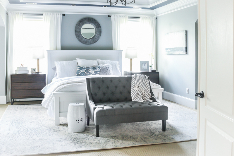
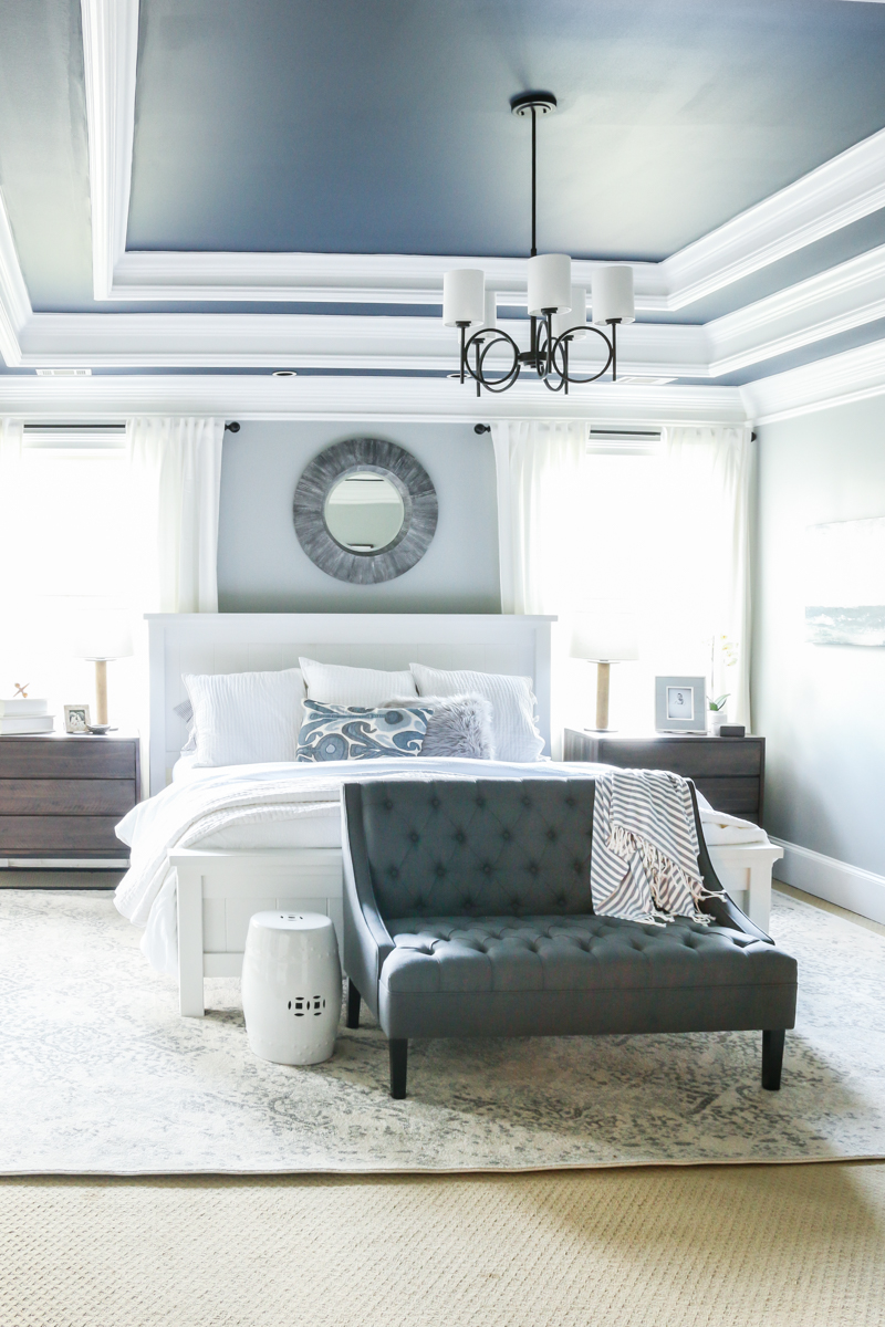
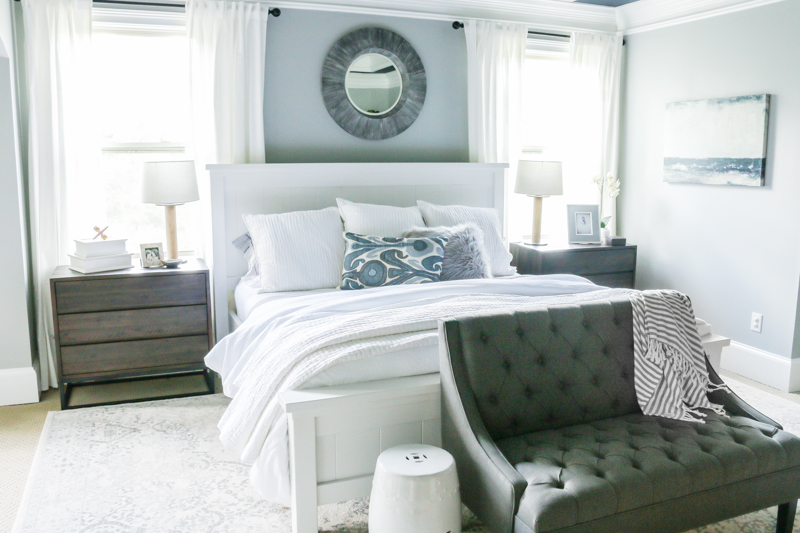
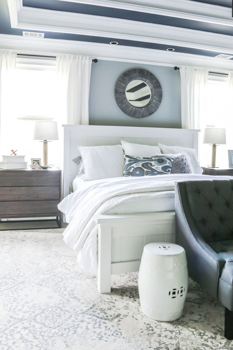
On a very serious note, I am thrilled to share with you the reveal of our bedroom. This space is a long time coming and we could not be happier with it! Here is our master boudoir…..
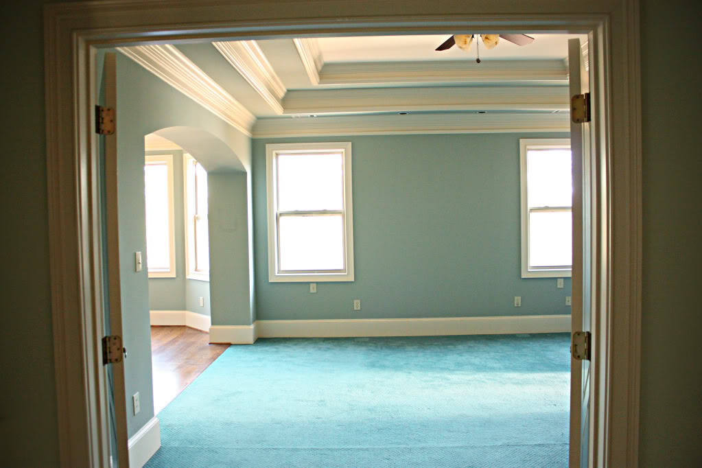
It seriously has come a long way from the green walls and tan trim and teal carpet. Here is the view when we moved in…
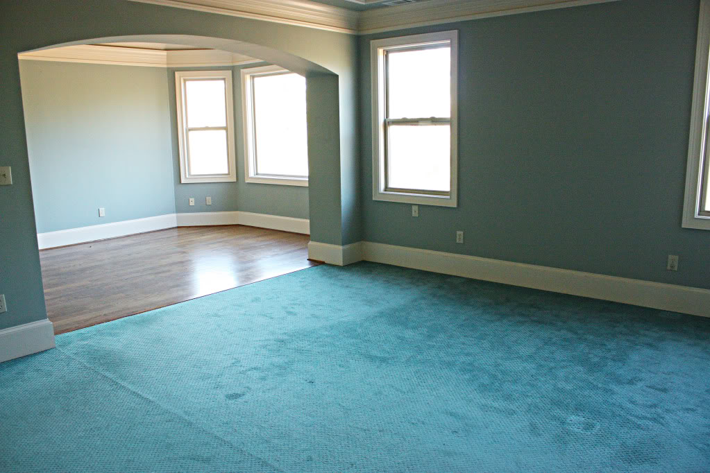
And from another angle….
But now it is so serene and calm and soothing….exactly the way we wanted it! The hardest part about the master bedroom for us is that it has to meet TWO people’s expectations. Jeremy and I both are fairly opinionated when it comes to how spaces look and feel and what functions well. So for us, we knew that we wanted to create an adult space that wasn’t too trendy or too overwhelming. With four rowdy boys, this was the only spot in the house that was OURS. And we had specific needs.
First, we both agreed that we wanted to keep our big kingsized farmhouse style bed. It was Jeremy’s first DIY build and held a very special place in our hearts. It needed a makeover so we were able to give it a more clean and modern look with chalk paint (read that post here). We also realized that this space connected to the sitting room where we binge on tv shows and work on our laptops at night. It was full of grays and blues and whites and greens.
Lastly we wanted to make sure that the style of the room reflected both of us. Jeremy likes more industrial pieces and dark colors….I like lighter colors and lots of texture. We both wanted it to be clean and comfortable. We actually said the words….walking in should feel like exhaling. Exhaling. That thing we used to do before children.
In a practical sense, we knew we needed a full length mirror, a place to sit down to put on shoes and side table storage.
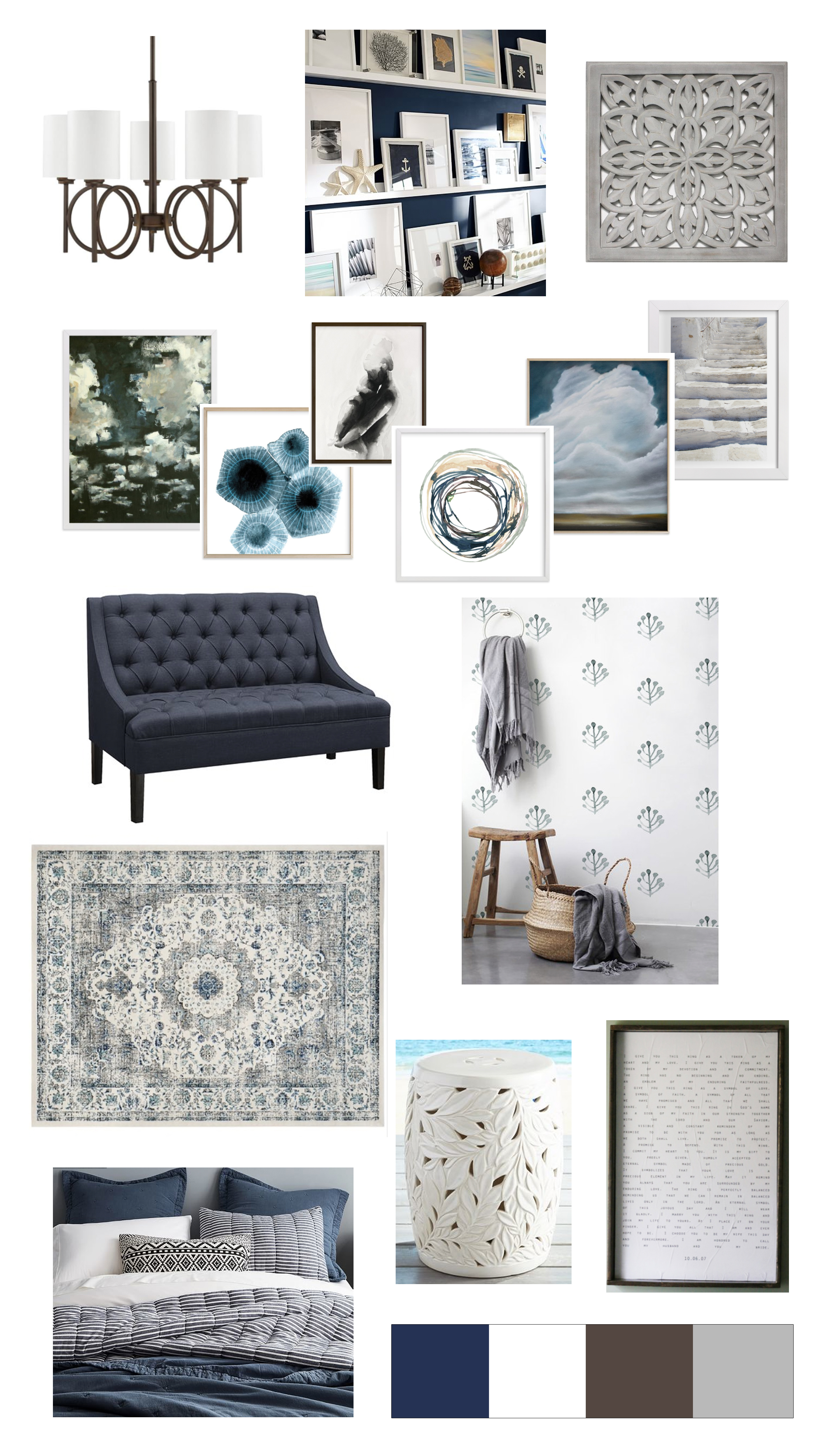
We came up with an original game plan and I can not tell you how helpful it is to make a moodboard. All these pieces show what takes center stage and what ‘plays well with others’ (mom of a preschooler here!). These type boards are super challenging for me to make but I am always so grateful to have them. Here is the link to the moodboard details.
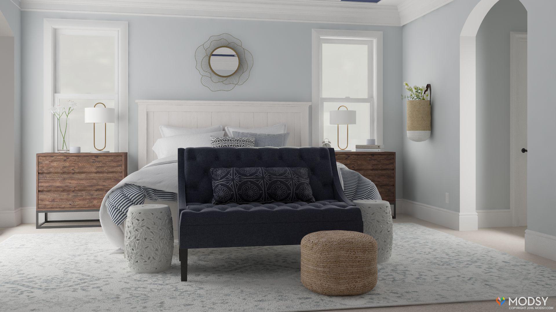
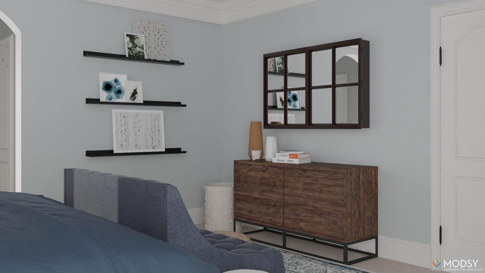
Because I am NOT a designer, one of the biggest surprises of this process was learning about Modsy. It is a company that creates 3D renderings of your space with items you picked out. This was SO helpful. I had already picked out a bunch of stuff for the space and then seeing it in a space (I mean that rendering looks like real life!!!) made me realize what needed to be tweaked, purchased and completely nixed.
I still can’t believe that it’s such an affordable service…and one that helped me realize what to do with this corner of the bedroom. Click here to read that post and hear more about this website (there is a code if you wanna try it out!).
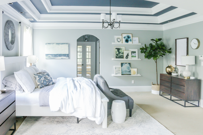
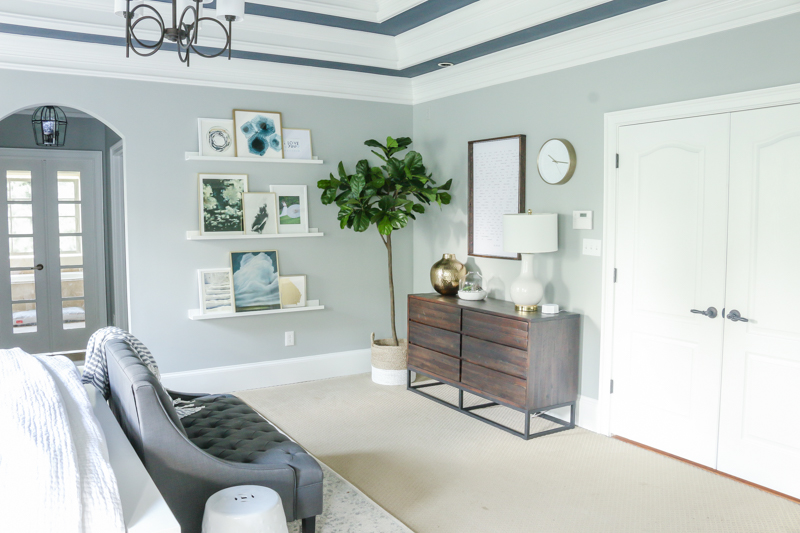
So in our space, we brought in a bunch of new stuff to better fit our bigger room. Our last master was fairly standard sized and this one is definitely roomier with a different layout…so new nightstands and a matching dresser and a bench were major players.
The rug we needed was also pretty huge…an 11×14. And yes, that is the biggest rug I have bought to date 
Another silent ninja in this space is our new mattress. Investing in comfort has literally never been sweeter! We got a new SleepNumber mattress and adjustable base (it can move the head up and down and is like a Fitbit for your sleep!) and my only regret is not doing it sooner! I could have been so much more comfortable for years! Click here to read about more details on that.
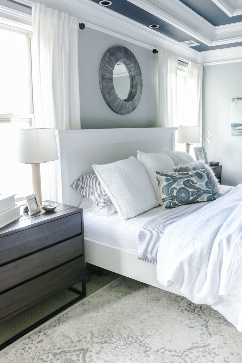
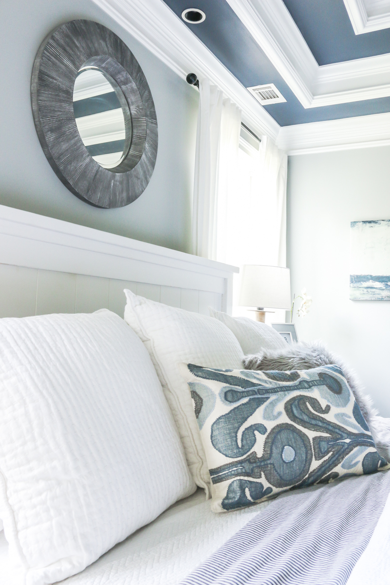
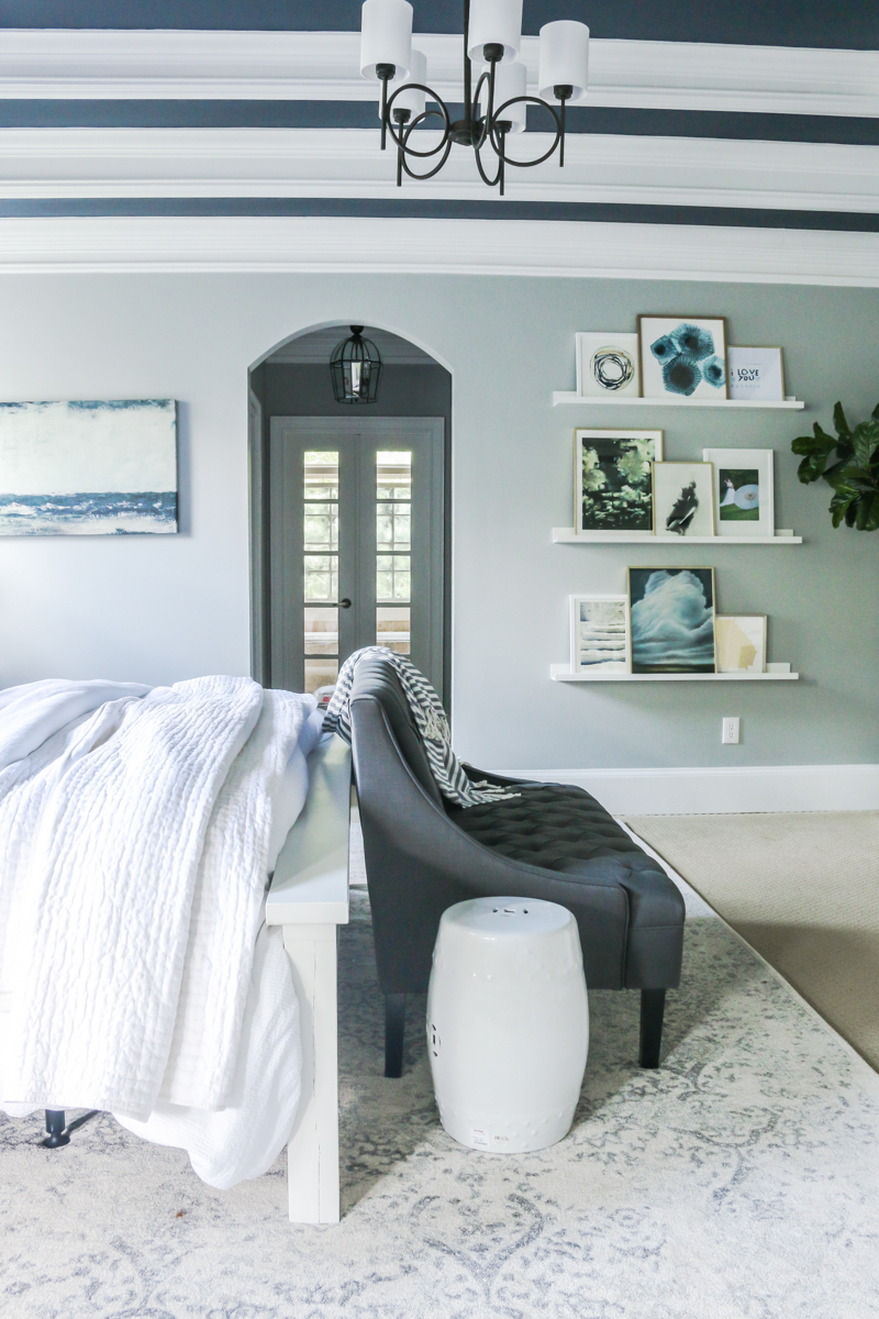
We added to our existing bedding with more white euro shams and duvets and I was able to score a mirror at Goodwill to go over the bed…yes, it needed a makeover but now it is like the star of the show….having the texture I love and the dark gray that Jeremy wished for. Plus it’s the perfect size….scale is everything in big rooms.
Can you see the texture on the mirror from this photo? It’s kinda like the love child of wood and wire. And speaking of texture – our side tables have LOTS. They are actually small dressers but add the storage that we desperately needed and I think are simple industrial pieces that don’t look too rough.
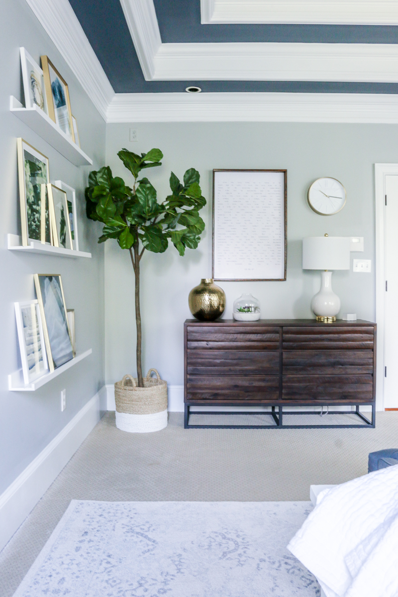
The matching dresser is on the other side of the room next to the double doors.
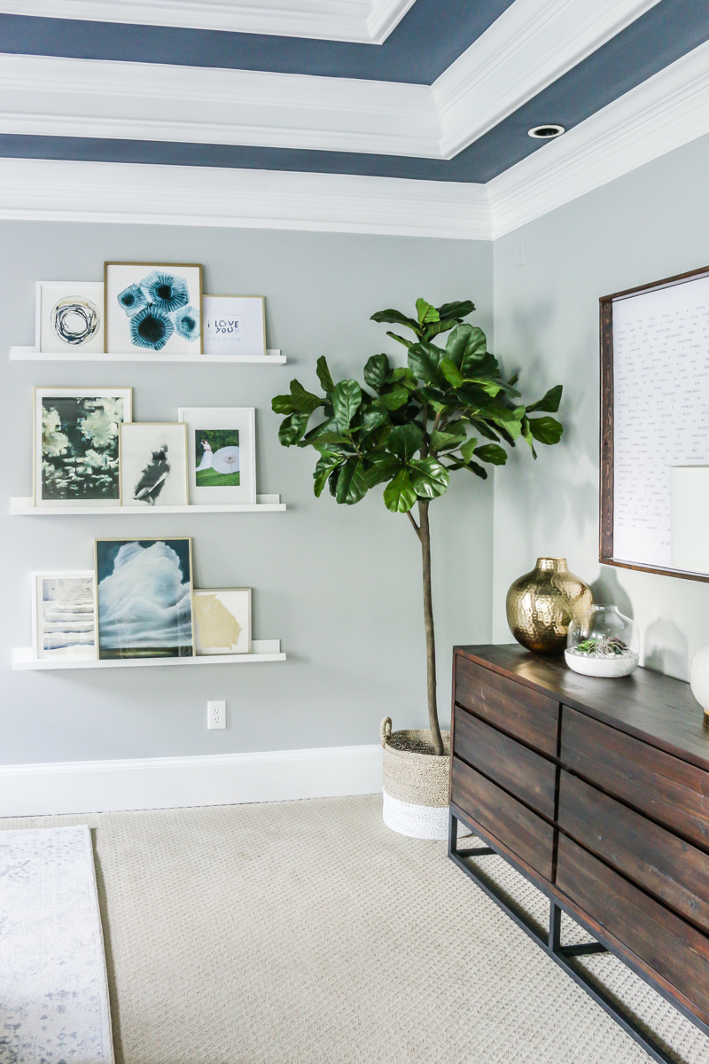
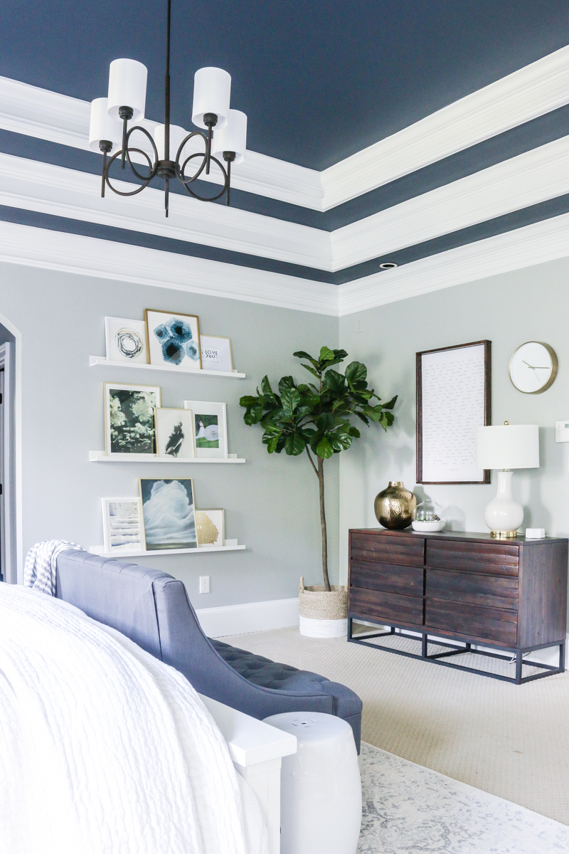
We flanked it with floating shelves and a gallery of artwork and photos that we LOVE. Putting together pieces of artwork is really hard sometimes, right!? I like to say that if you love all the pieces, then just go for it and tie them together with frames. That’s what we did….I loved all these different works of art from Minted and made them work with gold and white frames. If you wanna read about what each piece means to me, click on this post.
I filled the corner with a faux fiddle leaf fig and I can’t tell you how much stress has been lifted from NOT adding another plant to my life. I know that sounds ridiculous but I am terrible at house plants! I keep killing them! This one was the perfect size and looks so real and was a great price for the height!
I also love how it balances out the height of our vow art. It is what that small print word art is over the dresser. Those are our wedding vows that Jeremy and I recited to each other. You can read about that project here.
I gave a mini tour of this space on Insta-Stories and shared some of the little things I would love to change down the road – like frosting the doors from the closet hall to the bathroom….and making a bed skirt. #details But in general, I’m so happy to call this space done. It FEELS done and I don’t look around wishing things were different. Also – there is no way for me to get my 8month pregnant butt on the ground to do a bedskirt. Let’s be reasonable
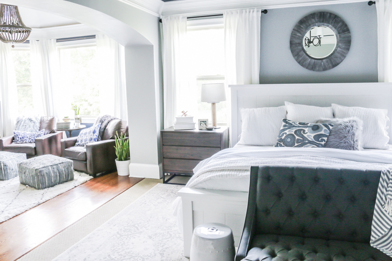
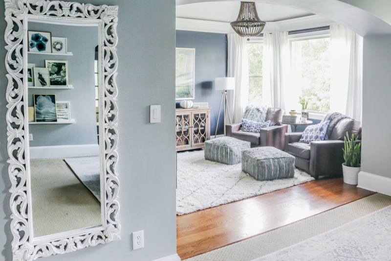
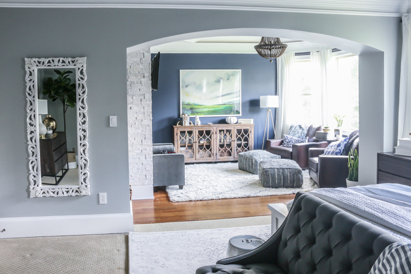
The other side of the room has a big arched opening to the sitting area. There was only a tiny bit of wall left and we decided that it was the best home for a full length mirror.
Look at all that texture! The carved wood, the beaded chandelier, the shag rug, the tufted bench, the pick-stitch of the quilt, metallic threading in the leather poufs and the shine off that garden stool. This is my style….LOTS of texture. ALL the texture.
And with that, I have officially met my goal of being prepared for baby girl bower! This room was the only thing on my list and it feels so good to have that DONE. Of course, now I have to buy girl clothes….but the bedroom was so much more important
If you are looking for a paint color – the ceiling and the sitting room are both Benjamin Moore Hale Navy. The walls in the bedroom are Metropolitan by Benjamin Moore. The bed is Linen White chalk paint by Rust-Oleum.
All of the items are linked here – click on any of the photos to shop or just see more details…
What program do you use to make your mood boards? Your master bedrooms looks awesome!
You turned me onto Benjamin Moore metropolitan when you used it in your kitchen! I used it on my kitchen last year and then was super intrigued by the entire affinity collection and used coastline for my son’s nursery this spring!
Katie, it turned out beautiful. I have always thought a rug in our bedroom would add warmth but we have carpet so I am glad to see you did it anyway. We need a headboard so I am on the hunt and now I want to dash off and grab a fake plant. I can’t keep the real ones alive! I also need to just get some art to add to our space. I am SO indecisive! xoxo ERIN
All that space – true luxury! And I love the little settee at the end of the bed – great place to put on your boots.
I bought that rug for our master bedroom after you posted about it awhile ago. And I love it!
I love it! It’s tough to get the right color of baby blue on the walls without it looking dated and I think you hit the nail on the head with this one.
Can you link to the fiddle leaf fig? I’ve killed both of ours and am weary about buying a faux one sight unseen, but would totally pull the trigger if this one has your thumbs up!
So relaxing and calm. Love the way this turned out.
I love this color scheme and re-do. I recently bought a bedskirt on Amazon which is so awesome I would never consider making one again. It is full fabric (none of that mesh on the flat side) and nice quality. https://www.amazon.com/gp/product/B018FXGZBQ/ref=oh_aui_detailpage_o00_s01?ie=UTF8&th=1
I LOVE your bedroom – the colors, style & textures all speak to me. Great job! I would love to see a post about how you layer your bedding. That’s a design skill I haven’t mastered. My bed typically just has a duvet with some throw pillows, but I love the look of a layered bed. I’d love to understand what different pieces you incorporate that all go together without feeling like you have 52 blankets on you when you sleep.
So beautiful and relaxing, I really like the combination of texture and industrial, exactly the feel I’d like to have in my home. I am so excited for you to welcome your new baby girl!
Is there going to be a nursery for baby girl or is she rooming with the other kids?
Gorgeous!!
The guest room will be turned into her room after she is done bunking with us
xo – kb
That’s my problem too – I kill everything
The tree is linked at the bottom of the post – just click on the photo of the tree in that little photo scrolly thing.
xo – kb
It’s made in Photoshop
xo – kb
I’m in the process of painting our master bath Hale Navy. LOVE the color. Definitely is darker in our bathroom than how it appears in larger rooms but man I love it.
Simply stunning!
I love all of the blues and light! Where is the full length mirror from? This boy mom needs some girl space in her house.
As a Brit, I have to ask – what on earth is the purpose of a bed skirt? This bed arrangement looks complete to my eyes, and the addition of ruffles or any other fabric below the existing bedding would over-frill this look to my mind.
PicMonkey is a similar, free, online, easy to use tool for those without Photoshop!
Oh Katie- I am obsessed with the palette of this room! The ceiling is a game changer. Inspires me to get going on getting my nightstands in shape!
The mirror is from HomeGoods…I’ll keep my eyes peeled for an online version!
xo – kb
It’s just simply to hide whatever you have beneath the bed or to hide the bed frame. Ours is more to hide those supports.
xo – kb
I painted my master bed and bath Hale Navy about 3 years ago and I still love it. Congratulations on getting it completed before baby girl arrives!
I love the hanging basket with flowers on the wall that’s in the Modsy photo, do you know where I can purchase?
Thanks
Here you go!
xo – kb