Disclaimer – This is a sponsored post brought to you by Modsy. All opinions are 100% my own.
YOU GUYS.
You are literally gonna choke when you see today’s post. I hired a designer. AN INTERIOR DESIGNER. for under $70.
Yes, you read that correctly. And it’s a complete game changer.
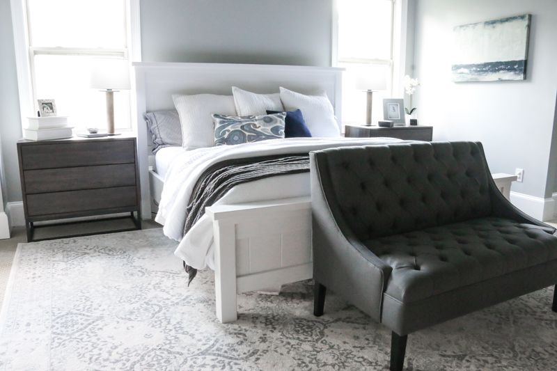
This is my room right this very minute….
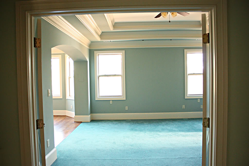
And this is what it used to be…
I had an idea of what I wanted. I had a whole BOARD of ideas. But let’s just be perfectly honest….I am not an interior designer….I second guess every single decision I make every day….right now I am questioning whether or not it was smart to even admit that online. But the point is….I am like 99% of you. I have no idea what I’m doing when it comes to design. Not really. I mean sometimes I look at something and think…yup love it. And then other times I come back and think WHATTHEHECKWASITHINKING!? I can name half a dozen design related decisions right now that were utter disasters. And I totally put them on the internet thinking they were good.
So when it came to our master bedroom, I knew that I wanted it to be right. I spend a fair amount of time in there….quality time….relaxing detox away from the kids time. It needed to give off just the right vibe. I wanted it to be soothing and comfortable and reflect both Jeremy and me.
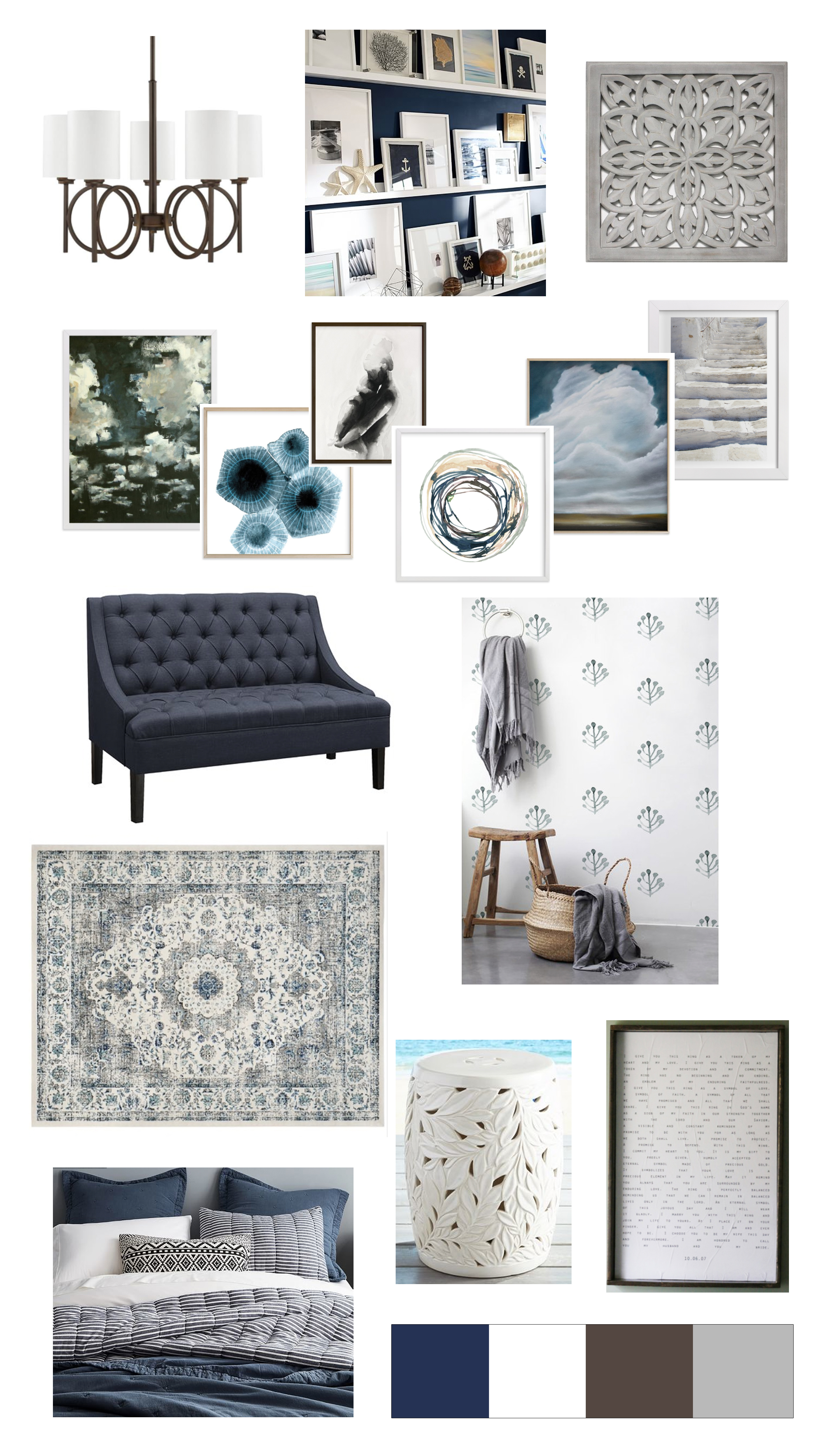
So I had created that moodboard. I picked out the items thinking of each wall, and each layer and each texture and was expecting GREATNESS. And then I found out about Modsy from my BFF. She told me all the details and I was thinking…no freaking way. That’s too good to be true. Modsy is basically a 3D visual aid website for interiors….they build out your space in a 3D picture so that you can see exactly what it looks like. And for me, that is invaluable – especially since I am the one convincing Jeremy to invest in things! He needs pictures!
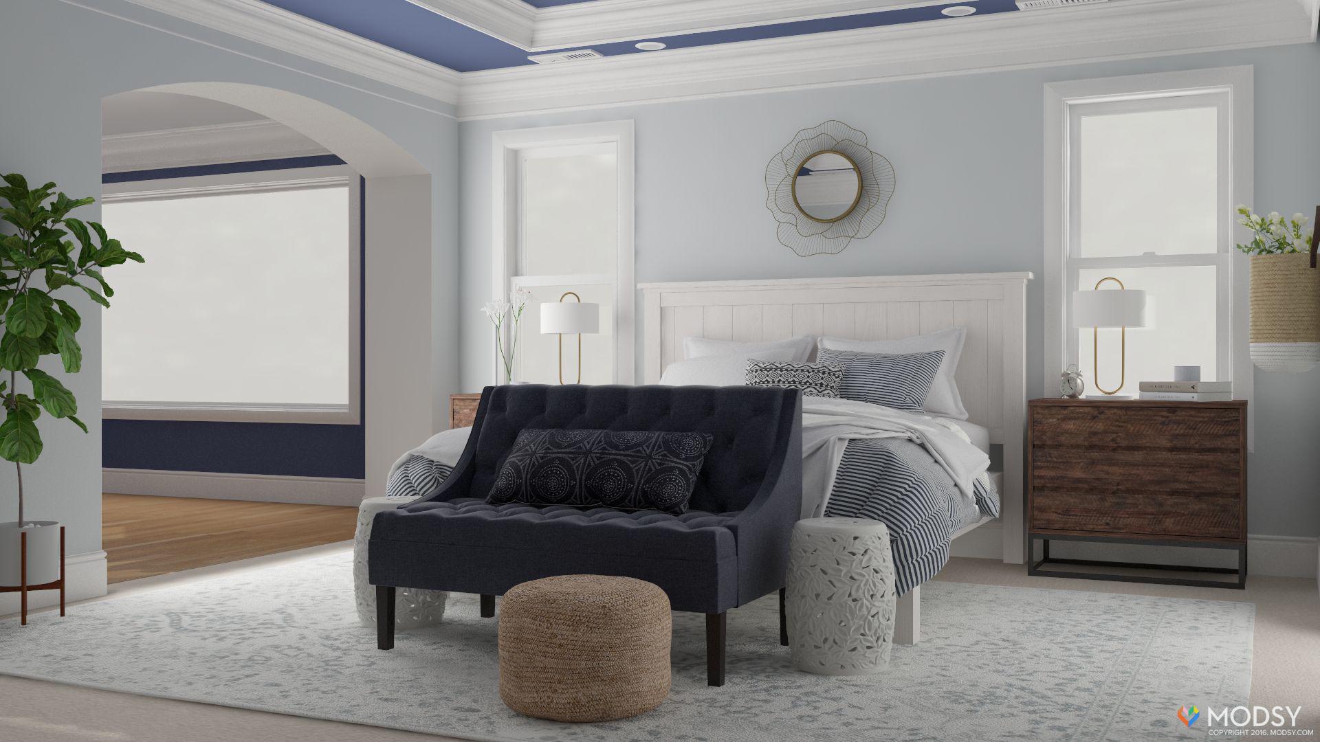
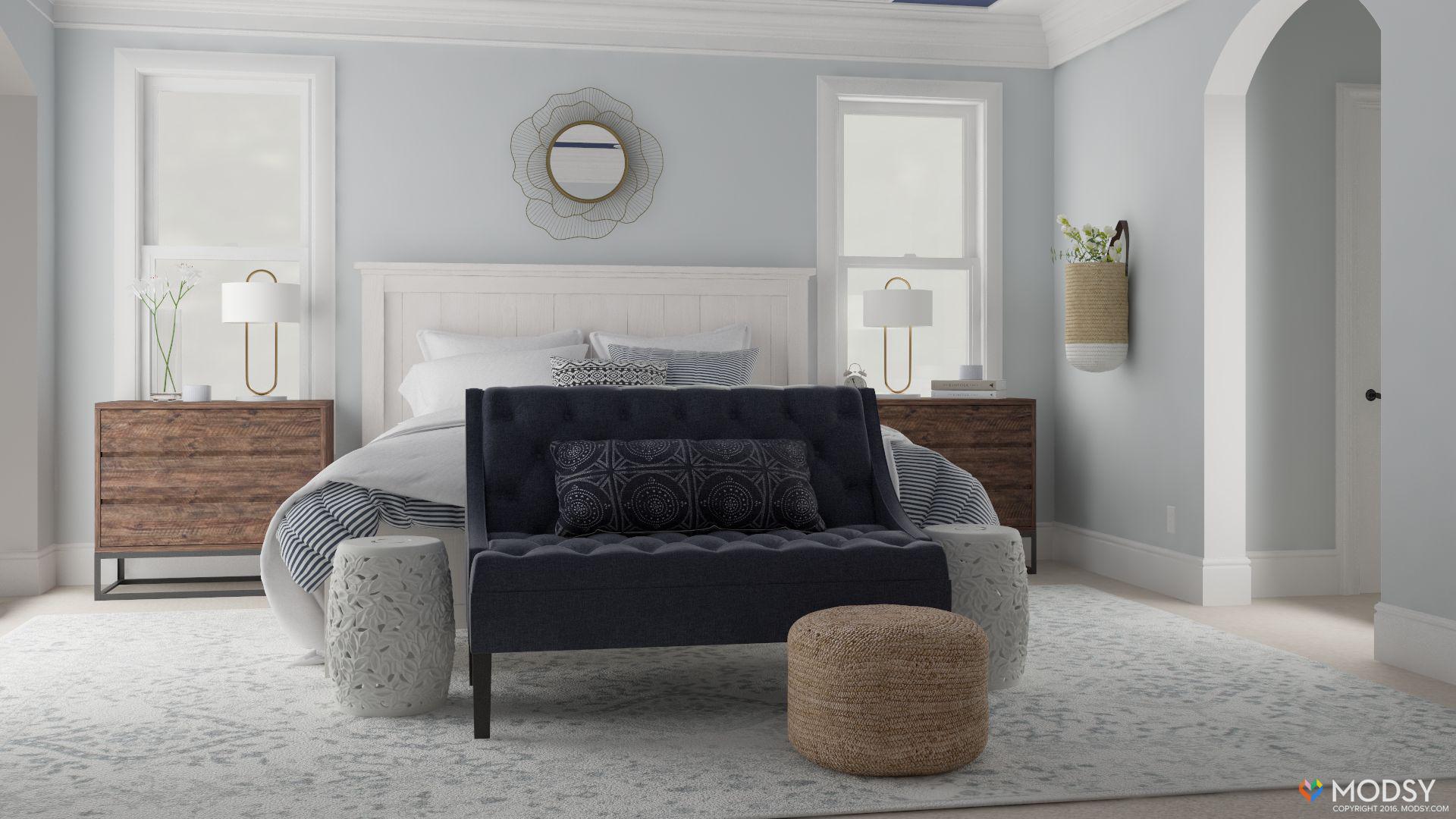
I sent over my moodboard and a couple measurements and a few other ideas and got back this….
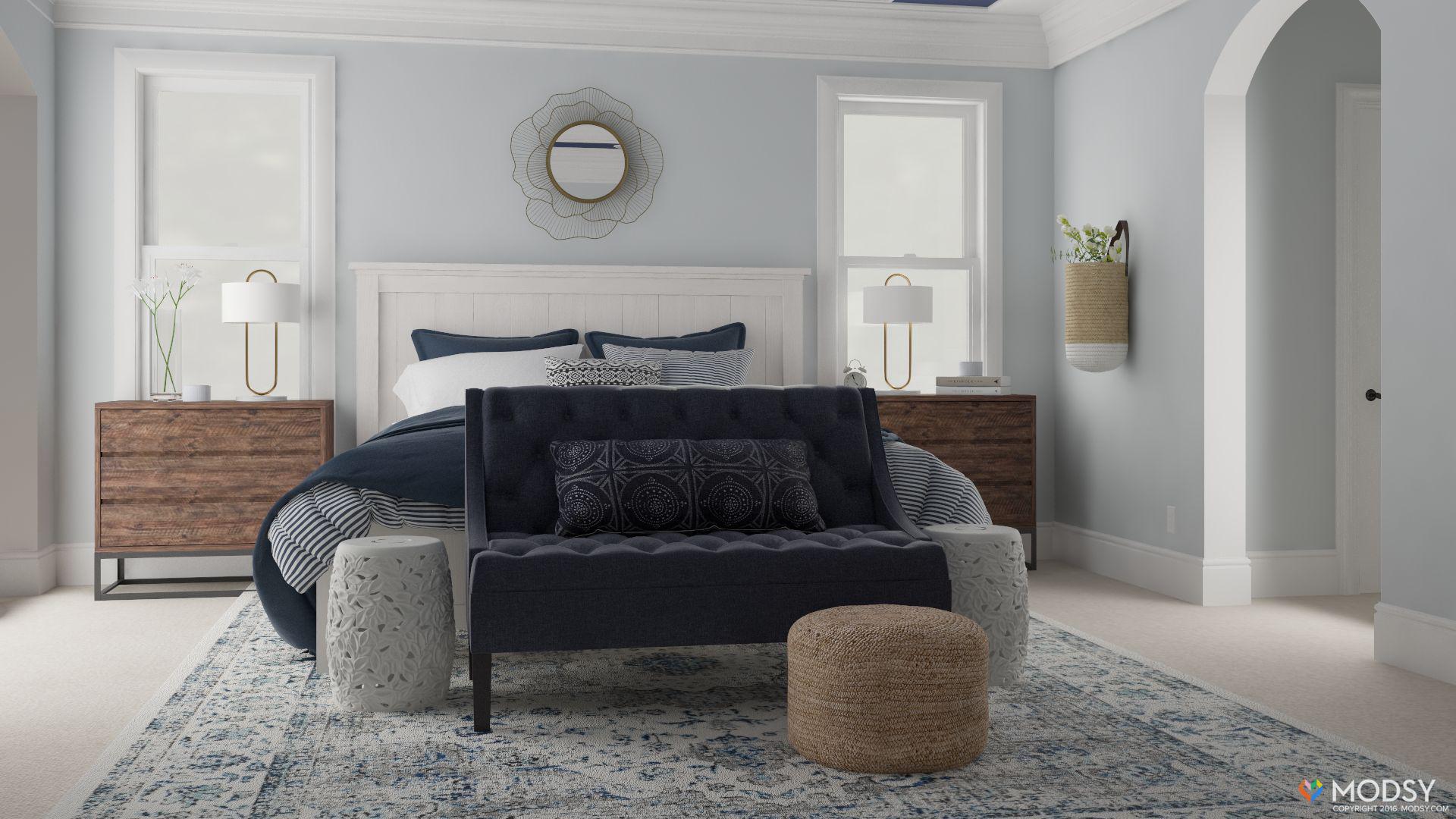
GUYS THAT IS JUST A RENDERING. THAT IS NOT ACTUALLY MY ROOM.
(and yes, I am yelling at you because this is BIG news. It looks so real.)
So the items I sent over….everything down to the bed that Jeremy BUILT….they were able to recreate it in a 3D format and show me exactly how it would look together. I was blown away.
After I recovered from the shock and awe, I realized that Modsy showed me some vital errors in my planning process. Here are some of the things that I learned….
- I didn’t like the bedding I chose with the settee. It was dark gray on a dark navy and looked too heavy to me. Thank goodness I had not ordered the bedding yet! Modsy saved me a huge mistake there.
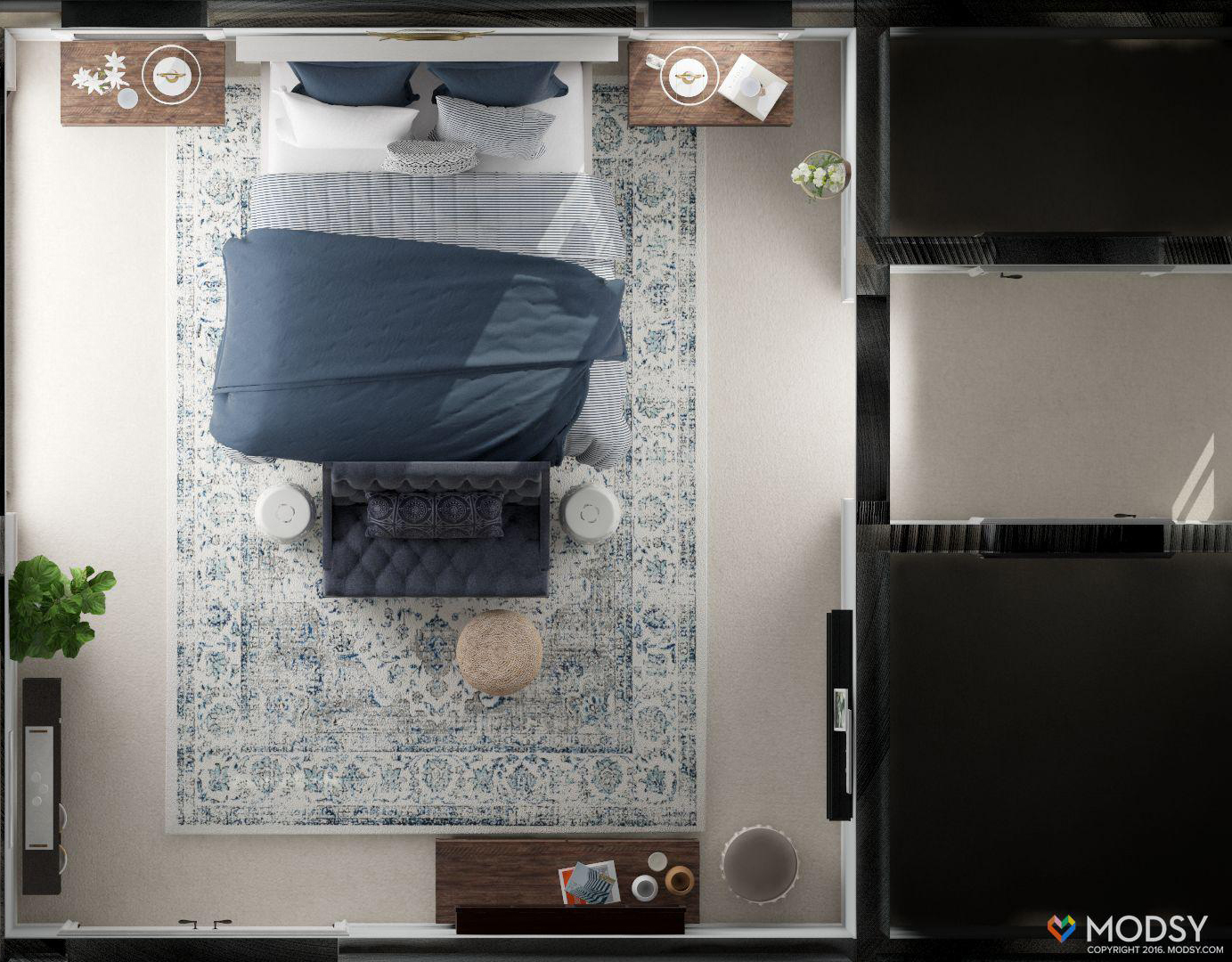
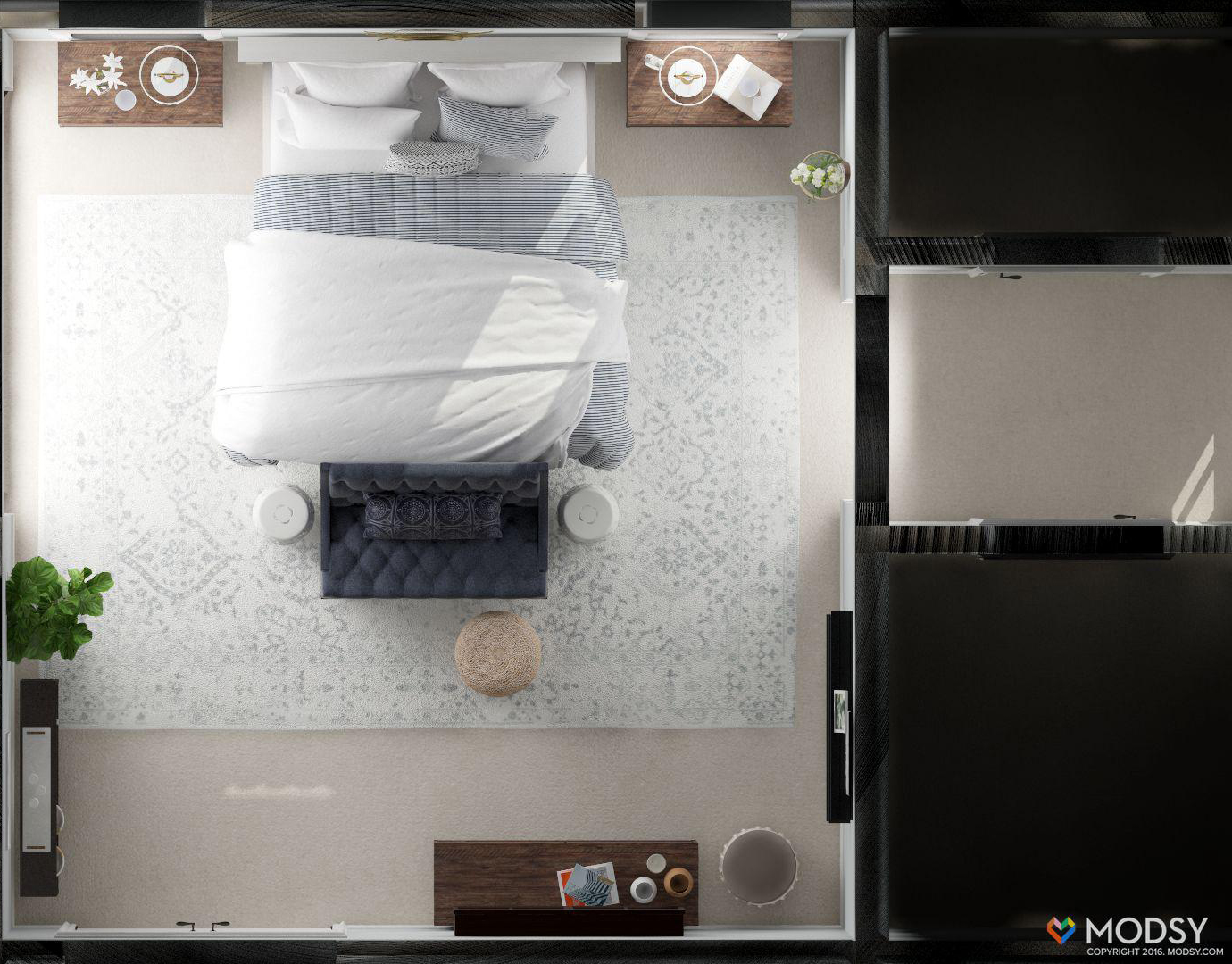
2. I didn’t like the rug underneath the side tables where it was visible under the metal base. Since the side tables were one of the things Jeremy LOVED, I needed a bigger rug or to orient it differently. I also was glad that I didn’t order the rug yet because I didn’t love the blue in the rug as much as I thought I would. Crisis averted!
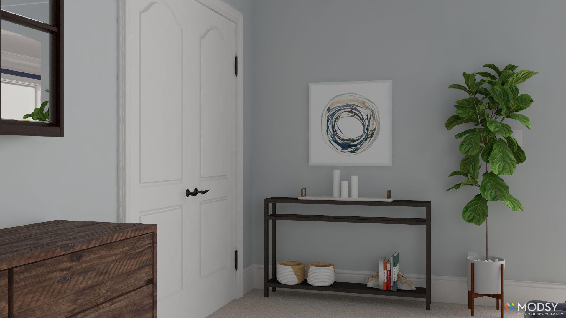
3. Behind the door, I asked to see a console table or a small desk. I hated it. There used to be a tall dresser there….and I realized very quickly that the narrow space just felt too cluttered and I needed more breathing room there. The rendering rescued that wall completely.
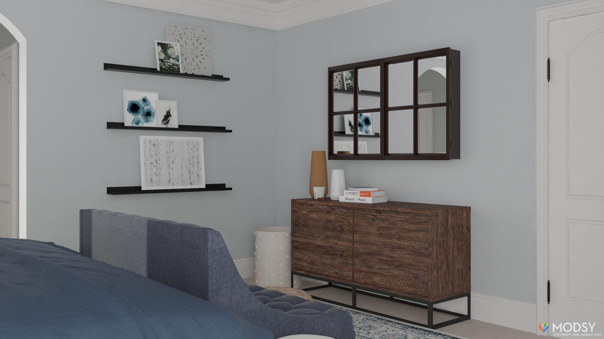
4. Across from the bed, we were placing a dresser and on an adjoining wall planned for picture ledges. This absolutely sold me on the picture ledges and made me realize that we need something big over the dresser….either a mirror or a tv cabinet or something that visually takes up space.
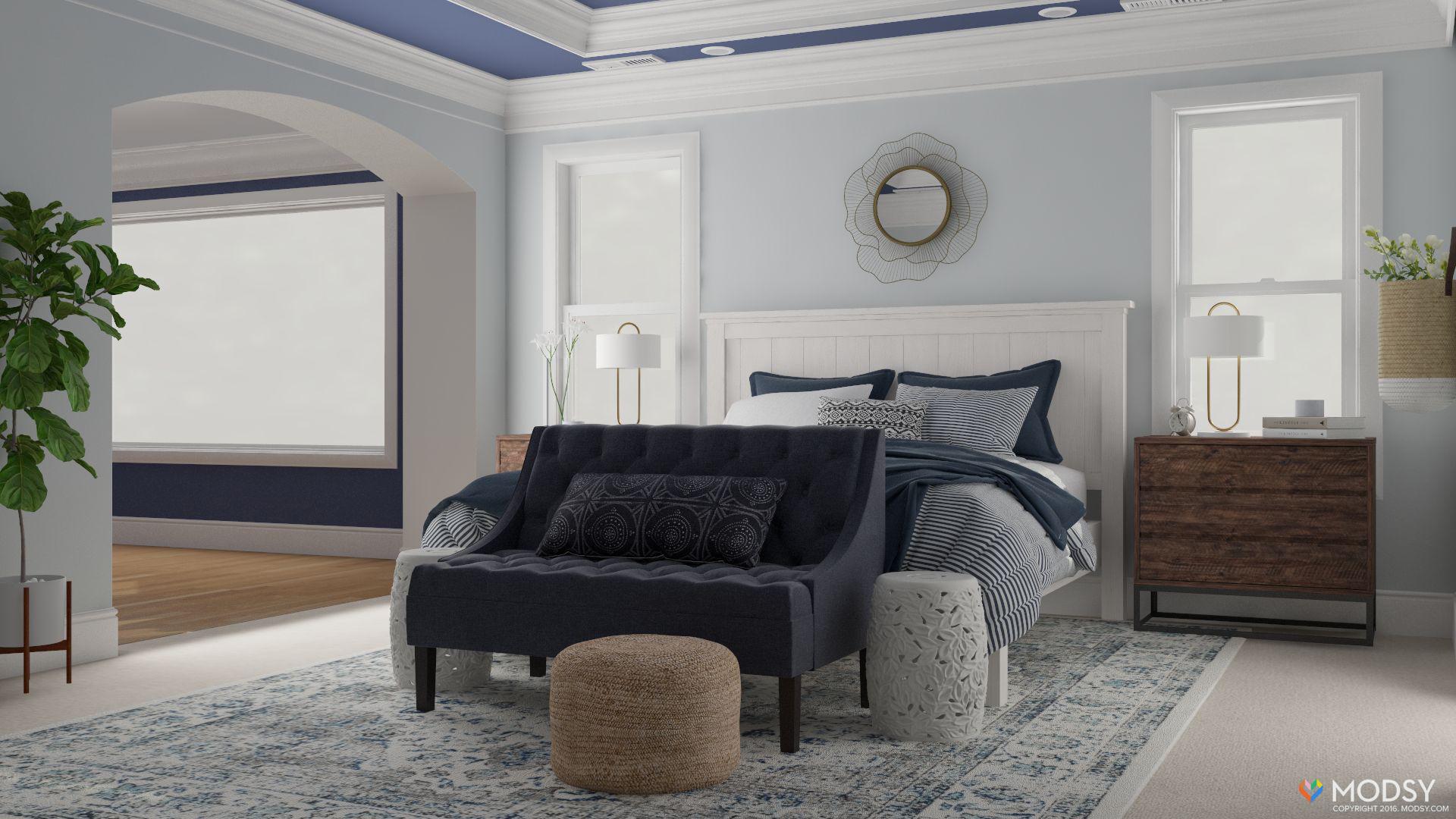
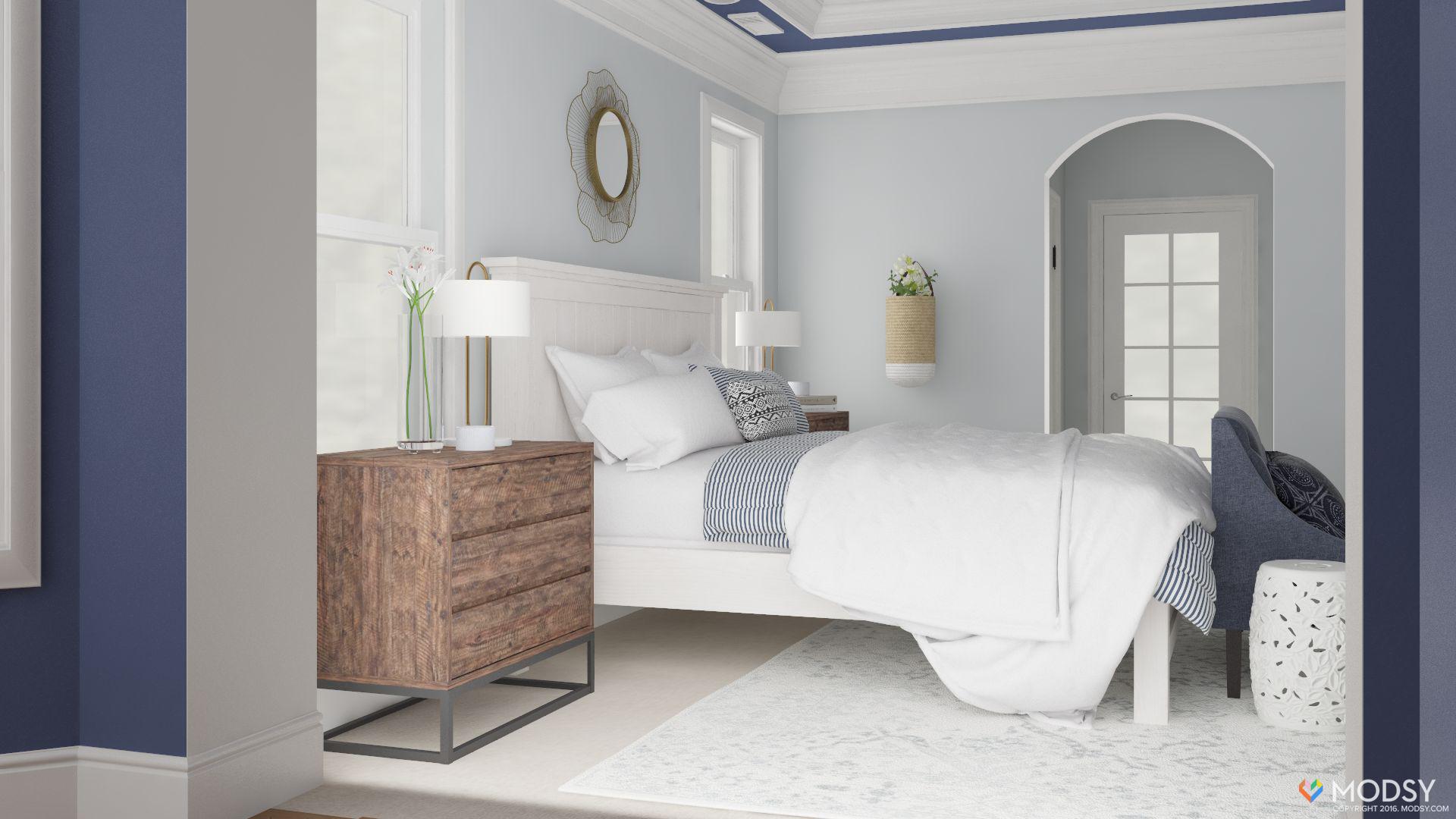
So I made some notes….deciding that I would like to see the room with lighter bedding and a different rug and this is what I got back…
Looks so much better right!? The biggest decision for me here was the rug. I mean…rugs are expensive to buy and ship and even expensive to return. I really wanted to get the right one the first time. I also had the rug oriented differently. Turning it sideways was decision to make the side tables look a little more included in the plan.
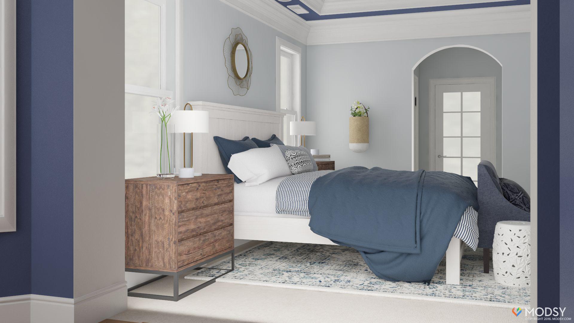
And here is what it looked like from another angle. You can see where the rug now extends all the way to the edge of the side table. After seeing these pictures, I was sold on the different rug….and the white bedding. I immediately ordered both…feeling a little bit cocky. I mean…I had renderings. It was gonna look awesome.
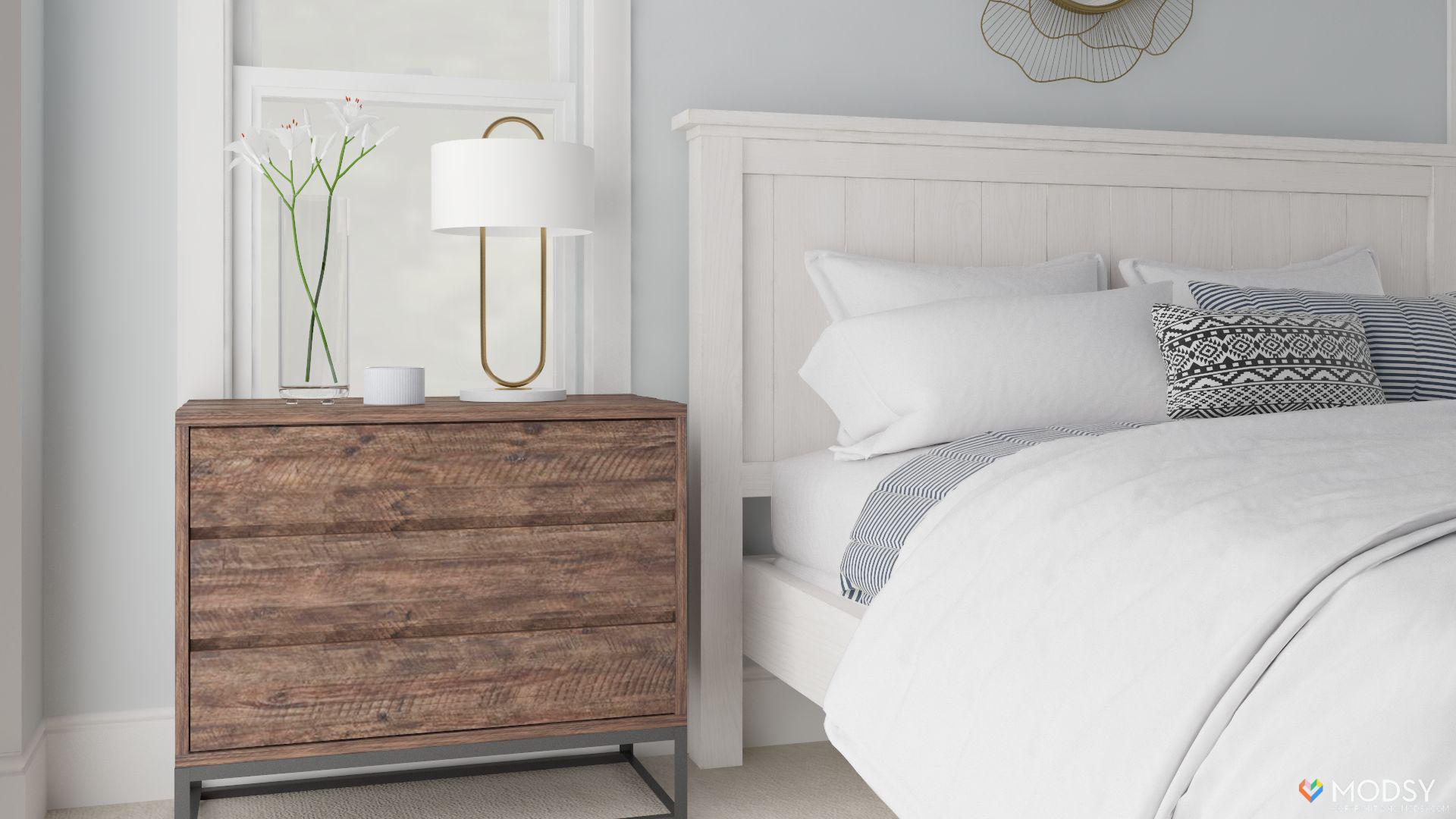
Now I want to show you something….this is the rendering…
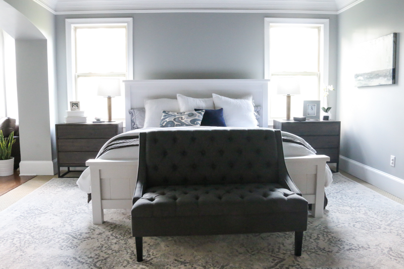
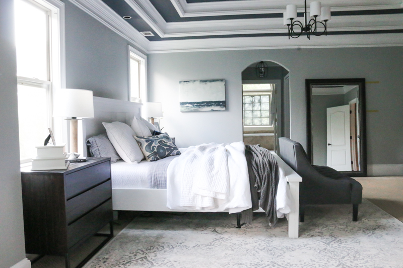
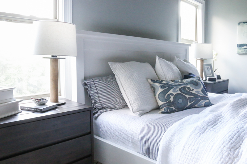
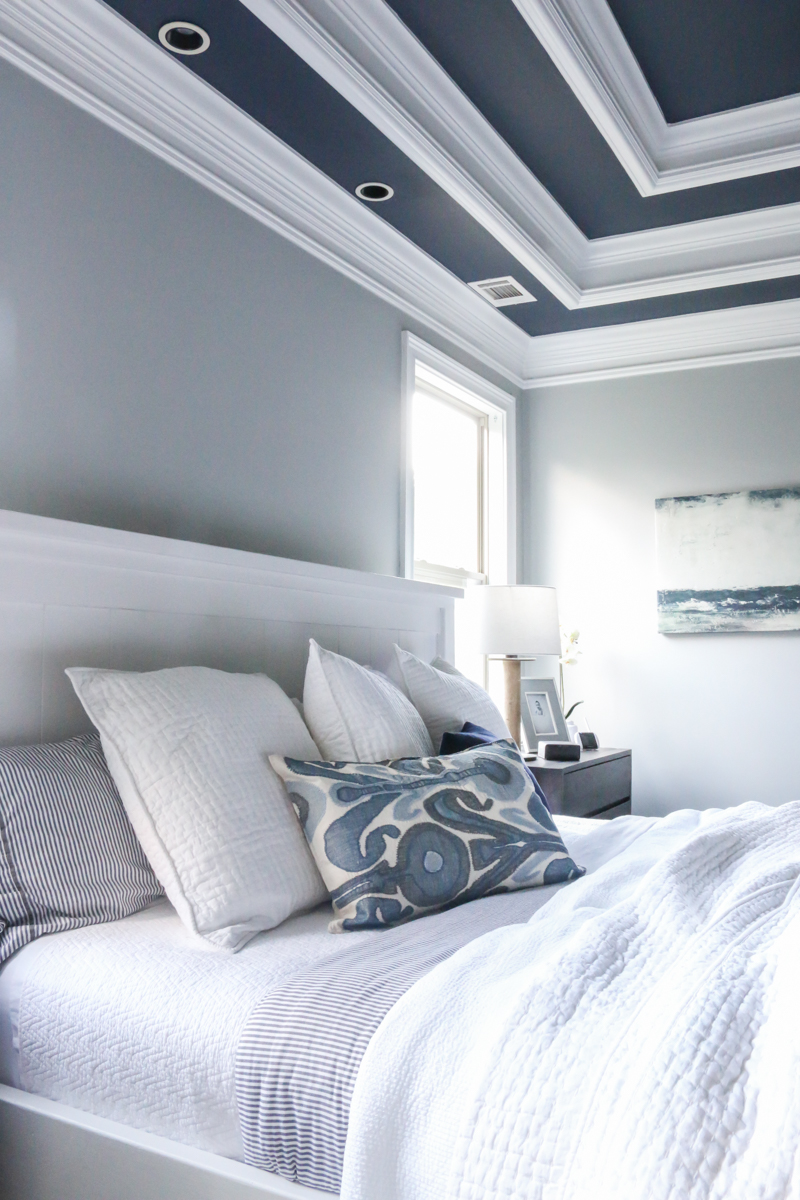
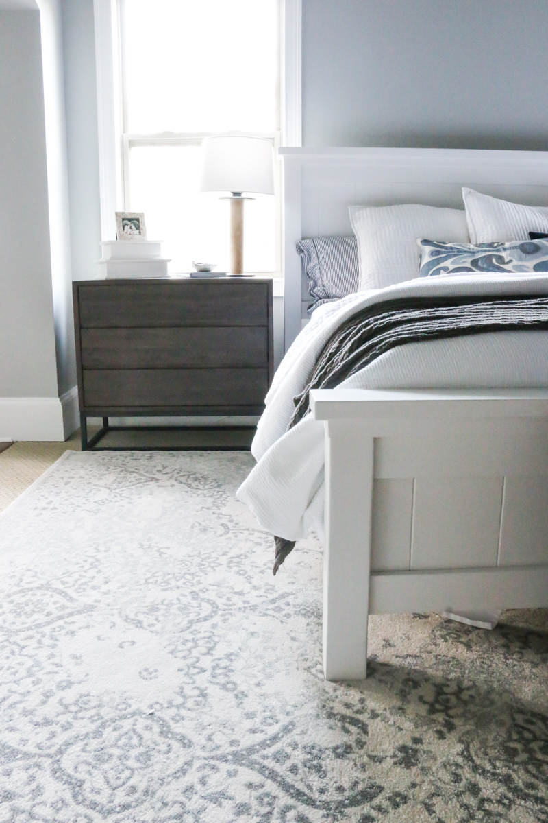
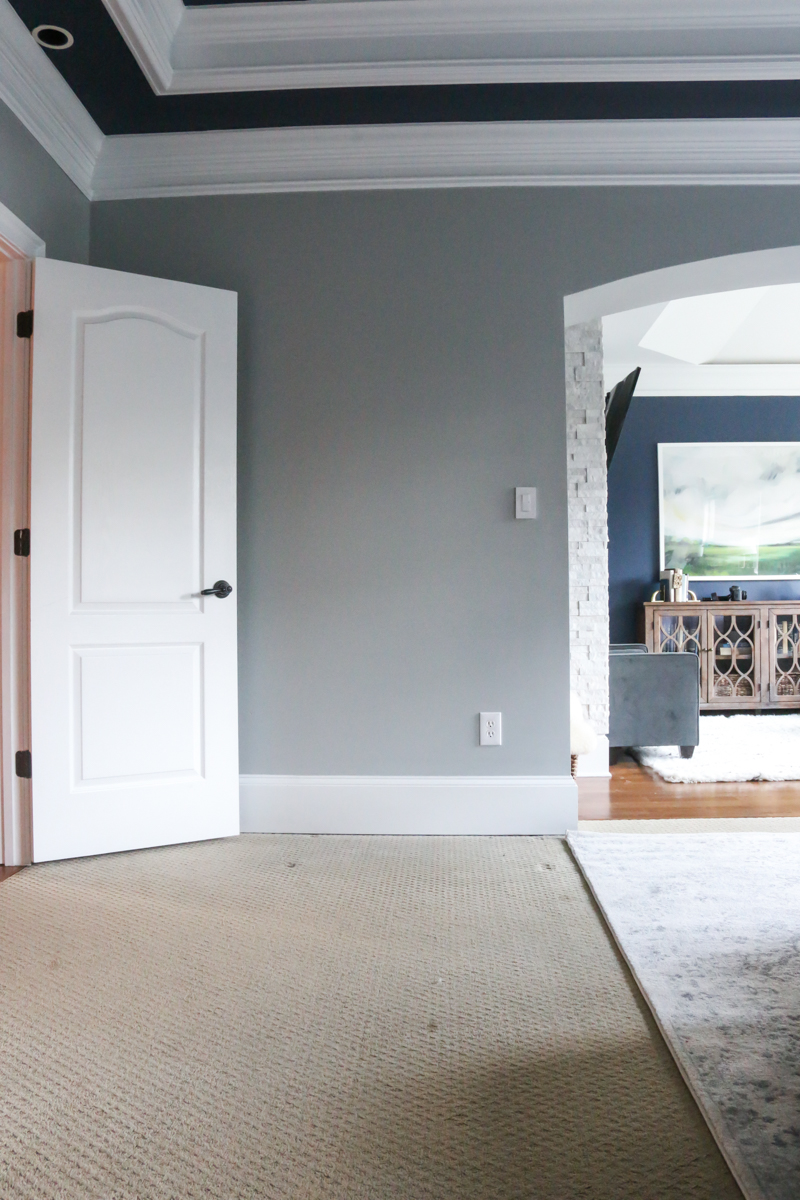
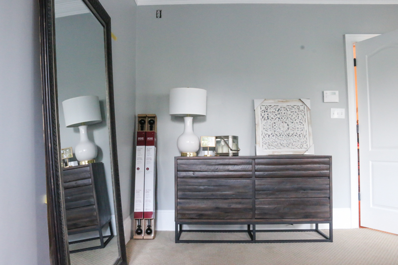
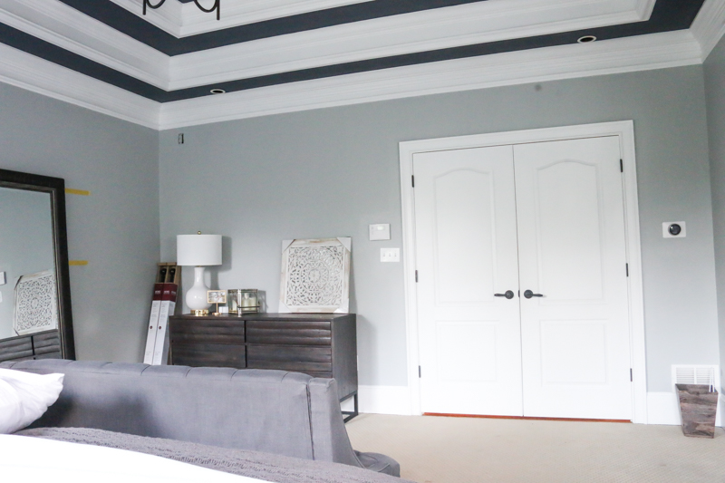
And this is the real life space…
This is the rendering….
and real life….
Rendering….
Real life….
It’s blowing my mind how real they look. But that isn’t why I think Modsy is awesome. I mean…yes, it is legit Ellen Degeneres awesome that they give you renderings…but at the end of the day, that’s not why you should use them. It comes down to two things….
Money and Time. Two things we all are grasping to hold onto.
SO when it comes to MONEY, this service costs under $70. WAY cheaper than hiring a designer. And can save you money from bad purchase decisions and return costs. If I had bought the rug and bedding and console table for my original moodboard, I would have had to pay $50 to return the rug and ship it back (not to mention the hassle of bundling a rug back up, sitting on the phone with the return department, arrange pick up and moving it back downstairs), and the cost to drive the bedding and console back to the store would have been at least $20….so right there I saved my entire Modsy fee.
It also saves us TIME. Putting a room together takes SO much time. You search websites sourcing items. You put together moodboards. You go to stores hoping things work well. You literally spend HOURS pulling things in and hoping they layer correctly and give off the vibe that screams YOU. And sometimes they just don’t. My brain is like a fidget spinner with finishing a space….am I doing this right? will I love it on the wall as much as I love it in the store? will I buy something too small or too big? Having a picture with things sized in the space and can be easily switched out with other items….that saves HOURS.
And the best part is the confidence. Knowing how it all pulls together.
I look at this space now….even though it’s not 100% done and feel so passionate about it. I feel so confident that it is becoming exactly what I wanted.
I know I sound like a sales person for Modsy….but I literally can not help it….I’m so excited to have this service available. It makes me feel like maybe my rooms have a chance!
Okay okay. So let’s get back to the room updates. We got our side tables and settee and literally unrolled this bedding minutes before this photo. I painted the bed a couple weeks ago because I knew that the rug decision would be made by now….more on that soon.
So the things to do still in this space…..the curtains. And something over the bed.
I love the round item in the renderings and also that wall flower basket so it’s probably gonna be something like that.
Remember that wall with the console that I decided I hated…..yeah. No console there. No desk either. I think it’s a good spot for a full length mirror.
And then there is this bad boy. This corner across the bed is gonna get the picture ledges….which I have to build or make an ikea run. Over the dresser, we are still deciding. I told Jeremy that it would be cool to get something big like in the renderings but he thinks it’s weird to have a tv when he really wants a projector (yes I said that out loud…the man wants a humongous projector).
I even think a big round mirror or giant oversized clock would work.
BUT PROGRESS!!! So that’s the great news! And I’d love to hear what you think about Modsy. Are you as excited about it as I am? I am super excited to continue working with the service as I finish up the room….I think it will help soooo much!
And just for clarification….Modsy is $69 for a 3D model of your space, 360 degree room visualization, 2 custom designs based on your style and goals, unlimited design revisions, and all the direct links to the merchandise. AND we have a special discount code just for you! Use BOWER20 for 20% a Modsy Design Package (includes our $69 and $199 options) CLICK HERE TO TRY IT OUT. And please please please tell your friends about this…it’s gonna be such a game changer! And if nothing else…take their style quiz….it might teach you a thing or two about yourself!
p.s. I know there will be lots of questions about items – the wall color is Metropolitan by Benjamin Moore. The ceiling color is Hale Navy by Benjamin Moore. The rest of the items are linked here….side tables, dresser, settee, bedding, rug, ikat pillow.

Love the room. A round mirror over the dresser would be nice. It would add visual interest since there are lots of lines in the room. Modsy sounds great. I will have to check them out.
What a neat concept! I think moving the ledges to over the dresser would be a good idea. Simplify that corner a little and gives you something to put in that dresser spot. Also, would you put a projector TV in the bedroom area when you already have one in the sitting room area? That seems like overkill. I think the settee is too tall and couch-like for the end of the bed. A low, backless tufted upholstered bench would look good there if you can find another spot in the house for the settee?
Loving where this is going. My only piece of (unsolicited) advice would be to pull the rug forward a bit. In the renderings it’s at least a foot in front of the nightstands and I think it gives them better breathing room. It also keeps the rug from lining up so perfectly with the corner of the entrance into your sitting room. Just my two cents! Cannot wait to see the final result.
i found out about modsy through Cyrus vs. Cyrus on Bravo (which I am surprisingly v. into!)
So you went in to this knowing what you’d like to put in there. For example, if I sent them my kitchen and the one thing I want, can they help with the rest? Like what color to paint the walls? cabinets? etc? I’m struggling to decide if I want neutral walls and a color backsplash or color walls and a neutral backsplash while factoring in my current granite….I was just going to get samples of both. But let’s say I am redoing my living room and have an idea about what I want but not sure where to find it. You might have just sold me on this service.
HOLLY COW that rug is an AMAZING price!
Love the colors…. so soothing. Very pretty.
Yes exactly…I decided that I would do this in at least two rooms first…ya know…as a test. One room with the moodboard in mind (my master bedroom) and the other without picking anything but chairs (it was the living room). And they totally can change the rest.
xo – kb
I thought the same exact thing! I haven’t told Jeremy yet…which is gonna be really fun
xo – kb
I don’t actually think I can fit as many pictures and I really want to do art and my photos…so that is why I wanted to put it on the bigger wall. And I didn’t want to do a bench since there was a bench in the adjoining sitting room…like literally eight feet away. In real life it looks just great.
xo – kb
The room is really pretty. I rarely comment, so I feel bad about this, but I think you need a different little sofa. Something with a lower back and maybe even a little curve to it to offset all the straight lines in the room.
A possibility: the Harlow loveseat from Pottery Barn. Thanks for posting your rooms. They really are fun and inspiring.
Totally agree with you about the settee, Christine!
Are you going to share the living room?
What do you think of the rug on top of the carpet? My husband and I are buying a new house that has carpet in the bedrooms and I suggested doing what you did (rug on top), but he was opposed as he thought it would look a little weird and feel weird underfoot… just wondering what you guys thought? I think our carpet isn’t as flat as yours do that might be a little difference.
I think you should add the plant!
Yes when I really start it I definitely will share. My goal this year is to reveal a finished master bedroom, a finished guest room, a finished LJ/Max nursery, the living room and the dining room. It’s a lofty plan but hopefully it will be doable.
xo – kb
I knew people would say that but I swear in real life it is lower than what these photos read. I take photos at about four foot high on a tripod…so this gives a different perspective to what is really true to the naked eye. In real life it reads lower and makes more sense.
xo – kb
I thought it was gonna be a 50/50 chance I would love it….THANKFULLY I DO. I think that because our carpet is a little bit more of a flat weave that it makes sense.
xo – kb
Love how the room turned out, do you know where the stripe bedding is from in your mood board?
Looking awesome, Katie! I know this is a detox from kiddo time space, but I wonder if you might like a canvas print of your kiddos in this space – maybe in Black and White? Or maybe a collection of square canvases with a picture that really shows each of your kiddo’s personalities in Black and White that you could hang together? If you save a spot for your sweet girl and print one of you and Jeremy together, you’d have a nice rectangular three on three layout! They are all at such a precious age right now and as they grow, I love the idea of seeing their baby faces, grinning at you both as you wake up each morning <3 Plus, your incredible photographs should be displayed!
I’m very impressed with everything I’ve seen with this company!!
I’m transitioning for a move soon; I most likely consult and use their service. It is both affordable and results from photos have won me over!
What a neat concept! The room is turning out great so far, too. And the settee…it’s the PERFECT size for catching clothes. haha At least that’s how it’d function in my bedroom. I have a lovely antique chair in my bedroom that a friend of mine reupholstered for me and I rarely actually get to see/sit in it because it’s a great landing place for barely worn clothes, throw pillows, etc. I’m the worst!
But for real, though, it all looks great. Can’t wait to see it finished and all the other projects you mentioned.
I really appreciate you advertising this and showing your experience- I’ve already forwarded your post to 4 different people that could really use this – each for different reasons. One of the people I shared this with is in the process of moving – will the coupon code expire? Also, just want to say that I think it’s super smart of you to advertise this outright and be the test user on our behalf. You can still show credibility and intelligence by being clear about what you don’t know and show how you leverage resources to get you to the desired outcome. They aren’t your competitor but you share an audience/client base- this was a smart partnership.
Since I am commenting I thought I would take the opportunity to say that I agree with other commenters that the couch at the end of the bed doesn’t seem like the right size in height or width. If you love and it’s functional (sounds like you wouldn’t want to swap it with another) then I would reconsider how you want to balance it out with those stools. My sister once taught me that sometimes it’s better to buy only one of something because then it looks like it might be one of a kind item and is more special than just factory-lines and mass distribution. (She taught me this when I was buying a really pretty glass from Anthropologie and I considered getting a pair). While I don’t think all items are eligible and while some things are a little too identifiable to get away with it – I think these ceramic potter’s stools are falling into this ‘two is too many’- category for me. One on it’s own would look like a beautiful stool that has a really pretty detail that you don’t find on the standard stool. Two ceramic stools just looks like your bench isn’t long enough for the bed and you are filling dead space with whatever they had two of at Home Goods. You’re diluting the impact of the individual piece and it’s function by advertising the need to have multiple. You’re also bringing attention to the dimensions of the bench. Also, do you really forsee yourself using that surface on both sides at the same time?
Sorry for submitting unsolicited feedback that doesn’t relate to the intent of your article – really don’t care what you personally want to pick for your bedroom lol and am still really appreciative of you posting about this service.
Best,
Jackie
Yes! They are from Ikea. Here is a link you can get them from amazon with free prime shipping
xo – kb
We are definitely going to add some photos of the kids to the space (I mean we are obsessed with our children so obviously) but we are also trying to balance our ‘adult’ space and relaxing space with parenting space. And to be completely honest…it’s weird to me to be having romantic time with Jeremy and see giant smiling photos of the children…so small ones will do just fine
xo – kb
Oh yeah…that’s completely understandable…the settee is actually a bit longer than the rendering in real life and having one stool might be doable but two plus a pouf would probably feel a bit cluttered…but you know, they didn’t know that when they put these renderings together that I only wanted one. I definitely love the settee and it’s actually something that I’m not afraid of loving even if everyone else doesn’t! ha! It’s the perfect perch for me and for the kids to sit and hopefully I’ll make my bed again soon so that I can maybe do an Instagram video of the space so that it makes more sense!
xo – kb
I just signed up for the service based on this post. I know what I like and have a ton of pins on my Pinterest board, but I struggle to pull it all together and make a decision….which in turns into analysis paralysis and likely the reason my living room looks like I’m still in college! I have the $ to spend but not time to buy a bunch of pieces and hope they look good together. Really hope this service give great results. I’m excited!
I need that navy striped bedding! May I ask where it’s from?! Perhaps you linked it already somewhere else but I don’t know where to find it. The link for the bedding takes me to the PB Pickstitch Quilt…..which we already own. Great minds think alike! Beautiful room! Love your blog!
I have that rug and LOVE it! Your is looking great!
Could you put the art work that’s on the wall to the right of your bed over the dresser? I can’t tell if it’s as large as you’d want for that space but I think it would look good. Unless you didn’t want something competing with the picture ledges.
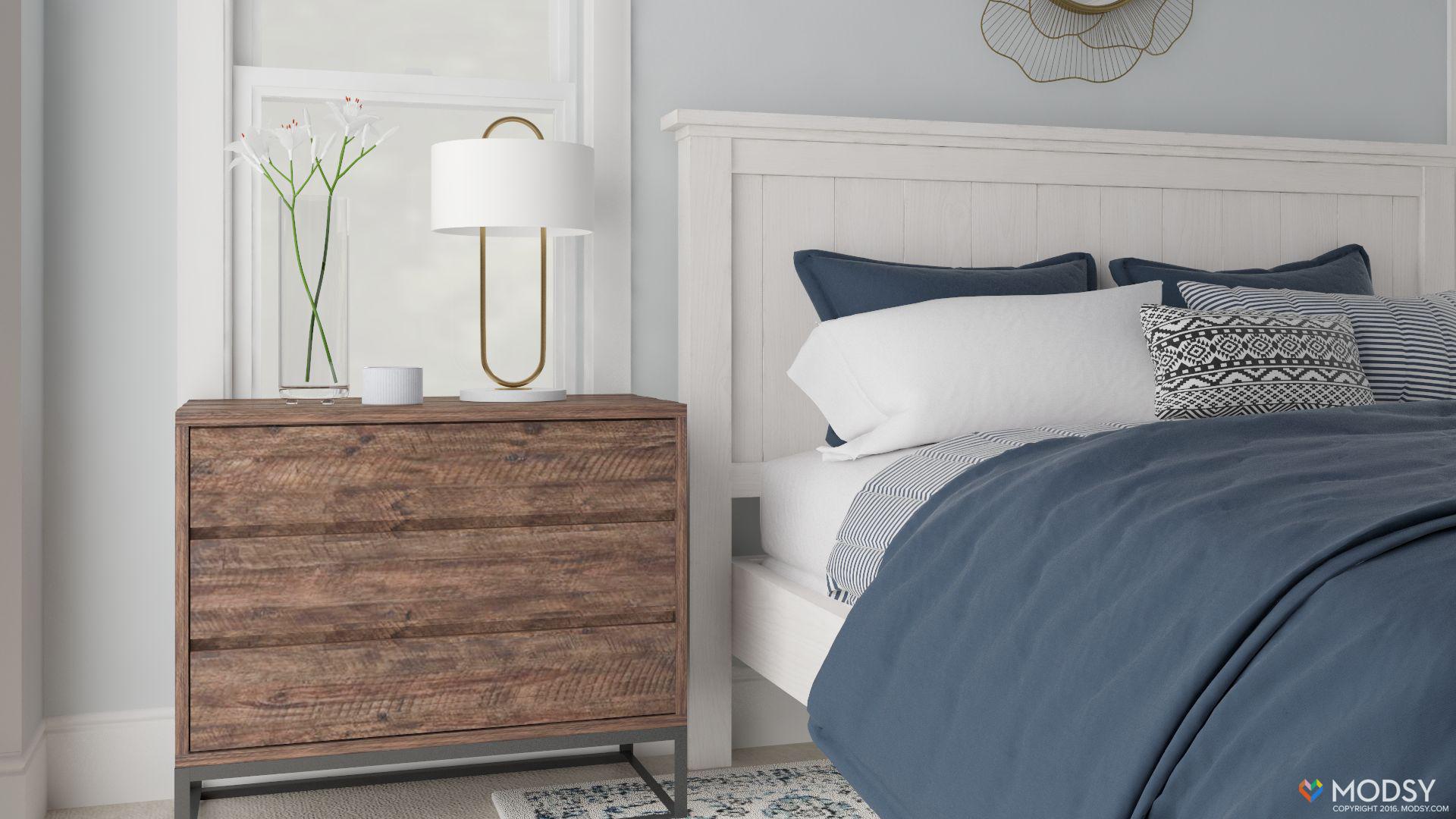
Wow, so cool to see the rendered vs. real images! The one thing that looks really different is the color of the side tables– I like the warmth they brought to the rendered images. Is that just a trick of the lighting in the photography or are they really a lot darker and grayer?
I love this! Do you, by chance, know if something like this is available for exterior? We have an older (1955) home that needs some TLC. We have ideas, but are scared to pull the trigger without a good visual first.
Oh that’s a great question. I don’t actually know. The best thing to do is ask them…if you click here and scroll to the bottom, there is a contact us button available
xo – kb
The most accurate color is probably the second to last picture in the post…but slightly warmer than that. My computer does a weird thing where I edit the photos and they get cooler in hue when I upload to the blog. I have no idea why.
xo – kb
See that’s the problem…I’m trying to think of something else that wouldn’t compete. It feels like overdoing it with side by side art, right?!
xo – kb
I love this space. I have the same rug in my master with a white bed frame and gray walls. I’ve been toying with different bedding colors and night stand finishes and these all look lovely together. Some great inspiration for me. Love it!
I literally never comment, but just wanted to say Thank you for changing my life! Honestly, I think this is exactly what I’ve been missing. Perhaps overly dramatic, but I can not wait to use this. I’m Canadian, and while we won’t have access to all of the amazing stores and deals you do, we can still make use of some of the stores that we have up here.
Also, your room looks fantastic. I don’t know how you do it with 4 little kids and another on the way! Inspiring!
In all my former apartments I had an area rug over carpet in the living room and it worked totally fine!
Loving the colors! Where is the wall art from on your mood board? Thanks!
All the art is linked in this post! Sorry about that!
xo – kb
Love it all…but keep the giant clock out of your bedroom. It will tick tock all night and keep you awake.
Looks awesome and super relaxing! Can you share where the hanging basket is from? I need one!
Thanks so much
Pretty please tell me that artwork next to your bed can still be found somewhere?? It needs to be in my basement bathroom!
I know this is an old post but I had to comment because I am in love with Modsy! I just received my living room designs today and I am just so excited about them. I already photographed and measured my bedroom to do that next. Thanks for sharing! I’ve always wanted to hire a designer but its out of my budget so this is perfect.
Hi, Katie. Your coupon code has expired. Just FYI. I’ve tried to use it twice, but have to use other ones because yours isn’t working. Probably missing out on referral credits, so just wanted to ping you.