I’ve been looking forward to this day for a long time. It’s time for the Pedraza Kitchen reveal! Wahoo! Hoorah! Yay! Hoody-Hoo! All excited sound effects aside….Let’s just get to it!
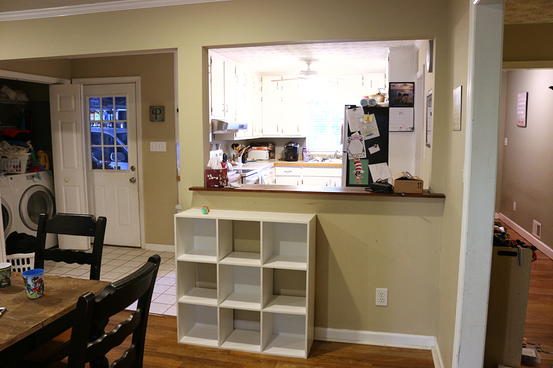
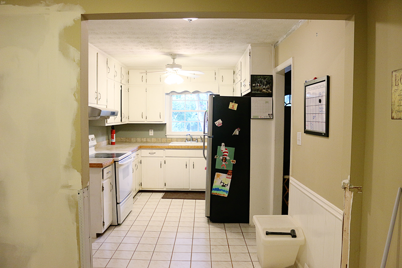
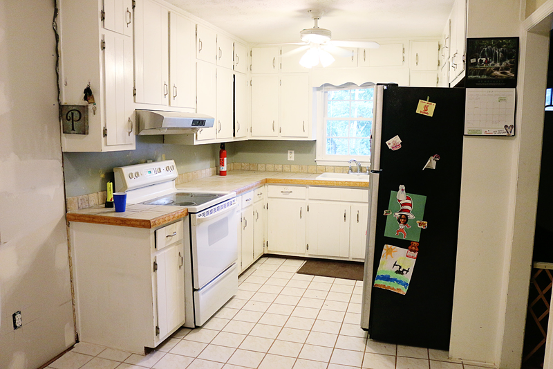
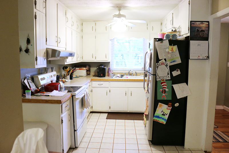
The Pedraza project was our biggest undertaking in 2016. You can read all about the plans and the story behind the renovation here. At the beginning of this undertaking, the area looked like this…
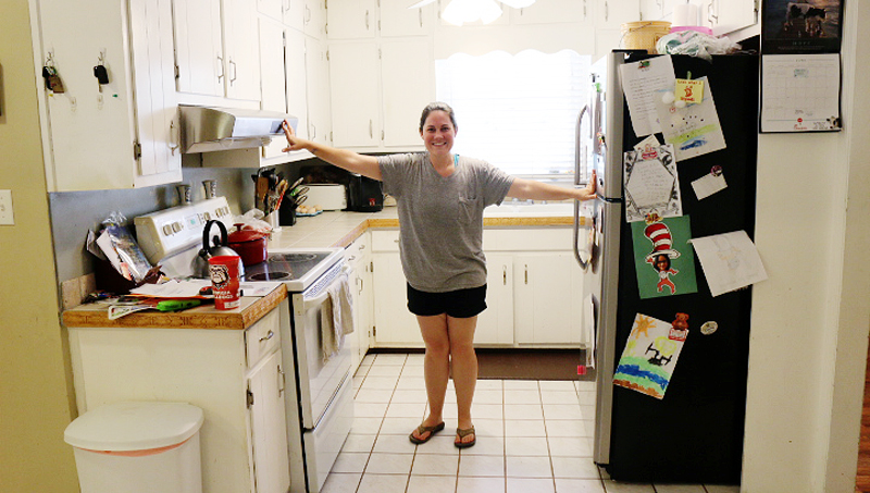
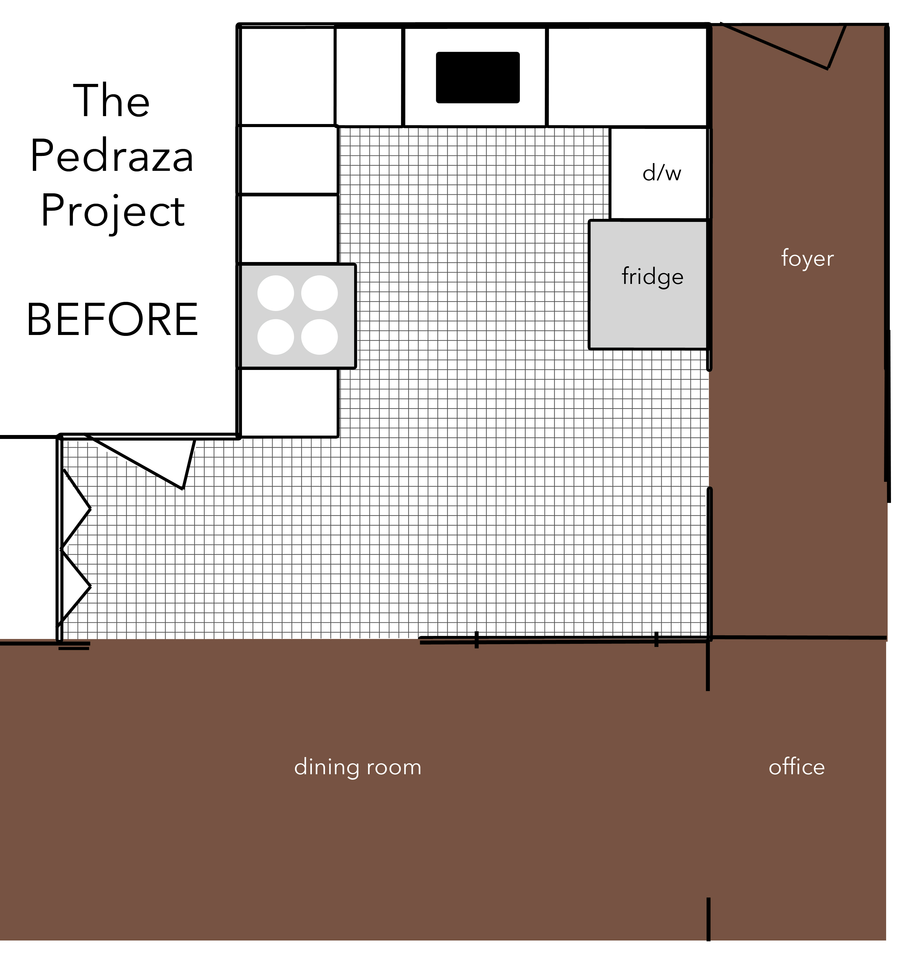
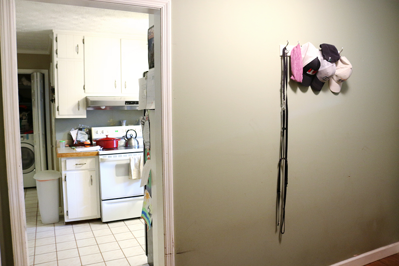
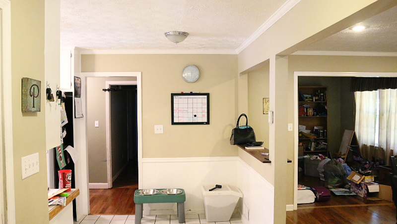
Their cramped kitchen had loads of wasted unused space and it was open to their laundry closet with a pass through to their dining area. Pretty much everything – from the layout to their appliances to the cabinetry was dysfunctional in some way or another. Both Danny & Charity like to cook making the kitchen their biggest sore spot when it came to entertaining and just everyday life.
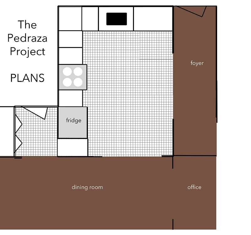
After reviewing a ton of options, they decided that they would be willing to lose the access to their garage from the kitchen and gain a wall. A wall separating their kitchen from the laundry would allow them to increase their cabinet space (hello pantry!) and get a traditional L-shaped kitchen that had better flow and more elbow room. We also decided that opening up the doorway from the hall to the kitchen would give them even more light and space.
I would love to claim the decisions and design as my own….but really I only acted as a guide and stylist. Most of these decisions were their own. They would say, “we need a floor that would hide dog hair”….I would share a few options that I thought fit the bill, and they got to choose. They picked out the backsplash and the countertop and even the color of the paint. I felt like the effort was definitely collaborative – when they didn’t have an opinion we chose the thing we thought would suit their family and lifestyle the best. I say all that because this was a design recipe meant just for their family.
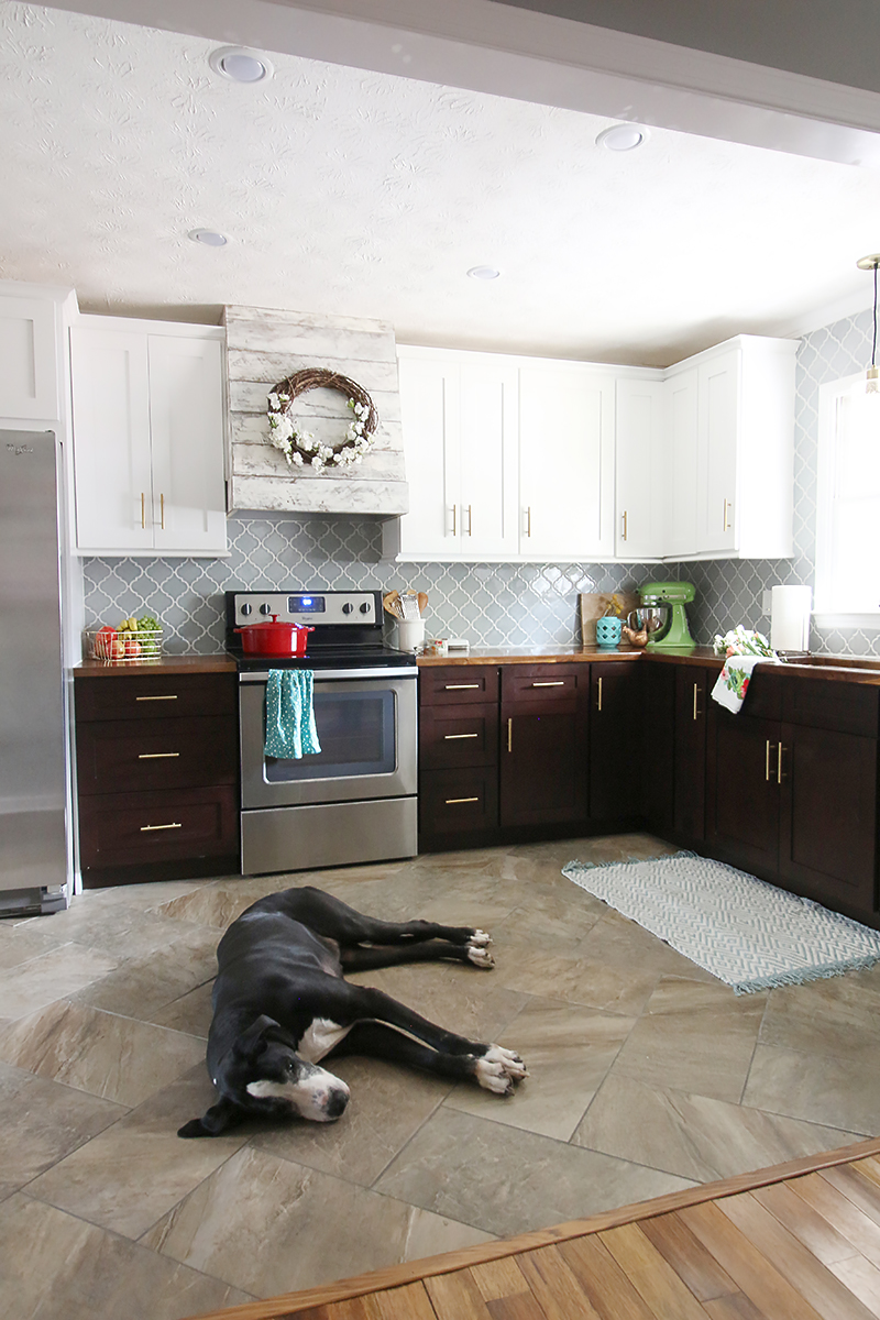
Here we go….
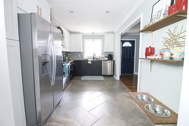
And here is the view from the foyer hall…
Before, the kitchen cabinets were original to the house. They didn’t close properly or provide sufficient space for the family. Since they didn’t have a pantry, they kept most of their dry goods and food in them along with their dishes.
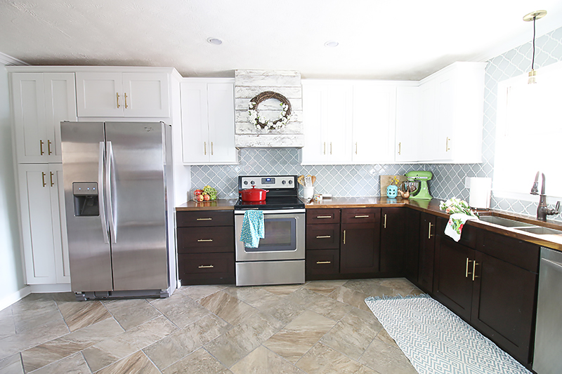
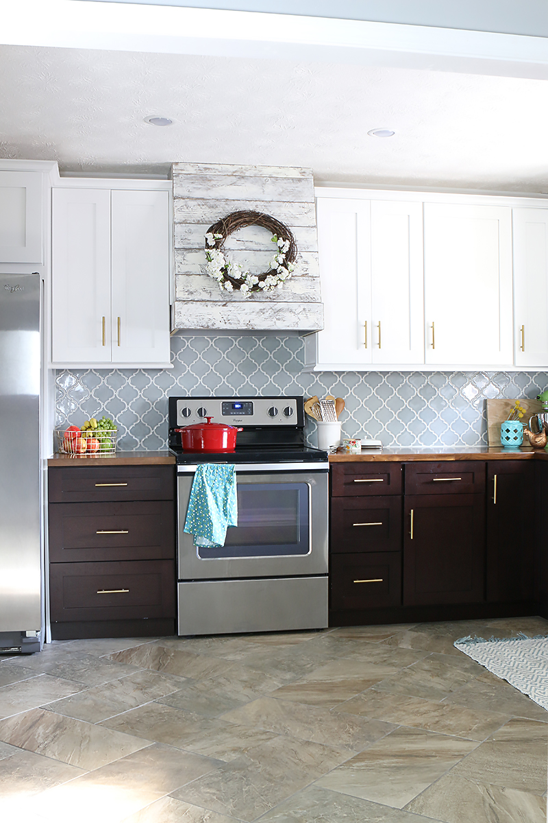
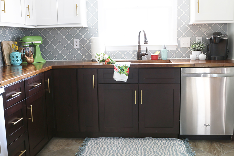
After, the cabinets are taller and laid out to allow for more storage. Special thanks to RTACabinets for providing these and helping us design the layout! Here is the post all about them. And I especially love the dark cabinetry on the bottom and the white on the top. That brightens up the space while still providing warmth and contrast.
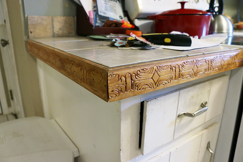
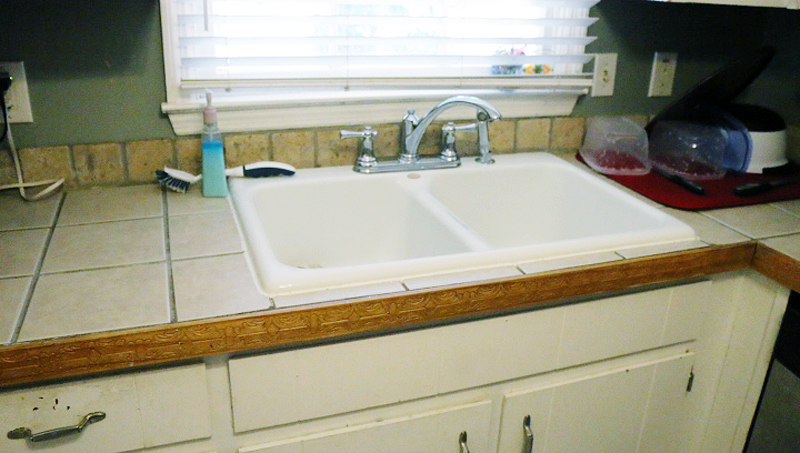
Before – the backsplash and countertop was a mix-n-match combo of travertine, ceramic floor tile, and carved wood.
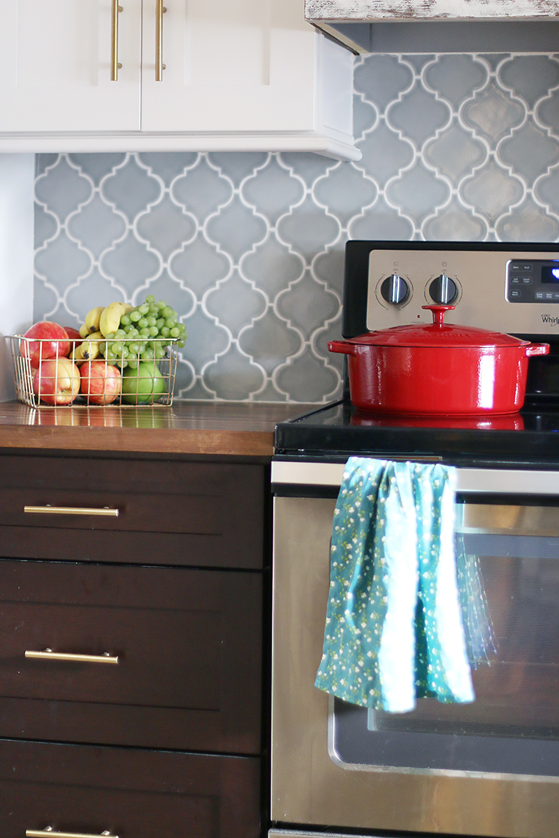
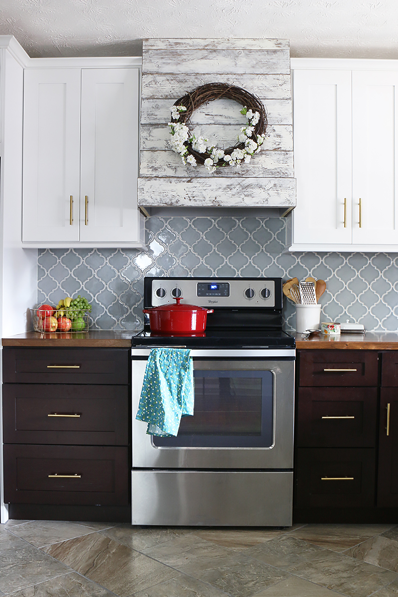
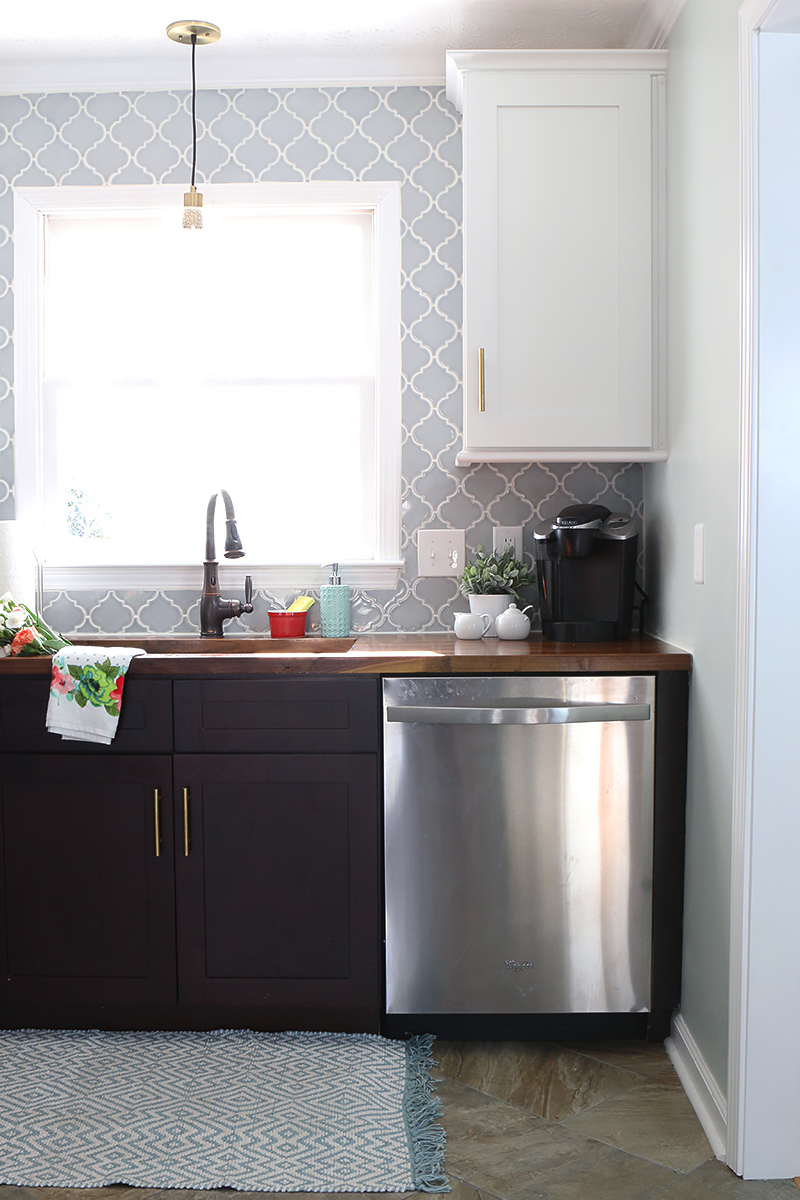
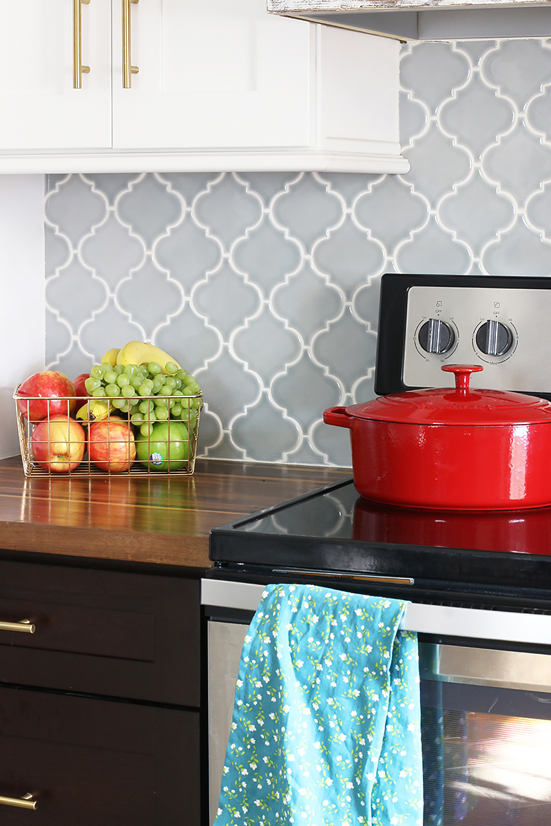
Now the arabesque tile backsplash is the crown jewel of the space. The butcher block counters add warmth and charm. I can’t thank Floor & Decor enough for providing these amazing products. See this post about how we installed the backsplash and this one where we installed countertops.
Before the appliances were mix-n-match and falling apart. The fridge was much smaller than average sized fridges, the stove was falling apart and the dishwasher didn’t actually wash dishes.
Now the matching stainless Whirlpool appliances are perfect for this family of four-going-on-five. Not only do they function great but they look amazing too. And Charity was so excited to have ‘ice in the door’ on the fridge. It was equal parts hilarious and adorable 🙂
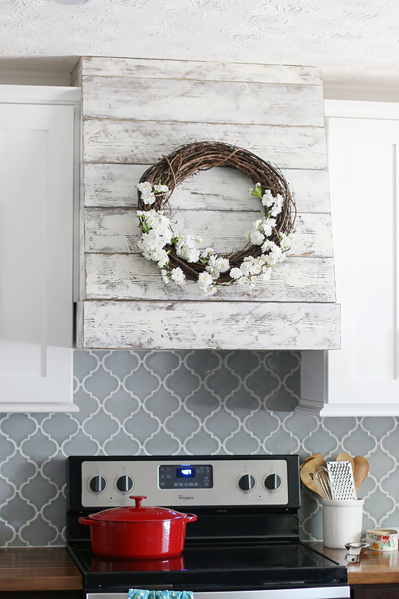
One of my favorite things was to build them a custom range hood. This project was easy and adds some rustic charm to the kitchen which is something they said they loved. I will explain more on this project in the future 🙂
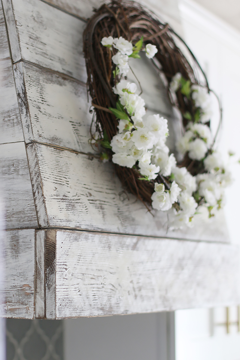
Isn’t that finish just so pretty? I love seeing a little wood grain through.
The sink before was shallow and was right in the way of the dishwasher. If the dishwasher was open, then you couldn’t stand in front of the sink. It was a tricky situation when it came to loading 🙂
Now the dishwasher is next to the sink which makes loading really easy!
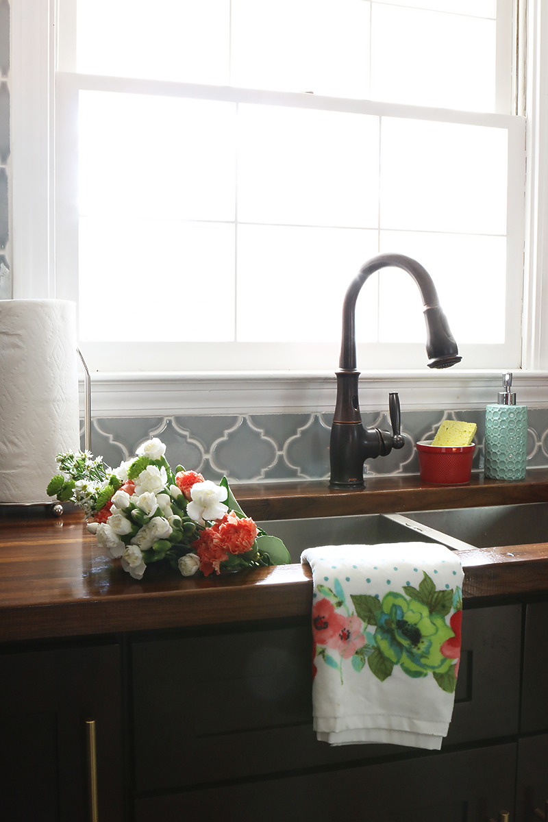
And the sink is deeper and has a really nice faucet which has motion activation. You can read all about the sink and the faucet here.
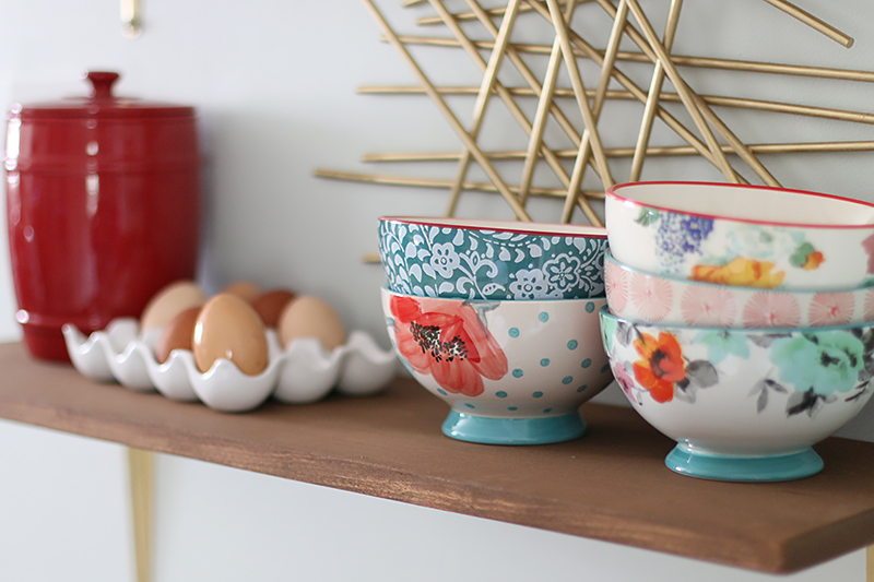
We staged the entire kitchen with new finds from various places. The color scheme for the accents all came from the Pioneer Woman collection at Walmart. They were colorful and fun and added a little pop to the space. Plus Charity loves her stuff 🙂
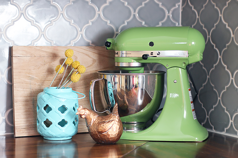
This is the view that is probably the one that Charity sees the most. She stands here all the time (like most moms do!) and it has her new little coffee station and her little mixing corner.
Meet Kermit. That’s what she had named her mixer and now she gets to see it all the time. Charity said – it’s so convenient to have it out!
The wall that is next to the opening used to be a little feeding station.
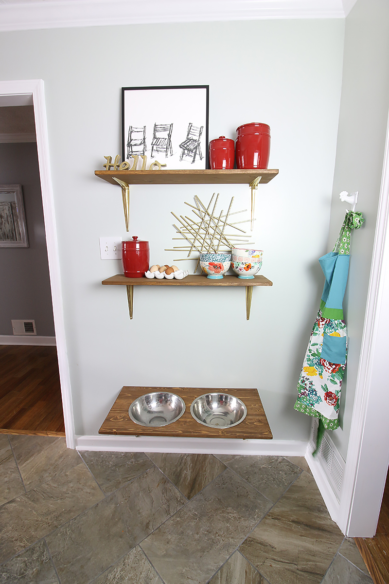
After the new layout, this area was a shallow spot that was perfect for a set of shelves. We also found a great way to keep the feeding station for their great dane Bella 🙂
And the kids love that they have a spot to put their chicken eggs. Yes, this sweet family has a coop that they collect eggs from every day.
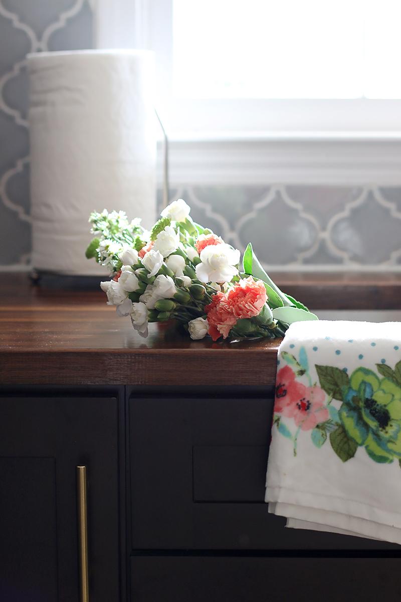
More detail shots…
Overall, I am super proud of this project. And it’s not done just yet. We still have to share the foyer and dining room. They were tweaked in the process and I can’t wait to show you them as well.
Here are some of the old posts and the sources for the items shown….
- Meet the Pedrazas
- Pedraza Kitchen Plans
- Demolition Day
- A plan with floor & appliance details
- Cabinet Info
- Tiling a Herringbone floor
- Installing a butcherblock countertop
- Tiling around a window
- Converting a light fixture
- Appliance Info
If you want to know specific info on any of the other items, please just leave a comment and I will do my best! And thank you guys for your support and patience in this project. Seriously….we are so happy to have it complete and to be able to share it with you. I am so glad that they have this space now! Even Charity’s mom said that Christmas dinner tasted better because of this room and that was just the best compliment….because isn’t that what DIY is all about? Making life just a little sweeter with our spaces? And now I want to hear your favorite parts? That hood? That tile? That big ole horse of a pup? 🙂
I LOVE IT! I also love that floating dog bowl shelf!! I have a Great Dane and he needs it!! lol!! The kitchen is beautiful!
Wow! This kitchen looks gorgeous! Everything about it is so pretty. The two-tone cabinets are so refreshing vs. all white and I love the way the dark grains in the floor tie into the darker bottom cabinets. Hiding dog hair without compromising warmth for the win! 🙂
I was a little skeptical of the back splash when it first went up, but it could not be more beautiful in that space! Great joint effort!
Katie, kitchen looks great! Came together so perfectly!
On a side note, when people have brought up the banner ads that pop up everywhere, you always ask which ones they are. It’s at the bottom of the page and also in your header (they play the same ads). It’s the ones by AdChoices and I saw ads for TaxAct, Cars.com, Xfinity, and Methodist Hospital. They are pretty large ads and you can’t minimize or x them out. Hope that helps. 🙂
Looking forward to reading about the range hood cover….SO cute!
Beautiful!!! Well done. I think my favorite part is that pretty backsplash! Love it!
Looks beautiful and so much more functional! And I love their dog!
Beautiful! I absolutely love the dark cabinets on the bottom and white on top. We are about to dream up our new kitchen and I am thinking to use this as some of our inspiration! Is the microwave hidden in a cabinet somewhere? I’m trying to figure out what to do with mine in our layout.
What is the paint color on the walls? And it shows grey sometimes and blue…how does it look in person?
looks awesome! Great job! I was just wondering where the microwave is?
Looks amazing! Do they have a microwave?
Love it! Its beautiful! Where are the cute accessories and rug from?
I just read they came from Walmart 🙂 so pretty!
So happy to see the final product 🙂 How are the cabinets holding up on the bottom with a big dog? Is she finding it hard to keep them clean? That backsplash……………….so yummy!
Can you share what their overall budget was? And maybe the cost break-down? Or an estimate? We bought a house and want to redo the kitchen and these are some great ideas!
Finally! It seems like forever, but the wait was worth it. Love it. No doubt the Pedrazas are over the moon.
It looks great!!! I love that tile backsplash! Gorgeous! I knew it was PW stuff right off. I got the same towels for Christmas! love the colors.
Congrats on a job well done.
Yes the microwave is small and it’s in the pantry next to the fridge 🙂
So far I think that she just has a bit of dog hair that sometimes makes its way to the single bottom ledge of the face detail. It is easily wiped off with a damp towel…so win win! And we purposely went with a darker bottom to hide any brush marks that may happen with the pup – we knew to do that specifically because Bella likes to throw her weight against Charity wherever she stands 🙂
Great job! And what an awesome friendship! (Btw, I love the PW line as well–such a fun mix of colors/patterns!)
It looks great! So open,functional and lovely. I hope the Pedrazas have many years of happiness in it!
I don’t suppose you salvaged some of the craved trim from the counters? Could make a fine frame or detail elsewhere.
I’ve been waiting for the final reveal! It looks wonderful. Love the color scheme, too. I liked the construction/demolition aspects, too–seeing how walls can be changed/added to make the flow better. Stunning!
Where carved not craved. Oops!
Beautiful kitchen. Love the two tone cabinets and that backsplash! WOW!
Such a difference space wise! Im wondering about the rustic hood- it seems somewhat out of place in the kitchen. Is the rest of the house rustic/farmhouse?
It looks so beautiful Katie! I absolutely love the colors, the backsplash and the pup…of course! What a fun project, the reveal was worth the wait for sure!!
It’s beautiful. You all did a great job. Your friends must pinch themselves every time they walk in! How lovely to use your talents and connections to bless your friends.
My favorite is that tile back splash but I also love the floor.
What is the paint color? Beautiful!
This project is dynamite. I just wonder why you didn’t close in the cabinets at the ceiling. To me, that open inch or two is a greasy, dusty nightmare.
This look so incredible!! I’m so happy for Danny and Charity. I really love the mix of the herringbone tile with the wood counters and the dark and light cabinets. Great layout and design choices.
Love it! Where are the little bowls from, that are on the shelf? (Next to the eggs)
everything looks great! where is that cute little chicken hook from that’s holding her apron? can’t wait to see the rest!
Are there outlets on the range wall that are accessible from the counter top?
It looks great! You really made a whole new fresh & beautiful space!
It’s from Goodwill. I found it after I found my bull that matches 🙂
xo – kb
They are also from Walmart. They are the Pioneer Woman line 🙂
xo – kb
We couldn’t because it would make the lower cabinets impossible for Charity to reach. We made them as high as we could for her to still use them 🙂
xo – kb
It’s a mix. They said they wanted touches of it. So we did a bit of that in each space. When we share the other spaces, hopefully you will see how we tied it in!
xo – kb
We thought of that but they were GLUED to the plywood…making them impossible to remove in one piece. So yeah 🙁
xo – kb
It’s Sea Salt by Sherwin Williams 🙂
xo – kb
No…but they didn’t before either.
xo – kb
That’s a great idea. I would have to compile it all.
xo – kb
The rug is from Home Goods and the other accessories are mostly from Walmart and Goodwill and the art is from Minted.
xo – kb
They do. The pantry will get a hole and has an outlet available for it. I didn’t show it because they didn’t know if they were gonna get a new microwave yet. Their current one is small and it fits in there but we just didn’t share the inside of the pantry.
xo – kb
There is a spot in the pantry for it. They haven’t moved it in yet…because they were waiting to see if they would replace it 🙂
xo – kb
It’s kinda a green blue with gray undertones. It’s called Sea Salt by Sherwin Williams.
xo – kb
Oh ~ I love it. Love the backsplash tile and the range hood. Great job!! And it looks Bella approved. 😉
I love the feel of this kitchen, so much!
Where is the fruit basket from?
This looks really good! Can you do a write up on the permit/inspection process for the renovation as a whole? You added structure, moved electrical, plumbing, etc, and although Jeremy is capable of performing the work, it’s required to obtain a permit, typically for this level of updates. It’d be good for other home owners (including myself) to understand how you go about doing that on your own and not through a contractor. We did a major bathroom/dormer/structural addition last year and hired it out soup-to-nuts to get it done quickly, so my contractor handled the whole process.
In Massachusetts a homeowner can actually pull their own electrical permit (oddly), but every other trade (like plumbing) must pull their own permits under the general permit. It’s just good to know if you aren’t going to have a General Contractor manage your project.
Looks great! The back-splash is my favorite as well!
Great job Katie! I wish you were our neighbors to light a fire under our butts to do this! One day ….one day…. what a deserving family! What great friends!
The room is beautiful. Great job! I have to know how you caulked the counter and tile. We have arabesque tile that we installed and I need to caulk but I can’t figure out if I should tape the top side (tile side) or not. There are so many grooves I can’t image getting the straight line you did. Thanks
I think this is my new favorite room you have redone. It is just. so. GOOD! The finishes and the function have me drooling. I even had to pass my phone over to my husband to show him the picturesame, and he was wowed. Which is saying something, because typically I’m the only one who cares about home design/diy stuff!
It’s from Walmart! It was under $2! Isn’t it cute?!
xo – kb
Every area is different. Our area has different requirements since it is rural. We did add structure…didn’t replace/remove any electrical or change plumbing. In our area, the improvement has to have a value of $2500 or more to require a permit otherwise you can DIY with the homeowner. We did ask an engineer to come in before hand to make sure that we were not adding any load to the home and then we paid for a plumber to come check all the plumbing. We are very familiar with the different areas being so different though because the Monroe house has completely different requirements.
xo – kb
We just tape the bottom (countertop side) and do the line as thin as we can.
xo – kb
So glad to see it done! Do you have a picture of what it looks like with the laundry room next to it? I feel like that would be the perfect ending to the initial posts about changing the layout. I would love to see what it looks like now that everything is done!
Yes I will definitely share that when we reveal the dining room area 🙂
xo – kb
This is absolutely gorgeous. I’m totally in love with how bright and calming everything is. But…that last shot with their beautiful Bella sprawled in the middle of the kitchen floor is EVERYTHING. <3 🙂
it looks like it was probably pretty simple, but i’d love to hear the details on the dog feeding station!
The floating dog bowl shelf is so smart! Now they don’t have to move bowls everytime they clean the floors! That’s some Bower genius right there.
I see it now! 🙂 They must be so thrilled with their new space! 🙂
I purchased a Consumer Reports kitchen edition magazine. It compares all the appliances, counter-tops, floor types etc. The interesting thing it said was you should never use an under mount sink with wood counter-tops. It didnt say why but thought you might find that interesting since that is what you put in the Pedraza kitchen.
It’s probably because the moisture issue. Most people don’t want to go through the trouble of proper sealing. It’s like putting a boat in the water…it doesn’t make a whole lot of sense to put a chunk of wood that rots with moisture in a huge body of water. But if you properly seal it and keep it free from dry rot – it works great 🙂
xo – kb