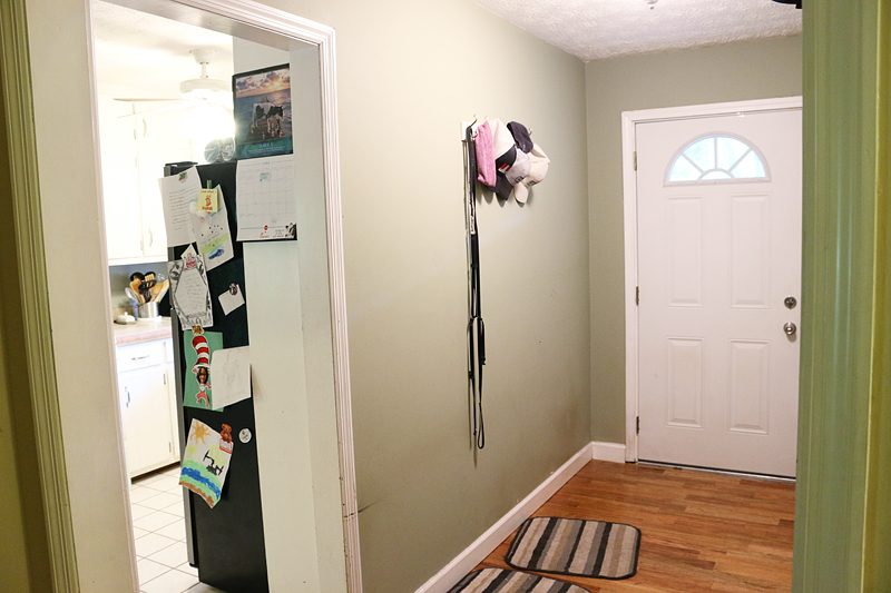
Honestly, we kinda didn’t realize that we should be taking before photos of the foyer. I don’t know why it slipped my mind but the fact is…we were making this doorway opening bigger and we would need to redrywall it….so of course, the foyer would FEEL included in the kitchen space….and would obviously need repainting. That is what happens during the heat of the Georgia summers….you LOSE YOUR MIND.
Anyhoo….that is why there aren’t a ton of before photos.
And if you are new here….welcome to the Pedraza’s house….Danny & Charity Pedraza are some friends that we helped with a kitchen makeover and you can see that full space IN THIS POST.
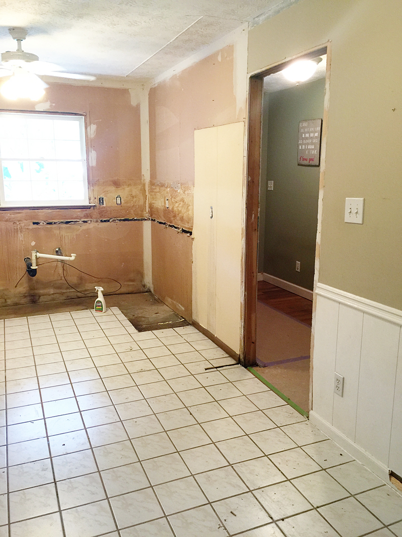
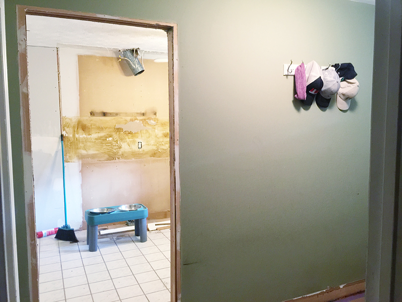
Okay – so the foyer before was actually quite spacious. It was a wide hall with the front door on one end and had a side door to the kitchen. That side doorway is the one that got punched in the face 🙂 You know…in the nicest way possible.
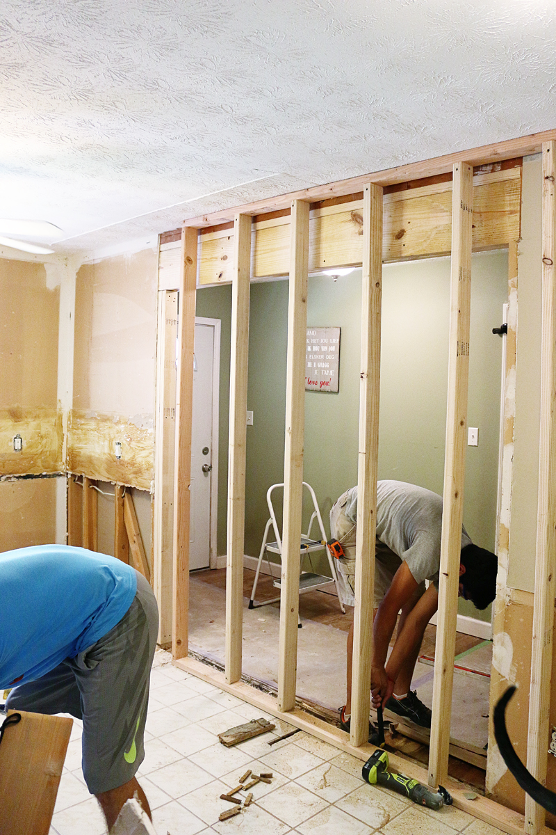
It should be noted that this was a load bearing wall on one side and not the other and we did have an engineer friend come in to double check our decisions. We feel like it’s always a good idea to talk things through, pull any needed permits and consult professionals before tearing down walls 🙂 In our case, we were very confident that this was an easy and needed action for the functionality of the space. And in our area, this simple modification didn’t require a permit. Every area is different so it’s a good idea to always consult a pro for that very reason.
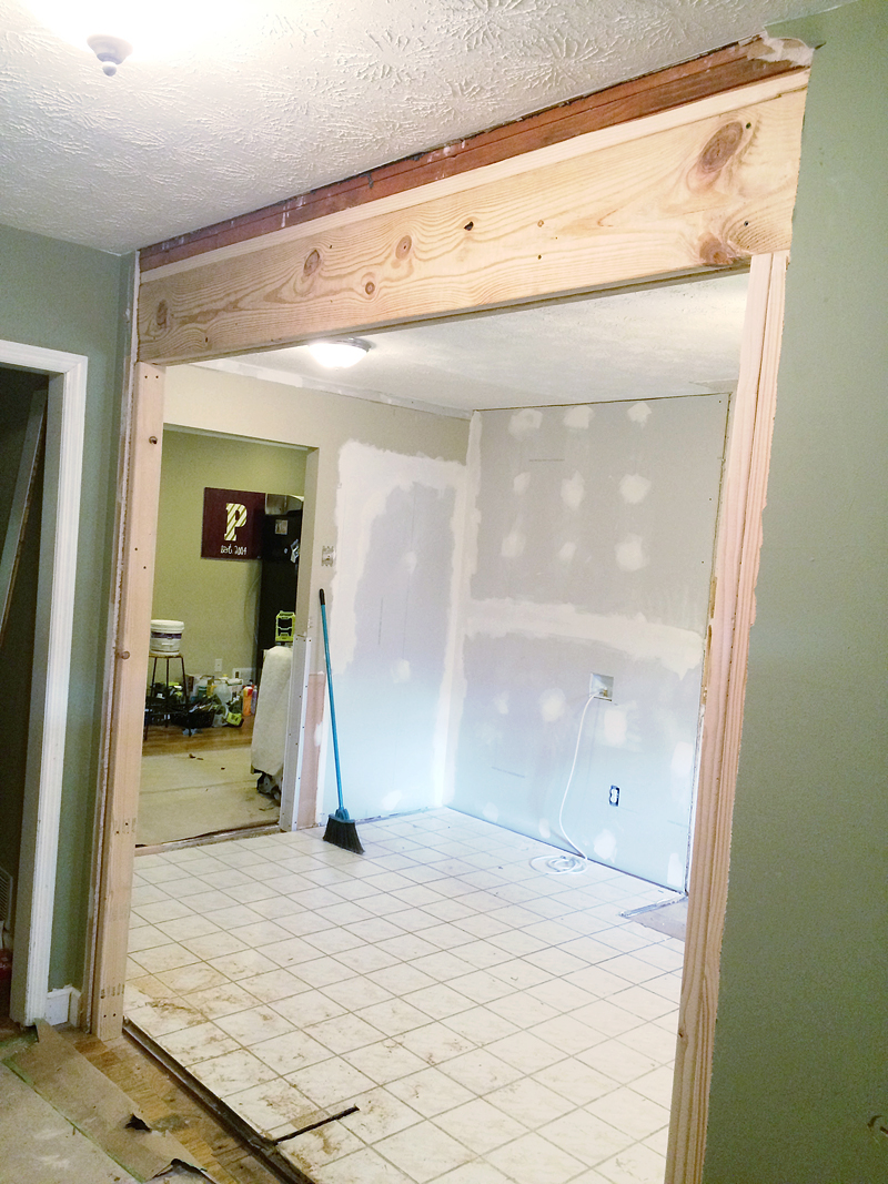
This is the wall that would be getting the big open feeling…
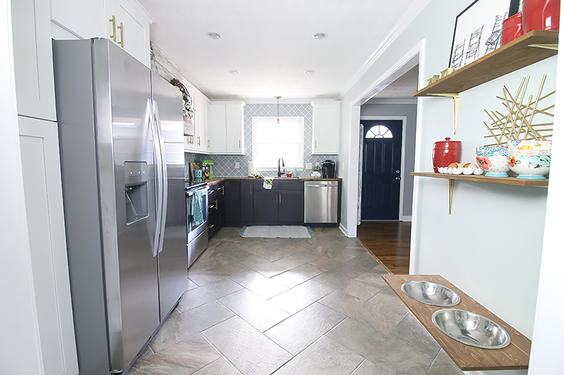
After the supports were in, the guys demoed the wall and put up the header and almost INSTANTLY the room felt bigger, brighter and made so much more sense. Now the kitchen felt bigger and the foyer felt size appropriate….nothing out of whack or disproportionate.
Close a wall, open a wall. That was basically the idea in this kitchen. We closed one wall (see that raw drywall in the background?) to allow for more wall space and opened one wall to allow for open space. The foyer was the generous soul who gave to the kitchen but in return, we figured it was due a mini makeover of it’s own.
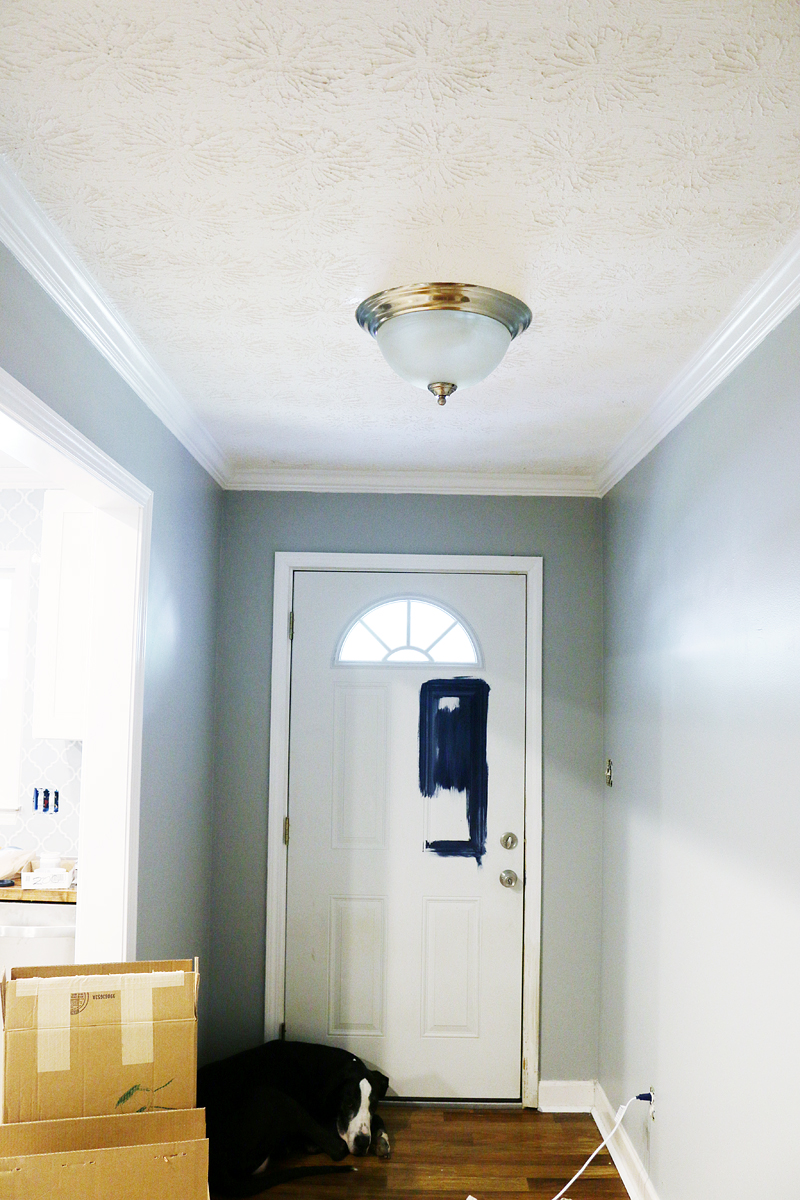
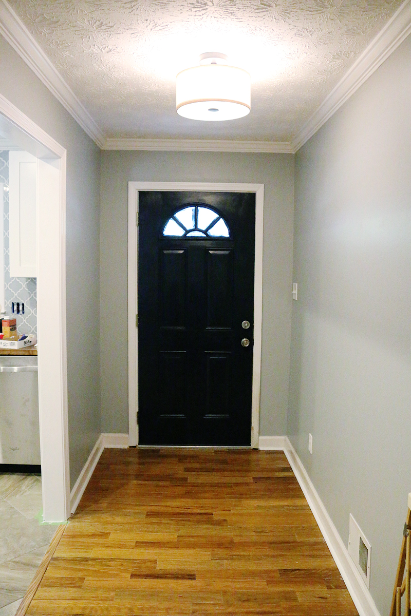
After the drywall and trim was wall installed, the space got a fresh new coat of paint. It’s Lunar Surface by Behr for those wondering and it’s a very cool gray with blue undertones.
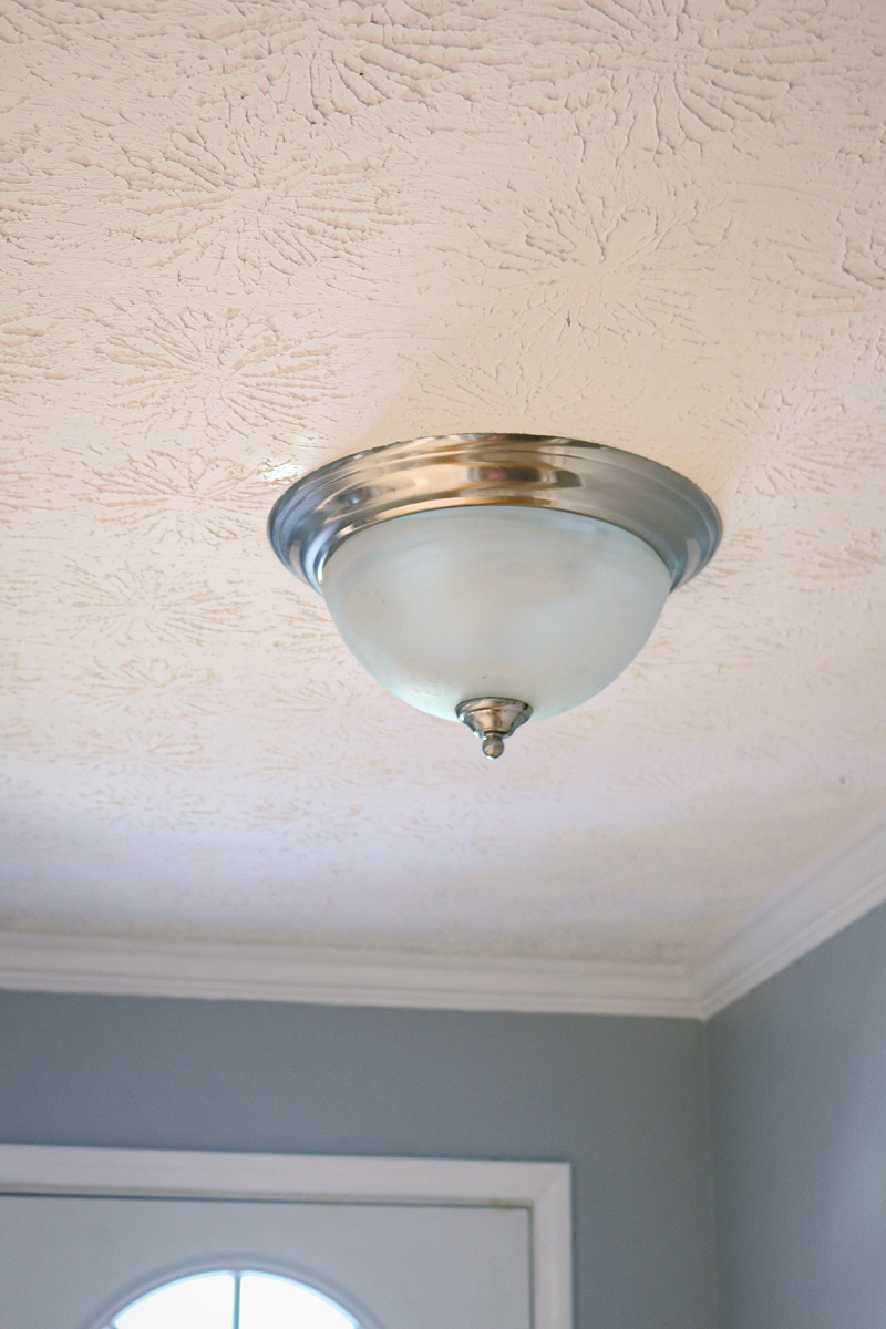
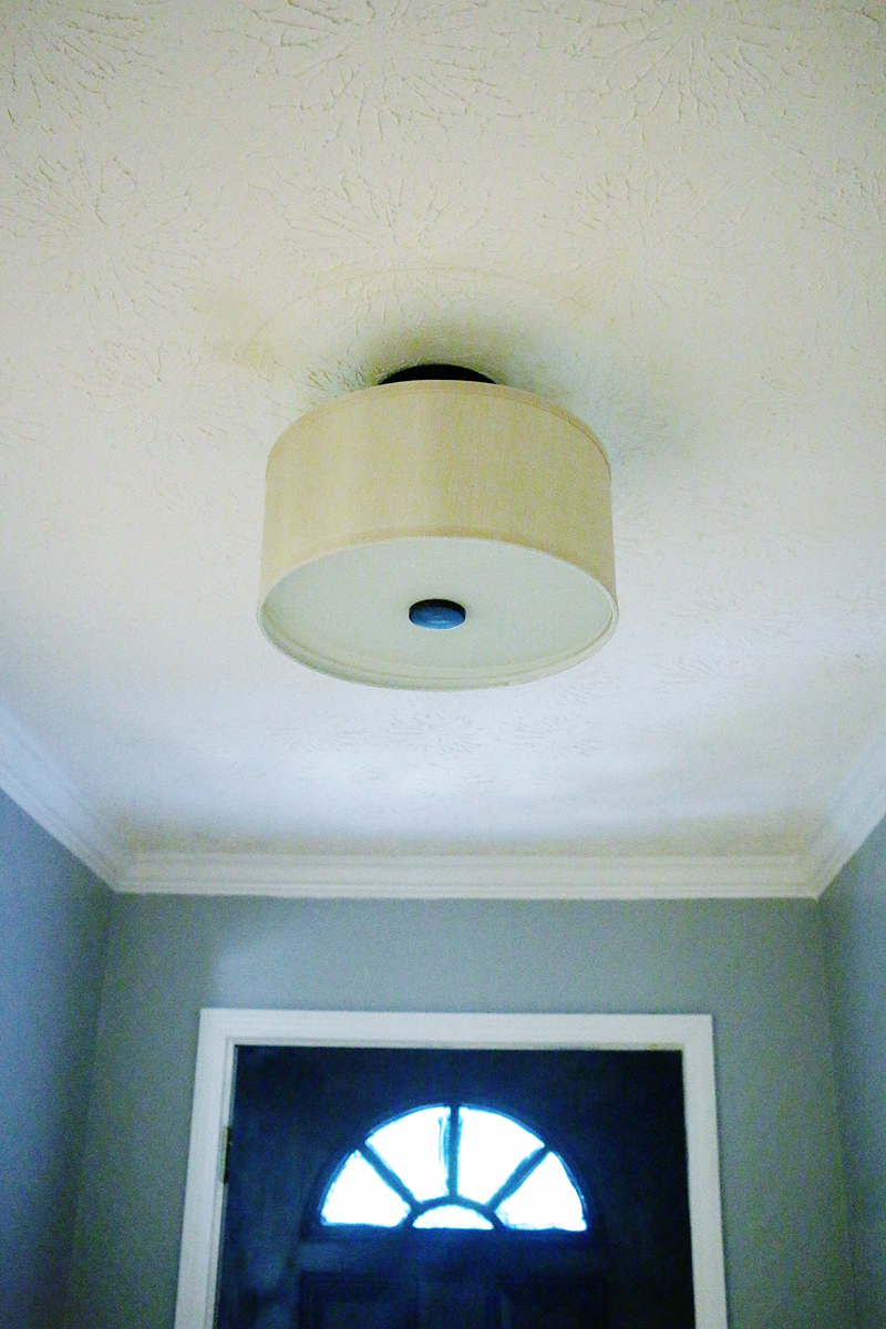
We found a super affordable light fixture so the boob light got the boot too.
I asked Charity what color she would like the front door and she said navy so we gave it a couple coats of navy paint and it really added a lot of contrast to the space.
And now you can actually see the door from the entrance to the kitchen. Talk about open concept! It allows for so much more light and it feels like you just want to usher people in from outside and feed them 🙂
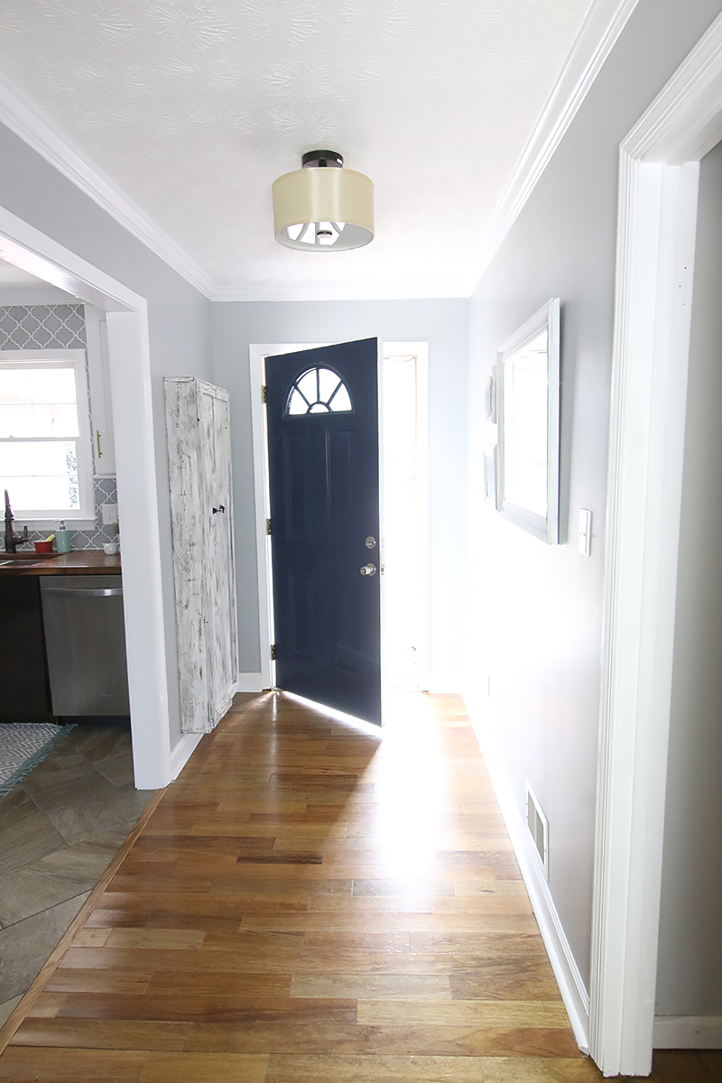
Even though the space didn’t get anything super fancy, it feels cleaner and more functional. And Charity can add to her gallery wall as she pleases 🙂
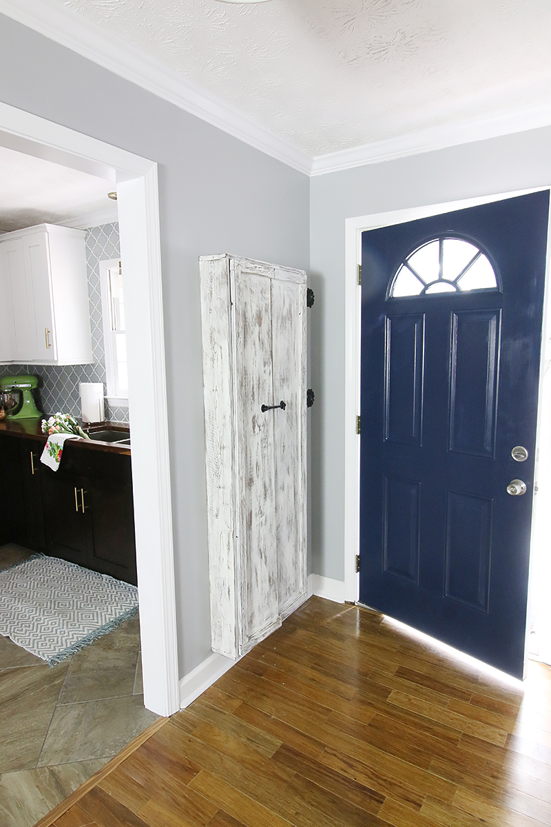
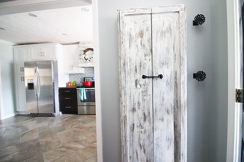
Behind the door, I built a wall mounted broom closet that holds all the brooms and swiffer mops in her collection. Since she has to sweep up after her great dane Bella everyday, this is a well used storage area. And since they don’t have any hall storage in here, it’s nice to be able to close that up and hide it away.
I love how the finish ties in with the hood that we built in the kitchen. I honestly think that little touches that coordinate like that are really nice as long as you mix other finishes in as well. Jeremy installed some little curtain tiebacks beside the broom closet so that leashes and small hanging items can be stashed off the floor.
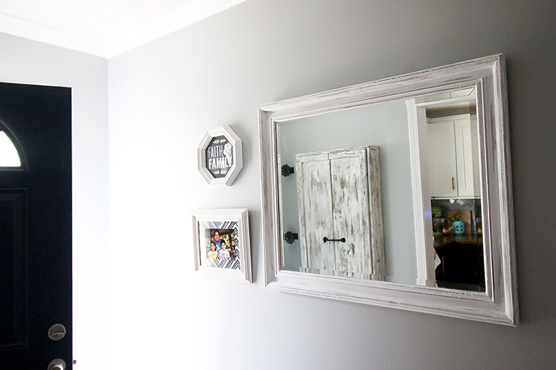
And the wall opposite of the kitchen has this little collection of distressed white framed items. I found the beveled mirror at Goodwill for under $20 and the frames are yard sale finds that I always throw in my stash. I told Charity that in the future, she may want to pick up a small bench and maybe some baskets to slip under it so that the kids can sit and take off their shoes here. It is the perfect spot for a perch because the kitchen is right there!
So that is the foyer reveal and what is next is the dining room! I can’t wait because it was another room that we didn’t anticipate giving a makeover but it turned out SO pretty 🙂
Do you have a source for that drum light? I love it!
I have a similar boob light and am looking for a similar semi flush mount replacement fixture for my low ceilings. Source please?
I have been thinking of taking out a wall in my very small kitchen so that it opens up to the dining room and living room but my son told me that if I did that, then the kitchen had to always be presentable-no stacks of dirty dishes -because then everyone that visits would see it. I thanked him for his wonderful insight and the wall stayed. Now seeing this great makeover makes me want to bring the wall down. Great job!
I’ve been looking for a little broom closet just like that! DIY or buy?
I love that light fixture! Where is it from?
I built it 🙂
xo – kb
Here is the link. Isn’t it cute?!
xo – kb
It’s from Home Depot. Here is the link 🙂
xo – kb
Bahahahaha! I love it 🙂
xo – kb
It’s from Home Depot. Isn’t it cute?! Here is the link.
xo – kb
Great job Katie!! Looks so good!
Awesome! Would you be able to provide some more details for the broom closet? We just did a kitchen renovation and knocked out our coat closet. It was a great decision, but we have no place to put brooms, etc. really love this idea and would love to see more details on what you did if you have time. Thank you!!
You guys did a fantastic job. Love the lil broom closet. Can’t wait to see the dining room….. and you can’t stop there. 😉
Can you provide the details on the broom closet build?
I love it!
Can you show a pic of the other end of the foyer? Love the makeove!