Disclaimer: This post is sponsored by Cabinets.com. All opinions are 100% my own.
OH BOY! This is exciting! I have been looking forward to this post all freaking week and I can’t wait to show you everything we have planned for our basement kitchen.
Ok…first let me tell ya, if you have been on vacay or swamped with work or on a blog break, we had friends move into our basement. We’ve known them forever and they have three kids with one on the way and are house hunting but for now they needed a place to live and we offered up our partially finished basement. They said yes and the rest is history. The great thing about this basement space is that it has lots of square footage for a basement. The bad part is that “partially” in partially unfinished label. It had no laundry and no kitchen. So this post is all about our kitchen planning….because you can imagine with three kids, you need a kitchen.
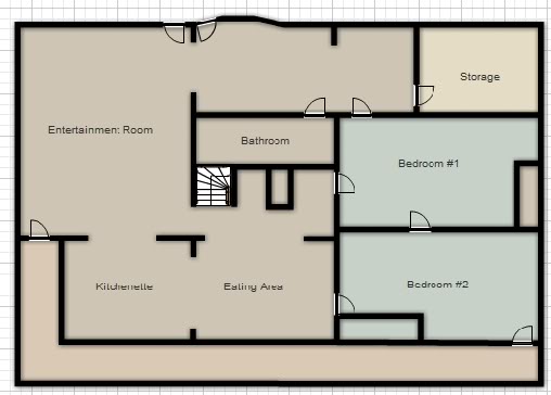
Here’s the floor plan so you can see where everything is…..go ahead and get your bearings….
Rewind to 2009….when we were house hunting, this is what it looked like….the room I am standing in is the living area (entertainment room) and looking at the doorway to the kitchen…
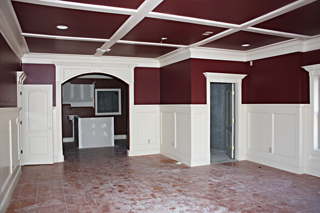
The kitchen had this weird window to the back hall….we call it the pass-through because the only thing we could imagine was that they had a gas grill back there and passed hot sausage through this window to serve at the bar….
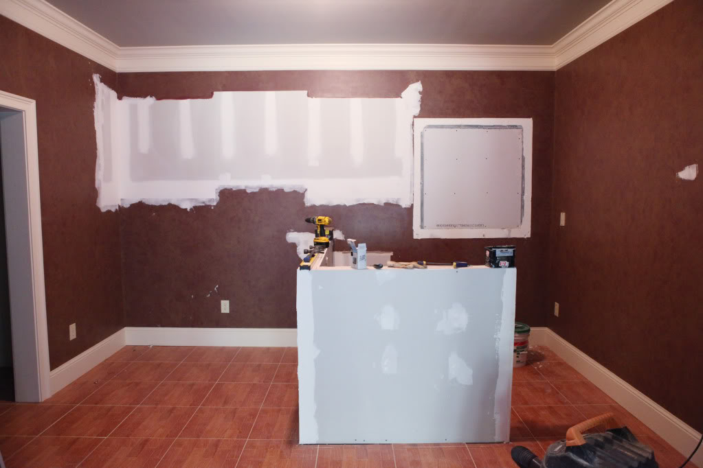
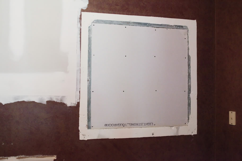
We drywalled over it….because we don’t have a single friend that likes sausage. Kidding….because we don’t like weird holes in our walls.
Jeremy also removed the bar area because it was a terrible use of space. Obviously at one point there were cabinets down here but we never saw them and imagine that they were either removed prior to sale or stolen.
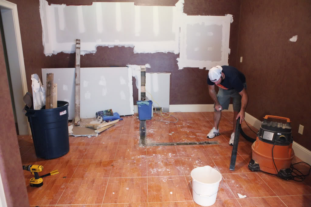
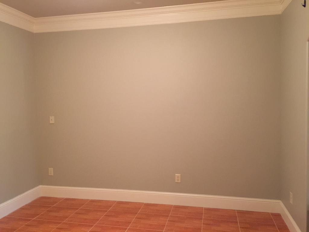
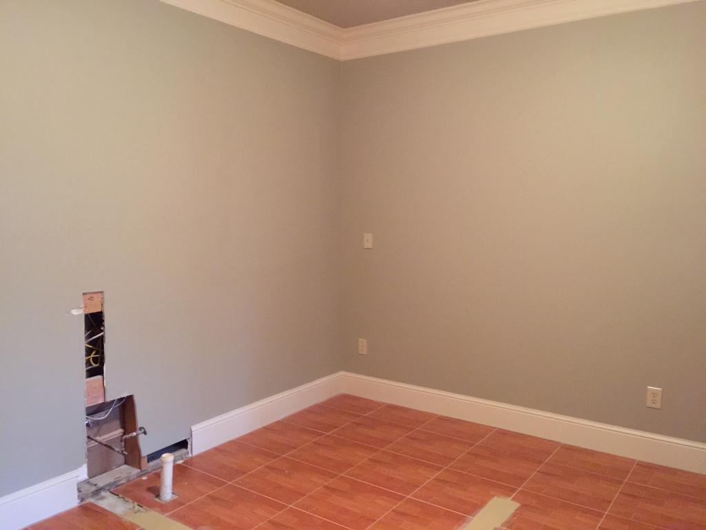
After a quick paint job and a patch job to the floor…here is what it looks like today…
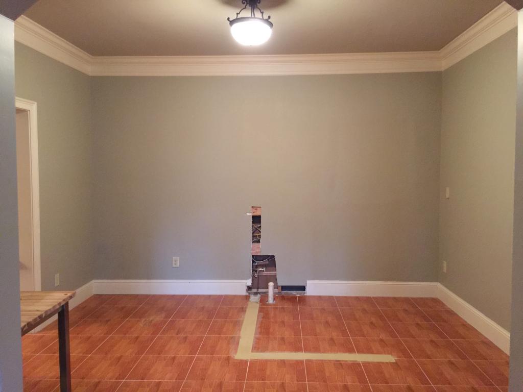
The back wall is the one that has all the plumbing lines. This one makes sense for any water usage…like a sink, dishwasher, and fridge because then we wouldn’t have to move drains and all that.
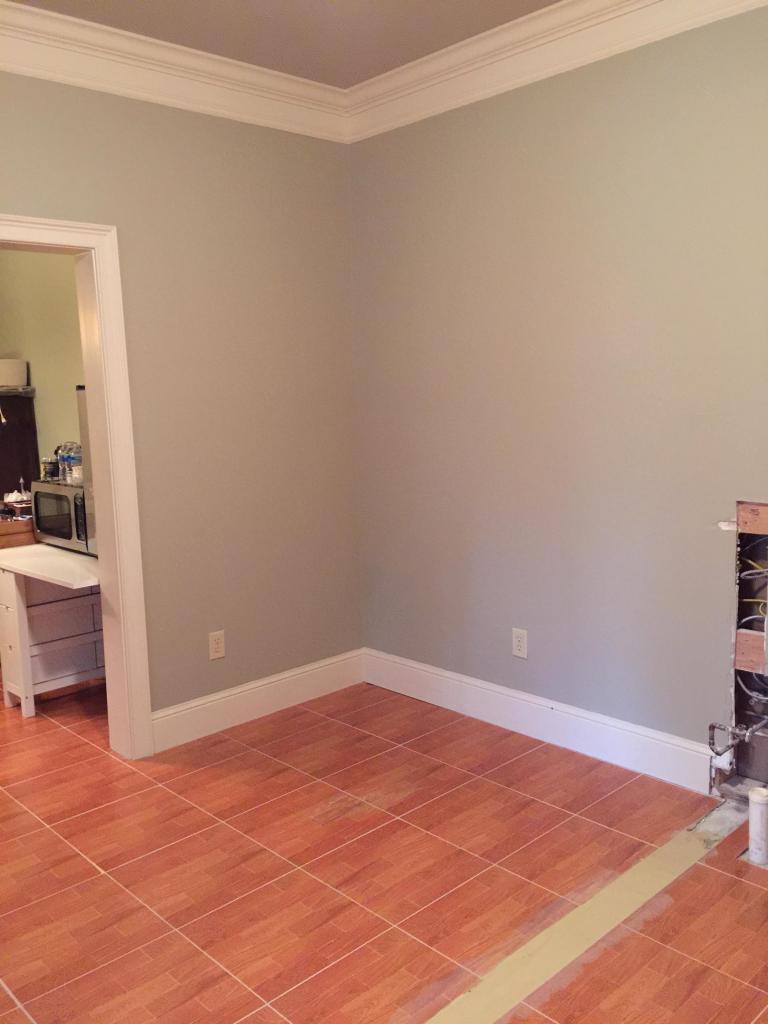
It is right next to a wall that we have ‘back access’ to….so that makes it a lot easier to add electrical and all that. We figure that an L shape kitchen would be the perfect solution and utilize the most space.
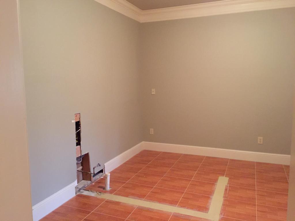
This is the wall that we can access the back side. It will be the wall for a range and for cabinetry. I am thinking a tall pantry cabinet in here because that is one thing that this space lacks….storage!
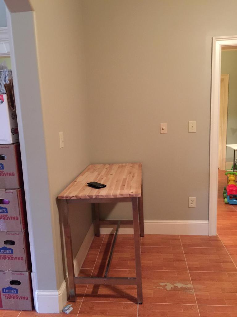
Across the room is a little corner that we are not going to really touch. We figure that we have this small table frame that we can add wheels to and make it a movable island. When it isn’t in the center of the room, it can be pushed to this corner and used as a small breakfast bar. So that is the ONLY thing that we had for this space and the only thing that is staying.
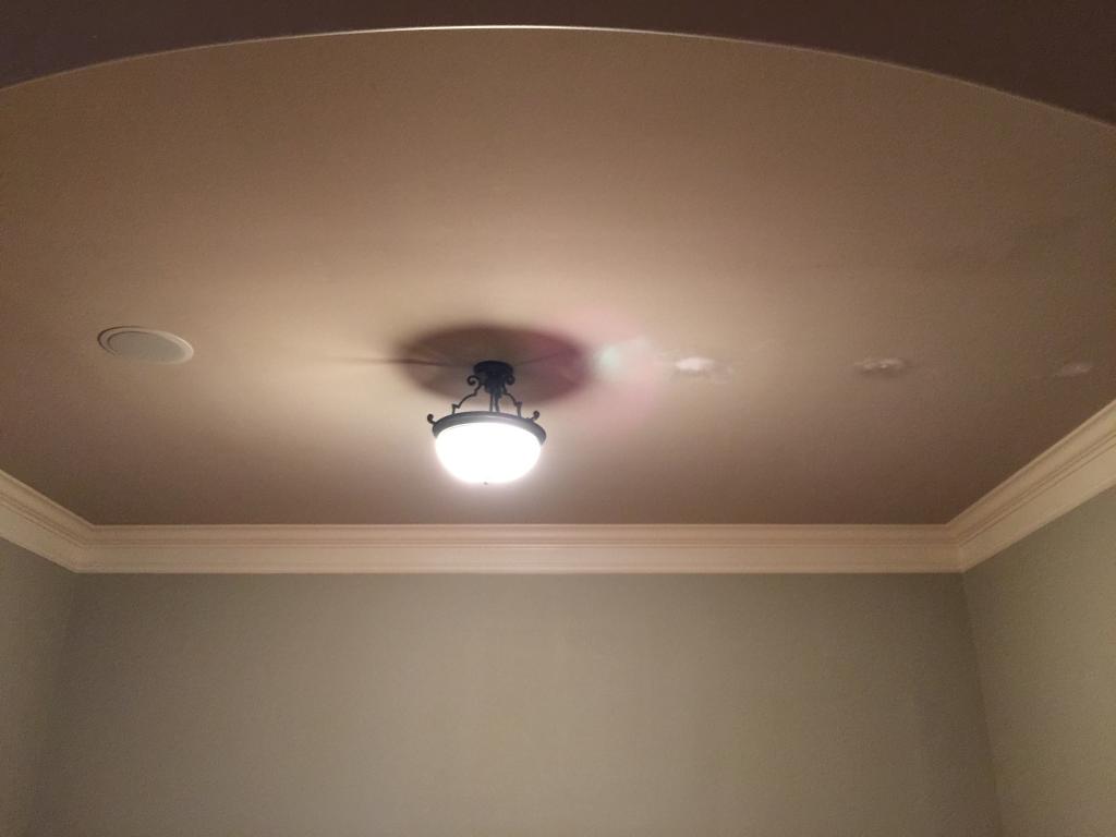
The lighting situation is kinda bleek. It has one light that is smack dab in the center of the room. Since this space doesn’t have a single window – two doorways (one small to the dining room and one large to the living room), it feels really depressing. So we are adding more recessed lighting so that the entire space is bright and feels clean and fresh. I also want to add some accent lighting….more on that later.
Okay….so are you ready to see what we have planned so far? This is our preliminary inspiration board. It will make for a kitchen that has a simple industrial vibe that has loads of storage and should be classic enough to last for years….
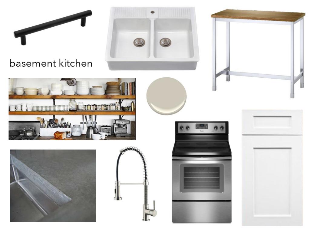
First…the overall plan is to use a simple monochromatic color scheme, have loads of texture and use hard-wearing materials. We want to add that industrial vibe with concrete countertops but also with incorporating some wood open shelving, stainless appliances and dark hardware. The classic touches will come with the cabinetry – OMG SHAKER STYLE – and a farmhouse sink and a clean color palette.
We knew that the first step in this kitchen adventure was sourcing cabinets and we looked at tons of different options before finally landing on Cabinets.com.
I know that you are thinking…of course, you love them…they are sponsoring this post. Well…just for full disclosure, we picked out their ready-to-assemble (RTA) cabinets in the shaker style (these are called Titusville and the door style name is Shaker Maple White) and were ready to pull the trigger far before we were getting anything for free. I spent hours looking at different styles and different quality and different price points and I always came back to the RTA cabinets at Cabinets.com. Jeremy and I even called them up to use their free kitchen designer because let’s face it….I know what I like but I am no kitchen designer.
Then when Jessica (their kitchen designer extraordinaire!) called me and asked me some more detailed questions, I knew that the plan they had up their sleeves was awesome. They even provided two options for me. And both blew my socks off. Seriously. My feet are cold.
This is plan #1 – this has the layout I requested complete with full pantry areas and tall cabinets. The range has a microwave/hood combo over it.
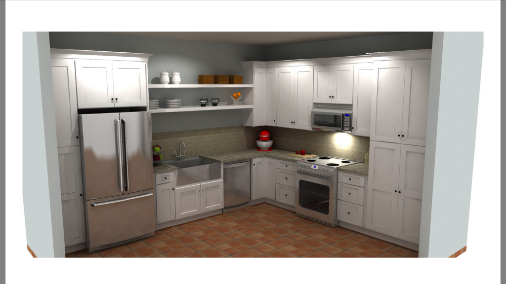
I love that the cabinets on the fridge side and the range side are the same height and it adds to the overall balanced effect for the open shelves.

But the wall of cabinetry here with the microwave hood seemed like A LOT of white cabinets….
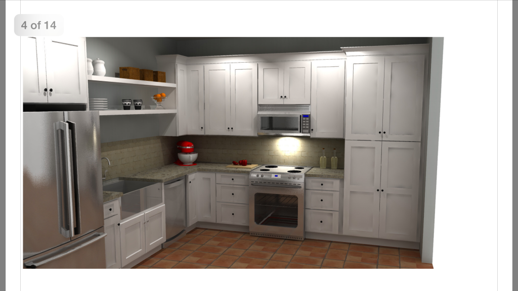
Now for option #2….remember…this is what we are currently working with….
Option #2 has varied height cabinets which really looks super dynamic from this view. Also it has a range hood that extends all the way up (BIG FAN HERE!) but that would mean that we would have to find an alternative place for the microwave (I’m thinking inside the pantry).
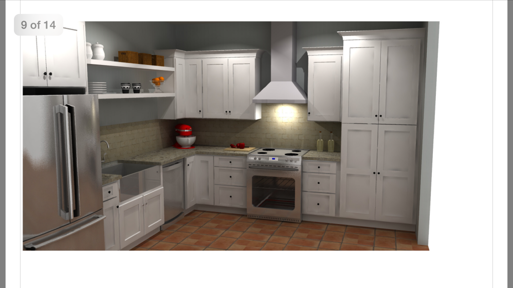
As much as I love the dynamic effect of different height cabinets, I don’t love that from this view because then the cabinets are not even on either side of the open shelves.
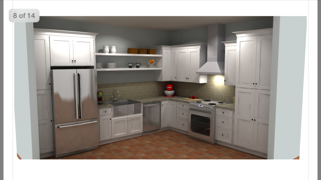
Overall though….SUPER IMPRESSED with the mockups. And they were super fast and very helpful in allowing me to imagine what we were actually going to purchase. So I decided that I wanted the range hood….obviously….and because we were going to lose cabinet space by putting the microwave inside the pantry and because we would lose the microwave cabinet, that we should opt for the higher height cabinets. That way we have a smidge extra storage and I still get that balanced look on the open shelving.
We printed off our cabinets-to-buy list and that’s when Jeremy decided that he would contact Cabinets.com to see if they could give us a discount. They said YES and we also hit it right as they started their 25% off sale! Even though we did have to pitch in for the cabinets, it was such a good feeling knowing that whoever was in this space, they would be getting top of the line cabinetry. And let me tell ya….yesterday we started the assembling process (more on that later) and I have to admit….I am CRAZY jealous. These are so freaking nice. Like way nicer than what I have in my kitchen. Soft-close drawers….substantial feeling doors….perfect finishes…the green monster had me DROOLING.
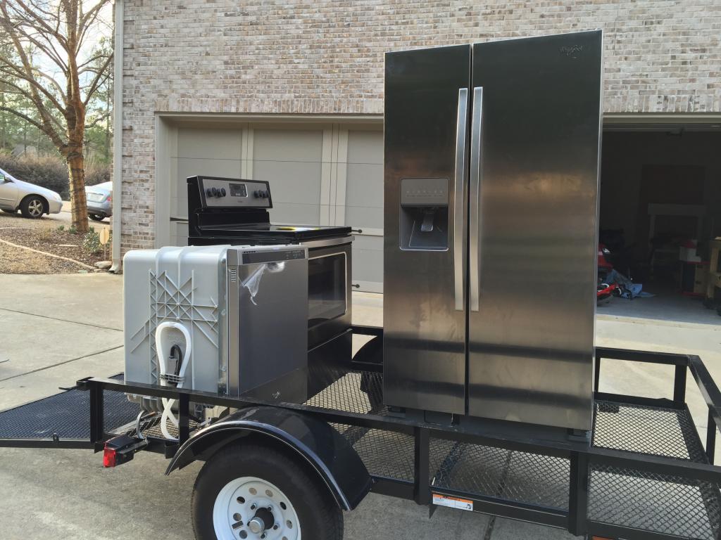
We also got our appliances! We had a strict budget and hit up floor models so that we could get stainless steel Whirlpool brand. I’ll be sharing our tricks to get the best price here soon. Basically we got all three appliances for $1200…including tax…which is a great price.
Sooo now here is where I need some help. I have been going back and forth on all fronts, trying to figure out what would be the best fit for down there and I am kinda on the fence about three different areas. So I thought that maybe if I put it to a vote, I would get some clarity.
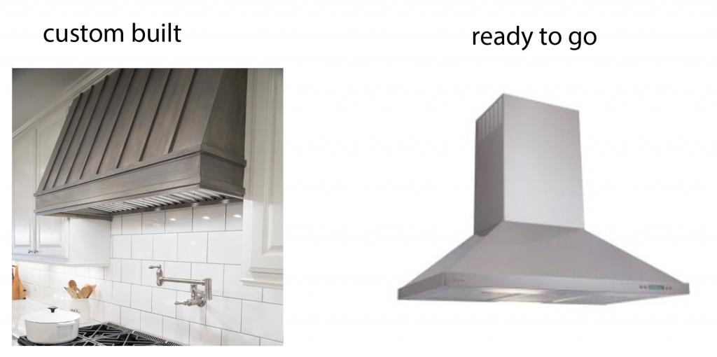
First…the hood. I love the look of the ready-to-go hood in the designer mockups. BUT they are pretty pricey. I have scoured Craigslist and have looked into buying floor models but they all are much more expensive than getting a smaller range vent and building a custom cover. Kinda like what we did for our kitchen. Jeremy is full on the ready-to-go page but I am kinda leaning toward custom built because it would be cheaper and lend itself toward the industrial vibe if we did it right. What do you think?
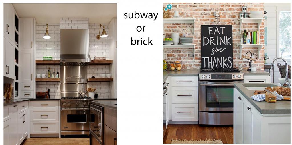
Second point of contention….the backsplash. I have been all over pinterest and the things that stand out to me for industrial inspired kitchens are two types of backsplashes….white subway tile with darker grout or brick. Both have a cool imperfect vibe about them and they are both LOADS of texture…which I LOVE. I am leaning toward the brick because we could get cheap panels and do the ENTIRE WALL which is a huge statement. The brick we could remove down the line if it goes out of style. The tiles are more classic but I would not be able to remove them and they would cost more and I would only do them to the bottom of the shelving and bottom of the hood….so not as big a statement. Also they are more permanent. I feel like taking the risk on the brick would be good but it’s also harder to clean…and since it’s not my space, is that a big task to put on someone else? What would you pick?
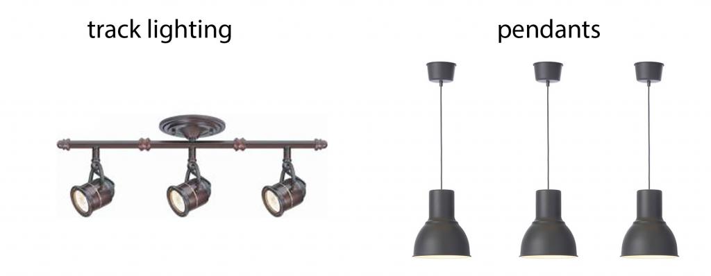
Last but certainly not least is lighting. I am thinking six recessed lights in the whole kitchen and then we need something to add drama….like accent lighting over the open shelving. I have scoured and searched and really don’t want to spend more than $100 on additional lights. The options I have found are both great with my industrial mindset (how many times have I said industrial in this post?!? gah!) and they both would fall right around $100. The track lighting….well…it’s track lighting….but it’s cool track lighting. And I could aim it straight down over the shelves or adjust them all in the same direction and make that shelving/sink area feel very refined. The pendants are from ikea and I think three of them would look really striking. They would make a huge statement. Plus, each pendant is only $30 so it would be a huge budget saver. I know that I could probably find other pendants at similar prices but these black ones would be classic with the matte black and are a little bigger so unless craigslist comes through…I like that I can get these easily.
What do you think? Would you take the risk?
A huge thank you to everyone who is taking the time to vote. And if you are in the market for cabinetry…I really hope you check out Cabinets.com. They truly wowed us with their customer service and the quality of their product. They run sales periodically so you can sign up to be notified of the next sale on their website…click here and sign up at the bottom of the page under “SIGNUP FOR DISCOUNT ALERTS”.

So your friends are already living down there and still have no kitchen!?! Holy cow, I could not do that. Especially with little kiddos. I vote do whatever is fastest to get those poor people a working kitchen. I thought this was going to be a recap!
Hi Katie! I love your ideas!! When are you going to come do my house? :P, kidding aside, how big is this room? You’ve inspired me… Wonder if I could fit layout #1 in my kitchen?!
First time commenting, but I just wanted to say I love the kitchen design and can’t wait to redo my own.
I wonder if flipping the fridge and the tall cabinet next to it will allow the open cabinets to feel more balanced. I agree about the wonky feeling of the different height cabinets on either side and since you probably don’t have to do anything different, that could work…just a thought 🙂
The brick is a nice warm classic texture that will still feel good once we all tire of the “industrial” trend. Down the road, you can even paint it a solid color for a brand new look with texture. I vote for warmth and texture in a windowless basement kitchen to keep any “cave-like” feelings away. Love those mock-ups! I am swooning over the height of those cabinets, and dying to know how you got all the appliances for that cheap. President’s Day sale?
Hi Katie. I recently pinned this photo that looks extremely similar to the style you’re going for with the industrial/contrast kitchen. I’m sure you’ve seen it already, but maybe a planked backsplash, similar to what’s shown, would be cheap, easy, and fit in with your theme. Just a thought :-). https://www.pinterest.com/pin/242701867395163357/
Looks really good! Would you mind sharing a link for the ‘industrial’ (couldn’t resist : ) ) track lighting? We’re in the midst of re-doing our rental unit’s kitchen and that track lighting is so much better than what I’ve found!
Love it Katie! Can’t wait to see the end result! Are you thinking of renting this space out after your friends move out? Or just keep it as an extra kitchen for entertaining?
When it comes to kitchens it is always best to stick with classic choices. White cabinets and white subway tile and then add the other stuff like the custom hood, lighting etc to give you the look and feel you are going for.
My inlaws had the faux brick and it always looked dated to me. It was an element that was not repeated anywhere in their house and it just looked out of place. If your going to invest in something regardless of the dollar amount make sure it will last longer than the 10 year trend span.
My choices would be
Custom build
white subway tile
track lighting
My votes: Subway tile (for ease of cleaning), ready to go hood, and pendant lights
Such beautiful choices, no matter what you choose it will bless anyone that calls it home (even if for a little while).
I don’t know if you’ve heard of Southeastern Appliances in Covington. It’s small and been there forever but they not only beat everyone’s price on my range hood, they gave me an extra charcoal filter. They also have a floor model/dinged appliance room that is steeply discounted.
Good luck! I can’t wait to see how it turns out.
Hi Katie, love the direction you’re going with the kitchen! Have you checked out remodel market.com for the hood? I thought they had fair prices and a good rep.
Love the look you have planned so far! The industrial look is perfect for a basement kitchen. You can have a little more fun with it. Also what is the random window for? Why would anyone pass through there? Weird. You mentioned using concrete counter tops. Are you going to do a tutorial on them? We are looking to do a concrete counter top in our laundry room, and possibly one as a outdoor kitchen. Any tips would be awesome! I don’t know how you are doing all of this with three small kids, pregnant, and a basement full of kids too. Craziness! You prove that kids don’t stop home renovations!
OK. I love both options… but for functionality sake i’d probably just go with a microwave over the stove with vent feature. one day when you’re guest have their own lovely home and your basement is just Bower Family and Friends rec space… you’ll be able to toss a bag of popcorn or whip up a quick Chex mix or nuke that Chinese take out right there. unless you don’t eat take out, or popcorn, or Chex mix. then i love the custom hood and track light option!
Something to think about when making the backsplash decision- would the brick make it feel dungeon-like since there are no windows?
Can’t wait to see it finished I think it’s going to look fantastic!
Oh man. I would *never* put brick in the kitchen; wayyyy too hard to clean.
Love the pendants!
LOVE love love seeing all of your major renos. Makes me feel like I’m living vicariously through you. Can’t wait to see the finished product.
Melanie
cornerofsass.blogspot.com
I really like the look of the brick and subway tile is alllllll I see anymore, so it would be neat to see something different and interesting. As far as cleaning goes, I don’t think it will be that difficult. I mean, sure in 20-30 years, someone might be like what the heck, but for a long while, it’ll be fine.
Looks so great so far!
They have a working range and fridge because we tried to get those up and running asap but in general when they are home they come upstairs and I cook for everyone.
xo kb
Right now the idea is to allow this space to be used for friends or missionaries from church that are in transitions or need a temporary short term place. We honestly are trying to stress to the kids that this is no longer our “home” but we don’t plan on making money from it like renting.
xo kb
ready to go, subway, pendant
🙂
congrats on baby #4!
Oh pretty please go with the brick!! I have been wanting to do this in my kitchen and would love to see the installation process!
I love brick in kitchens but not fake brick and not near water and grease. I would totally go with subway tile. It’s classic. Shaker cabinets and subway tiles have always been around so that’s the way I would go. More cost up front but will never have to be taken out. Also so much easier to clean!! I hate cleaning as it is and if it’s hard I’d just get mad. Lol
Can’t wait to see the finished product! 🙂
Try cleaning the rough texture of brick, no way. White subway tile is a classic for a very good reason and so easy to keep clean. Also will keep the basement lighter. But I know, whatever you do will look great.
I would definitely advise against the subway tile. It’s so 2013, and will surely go out of style fast and not be coming back. Think to the tune of 70’s purple and orange kitchens…not coming back for a LONG time. The subway tile is also very pinterest-y and unoriginal.
Those cabinets look awesome!!! I’d go with custom hood, brick, and either lighting -although track looks unique ….pendants are everywhere. What fun to decorate once it is done 🙂
Agree! And especially by the stove! It’ll be covered in spaghetti sauce splatters and grime in a matter of a week. Go for clean and practical. No one wants to live with other people’s dirt!
Looks good! I vote custom built hood, subway tile backsplash, and the pendant lights.
The ideas you have are great. I was just wondering if you were planning on leaving the shelves white like in the mock up or doing them in a stain like what some of your examples look like? A stained wood against white subway tiles would look awesome and definitely add to the industrial feel you are going for.
Subway tile is EVERYWHERE! Love the brick option and the fact it’s not so permanent. White tile and dark grout makes me think of a restaurant and not a home kitchen.
Hi Katie,
On your mood board, is the island from Lowe’s? I have been looking at one for months to use as a craft/quilt cutting table. Is it sturdy/steady?
I really think the brick is needed to warm up all the “cold” surfaces. It’s going to look fabulous whatever you do.
I know it seems counterintuitive to choose darker brick over lighter tile in a windowless space, but I really think the brick would look much warmer and more inviting than the white in this case. Seems like the subway tile might possibly seem a little cold & bleak. Fun, fun choices, though, and I know it will be gorgeous either way!
You are amazing. How do you find time for everything?? Researching, pinteresting, big projects, blogging, AND taking care of your sweet boys AND running a household, and one with extra ‘family’ members in it right now, at that. Seriously. Sometimes it’s all I can do to get dinner on the table at the end of the day at home with just my two under 3. Any secrets you can share about being so productive while parenting Littles???
Are you still renting that house you used to live in before you moved here? Or did you sell it? I can’t remember.
I think if you could do tile as much as you can budget now, you can add more later when you save up a bit more for that “all the way up” wow factor. Who says you have to do it all or none?
But if you go the brick route, you might be interested in this painting technique by these formerly professional painters (though in tones that more suit your style): http://www.epbot.com/2015/01/diy-faux-brick-painting-tutorial.html
It’s going to be amazing and I can’t wait to see it all come together. I love the clean look of stainless appliances, silver pendants and subway tile…fun project to watch!!
Definitely the pendants. My in-laws had track lighting in their kitchen and it got so hot in there when the lights were on! I love the look of both the brick and the subway tile, but I agree with other commenters about subway tile being more practical in a kitchen. I do not agree with the one commenter about subway tile being “too 2013” and “Pinterest-y” because it is a classic design element that is found in both older homes and contemporary homes. White subway tile is no avocado fridge!
I would definitely go with the white subway tile because it’s easy to clean, it makes for added brightness in the kitchen and subway tiles are classic and have been in style forever! I think a custom hood adds elegance and charm! Then you could have a place to display beautiful platters or whatever your heart desires. If you build the hood with a 4-5″ shelf around it, its perfect for displaying little vignettes. I also like the pendants and should you tire of the color, you could paint them. Pendants are timeless as well! Happy decorating and congrats on your pregnancy! Very happy and excited for you and your family!
I love your kitchen designs! And the little voting buttons were fun. I loved being able to see the results instantly to know what others picked too. Thanks for letting us in on the fun!
Having had a similar windowless kitchen (a galley style no less!) I would go DEFINITELY for the tile. It reflects SO much light (I was AMAZED at the difference after completely doubting- but going with ;-)- my mom’s advice. It made my husband and my first kitchen feel much more legitimate and less like the actual retrofitted wet bar in the basement game room of my parent’s house it was.
Also, thank you for your and your entire family’s choice to create a home for others. It is a gift of servitude and I so appreciate that you decided to share the decision (and the remodel/renovate/redecorate!) with the internet mass, opening it, and yourself, to inevitable judgment. He knows our hearts and intentions. Instead of shying away, I love that you are so simply proclaiming that this is one way that you are serving Him.
Just wanted to put in my two cents- we lived with a faux brick backsplash and I HATED cleaning it! It was such a pain and I always felt like it was dirty. Now we have subway tile and I love it!
Hi Katie!!! I love your plans! I have a suggestion for lighting. You said that it is dark in this kitchen because there is no daylight. I recommend this option:
http://www.homedepot.com/p/Lithonia-Lighting-Versi-Lite-White-3000K-LED-Mini-Flush-Mount-FMML-7-830-M6/204648154?N=5yc1vZc7nkZwvZ1z115g2
Just MAKE SURE you get it in 2700 or 3000 degrees Kelvin (NOT 4000K). The distribution on this fixture is amazing! It SURFACE mounts, so no recessing anything! Recessed lighting just doesn’t throw sideways very well, and this will really light everything better. I’m trying to remember the dimensions of your room; it looks like it is about 16′ square. I’d guess that you want 4 fixtures. Your utility may offer a rebate for LED lighting (which reduces the price).
You may want to add undercabinet lighting, we did LED tape light under our cabinets, and used http://inspiredled.com/
It was about $200 for the undercabinet tape product. (You can do it cheaper with IKEA, but the wire lengths won’t be custom.)
THEN, pick a little decorative lighting for accent. I usually source that from Overstock or Wayfair… they have good prices.
…You may also have lighting sponsors! Which would be great.
On the hood… our custom one has been 2 years in the making (and we have one child). Unless someone is going to build it for you, I’d go with out of the box, since this isn’t for your kitchen. That is pure opinion, and you guys are great with projects, so it might be no big deal for you.
GOOD LUCK!!!
It all seems really extravagant for a basement kitchen
I agree.
Ready made hood to get those people a kitchen ASAP.
Brick is too hard to clean.
Track lighting is all or nothing: Either you are being blinded by the light shining in your eyes, OR you are casting a shadow and can’t see what’s in front of you because it’s too dark. lol
I can’t wait to see it finished!
We are on the hunt for cabinets. It is so stressful. I didn’t know cabinets.com did free mock ups. I am going there now.
I think there needs tobe a third open shelf that will be the same heigh as the lower shelves on right. I think thats what’s throwing the look off for me. I readsome where that grouping thingsin odd numbers such as 3 and 5 for example are better and more appealing to the eye, and will be more functional as well. I have 3 open shelves and it’s both functional and looks better. Love the brick and the track lighting paired with the stainless hood, which they seem to say starbucks coffee shop which is perfect for a basement with more of a fun and casual atmosphere!
I don’t know what’s up w the auto correct on my sentences.
Subway tile is timeless; been used in classic and modern kitchens for years. Agree that brick would make the kitchen look old and like a dungeon, much less how hard it is to clean. We had faux Z-Brick in our first kitchen and it got so messy looking in a short time. And I am a good cleaner. Subway tile, stainless steel, etc. would look nicer and more industrial. Love brick on walls in certain places, but think a bad choice and look in a kitchen. Unless you live in a large industrial loft, I think brick looks country, and not what you are going after. Know the finished kitchen will be lovely.
LOVE the kitchen plan! I also love the heart and care you are putting into a space that will be used to bless others. I am sure it will be such an encouragement for many many families for years to come. Thanks for showing us how our homes can be used to bless others- I hope to follow your example!
“Those poor people”? Katie is generously hosting a WHOLE family in her basement while raising her own three youngsters and pregnant with a fourth! She is smart not to rush a very expensive project like a new kitchen. She is moving very quickly as is but being contemplative about expensive, long term renovations is the right thing to do!
im dying to know how you got those appliances!! I need all of those things like yesterday!
Perhaps you could do brick everywhere except behind the stove… Not sure what other finish I would choose there, but that is where you will have most of the cleaning issues…
I love the look of the brick in the pic you shared, but that’s a pretty bright space with natural light. I would worry that in a basement it’s going to be too dark. I also think it would clash witto concrete countertops. I’d go back to the drawing board on the backsplash, subway tile is getting tiresome, but I do like the idea of a reflective surface.
I’ve been imagining a small Reno in my own kitchen. I’m super jealous that you get the fun of doing a reno project without giving up your primary kitchen space. When we did our backlash (first time tiling so it was a 2 week thing), I nearly list my mind! We only have 1 toddler but it was a nightmare just the same.
I think the overhead hood is very fitting for the industrial feel while still being very timeless.
Subway tile is still industrial without being over the top. The rest of the space would look weird if you go too industrial with everything.
I really like the track lighting & I don’t have a reason. I guess it just strikes a chord with me although I don’t have any in my own home.
Have fun!
Brick all the way! Or something other than white subway tile. I am so sick of it; it looks just plain ugly in my view, and with dark grout it’s even worse. It is not exciting or pretty.
If you go with brick, will you use the same kind of panels as the ones in the nursery? If so, I’m curious… have you considered cutting in on the brick pattern to scatter that seam a bit? think of laying sheets of subway tile and how they aren’t square, but have places where the next sheet overlaps to ensure there isn’t an obvious gap. Does that make sense? Perhaps cutting the panels in that way would lend to it looking more like actual brick and help avoid that seam, since you won’t be painting it? Just a thought. 🙂
Given the small space I would have to disagree with the choice of no microwave over the stove. We have that combo in our kitchen. It works great, it is practical and I would much rather have the cabinet space. To each their own but for a basement rental style unit it seems like you are choosing “pretty” over strorage IMHO. Looking forward to seeing the final product!
That’s just so kind! 🙂
Everything looks so pretty!
I like the first option better with the taller cabinets so Im Glad You went with that one.
I like the industrial looking hood, love the brick wall (although I also like the subway tile) but the thing about having 2 kitchens in one house is that you can actually “go for it” instead of doing the neutral and safe choices. I love both lighting choices too.
You have great taste so I’m sure it will look beautiful. Btw, great job with your bathroom, it looks like a lot of work but it came out gorgeous!
I have so enjoyed watching what y’all are doing! And so wonderful for your friends, but with lasting value too. Super smart! For the kitchen… I vote for the ready to install hood (because it’s a cleaner look), the subway tile (again the cleaner look, and omg I’ve had brick in the kitchen before – yuck! Impossible to clean), and the pendant lighting (because it’s more of a home feel to me). I don’t mind that the cabinets are not the same height on one wall, I find it interesting. It’s going to be a fantastic kitchen. Maybe yours will get an upgrade in a year or two!!
I actually thought of that and also thought of adding additional grout to the mortar lines to give it a more realistic effect. I’m not sure exactly what would look best but it’s just an idea.
xo – kb
I voted already made hood, brick and pendants. But I’m not sure about the brick- I love Westons room but don’t know if it will be practical? If you feel it will be just as practical then yes, I would vote brick. But if you think it would be harder to keep clean then white subway it is.
I think in a small space the hood needs to be a feature that doesn’t cry attention- in a bigger kitchen I’d be all for a custom hood. Plus I don’t feel like you Bowers will be utilising this space much yourselves so you should save your effort for your own spaces up stairs!
Also, I voted pendants, but I’m confused as to the placement of these…? Will they be going against the wall and hanging directly above the shelves or where…? I’m now considered the track lights in the middle of the room, but facing the shelves.
Either way you have very lucky friends and they will appreciate any kitchen you give them- I hope you’re getting your rent payments in labour at least! Love the choices!
*PS, sorry Aussie spelling! haha
Oh if I had standard ceiling height in here, I would have definitely chosen the microwave over the range but since we have almost ten ceilings, we can add taller cabinetry.
xo – kb
We are renting it.
xo – kb
It’s actually from Ikea. I got it a while back in the clearance section.
xo – kb
I think you should go with subway tile. It will reflect the light keeping the airy theme. Otherwise…any other day I would ALWAYS choose brick! 🙂
Yeah, I guess I don’t cook splattery food much but my stovetop backsplashes rarely even need wiped.
The subway tile with dark grout is too ‘something Joanna Gaines puts in every single Fixer Upper’ for me. LOL
I love a hood/micro combo. I’m old.
Wow, score on that appliance deal. Mine were like $1200 each and even that was a deal!
frozen pizza 🙂 Just kidding…I married an awesome man that helps me a lot 🙂
xo – kb
My vote for ready to go and the subway tile is all about WHAT IS EASIER TO CLEAN! Grease on brick? Grease on a pretty wood painted vent cover? No thanks.
I think you should do a stainless steel backsplash. It would fit the kitchen style perfectly, be super-easy to clean, and reflect a bit of light back into the room.
p.s. How are you planning to vent the hood?
We will go with a ventless hood.
xo – kb
Maybe you’ve already mentioned it somewhere, but what are the plans for the floor? Are they staying as-is, patch job and all? Just curious. 🙂
I like the sconces with arms that are in the picture with the white tile… Track lighting is not cool right now, as you know, and I don’t see the pendants working in that space. OR maybe you could install under cabinet lighting under the bottom shelf to light the sink area.
I love all of your ideas for his kitchen!
One suggestion: definitely put the he says lighting on a dimmer switch. We installed six recessed lights and when they’re on full power, they’re a little too bright. However, we do have a kitchen window in the skylight. You won’t have natural lighting, but you still may want to leave the option of dimming the lights, which is especially nice in the evening.
Also, and this is probably a given, but make sure to have the separate center light (if you keep it) on a different switch so you can turn it on separately.
Lastly, it would be beneficial to put a recess light on a separate switch above the sink for whoever is washing the dishes.
Good luck with everything! 🙂
I love all of your ideas for his kitchen!
One suggestion: definitely put the recessed lighting on a dimmer switch. We installed six recessed lights and when they’re on full power, they’re a little too bright. However, we do have a kitchen window in the skylight. You won’t have natural lighting, but you still may want to leave the option of dimming the lights, which is especially nice in the evening.
Also, and this is probably a given, but make sure to have the separate center light (if you keep it) on a different switch so you can turn it on separately.
Lastly, it would be beneficial to put a recess light on a separate switch above the sink for whoever is washing the dishes in case they don’t want all of the lights on.
Good luck with everything! 🙂
We haven’t decided…mostly because we can’t agree. Jer wants to spring for engineered hardwood (we had it in our last basement) and I think laminate is smarter since the space is so large. Until we get on the same page, it’ll stay as is.
xo kb
Oh goodness, I wasn’t criticizing anyone and I never said she wasn’t being generous. I was just saying, as the mother of three small children myself, I know how difficult it would be to move to someplace new (and probably significantly downsizing) and have no working kitchen. So yes “those poor people” because I can empathize and feel for how challenging this period of their lives may be.
I am pretty OBSESSED with the cabinetry you chose, Katie. And I love that you have so much storage space – the pantries are awesome. Those Shaker doors get me every time. I actually need to start planning for our kitchen design for the build and now you have me looking at Cabinets.com. We did IKEA cabinets last time, and we were happy with the experience, but that doesn’t mean I’m not open to new things. =) Thanks for the rec. Looking forward to following along.
Also – is that sink from Cabinets.com? That apron front stainless number is haunting my dreams.
No…it’s just what we told them that we liked.
xo – kb
I get what Amanda is saying and I definitely see your point too Liz. I think that moving is always a challenge and yes, no working kitchen (no matter how many kids you have) is tough. But I think that Amanda is saying that because the phrase “those poor people” can come across a little bit like we are not providing what we should or we are subjecting them to something negative. If I were the sensitive type, it would feel like a criticism because it is our home and we have opened it to them and we told them that the kitchen would be a work-in-progress for a little while. The only scenario I can draw similarities to would be if you were to have a house guest and they didn’t have their own bed…you had a couch…and that is where they slept. If someone said “those poor people”, you would feel like you should have a bed for them…even if it wasn’t feasible at that time. We all want to serve others the best we can and we did our best to make sure that they had working appliances as soon as possible…and we do make them dinner the nights that they are here at the house…so I hope that comforts you to some degree. And I love that you can empathize with people who may be going through something challenging…I think that is noble and I don’t want you to be discouraged or criticized either….we all need to be able to see both sides and focus on that fact that loving others can have bumps in the road!
xo – kb
I love those cabinets!! I am such a sucker for shaker style. And I love both the brick and tile options. It might look awesome to do the tile on the side of the kitchen with the sink and range but then do an accent wall of brick somewhere else in the basement or the opposite side of the kitchen. The only thing I am confused about (as someone who works at a lighting store) is where those pendants would actually go? They are pretty deep and wide to hang three over the open shelving…would they just butt right up against the wall? Maybe I am just not understanding the placement. If you go for that track light I would recommend placing it slightly out from the shelving so that you can aim it into the shelves or onto the sink if you want. If you place it directly above the shelves you will only get light on that top shelf and it won’t really do much else. Hope that’s helpful. Can’t wait to see how it turns out!!
Yes…they would be really close to the wall…it would be the smaller size of those pendants (they come REALLY large and then smaller).
xo – kb
So we remodeled our kitchen almost three years ago and I had this crazy idea to put in real brick as the backsplash, all the way to the ceiling, with floating shelves on one wall. And it is HANDS DOWN the most commented on thing in our higher-end reno. Partly because we used old chicago-style blemished and recovered brick that we laid in a herringbone pattern, and partly because we painted it. And it is awesome. Any spills or splashes come right off with chlorox wipes and in the future, I (or future homeowners) can repaint it any shade. It is my favorite thing in our kitchen, more so than any of the other things we carefully picked out. Go for the brick! 🙂
Hi Katie,
Just curious where the track lighting is from? I really love it! Not usually a fan of track lighting, but you are right it is pretty! Looking for something similar. Ikea has a cheaper version of that for 40$, called the Vitemolla, but not as nice as the one you posted.
As for the choices, since it will mainly be a rental or secondary kitchen for you folks I would make it as easy and cost effective as possible. If it were your own space, the custom vent hood would be my vote, but since it’s not, give yourselves a DIY rest and go for the ready to assembly. I will always love white subway tile with dark grout! And the track you posted is cute, but the pendants are beauties as well. Can’t go wrong either way!
thanks,
Kari
I chose the Ready To Go Hood, brick and pendants. I’m building a new house right now, we are going with white cabinets, black counters, stainless steel range hood and white subway tile. But, for your industrial feel in the basement, I think the brick is the way to go. I love it!
The track lighting is from Home Depot. Here is the link.
xo – kb
Here is the link. It’s from Home Depot 🙂
xo – kb
Wondering if you considered glass fronted cabinet doors for some of the cabinets above the range?
Great ideas for the basement kitchen! We are about to remodel and I would love to hear more about your low cost appliance tips if you have time for a quick post!
We did but since this isn’t really going to be our space, it was a risky choice. A lot of folks don’t have matching dishes and pretty kitchen stuff so we figured that open shelving was probably going to be where they put their ‘sets’ and the cabinets near the range would be where they hide everything else.
xo – kb
I wanna know how you scored that deal on the appliances!! When will you be sharing your tips and tricks, Katie?
Yes! Soon!
xo – kb