I thought by now I would have at least ten thousand photos of our Christmas shananigans with two hooligans named Will & Weston up. Apparently this Apple learning curve is no joke. So while I sort through all those photos and try to retrain my brain on all things computer, allow me to put up a post that is a long time coming. This is probably gonna get some of you shouting BORING! (especially since we are already at the midway point of painting. Can you believe that we are at the half-way point of painting the rooms on the first and second floor?!)…but this is the post about all things PAINT!
Yup, if you were one of the hundreds of people that ever asked me…what color is _______? (fill in that blank with a room name) then this is the post for you and your paint-chip-obsessed brain.
Here are all the paint colors that I have color matched so far as well as the color scheme that we have already been working toward in this house.
First up…the old paint colors…
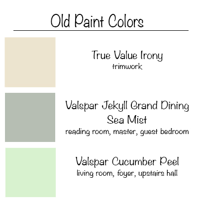
The living room and the foyer as well as the stairway to the upstairs hall and the ‘adult bedrooms’ have all remained untouched. Mostly because of a height issue. All of the ceilings match the trimwork (which as you can plainly see on your color-enhanced monitors) is not white. Not even close to white. So that means all the trim and all the ceilings need painting. Not a problem if you don’t mind being hoisted or situated 20 feet in the air. I do. I have a problem with that.
I’ll have you know that we got a quote on painting just the ceilings and trimwork in the foyer and the living room (just two rooms) because those are the ones that are two story high and it came in over $3K. That’s about when Jer and I looked at each other and said “I guess we are renting scaffolding.”
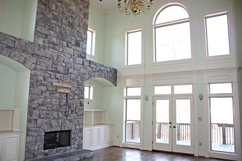
I have not been hiding the fact that I do not like the Cucumber Peel color, especially next to the non-white-trim…but the last color (which is very close to the swatch listed above but not a perfect match) is not one that bothers me. If only the previous owners left me a bucket or two of paint! ::shakesfistsatuniverse::
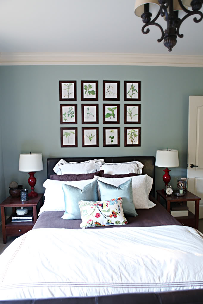
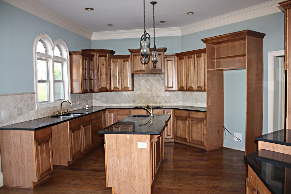
Jekyll Grand Dining Sea Mist (that’s no joke…that’s the real name) lived in the guest bedroom, the old kitchen, the reading room and the master. And yes…it looks different in each room.
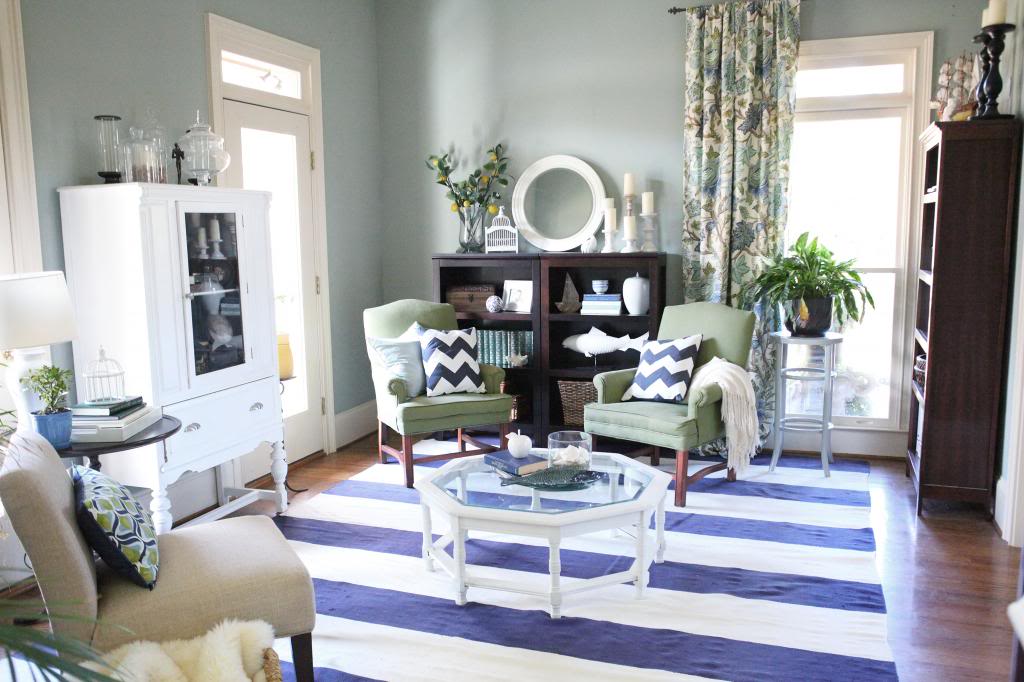
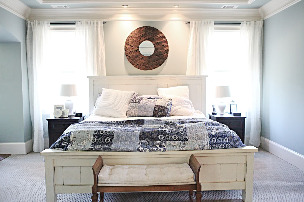
Moving on to our outside colors…
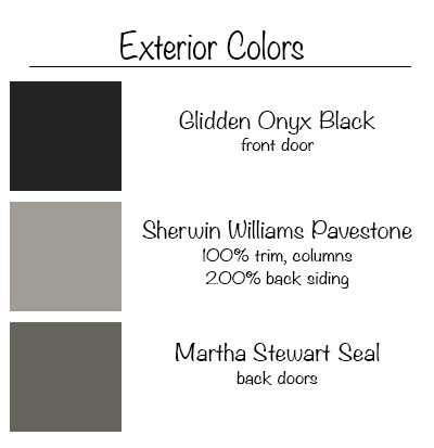
I did not list the previous exterior colors…but if you are interested in those…go outside, pick up a dog turd and have them color match it at your local home improvement store. It’s that color.
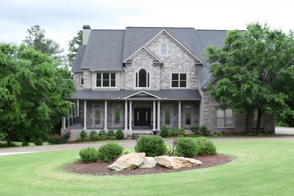
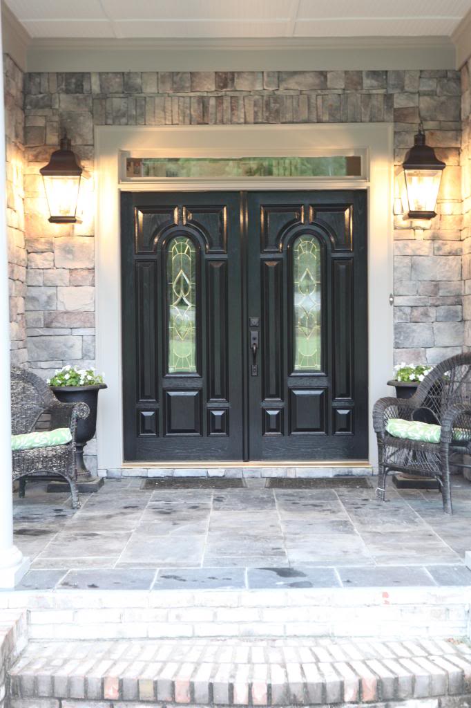
The new trim on the front as well as the columns are all Pavestone at 100%. The front doors are Onyx black but frankly, I have been fighting the urge to paint them a fun green or navy color.
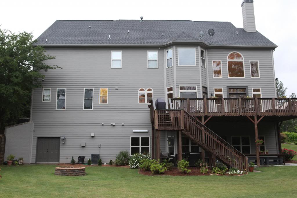
On the back of the house, the darker color is Pavestone at 200% (the Sherwin Williams can lighten it or darken it for you)…
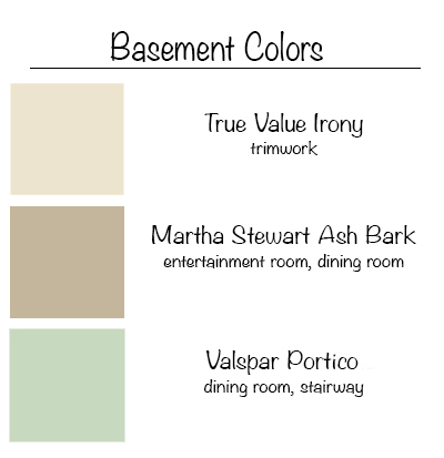
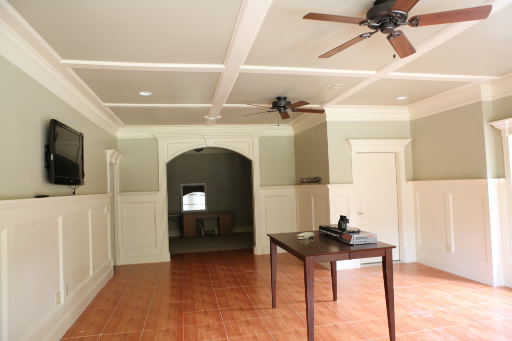
The basement is a long way from being close to done…but we did the best we could to make it as neutral as possible as quickly as possible (when my sister got married in our backyard, we revved the engines to make this area suitable.
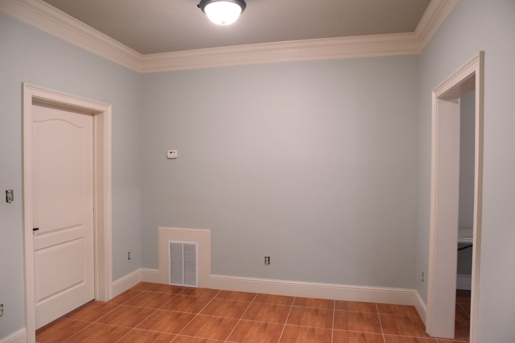
Now comes the doozie…the one long LONG list of colors in our house so far that we have used. I don’t know what is wrong with us (ahem me)…picking so many neutrals that are closer than conjoined turtles (google that one…it’s crazy).

We definitely have a very neutral base going on with grays like Metropolitan in the kitchen, bathroom and nursery….
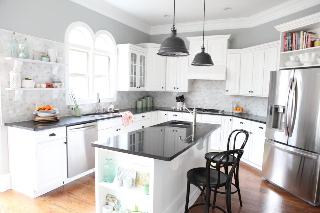
and then also with the darker, moodier Secret in the dining room…
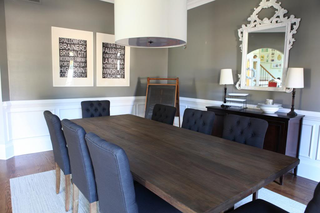
Then we have a bunch of turquoise-y blues…like Palladian Blue in the office (I would love to repaint our bedroom this color!)…
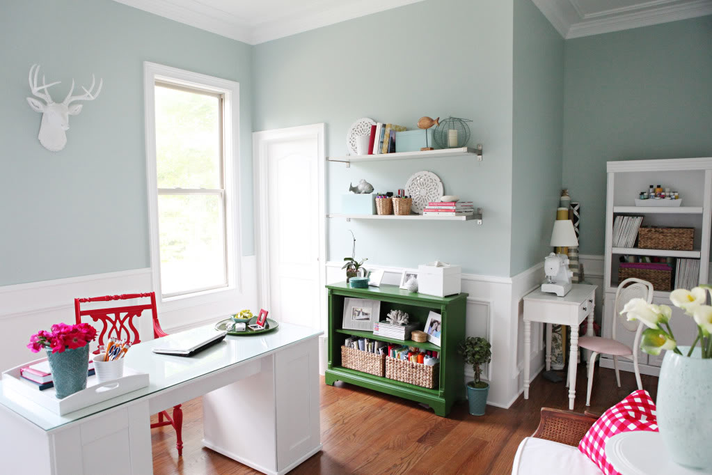
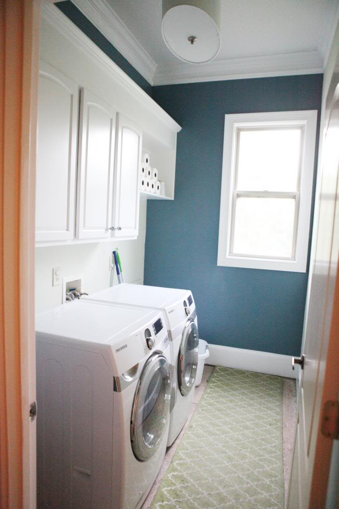
a shade darker with the Kerry Blue Terrier in the laundry right next door…
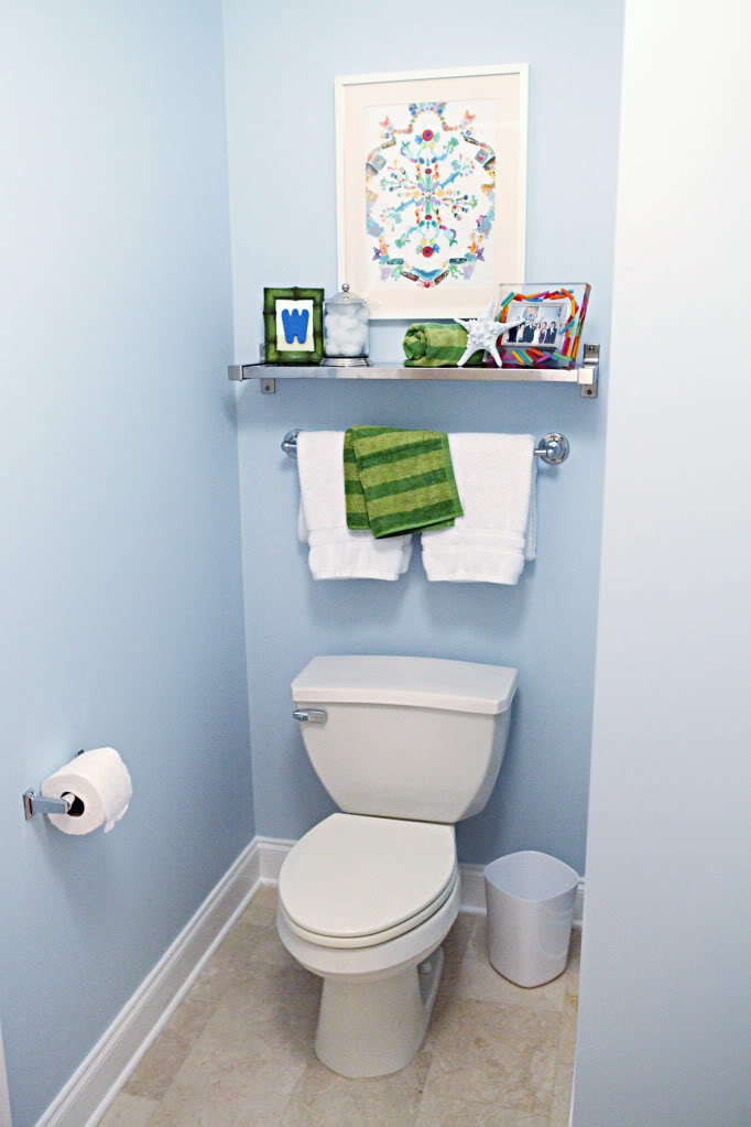
And then this baby blue in the boys potty/tub bathroom. I think this is due for a makeover at some point…just saying.
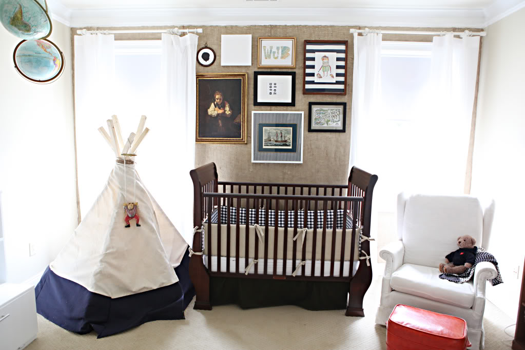
Oh and don’t get me started on the beiges/taupes/tans…Martha Stewart Sisal in Will’s room…
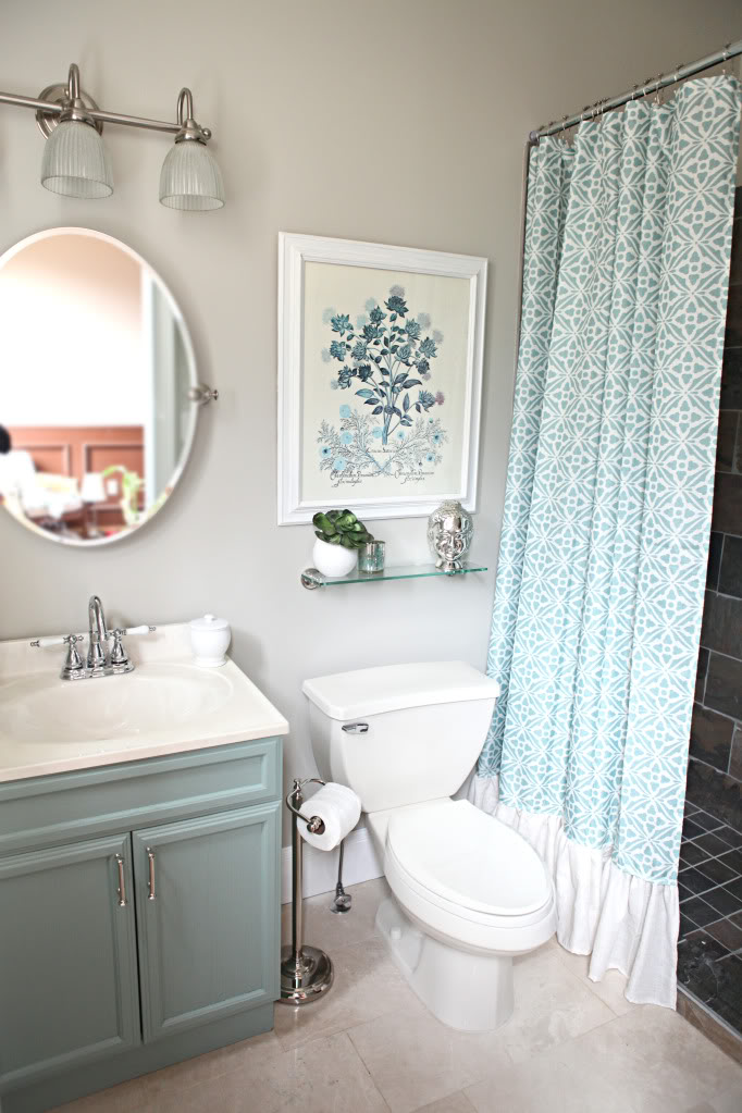
Marble Tile in the office bathroom…
And Stingray in the hall. I think in the end, we will probably repaint all the beige-y colors to Stingray and just stick to one color. one can of paint. Thank you and amen.
But as we are simplifying the overabundance of beiges…I would also like to show ya the overall dream…the PAINT COLOR wishlist if you will….

The top row would be the paint colors that really are more walls and rooms throughout the house and the bottom row would be more accent colors (a feature wall! a painted vanity! a rug/accessory/bedding/furniture!). Already we have most of these colors in the rooms…it’s just a matter of simplifying so that you can see those colors with all the mess. And that isn’t to say that smaller accent colors will be used too…like the bold bright true red in the office or the guest bedroom. It’s all a matter of finishing spaces and trying to make everything work together for the good of the house.
Plus, the good thing about this color scheme thing is that most of these colors have already been used in the house (only the orange rust color and the navy have yet to be used when it comes to painting) so I feel very comfortable knowing that the hard part (picking the right beige) is over for us. May the scaffolding begin.
No, not really. I need a couple months to work up to that 🙂
Wow! I love seeing a recap of all the rooms you have done (even though that wasn’t the point of this post 🙂 )… You have done so much… Out of curiosity, what percentage of your house would you say is finished? (or mostly finished- I know nothing is ever really “done” 🙂 )
Now that I realized that most of the neutral rooms I thought were more on the done side are actually not (Will’s room, the kids bathroom, the office bathroom…) I would say maybe 20%. The outside is like 90% so that’s huge….and the kitchen is closer to 90%…but just deciding the colors are huge for me. HUGE!!!
xo kb
I feel for you! I have high ceilings and am afraid of heights too. Desperately wanting to re-paint!
I just recently discovered Palladian Blue. I want to put it in my kitchen. I’ve got scary McDonalds yellow in there now. (In my defense, we were broke and it was an oops can at Lowe’s and it didn’t look as bright and offensive in the store). But, I’m way done with it now. I haven’t been able to find a decent picture of what it looks like in a larger space, so I’m glad you posted this. I love it even more! I’ll be interested to see what it looks like in my kitchen though.
I love those colors. Palladian blue is a great color. My mom has it in her kitchen. I was thinking of putting it in a powder room. Do you think it would work in a very small windowless room? Also, can you list the colors in those two rows you have at the end of your post?
Hate trim! I touched some of ours up last year and it wasn’t bad but having to actually repaint a different color, ah no. That might push this momma over the edge. Love seeing all the colors used and I should put all the colors I’ve used together like this. I’m all over the color map so this could be interesting!
Great post!! Love seeing all of the paint selections in on post. Thanks! Question – have you already imported your photo library to your new Mac? If so, any troubles? Everything migrate to new computer smoothly? I’m thinking of changing to a Mac but fearful that I will lose the organization of my photos in the transition. (you know, the 10’s of thousands of photos!).
$3k hurts, man. That’s kinda crazy talk in my mind for painting those two rooms. Oye.
Love your colors and love how your house is coming together. I missed the post on your stingray color update and I’m crazy about it! That room/hall looks so much more updated now!
I love your house. I love your style with every post that I read.
Paint has been the biggest issue in our house. We painted every room before we moved in (almost 2 years ago). And now some rooms have been painted 3 or 4 times since then.
But I think that I am finally finding my style and what works with this house.
I guess it will all get figured out one day 😉
Love it! We have our main living area the orange/rust color. It’s Sherwin Williams Tiger Eye and I love, love, love it! We get tons of compliments from visitors. I will say I was holding my breath during the whole painting my walls orange process! Good luck!
Great post, Katie! And thank you for adding the “Pin It” button to your posts! You always have good design ideas.
What is the color of the vanity in your office bathroom? I have been looking for that same color for a vanity in my house and cant seem to find “the one.” BTW, your house is beautiful. I check your blog often for color scheme ideas and find myself having the same ideas as you for my house.
I also share in the 20′ ceiling with ivory trim problem. Except back in December the painter that bid our job told us we could save over $1k with a paint sale. Well, we committed and now should be committed as we are choosing colors for 75% of our house in one go. And have a 6 week deadline that is fast approaching. Thanks for sharing your color plan. I will be using it as a much needed resource!
I want to re-paint my whole house now.
I know I’ve said it before but I am so in love with your dining room table & chairs!
I find it hilarious that the trim color is called Irony given how much you hate it! I really like the final color palette. The brighter pops feel warm and inviting. I can’t wait to see how you keep pulling it all together, one wall at at time.
Totally unrelated to paint, but does will stay in his crib all night? Any plans to transition him to a big boy bed?
We converted the crib to a toddler bed (it just required us removing one ‘wall’) and we do plan on transitioning him to a twin when he says he wants to…right now he said he likes his bed but wants a big boy bed when he is four. We will wait and see I guess!
xo – kb
Yes. When I found that out…I laughed really loud and long…in front of people…who had no idea what I was laughing about.
xo – kb
I do! I think it would read less ‘fresh’ than with bright light but that muteness (is that a word?) could totally work!
And here are the colors in that last graphic (L to R) –
BM Metropolitan
MS Kerry Blue Terrier
BM Palladian Blue
BM Stingray
BM Secret
Valspar Posh Red
BM Rust
Valspar Park Place
Valspar Lime Twist
BM Hale Navy
xo – kb
I haven’t yet. I’m waiting to make sure I can do Photoshop on the new Mac…which right now is a bit different so I like having a backup plan.
xo – kb
Valspar Park Place. It’s an Allen + Roth color.
xo – kb
Oh, I love the black doors! Paint more trim Katie, paint more trim! 🙂
Yay! Looking at your rooms is like an updated tour post! I had forgotten how much you have finished over the past year (AND how much I like what you’ve done). And I’m impressed all over again that you did it with 2 1/2 little boys! (Not to offend you or any one else with the “1/2”) I love your wall colors, don’t know how it looks in person, but on my computer it looks really put together. If I were you, I don’t know if I would change anything until I did the other half of the house. I could live with what you’ve done!
Btw, my dining room color is Valspar “Jekyll Island Grand Dining Sea Mist” (I still have a can of it) and it is a definite GREEN with grey undertones! I think they made a mistake color matching your blue! I picked a blue for my living room to match the green since they flow together, but that blue is Valspar “Lighthouse Shadows”. I wonder if that is the match for your blue? It has some grey, as well but not as much as the green. Since I was using this color (this was about 2 yrs ago), I checked their “Jekyll Island” collection, and there was a yellow, my green, and an ivory. No blue. I was weirdly excited about the connection with your house (I love me some grey!), but womp womp, the green/blue thing…
Also, count me as glad about your addition of the Pinterest button as well!
Edited to say this: Looking at your pics, the color I’m talking about LOOKS blue. It maybe green and just doesn’t look that way on my monitor. If it is green, forget everything I said about it!
Oooo, I’m seeing that orange or navy on the laundry room door????? I love the colors that you have so far. Very clean and cozy 🙂
Hi Katie,
I never comment..but I do love your blog! I was just wondering if you would consider a post about how you handle working from home on your blog, doing photography, house projects and being a full time mom. I am currently pregnant with baby #2 and I’m considering staying at home with them while trying to start an at home business. I’m concerned about not having enough time to do both.. or the possibility of my kids getting less attention because I’m on the computer when I should be playing with them etc. Any words of wisdom would be great!
I just can’t even deal with the conjoined turtles! Are you kidding me!? Bless their hearts! By far the saddest, funniest thing I’ve seen all day.
This is such a helpful post! Thanks KB!
Is valspar lime twist that amazing Kelly/Kate Spade-ish green you have in your office, bookshelf I think, and the octagonal mirror above dresser in the before eyes/nipples (haha) of your house?
I have always loved the color but never even knew where to begin without knowing brand/color name!
Your place looks amazing! 🙂
Where did you get the white bed frame from? It is really pretty.
Thanks for posting this! I’m seriously considering Palladian Blue in our nursery. We are waiting until D-Day to find out boy/girl… and I think this is a great compromise for either one!
One question: If you DIDN’T have crown moulding, would you paint your ceilings the same color as your walls, or keep with white ceilings to make things feel more open? I would love your take on this.
(Am I the only person who cringes when they see a colored wall meet up with a white ceiling when there is no trim there? Probably.)
What is your back splash in the kitchen? I love it!!
Are you still enjoying your dining room chairs? Are they as sturdy as you hoped? They look great!
Yes they are! So far we have used them half a dozen times and so far so good!
xo – kb
It’s 1″ marble hex from the Tile Shop. Here is the post about us installing it.
xo- kb
I think it could go both ways! I have seen some great rooms that have the walls, crown and ceiling all the same color and it looks smashing. I imagine that the tricky part would be picking a color for the ceiling and the walls that would read well all over (I’ve never done that technique so I don’t know how it would work with color casting/shadows/etc.) The worst thing that could happen is that you do paint the ceiling either a color or white and then later you repaint, right?
xo – kb
We built the master bed! Isn’t it cute?! Here is the post about it 🙂
xo – kb
Yes that is the color! I love me some Lime Twist 🙂
xo – kb
I will put that one on the list!
But I must warn ya, my biggest tip is probably DON’T SLEEP 🙂
xo – kb
Yes! I know exactly what you mean. That wall color in there is tricky to the eye too.
xo – kb
Love me that Kerry Blue!
First I can see why you bought your house – the molding is AMAZING! I painted my office a similar color to your’s it’s Grand Hotel Mackinaw Blue but it reminds me of Tiffany Blue. http://media-cache-cd0.pinimg.com/originals/70/c5/68/70c5684b240882a19efa0e6d6d6ff435.jpg
Hey Alissa! I am a work-at-home mom (photographer) so I hear your pain. What I do is section out the day. Here is my schedule (it has worked wonders for months)
6AM: wake up, shower, get dressed. It sucks getting up this early, but beind dressed and put together for the day helps keep me energized.
6:30AM: coffee and make everyone breakfast
7:00AM: eat quickly then the family gets up, while they are eating I take a half hour to start some work (generally plan out the day for the family and my work)
8:00-10AM: I devote this time to playing or going to the library/museum etc with the kids.
10:30AM: lunch
11AM-1PM: Kids get a choice to nap OR play independantly (I then work for 2 hours. My kids are 3 and 4 so they are ok with this. Generally my 3-year-old naps and my 4-year-old plays.)
1-7pm: play with the kids, make and eat dinner, get kids to bed
7-12AM: work and clean up! This time is 100% MY time to work. If the kids are still up after 7pm, my husband takes over. I take this time to edit photos, do household chores, etc.
I also get Sundays from 6AM-1PM (when football starts haha) to MYSELF for work and that is when I schedule photoshoots.
Sorry for so much detail, but putting the schedule together REALLY helped us. We even have it printed on the fridge. My hubby helps from 6pm on too, so sometimes I clock in early. But let the family know that Mommy’s “office hours” are 11-1 and 7-midnight (for example). They need to understand it in order for it to work!
Hope this helps!
Melissa
Nice color palette at the end there! And I really like the stingray paint color.
I guess you know that about the time you get through painting that big house, you’ll have to start over, but that’s definitely a first world problem:) Good luck!
How do you decide on paint colors in a “single” space? For example, off of our upstairs hallway (think John & Sherry’s house) we have 4 bedrooms, a bonus room, and a bathroom. The master is green, one guest (future nursery) is gold, mint bathroom, super bright mint guest room, and bright blue daughter’s room. Bonus room is tan. I want to paint the super bright mint guest room. I was thinking gray until I changed the bedding to gray. Would another color be too busy? The nursery would be painted a light color as well. Debating repainting the bathroom to a more neutral color. Does any of this make sense?
Thanks Katie and Melissa!
The business I am starting is also photography! I’m planning to only do a few weddings this year and see how it goes. I have about one month booked for this summer so hopefully we’ll survive! I’m hoping/thinking that I’ll be able to get most of my work done when kiddos are sleeping but I’m also one of those unfortunate people who need a ton of sleep.. at least 7-8 hours or I’m a crabby mess 🙂
I appreciate the schedule example… and I would love to find out more about how Katie handles this.
Thanks Ladies!
I think it’s all about sight lines! If you are in the hall and a crazy shot of color bounces around in one glance then you might want to consider reusing a color but using a different accent color (like if the master is green with blue bedding, then make the guest room green with white and yellow). I like to step back and take things in…so for example, painting the hall Stingray meant that it would have to look good if I were in the reading room I would see blue/green, stingray, and then dark gray of the dining room. Then also, if I were in the hallway, I would see stingray next to the metropolitan gray of the kitchen and bathroom, kerry blue of the laundry room and then the palladian blue of the office. They all have to play nice!
xo – kb
I LOVE your style! Your home is beautiful and I can’t wait to have a home of my own to start decorating. Picking paint colors is SO MUCH FUN! 🙂
Then I read this! http://makelyhome.com/when-to-hire-a-painter/
That is so interesting. I wonder what the ‘rate’ was on her job…and I am amazed that it only took two guys 2.5 days. Our quote for just the trim in both of our two-story spaces was 6 guys and they said it would take 6 days…I probably should attempt to do math here…
xo – kb
Everytime I see the picture of your living room I swoon a little bit even with the Cucumber Peel 😉 I am probably going to have to steal some of these for my house as I’ve been on a painting spree. Thank you for providing all the details!
I love you house. I found your web while looking for the color park place. I can’t decide if its too green. I wanting to paint my living room dining combo which has 20′ ceilings. Do you think that would be too much of 1 color? Thanks so much for your post.
I think your palette may be the solution I’ve been searching for . . . for WAY too long. Question for you: We have medium-dark wood work and floors on the first and third floors and “navajo white” trim with the same medium-dark wood floors on the second floor. Do you think this palette will work with those “fixed elements”? The wood and painted trim have orange and yellow undertones, respectively. We are not painting the beautiful wood trim. Thanks!
I think it may work as long as you pair the colors on your first floor correctly. I probably would stick with the lighter part of this color scheme – the light grays, tans and the light blues.
xo – kb
I’m not sure if I missed it, but what color is the new trim?! We’re putting the house up for sale and this awful trim badly needs a little love to freshen it up before doing so! I certainly don’t look forward to it, any suggestions on getting it done nice and easy? We have hardwood, carpet and tile.
We use bright white untinted paint in semi-gloss. It’s easier to remember that way!
xo – kb
I just love your house and all that you have done to it. I found your blog by seeing your shelf post on Pinterest. So glad I clicked on it. I live in California and I am currently updating my house. I am a Realtor so I love houses and especially redoing them. Can you tell me what paint color you used in the guest room with the wood shelves you made? I love it and warm deep gray is hard to find.
All our paint colors are in the side bar box labeled “Our House Paint Colors” – this one is called Secret by Benjamin Moore 🙂
xo – kb