This is a sponsored post brought to you by FrogTape for Bower Power’s Frog Tape Fridays. The opinions are completely my own based on my experience.
Goodbye goldie locks. It’s not me….it was you. The brownish orangey tone just wasn’t my cup of joe…errr…cup of Jer 🙂
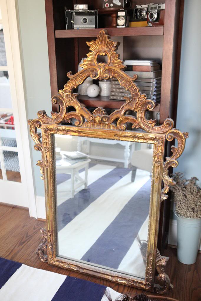
Anything would be better in my book than the current finish…so it came next in our whirlwind dining room makeover. The first thing I did was wipe it all down (it’s like a dust magnet and that is a big no-no when it comes to painting). I then covered up the mirror part with FrogTape and brown paint paper so that it would be easy to clean up.
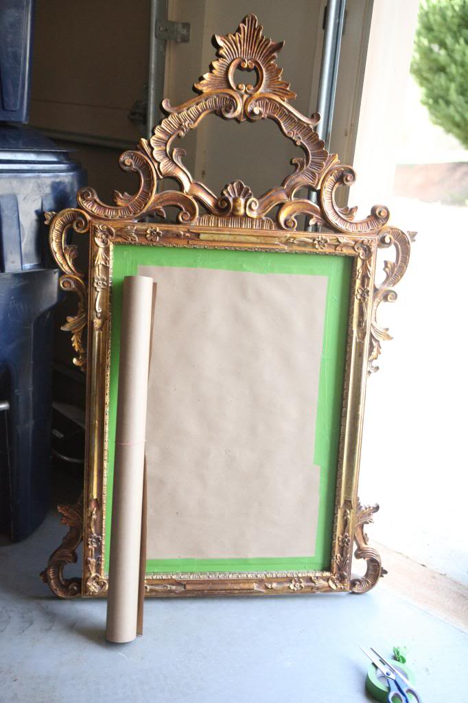
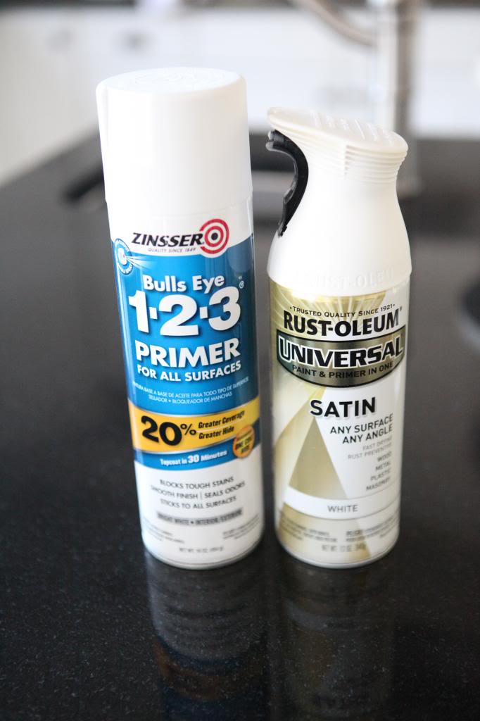
Time for painting…here’s what I used: Zinsser Bulls Eye 123 Primer & Rustoleum Paint n Primer in one in white. I love the Zinsser primer. It’s like Taylor Swift…it really does stick to everything. I feel like 32 sister 🙂
I chose to go with the satin paint over the primer because I wanted the mirror to be more subtle than the effect that a gloss would give. And yes, the Rustoleum has primer in it but I’ve found that a light dusting of the Zinsser primer helps things stick just a smidge better.
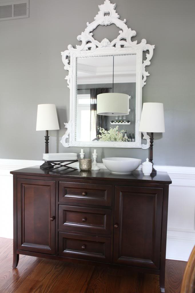
A few coats later, I have one very white mirror. So much better than the orange.
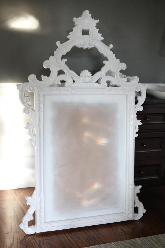
I went ahead and hung it up after removing the paper and tape…it immediately was more my style.
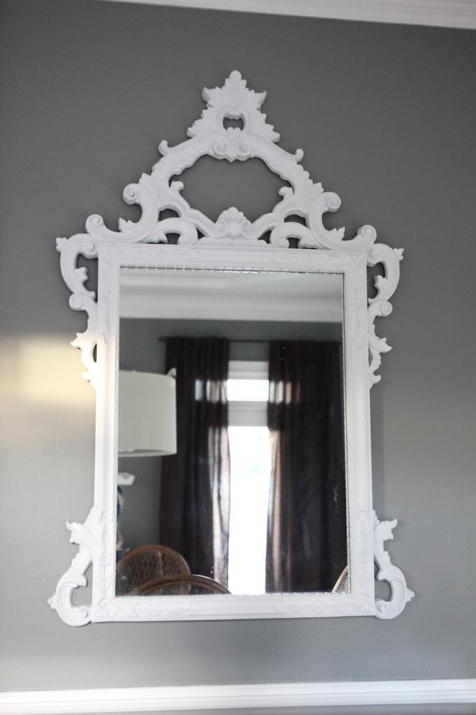
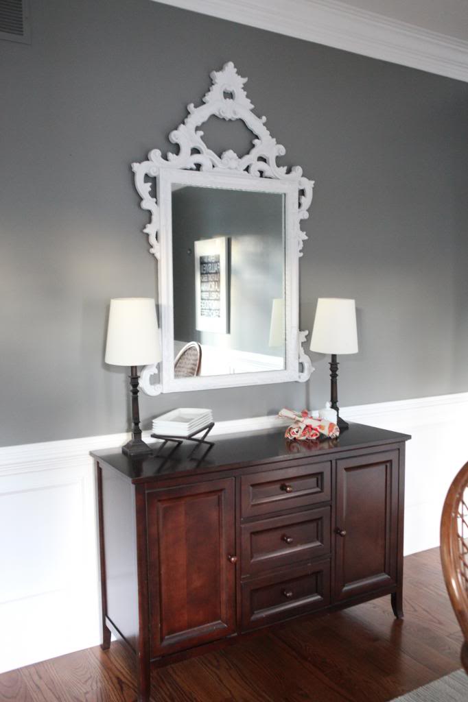
Doesn’t it look so much better against the dark gray? I love the contrast.
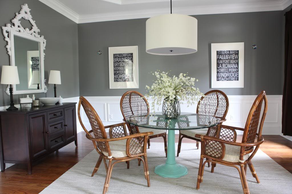
Oh and some folks were asking for a wide open shot of the dining room. It’s in transition right now so please don’t think this is finished by any means. I asked Jer to pull this old table out of storage (and we had to pick up the glass top from the friend he rented from 7 years ago!!). I love the table but it’s obviously too small for this space for long term. But it’s a nice stand-in till my new beauty arrives…aka…when we find the time to drive up to Chattanooga, rent a uhaul and bring it home 🙂
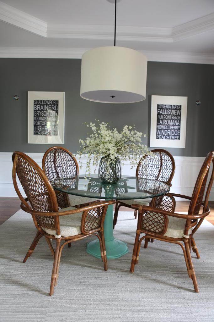
I think I might just go ahead and paint the base just for kicks. And I need sconces. I took out the old ones…they just weren’t screaming dining room to me.
oh and ignore the too-short curtains. I had three…the fourth curtain was left at the old house in the bathroom…and obviously they are high-watering it. I just wanted to see how the dark brown looked. The linen looks really good to me….it’s now just a waiting game till I can either go to Ikea to buy the longer ones or make my own.
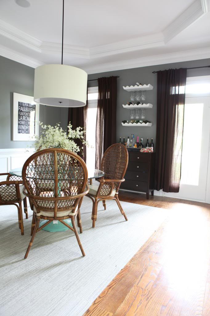
Another random note….I like the round pendant light in here with the round table but I’m unsure how it will look with the large rectangular table-to-be. Anyone out there with a rectangular table and a round pendant? If we don’t love it, I guess I could switch it out with the kitchen table light. We’ll have to wait and see what looks best I guess.
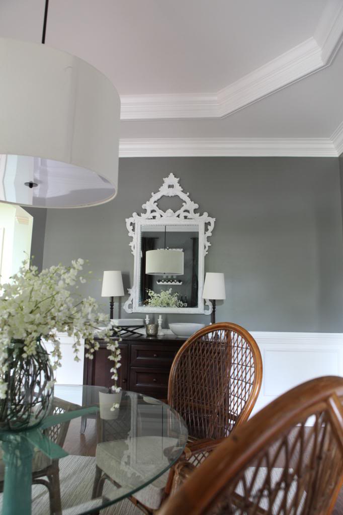
So there you have it folks…new life in an old mirror. I think Jer’s great aunt would be surprised to see how modern her mirror looks now…it definitely doesn’t look like it got a bad self-tan anymore, right?!
I think the round pendant may look even better with the rectangular table. If you look at the last picture that you posted, you can see the round pendant in the mirror, and with the right angles of the buffet added to the other lampshades and the bowl, the addition of curves to the angles looks really nice!!
That looks like a $300 mirror now! Thanks for the tip about that primer, now I can talk the man into spraypainting EVERYTHING!!!!
Where is your china cabinet? After you showed us the finished wall and it was still in the room, I thought how good it would look if you painted the bottom “half” the dark gray like your walls and left the top white (opposite of your walls/wainscotting). By the way, I do love the look of the darker walls and white wainscotting. Would love to do this in my dining room, but we have stained wood trim and wainscotting and my husband REFUSES to let me paint them.
Love the mirror! Even if you wanted to keep the curtains, you could just add a band of fabric at the bottom; thus making them longer and you can bring in an accent color that way.
I love that mirror!
Also, I have an almost identical round light fixture over a rectangular table. I like the contrast. I can send you a picture, if you’d like!
Oh my! It does look pretty painted white, but I have to admit, my heart did break a little reading this post 🙂 I am so in love with old, antique-y gold pieces like that – seriously, that’s like my dream dining room mirror! But the white does give a completely different look – amazing what a little paint can do!
Oh my lanta I’m diggin’ the white/gray contrast! Love love love the mirror. I totally eat up that intricate detail, errr basically anything that looks like it has a tiara on top. Nice work, Katie B! 🙂
Hi Katie, Love the change to your mirror and to answer your question. I just recently redecorated my dining room and bought a lovely rectangular trestle table in the same tone as you. I have a white round pendant light above it and dark walls and I love the contrast it gives. Hope it helps!
We have a big ole round pendant with a large, reclaimed farm table – and I LOVE it!
http://lot23blog.blogspot.com/2013/04/moving-day.html
There are a couple of bad iPhone pictures in the post above if you’re interested in seeing. 🙂 And I promise it looks even better in person and with the full set of chairs. I should really update my blog. Aye.
Anyway – LOVE the mirror! And glad to see I’m not the only one mixing grays and creams and browns. I keep telling myself they’re all neutrals so they should work. haha
You get 10 gold stars for that mirror, Katie B. It’s amazing against the gray.
As for the round pendant/rectangular table thing, I think round pendants go well with everything.
I’m sure you’ve answered this a thousand times, but where did you get the chairs in the dining room??? Thanks!
How cool that it’s a family hierloom. Sort of!
I horfed at that mirror initially and the gasped at the after. It is gorgeous.
I think the gold would have looked great against navy walls, and perhaps in a more modern/industrial space to create the old vs new contrast.
But I agree with what you did for your space. That gold had no place in that room!
What about the yellow curtains? I loved those – if you’re not putting them in another room, just send them my way!!!
Katie, what happened to the yellow curtains?
I love the flowers on your table. What type are they and are they real or faux?
Katie – this is the dining room light fixture I have been searching for!! Did you make that or buy it somewhere? I have an off center light over my rectangle dining room table and wanted to hang 2 pendant/shade lights to balance the space. I think this is just what I need!!
I would prefer the round light with a rectangular table. They will offset each other nicely – the bigger thing I would worry about is making sure the size of the light fit the size of the table.
You should just add a panel to the bottom of the brown curtains to add a little more color and fun! And you surprised me with how great that mirror looks. I thought it was too far gone but the power of spray paint has done it again!
I like the punch of color of the base–it stops everything from being too matchy matchy. I wonder what color you are thinking…
The mirror looks great! I may need to pin Zinsser so that I remember it exists!
I was thinking the same thing about adding a band of fabric to the bottom of the curtains.
LOOOONNNGGG time reader, first time commenter 🙂
I love how your dining room is coming together! I am obsessed with those chairs. I have a circular pendant over our rectangular table, and I love it! It’s a nice contrast, I think. You can see pictures of it on my blog’s house tour, if you’d like:
http://www.tudorsdownblog.com/p/our-home_06.html
Keep up the great work! I so look forward to reading your blog!
-Sarah
tudorsdownblog.com
Very nice! I think the light will work well with the rectangular table. Can’t wait to see what else you do! And Ikea curtains are the way to go!
in your “you may also like this” section….there is always an ad from RANT SPORTS, with a slutty pic. that’s odd.
Have you been happy with how the Walmart buffet has held up? I’m thinking about buying one.
It looks great! Love me some spraypaint. Also, if you like the curtains, but just need them longer, it would be easy to add a band of fabric at the bottom. A fun accent color maybe?
The mirror looks great against the dark wall. And I absolutely love your display of vintage cameras!
Very pretty! We have a long rectangle dining table and a big ol drum shade pendant and I like it so I say go for it because it looks great in that dining room!
I’m loving the transformation of your dining space. Have you thought about adding a dark glaze to your mirror which would tie in some brown to coordinate with your buffet and brown curtains? That fabulous mirror has wonderful grooves that would be perfect for a light application of a dark glaze!!
While I love an antique gold tone in a lot of things, I think this was a great choice – IMO, works better with the other furnishings and colors in the room. While I’m not usually in love with ‘upside down lampshades’, I do like yours in this room – I think the right sized rectangular table would look terrific with it.
I have a large rectangular table with a large round light fitting above it and I love it. It brings some much needed curviness to an otherwise boxy room. I love how the mirror turned out – it looks fantastic. I didn’t mind the gold but the finish is hard to see on the computer maybe. It didn’t look that orange on my screen. I can’t wait to see how it all comes together!
Amazing Job Katie, the room looks phenomenal, absolutely love the color on the walls. According to me when you will receive you long awaited beauty , you might want to add one more round pendant light . That will cut down all the rectangle and square edges around the room.
Oh the mirror mirror on the wall is the killer for me. in that room.
I love your blog and your sense of humor, and I LURVE me a giant round pendant with a rectangle table. I just bought a giant round pendant from PB … it was on clearance and I had coupon, so I brought that bad boy home for just under $30! My hubby hung it over my rectangle kitchen table and, like I said, I LOVE it … like a fat kid loves cake!! That being said, I’m sure yours will look just as awesome!
Keep on keepin’ on!
<3
That is one classy mirror! 🙂 I am absolutely loving how this room is coming together!!
Why not just sew a panel on the bottom of the curtain? it might look nice with the two colours!
It looks a billion times better in white! Perfection!! 🙂
Love the contrast of the white and the dark grey! It looks fantastic!
Love that mirror now! Paint definitely gave it new life. Good job!
I miss the yellow curtains, love the flowers in the middle of the table and now comes the fun part the final touches to a room!
Love the mirror! Such a great update!
I have a round pendant a lot like that over a rectangular table and I love it!
here’ s a pic: http://imgur.com/I6W4sMd
I agree that the mirror looks better white, at least with the design you have going in the room. I think that green aqua color on the table is so pretty with everything else in the room, maybe you could use that color on the bottom of the curtains. Also, are the flowers on the table real or fake? The arrangement looks so pretty.
I love the white paint on the frame! Looks awesome!! And what Sarah F. said… I would totally sew some fabric on the bottom…. it would look great 🙂
I LOVE the sweet white flowers on your table. Are they real? If so, what kind of flowers are they? If not, where did you get them??
I should of course also mention that your dining room 2.0 looks amazing! I think it’s the wall color. Game changer.
Love it!! I love the white mirror against the new grey paint! So pretty! Infinitely better than the old gold. I now feel inspired to paint my dining room grey too… It’s so beautiful!
How about some patterned curtains? Break up the color blocks a bit? A bright(er) color?
I’ve got a gorgeous drum light over my weathered faux antique rectangle table. The contrast between sleek and curvy and old classic solid is fab. My whole kitchen/dining/family open concept space is like that, and I love it. Go for it!
Where did the yellow curtains go? I feel like they would still look so pretty in there.
Hey there! Your dining room is looking AWESOME! I actually just built a rectangular dining table and have a round light and really like it. You can check it out towards the bottom of THIS post.
I love the white frame against your walls! We painted our living room a similar color last winter and I’ve been biding my time until the weather warms up so I can spray paint all my wall frames white : ) It’s going to look awesome! Thanks for sharing! I’ll have to try that primer!
I love spray paint – would love to meet up when you get to Chattanooga. A few good places to explore too.
I can’t tell how big the pendant is from the pictures, and I don’t know how big the table is (I’m thinking huge), but to create a “rectangular” shape with curvy lines, you could add 2 more smaller (but similar) pendants on either side of the larger one. That way, it would elongate the structure but maintain the round edges.
As for the round drum shade and possible rectangle table….I’m buying one from West Elm this weekend to go over our dining room table. I love the contrast the two different shapes offer and drum shades in my opinion are so classic. I just love them. I say keep it 🙂 I was going to ask where you got your shade from because it’s much deeper err bigger than the WE one.
Wow! The whole room is going to end up looking really great. The mirror, especially!
Beautiful!!
We have a round pendant (similar to yours) with a rectangular table and I love the look :). I’m planning on beefing up our table and some point in the future… but here’s how she is now: http://www.pepperdesignblog.com/tag/dining-room/
Pretty!
Love the table!
http://happinessiscreating.com/
Love the white, but I think I would add just a touch of glazing to highlight the gorgeous details!
I can understand how you would want something bigger in here since you like to have family over, but I really like the look that this table gives. It would help if the chairs were not brown, and I don’t much care for the brown curtains, but I think the aqua table base looks super nice with all of the gray and white and mocha.
Gorgeous! That is my favorite spray paint!
Have you considered adding a fabric strip to the bottom of your curtain panels, maybe in a wide stripe? Good job on the mirror. I have a large round pendant above my dining table which is long and oval-ish.
We have a round pendant over our rectangle dining table and I love how they play off each other.
Looks great! Please don’t paint the base of the table though – I don’t know how it is in person but in the pictures the pop of colour is my favorite part of the room!
I’m loving the way this room is coming together! Can’t wait to see more 🙂
I guess I differ from the majority on the round drum over the rectangle table. I had round over rectangle and it just bugged me every single day! I finally switched it out with a fabric rectangle shaded fixture from west elm and I love it so much more now.
Maybe the look wasn’t working for me because the whole space the table is in is long and narrowish, so the rectangle just made it feel more united to me. I bet the circle would look good in a room like yours that has a more open feel.
Love the mirror, btw!
That mirror is B – EAU- TI-FUL!! It just goes to show anything with good shape/structure can be made over to suit. Some people love the antique, some love the modern but whatever is your style it’s the mirror itself that holds up either way. Jer’s Great Aunt should be proud tan or no-tan. 😀 I love the white/grey. I also love the colour of the pedestal on that table, what colour would you repaint it? Can’t wait to see your new big table.
LOVING the wall color!
I agree, mixing shapes usually means good design. Elements of design would tell us to mix away!
Looks great! We have a similar round pendant over a table that looks really similar to your new baby.
http://pinterest.com/pin/193021533999612421/
When do the chairs get a facelift?
Really like the mirror painted white, but I feel like you lost some of the dimension. Have you thought about going over it just a bit with some light gray paint to pick up the details in the mirror?
The mirror was a good call-I’d even hit it with a lil rub-n-buff in matte silver to highlight all those nooks and crannies.
You can add to those drapes at the top or bottom or even in the top third-it’s just straight sewing; any color that you choose- fuchsia, gold, pale blue, bright green-would look amazing, and then you could tie it in to the runner/napkins/whatever.
It’s got a great start-will be fun to see the rest!
Hi Katie,
I’ve been following your blog for a while and I’m always excited to see what you’ve been up to! I love the contrast between the white and grey – it looks so fresh and clean. I’ve been thinking about painting the walls in our house grey, but not sure it would work as we have very low ceilings and much smaller proportions that your gorgeous house – it is a 1846 Victorian cottage in the English countryside! I can’t wait to see how the dining room comes together especially with the curtains – why don’t you go for a fabric with white background and a grey pattern to bring the whole look together?
Looking good! Where is your sideboard from?
My husband would think those curtains are the perfect length. We bought curtains for my daughters room and he decided to hem them on his own. They are about the same length as above. We have been in a months long ‘discussion’ about the living room curtains about this very topic. He wants to trim them to an odd length. I need to find a good article so I can prove my point to him about the appropriate length for curtains.
The dining room is looking good!
I have a big round pendant from crate and barrel over a square pub height table and it still looks great!
The mirrors looks beautiful with the gray walla.
I have converted to frog tape because of you. You seemed so happy with it so I gave it a try. I ran out one day and tried to use the “blue stuff” and it just wasn’t the same. I think of you every time I pull out my roll.
Love the dining room and the way the mirror looks against the grey.
Where is that awesome center piece from? More importantly, those flowers?! Can’t wait to see it all come together!
Both parts are from Pier 1. The branches are fake and the vase was too!
xo – kb
Aww that’s sweet. I love it so much too!
xo – kb
It’s the Canopy line from Walmart 🙂
xo – kb
I did think about going back with a dipped rag to bring out some detail…it is a bit flat, huh!?
xo – kb
When I figure out what I’m gonna do with them…stay or go!
xo – kb
I still have them but I was not lovin’ it more than the brown.
xo – kb
They are fake! They were from Pier 1. Real beauties!
xo – kb
I moved it to the basement! I like your two-tone idea but it just wasn’t working for me in the dining room and where I wanted to go with it 🙂
xo – kb
Ohh…I do like that 🙂
xo – kb
Haha…I might be getting rid of them in the future, I’ll let you know 🙂
xo – kb
I got them off Craigslist…I think I paid $35 for all four 🙂
xo – kb
They are fake but totally look great, right!? They are from Pier1.
xo – kb
I got it off Overstock! Here is the old post about it!
xo – kb
I still have them but I didn’t love them more than the brown so I took them out.
xo – kb
We’ve been happy with it! The bottom drawer is a little tight but I haven’t tried rubbing soap on the edges yet.
xo – kb
Hi there,
We have an 8 seater rectangular dining table with a round pendant “chandelier” above it-if you have a look at the second photo in the post linked below you can see one angle of it. 🙂
http://sufficientlysufficient.blogspot.com.au/2013/05/cupboard-love.html
I love your dining room! The mirror looks great.
Where did you get the great shelves with the rack for wine glasses? Love the room.
yikes. Thanks for letting me know.
xo – kb
I did think of wiping it with a dark gray on a rag just to bring out those details. It does look somewhat flat to me in these photos but less so in real life. I’ll have to wait and see 🙂
xo – kb
Well I still only have three curtains so that last one would be a really long added panel 🙂
xo – kb
Thats an interesting suggestion!
xo – kb
I have but I don’t have that last panel. I’ll still have to replace it either way.
xo – kb
I like the color too but I’m not 100% certain either way.
xo – kb
I don’t know yet. I love the color just not in here.
xo – kb
They are fake…but look really good, huh!? I usually assume fakers always look fake.
xo – kb
hahaha!
xo – kb
They are Pottery Barn wine bottle holders with Ikea glass holders attached.
xo – kb
I am LOVING the direction you are headed. The mirror is perfect, I am such a sucker for high contrast. Can’t wait to see the new table. I thought the three pendant solution was really interesting, you could make that look very romantic and eclectic, something to think about. Can’t wait to see the chair solution, too. Great job!
where did you get your pendant lighting above the table? LOVE it!
That’s not creepy.
I didn’t mind the mirror before, but in white it looks kind of sad. It looks like an ornate mirror that was spraypainted white, not an ornate white mirror. It was worth a shot but I think it fell flat.
Hi Katie! The dining room looks amazing with the new wall color! I had a quick question for you about the rug in your dining room. We are trying to find something similar for our large family room and was wondering where you got yours. Also quick side note that I swoon every time you post something about your kitchen! You guys did an absolutely incredible job!:)
I noticed this too. It says “ranker dot com” and is the last image. It’s of a woman. Weird.
It definitely photographs flatter than it even appears in real life. I still think it is less dimensional than I had hoped though. We’ll wait and see what’s gonna fix it…
xo – kb
Overstock!
xo – kb
It’s actually FLOR tiles 🙂 They are awesome for spaces like this because if food drops on it, I can just pick up that tile and wash it off in the sink!
xo – kb
Sweet project.
Very nice idea and instructions.
If I lived in Atlanta I’d buy your dining room chairs! 🙂 i like them.
Speaking of your T-Swizzle reference… Have you seen this you-tube video?
32 – Taylor Swift 22 Music Video PARODY”
http://www.youtube.com/watch?v=YSnDJ7exSO0
The mirror had value when it was gold. You should have gotten a cheap mirror to spray white. The gold was classic, the white is trendy and will get edited out when the style is over.
Looking great in there! Our poor little dining room is in need of storage, but I’d gladly take this lovely mirror. Nice update
Love the room and hardwood floors!
Ah the white is very nice! Really refreshing. I love spray paint.
I have to say, I hope they go! Maybe transfered somewhere else. They just don’t fit the over all style of that room any more, IMO.
How is the quality of the sideboard? I was looking at that one, but I can’t get my husband on board because he’s scared the quality is going to be bad (Walmart…ya know).
Love the room, I love grey and white!! Really loving the flowers on the table, are they real? Where did you get them, vase also!!! Thanks!!
They are not real…total fakers. They and the vase come from Pier1 🙂
xo – kb
Thanks 🙂
So i went on pier one looking…do you remember what they are and about how many you have in there?
The mirror is def. better in white! Love it against the gray! Also, just as a sidenote: the 5 little boxes that pop up under a post “things you may like”…the 5th one has had some less than wholesome pics of barely clothed ladies on it. Just thought you might want to know as I doubt that’s the image you’re going for on your blog. 🙂
Quick question, trying to enter your giveaway…and it won’t let me. Maybe I missed it and its already closed. We are in desperate need of new flooring. CARPET in the KITCHEN! WHY?!?!?!?!?!?
I don’t know the name…they were just in a vase on display in the store. It was right in March so it’s not that long ago.
xo – kb
eeek! thanks.
xo – kb
I LIKE the blue table base. I think that color would be a great accent color all over the room!
I would say that its decent for the price. I can’t imagine it being sold at Pottery Barn but it feels sturdy and solid and besides the drawers having a snug fit at times, it is great.
xo – kb
We have a rectangular table (dark wood, like your side table) and a round pendant (nearly identical to yours), and I love it. I also LOVE that color of gray. What it is?
It’s Benjamin Moore’s Secret.
xo – kb
You have so much great curve in this room, the drum shade over a rectangular table will look great!
I love the idea of painting this white! I have been thinking about doing this to a similar mirror I have. I’m not sure it goes very well with the furniture. I think it perfectly stands out against the paint, but next to the wooden drawers below? Maybe it’s my CD but I feel like the woods should match to some extent.