Look at all the art the office has!
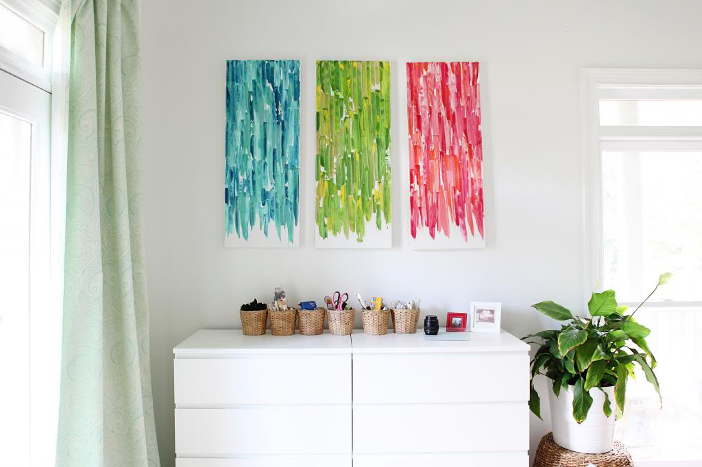
It’s basically the Louvre. Countless pieces of priceless artwork. I’m sure George Clooney and Catherine Zeta Jones are calculating a way to steal it right now.
But the crazy thing is…this is ridiculously easy. It’s a spin on the knife art that I made a while ago for our foyer. Remember that?
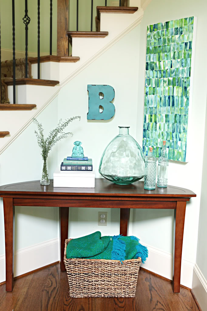
It took me about twelve minutes a piece and they were quite inexpensive. First you need three canvases. Then grab at least five different colors of craft acrylic paint. It’s good to have a granola bar box to rip open to use as your paint palette. Only the Chewy Dipped Chocolate Chip by Quaker Oats will do. No other cardboard. Remember that. It’s vital. And the last thing is your tool…I used a slanted flexible painting knife. It’s from Home Depot – they clearance them out a while ago but they are Martha Stewart so you can probably get it at Michaels.
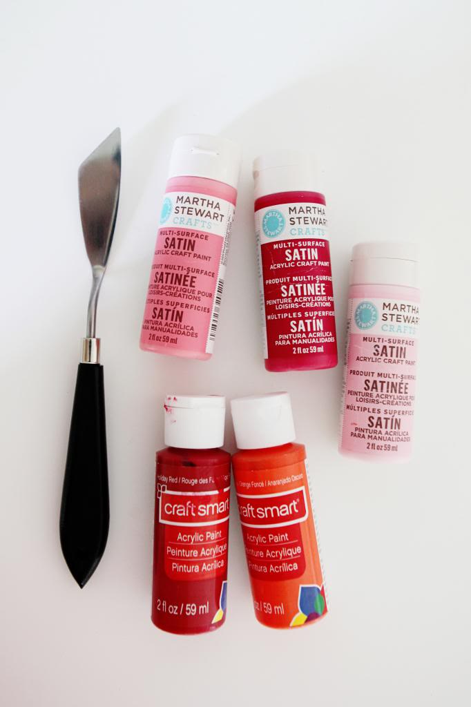
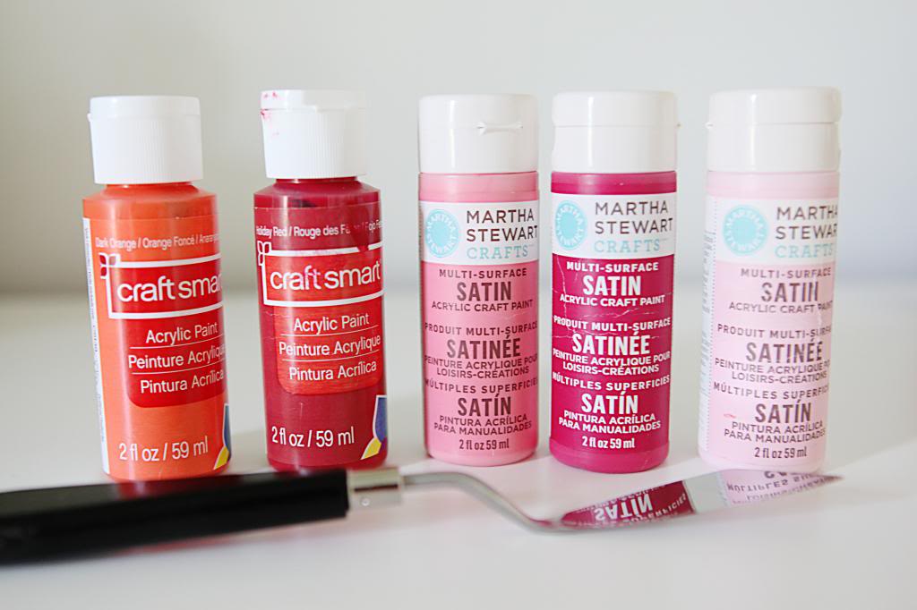
Remember that this art is custom and you can use any colors you want and make it personalized specifically for your space. But you also don’t want to mix five colors that are so close that it just looks like a big orange blob. Here are my biggest tips for choosing paint….
- choose one middle color that will dominate
- choose a light color that is MUCH lighter
- choose a dark color that is at least TWO shades darker
- choose a wild card color that plays nice (like the orange below)
For the full rundown on how to do these knife paintings – read this post.
These are slightly different in that I didn’t create a tiled look. Instead I loaded my knife and then smeared it down as far as it would go. Then I loaded it again and repeated. There was no specific science to how much paint was on the knife….just a variety of color dips. When it came time to do the second ‘row’ I started my smear right below the end of the upper smear. Does that make sense? So if each smear ended in a different spot…the next row started in a variety of different spots.
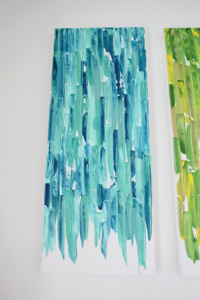
When I got to the end, I knew that I wanted the “waterfall” look…like the paint was a fringe skirt on my free spirit. So instead of finishing the last rows I smeared till it ended and left the bottoms blank.
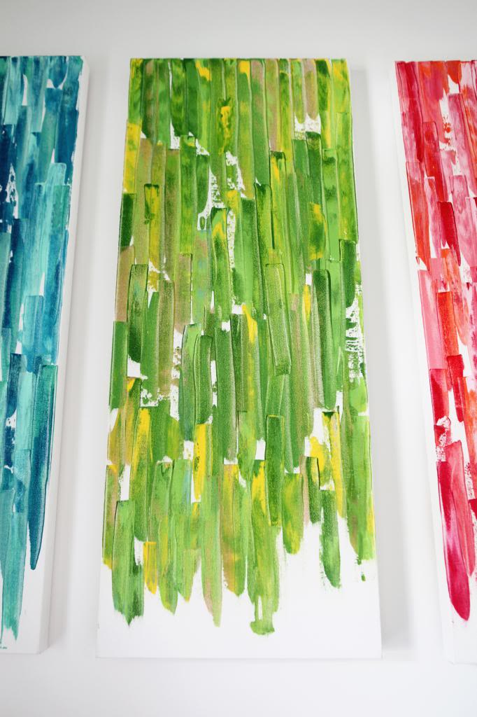
I love the fact that these are huge blasts of color. The white walls need it.
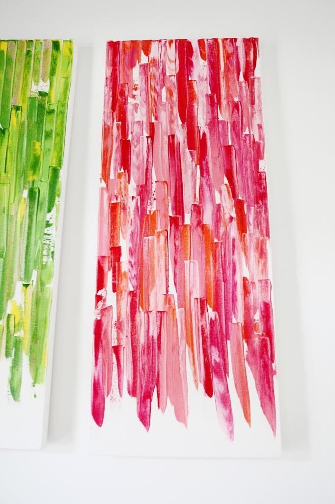
Art isn’t as functional as shelves or additional storage but since this is the first thing you see when you peek into the office…it is nice to have a splash of fun color. And I see this as more youthful and a bit feminine with it’s color scheme but I think you could man it up with grays and blacks and browns and tans.
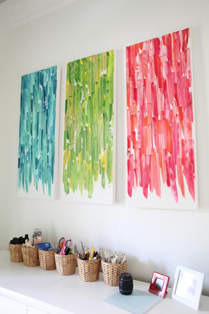
Also – did you sneak a peek at the curtains? I haven’t finished them yet – they are just fabric that is pinned up but they were the cheapest patterned fabric I could find…$3 a yard. I needed three and a half yards per panel – 14 yards total for the two doors. I don’t think it’s a forever fabric but at $42 (most panels at the length I need cost a small fortune) it works. I just wanted something up….at some point it doesn’t matter if it’s perfect…it matters to get it done….can I get an amen?!
Anyhoo….Happy painting!
Update : Looking for more info on something you see in our house? We have a Shop the Bower House page with paint colors and links to accessories, furniture and decor!

This is a great idea! A pop of color is the best to life to a space. I love the little woven cup holders as well! Where can I find them!?!
I love crafty art goodness… waterfall effect = nailing it. We also get after Canvases and Craft Paint (new store name?). We made this beast years ago…
http://houseofbennetts.com/2014/05/19/etsy-art/
I love the depth of colors. This looks like it could be good to do with kids too.
Ikea. They are actually planters!
xo kb
Oh I am in love with this! Beautiful and easy, that’s how I like my women. Oops I mean art!
That took a terrible turn. But I stand by it.
I wish I had a huge empty white wall to do this on!
Brilliant!
AMEN!!! Getting started in my problem….LOL!!!
I love this look, Katie! I remember when you did knife art the first time, and I stowed the idea away for a future project of my own. Well, you know how those “I should do that one day” ideas are — there are usually just too many! But seeing it again in a different way may be just the push I need to get this one off the ground.
Question: do you tape off the edges of the canvas or anything like that? I’ve done some canvas art before that ended up not going on the wall because I didn’t like how unfinished the edges looked.
This is so cool! At first glance I totally thought it was crepe paper streamers (and loved it) but the paint is just so great! Such great colors all around. I love the waterfall look.
I love the saturated colors. They really bring some life to those white walls. What method do you use to hang your canvases? I’ve been hammering in a picture bracket, but I’m not really sold on it.
ABSOLUTELY love it! I am completely inspired to create my own versions of these. You are so creative! Don’t you just LOVE the Martha Stewart paints??!! I can’t speak highly enough about them.
Hi Katie! Totally random, but I was reading an article someone posted on FB about food allergies and it had a picture of you holding Weston in it. Thought you might like to know! Here’s the link: http://moms.popsugar.com/Understanding-Kids-Food-Allergies-34191032?slide=8
You are so amazingly creative! I love everything you do and it’s all so (mostly) simple kind of like why didn’t I think of that!
Beautiful paintings, and great curtains. Loving the pops of color!
AMEN! I have a saying framed and hanging in my kitchen that says, “Done is Better Than Perfect”. It’s my new mantra! Especially after building our house last year!
hahahahahaha!
xo – kb
I didn’t but if you wanted to there would be no harm!
xo – kb
They would look even more finished if you painted the edges of the canvases instead of leaving them white. Gold, black or even a color from each palette would work.
Very pleasant, calming feel to it. It actually makes me think of the beautiful bamboo “walls” at Zoo Atlanta.
They asked permission but it was weird that they put it in that slideshow.
xo – kb
So cute! I’ve gotta do this…
Gorgeous…..especially love the blue one. This may be the kick in the pants I need! I loved your other painting but never made one of my own. Your office is looking great!
Wow, these look so awesome! I love the colors you choose. This would be a great little project for me and girls to do.
http://palsywalsyblog.blogspot.ca/
I LOVE THESE SO MUCH…thanks for the inspiration! <3
These are awe-some! I’ve been looking for a paint project for my seven year old and I to do together. Free spirit doesn’t even begin to describe my girl, she’d paint the world if she could. 🙂
LOVED this: “like the paint was a fringe skirt on my free spirit” !
I like the unfinished edges. Love the colors!!!
KB I LOVE the new website design!!!!!! BEAUTIFUL!!!!!!
So how much for the set?….seriously….Knowing me I would purchase the items and never get it finished….too much on my “plate”.
Love the paintings, they look really high end! I also love the new blog layout, so clean and fresh!
I like this art a whole lot, and I love the mobile website! Looks phenomenal!
Aaaaaaaaaaaaaaaaaaaaaaaaamen!!! You make everything looks so simple
I love it! You are very creative. Nicely done and I love the curtain fabric as well. Even if it’s cheap, that’s still a lot of work for it not to be forever……..at least for now, lol. 😉
Fun art – love the pop of bright color and the girliness!
Also, did you do a major blog reformat job (fonts, headers, etc.) or is my browser on the fritz? It looks great either way!!
I’m working on it right now…painfully slow and it’s probably gonna be wonky for a bit 🙁
xo – kb
I use one of those fancy nails…and a hammer 🙂
JK. I do use a nail but I am sure my boyfriend would prefer something more sturdy.
xo – kb
This is great and, I have to say, I much prefer the look without the edges finished!
Katie- I just saw this free printable and thought it would be perfect for your office! It is fun, colorful, and FREE!
http://www.basicgrey.com/files/images/HIP_Capture.jpg
Wow! The blog looks great 🙂 Thanks for the reminder about your knife art (too Dexter of a name?!) I need some cheap art to fill big open spaces in our basement. This looks like a great way to add a pop of color and I have a MIchaels GC left from my birthday! Win. Win!
Keep up the good work formatting can be such a pain but it’s worth it. 🙂 Last night all the links were white (and therefore invisible) BUT they are all a very pretty teal this morning. Looks fab!
Already looks amazing!!!
Love the art. Can’t wait to see the new rooms. Are you moving the library stuff to the living room?
AND…love the new blog format. Fresh and modern.
Byeeeee
Looks great. Love your new blog look. 🙂
Loooooooooooooooooove the new look of your blog! Fun and fresh 🙂
The redesign is looking great – really fresh and clean. But I just had to tell you, I popped over here yesterday and you must have been in the middle of the switch. Only half the blog header was there and it read:
BOWER, the blog about nothing.
I had a good laugh and then left you to it. At least you have that kink straightened out!
Hey girl! First off, great idea on adding color with art! Second, I LOVE your website redesign! I swear I check-in on your adventures daily, and it looks superb! See, some things do get wrapped up! 😀 Have a good one!
Hi Katie! Wow, I just love this art. Nice work!
Love the art and the new site design. Things are even loading faster, it seems! One bit of feedback… The light gray text is tough on the eyes. Would you consider going back to a darker text color for the main post text?
Thanks for the input. I’ll look into it.
xo kb
Love the artwork! Also, I’m really liking the new site design – really clean looking 🙂
Love this artwork! I’ve been meaning to try the last one you made, but this really stands out! Also, I love the new site design and logo! They look fantastic!
That’s hilarious!
Katie- I just finished my own version of knife art. I picked up a $3 dollar canvas at Goodwill “24×32” that I primed/spray painted over. I needed it to hang horizontally. I had light aqua, turquoise, to darkish blue with shades in between. 6 colors. I used an old paint scraper like you used in the first project. I made longer rectangles than yours but the same idea. If I had to do it over again, I would leave more white showing , like you did. I got a little OCD, and felt like I had to cover the white. I also extended the color on the sides, which I like. But I must say, it looks pretty darned good, and I only spent $3 dollars! Thanks for the inspiration! The timing of the post was perfect.
COOL! Way to go! Those are my favorite colors 🙂
xo – kb
Hi Katie – not sure if you know, but the site is doing some funky things today. When you come to the main page, the article area doesn’t display any of the feed, it has a single ad in it and the rest is blank. Also, there is an ad in your banner at the top, so it is cutting off your blog name. Like the new look – but thought you should know there may be a few glitches.
I know 🙁 I can’t change anything until my host updates some stuff. It takes 24 hours so I am impatiently waiting on them.
xo – kb
The reading room stuff is getting split up in different rooms. Can’t wait to show you where it all goes 🙂
xo – kb