Consider this one of those ‘forgot to tell ya all about it’ kinda posts.
Consider it that because literally, I forgot to tell ya all about it. I started. But never finished. And since I get so many questions about it (both in real life and when it’s in the background of other photos online), I thought…let’s just do this. Everyone likes a new kitchen light.
So our whole kitchen transformation ended last year (there are still little things we tweak here and there but for the most part, we are pulling out the Swiffer not the paintbrushes) and our light over the table was specifically something that went through phases.
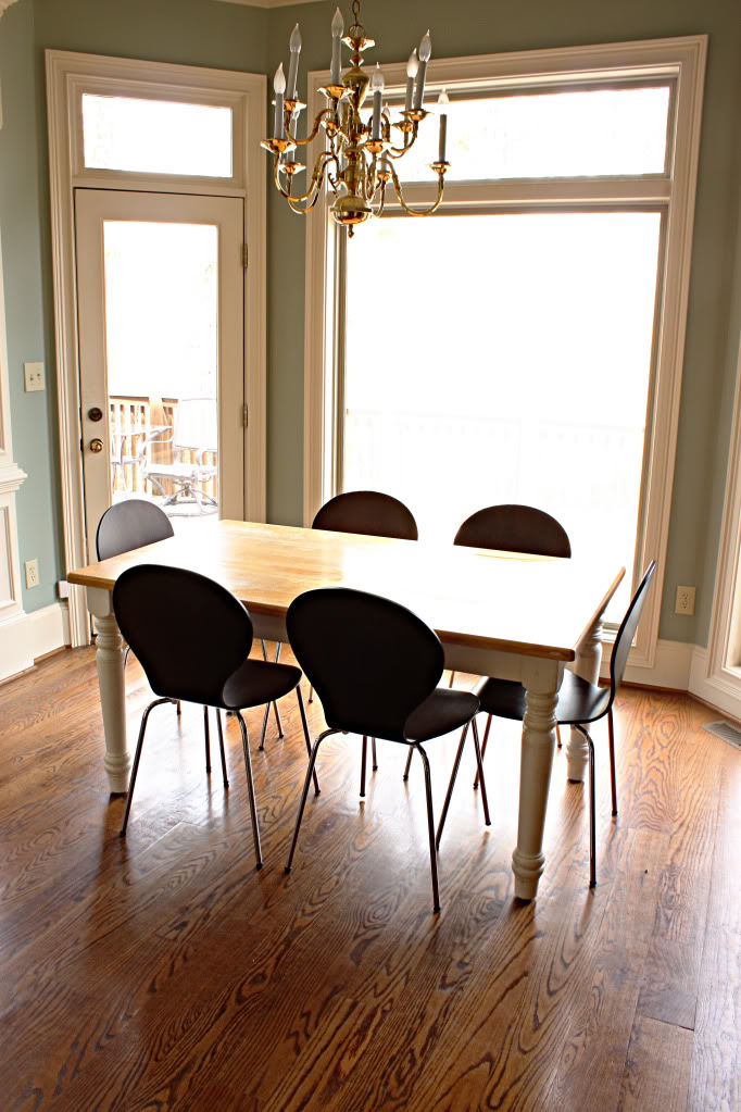
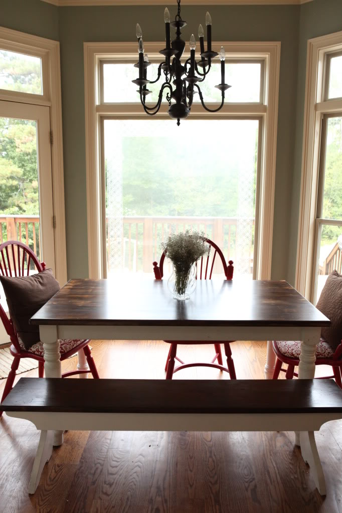
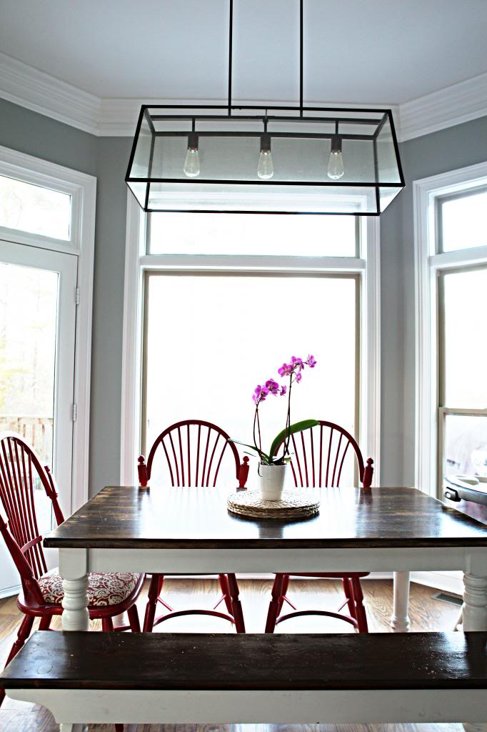
The house was born with that gold beauty (you know the one…it can be found in any local Goodwill’s lighting section) and we were fine with it for a while. It got the job done. Then our shiny baby went through it’s dark, moody teenage years (spraypainted it to the darker oil rubbed bronze). Well the time to trade in the Abercrombie mini skirts for something more grown up came and we fully embraced the adulthood of the light situation.
It helped that The Tile Shop lit a fire under our rears (fun-fact: Will calls your bottom a “cutie bootie” every.single.time. and it always comes at the most hilarious moments….like in the grocery store when he’s eyelevel with some guy’s wedgie). Since our backsplash was provided by The Tile Shop, they asked to come in and take photos to add to their portfolio. I guess it makes more sense to provide tile and then send a couple of people out to style and photograph than it does to build a kitchen and then style and photograph. One of the things they bought for this space was this new light. I told you all about that here.
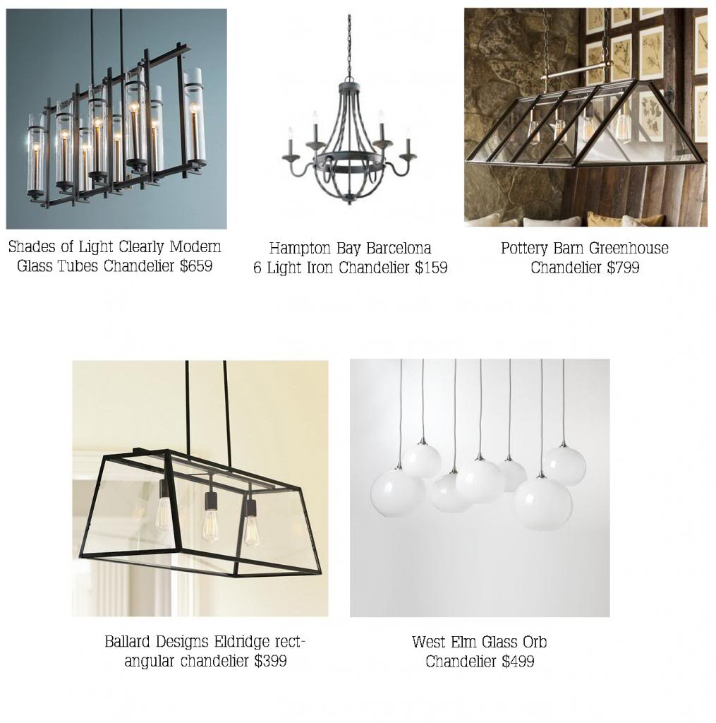
The best part about the entire process was that we got a say in which light went in here and I had it narrowed down to five beautiful choices. In the end, the Ballard Designs Eldridge Rectangular Chandelier fit the bill perfectly.
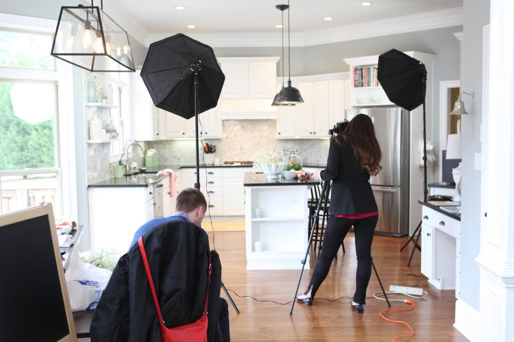
The funny thing about this photoshoot is that you never got to see the crazy before photos….where we were scrambling like a couple of eggs in a hot skillet (sorry…the cheese is unstoppable sometimes) with a three month old, a two year old and no idea what to expect.
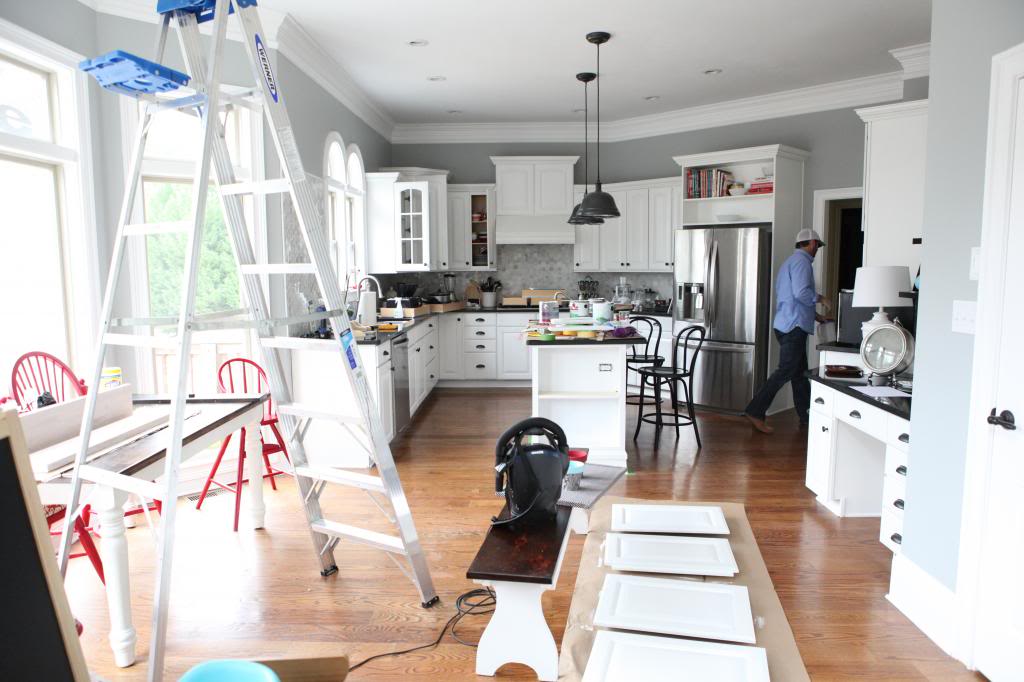
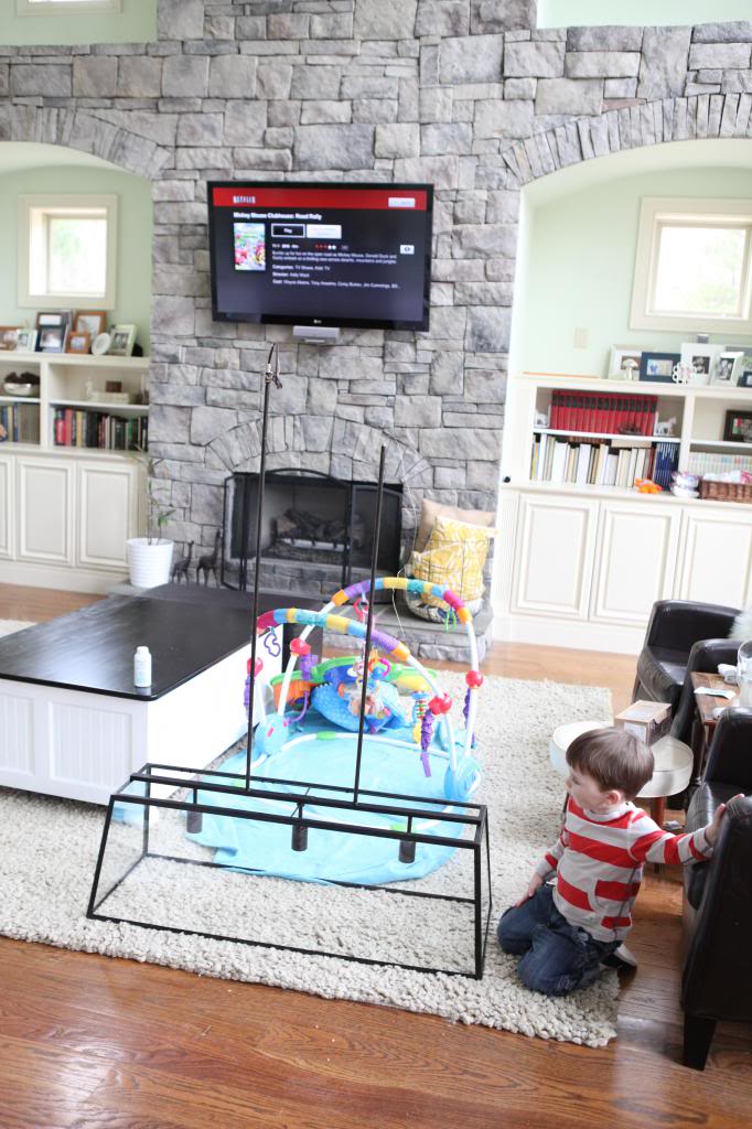
This is when we were up to our eyeballs in everything “KITCHEN BLITZ!”. Cabinetry was drying, light was down, shelves weren’t installed, random sippy cups were on the loose. It was like a scene out of a horror movie…
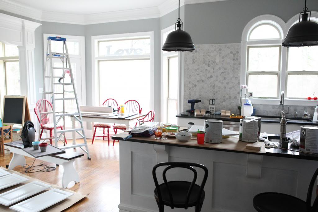
We were really excited to hang the light so we took down the old one a little prematurely (as in, the kitchen is surprisingly dark in this area when we don’t have a light here…) and then had to wait for the new chandelier to come in the mail…
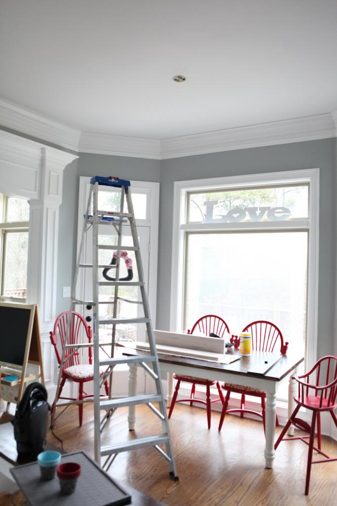
Once it did, the assembly part took two seconds…and we had to figure out if we wanted it hung lower or higher (see the little extension poles where the wires pop out?). I told Jeremy that it probably would be a good idea to just hang it higher. I remember at my parents house that the kitchen light fixture hung a little lower and if the table shifted a little, one of my tall brothers would hit his head or a toddler would be infatuated with climbing up there to Tarzan on the sucker.
So high it went. It didn’t come with lightbulbs so we bought some at Lowe’s (anybody else know a source for brighter Edison style bulbs?) and the height is just perfect for us. Note that we have very high ceilings and we probably couldn’t have gotten away with hanging it so high if proportionally it looked weird. Also, we saved the extension rods so that if we change our mind in the future, it can always be lower.

It definitely mimics the shape of the window behind it….which I love. And I also like that it is simple and plays well with our inexpensive island pendants….making it the Jennifer Lawrence of lights….except without all the falling.
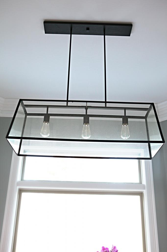
Plus, the price was right 🙂 Seriously though…I would have footed this bill for this baby in less than a heartbeat…it’s probably one of the only light fixtures I’ve ever seen that I could see myself never replacing….I love it that much. I even considered buying another one for the dining room…to which Jeremy nixed the idea. Maybe I should get Eldridge’s cousin….sexy Panaorama 🙂 yes. I just called a light sexy.
Totally in love with it, Katie! I didn’t notice it in the photos before, so it’s still a big reveal to me 😀 Also – seriously – how cool is it to have the Tile Shop feature your kitchen?!!
I love the new light and I’m so glad someone else loves the Panorama as much as I do! I can’t wait to install it in our breakfast nook!
LOVE! We installed the West Elm Capriz Chandy in our Dining Room, and sometimes I just stop to admire it. Great lighting makes a room. http://oneprojectatatime.blogspot.com/2011/07/30-install-chandelier-over-dining-table.html
“Edison-style” (ie incadescent) bulbs are now banned in Canada (100W already, with 60W and 40W coming up in December)… which means they’re getting harder and harder to find, and will eventually be impossible.
http://www.cbc.ca/news/technology/incandescent-light-bulb-ban-starts-jan-1-2014-1.2462888
There are a few florescent bulbs the the local home depot that don’t look horrible, but they’re so expensive it’s hard to convince myself to buy them when a spiral will do the job – it just isn’t very pretty.
I love this fixture. I’ve considered it for over my future kitchen island, but I think it’ll be too big. Looks perfect in your kitchen!
I love it, but I love the Shades of Light one (though it looks too up-shining) and the greenhouse one, too.
In my kitchen, I’d have to be up on the table cleaning the glass about weekly, it’s dust central here.
Looking great Kate!
That is the EXACT light fixture I would like over my dining room table. We just bought a fabulous table and it needs something more than the basic builder light. I just cant see myself forking over that $$ for this. Too bad I do not have the skills to DIY that 🙁
Having the same issue with brightness on our Edison style bulbs. Not nearly enough light! I’m guessing this is why they changed it over time? Love the look, but not crazy about the dimness. Hopefully someone posts a good source here because I’m looking for one too!
Hi Katie!
My family used to own a lighting store for over 20 years and I know what’s happening with the light bulbs. New regulations were introduced several years ago on high-powered incandescent light bulbs to try to force people to use energy conserving bulbs (like fluorescents, halogens, or xenon) in their homes instead. The 100W light bulb will soon be a thing of the past! The highest bulb available will soon be 60w, and in many places it already is. It’s sort of like NY and the whole 64oz soda thing… 🙂 Not really being shared with the public, but if you’re in the industry you’re ‘in the know.’ Love your blog and those cutie-patooties!! xo
Amanda
The light looks great. Ballard now carries a sconce version of it, if there’s anyplace in your house you need sconces.
A lighting store recommended http://www.1000bulbs.com/ to me. Seems to have just about everything.
What I really what is someone to make Edison looking bulbs but more energy efficient!
We have Edison style bulbs at my work (I work at a cabinetry showroom) and we got them from Restoration Hardwar
Hey Katie!! Love the light! Thank you for the post. Also… is it a little weird that I’ve been checking your blog twice a day since monday just to check and see if “the time came” yet!?? Saw your instagram and you STILL look AMAZING 🙂 Good luck! I know everyone’s cyber thoughts are with you and your family now 🙂 XOXO… Natalie
Will u think abt changing the pendant lights over the island??
Love how the lights compliment each other, but are so different at the same time… Bold and opaque versus, translucent and airy… amaz.ing.
I love how it turned out. I cannot decide what to do over our table. Right now I have recessed lighting and hate it.
Love it! Ties in so well with the kitchen. We have the Panorama over our rectangular dining table, do it, you won’t regret it! I agree that it is sexy.
Menards has a comparable chandy for around$150.00. They also have matching pendants.
Love the light fixture! Looks great in your space.
I love your choice of light! I also like the PB greenhouse one, too. I hear you about your justification of the height that you hung it, but this is one of those things I’m kinda weird about. My ceilings are 8′ tall, and I can’t hang my lights high without it
looking disproportional. But then I flounder about how low to hang them. All the suggestions say about 3′ above the table. Which is where mine are (kitchen and DR). And I like the light and the look when I’m sitting at the table. Then I see pictures of every other light hanging MUCH higher above the table, and I have to give my light the side-eye. Other than your tall brothers hitting it, do you like the look of the lights hanging low? Am I the only one? I should add that I’m only 5’3″, so maybe I’m missing something other people notice? Also, your kitchen is much bigger than mine. The foot print of the workspace is 10′ x 10′, and the eating area is about 6′ x 6′.
I think we have the same gold light fixture you had in our “new” house! I can’t wait to do something with it 🙂 Love your new light fixture…gives me some ideas.
Is it just me, but it seems like when you are past due you seem to get a lot accomplished/a lot of posts up. =) Good luck, prayers for you and a healthy baby boy!
I’ve had my eye on that same light fixture for my dining room for some time now. The only thing holding me back was that I though it might show dust/look dirty easily. What is your experience with it? Does it stay clear/clean looking?
I’ve had to wipe it down twice now in the last year…which getting it perfect was kinda a job but it only was twice so it’s not as big of a headache as other light fixtures. I would say it’s average on the whole showing-dirt thing…not terrible (especially considering there is a table or chairs to stand on beneath it!)
xo – kb
Sometimes I like the look – sometimes not. It all depends on the light I think…and the table…and the room. I think honestly that it’s one of those people’s-choice things…do what you like and then it won’t irk you in your own home!
xo – kb
Maybe! It might be the nesting 🙂
xo – kb
Those are already changed to ones we love! Here is the post about them!
xo – kb
AGREED!
xo – kb
Looks awesome! I love how it open it is- keeps the kitchen feeling airy…
Love it! I have the Eldridge Pendant from Ballard Designs in my ‘nook’ area. I get so many compliments on it!
Congratulations on the gorgeous shoot, Katie! So glad that you’re loving your new chandy. Looks gorgeous in your space.
– The Ballard Team
Actually, they do make Edison bulbs that give off the same light, just with fewer watts. Meaning 30% less energy use. That’s still not as good as CFL or LED, but it’s an improvement on the ol’ Edison bulb.
http://blog.topbulb.com/incandescent-bulbs-going-away-next-generation/